10,000 search results
(0.021 seconds)
- Eurostile by URW Type Foundry,
$89.99 Eurostile Display Caps The Eurostile font family was designed (by Novarese and Butti in 1952) to complement the titling font, Microgramma, by offering a lowercase alphabet. Issued by the Nebiolo foundry, the rather square sans serif Eurostile became popular for display and advertising use. The linear nature of Eurostile suggests modern architecture, and its attraction is technical and functional. Eurostile is commonly misspelled Eurostyle.
 - Eurostile by Mecanorma Collection,
$45.00 - Eurostile SH by Scangraphic Digital Type Collection,
$26.00 Since the release of these fonts most typefaces in the Scangraphic Type Collection appear in two versions. One is designed specifically for headline typesetting (SH: Scangraphic Headline Types) and one specifically for text typesetting (SB Scangraphic Bodytypes). The most obvious differentiation can be found in the spacing. That of the Bodytypes is adjusted for readability. That of the Headline Types is decidedly more narrow in order to do justice to the requirements of headline typesetting. The kerning tables, as well, have been individualized for each of these type varieties. In addition to the adjustment of spacing, there are also adjustments in the design. For the Bodytypes, fine spaces were created which prevented the smear effect on acute angles in small typesizes. For a number of Bodytypes, hairlines and serifs were thickened or the whole typeface was adjusted to meet the optical requirements for setting type in small sizes. For the German lower-case diacritical marks, all Headline Types complements contain alternative integrated accents which allow the compact setting of lower-case headlines.
 - Eurostile LT by Linotype,
$40.99Eurostile® is one of the most important designs from the Italian font designer Aldo Novarese. It was originally produced in 1962 by the Nebiolo foundry as a more complete version of the earlier Microgramma, a caps-only font designed by Novarese and A. Butti. Eurostile reflects the flavor and spirit of the 1950s and 1960s. It has big, squarish shapes with rounded corners that look like television sets from that era. Eurostile has sustained the ability to give text a dynamic, technological aura. It works well for headlines and small bodies of text. The Eurostile font family has 11 weights, from roman to bold and condensed to extended. In 2009 Linotype released a revised version in the Platinum Collection under the name , with three weights in all three different styles. And additionaly there are now new weights for the Eurostile family as , and ." - Eurostile Unicase by Linotype,
$29.99 Akira Kobayashi modified his Eurostile Next design into a fun unicase version. Ascenders and descenders have been traded in for alternates of letters that all share the same height. The effect is similar to using all caps, although this is quite a bit more quirky. For example, letters like the lowercase a and e are now the same height as their capital versions and the lowercase y has been raised to fit between the baseline and top height. Odd relationships such as these give Eurostile Unicase a fresh and funky feeling. Try using it for headlines and titles, then use Eurostile Next for the body text!
 - Eurostile Round by URW Type Foundry,
$89.99 Eurostile, created in 1962 by Aldo Novarese for the Nebbiolo type foundry, is one of the most popular sans serif fonts of all, and has been for about 50 years. Originally designed as a screen font it was very popular from the beginning, even though it is only a slightly modified version of the 10-year-older Microgramma, but completed with lower case characters. On public demand, URW++ has expanded its range of Eurostile with Eurostile Round with 19 additional styles. Quite like Futura Round by URW++, Eurostile Round works perfectly well as webfont.
 - Eurostile Next by Linotype,
$50.99 Eurostile Next is Linotype's redrawn and expanded version of Aldo Novarese's 1962 design. This new version refers back to the original metal types and to its mid-century modern aesthetic of squarish characters and subtle curves. Eurostile Next brings back the gentle curves, which were lost in other digital versions, therefore regaining the spirit of the original design and its somewhat softer demeanor. The family has been greatly expanded, now consisting of five different weights: ultra light, light, regular, semibold, and bold. Along with the regular width, all weights also have extended and condensed versions. Stylistically, Eurostile Next is well suited for designs in the fashion of the 50's and 60's, yet it still has a remarkably new and contemporary feeling. Its numerous variations and typographic features are invaluable for projects ranging from extensive corporate branding to one-off posters and from large signage to small print text.
 - Eurostile Candy by Linotype,
$40.99Eurostile Candy is a fun spinoff from Akira Kobayashi's Eurostile Next family. As the name implies, it is based on Eurostile but with many striking new features. Most obviously, the corners and joints have been rounded off to give it a more friendly and softer feel. On top of those changes, the main skeleton of many characters have been modified. Any extra strokes have been removed - such as in the a, s, or t - and joints have been simplified to create even more square shapes - like in the n and r. With these contemporary and futuristic-styled alterations, Eurostile Candy is a cool new design great for many display projects. - Eurostile SB by Scangraphic Digital Type Collection,
$26.00 Since the release of these fonts most typefaces in the Scangraphic Type Collection appear in two versions. One is designed specifically for headline typesetting (SH: Scangraphic Headline Types) and one specifically for text typesetting (SB Scangraphic Bodytypes). The most obvious differentiation can be found in the spacing. That of the Bodytypes is adjusted for readability. That of the Headline Types is decidedly more narrow in order to do justice to the requirements of headline typesetting. The kerning tables, as well, have been individualized for each of these type varieties. In addition to the adjustment of spacing, there are also adjustments in the design. For the Bodytypes, fine spaces were created which prevented the smear effect on acute angles in small typesizes. For a number of Bodytypes, hairlines and serifs were thickened or the whole typeface was adjusted to meet the optical requirements for setting type in small sizes. For the German lower-case diacritical marks, all Headline Types complements contain alternative integrated accents which allow the compact setting of lower-case headlines.
 - Eurostile Next Paneuropean by Linotype,
$50.99Eurostile Next is Linotype's redrawn and expanded version of Aldo Novarese's 1962 design. This new version refers back to the original metal types and to its mid-century modern aesthetic of squarish characters and subtle curves. Eurostile Next brings back the gentle curves, which were lost in other digital versions, therefore regaining the spirit of the original design and its somewhat softer demeanor. The family has been greatly expanded, now consisting of five different weights: ultra light, light, regular, semibold, and bold. Along with the regular width, all weights also have extended and condensed versions. Stylistically, Eurostile Next is well suited for designs in the fashion of the 50's and 60's, yet it still has a remarkably new and contemporary feeling. Its numerous variations and typographic features are invaluable for projects ranging from extensive corporate branding to one-off posters and from large signage to small print text. - SST by Monotype,
$82.99 Designed for global branding and supporting 93 languages, the SST® typefaces blend the organic readability and controlled structure of modern sans serif designs. In combining these attributes, the SST family is understated, versatile – and sure to be a timeless design. The SST Pan-European family has 17 fonts in total, supporting the W1G character set. It spans six weights from ultra light to heavy, each with an italic complement. In addition, three condensed designs and two monospaced (typewriter) typefaces were drawn to further expand the family’s vast range of uses. SST’s subtle design traits provide a quietly handsome and consistently friendly typographic presence that can be used for just about any typographic application. Broad range branding applicability combined with coverage for almost a hundred languages, makes SST one of the most widely accessible and usable typefaces available. Originally designed in partnership with the global consumer brand, Sony, the SST family is one of the most comprehensive type families available. Since extensive multi-lingual support was a critical design goal from the beginning, Akira Kobayashi, Monotype type director and primary designer on the project, turned to a network of local designers around the world for their individual language expertise. As a result, the details – which could be as subtle as stroke curvature and width – are consistent across Latin, Greek, Cyrillic, Arabic and multiple Asian languages. SST performs equally well in print and on-screen and the designs can be used at very small sizes in packaging and catalogs; while massive print headlines – even complicated wayfinding projects pose no stumbling blocks to the family’s typographic dexterity. While the family is also large enough to manage complicated typographic hierarchy, SST pairs handsomely with typefaces as far reaching as ITC Berkeley Old Style®, Meta®, PMN Caecilia®, Malabar® and Neue Swift®.
 - Acting by Ahmad Jamaludin,
$17.00 Introducing Acting! A robust slab typeface that effortlessly combines nostalgia with contemporary boldness. What sets Acting apart is its distinctive circular elements within each letter, adding a unique touch while maintaining clean and balanced shapes. With alternative glyphs, it truly comes to life. Acting offers versatility with three widths: Condensed, Normal, and Expanded, along with an oblique version, resulting in a total of six styles. Whether you're working on branding, titles, or headlines, Acting is your perfect choice for your project! What's included? Acting Main File Unique Letterforms Works on PC & Mac Simple Installations Accessible in Adobe Illustrator, Adobe Photoshop, Microsoft Word even Canva! PUA Encoded Characters. Fully accessible without additional design software. Multilingual Supports: (Afrikaans, Albanian, Catalan, Croatian, Czech, Danish, Dutch, English, Estonian, Finnish, French, German, Hungarian, Icelandic, Italian, Lithuanian, Maltese, Norwegian, Polish, Portuguese, Slovenian, Spanish, Swedish, Turkish, Zulu) Come and say hello over on Instagram! https://www.instagram.com/dharmas.studio/
 - Sci Fied - 100% free

- Sci Fied - 100% free

- Riot Act - Unknown license

- Sci Fied - 100% free

- Sci Fied - 100% free

- SFT Sushka by Schrifteria Foundry,
$35.00 About SFT Sushka SFT Sushka is a narrow headline typeface that will look particularly good on the packaging of something delicious. 10 different widths and a variable font make it possible to fit the font into various limited spaces. Soft shapes and rounded notches make SFT Sushka cozy, friendly, and appetizing. But if you need a more concise and readable version, the Flat Subfamily without notches is available for you. The family forms a gradient from very narrow and quirky to wider, softer, and more fluffy styles. Therefore, the variation is not just in width and thickness, but in the overall mood as well. You can use the variable font without any concerns about unexpected intersections in the letters! Its structure is no different from static fonts. And last but not least, SFT Sushka allows for a very tight line spacing even in languages with diacritics! SFT Sushka has wide language support: 200+ Latin and 60+ Cyrillic languages. Language support Latin: Abenaki, Afaan-Oromo, Afar, Afrikaans, Albanian, Alsatian, Amis, Anuta, Aragonese, Aranese-Aromanian, Arrernte, Arvanitic (Latin), Asturian, Atayal, Aymara, Azerbaijani, Bashkir-(Latin), Basque, Belarusian (Latin), Bemba, Bikol, Bislama, Bosnian, Breton, Cape-Verdean-Creole, Catalan, Cebuano, Chamorro, Chavacano, Chichewa, Chickasaw, Cimbrian, Cofán, Cornish, Corsican, Creek, Crimean Tatar (Latin), Croatian, Czech, Danish, Dawan, Delaware, Dholuo, Drehu, Dutch, English, Esperanto, Estonian, Faroese, Fijian, Filipino, Finnish, Folkspraak, French, Frisian, Friulian, Gagauz (Latin), Galician, Ganda, Genoese, German, Gikuyu, Gooniyandi, Greenlandic (Kalaallisut), Guadeloupean-Creole, Gwich’in, Haitian-Creole, Hän, Hawaiian, Hiligaynon, Hopi, Hotcąk (Latin), Hungarian, Icelandic, Ido, Igbo, Ilocano, Indonesian, Interglossa, Interlingua, Irish, Istro-Romanian, Italian, Jamaican, Javanese-(Latin), Jèrriais, Kaingang, Kala-Lagaw-Ya, Kapampangan (Latin), Kaqchikel, Karakalpak-(Latin), Karelian (Latin), Kashubian, Kikongo, Kinyarwanda, Kiribati, Kirundi, Klingon, Kurdish-(Latin), Ladinlatinlatino-sine-Flexione, Latvian, Lithuanian, Lojban, Lombard, Low-Saxon, Luxembourgish, Maasai, Makhuwa, Malay, Maltese, Manx, Māori, Marquesan, Megleno-Romanian, Meriam-Mir, Mirandese, Mohawk, Moldovan, Montagnais, Montenegrin, Murrinh-Patha, Nagamese-Creole, Nahuatl, Ndebele, Neapolitan, Ngiyambaa, Niuean, Noongar, Norwegian, Novial, Occidental, Occitan, Onĕipŏt, Oshiwambo, Ossetian (Latin), Palauan, Papiamento, Piedmontese, Polish, Portuguese, Potawatomi, Q’eqchi’, Quechua, Rarotongan, Romanian, Romansh, Rotokas, Sami-(Inari-Sami), Sami (Lule-Sami), Sami (Northern-Sami), Sami (Southern-Sami), Samoan, Sango, Saramaccan, Sardinian, Scottish-Gaelic, Serbian-(Latin), Seri, Seychellois-Creole, Shawnee, Shona, Sicilian, Silesian, Slovak, Slovenian, Slovio-(Latin), Somali, Sorbian (Lower-Sorbian), Sorbian (Upper-Sorbian), Sotho (Northern), Sotho-(Southern), Spanish, Sranan, Sundanese (Latin), Swahili, Swazi, Swedish, Tagalog, Tahitian, Tetum, Tok-Pisin, Tokelauan, Tongan, Tshiluba, Tsonga, Tswana, Tumbuka, Turkish, Turkmen-(Latin), Tuvaluan, Tzotzil, Uzbek (Latin), Venetian, Vepsian, Volapük, Võro, Wallisian, Walloon, Waray-Waray, Warlpiri, Wayuu, Welsh, Wik-Mungkan, Wiradjuri, Wolof, Xavante, Xhosa, Yapese, Yindjibarndi, Zapotec, Zarma, Zazaki, Zulu, Zuni. Cyrillic: Adyghe, Akhvakh, Aleut (Cyrillic), Altaic, Andi, Archi, Avar, Bashkir, Belarusian (Cyrillic), Besermyan, Bosnian (Cyrillic), Bulgarian (Cyrillic), Buryat, Chechen (Cyrillic), Chukchi, Chulym, Chuvash, Dargwa, Dungan, Enets, Even (Lamut), Gagauz, Godoberi, Ingush, Kabardino-Cherkess, Karaim, Karakalpak, Karata (Karata-Tukita), Karelian, Kazakh (Cyrillic), Ket, Kildin Sámi, Kirghiz, Komi-Zyrian, Koryak, Kumyk, Lak, Lezgian, Macedonian, Moldavian (Cyrillic), Mongolian, Mordvin-moksha, Nanai, Nganasan, Oroch, Ossetian, Russian, Rusyn, Saami, Serbian (Cyrillic), Soyot-Tsaatan, Tabasaran, Tadzhik, Tatar Volgaic, Tindi, Touva, Tsez, Turkmen (Cyrillic), Udege, Udmurt, Uighur (Cyrillic), Ukrainian, Ulch, Uzbek (Cyrillic), Veps, Yukagir.
 - Excalibur SCF by Scholtz Fonts,
$21.00 Let it be known that this font is named for Excalibur, King Arthur's Magic Sword. The font is derived from a note that Arthur hastily penned to his Queen, Guinevere, during a lull in one of his many battles against the Saxons. Arthur's armour was so hefty that he could not easily seat himself, and so to pen his letter to Guinevere he plunged his legendary sword Excalibur into the marshy soil on which he had been fighting and thereby steadied his writing hand with the hasp of his magical sword. This ancient and battle-weary font is based on the writing from a fragment of that original document. It has been heralded by modern scholars as "grunge" writing of great antiquity. The font Excalibur SCF contains a full character set and it is professionally letterspaced and kerned. Use this font to create a feeling of haste, of authentic ancient history, of magical times, of chivalry, of dragons and of brave battles fought.
 - SST Arabic by Monotype,
$68.99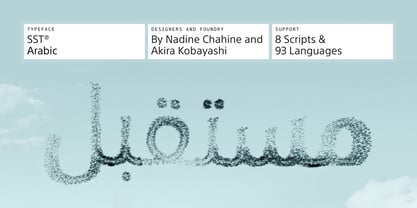
- Heritage Set by Katatrad,
$29.00 Heritage Set is a display font. It was designed specifically for display, headline, logotype, branding, and similar applications. Heritage Set has been designed to equipped with three different widths; Narrow, Normal and Wide, addition to expanding weights to support various usabilities ranging from ExtraLight, Light, Regular, Bold and ExtraBold. Which makes with a Tabular Lining features support the creativities of the designer from the Font Menu.
 - Sitting Duck by Kitchen Table Type Foundry,
$15.00 I have no particular affection for ducks, nor do I keep them, but I thought it was about time someone named a font after them! Sitting Duck is a jolly comic/kids font. Handmade (of course), cute and useful. Comes with extensive language support and a cool alternative asterisk in the shape of a duck.
 - Banquet SCF by Scholtz Fonts,
$21.00Banquet SCF is a rough-and-ready brush font with a "warts and all" appearance. Is has a simple, unsophisticated "believable" look. Use it when you want to make your message more honest, more homespun and more real. Use it in menus, invitations and advertisements. When I created it, I was designing a simple brush-written invitation to a medieval banquet. Hence the name: "Banquet". It has a full character set with all upper and lower case, special and accented characters. All characters have been letterspaced and kerned. - Scat Dingbats by Monotype,
$29.99Scat Dingbats from Laurie McCanna is a set of eclectic icons originally offered with the Scat typeface but useful as general purpose symbols. - Blackout SCF by Scholtz Fonts,
$21.00 Blackout SCF is a loose and informal grungy font with a modern, electric zappy quality. The font is particularly useable for the promotion of products aimed at young and trendy consumers. It can be used for the design of: CD and DVD covers; clothing advertising and swing tags; magazines and advertising; and cosmetic packaging. It has been carefully letterspaced and kerned. It contains a full character set: all upper and lower case characters, punctuation, numerals and accented characters are present.
 - LCT Palissade by LCT,
$19.90 Started during 2012, LCT Palissade is a letter type belonging to the Didone classification. It takes over the Italian characters from the XVII century. Century affected by a huge artistic and industrial mutation, we assist to the eruption of the railroad network and Turner’s paintings. In typography, the Didones(XVIIe) begins to concede the place to the Egyptians XIXe. We noticed an evolution to rectangular drawings, that were heavier and darker. LCT Palissade is in fact the study of a history flow, crossing through the industrial revolution and romanticism; the result of a strong letter type, solid, strict the drawing is orientated towards very dark, reminiscent of the characters beginning XIXe. The serifs are the summary between the British characters from the end of (XVIe) and the Italian ones beginning of (XVIIe). In order to spread out the romanticism, they are very fine to allow a largest contrast and keep the elegance of the global shape.
 - Setting Fires by Ahmad Jamaludin,
$12.00 Setting Fires is a beautiful, sweet font, a vintage monoline with movement and grace. This is a unique script for you. This font contain ligatures, many stylistic alternate, swashes. It is also support multi language. Setting Fires has an elegant and stunning effect as display font which makes it perfect for branding projects, logos, wedding designs, social media posts, advertisements, product packaging, product designs, labels, photography, watermark, invitation, stationery and any projects that needs a handwriting touch. What's Included? - More than 100 of glyphs - Ligatures & Stylistic Alternate - Works on PC & Mac - Simple Installations - Accessible in the Adobe Illustrator, Adobe Photoshop, Adobe InDesign, even work on Microsoft Word. - PUA Encoded Characters - Fully accessible without additional design software. - Multilingual Support
 - LCT Sbire by LCT,
$49.00 This Font is born basing itself on several standard typographic models. Inspired by our calligraphic drawings, the idea was to synthesize these many shapes into a unique font that can be used commonly. The slab base has been gradually humanized. The serifs have been carved, refined, rounded off, in order to galvanize the font and ease the task of reading in lower case. The angle of attack of the round letters is an echo of the 15 Century typographic heritage. It was important for us to create an expressive and humanized font, which could also be used for edition. The purpose was to confront the Ancient typographic canon of beauty with some funny and fancyful elements.
 - SST Japanese by Monotype,
$236.99 Designed for global branding and supporting 93 languages, the SST® typefaces blend the organic readability and controlled structure of modern sans serif designs. In combining these attributes, the SST family is understated, versatile – and sure to be a timeless design. The SST Japanese Pro family has 6 fonts in total. It spans four weights from ultra light to bold, and has two condensed weights to further expand the family’s vast range of uses. SST’s subtle design traits provide a quietly handsome and consistently friendly typographic presence that can be used for just about any typographic application. Broad range branding applicability, combined with coverage for almost a hundred languages, makes SST one of the most widely accessible and usable typefaces available. Originally designed in partnership with the global consumer brand, Sony, the SST family is one of the most comprehensive type families available. Since extensive multi-lingual support was a critical design goal from the beginning, Akira Kobayashi, Monotype type director and primary designer on the project, turned to a network of local designers around the world for their individual language expertise. As a result, the details – which could be as subtle as stroke curvature and width – are consistent across Latin, Greek, Cyrillic, Arabic and multiple Asian languages. SST performs equally well in print and on-screen and the designs can be used at very small sizes in packaging and catalogs; while massive print headlines – even complicated wayfinding projects — pose no stumbling blocks to the family’s typographic dexterity.
 - LCT Picon by LCT,
$35.00 Big modern sans-serif family, for multiple use.
 - SST Thai by Monotype,
$67.99 Designed for global branding and supporting 93 languages, the SST® typefaces blend the organic readability and controlled structure of modern sans serif designs. In combining these attributes, the SST family is understated, versatile – and sure to be a timeless design. The SST Thai family has 4 fonts in total. It spans four weights from light to bold. SST’s subtle design traits provide a quietly handsome and consistently friendly typographic presence that can be used for just about any typographic application. Broad range branding applicability combined with coverage for almost a hundred languages, makes SST one of the most widely accessible and usable typefaces available. Originally designed in partnership with the global consumer brand, Sony, the SST family is one of the most comprehensive type families available. Since extensive multi-lingual support was a critical design goal from the beginning, Akira Kobayashi, Monotype type director and primary designer on the project, turned to a network of local designers around the world for their individual language expertise. As a result, the details – which could be as subtle as stroke curvature and width – are consistent across Latin, Greek, Cyrillic, Arabic and multiple Asian languages. SST performs equally well in print and on-screen and the designs can be used at very small sizes in packaging and catalogs; while massive print headlines – even complicated wayfinding projects pose no stumbling blocks to the family’s typographic dexterity.
 - SCR-N by URW Type Foundry,
$39.99 SCR fonts are screen optimized (also called 'pixel fonts'). Unlike standard fonts (and like the few well-hinted fonts like Verdana or Arial), they give a crisp look on screen at very small sizes, thus increasing legibility. The perfect applications for those fonts are web pages and software user interfaces (computer, cellular phones, console games and any other system that uses a screen interface). Unlike most pixel fonts, SCR fonts contain kerning information. Kerning is the adjustment of space between certain pairs of characters (like 'AV') to make text look more fluid, thus increasing legibility and appeal. To benefit from this feature, auto-kerning must be activated in the application. In Photoshop, kerning must be set to 'Metrics'. Although SCR fonts are optimized for screen, they can be used for print (in Illustrator or Indesign for example) for a decorative 'computer text' effect. In this case, there is no constraint: they can be used as any other font. For screen use (in Photoshop, Fireworks, Flash... ), they have to keep aligned with the screen pixel grid not to look blurred or distorted. To achieve this, here are the guidelines to follow: RESOLUTION If the application permits it (Photoshop, Fireworks), document resolution must be set to 72 pixels per inch. SIZE The font size must be set to 10 (or multiples of 10) points. POSITIONING & ALIGNMENT The reference points of text fields and text blocks (upper left corner for left aligned text, upper right for right aligned text) must be positioned at integer values of pixels. In Photoshop, text can be precisely moved with [Edit Free Transform]. In Flash, movie clips containing text fields must also be positioned at integer values on the stage. Text must be aligned to the left or right only. Center alignment can be simulated with left alignment by adding spaces at the begin of each line. To dispense with the positioning and alignment constraints, text anti-aliasing can be turned off if the application permits it (Photoshop, Flash MX 2004). OTHER SETTINGS Leading (line spacing), tracking (letter spacing), manual kerning and baseline shift must be set either to integer values of points or to multiples of 100 units (depending on the application). Vertical and horizontal scaling must be set to 100%. Faux bold or Faux italic must not be used. The document must neither be resized on export, nor allow resizing (Flash Movies).
 - Sgt Peppers by K-Type,
$20.00 SGT PEPPERS LONELY HEARTS CLUB is a typeface inspired by the capital letters on the bass drum in the Beatles' Sgt Pepper album cover. The original lettering was hand painted by fairground artist Joe Ephgrave during March 1967 in an art deco style he called 'futuristic'. The font completes the uppercase, adds a lowercase, and includes a full complement of over 400 characters. SGT PEPPERS OUTLINE and SGT PEPPERS OUTLINE FILL are two fonts with matching spacing and kerning that can be overlapped for creating bicolor/multicolor effects and faux drums. The Outline and Outline Fill fonts do not contain lowercase characters, instead they comprise two weights of outline capitals as painted on the Sgt Pepper drum. The uppercase letters are in the wider style from around the outer edge of the drum, and the lowercase keys deliver the more condensed 'Lonely Hearts' inline style from the middle of the drum. The uppercase Y has been flipped to produce a more conventionally acceptable character with the thicker diagonal arm on the left. However, Joe Ephgrave's reverse Y (with inline) is included in the Outline fonts at the Section keystroke § (Alt-0167 on Windows). A simplified vector image (mono) of the bass drum without lettering is also included within the Outline fonts at the PlusMinus keystroke ± (Alt-0177 on Windows).
 - SCR-I by URW Type Foundry,
$39.99 SCR fonts are screen optimized (also called 'pixel fonts'). Unlike standard fonts (and like the few well-hinted fonts like Verdana or Arial), they give a crisp look on screen at very small sizes, thus increasing legibility. The perfect applications for those fonts are web pages and software user interfaces (computer, cellular phones, console games and any other system that uses a screen interface). Unlike most pixel fonts, SCR fonts contain kerning information. Kerning is the adjustment of space between certain pairs of characters (like 'AV') to make text look more fluid, thus increasing legibility and appeal. To benefit from this feature, auto-kerning must be activated in the application. In Photoshop, kerning must be set to 'Metrics'. Although SCR fonts are optimized for screen, they can be used for print (in Illustrator or Indesign for example) for a decorative 'computer text' effect. In this case, there is no constraint: they can be used as any other font. For screen use (in Photoshop, Fireworks, Flash... ), they have to keep aligned with the screen pixel grid not to look blurred or distorted. To achieve this, here are the guidelines to follow: RESOLUTION If the application permits it (Photoshop, Fireworks), document resolution must be set to 72 pixels per inch. SIZE The font size must be set to 10 (or multiples of 10) points. POSITIONING & ALIGNMENT The reference points of text fields and text blocks (upper left corner for left aligned text, upper right for right aligned text) must be positioned at integer values of pixels. In Photoshop, text can be precisely moved with [Edit Free Transform]. In Flash, movie clips containing text fields must also be positioned at integer values on the stage. Text must be aligned to the left or right only. Center alignment can be simulated with left alignment by adding spaces at the begin of each line. To dispense with the positioning and alignment constraints, text anti-aliasing can be turned off if the application permits it (Photoshop, Flash MX 2004). OTHER SETTINGS Leading (line spacing), tracking (letter spacing), manual kerning and baseline shift must be set either to integer values of points or to multiples of 100 units (depending on the application). Vertical and horizontal scaling must be set to 100%. Faux bold or Faux italic must not be used. The document must neither be resized on export, nor allow resizing (Flash Movies).
 - SST Vietnamese by Monotype,
$67.99 Designed for global branding and supporting 93 languages, the SST® typefaces blend the organic readability and controlled structure of modern sans serif designs. In combining these attributes, the SST family is understated, versatile – and sure to be a timeless design. The SST Vietnamese family has 4 fonts in total. It spans four weights from light to bold. SST’s subtle design traits provide a quietly handsome and consistently friendly typographic presence that can be used for just about any typographic application. Broad range branding applicability combined with coverage for almost a hundred languages, makes SST one of the most widely accessible and usable typefaces available. Originally designed in partnership with the global consumer brand, Sony, the SST family is one of the most comprehensive type families available. Since extensive multi-lingual support was a critical design goal from the beginning, Akira Kobayashi, Monotype type director and primary designer on the project, turned to a network of local designers around the world for their individual language expertise. As a result, the details – which could be as subtle as stroke curvature and width – are consistent across Latin, Greek, Cyrillic, Arabic and multiple Asian languages. SST performs equally well in print and on-screen and the designs can be used at very small sizes in packaging and catalogs; while massive print headlines – even complicated wayfinding projects pose no stumbling blocks to the family’s typographic dexterity.
 - SST Hebrew by Monotype,
$67.99 - Scratch SCF by Scholtz Fonts,
$15.00Scratch SCF is a grunge font with a difference. It has an irregular, almost random outline that suggests an old-fashioned quill pen that is leaking and scratching its way across the page. There are also connotations of simplicity, of a writer that is unsophisticated, possibly learning to write for the first time. This is a font that avoids all the associations of slick, worldly-wise urbanity, of cynicism and of "the medium being more important than the message". Instead the simplicity of Scratch SCF conveys a sincerity and integrity of design that bespeaks simplicity and old-fashioned honesty. All these associations are conveyed with a contemporary look, without resorting to rehashing the past with yet another retro font. Scratch SCF has a full character set: all upper and lower case characters, all special and accented characters and all punctuation, numerical and mathematical characters. All have been carefully spaced and kerned. Scratch SCF Staggered is a little more "grungy" than the regular style because the individual letters do not rest on the same baseline and thus have more vitality. - Act Stern by Identikal Collection,
$23.00 - Set Theory by Haiku Monkey,
$10.00If you were a superhero, wouldn't you want your unitard to sport Set Theory, big and bold, on the front? - Jet Set Groove - Personal use only


Page 1 of 250Next page