3,535 search results
(0.017 seconds)
- SK Seren by Salih Kizilkaya,
$9.99 SK Seren is a clean, double weight and semi-serif font family. This font family, which you can use in long texts or headlines, logos and posters you will design without hesitation, manages to stand out even in the most crowded environments. As you can easily use in print and web design, this is the only font you need in every medium. This family consists of 10 different fonts and 5890 glyphs. In this way, it contains all the typographic materials you will need in your design and offers full support to the Latin alphabet. This font family is a new version of the first font I designed while studying college in 2018. This version includes many new glyphs that were not available in the first version, and all bugs found in the first version were fixed and kerning settings were reconfigured.
 - Serene Textured by Pedro Teixeira,
$14.00 Serene Textured Script is informal, good for logos, headlines in magazines or titles in food recipes with a slight retro feel and textured that add value to your designs.
 - Noble Serenity by Hipfonts,
$9.00 Introducing Noble Serenity, where timeless beauty meets serene elegance. This exquisite serif font is a harmonious blend of sophistication and tranquility, designed to elevate your designs with a touch of refined grace. With its clean lines, delicate curves, and perfectly balanced proportions, Noble Serenity exudes an aura of understated charm and sophistication. Each letter is meticulously crafted, reflecting the meticulous attention to detail and craftsmanship of a bygone era. Whether you're designing wedding invitations, luxury branding, or editorial layouts, Noble Serenity brings an air of refined beauty to your projects. Discover the captivating allure of Noble Serenity and let your designs embrace the essence of timeless elegance. Elevate your typography to new heights with this font that whispers of tranquility and commands attention with its noble presence.
 - French Deco JNL by Jeff Levine,
$29.00 A wide and thin hand lettered Art Deco design from the vintage French lettering book "L'Art du Tracé Rationnel de la Lettre" was the inspiration for French Deco JNL; available in both regular and oblique versions.
 - Old French School by JBFoundry,
$20.00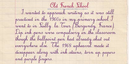
- French Wine JNL by Jeff Levine,
$29.00 French Wine JNL is an Art Deco thick-and-thin type design based on the hand lettering from a vintage poster for Monarch Cabernet Sauvignon wine. The typeface is available in both regular and oblique versions.
 - French Geometric JNL by Jeff Levine,
$29.00 An Art Deco geometric alphabet found within the pages of the 1939 French lettering book "Modèles de lettres modernes par Georges Léculier" ("Models of Modern Letters by Georges Léculier") is the basis for French Geometric JNL; available in both regular and oblique versions.
 - FHA Condensed French by Fontry West,
$25.00 FHA Condensed French One could speculate that FHA Condensed French probably started life as wood type for displays, headlines and posters. The exaggerated sharp serifs and condensed forms were not uncommon for that period. At some point, sign painters picked up Condensed French added their own character. At the end of the nineteenth century, Frank H. Atkinson included Condensed French in his samples of lettering for his book, ”Sign Painting, A Complete Manual.” This book became one of the definitive guides for signwriting and hand lettering. In 1999, Mike Adkins digitized Condensed to add to our Atkinson collection. For its re-release, Condensed French has been updated with more language support, ligatures, and OpenType alternates. It has true vintage character but still plays well in more modern designs. A font for all seasons, the condensed forms and sharp serifs fit in every layout from wildwest days posters and creepy film credits to Christmas ads and Mother’s Day cards. While I can’t really see FHA Condensed French as the font for phone aps or video game text, it will provide impact to logos, branding, and product labeling.
 - French Song JNL by Jeff Levine,
$29.00 From the titles and credits of the 1952 British comedy “Song of Paris” comes this whimsical, hand lettered type design that’s casual, playful and charming. The digital version is called French Song JNL, and is available in both regular and oblique versions. This font release is the 1800th type design Jeff Levine Fonts has issued since its inception in January, 2006.
 - French Nouveau JNL by Jeff Levine,
$29.00 The hand lettering on a World War I recruitment poster for the French Air Service inspired French Nouveau JNL, which is available in both regular and oblique versions.
 - French Stencil JNL by Jeff Levine,
$29.00 French Stencil JNL was inspired by images of a set of metal stencils from France that were offered for sale in an online auction.
 - FHA Nicholson French by The Fontry,
$25.00 An Art Nouveau alphabet that has stood the test of time, Nicholson French, by legendary sign-painter Frank H. Atkinson, is over 100 years old and going strong. In modern typographic trim, it comes with OpenType feature replacement options and multi-language support, from standard Latin-1 to Latin Extended-A, Greek and Cyrillic.
 - French Cinema JNL by Jeff Levine,
$29.00 The hand lettered title credits for the 1950 French film “Lady Paname” inspired French Cinema JNL, which is available in both regular and oblique versions.
 - French Lettering JNL by Jeff Levine,
$29.00 An example from the vintage lettering book "100 Alphabets Publicitaire" ("100 Advertising Alphabets") provided the inspiration for French Lettering JNL. This stylized Victorian [or Western] type face evokes the era of fanciful lettering design from the late 1800s. Available in both regular and oblique versions.
 - French Film JNL by Jeff Levine,
$29.00 Hand lettering found in the September, 1936 issue of the French film publication “La Cinématographie Française” is rendered in a lovely Art Nouveau serif type style. This is now available digitally as French Film JNL, in both regular and oblique versions.
 - French Clarendon Expanded by Wooden Type Fonts,
$20.00 French Clarendon Expanded, a display text type.
 - Archive French Script by Archive Type,
$19.95Script display typeface. - French Calligraphic JNL by Jeff Levine,
$29.00 French Calligraphic JNL is actually more semi-calligraphic in nature. Its name takes a descriptive liberty because of the sharp, angled pen strokes of the original hand lettered example found in the 1930s publication "100 Alphabets Publicitaires" by M. Moullet. The design is available in both regular and oblique versions.
 - Archive French Shaded by Archive Type,
$19.95Engraved display typeface. - 1906 French News by GLC,
$38.00 We have created this family from the numerous derivatives in use for newspapers since the middle of the 1800s to the 1970s, inspired by the well known Clarendon. Mainly, the patterns are those used to print Le Petit Journal, a popular French Newspaper of the era (published from 1863 to 1937). The present version contains Normal, Italic, Bold and Bold Italic styles, in two sub families: 1906 French News for texts and titlings with upper and lower case, and 1906 French News Caps (Caps, small caps, small numerals, for texts and titlings).
 - French Bistro JNL by Jeff Levine,
$29.00 The 1930s French publication L'Art du Tracé Rationnel de la Lettre was a treasure trove of font revival ideas from the Art Deco era. One example featured a serif typeface with a number of stylized characters. This is now available as French Bistro JNL, in both regular and oblique versions.
 - MPI French Clarendon by mpressInteractive,
$5.00 French Clarendon was an extremely popular wood type font. Characters are heavy and condensed with bracketed serifs, which measure approximately 1/4 to 1/3 the height of the letter. Dozens of decorative wood type designs have been created based on French Clarendon. It was marketed as a wood letter by William H. Page & Company in 1865.
 - French Pastry JNL by Jeff Levine,
$29.00 A little ditty from France circa the 1940s called "J'ai Rêvé Dans Tes Bras" (which loosely translated means "I've Dreamed in Your Arms") offered up its title hand lettered in an interesting Art Deco sans. This formed the basis for French Pastry JNL, a tasty typographical tidbit further preserving the wide choice of lettering styles hand-crafted for popular sheet music of past decades.
 - FHA Eccentric French by The Fontry,
$25.00 The curves are vintage and the serifs are big. They're so big that for years I never had the courage to tackle this intimidating font. But when fellow signmaker Frank Smith laid the groundwork for this intriguing typeface by Frank H. Atkinson, I couldn't pass on the opportunity to take it from paper to keyboard. After all, at over 100 years old, I felt this alphabet had never been given a proper, digital treatment. So how did this face survive the last century? Well, for those who don't know the history, it survived in Atkinson's ubiquitous book, Sign Painting, published first in 1908, the generational standard for anyone interested in sign-related type design. The layouts and lettering treatments in this book have influenced countless designers for more than a hundred years, but most haunting to me was this strange face with the big serifs. Well, I'm haunted no more. The work is done, the kerning is complete, and nothing but a mouse-click separates a very old idea from the modern world. It's wide, it's big, and with those crazy serifs, it is definitely eccentric-!!!
 - MPI French Antique by mpressInteractive,
$5.00 French Antique was first shown in the specimen books of William H. Page & Company in 1869. The font is extremely tall and thin, with serifs taller than many character's widths. Lines are straight and clean with no fuss. French Antique can fit a lot of headline into a small space.
 - French Clarendon N2 by Intellecta Design,
$22.90 a revival of a classic wood type font...
 - Dizzy Fence by Putracetol,
$22.00 Introducing Dizzy Fence, a quirky and blocky display font. This font is perfect for your projects related to kids, which is playful and fun. This font also has 2 versions, clean and rough. Dizzy Fence also perfect for branding design, posters, apparel, logotype, header, quote, invitation, greeting card, cover, poster, fashion design and any more. Come with lot of ligatures character, its help you to make great lettering. This font is also support multi language.
 - Back Fence by Bogusky 2,
$15.00A clever font derived from wood planks - Serenity Font Duo by Nicky Laatz,
$18.00 An elegant duo of fonts and floral illustration extras - designed to work together in harmony, to produce a plethora of beautiful, sophisticated & feminine designs. The luxurious modern calligraphy script works perfectly together with the delicate hand-drawn florals - ideal for elegant branding projects, greeting cards, packaging, social media, logo design and of course, wedding invitations. Also included is Serenity Serif, a rustic serif font, with a touch of imperfection as you'd find in old printed press inks - to contrast with and therefore compliment the more refined luxurious contemporary flow of the script font . Serenity Script includes handy OpenType features that makes the font look more natural - it includes a universal beginning swash for lowercase letters , a full set of lowercase letters with ending swashes, a beginning swash that can be added via OpenType Ligatures by typing either { } or ( ), and a full set of alternate lowercase letters , as well as 70 beautifully crafted ligatures . A more slanted, and heavier version of the script is also included for you. OpenType capable software is required to access these features - The most popular of which is and Photoshop CC, any version of Illustrator, Indesign, Word (new versions). The Serif font comes in 4 versions: Regular, Bold, Heavy and Italic - when used together with different tracking settings and weights, they produce beautiful looking type designs to compliment the Script.
 - IM FELL French Canon - Unknown license

- French Stencil Moderne JNL by Jeff Levine,
$29.00 French Stencil Moderne JNL is modeled from an alphabet found in the 1930s publication "100 Alphabets Publicitaires" by M. Moullet, and is available in both regular and oblique versions. Strongly resembling the stencil motif of Futura Black, this French stencil alphabet has enough variations to give it a unique design flavor all its own.
 - French Serif Moderne JNL by Jeff Levine,
$29.00French Serif Moderne JNL gives a slab serif treatment to the lettering comprising Jeff Levine's French Art Initials JNL. The font - containing a full character set - was inspired by a page from an early 20th Century French alphabet book posted online at an image sharing site. - French Slab Serif JNL by Jeff Levine,
$29.00 Another example of 1930s French Art Deco lettering from the 1934 publication L'Art du Tracé Rationnel de la Lettre (which roughly translates to “The Rational Path Art of the Letter”) resulted in the digital typeface French Slab Serif JNL. This bold and slightly eccentric slab serif design is available in both regular and oblique versions.
 - French Art Initials JNL by Jeff Levine,
$29.00The source for these hand-drawn initials was an early 20th Century French alphabet book whose pages were displayed online at an image sharing site. This style typifies the Art Nouveau period, and makes a wonderful paragraph starter or "drop cap" for your printed projects. Some users may still want to compose headlines with this font, but be aware there are no punctuation marks, accents or kerning - just the twenty-six initials. - French Shipping Stencil JNL by Jeff Levine,
$29.00 The hand punched lettering of an antique French shipping stencil was the inspiration for French Shipping Stencil JNL; available in both regular and oblique versions.
 - French Stencil Serif JNL by Jeff Levine,
$29.00 Spotted for sale online, a partial set of antique tin stencils from France had a distinctively handmade look about them. Many of the characters were inconsistently wider than others, some characters were missing and one was damaged. Despite the obvious flaws, the image of these stencils served as the model for a digital font revival once the characters took on a more uniform appearance. French Stencil Serif JNL is available in both regular and oblique versions.
 - French Stencil Sans JNL by Jeff Levine,
$29.00 French Stencil Sans JNL is another typeface based on vintage French tin/zinc stencils. Slightly rounded corners and a "hand-cut" look add an interesting and charming variation that breaks away from the "standard" design of other metal stencil sets.
 - 1920 French Script Pro by GLC,
$42.00 This font was inspired by one of a standard French manual styles in use from the beginning of 1900s to the end of World War II, when people were writing most often with pen holders and metal nibs. This typeface is easily legible as it was used for the lithographic printing of university textbooks. All lower cases from a to z and numerals from 0 to 9 are doubled by a slightly different one to allow a varying manual aspect in texts. We have added a lot of diacritic characters, covering West (including Celtic) and North European, Icelandic, Baltic, Eastern European and Turkish language. A few special glyphs allows to make final loops or underlining.
 - Vtg Stencil France No3 by astype,
$28.00 The Vtg Stencil fonts from astype are based on real world stencils from several countries. All styles offering an extended Latin character set. » pdf specimen «
 - Vtg Stencil France No1 by astype,
$40.00 The Vtg Stencil fonts from astype are based on real world stencils from several countries. In the case of French stencils the challenge was special, because of the varieties of different widths and weights between the stencil sets – so I made France No. 1, No. 3 and No. 5. The most unique and eye-catching elements of typical French stencils are the figures 1, 2, 3, 7 and a specially 5. The figure 5 changes in style on smaller stencil sizes, its bobble getting replaced by something like a “breve”. The letters J and Q can differ in style too. While the local stencil lettering styles are gradually disappearing in other countries, there are regions in France, such as Normandy and Brittany, where these stencils are still in use today. They are used for technical lettering, which is what stencils were originally intended for, but also for ads and information signs in a more artistic or patriotic context. Over the time, these stencil letters became a globally recognized landmark of French design and French taste. All styles offering an extended Latin character set. » pdf specimen «
