461 search results (0.006 seconds)
  1. Croc by Hanzel Space, $25.00
    Croc, is a wedge serif font that is sure to stand out! A little bit retro and a bit modern, Croc. is great for logos, editorial or web design. The unique sharp serifs mixed with thin strokes give off a bold mid century architectural vibe. This modern serif typeface features serifs. Perfect for gorgeous logos & titles, The Croc will pair beautifully with many fonts and work well with whatever project you're working on.
  2. Eroded 2020 - Unknown license
  3. Erosion JNL by Jeff Levine, $29.00
    Take a classic sans serif typeface, run it through a filter for a "wind" effect then auto-trace the design. The result: a broken, jagged and rough type font called Erosion JNL.
  4. Darah Erc - Unknown license
  5. Roc Grotesk by Kostic, $40.00
    Roc is a sans serif grotesk inspired by American wood types from the end of the 19th century. With nine weights in five widths, this family contains 45 fonts in total. The character set supports Western and Central European languages, as well as Turkish. Roc Grotesk comes in a range of five widths: Compressed, Condensed, Normal, Wide and ExtraWide, in order to cover a wide scope of applications. Although the styles at both ends of each range are made in their most pronounced form in terms of width and weight, they are not taken to such extremes as to become absurd, and are quite usable in display settings. The Normal width keeps all its nine styles in proportionally similar widths. The Compressed width, however, is deliberately made to be disproportionate, so that every style takes the least possible horizontal space. That is why the contrast between Compressed Thin and Compressed Heavy style is substantial. As the weights progress from Thin to Heavy, the stroke contrast becomes more prominent. It is intentionally exaggerated in heavier weights, which is particularly apparent in the uppercase E and R of the Black and Heavy style. Roc has a large x-height and relatively short descenders and ascenders. No uppercase letter descends below the baseline, so the lines of an all-caps text can be packed tightly on a poster or a headline. The Regular style is somewhat generously spaced, as it is most likely to be used for setting longer passages of text. Its Bold counterpart is spaced in such a way that the width of the text column will be similar to the text set in Regular. Tabular figures in these two styles have exact matching widths, so for example, you could emphasize one row of numbers in a data column without visually disrupting the vertical order of the table. The lowercase g and r have alternatives to accommodate what most designers expect from a typical Grotesk typeface. The single-story g and the cut-off r are accessible via the OpenType feature.
  6. R-2014 Eroded - Personal use only
  7. Durango Western Eroded - Personal use only
  8. OXIDO ExtBd ExtCond - Personal use only
  9. BikyBold - 100% free
  10. Slurp - 100% free
  11. Swish - 100% free
  12. pulse sans virgin - Unknown license
  13. Write Off - Unknown license
  14. Skratch by Hanoded, $15.00
    Skratch is scratched. Skratch is distressed. Skratch is eroded. Skratch is.
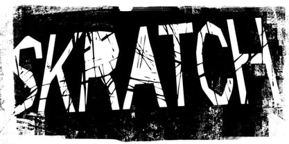
  15. Apocrypha by Device, $39.00
    Inspired by an example of eroded Portuguese cast-iron ecclesiastical lettering mounted on marble, Apocrypha has been designed to evoke an age-worn imperfection; once elegant, but now eroded and distorted by time. Mix the characters in the upper and lower-case keystrokes for authentically uneven results.
  16. SEISDEDOS DEAD - Personal use only
  17. Casper Comics - Personal use only
  18. KG All Of Me by Kimberly Geswein, $5.00
    A stamped, eroded font with the texture of a real rubber stamped image.
  19. Casper Comics Solid - Unknown license
  20. Gill Facia by Monotype, $29.99
    Based on lettering from Eric Gill for the British bookseller WH Smith, Colins Banks made the Gill Facia family for Monotype in 1996. This lettering from Eric Gill was one of the first alphabets that was used for corporate branding. Gill Facia is an elegant signage face for advertisements and for displays.
  21. Times New Romance - Unknown license
  22. Write Off Oultine - Unknown license
  23. Nosfer - Unknown license
  24. Nadall - Unknown license
  25. Chyelovek - Unknown license
  26. Alouette by Funk King, $5.00
    Alouette is a graceful modular script font. Evocative of the mysterious, southern charm of New Orleans.
  27. Astigma - Unknown license
  28. Rogers - Unknown license
  29. Nosferatu - Unknown license
  30. Futurex Phat - Unknown license
  31. Nosferatu - Unknown license
  32. Katzenjammer by Hanoded, $15.00
    Katzenjammer is a German word meaning 'Cat's Wail' - it is used to describe a hangover. Katzenjammer font is a slightly eroded, squarish typeface, which would be ideal for headlines, packaging, posters and websites. This all caps font comes with different upper and lower case glyphs and a non-eroded set of alternates for the lower case - for those who like their alphabet nice and neat.
  33. Violation - Unknown license
  34. Futurex Phat Outline - Unknown license
  35. Presentation JNL by Jeff Levine, $29.00
    Presentation JNL is built on the letterforms of Gilbert JNL (which in turn was modeled after Eric Gill's classic sanserif design).
  36. Futurex Phat - Unknown license
  37. Morpheus - Unknown license
  38. PR Dim Sum by PR Fonts, $8.00
    Hand lettered with a pointed brush, this font strives to be evocative yet remain readable, even for medium length passages of text.
  39. Decaying - Unknown license
  40. Futurex Phat Outline - Unknown license
Looking for more fonts? Check out our New, Sans, Script, Handwriting fonts or Categories
abstract fontscontact usprivacy policyweb font generator
Processing