165 search results
(0.017 seconds)
- News Gothic BT by Bitstream,
$29.99 The standard American sanserif of the first two thirds of the twentieth century, prepared for ATF by Morris Fuller Benton in 1908 under the name News Gothic, with a matching lightface known as Lightline Gothic. Linotype’s Trade Gothic follows News Gothic except for its widely-spaced straight-sided boldface based on ATF Alternate Gothic No.3. Linotype matches News Gothic Bold, a boldface version that originated at Intertype, with Trade Gothic Bold No.2. Ludlow Record Gothic follows News Gothic more loosely. News Gothic BT™ font field guide including best practices, font pairings and alternatives.
 - Engravers' Roman BT by Bitstream,
$29.99A set of capitals popular with American engravers and typefounders through the last third of the nineteenth century, shown under this name by ATF in 1903. - Drescher Grotesk BT by Bitstream,
$50.99 Mr. Gogoll's successful revival of Arno Drescher’s Super Grotesk was awarded the 1999 Kurt Christians Award. The Drescher Grotesk family consists of seven roman weights, including a version designed for use at small point sizes. Drescher Grotesk is a classic German geometric design, complete with the original “angled” brackets.
 - Artane Elongated BT by Bitstream,
$50.99Artane, Tony Fahy's first typeface for Bitstream Inc., has a specific philosophy at the core of it's creation. He decided he would try to create a Roman sans that would have the elegance of a serifed italic, such as Stempel Garamond, Bembo, or Baskerville. - Engravers' Gothic BT by Bitstream,
$29.99 Gothic capitals of the same form as Copperplate Gothic, lacking only the oversharpened corners.
 - Lindisfarne Nova BT by Bitstream,
$50.99 Lindisfarne Nova is an uncial-like design based on the script found in the Lindisfarne Gospels. Created by Harry Pears and Margaret Layson, it is available in two weights, regular and bold. Lindisfarne Nova is Harry’s first completed font. There are also two companion styles, Lindisfarne Nova Incised and Lindisfarne Runes.
 - Cruz Cantera BT by Bitstream,
$50.99 Cruz Cantera is a crisp and stylish yet informal sans serif typeface created by NYC type designer Ray Cruz. It is a slightly condensed design. The vertical strokes have rounded terminals, and there are some characters with serifs. Notable characters include the upper and lowercase E. There are three weights and each works equally well alone, or together for both display and text. Original design by Ramon Cruz completed in 2002.
 - Wavy Rounded BT by Bitstream,
$50.99Wavy Rounded is a stylized sans serif display typeface by Japanese designer Hajime Kawakami. Some of the characters possess quirky features that randomly create fun visual “waves”. There is a handful of alternate characters including an old style figure set. Catch the Wave. - Frank Ruehl BT by Bitstream,
$29.99Frank-Rühl (or Ruehl) is the ubiquitous Hebrew text font style. There are many fonts that belong to this style, and all are based on an early 20th-century design by Raphael Frank. Some of the fonts are actually called Frank-Rühl (or Ruehl) and some are not. It was originally designed in a single weight. Bitstream developed Frank Ruehl for the Microsoft Windows operating system. The font is encoded with a Microsoft defined Hebrew character set, Hebrew Code Page 1255. Within the TrueType fonts, the characters are assigned Unicode character IDs. The font includes Hebrew characters, and Latin glyphs from Dutch 801 bold. - H74 Viva Los Vatos by Hydro74,
$25.00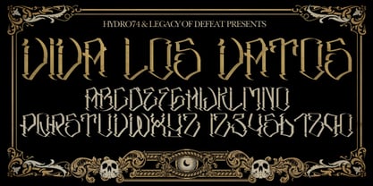
- New Lincoln Gothic BT by Bitstream,
$50.99New Lincoln Gothic is an elegant sanserif, generous in width and x-height. There are twelve weights ranging from Hairline to UltraBold and an italic for each weight. At the stroke ends are gentle flares, and some of the round characters possess an interesting and distinctive asymmetry. The character set supports Central Europe, and there are three figure sets, extended fractions, superior and inferior numbers, and a few alternates, all accessible via OpenType features. Back in 1965, Thomas Lincoln had an idea for a new sanserif typeface, a homage of sorts, to ancient Roman artisans. The Trajan Column in Rome, erected in 113 AD, has an inscription that is considered to be the basis for western European lettering. Lincoln admired these beautiful letterforms and so, being inspired, he set out to design a new sanserif typeface based on the proportions and subtleties of the letters found in the Trajan Inscription. Lincoln accomplished what he set out to do by creating Lincoln Gothic. The typeface consisted only of capital letters. Lincoln intentionally omitted a lowercase to keep true his reference to the Trajan Inscription, which contains only magiscule specimens. The design won him the first Visual Graphics Corporation (VGC) National Typeface Competition in 1965. The legendary Herb Lubalin even used it to design a promotional poster! All this was back in the day when typositor film strips and photo type were all the rage in setting headlines. Fast forward now to the next millennium. Thomas Lincoln has had a long, illustrious career as a graphic designer. Still, he has one project that feels incomplete; Lincoln Gothic does not have a lowercase. It is the need to finish the design that drives Lincoln to resurrect his prize winning design and create its digital incarnation. Thus, New Lincoln Gothic was born. Lacking the original drawings, Lincoln had to locate some old typositor strips in order to get started. He had them scanned and imported the data into Freehand where he refined the shapes and sketched out a lowercase. He then imported that data into Fontographer, where he worked the glyphs again and refined the spacing, and started generating additional weights and italics. His enthusiasm went unchecked and he created 14 weights! It was about that time that Lincoln contacted Bitstream about publishing the family. Lincoln worked with Bitstream to narrow down the family (only to twelve weights), interpolate the various weights using three masters, and extend the character set to support CE and some alternate figure sets. Bitstream handled the hinting and all production details and built the final CFF OpenType fonts using FontLab Studio 5. - Engravers' Old English BT by Bitstream,
$29.99Designed by Morris Fuller Benton in 1907; an improved version of the familiar nineteenth century blackletter as he had executed it in his Wedding Text. - Iowan Old Style BT by Bitstream,
$40.99Iowan Old Style was designed for Bitstream in 1990 by noted sign painter John Downer. Iowan Old Style is a hardy contemporary text design modeled after earlier revivals of Jenson and Griffo typefaces but with a larger x-height, tighter letterfit, and reproportioned capitals. Iowan Old Style Titling was designed by John Downer and added to the Iowan Old Style family in 2002. The cap-only character set includes several ornaments and fleurons, broadening the appeal and functionality of the typeface family. Iowan Old Style was originally designed for Bitstream in 1990 by Downer, a noted sign painter. Iowan Old Style is a hardy contemporary text design modeled after earlier revivals of Jenson and Griffo typefaces but with a larger x-height, tighter letterfit, and reproportioned capitals. Expert and old style figure font sets were added in 2000. - Oz Handicraft BT WGL by Bitstream,
$50.99Oswald Cooper is best known for his emblematic Cooper Black™ typeface. Although he was responsible for several other fonts of roman design, Cooper never drew a sans serif typeface. But that didn’t stop George Ryan from creating one. Ryan saw a sans serif example of Cooper’s lettering in an old book and decided that it deserved to be made into a typeface. Ryan’s initial plan was to make a single-weight typeface that closely matched the slender and condensed proportions of the original lettering. While the resulting Oz Handicraft™ typeface proved to be very popular, Ryan was not satisfied with the limited offering. So, between other projects – and over many years – Ryan worked on expanding the design’s range. The completed family includes light, semi bold and bold weights to complement the original design, plus a matching suite of four “wide” designs, which are closer to normal proportions. Fonts of Oz Handicraft include a Pan-European character set that supports most Central European and many Eastern European languages. - Strike Swiss - Unknown license

- American Participants - Unknown license

- Jackdaws by Bogstav,
$17.00 A rough, yet legible version of my handwriting. Comes with contextual alternates that makes your text look even more cool! Also with loads of international letters! Viva multilingual support!
 - Sunny Sam by Mans Greback,
$39.00 Sunny Sam is a fun handwritten typeface. It was drawn and created by Måns Grebäck during 2019 and 2020. The movements of this happy script font represents optimism and vivacity. Sunny Sam comes in three high-quality styles: Thin, Medium and Bold. The three weights works great as complements to one another. It has an extensive lingual support, covering European Latin scripts. Sunny Sam contains all characters you'll ever need, including all punctuation and numbers.
 - Ranchstyle by Ampersand Type Foundry,
$29.00 Based off of research into Nevada cattle branding irons of the 19th century, Ranchstyle takes the vernacular from rancher’s brands of the old west, digitizes it, and brings it into the contemporary world as a vivacious spunky typeface. The letterforms mimic bent metal and have the fluidity that follows such a material.
 - Bamberger by Fontimonim,
$39.00 A bold, vivacious and rough font that includes six weights for widespread use. Bamberger balances the eccentricity of hand-drawn letters with the stability and readability of a basic and neutral sans font. This combination radiates warmth and boldness appeal. It works great on packaging, viral campaigns, restaurant menus, children's books and digital applications.
 - Cochin by URW Type Foundry,
$35.99 The Cochin font is based on the work of eighteenth-century punchcutter, Cochin. Charles Peignot commissioned the revival of this strong typeface in 1912. The capitals are squarish. The lowercase has long ascenders and sharp serifs, giving Cochin an unusual elegance. The curved ascender in the italic lowercase d is a major characteristic and the p and q lack foot serifs. Cochins overall vivacity derives from the engravings on copper, produced in France in the eighteenth century. Cochin is a trademark of Linotype Corp. registered in the U.S. Patent and Trademark Office and may be registered in certain other jurisdictions in the name of Linotype Corp. or its licensee Linotype GmbH.
 - Magica by K-Type,
$20.00 MAGICA is a book and display face that is both distinctive and legible – clear letterforms and a generous x-height make Magica a good choice for text or titles. The typeface has elegantly chamfered serifs and a confident, vivacious character that is equally suited to formal and informal usage. Magica is available in three weights – Regular, Medium and Bold – each supplied with a free italic.
 - Scriptease by ITC,
$29.99Scriptease is the temperamental creation of Phill Grimshaw, based on the forms of copperplate typefaces. At the same time, the playful forms display a variety of Rococo elements. Richly ornamented with vivacious swirls, especially on the capitals, the forms of this font dance across the paper. The capitals can also be used as initials combined with other alphabets. Scriptease looks as though it were made for the light, carefree side of life. - HotTamale by Jeff Kahn,
$29.00 HotTamale is suitable for display and text. Its large x-height provides excellent legibility at small point sizes. It is bouncy and playful, yet unlike some fonts that are exaggerated or distorted in style, HotTamale is highly refined. Avoid the monotony of repeating glyphs! HotTamale includes OpenType contextual alternates for a random and spontaneous appearance. HotTamale is vivacious, warmhearted, direct, and suitable for packaging, restaurant use, websites, magazines, lively heads, sub-lines, and children’s books.
 - Merick by Eurotypo,
$28.00 Merick is a modern and slightly condensed cursive, carefully drawn to obtain a very readable font. This font is a versatile and elegant script, based on the author’s calligraphy, the lower cases are connecting with lots of dynamic and vivacious swashes, ligatures and alternates. Merick is perfect for logotypes, posters, cards, menus, product packaging and other printables, as well as web applications.The swashes, tails and alternate letters will add a finishing touch to every logo or headline.
 - American Text BT is a distinctive and historically rich typeface that carries the spirit and flair of early American typography. It falls within the category of display fonts, which are typically use...
- Zigzag by Volcano Type,
$60.00 ZIGZAG is a funny font family whose letters have four varieties each in order to multiply expressions and attract the eye by breaking the rhythm of reading. There are two styles available Rounded and Not Rounded. The variations oscillate between a hand-drawn design and a geometric or imaginative drawing. Opentype’s function lets you choose between different variations of each glyph and contextual variables allow to mix the styles. Benoît Bodhuin designed ZIGZAG Rounded in 2011/12 for the theatre Vivat. In 2013 ZIGZAG Rounded was supplemented by ZIGZAG Not Rounded.
 - Cloister Black BT is a distinctive and historic typeface that traces its origins back to the late 19th and early 20th centuries, embodying the transition from Gothic to modern type designs. Character...
- Casttano by Beary,
$8.00 Casttano is modern feminine font, every single letters have been carefully crafted to make your text looks beautiful. With modern script style this font will perfect for many different project ex: photography, watermark, quotes, blog header, poster, wedding, branding, logo, fashion, apparel, letter, invitation, stationery, etc. This font including alternate glyph. You can access the alternate glyph via Font Book (Mac user) or Windows Character Map (Windows user). Ligature & alternate glyph: at att bt btt ct ctt dt dtt et ett ft ftt gt gtt ht htt it itt jt jtt kt ktt lt ltt mt mtt nt ntt ot ott pt ptt qt qtt rt rtt st stt ut utt vt vtt wt wtt xt xtt yt ytt zt ztt Foreign languages support: ÀÁÂÃÄÅÆÈÉÊËÌÍÎÏÐÑÒÓÔÕÖÙÚÛÜÝßàáâãäåæèéêëìíîïðñòóôõöùúûüýÿ Thanks for looking.
 - Delectables by ITC,
$29.99A former lettering artist at Hallmark Cards, Rob Leuschke now has his own thriving design businesses, Alphabytes and the new TypeSETit. Growing up in St Charles, Missouri, where he still lives, Rob showed great artistic promise at an early age. He earned a BFA in graphic design at the University of Missouri at Columbia. After graduation, his stint at Hallmark Cards gave him the opportunity to learn from and work with some of the best lettering artists in the industry. Rob struck out on his own in 1987 and now boasts a long list of clients from all over the world. Rob has created over 250 custom typefaces, and his work has been exhibited in New York. Ambiance BT is Rob’s first typeface published by Bitstream, with more to follow. - Upper Clock by Casloop Studio,
$5.00 Introducing Upper Clock Typeface, your ticket to a world of typographic innovation, drawing inspiration from the sleek design of the ETCH Clock. Prepare to explore a myriad of creative possibilities for your Display Text with this cutting-edge typeface. Tired of mundane, uninspiring fonts that lack personality and flair? Upper Clock Typeface is here to infuse your digital designs with the vivacity of Retro Flat, the whimsy of Memphis, and the evocative nostalgia of Modern Nostalgia. Comprehensive multi-language support, including Western European, Central European, South Eastern European, South American, Oceanian, and even Esperanto. Upper Clock isn't merely a typeface; it's your ultimate solution to typographic challenges. This versatile tool is your gateway to crafting visually stunning, one-of-a-kind designs within the realm of Display Text. As you implement Upper Clock Typeface, watch in awe as your typographic dilemmas seamlessly transform into relics of the past. Take your design endeavours to new heights with Upper Clock Typeface today! Upper Case.
 - Bird & Thorn by Set Sail Studios,
$20.00 Introducing Bird & Thorn; A vivacious & expressive script font with a stylish quality. Bird & Thorn is completely hand-drawn and designed to perfectly re-create natural handwriting; this is achieved by the addition of 93 custom ligatures. These double letters connect and flow much more authentically and are guaranteed to give your text that extra quality and distinction. It's the perfect choice for stylish branding & logo projects, product packaging, handwritten quotes & editorial design. Bird & Thorn supports a large number of languages including; English, French, Italian, Spanish, Portuguese, German, Swedish, Norwegian, Danish, Dutch, Finnish, Indonesian, Malay, Hungarian, Polish, Croatian, Turkish, Romanian, Czech, Latvian, Lithuanian, Slovak & Slovenian.
 - Mrs. Santhi by Abo Daniel,
$15.00 Proudly present Mrs. Santhi, a fancy Signature Font. This font is very unique. I designed it for you who want something different from the others. It is perfect for branding, photography, invitations, quotes, watermarks, advertisements, product designs, labels, and much more! I created 194 ligatures to keep this font look natural: aa ab ah ak al am an at ant all amm ann att bh bt cc ch ct dd eb ee ek em en et enn ent ett ff gh hh ii ib ik in it inn int itt ix ixx kh ll mm mt nt nn oo oh on ob ok ol oll om ot ont ott oot onn ox oxx ph pt and more as you can see on the presentation pictures. Mrs. Santhi also features punctuations and multilingual support. Hope you love it!
 - Fry by omtype,
$25.00 The typeface Fry was developed in 2008 specially for the Sky-Fish company (fish and seafood dealer). Type is designed for small texts, it has friendly and fairytale historic flavor. Fry takes openness and dynamism of humanistic sans serif, simple and softness of lubok's letters (primitive style) and fluidity of shallow marine fry. Despite of funny style, Fry works well even in the 5 point size. In large sizes Fry demonstrates its originality, vivacity and softness, in the small characteristics become less visible, and Fry's readability becomes more important. So this makes the typeface suitable for many tasks of typography. The typeface includes extended set of Latin, old style and lining figures, historical alternates and special local features. The combination of lubok's aesthetics and funny dynamic forms make a nature of Fry. Fry was exhibited at the Svjato Kyrylyci (Kharkov, Ukraine) festival in 2008. It was awarded for excellence in type and graphic design at Modern Cyrillic 2009 competition. Fry was selected among 50 typefaces for the Call for type exhibition in the Gutenberg museum (2013).
 - Fry Pro by omtype,
$37.00 The typeface Fry was developed in 2008 specially for the Sky-Fish company (fish and seafood dealer). This type is designed for small texts and has a friendly and a fairytale historic flavor. Fry takes the openness and dynamism of humanistic sans serif, the simple and softness of lubok’s letters (primitive style) and the fluidity of shallow marine fry. Despite its funny style, Fry works well even in the 5 point size. In large sizes Fry demonstrates its originality, vivacity and softness, in the small characteristics become less visible, and Fry’s readability becomes more important. This makes the typeface suitable for many tasks of typography. The typeface includes extended set of Latin, Cyrillic and Greek, old style and lining figures, historical alternates and special local features. The combination of lubok’s aesthetics and funny dynamic forms make a nature of Fry. Fry was exhibited on Svjato Cyrillic (Kharkov, Ukraine) festival in 2008. It was awarded for excellence in type and graphic design at Modern Cyrillic 2009 competition. Also it received the second prize in display category at Granshan 2011. Fry was selected among 50 typefaces for the Call for type exhibition in the Gutenberg museum (2013).
 - Tokyo City Pop by IKIIKOWRK,
$19.00 Are you prepared to add a retro energy and the vivacious pop culture of the 1980s to your creative projects? Look no further than Tokyo City Pop, the ideal retro pop font that is ready to give your creative pursuits a fresh and vibrant edge! Tokyo City Pop yells instead than merely speaking. Its text is bold and funky, dancing across the page and vibrating with the energy of a busy city. Each word evokes a burst of vitality, embodying the youthful spirit and inventiveness that characterize urban landscape. This typeface is perfect for an vintage stuff, retro poster layout, magazine design, packaging, food & beverages and also good for quotes, or simply as a stylish text overlay to any background image. What's included? Uppercase & Lowercase Number & Punctuation Multilingual Support Works on PC & Mac
 - Homogenic by HIRO.std,
$16.00 Homogenic is a new casual modern script font. This font describes about girly, feminist, elegant, dynamic, humanist, easy to use and will bring a good harmony when the letters are connected and paired each other. FEATURES - Support Opentype Features - Support Ligatures - Automatic stylistic alternates bb dd ee ff gg hh ii kk ll mm nn oo pp rr ss tt zz ah ak al am an ar ba bh bl br bt cl ch eh ek el em en gh ght gl gn gr gt ie ih ik il im in ir jt lt nt oh ok ol om on or or ov ow se sh sk sl sn sp sr st ue uh uk ul um un ur ve we wi wo yl yn yt Sl Sh Sk - Uppercase - Lowercase - Numbering and Punctuations - Multilingual Support - Works on PC or Mac USE Homogenic works great in any branding, logos, magazines, apparel, wedding designs, social media posts, advertisements, product packaging, product designs, label, photography, watermark, invitation, stationery and any projects that need handwriting taste.
 - Julietrose by Monotype,
$29.99Julietrose debuted in May of 2006 and was quickly embraced by members of the graphic design community, who found it as charming as its name. The playful, full-bodied script began to show up in all forms of graphic communication. However, it soon became apparent that a bold weight would add more versatility to the design. Martin Wait, Julietrose’s designer, happily obliged by drawing a new and more forceful weight of the typeface. Where Julietrose is vivacious and lighthearted, Julietrose Bold is assertive and speaks with authority. They are clearly sisters, though – both weights feature flamboyant swashes and elegantly long ascenders and descenders. Both designs also offer a suite of swash and alternate characters, and are available in OpenType format The Julietrose family is small but irresistible. This pair can easily charm their way into such diverse uses as posters, restaurant menus, social announcements and even product brochures. - Core Deco by S-Core,
$20.00 Core Deco is font family inspired by Art Deco posters from 1920s, '30s, and '40s. The font family is anchored by two fonts: Core Deco, an elegant monolinear update of Art Deco lettering, and Core Deco C1, a vivacious weighted counterpart. Both channel the era's affinity for geometry and are accompanied by a host of alternate styles. Three variants of Core Deco (A1–A3) offer drop-shadow options on the monolinear style. Eight variants of C1 (B1–B6 and C2–C3) offer contemporary takes on Art Deco outlining and shading of weighted strokes. One variant (C4) offers a drop-shadow only option that may be layered with any of the weighted fonts. The Core Deco family supports complete Latin 1252, Central European 1250, and Turkish 1254 character sets. If you are looking for an Art Deco–style style font which is modern and immediately usable in various artworks, get this family!
 - BeachBar by DearType,
$40.00 BeachBar is a modern bold script with a sunny mood. It is inspired by, well, Beach bars, the summer and the sea, the hot afternoons with a cocktail in your hand and the sound of splashing waves. Beachbar turns our love for summer into a dynamic and vivacious font that comes in three different styles to choose from: BeachBar (connecting small letters, disconnected basic caps, ideal for text), BeachBar Alt (all letters are disconnected) and last but not least BeachBar Script (connecting letters, script-like caps and a bold set of swash capitals for more eye-catching designs). All three styles come in six weights making the font versatile and useful both for web and print; think websites, posters, menus, logotypes, cards, signage, packaging and whatnot. BeachBar is friendly, sturdy and it makes a statement, but most of all, it is fun to play with.

