7,859 search results (0.017 seconds)
  1. EnglishTowne-Normal - Unknown license
  2. Korean Calligraphy - 100% free
  3. Scrypticali Normal - Unknown license
  4. Kismet-Normal - 100% free
  5. Platonick-Normal - Unknown license
  6. Throrian Formal - 100% free
  7. WildWest-Normal - Unknown license
  8. Pea Jordan - Unknown license
  9. FirstGrader-Normal - Unknown license
  10. Eklektic-Normal - Unknown license
  11. Conman Regular - Unknown license
  12. So Normal - Unknown license
  13. Heidelbe-Normal - Unknown license
  14. Nickerbocker-Normal - Unknown license
  15. Slogan-Normal - Unknown license
  16. Present-Normal - Unknown license
  17. Viking-Normal - Unknown license
  18. Vital Formations - Unknown license
  19. Flemish-Normal - Unknown license
  20. Juniper-Normal - Unknown license
  21. Domino normal - Unknown license
  22. StrangePhenomena Normal - Unknown license
  23. Houters-Normal - Unknown license
  24. Permanent daylight - Unknown license
  25. Ironick-Normal - Unknown license
  26. Chizzler Normal - Unknown license
  27. DearTeacher-Normal - Unknown license
  28. Coliseo-Normal - Unknown license
  29. Conman fat - Unknown license
  30. StrangePhenomena [normal] - Unknown license
  31. Permanent Park by Wing's Art Studio, $16.00
    Permanent Park - 1990s Graffiti Inspired Marker Pen Font A hand-drawn marker pen font inspired by graffiti tags and 1990s Hip Hop. Permanent Park is a marker pen font with a graffiti tag aesthetic inspired by the golden-age of Hip Hop and 1990s TV shows. It’s 100% hand-drawn and comes packed with alternative characters for creating truly natural looking type treatments. No repeated oo’s, ee’s and ll’s that are a dead give-away of lazy lettering! Permanent Park is a highly customisable all-caps design featuring a complete set of uppercase and lowercase characters, along with numerals, punctuation and language support. It also features a complete set of alternatives with additional lowercase characters (for mixing things up even more), and a selection of underlines and symbols for an illustrative flourish. It’s a uniquely fun, urban looking font, typical of 90s music videos and TV shows, and equally suited to sports, travel and food themes. Check out my visuals for ideas on how you might use it on posters, movie titles, product packaging, broadcast and advertising.
  32. Slam Normal by Wiescher Design, $12.00
    »SLAM« is my new, very sturdy but elegant slab-serif font family. I designed this font family with body copy in mind and gave it all the glyphs necessary for use with all latin writing languages. I also gave the fonts all kinds of different numerals as well as a complete set of small caps and overall extensive kerning. It comes in eight normal weights with corresponding oblique cuts and it comes in a rounded version and corresponding obliques as well. Enjoy this original font, it is a real work horse!
  33. Des Morgan by Reyrey Blue Std, $14.00
    Introducing Des Morgan. An unique, classic and elegant font with various alternates that will make your presentation or logo even more beautiful and stunning! . This font is perfect for branding, logos, wedding stationery, cards, gift designs, photography, watermark, product packaging and quotes. You won't get cute, whimsical, funny logos with this font. Only high-end, upscale, sophisticated Branding Design. Features : · All Uppercase and Lowercase · Number & Symbol · Supported Languages · Alternates and Ligatures
  34. Domani CP by CounterPoint Type Studio, $29.99
    Domani from CounterPoint is a faithful digital revival of an old photo-typositing face called ITC Didi. Originally designed by Herb Lubalin and Tom Carnase, Domani brings to life a font that has been somewhat neglected by the digital era until now. Brought to the attention of Jason Walcott by graphic designer Rob King, this font immediately captured Jason with its 1970s high contrast Didone style, typical of that time period. It has some unique design details that set it apart from other didone style typefaces. “Domani” is the Italian word for “tomorrow”. The name was suggested by Rob King, and Jason felt it was perfect for this revitalized design. Walcott has created a professional quality digital version that is both faithful to the original design while expanding the character set to make use of OpenType features. A full set of swash capitals and several swash lowercase, designed by Walcott, has been added, as well as support for Latin-based and Eastern European languages.
  35. Lost Format by T-26, $19.00
  36. Forlane SB by Scangraphic Digital Type Collection, $39.50
    Since the release of these fonts most typefaces in the Scangraphic Type Collection appear in two versions. One is designed specifically for headline typesetting (SH: Scangraphic Headline Types) and one specifically for text typesetting (SB Scangraphic Bodytypes). The most obvious differentiation can be found in the spacing. That of the Bodytypes is adjusted for readability. That of the Headline Types is decidedly more narrow in order to do justice to the requirements of headline typesetting. The kerning tables, as well, have been individualized for each of these type varieties. In addition to the adjustment of spacing, there are also adjustments in the design. For the Bodytypes, fine spaces were created which prevented the smear effect on acute angles in small typesizes. For a number of Bodytypes, hairlines and serifs were thickened or the whole typeface was adjusted to meet the optical requirements for setting type in small sizes. For the German lower-case diacritical marks, all Headline Types complements contain alternative integrated accents which allow the compact setting of lower-case headlines.
  37. Permanent Headline by URW Type Foundry, $35.00
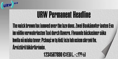
  38. Forlane EF by Elsner+Flake, $35.00
  39. Jordan Smith by Letterafandi Studio, $14.00
    Jordan Smith is a natural handwritten font. It looks stunning on wedding invitations, thank you cards, quotes, greeting cards, logos, business cards, and every other design which needs a handwritten touch.
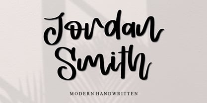
  40. Agatized Formal by ULGA Type, $25.00
    Agatized Formal is a chunky stencil typeface with slightly condensed letterforms and tight spacing. Designed primarily for display use, it’s ideal for posters, logos, advertising, book cover designs or small chunks of text such as pull-out quotes. It exudes authority without taking itself seriously, like a plump jolly uncle in charge of a brass band. Agatized Formal is a big, bold typeface with a charismatic presence that commands attention – in a friendly way, of course. But what really makes this typeface come alive is its arsenal of alternative characters and ligatures. There is a saying: Use sparingly. Whoa! Not here, no, no, no. Make your Glyphs palette earn its money. Flex your OpenType muscles: get stylized, contextualized, indulge in some ligaddiction. This typeface is a peacock that likes to put on a show, spread its plumage and strut around in all its blazing glory. Agatized, according to Wiktionary, means: A living thing converted into the form of agate; fossilized. I felt the name suited the solid, almost rock-like letterforms, but most of all I just wanted a typeface name that began with the letter A. Although Agatized Formal is a single-weight typeface it has a sibling, Agatized Informal, an older, more casual brother, rougher round the edges with craggy good looks and an altogether more jaunty style.
Looking for more fonts? Check out our New, Sans, Script, Handwriting fonts or Categories
abstract fontscontact usprivacy policyweb font generator
Processing