10,000 search results
(0.034 seconds)
- Dim Basic by Graffiti Fonts,
$15.00 - Bim - Personal use only

- Dom by ParaType,
$30.00 Dom was designed by Peter Dombrezian for American Type Founders in 1951–52. It is an informal unjoined script typeface that looks brushwritten. Its letters are almost monotone, freely or casually drawn. Vertical strokes of them have irregular ending at different heights, and oval axis have slightly different slopes. This typeface is to create a friendly, informal look in signs, advertising, and invitations. The Cyrillic version of the Bitstream digital font was developed by Dmitry Kirsanov for ParaType in 2008.
 - Dom by SoftMaker,
$9.99 Dom is an informal brushwritten typeface published by SoftMaker.
 - Dix by Just My Type,
$20.00 An offbeat not-quite-slab, not-quite-bracketed serif. And its extreme weight and width. Richard Dix started as a surgeon and turned out an actor, one of the lucky few who made a successful transition from silent film to talkies. In 1929 he made the movie western, “Redskins,” and his name appeared on a brilliant poster promoting the film. “Richard DIX”; four upper case and six lower case letters. The font Dix is derived and extrapolated from impressions of those 10 letters. Inspired by the poster for the 1929 film, “Redskin,” and a desire to create a black Edwardian font with an offbeat serif. Usage recommendations Western movie or 19th century-style advertising posters.
 - Zim by Scholtz Fonts,
$19.00 Zim is a bold, earthy font, named for the Great Zimbambwe ruins (a World Heritage site). Its solid silhouette represents the timelessness of this ancient structure. The font is very readable, and its bold, rugged shape make it ideal for display purposes, for posters and headlines. Fully professional, it contains a complete set of 255 characters — Upper and Lower case, all numerals, punctuation, symbols and accented characters. It is suitable for layout work in all major European languages — Spanish, Portuguese, German, French, Swedish and Italian (to name a few). The characters are spaced for readability and have been carefully kerned.
 - Dom by Tilde,
$39.75 - Dime by Produce,
$29.00 Intended to create a typeface that contain both two dimensional and three dimensional elements, Dime gives a very bold optical illusion effect. It is so intense and masculine that it is still macho in pink. Available in both Solid and Lined.
 - Dom by Bitstream,
$29.99 The most familiar of brush scripts designed by Pete Dombrezian for ATF in 1951.
 - PR Dim Sum by PR Fonts,
$8.00 Hand lettered with a pointed brush, this font strives to be evocative yet remain readable, even for medium length passages of text.
 - Mr Dum Dum by Hipopotam Studio,
$60.00 Mr Dum Dum was designed for our game – Ba Ba Dum. In Ba Ba Dum players can learn words in different languages, so we needed a typeface that can support not only all latin characters but also Cyrillic, Greek and two Japanese syllabaries – Hiragana and Katakana. Eventually we wanted to add Chinese support so we designed 1314 Simplified Chinese characters – just enough to cover all words available in Ba Ba Dum plus necessary logograms to translate the games UI.
 - IDM Minimal - 100% free

- DIN Schablonierschrift - Unknown license

- DIG DUG - Personal use only

- Club Dia - Unknown license

- Pea Kim - Unknown license

- Dem Bones - Personal use only

- Buddy jim - Unknown license

- Die Nasty - Unknown license

- Burnstown Dam - Unknown license

- Die Nasty - 100% free

- Jim teacher - Unknown license

- DIY One - Unknown license

- Thin Dime - Unknown license

- Clam Dip - Unknown license

- Dom LT by Linotype,
$29.99Dom Casual and Dom Diagonal are a set of informal script typefaces that look like brush writing. They were designed by Peter Dombrezian for American Type Founders in 1952 and were an immediate success. Use these typefaces to create a friendly, informal look in signs, advertising, and invitations. - Tim Sale by Comicraft,
$39.00 If you're familiar with the work of Eisner Award winning artist Tim Sale, you'll also be familiar with the soft curves and hard edges of the characters he brings so vividly to life in the pages of GRENDEL, BATMAN and SUPERMAN. Now you can get to know a selection of the characters Tim has been working on his whole life, and Comicraft has been kind enough to arrange them in alphabetical order for you! Based on Tim's own hand lettering work in the lost Dark Horse classic, BILLI 99, the Tim Sale font brings together the class and finesse of Hunter Rose, the elegance and charm of Bruce Wayne and the honesty and trustworthiness of Clark Kent. Don't go into the big city alone at night without it. See the families related to Tim Sale: Tim Sale Lower & Tim Sale Brush.
 - Dem Bones by Greater Albion Typefounders,
$3.50 Dem Bones is a bit of fun-display alphabet (capitals), numbers and punctuation assembled out of the sort of knobbly ended bones that dogs used to gnaw on in all the best childrens cartoons and comics. Thing Gnasher and Gnipper or Spike and Tyke. Dem Bones is particularly apt at Halloween, but can introduce some un at any time of the year...
 - Dime Museum by Solotype,
$19.95This idea of "wrong way weights" was originally called French Clarendon by the Americans, Italienne by the French, and American by the Italians. Sounds like nobody wanted to own up to it. When it was revived by ATF in 1933, it was given the name P. T. Barnum. Many variations have appeared. Dime Museum is an old wood type. - Dias Irregulares by Jrmuitos,
$20.00 Dias Irregulares is a font inspired by ignorant tattoo style. Contains 2 alternative characters for each letter and 4 cute illustrations. It's perfect for artistic publications, clothing and many other things. All made by hand, such as my tattoo work.
 - FF Dig by FontFont,
$41.99 - Dom Casual by URW Type Foundry,
$89.99 Dom Casual is a very condensed script, almost monotone, with irregular vertical strokes ending at different heights, and which suggests a freehand effect. It was designed by Pete Dom in 1951 for American Type Founders. As its name suggests, the Dom Casual font gives the appearance of a quick brush-like lettering and is suitable for setting titles, subheadings and short copy. There is some variations of stress in the rounded letters.
 - Normalise Din by Mecanorma Collection,
$45.00 - Reverend Jim by The Type Fetish,
$10.00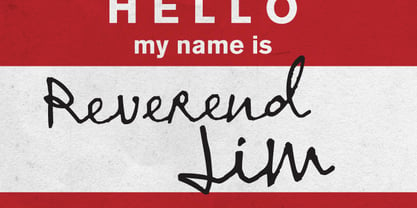
- Maggie Sims by Gleb Guralnyk,
$15.00 Hello! Introducing a bold serif font — Maggie Sims. It's a decorative shape bold typeface with lot's of extra characters. Available ligatures and alternative letters helps to create an original lettering compositions. Please make sure that OpenType features are supported & enabled in your software. Maggie Sims Font has a multilingual support (check out a screenshot with available letters and signs). Thank you and wish you a peaceful sky!
 - DIN 1451 by Linotype,
$40.99 DIN stands for Deutsche Industrienorm, German Industrial Standard. In 1936, the German Standard Committee settled upon DIN 1451 as the standard font for the areas of technology, traffic, administration, and business. The committee chose a sans serif font because of its legibility and easy-to-write forms. This font was not seen in advertisements and other artistically oriented uses, and there were disagreements about its aesthetic qualities. Nevertheless, this font was seen everywhere on German towns and traffic signs and hence made its way into advertisements because of its ease of recognition.
 - FF DIN by FontFont,
$104.99 Dutch type designer Albert-Jan Pool created this sans FontFont between 1995 and 2009. The family has 20 weights, ranging from Light to Black in normal and condensed styles (including italics). It is ideally suited for advertising and packaging, editorial and publishing, logo, branding and creative industries, poster and billboards, small text, wayfinding and signage as well as web and screen design. Looking for the new Thin and Extra Light weights? They are available through fontshop.com, linotype.com and fonts.com. FF DIN provides advanced typographical support with features such as case-sensitive forms, fractions, super- and subscript characters, and stylistic alternates. It comes with a complete range of figure set options – oldstyle and lining figures, each in tabular and proportional widths. As well as Latin-based languages, the typeface family also partly supports the Cyrillic and Greek writing systems. In 2011, FF DIN was added to the MoMA Architecture and Design Collection in New York. This FontFont is a member of the FF DIN super family, which also includes FF DIN Round.
 - Die Lara by Ingo,
$27.00 A girl’s handwriting written on the iPad Writing changes – throughout history over centuries, but also from generation to generation. Each new generation of students learns to write the basic forms of the letters a little differently than their predecessors. The role model is also changing. The cursive handwriting taught in school is getting closer and closer to printed type. The children no longer learn the forms of cursive handwriting required for connected writing, but first the “block letters”, only later should they develop their own individual handwriting from this, which many of them no longer do. And the writing tool is also changing. Of course, script looks different when children no longer learn to write on paper with a fountain pen, but on a tablet computer with the “pencil”. The writing experience is completely different, and the “material properties” are different too. There is practically no writing resistance that would make it difficult to move against the direction of writing. "Die Lara" was created based on the template by Lara Mörwald from the winter of 2023. The font version "Black" corresponds to the handwritten original, all thinner variants up to the wafer-thin "Hairline" are derived from it. In the variable font, the intermediate forms can be selected steplessly. In order to preserve the handwritten character of the font, "Die Lara" contains several alternates to most letters and numerals, so that different character forms alternate in the typeface. If the "ligatures" function is activated in the app (which is the default in most programs), these alternates appear automatically as you type. There is also an alternative "swashed" variant of some letters. So you can set somewhat livelier accents at the beginning or end of a word. "Die Lara" also contains fractions and tabular figures.
 - Die Bruecke by Hanoded,
$15.00 Die Brücke was a group of German expressionists which formed in Dresden in 1905. Members of the group include Erich Heckel, Fritz Bleyl, Ernst Ludwig Kirchner and Karl Schmidt-Rottluff. Much of the group's work was influenced by primitivism and medieval woodblock printing. Die Bruecke font was based on a printed invitation for an art exhibition from 1906. Although the font is all caps, upper and lower case glyphs differ and can be interchanged. Of course Die Bruecke comes with extensive language support.
 - Dic Sans by CAST,
$70.00 DicSans is a square sans-serif typeface, inspired by Aldo Novarese’s Eurostile, it was meant as a sort of contemporary "open" Eurostile. It is a semi-custom font, designed and expanded according to costumers’ requests, since 2004 up to 2013. For this reason it has many glyph variants (up to three variants per lowercase glyphs and numbers, special smallcaps etc.) and wide language coverage.


Page 1 of 250Next page