10,000 search results
(0.038 seconds)
- Mildstones by IKIIKOWRK,
$17.00 Proudly present Mildstones - Modern Bold Sans, created by ikiiko. A contemporary bold condensed sans serif typeface created to breathe life into headlines with its eye-catching presence. Mildstones attracts attention and takes any design project to a new level with its striking and fashionable look. Each letter in Mildstones has undergone meticulous design in order to convey a sense of power, assurance, and beauty. The font has a sense of verticality and compactness due to the condensed proportions, which also make it easy to fit into small places while keeping outstanding readability. The Mildstones experience is more than simply a font. It has been meticulously designed to be a dependable and powerful typographic in terms of both aesthetic and readability. This type is very suitable for making a headline news, sport advetorial, logotype, branding, poster, magazine layout, quotes, or simply as a stylish text overlay to any background image. What's Included? Uppercase & Lowercase Number & Punctuation Multilingual Support Works on PC & Mac
 - Resplendent by Set Sail Studios,
$16.00 Resplendent is a beautiful and free-flowing hand-lettered modern brush script font. Along with a full set of alternate lowercase characters, Resplendent comes in 2 different styles; Brush and Solid - giving you a hugely versatile brush font which can be used in a range of different scenarios. Resplendent Brush maintains a rough hand-painted aesthetic, whereas Resplendent Solid has a totally clean & smooth finish to it's edges; ideal for vinyl cutters such as Cricut and Silhouette Cameo, or simply for any project which needs a silky smooth style. Both styles of the font include an 'Alt' version, this has replaced all of the lowercase characters with a completely new set. If you wanted to avoid letters looking the same each time to recreate custom lettering, or try a different word shape, simply switch to the 'Alt' fonts for an additional layout option. Language Support • All Resplendent fonts include language support for; English, French, Italian, Spanish, Portuguese, German, Swedish, Norwegian, Danish, Dutch, Finnish, Indonesian, Malay
 - Bayshore by Set Sail Studios,
$18.00 Perm your hair, squeeze into your lycra, and retro-fy your text with Bayshore! A totally tubular mono-line script font straight out of the 80's. This hand-drawn font is perfect for creating slick & stylish lettering. Whether it’s for logos, product packaging or merchandise, Bayshore is guaranteed to give your text an unmistakeable retro quality. Bayshore comes as a single font file with added features allowing you to customise your text; End Swashes • Each lower-case character has a separate ‘end-swash’ version, use this for the last letter in a word to give it a custom-feel styling. These end-swashes are accessible via any software with Opentype capabilities, simply by turning on ‘Stylistic Alternates’. Underline Swashes • Four swashes of varying lengths are also available, simply by typing any of the square brackets [ ] { }. These can be used to underline your text and give it a real eye-catching quality.
 - Quiroga Serif Pro by TipoType,
$29.00 Quiroga Serif began in 2007 with the name Quadratta Serif. This typography was designed for continuous text, legible at medium and small sizes, with great saving of space, optimized for 6, 8, 10 and 12 points. The morphology is a mix between tradition and innovation; it has a vertical axis, thick serifs, tall x-height, light modulation and a lot of internal space between letters: key to improve legibility at small sizes. Formally, my idea was to make a serif type that had a unique color, this is visible due to the light modulation. This is also complemented with the incorporation of not common, alternative signs. Some parts of the letters that are usually curb or diagonal where made horizontal (for example: a, q, p, etc.), this makes the eye of each character to be wide and unique. The serifs (wedge type) suffered diverse variations during the process. At the begining they where thicker and ended vertically, but this caused a great deal of printing errors. And so we decided to modify them by giving them an angle to avoid visible errors in medium and small sizes. The ch, and ll ligatures where rescued because they are a part of our current spanish alphabet. The historic ligatures and stylistic alternates give different options to users who want different alternatives within a text. The accentuation signs were composed in a middle line above all signs to avoid visual shock. We also gave plenty of importance to small caps numbers, mathematical signs and currency signs so that the could interact well.
 - Butterfly Wingz by Ingrimayne Type,
$5.00 IngrimayneType has put letters inside a variety of objects, including bowling pins, book covers, coffee mugs, teapots, pumpkins, Christmas ornaments, train cars, tombstones, old bottles, circles, and rectangles. In each case the letters were placed on a single shape. The use of the Opentype feature of contextual alternatives makes it easy to use two different but alternating shapes. ButterflyWingz puts its letters on the right and left wings of a butterfly. The wings provide a large surface for drawing letters, but they have a odd shape so letters must be distorted to fit. The wings are symmetrical but some letters are not, so the right and left wing versions of the same letter are sometimes quite different. Without the contextual alternative feature one could design a typeface like ButterflyWingz but the user would have to alternate upper and lower case keys. With contextual alternatives turned on, the computer automatically alternates the letters creating a line of complete butterflies. Turning on the Opentype feature stylistic styles one (ss01) replaces the empty spaces with empty wings. However, sometimes an empty wing at the end of a line is unwanted and it can be removed by changing the typeface or by turning off the stylistic style for that character. The family contains two styles, a filled style and an outline style. They can be used separately or together in layers to add color. (Empty wings are on the logicalnot and registered characters.) ButterflyWingz is hard to read and should be used in small doses for decorative effects.
 - Farm Wave by Authentype,
$11.00 Farm Wave Regular & italic - beauty font design include regular & italic font Image used : All photographs/pictures/logo/vector used in the preview are not included, they are intended for illustration purpose only.
 - Jingle Condensed by ArFF,
$24.95I once tried to imagine what the children of Schoolbook and Bodoni would look like if they were married. I'm still trying to imagine that! In the meantime I drew the Jingles. - Look @ Me by Matthias Luh,
$20.00 Look @ Me is a cartoonish, fancy font. Its special features are the different eyes of the capital letters. The letters literally have faces and who knows, probably they may talk to you... ;)
 - Public Interest by Bogstav,
$16.00 Public Interest in my all caps fine looking handmade font. Each letter has 5 different versions and they automatically cycle as you type - making your text look even more lively and vibrant!
 - Blazedale by Chank,
$99.00 Check out this new guy: he’s casual & elegant, jaunty and sharp. Fancy, but not over-the-top. Blazedale is an instantly likable new display face ready to send a funky upbeat message.
 - Firefly by Canada Type,
$24.95 Firefly was designed by Miranda Hopper during her time in Patrick Griffin's type design class of 2010 at Humber. It is a light, narrow alphabet that works well in casual, leisurely design.
 - Jingle Wide by ArFF,
$24.95I once tried to imagine what the children of Schoolbook and Bodoni would look like if they were married. I'm still trying to imagine that! In the meantime I drew the Jingles. - TrueLove by Autographis,
$39.50 TrueLove is my script for those occasions when you want to show someone that you really love him or her, when what you have to say really comes deeply from your heart.
 - Mykonos by Deniart Systems,
$20.00 A geometrical, modern, angular design inspired by the Greek Key. It's complex yet simple, creating smooth, continuously flowing print. This font is well suited for headlines, posters, greeting cards, and much more.
 - Sabrosa by JAM Type Design,
$16.00 This display type family was developed with large headlines in mind. While the fonts work will at large size, they are not overbearing and get the point across without being too “shouty”.
 - Diamond Ring by Dharma Type,
$24.99 Diamond Ring is an Art Deco font inspired by Japanese designs for cosmetic packaging and posters used from the end of the 19th century to the early 20th. The most distinguishing characteristic is the diagonal parts of the glyphs. All diagonals have the same degree of the angle. By this elements, whole design of this font and typography with this font look like the shining of diamond ring during total solar eclipse. When you prefer more humanly letter form, please try our Yasashii that used in La La Land.
 - Tre Giorni by Eurotypo,
$60.00 Tre Giorni, is a variant of the "Due Giorni" font with the possibility of combining between the two. This useful writing font is very expressive, fresh, agile and organic. It comes in two styles: Solid and outline (just a little shine) Each font contains 571 glyphs with many OpenType features: standard and discretionary ligatures, stylistic alternates, decorative characters, old-style figures, small caps, titles, case sensitives, and ornaments. Specially designed for creating eye-catching headlines, logos, packaging, greeting cards, advertisements and websites. It also has good readability for longer texts.
 - Woolen by Magpie Paper Works,
$32.00 Woolen is a hand-inked & italicized serif, based upon a 17th century type specimen by Jean Jannon. Many of the capital letters are decorated with subtle sprigs and leaves, while the lowercase letters remain classically styled, giving the font a warm and natural look with just the right amount of dignity. Woolen is perfect for logos and branding – she shines in retail identities, particularly for farms, markets, and restaurants. Even though the font is slanted, it reads beautifully as body text and display headlines. Multi-language support is included in the font.
 - Redig by Great Scott,
$16.00 Redig is a bold condensed display typeface with an assertive and athletic aesthetic. Inspired by newspaper headline typefaces from early 1900s it has chamfered corners with rounded edges that smooths out some harshness and generous x-height to its lower case characters. Redig will shine when used big. And I mean BIG. This is certainly a case when “bigger is better” really is the truth. Redig comes with an oblique style and ligatures and works best in headlines, logos, branding, social media or any display type use. Use it big.
 - Alessandra by Lunas Type,
$19.00 Introducing Alessandra, a stunning script font inspired by the elegance of Victorian style. With its graceful curves and intricate details, Alessandra exudes a timeless beauty that captivates the senses. This font is adorned with exquisite ending and beginning swashes, adding a touch of refinement and sophistication to every letter. Perfectly suited for various design needs, Alessandra shines brightest on wedding invitations, greeting cards, and any project that calls for a touch of romance and charm. Let Alessandra elevate your designs with its enchanting allure, bringing a sense of elegance and grace to your creative endeavors.
 - Wesker by SimpleType Studios,
$15.00 Introducing our Wesker - Sans Serif Display Font Collection—a stunning blend of style, versatility, and impact. With 15 fonts, 5 weights, and 3 widths to choose from, your designs will shine like never before. Each font is meticulously crafted to leave a lasting impression, offering unparalleled elegance and precision. Whether you're creating logos, packaging, or posters, our collection empowers you to make a bold statement. Don't settle for ordinary—unlock the power of extraordinary typography. Order our Sans Serif Display Font Collection today and elevate your designs to new heights.
 - Kapsalon by Hanoded,
$12.00 It could be you’ve never heard of Kapsalon and I will forgive you for that. Kapsalon is a Dutch word, meaning ‘hairdresser’s’. Since 2003 it is also a very popular snack food, which consists of french fries, döner kebab, lettuce, sambal, garlic sauce and melted Gouda cheese, served in an aluminium tray. I have to admit that I have never eaten a Kapsalon myself, as I am not too fond of fast food. I named this font package Kapsalon, because, like its namesake, it consists of several unrelated elements that work really well when combined.
 - Smooth Brushings by Hanoded,
$20.00 When I was painting this font, I suddenly had the movie Cool Runnings (1993, directed by Jon Turteltaub) in my head. I had to name the font, so I came up with Smooth Brushings. Of course, this font has nothing to do with the movie. Smooth Brushings is an all caps brush font, which was made with a stiff brush and some China Ink. Upper and lower case glyphs can be mixed. It is a very legible and clear font, ideally suited for posters, product packaging and book covers.
 - LiebeMenu by LiebeFonts,
$19.90 LiebeMenu is a comprehensive set of hand-drawn restaurant and menu essentials: Restaurant signs and menu labels, dishes with vegetables, meat, fish and cheese, and of course drinks and desserts. Whether you design professional menus for a gourmet restaurant or for your friend’s dinner party, LiebeMenu instantly adds a warm personal touch. Over 110 carefully crafted drawings are included in this single font and can be used in any text or graphics application. If you like this font, you may also like our cooking ingredients font LiebeCook and our decorative restaurant phrases font LiebeMenuLettering.
 - Mr. Victoria by Gulce Baycik,
$10.00 Almost all of my works are conceived out of my love of illustration and handmade crafts. In this case, Mr. Victoria’s hand-lettered quality reflects its sensitivity and warmth. Mr. Victoria contains West European diacritics & ligatures and is highly suitable for international environments & publications. As an elegant & charming display typeface, Mr. Victoria shines with color and is suitable for impressive invitations, classy headlines and logotypes. Mr. Victoria also contains a group of mustache icons for you to glamorize your designs! Enjoy it you shall, as much as I did creating it.
 - Ironbridge by Device,
$29.00 A cast iron plaque from Bristol Temple Meads Station serves as inspiration for this antique font. The plaque commemorates the design contribution of Isambard Kingdom Brunel, who in March 1833 at only 27 was appointed chief engineer of the Great Western Railway, the line that links London to Bristol. This helped establish Brunel as one of the world’s leading engineers. Impressive achievements along the route include viaducts at Hanwell and Chippenham, Maidenhead Bridge, Box Tunnel and Bristol Temple Meads Station. Ironbridge evokes industrial heritage, gothic spookiness or eroded heavy metal.
 - Carot Display by Storm Type Foundry,
$45.00 Carot Display is made for book covers and posters, but will also shine in advertising and visual identity. The whole Carot system is built up from what has long been around; in any case, it was the intention: to evoke the already experienced visual reminiscences of today's spectacled people. We all have a tendency toward sentiment, which, with each new diopter, deepens to melancholy. Only good font can calm us down. I believe in the raw effect of “Carot” typefaces. The superfamily of 64 members offers a modern alternative for all types of design work.
 - Guilty Pleasure by Hanoded,
$15.00 Some time ago, my kids asked me what kind of sweets I really liked. To be honest, I don’t actually like sweets at all - never have, never will. BUT… you can wake me up for chocolate and ice cream! Those are my guilty pleasures! Guilty Pleasure is a handmade font. I used China Ink and a brush to create all the glyphs. Guilty Pleasure is a very distinct display font. I recommend you use it for your ice cream or chocolate packaging… but that, of course, is entirely up to you!
 - Hello Amsterdam by Ake,
$18.00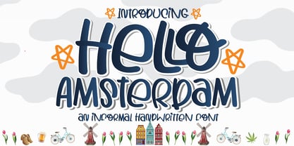 Hello Amsterdam Font is an informal, cute modern, fashionable, friendly, and trendy handwritten font. With its playful yet versatile style, Hello Amsterdam adds a delightful touch to any design project. Whether you're creating greeting cards, invitations, logos, social media posts, or anything in between, this font brings a casual and adept vibe to your work. Its handwritten charm and contemporary appeal make it a perfect choice for those seeking a touch of personality in their designs. Embrace the trendy vibes of Hello Amsterdam Font and let your creativity shine!
 - Sunshine Formula by PizzaDude.dk,
$17.00 Imagine having a formula for sunshine. I mean, in a way to make the sun shine when you want it, or really need it. That could be for a day at the beach, or for the plants in your garden - or even better: make someone happy with a little bit of sunshine! I made this font on the first day of summer in Denmark 2020 - the rounded corners and the soft and easy look of Sunshine Formula, really got me into the "this-is-going-to-be-a-great-summer" mode! :)
 - Durazno y Amor by Ocha Puyaber,
$10.00 Durazno y Amor is a cursive font family. It is inspired by love, hearts, and Chilean script. It can be written in Aymara, Mapuche and Rapa Nui from Chile. It can also be written in Dutch, Maltese, and other languages. This font family is cute and fun. It has many heart decorations. The strokes are drawn with a round cap tool, with no contrast. The form is upright. Parts A have capitals with high starts. Parts B have capitals with low starts. Parts F are Final forms. Parts U are love line Unions.
 - Compagnon by Hanoded,
$15.00 Compagnon is a friend, a partner. This handmade display font will come in super handy when you are working on that book cover, or the packaging of a product. It will shine on posters and websites and it will keep you warm at night. I guess that last bit is an exaggeration… Compagnon comes in three distinct styles: a ‘regular’ version, which is a bit rough around the edges, a ‘dirty’ version, with a juicy eroded look and a polka dot version. All three have their accompanying italics.
 - Versteeg by Blank Is The New Black,
$10.00 Versteeg was originally designed as a font that would work at a singular pixel level. In the spirit of this reduction, Versteeg was designed with an x-height of 3 units with capitals at 4 units. This extreme simplification is what makes Versteeg unique. After designing the square version of the typeface, creating a series of circular versions was a natural evolution. These versions have a resemblance to braille, but don't actually have a relationship with any braille characters. The width of each face is carefully designed to make sure that the letters will align perfectly in multiple lines. Versteeg is, for the most part, a display typeface, and isn't recommended for large blocks of text.
 - Text Tile by Tetradtype,
$25.00 TextTile is a system of heavy sans titling faces which can be utilized to carry a repeating chromatic pattern across words and letters. It stands apart from other chromatic faces, where layered effects typically interact only within each letter and do not carry through from one letter to another. The pattern repetition across letters of varying widths is achieved through OpenType substitution, using conditional alternates for each successive letter to allow for a seamless appearance across words, regardless of letter combinations. Though the pattern exists on a strict grid and the letters' widths and spacing must be highly regular in order to preserve the pattern repeat, the letterforms themselves are not rigid; rather, they appear organic, lively. The initial release includes patterns inspired by a classic buffalo plaid, separated into its horizontal and vertical components to maximize the creative possibilities for layering one-, two-, three-, and even four-color plaid patterns. Kits are available to produce the plaid pattern in detail—with overlapping diagonal hatching fully visible—or as a simplified version in which transparency can be used to simulate plaid or to create a checkered or striped effect. The TextTile family of fonts is a flexible canvas for mixing and matching a broad array of patterns to create a unique look. Check back for more pattern releases and take a look at the online specimen to see what is possible with the current offerings. Usage Notes For best results use an OpenType aware program. Enabling Contextual Alternates will ensure pattern alignment. For patterns that are made up of vertical stripes or columns using the Stylistic Alternate/Stylistic Set 1 will shift the columns. Stylistic Set 2 will change 1-0 into blocks of patterns.
 - Danielle BF by Bomparte's Fonts,
$40.00 When I first saw the scrapbook pages of Danielle Paradis, I was immediately struck by the funky-cool distinction of her handwriting style. I was inspired and felt moved to ask her for samples, from which to build a complete font. This warm and friendly font is applicable to a wide variety of uses. Use it wherever a casual cool look is desired. It's right at home on trendy restaurant menus, children's publications, organic food labels, correspondence and of course, scrapbooks, to suggest a few. A number of stylistic alternates are included.
 - Happy New Year Party by Putracetol,
$26.00 Happy Ney Year Party is a playful and quirky display font. I made this font especially for New Year and holidays. This font has 8 decoration versions : regular, firework, splash, ribbon, star, trumpet. These decorations are related to New Year decorations, making this font the perfect fit for any new year or holiday themed activity / project. Happy Ney Year Party perfect for crafter, gift, tshirt, card event, anniversary, birthday,greeting cards, logotype, branding, poster, packaging, stationery, website, and any other projects requiring a handwritten and luxurious touch. This font is also support multi language.
 - Thickset by Josh Grzybowski,
$19.99 She may not be the heaviest font on the street but Thickset can throw her weight around with the best of them. Designed as a display font, Thickset is a solid slab-serif with thin counters that makes it ideal for publications like fashion and editorial magazines. But don’t get me wrong, she’s more than willing to give anything a try. Just as long as you respect her in the morning. In addition to ligatures and fractions, Thickset’s other OpenType features include old style numbers and small caps.
 - Pleiad by URW Type Foundry,
$39.99 Seven superb scripts, to be freely mixed with one another. Alone, each of them flows nicely, but combined they reach ultimate vitality and grace. The Pleiades are one of the most beautiful constellations in the sky, and in Greek mythology they were seven divine sisters. Luxurious freedom of choice and excellent readability make Pleiad the perfect face for a variety of projects, from stylish invitations to magazine ads, from poetry books to restaurant logos. Sometimes calm, sometimes flittering – but always fair and graceful – this sublime calligraphic type family will hold an everlasting fascination.
 - Deca Serif by ParaType,
$30.00 Super family Deca consists of ten fonts. Six sans serif styles form the Deca Sans family and four styles of serif family named Deca Serif . These are low contrast fonts of pure design with ovals bent to rectangular shapes. They are nicely readable in small sizes and can be recommended for scientific, legal, official and business documents. Serif and sans serif fonts were designed in comparable proportions, they are balanced by color and have similar details in basic shapes. These features provide high compatibility and assume collective usage of the fonts in documents.
 - Deca Sans by ParaType,
$30.00 Super family Deca consists of ten fonts. Six sans serif styles form the Deca Sans family and four styles of serif family named Deca Serif . These are low contrast fonts of pure design with ovals bent to rectangular shapes. They are nicely readable in small sizes and can be recommended for scientific, legal, official and business documents. Serif and sans serif fonts were designed in comparable proportions, they are balanced by color and have similar details in basic shapes. These features provide high compatibility and assume collective usage of the fonts in documents.