9,924 search results
(0.02 seconds)
- Upper Clock by Casloop Studio,
$5.00 Introducing Upper Clock Typeface, your ticket to a world of typographic innovation, drawing inspiration from the sleek design of the ETCH Clock. Prepare to explore a myriad of creative possibilities for your Display Text with this cutting-edge typeface. Tired of mundane, uninspiring fonts that lack personality and flair? Upper Clock Typeface is here to infuse your digital designs with the vivacity of Retro Flat, the whimsy of Memphis, and the evocative nostalgia of Modern Nostalgia. Comprehensive multi-language support, including Western European, Central European, South Eastern European, South American, Oceanian, and even Esperanto. Upper Clock isn't merely a typeface; it's your ultimate solution to typographic challenges. This versatile tool is your gateway to crafting visually stunning, one-of-a-kind designs within the realm of Display Text. As you implement Upper Clock Typeface, watch in awe as your typographic dilemmas seamlessly transform into relics of the past. Take your design endeavours to new heights with Upper Clock Typeface today! Upper Case.
 - Cover Up by Hanoded,
$15.00 Cover Up is a roughish font with a lot of character. Its edges are slightly jagged, there is no real baseline and it looks like the whole thing has been sand blasted. When you get to know Cover Up, you’ll find that it comes with a hidden agenda, because underneath the rough exterior lives an oh-so sweet heart. Use it for your product packaging, book covers and posters - it won’t disappoint you. Comes with an illegal amount of diacritics.
 - Hiper Hoper by Sipanji21,
$10.00 "Hyper Hoper" is a 3D layered graffiti font that includes regular, shadow, and inner styles within each character. Fonts with multiple layers like this are designed to provide a three-dimensional effect to the text, enhancing its depth and visual appeal. By utilizing the regular, shadow, and inner layers in "Hyper Hoper," you can create text that appears to have depth and dimension, with shadowed and inner details adding a dynamic quality to the font. This font is suitable for various design projects such as graffiti art, posters, or any creative work where a bold and three-dimensional typographic style is desired.
 - Senpai Coder by Dharma Type,
$9.99 Senpai Coder is a family of typewrighter-style monospaced font for developing, programming, coding, and table layout. Some desirable features in monospaced fonts are listed below. 1.Easy to distinguish 2.Easy to identify 3.Easy to read Senpai Coder has very distinguishing letterforms for confusable letters such as Zero&Oh, One&I, and Two&Z. A lot of ingenuity makes this family very distinguishable. Italics have somewhat large inclination angle to be distinguished from their Roman. For the same reason, Italics are slightly lighter than Romans. Italic is not cursive Italic. It is near the slanted Roman. This is an intentional design to identify Italic letters. Cursive is not suitable for programming font. Typewriter letterform (serif) is good for reading. Common elements for each letterform makes harmony and a sense of unity. Senpai Coder supports almost all Latin languages. Try this all-new experiment.
 - Play Day - Personal Use - Personal use only

- Child's Play Trial Version - Unknown license

- Quantum Flat Hollow BRK - Unknown license

- Quantum Flat Hollow (BRK) - Unknown license

- Face plant hollow 2 - Unknown license

- Face plant hollow 2 - Unknown license

- Sil Vous Plait NF by Nick's Fonts,
$10.00Morris Fuller Benton's 1917 typeface named Invitation provided the pattern for this elegant and endearing face. Classic Engravers Roman style caps are exquisitely balanced with a sinewy lowercase, adding warmth and charm. All versions of this font include the Unicode 1250 Central European character set in addition to the standard Unicode 1252 Latin set. - Polipop Playful Display Font by Maulana Creative,
$14.00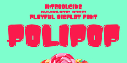 Polipop playful display font. Bold stroke, fun character with a bit of ligatures and alternates. To give you an extra creative work. Polipop playful display font support multilingual more than 100+ language. This font is good for logo design, Social media, Movie Titles, Books Titles, a short text even a long text letter and good for your secondary text font with script or serif. Make a stunning work with Polipop playful display font. Cheers, Maulana Creative
 - Play Day Stencil JNL by Jeff Levine,
$29.00 The typography on a 1964 children’s activity book published by Whitman entitled “Build with Stencils” was in a bold, condensed design. The only problem was that the ‘rails’ [the parts that divide a letter into stencil pieces] were too narrow and would disappear at smaller point sizes. Widening the ‘rails’ just a bit greatly improved the appearance of the stencil characters. Play Day Stencil JNL is now available in both regular and oblique versions. In its day, the Whitman Publishing Company of Racine, Wisconsin published dozens of activity books for children, including a number of them with stencils. The company was a division of Western Publishers from the early 1900s through the 1970s, but went through a number of sales and name changes. Currently [as Whitman once again] it is owned by Anderson Press, and is known for its line of coin folders and books on coin collecting.
 - Lefferts Corners 2 - Unknown license

- KR Corners 2 - Unknown license

- Casper Comics Solid - Unknown license

- My Own Topher - Unknown license

- Zipper blues Outline - Unknown license

- Zipper blues Black - Unknown license

- Corner Store JF by Jukebox Collection,
$32.99
- Archive Copperplate Text by Archive Type,
$19.95Blackletter engraved display typeface. - Bill Corporate Medium by OGJ Type Design,
$35.00 Bill Corporate is a geometric typeface with generous capitals. A modern classic, based on Max Bill’s lettering work, its straightforward and uncompromising construction can be both edgy and sublime. With minimalist letterforms, pointy apexes instead of flat ones, and archetypal proportions, this font family doesn’t follow any trends but strives to achieve a timeless formal vocabulary. The skeleton of its letters is based heavily on the famous primary shapes of the Bauhaus: square, circle, and triangle. This makes for quite wide uppercase and much narrower lowercase letters. The contrast between uppercase and lowercase benefits inexperienced users, who will be able to get appealing results quickly. At the same time, it’s a powerful tool for seasoned designers, who can employ either case selectively to set the desired typographic course. Bill Corporate Medium’s 16 styles (including a set of eight lighter-than-light fonts from “Two” to “ExtraLight”) are an excellent choice for editorial design, branding, headlines, and even short to mid-length copy in a wide range of applications and industries. The uppercase letters in particular—with their varied widths and lavish dimensions—are suitable for cosmopolitan and stylish logotypes and wordmarks. Whenever a timeless, staid, and classy look is demanded, choose Bill Corporate.
 - Bill Corporate Narrow by OGJ Type Design,
$35.00 Bill Corporate supports Central, Eastern European and Western European languages.
 - Corporate E WGL by URW Type Foundry,
$210.99 The Corporate ASE typeface trilogy was designed by Prof. Kurt Weidemann, a well-known German designer and typographer, from 1985 until 1990. This superb trilogy consisting of the Corporate Antiqua, Corporte Sans Serif, and Corporate Egyptian is a design program of classical quality, perfectly in tune with each other. Weidemann says: My ASE trilogy, quite like triplets, is in perfect harmony and covers all needs of modern typography! Initially exclusively designed for DaimlerChrysler as a corporate font, the ASE trilogy may be now licensed and used without restriction. URW++ digitized the ASE for DaimlerChrysler and Prof. Weidemann and is the exclusive licencing agent for this outstanding and extremely popular typeface program.
 - Street Corner Racing by Sipanji21,
$15.00 "Street Corner" is a display font with a Racing and futuristic theme, perfect for design projects such as sports jerseys, athletic shoes, helmets, and other sports-related products. With its dynamic appearance, this font brings a sense of energy and movement to your designs. The clean lines and modern feel of "Street Corner" make it an excellent choice for projects that require a sleek and contemporary look. Whether you're designing for a sports team or creating an athletic product, "Street Corner" will help you create a strong and memorable brand identity that embodies the spirit of sports and the future.
 - 1751 GLC Copperplate by GLC,
$38.00 This family was inspired by an engraved plate from Diderot & Dalembert's Encyclopedia (publication beginning in 1751), illustrating the chapter devoted to letter engraving techniques. The plate bears two engravers names : "Aubin" (may be one of the four St Aubin brothers ?)and "Benard" ( which name is present below all plates of the Encyclopedia printed in Geneva ). It seems to be a transitional type, but different from Fournier or Grandjean. Small caps are included in fonts for TTF and OTF version, separate files are included in the family sets of the Mac TT version.
 - Archive Copperplate Head by Archive Type,
$19.95Engraved shaded display typeface. - Inglenook Corner NF by Nick's Fonts,
$10.00This whimsical wonder is based on the lettering of Laurence Schall, as presented in Lewis F. Day's 1910 classic, Alphabets Old and New. The typeface radiates a charm reminiscent of the works of many talented artists (including Howard Pyle and Arthur Rackham) who illustrated children's books around the turn of the twentieth century. The Opentype version of this font supports Unicode 1250 (Central European) languages, as well as Unicode 1252 (Latin) languages. - Pacific Clipper SG by Spiece Graphics,
$39.00 Pacific Clipper has its roots in an old 1930s showcard lettering style. An extra bold version of this sign painter’s relic is shown in Carl Holmes' wonderful book on lettering. It may be described as what happens when Rudolf Koch's Kabel Heavy meets ATF's Novel Gothic. Also known as Sam’s Tune, Pacific Clipper’s noteworthy features include wedged crossbars in the capital A, E, F, and H. Overcurving is present in the capital B, D, P, and R while vertical strokes in the lowercase b, d, h, k, l, and t are chopped off obliquely. Figures in Pacific Clipper are also refreshingly different, particularly the number 4. This lettering favorite turned retro typeface has been extended to include a variety of weights. Pacific Clipper is now available in the OpenType format. Some new characters have been added to this OpenType version as Stylistic Alternates and Historical Forms. These advanced features work in current versions of Adobe Creative Suite InDesign, Creative Suite Illustrator, and Quark XPress. Check for OpenType advanced feature support in other applications as it gradually becomes available with upgrades.
 - Corporate S WGL by URW Type Foundry,
$210.99 The Corporate ASE typeface trilogy was designed by Prof. Kurt Weidemann, a well-known German designer and typographer, from 1985 until 1990. This superb trilogy consisting of the Corporate A (Antiqua), Corporate S (Sans Serif), and Corporate E (Egyptian) is a design program of classical quality, perfectly in tune with each other. Weidemann says: “My ASE trilogy, quite like triplets, is in perfect harmony and covers all needs of modern typography!” Initially exclusively designed for DaimlerChrysler as a corporate font, the ASE trilogy may be now licensed and used without restriction. URW++ digitized the ASE for DaimlerChrysler and Prof. Weidemann and is the exclusive licensing agent for this outstanding and extremely popular typeface program. Meanwhile, URW++ enhanced the Corporate ASE family in regular, bold, italic, and bold italic by Greek, Cyrillic, and all additional Latin characters to cover Eastern Europe including the Baltic Rim, Romania and Turkey. Corporate ASE in regular, bold, italic, and bold italic is now available in the WGL 4 character complement.
 - Copperplate Gothic Hand by Wiescher Design,
$39.50 The classic font as designed by F. W. Goudy for ATF in 1901, now in a hand-drawn version for a little bit of variation. Everybody else just offers another version of the same old Copperplate, but I now have a new rough one. Oh, just for the record, I have a couple of other versions of this font in my collection of the Copperplate Classic fonts. Your rough designer Gert Wiescher
 - Sky Clipper JNL by Jeff Levine,
$29.00 Sky Clipper JNL is a bold, Art Deco sans serif typeface derived from the hand lettered title on a 1940s-era “Big Little Book” entitled “Flying the Sky Clipper with Winsie Atkins”. The design is available in both regular and oblique versions. “Big Little Books” were published by the Whitman Publishing company and featured short stories printed in a tiny sized book format for young children.
 - Copperplate Classic Medium by Wiescher Design,
$49.50 Copperplate was the classic nineteenth century engravers typeface, consisting of capitals and small caps only. Among others (for example Deberny & Peignot) F. W. Goudy's cut for ATF around 1901 is probably the most widely known. Copperplate typefaces are traditionally used for business cards and all that "serious" stuff. My Copperplate Classic is a completely new design, based on some old samples. To make it look more up-to-date and elegant, I gave it some extra swings here and there. The old fonts were all designed with clogging corners or points that can break off in the minds of its designers. Today we do not have those problems any longer, so I could give my Copperplate Classic real sharp pointed serifs. To give you more choice I now added this medium cut in three variations, medium, sans and rounded! Enjoy! Gert Wiescher
 - Corporate A WGL by URW Type Foundry,
$210.99 The Corporate ASE typeface trilogy was designed by Prof. Kurt Weidemann, a well-known German designer and typographer, from 1985 until 1990. This superb trilogy consisting of the Corporate A (Antiqua), Corporte S (Sans Serif), and Corporate E (Egyptian) is a design program of classical quality, perfectly in tune with each other. Weidemann says: "My ASE trilogy, quite like triplets, is in perfect harmony and covers all needs of modern typography!" Initially exclusively designed for DaimlerChrysler as a corporate font, the ASE trilogy may be now licensed and used without restriction. URW++ digitized the ASE for DaimlerChrysler and Prof. Weidemann and is the exclusive licencing agent for this outstanding and extremely popular typeface program. Meanwhile, URW++ enhanced the Corporate ASE family in regular, bold, italic, and bold italic by Greek, Cyrillic, and all additional Latin characters to cover Eastern Europe including the Baltic Rim, Romania and Turkey. Corporate ASE in regular, bold, italic, and bold italic is now available in the WGL 4 character complement.
 - Copperplate Classic Light by Wiescher Design,
$88.00 Copperplate was the classic nineteenth century engraver's typeface, consisting of capitals and small caps only. Among others (for example Deberny & Peignot) F. W. Goudy's cut for ATF around 1901 is probably the most widely known. Copperplate typefaces are traditionally used for business cards and all that "serious" stuff. My Copperplate Classic is a completely new design, based on some old samples. To make it look more up-to-date and elegant, I gave it some extra swings here and there. The old fonts were all designed with clogging corners or points that can break off in the minds of its designers. Today we do not have those problems any longer, so I could give my Copperplate Classic real sharp pointed serifs. To give you more choice I now added this light cut in three variations, light, sans and rounded! Enjoy! Gert Wiescher
 - Beanie Kopter NF by Nick's Fonts,
$10.00The exuberant, if somewhat unorthodox, letter stylings of British poster artist Cecil Wade inspired this offering. The font has extensive kerning to keep the letters packed tight. Both versions of the font include the 1252 Latin and 1250 CE character sets (with localization for Romanian and Moldovan). - Coupon Clipper JNL by Jeff Levine,
$29.00Coupon Clipper JNL is a fun, playful, casual sans serif font that evokes some of the lighthearted typography of the late 50s and early 60s. - Supper Club JNL by Jeff Levine,
$29.00After creating the all-caps version of Supper Club JNL, a conversation between Jeff Levine and fellow font designer Ray Larabie brought forth the idea that one of Ray's freeware fonts had a lower case that would perfectly fit Jeff's design. With Ray's permission, Jeff adapted the lower case to his capital letters and the final version of Supper Club was born. Two separate ideas become one stylish Art Deco type design. - Lance Corporal NF by Nick's Fonts,
$10.00This font was inspired by Arts and Crafts lettering found on the cover of the Austrian journal Ver Sacrum (Sacred Spring), 1898. Primarily an uppercase-only font, there are several variants in lowercase positions. Both versions of the font include 1252 Latin, 1250 CE (with localization for Romanian and Moldovan). - Corporative Sans Rounded by Latinotype,
$26.00 Corporative Sans Rounded is the rounded version of Corporative Sans. Its curved terminals provide it with a marked personality and distinctive traits, but turn it into a friendly face at the same time. The font works well at both display and small sizes. Corporative Sans Rounded is the perfect choice for logotypes, posters, signs, branding, packaging and so on! Corporative Sans Rounded comes with Latinotype’s standard set of 350 characters, making it possible to use the font in 128 different languages. Corporative Sans Rounded provides users with a wide range of characters, weights and widths for every project. By combining different variants, designers can achieve the best results. The family consists of 32 fonts: a basic family that includes 8 weights plus italics and an alternative family of 8 weights with matching italics as well. Corporative Sans Rounded was created by LatinotypeTeam and developed by Elizabeth Hernández and Rodrigo Fuenzalida, under the supervision of Luciano Vergara and Daniel Hernández.


