976 search results
(0.015 seconds)
- Monita Signature by Aminmario Studio,
$20.00 Introducing Monita Signature font is a classy and elegant script. This font was created to look as close to a natural handwritten script, as possible by including some lowercase alternates, ligature and underlines. Comes with regular and italic. Perfect for any awesome projects that need hand writing taste. This is suitable for logos, watermarks on photography, signatures, branding, advertisement, quotes, invitations, stationery, wedding design,album covers, business cards, clothing, magazines, posters, and more!
 - Tassista by MAC Rhino Fonts,
$59.00 Tassista means taxi in Italian. It suits this typeface well as the source of inspiration is the closing credits from the film Taxi driver, directed by Martin Scorsese in 1976. The typeface is designed to perform especially well in smaller sizes and makes it suitable for various credit copy, footnotes etcetera, nearly always presented in minor sizes. During the designs process it seemed more logical to make small caps instead of traditional lowercases.
 - Konnect by Adam Ladd,
$25.00 Konnect is a geometric sans serif featuring a blend of modern, classical, and playful characteristics. The simple, clean forms and classically-inspired proportions give it a timeless quality and interesting rhythm. A large x-height, closed apertures, and horizontal/vertical terminals create a distinct appearance. It includes a wide range of weights, from fine and functional Hairline to hefty and confident Black, each with italics, all ideal for branding, advertising, logos, magazines, and more.
 - Musical Arrangement JNL by Jeff Levine,
$29.00 The hand-lettered title on a piece of sheet music for 1938's "Don't Be That Way" (as recorded by Benny Goodman) featured squared letters with rounded corners, slight variants in line thickness and interesting "overhangs". Additionally, some letters closed off on one end while others were opened, giving the impression of a slight "maze" effect. This unique song title was enough of an inspiration to be turned into Musical Arrangement JNL.
 - Bill Display by OGJ Type Design,
$29.00 Bill Display is a post-Max Bill font, developed in close cooperation with the Max Bill Georges Vantongerloo foundation. MAX BILL Last universal scholar, most important design teacher of the 20th century: There are superlatives, always very enthusiastic, when the importance of Max Bill is discussed. The trained silversmith studied at the Bauhaus, with personalities such as Josef Albers, Paul Klee and Oskar Schlemmer. He worked as an architect, later as sculptor and designer.
 - ITC Zapf International by ITC,
$39.00 Zapf International font is the work of German designer Hermann Zapf, formal enough for widespread use yet tempered with calligraphic warmth. Vigor in the italics is achieved more from design than from slant. One of the distinguishing characteristics of Zapf International is its graduation of weights. Light and medium are relatively close and equally eloquent for text. Demi is a full two steps heavier than medium and heavy several steps beyond demi.
 - Karben 105 Stencil by Talbot Type,
$19.50 Karben 105 Stencil is a contemporary stencil font. The stencil breaks in the letters are applied in a way that is sensitive to the forms of the character in pursuit of a more elegant stencil. Karben 105 Stencil is available in a family of three weights. Karben 105 Stencil is closely related to Karben 105 and Karben 205 . All of the Karben fonts feature an extended character set, including accented characters for Central European languages.
 - Concerto by profonts,
$41.99 profonts Concerto and profonts Sonata are closely related to each other. In fact, the only difference between the two related fonts is in the upper case characters. Concerto's upper cases are more complex, swashier than those in Sonata. One is a perfect complement to the other, and that is why they are offered together at special rate. Both fonts contain about 370 glyphs covering the complete Latin set for Western and Eastern Europe.
 - Jumbalo by Sharkshock,
$115.00 Jumbalo is a fun loving family suitable for a variety of purposes. This all caps display font is characterized by its loose, rounded features and balloon-like structure which gives it a retro vibe. The letters are closely spaced together to create a snug feel. Jumbalo would work well in a children’s book, retail packaging, or company logo. The complete family contains full and basic Latin, punctuation, European accents, kerning, and includes an outlined version.
 - Sonata by profonts,
$41.99 profonts Sonata and profonts Concerto are closely related to each other. In fact, the only difference between the two related fonts is in the upper case characters. profonts Concerto's upper cases are more complex, swashier than those in profonts Sonata. One is a perfect complement to the other, and that is why they are offered together at special rate. Both fonts contain about 370 glyphs covering the complete Latin set for Western and Eastern Europe.
 - Otoiwo Grotesk by Pepper Type,
$39.00 Otoiwo Grotesk is an extremely versatile sans-serif typeface with a closed aperture. It features whopping 126 styles over 7 widths, each containing 9 weights with corresponding italics. The mood of the family ranges from fairy neutral in Normal and Condensed widths to very flavorful Compressed and Ultra Wide. Rich language support, which includes Cyrillic and spans 131 language ovarall, makes Otoiwo Grotesk a worthy choice for brands that strive to reach international audience.
 - Bruce 532 Blackletter by Intellecta Design,
$23.90 A classic font design remastered by the type foundry Intellecta Design, from the extra-rare Bruce's New York typefoundry from 1882. Distressed and antique, use this font in display purposes for a stylized type design. Great display face for headers and antique-like projects. Contains a limited amount of letter designs. Using the "0" and "2" keys you get two different fleurons to start words. Use "1" or "3" keys to close words with fleurons.
 - Halivelavierta by Ilhamtaro,
$99.00 HALIVELAVIERTA is a combination font between blackletter and serif, but I included it in the blackletter category because of the boldness and spacing that is close to a blackletter font, resulting in a font with a slightly gothic feel, vintage but also suitable for modern designs. YOU WILL GET : Halivelavierta.otf To enable the OpenType Stylistic alternates, you need a program that supports OpenType features such as Adobe Illustrator CS, Adobe Indesign & CorelDraw X6-X7. Cheers!
 - Recht by Mint Type,
$32.00 Recht is a geometric sans with much attention to curvature compensations, classifying between classic geometric sans-serif typefaces and neo-grotesques. The family contains 10 weights with corresponding italics, Cyrillic script with inclusion of Ukrainian Cyrillic, and a bunch of OpenType features. Recht has a closed aperture and is extremely versatile, working exceptionally well in both headlines and long text paragraphs. You can use stylistic sets for added geometric or humanist flavour.
 - Taylor Demian Script by Get Studio,
$17.00 Introducing Taylor Demian Signature Font This new script font embodies the essence of a natural signature style. Designed to convey elegance and organic handwriting, it effortlessly exudes a sense of graceful flow. Meticulously crafted, this font can be seamlessly incorporated into various contexts. With its elegant signature style, natural impression, and clever ligature usage, this script font closely resembles authentic handwriting. It brings a personalized and aesthetically pleasing quality to your design projects.
 - Pandilla by Typozon,
$39.00 Pandilla was inspired from personal sketches and letters developed by the past of the years making graffiti art. the forms of this typeface are related with the graffiti and street scenes of the different cities around the world and takes traits and elements of the Handstyle, Classic graffiti, Brazilian Pichação and different urban letters. This font has a variety of objectives, the first is to create a legible version of the graffiti inscriptions and use this typography for different print pieces, the second objective is to give back the essence of the meaning of the word "Pandilla", this word has been transformed for the past of the decades and now is associated with negative things. The original meaning of this word is a group of people who feel a close relationship, which usually have a friend or close interaction with ideals or common philosophy among members. Pandilla is to be used in different print purposes and graphic pieces like: Posters, Brochures, Magazines, Business cards and different stuff that uses big type sizes and big display formats.
 - Premier by ITC,
$29.99Premier font was designed by Colin Brignall. Premier Lightline displays all the elegance and sophistacation of the 1920s and 30s and consists of a refined lowercase with high ascenders and generous capitals which can also be used alone. Premier Shaded is an all caps typeface which provides a robust counterpart to the fine elegance of Premier Lightline. Premier Shaded should be used with close or ever overlapping letter spacing and is ideal for strong, eye-catching headlines. - Baraka by Typophobia,
$20.00 Baraka - in Swahili - a blessing. It is a simple, block-like typeface closed in cuboids. It was created and designed in Tanzania, Africa. It contains 183 gliphs, which due to their simplicity, which consisted in cutting out letters from rectangles using as little light as possible, makes an impression and is in fact a very heavy display typeface. It was created primarily for posters and labels, where thanks to its modularity and form enclosed in a limited geometric figure
 - Sequel Rounded by OGJ Type Design,
$35.00 Sequel Rounded is a post-Max Bill font, developed in close cooperation with the Max Bill Georges Vantongerloo foundation in Switzerland. MAX BILL Last universal scholar, most important design teacher of the 20th century: There are superlatives, always very enthusiastic, when the importance of Max Bill is discussed. The trained silversmith studied at the Bauhaus, with personalities such as Josef Albers, Paul Klee and Oskar Schlemmer. He worked as an architect, later as sculptor and designer.
 - Amostely Signature by Kotak Kuning Studio,
$15.00 Amostely Signature is a handwritten signature script with a natural & stylish flow. This font has a multitude of natural looking ligatures in its OpenType features - making the font look as close to natural handwriting as possible. This collection of scripts is perfect for personal branding. Amostely Signature Font is perfect for many different projects such as logos & branding, invitation, stationery, wedding designs, social media posts, advertisements, product packaging, product designs, label, photography, watermark, special events or anything.
 - MGN Goddess by Morgana Studio,
$17.50 MGN Goddess is a serif typeface released in 2022. The liquified lines in several characters of Goddes create an exquisite, unworldly touch. To magnify its beauty, the typeface has a dissolving lobe and tapering spurs that stand out among the others. The overall feminine and exclusive impressions of the font delivers are closely related to Parisian nuances. Therefore, this magical typeface is suitable for use for posters, logos, and headlines, especially for fashion and beauty products.
 - Gloss Drop by phospho,
$20.00 Gloss Drop is a wild hand lettered typeface, that passed the process of digitization without losing the spontaneous vibrancy of brush lettering. With the power of OpenType it gets real close to what you normally do with ink, brush and paper. Like in real handwriting, some, but not all, letters connect within a word. Automatic OpenType features handle the choice of inital and final forms neighbouring a gap and choose the adequate medial or isolated forms.
 - Malibu by ITC,
$29.99Malibu was designed for ITC by Alan Meeks in 1992 and is a font with distinctive calligraphic roots. Pronounced stroke contrast and a marked leaning to the right give the font its energetic, lively image. The letters look almost as though cut from paper, their outer contours angular and pointed against a background. Flowing and demure, Malibu works well for both short texts and headlines. For best results, the lower case letters should be set close together. - Textbook New by ParaType,
$30.00 Designed for ParaType in 2007 by Isabella Chaeva. The type is based on Bukvarnaya (TextBook) photocomposing version designed in 1987 by Emma Zakharova. The initial Bukvarnaya for metal composition was created at Polygraphmash in 1958 by Elena Tsaregorodtseva. It was developed for primers and the first level school textbooks. An early sans serif ('Grotesque') with half-closed static letterforms. For use in book and magazine typography, advertising and headlines. Also may be useful as screen font.
 - Amirah Brillone by Kotak Kuning Studio,
$17.00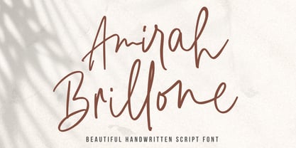 Amirah Brillone is a handwritten signature script with a natural & stylish flow. This font has a multitude of natural looking ligatures in its OpenType features - making the font look as close to natural handwriting as possible. This collection of glyphs is perfect for personal branding. Amirah Brillone is perfect for many different projects such as logos and branding, invitations, stationery, wedding designs, social media posts, advertisements, product packaging, product designs, labels, photography, watermark, special events or anything.
 - Donittan Story by Kotak Kuning Studio,
$17.00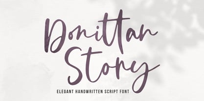 Donittan Story is a handwritten signature script with a natural & stylish flow. This font has a multitude of natural looking ligatures in its OpenType features - making the font look as close to natural handwriting as possible. This collection of glyphs is perfect for personal branding. Donittan Story is perfect for many different projects such as logos and branding, invitations, stationery, wedding designs, social media posts, advertisements, product packaging, product designs, labels, photography, watermark, special events or anything.
 - Aliykit Open by John Moore Type Foundry,
$35.00 Aliykit Open a decorative OpenType font generated from geometry with parallel lines of open and closed forms, by the way they can fit inside the Art Deco style but is part of the design influence of Venezuela in the area of art and cinetic art, his set of characters includes letters for western and eastern European languages and Cyrillic, also provides several ligatures that link between them. It is ideal for decorative display headlines to large sizes.
 - Silk Sans Display by SilkType,
$47.50 Silk Sans Display is the sans version of the high-contrast typeface Silk Serif. The main feature of the font family is the disconnection between the bowls and the stems. However, the bowl is very close to the stem, creating the illusion of connection. Silk is delicate and legible — but above all, it is sophisticated. Silk Sans Display is available in 7 weights, from Extra Light to Black, and supports Western, Central and South-Eastern European languages.
 - Ongunkan Rhaetian Script by Runic World Tamgacı,
$60.00 Rhaetic or Raetic (/ˈriːtɪk/), also known as Rhaetian, was a Tyrsenian language spoken in the ancient region of Rhaetia in the eastern Alps in pre-Roman and Roman times. It is documented by around 280 texts dated from the 5th up until the 1st century BC, which were found through northern Italy, southern Germany, eastern Switzerland, Slovenia and western Austria, in two variants of the Old Italic scripts. Rhaetic is largely accepted as being closely related to Etruscan.
 - Mariné by TipoType,
$19.90 Mariné is a geometric sans but with the softness of humanistic strokes. It’s mild contrast and multiple different styles allow Mariné to work well as both a text and display font. It also includes an Up version and calligraphic features that add a touch of informality. Mariné is available in an extended family and is the close cousin of Amelia (available at MyFonts.com). All differences between Mariné and Amelia appear in the italic and Up versions.
 - Parangon by ParaType,
$25.00 PT Parangon™ was designed in 1986-2002 by Anatoly Kudryavtsev and licensed by ParaType. This type family belonges to Neogrotesque subclass of closed Sans Serif. Letterforms of lower case is based on the tradition of 1710 Civil type and some modern Italic types. The family has a lot of weights and styles including Extra Condensed, Condensed, Regular, Extra Light, Light, Bold, Extra Bold. For advertising and display matter. Also it can be used for texts in advertising magazines.
 - Serp and Molot by ParaType,
$30.00 Designed for ParaType in 2003 by Tagir Safayev. The typeface was inspired by some of the Cyrillic letterforms of Sergey Chekhonin (1878-1936). Chekhonin belonged to the World of Art group, which is so closely associated with the flowering of Russian book and theater design at the beginning of the 20th century. For use in advertising and display typography. Serp & Molot has been adjugded Award of Excellence in Type Design of 'bukva:raz!' ATypI International Type Design Competition, 2001.
 - Shutterbug JNL by Jeff Levine,
$29.00 On April 20, 1950, film comedian Jerry Lewis indulged his love of cameras by opening up Jerry Lewis’ Camera Exchange on Vine Street in Hollywood. It closed in 1951. Thanks to an image preserved within newsreel footage of the shop’s grand opening night, a glimpse of the post-Art Deco signage with its unusual, block style lettering inspired a digital version. Highly unusual and best for novelty projects, Shutterbug JNL is available in both regular and oblique versions.
 - Municipal Pool JNL by Jeff Levine,
$29.00 A photo of the now closed [circa-1953] Lowell Municipal Pool (at 1601 N. 28th St.) in Boise, Idaho shows the words “Municipal Pool” formed into the cement of the entrance to the above-ground swimming facility. Both the lettering and building entrance designs harken back to the Art Deco era and the sign features stencil-like characters. This inspired a typeface aptly named Municipal Pool JNL, and is available in both regular and oblique versions.
 - PLatinum by Letterhead Studio-IG,
$35.00 The pLatinum family was created in 1998. Ink, scanner, Fontographer and as a result Regular and Italic styles of pLatinum typeface. Kyrillitsa'99 International type design competition Award winning typeface. The design style is “Irregular Serif”. The glyphs of pLatinum roman are reminiscent of the Russian types of early eighteenth century—especially in the smaller point sizes. An Italic, surprisingly close to the handwriting copybooks of mid-eighteenth century, is a later addition to the design.
 - Tsubame by Thirdin,
$30.00 "TSUBAME" means swallow in Japanese. These fonts are based on the shape of Tsubame. The relationship between humans and swallows is as deep-rooted. Japanese swallows have adapted to nesting in and around human habitation from ancient time. So in Japan, they prohibited people from catching or killing swallows because of their beneficial role as insect eaters. Since the relationship between humans and swallows is close, this font's letter spacing is designed to be very tight.
 - Retail Script by ITC,
$29.00Retail Script was designed by Vince Whitlock in 1987. It is a font with strong, dynamic base forms and very small ascenders and descenders, which makes a closed, solid overall image. The fine white lines which are traced within the figures make the font a bit more cheerful and the shading makes the figures look three dimensional. The energetic Retail Script is best used in headlines in larger point sizes in order to preserve the look of its fine details. - Kettering 205 by Talbot Type,
$12.99 Kettering 205 is a geometric slab-serif with Art Deco influences, such as lowered crossbars on many characters, and a crossed W. It includes old style non-aligning (lower case) numbers, both proportional and tabular as well as accented characters for Central European languages. It’s a highly individual looking font, but retains good legibility coupled with striking looks as a display font. The Kettering 205 family comprises of six weights and is closely related to Kettering 105, its less Deco flavoured cousin.
 - Tarnese by Eurotypo,
$48.00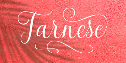 Tarnese is a calligraphic font, created to look as close to a natural handwritten script as possible. Tarnese includes over 60 natural-looking open-type ligatures and and a full set of upper and lowercase alternates, making your design more attractive. In the glyph palette you will also find ornaments that can be used for underlining, and to combine and enhance your text. Suitable for use in designing titles, invitations, title books, stationery designs, quotes, branding, logos, greeting cards, packaging, posters, and more.
 - HGB Ypsilon by HGB fonts,
$23.00 Playing with old rub-on letters led to this alphabet. On the Letraset sheets (the older ones still remember...) there were always letters left over that were never or rarely used. I sometimes let interns play with it. To explain, I first rubbed an example myself. Two y's from a Helvetica made a pretty shape. Looking closely, you see a contoured, italic N. I developed the HGB Ypsilon font from this N. A purely decorative typeface – it could be interesting for some logo.