472 search results
(0.008 seconds)
- Fighting Words by Comicraft,
$19.00
- Zuben - Personal use only

- Mesh Stitch - Personal use only

- Pixel - Personal use only

- PIXymbols Chess by Page Studio Graphics,
$29.00 - Def Writer | BASE Cyr - Unknown license

- Quigglesmith by Comicraft,
$19.00
- Occidental Tourist JNL by Jeff Levine,
$29.00 - Rooky Hand - Personal use only

- Bloc - Personal use only

- Extreme by BA Graphics,
$45.00 - Manic - Personal use only

- Naville by Letterhend,
$16.00
- Reluctant Aviator by Hanoded,
$15.00
- Rounded, two. - Personal use only

- Barnboard by BA Graphics,
$45.00 - BLU Esoteric - Unknown license

- KG Build A Game by Kimberly Geswein,
$5.00
- Rookie JNL by Jeff Levine,
$29.00
- Home Field JNL by Jeff Levine,
$29.00 - KG Makes You Stronger by Kimberly Geswein,
$5.00
- BLU Esoteric - Unknown license

- LHF Cafe Corina by Letterhead Fonts,
$39.00
- Corkboard JNL by Jeff Levine,
$29.00 - Bellanovie by Nurf Designs,
$16.00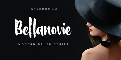
- Janda Apple Cobbler by Kimberly Geswein,
$5.00
- Poster Plain JNL by Jeff Levine,
$29.00
- Whiteboard Modern by Albatross,
$19.95
- Etch A Sketch by JOEBOB graphics,
$9.00
- Fraught by Morganismi,
$12.00
- Exogenetic by Aaron Nicholls,
$19.00
- Drawzing by Fonthead Design,
$19.00
- Bloody Nose by Mabry Creative,
$35.00
- Feltboard JNL by Jeff Levine,
$29.00 - LC Chalk, although a fictional creation for the sake of this description, embodies the essence of nostalgia and creativity, merging the simplicity of handwritten notes with the rustic charm of chalkb...
- Monthly Meeting JNL by Jeff Levine,
$29.00
- JT Symington by JAM Type Design,
$15.00
- Geozone by Ilse Joubert,
$7.00
- Chalkboy by Typefactory,
$14.00
- Penny Pincher by Great Lakes Lettering,
$12.00


