8,097 search results
(0.067 seconds)
- Choplin by René Bieder,
$25.00 Choplin is a modern and clear geometric slab serif with a sturdy heart. It was designed based on the Campton Family, with the same principles in mind: geometry, simplicity and neutrality. As a consequence, Choplin could be seen as an immediate companion to the Campton Family. However, during the process lots of details were changed in order to sharpen the slab serif character which resulted in a slightly different interpretation. Similar to Campton, it is perfectly suited for graphic design applications ranging from editorial, corporate, web, interaction to product design. In addition, it has an extended range of alternative glyphs, ligatures and opentype features which provide flexibility and uniqueness wherever it is placed.
 - Chorine by The Flying Type,
$24.00 Chorine is a retro face, impacting and comfy, available in two cuts. It's great for vintage, nostalgic and psychedelic pieces yet also for creative contemporary designs. Chorine sounds sixties, sounds seventies and sounds perfectly now. Play it!
 - Chopic by Alit Design,
$15.00 Presenting the 🗯️💬CHOPIC Comic Typeface💬🗯️ by alitdesign. The CHOPIC Comic Typeface is inspired by the style of letters in comics that have less serious and fun characters. The lettering of CHOPIC Comic Typeface is a sans serif with display font characters which gives a fun and design impression for retro pop art. The CHOPIC Comic Typeface has 2 style font regular and brushed style and has 2 characters solid and 3D. The CHOPIC Comic Typeface is perfect for creating designs with non-serious concepts, designs for children, book headers, and of course for text on comics. The CHOPIC Comic Typeface also gets a bonus character of 230 Comic-themed illustrations that make creating designs even easier. Simply by downloading The CHOPIC Comic Typeface creating a Comic and non formal themed design is very quick and easy. The CHOPIC Comic Typeface is perfect for magazine cover designs, brochures, flyers. Instagram ads, Canva Design and so on with comic, non-serious, pop art, game mobile and fun design. Besides that this font is very easy to use both in design and non-design programs because everything changes and glyphs are supported by Unicode (PUA). The CHOPIC Comic Typeface contains 565 + 230 bonus glyphs with many unique and interesting alternative
 - Chofines by Viaction Type.Co,
$18.00 Chofines is a serif font with a retro style that is suitable for a variety of design purposes. Has a very soft curve, looks elegant and attractive when applied to the design. Equipped with opentype features such as Stylistic Alternate and rich Standard Ligature. It can be used in various countries because it supports Multilingual, adding to the maximum power of this font. You will get including: This font includes 2 styles, regular & oblique. It is very profitable to buy the Chofines font. Get it Now ! I hope you enjoy it and thank you. Viaction Type
 - S&S Amberosa by Spencer & Sons Co.,
$35.00 Distinctively Americana with a touch of Arts & Crafts, Amberosa is a typographic gem from the late nineteenth century, this undulating and organic typeface is a versatile and refreshing alternative to many of the font designs on the market today. Recapture the elegance of traditional flourished sign writing and make and provide ideal lettering for period inspired design work such as posters, signage, labels and book covers. You’ll find ligatures, 400+ stylistic alternates in keeping with the spirit of this pretty, old-fashioned typeface.
 - S&S Baldwins by Spencer & Sons Co.,
$35.00 Baldwins was inspired by the beauty lettering of ephemera prints. Ideal for product names, packages, labels, old fashioned signs and everything with specific characteristics of past times.
 - Chopin-Bold - Unknown license

- Cholvine by Letterena Studios,
$9.00 Cholvine is a clean, stylish and adaptable sans serif font. It is PUA encoded which means you can access all of the amazing glyphs and ligatures with ease! Add it to each of your posters, designs and pretty much anything that requires a cool touch.
 - Chaplin by Monotype,
$29.99The Chaplin font is a light-hearted script created for display purposes. Chaplin leans slightly to the right. Used for packaging and posters, the Chaplin font has a relaxed charm. - Thorin by Flawlessandco,
$9.00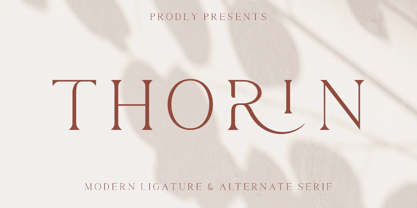 Thorin is a Serif Typeface with Elegant vibes in each character with some alternate. There's some connected letters and some alternates that suitable for any graphic designs such as branding materials, t-shirt, print, business cards, logo, poster, t-shirt, photography, quotes .etc This font support for some multilingual. Also contains uppercase A-Z and lowercase a-z, alternate character, numbers 0-9, and some punctuation. If you need help, just write me! Thanks so much for checking out my shop!
 - Cholens by Mevstory Studio,
$20.00 Cholens is a bold, rounded script typeface in a modern and classy style. OpenType features include old style figures and ligatures. Cholens is ideal for headlines, headers, logos, labels, packaging, postcards, presentations, magazines, invitations, and more. Features: Basic latin alphabet A-Z Ligatures & Alternates Accented characters Numbers, Punctuation, Currency, Symbols, Math symbols & Diacritics Old style figures
 - Chopader by Letterhend,
$17.00 Introducing, Chopader - a vintage sans serif font duo. Inspired by 50s 60s signages, this font made to bring back the good ol' days. This type of font perfectly made to be applied especially in logo, headline, signage and the other various formal forms such as invitations, labels, logos, magazines, books, greeting / wedding cards, packaging, fashion, make up, stationery, novels, labels or any type of advertising purpose. Features : Two fonts (Thin and bold style) numbers and punctuation multilingual PUA encoded Only caps We highly recommend using a program that supports OpenType features and Glyphs panels like many of Adobe apps and Corel Draw, so you can see and access all Glyph variations.
 - Chopsee by TypeUnion,
$35.00 Chopsee is a fun, fluid, versatile font family of 8 weights and matching italics designed by Dan Jones for TypeUnion. The font aims to encompass movement and fluidity with its accentuated curves and terminals. The raised x-height creates more synergy between the lowercase and uppercase characters thus enhancing the visual appearance. The family of 8 weights & italics means you have plenty of usage options whether digital, branding or print - Chopsee black is perfect for that new brand idea you have, while the lighter weights provide a subtle support to clean layouts whether it’s call out text on a website or in print applications such as posters or magazine layouts.
 - Chipen by 38-lineart,
$14.00 I am pleased to present you an excellent futuristic font "Chipen" in unique graphic style! This font consists of regular, expanded, regular italic and expanded italic, these 4 fonts are encapsulated in one variable. With one font variable, this will cover 4 styles and cover all the weights between regular and expanded. If you are used to working with variable fonts it will give you more weight options, if you have never tried this variable font it will be an amazing new experience for you, take a look at this video snippet: https://youtu.be/jgqNPGeoVjc Chipen comes in bold and with a “RoundCube” cut, this is perfect for modern, Sci-Fi, and technology themes. Coupled with the stripe in the middle of the makes it appear more sporty. Not only that, this stripe can also display "Eighties" if you package it in a retro concept. Another strength of this font is the lowercase ligature, we present a lot of ligatures and one of them might be suitable for your logo brand. Finally, this font is a dynamic font with a variable concept capable of covering more 'weight', unique to appearing in various eras, exploring the world of retro and even science and fiction.
 - Chaline by Flawlessandco,
$9.00 Introducing "Chaline" - A Modern Elegant Sans Serif Font. Chaline is a refined and contemporary sans serif font that seamlessly blends sophistication with versatility. There's some connected letters and some alternates that suitable for any graphic designs. This font support for some multilingual. Also contains uppercase A-Z and lowercase a-z, alternate character, numbers 0-9, and some punctuation. If you need help, just write me! Thanks so much for checking out my shop!
 - Carta S - Unknown license

- Planet S - Unknown license

- Fol S - Unknown license

- Crem S - Unknown license

- Charles S. - Personal use only

- Rensor S by Smartfont,
$25.00 Rensor S is minimalist font with smooth and elegant rounded edges. It has been designed with a clean, modern design aesthetic. Rensor S is perfect for poster design, ui design, mobile apps, branding and logo development, wayfinding and signage, digital art and much more.
 - Bradley S. by Samuelstype,
$18.00
- Corporate S by URW Type Foundry,
$180.99 The Corporate ASE typeface trilogy was designed by Prof. Kurt Weidemann, a well-known German designer and typographer, from 1985 until 1990. This superb trilogy consisting of the Corporate A (Antiqua), Corporate S (Sans Serif), and Corporate E (Egyptian) is a design program of classical quality, perfectly in tune with each other. Weidemann says: “My ASE trilogy, quite like triplets, is in perfect harmony and covers all needs of modern typography!” Initially exclusively designed for DaimlerChrysler as a corporate font, the ASE trilogy may be now licensed and used without restriction. URW++ digitized the ASE for DaimlerChrysler and Prof. Weidemann and is the exclusive licensing agent for this outstanding and extremely popular typeface program. Meanwhile, URW++ enhanced the Corporate ASE family in regular, bold, italic, and bold italic by Greek, Cyrillic, and all additional Latin characters to cover Eastern Europe including the Baltic Rim, Romania and Turkey. Corporate ASE in regular, bold, italic, and bold italic is now available in the WGL 4 character complement.
 - Sadina S by NumidiaType,
$29.00 Sadina™ S is the small lowercase font family of the default version Sadina™, It comes with the same OpenType features provided in the default family, and all lowercase glyphs are designed smaller. It will give you a different scripting taste.
 - Colin by Tickbite Type,
$18.99 Colin is a fresh, somewhat futuristic geometric sans serif type with a large x-height that, to me, communicates both seriousness and cheerfulness. It supports 70 languages incl. monotonic Greek and comes in 7 weights with a small number of alternate glyphs (ss01) for more flexibility. It features fractions, old style and tabular figures. Colin works great in titles, displays and short paragraphs. And where does it come from? To be honest, the reason for this font is a selfish one. I wanted a typeface where my initials (n and c) look identical, just rotated by 90 degrees. That didn’t completely work but, hey, it’s pretty close.
 - Choir by Linecreative,
$16.00 Choir is a modern sans serif font. Each letter consists of three combined lines that connect together like a maze. This font is suitable for logos, business cards, magazines header, Flyer Titles, or large-scale oven artworks.
 - Shopie by Hendra Pratama,
$19.00 Shopie is a handmade script made with a marker pen. It is useful for a variety projects such as quotes, book covers, t-shirt designs, magazine titles and much more. Features: 370 Glyphs Uppercase Lowercase Symbols & Punctuation Support more than 62 Languages Support OpenType Features Support PUA Unicode
 - Planes-S-Modern - Unknown license

- Mod Quad S - Unknown license

- genotype S BRK - Unknown license

- Jenna s Kitties - Unknown license

- Collective S (BRK) - Unknown license

- Dipple KK S - Unknown license

- Collective S BRK - Unknown license

- TypographerGotisch Schatten S - Unknown license

- Mod Circle S - Unknown license

- S Water Jump by Supfonts,
$10.00 Water Jump will be perfect for wedding lettering, beautiful frame for your home, book covers, greeting cards, logos, marketing, magazines or anything that requires cute handwritten lettering :) What's inside: Multilingual support Cricut support If you have any questions, please contact me directly or in instagram @superdizigner
 - Neuzeit S LT by Linotype,
$30.99 Designed by Wilhelm C. Pischner, Neuzeit-Grotesk first appeared in 1928 with the font foundry D. Stempel AG. In 1966, Neuzeit S was introduced by Linotype-Hell AG, intended for large bodies of text and predecessor of Siemens corporate design. Neuzeit S is timeless, combining strength of form and objectivity and legible even on inferior papers.
 - H-AND-S by AND,
$89.00 A common creation: (to pass from one hand to the other): For the first time, various hand-signs from diverse sources are unified into one single visual style. This compendium is the result of 15 years of incubation and 7 years of creation. In his travels throughout the world, graphic designer Jean-Benoit Levy, principal of the visual studio AND, has collected pictures of multiple hand signage. Uncertain what to do with those signs, he kept them year after year until the idea came to unify almost 200 handsigns into one single family. In accordance with this entire collection, the name of the typeface is a mix: "h-and-s". A global collection: (To put in good hands): We all have one thing in common: Hand-signs are an international language, they are meant to be understood by all of us. Each of us regularly comes in contact with modern hieroglyphs such as the hand-sign-codes that are so prevalent in our daily life. This way of communication belongs to no one in particular and to all of us in general. Even if the sense of certain signs varies from one culture to the other, there is a common hand-sign language. We are surrounded by this language of handsigns each time we step in a store, we eat, open a container of milk, we clean up, use package of wash-powder, by shaving, when we work, use tools, at home, by tearing the envelope of a condom, by traveling, etc. When we encounter these signs, we all understand them easily. A visual connection: (To go hand in hand): This typeface is a global visual statement. Collecting, ordering, redrawing, unifying. Reconstructed and assembled into one original alphabet, H-AND-S is a unique and complex signs program. Our choice is based on daily gestures and global hand-codes. Logically this typeface starts with the "American Sign Language" and expands on two type-variations, each on two levels of keyboard. The international team of H-AND-S would like to send his special thanks to all of the anonymous graphic designers throughout the world who designed different hand-signage and who influenced and inspired to create such a sign collection into one unified family. We, the global nomad team of AND, hope that you will enjoy our H-AND-S. Additional Credits Production: Studio AND. www.and.ch. Concept, Idea & Creative Direction: Jean-Benoît Lévy, Switzerland / USA. Research & Sketches: Eva Schubert, Germany. Illustration, Graphic Design & Visual Fusion: Diana Stoen, USA. Transfer, Adaptation & Refining: Moonkyung Choi, Korea. Finalization & Checking: Sylvestre Lucia, Switzerland. Coaching & Technical Advice: Mike Kohnke, USA. Creative Energy & Implementation: Joachim Müller-Lancé, Germany / USA.
 - Grotesk S SB by Scangraphic Digital Type Collection,
$26.00Since the release of these fonts most typefaces in the Scangraphic Type Collection appear in two versions. One is designed specifically for headline typesetting (SH: Scangraphic Headline Types) and one specifically for text typesetting (SB Scangraphic Bodytypes). The most obvious differentiation can be found in the spacing. That of the Bodytypes is adjusted for readability. That of the Headline Types is decidedly more narrow in order to do justice to the requirements of headline typesetting. The kerning tables, as well, have been individualized for each of these type varieties. In addition to the adjustment of spacing, there are also adjustments in the design. For the Bodytypes, fine spaces were created which prevented the smear effect on acute angles in small typesizes. For a number of Bodytypes, hairlines and serifs were thickened or the whole typeface was adjusted to meet the optical requirements for setting type in small sizes. For the German lower-case diacritical marks, all Headline Types complements contain alternative integrated accents which allow the compact setting of lower-case headlines.


Page 1 of 203Next page