216 search results
(0.031 seconds)
- Shoguns Clan - Unknown license

- Santa Christmas by Ake,
$12.00 Santa is a lovely duo font (display and script). Together or apart, these fonts are ideal for adding a chic and cheery touch to your crafts. This font is PUA encoded which means you can access all glyphs and swashes with ease!
 - Requiem II - Unknown license

- Qalisha Signature Script by Letterena Studios,
$10.00 Qalisha Signature consists of two fonts designed to complement each other perfectly. Together or apart, these fonts are ideal for adding a chic and cheery touch to your crafts. This font is PUA encoded which means you can access all glyphs and swashes with ease!
 - Christmas Combine Script by AEN Creative Studio,
$15.00 Christmas Combine consists of two fonts designed to complement each other perfectly. Together or apart, these fonts are ideal for adding a chic and cheery touch to your crafts. This font is PUA encoded which means you can access all glyphs and swashes with ease!
 - Cosmic Dream Sans by Carpiola Studio,
$10.00 Cosmic Dream consists of two fonts designed to complement each other perfectly. Together or apart, these fonts are ideal for adding a chic and cheery touch to your crafts. This font is PUA encoded which means you can access all glyphs and swashes with ease!
 - CGM Locust Resistance - Unknown license

- CGF Arch Reactor - Unknown license

- The Pablo Meganta Signature by Letterena Studios,
$10.00 The Pablo Meganta consists of two fonts designed to complement each other perfectly. Together or apart, these fonts are ideal for adding a chic and cheery touch to your crafts. This font is PUA encoded which means you can access all glyphs and swashes with ease!
 - Royal Ambition by Lemonthe,
$13.00 Royal Ambition is a perfect mix modern script and sans serif font. Together or apart, these fonts are ideal for adding a chic and cheery touch to your crafts. It was created to help you designing makes gorgeous logos, posters, wedding invitations, blog posts, social media, and more!
 - VTG Watson Steel Pen by Voltage Ltd,
$35.00 If you're regularly compelled to scrawl fiery French poetry, declare independence, or design indie folk albums, then Chris Watson's romantic Steel Pen typeface is for you. With old-school edge and spirited opentype alternates, it's as gallant as type gets.
 - Wild Flower Peach Creme by PeachCreme,
$14.00 Bonjour, and we are pleased to present "Wildflower"! A cheery, little hand-lettered typeface that has a charming and reassuring air. Ideal for making banners, logos, cards, and packaging, among other things. You may use its endearing and friendly personality to offer your work a genuine, one-of-a-kind vibe.
 - Rondabo by Yoga Letter,
$14.00 "Rondabo" is a cute display font with cute doll headdresses, cherries, a smiling sun, tulips, carrots, and cute bunny ears. This font can be used for spring, Easter, book titles, movie titles, cartoons, magazines, logos, and more. This font is equipped with upper- and lower-case letters, numerals, punctuation, and multilingual support.
 - Ceriburn by Typeskets,
$18.00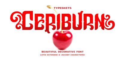 Ceriburn is inspired by the sweetness and richness of cherries. It easily evokes impressions of nature, elegance, and romanticism. You can use this stunning decorative font for logos, packaging, business cards, crafts, books, labels, headlines, invitations, print templates, and a multitude of other design ideas! Letter, Number & Punctuation, Accent Characters, Alternates Features.
 - Petit Four by Hanoded,
$15.00 A "Petit Four" is a small, bite-sized, French pastry. The font before you is a bite-sized Hanoded original. It is hand made, fun to use and comes with a lot of calories. Like its namesake, use Petit Four sparingly and it will be the cherry on top of your design.
 - Crunchy Taco - Unknown license

- KR Jigsaw Joey - Unknown license

- Space Quest by Lone Army,
$10.00 This font is inspired by aerospace. I use the negative spaces of each font to form planets or rockets. every glyph has its power. can be used as initials or as a word nicely. and also supports multilingual. the space design side is also found in punctuation to! thanks and enjoy the design! cherrs
 - Kage Retro by Sakti Avellin,
$15.00 Kage Retro is a fun and retro font, it's perfect for designs that need a playful, cheery accent. Kage Retro is suitable for book covers, posters, packaging, merchandise, logotypes, and many more! -standard glyph -Works on PC & Mac -Accessible in Adobe Illustrator, Adobe InDesign, it even works in Microsoft Word. PUA Encoded Characters – Fully accessible with no add-ons.
 - GFWaterproof - Unknown license

- Kirschwasser NF by Nick's Fonts,
$10.00An unannotated photocopy tucked inside the leaves of an old lettering book yielded this unusual and exuberant Art Deco face. The caps feature a simple “bubbly” pattern that makes this offering pack a punch, not unlike the German cherry brandy for which it is named. Both versions of the font include 1252 Latin, 1250 CE (with localization for Romanian and Moldovan). - Cabriolet by JVB Fonts,
$35.50 Cabriolet is a connected geometric script re-interpretation inspired by old chromo emblems of Chevy truck Apache of 1960. With three weight variables, it can be used in logos, games and graphic related to cars, automotive, American, Detroit, Art Deco, 1940, 1950, 1960, vintage, retro, classic and old machines. Can be expandable using underscore for connect words or expanding between letters space.
 - Kaldi by Hemphill Type,
$18.99 Kaldi is a tall condensed typeface that has gone through a natural process of handcraft and refinement to produce a speciality blend. On consumption expect light and dense notes with an earthy undertone. This font family was inspired by the legend of Kaldi – the goat herder who discovered the coffee plant after his goats started dancing after eating the coffee cherries.
 - Manju by Eko Bimantara,
$19.00 Manju font family represents retro 70s styles which have soft and chewy characteristics. Designed to be fit for display, titling, good for logo, header, and large size usage. The light styles can be also used for short text. It consists of 10 styles from thin to heavy with matching obliques. It has several opentype features such as alternates and ligatures, it also supports broad latin languages.
 - Jolly by Sebastian Losch,
$- Jolly is a cheery, little display typeface that is suitable for headlines and informal body-copy. Being slightly slanted to the right, jolly has a fairly positive straightforward appearance which makes it pleasant to read. Its various Open Type features, such as swashy alternates for the capitals, ligatures and stylistic alternates as well as the small caps and the extended language support make it versatile and open for different applications.
 - PH Font by Fontfabric,
$29.00 PH from Fontfabric Type Foundry is a multifaceted font system consisting of different font weights and type of condensation. Every one of these font weights contains a number of extension types - Condensed, Narrow, Regular, Extended and Wide. Along with all of this, you will also discover added groups of extras which could serve as a foundation or add that extra "cherry on the cake" to each unique design.
 - Crocodile Feet by Hanoded,
$15.00 I had a Neneh Cherry song in my head when I made this font. In ‘Buffalo Stance’ she sings about a gigolo with his hands in his pockets and his crocodile feet. I liked the sound of it, so Crocodile Feet font was born. Crocodile Feet is a children’s book font: bold and cute, with easy to read glyphs. Comes with double letter ligatures in both the regular and the dots style.
 - Cebreja by Rafaeiro Typeiro,
$29.90 Cebreja is made of “cereja” (Cherry in English) with “br” in the middle, “br” from Brazilian. So called because the font is made with Brazilian cherry wood, which allows thin rods to be carved without breaking and maintaining its shape with use and allowing the ink to spread evenly and precisely, since the density of the wood guarantees this robustness. Its well-polished and minimalistic, works wonderfully on its own for logos, headlines, posters, packaging and smaller applications! And with seven different weights with their correlated italics and all SmallCaps to choose from, your option to create more unique and versatile designs is a lot wider. Have fun and produce more. This typography has the OpenType features that are standard in our type foundry, complete set of numerals, standard ligatures, discretionary ligatures, Stylistic Alternates, Stylistic Sets –ss01 and ss02, in addition these features have been enriched with smarter scrypts, which make fractions form automatically; prevents alternate glyphs from clash. Making composition with this typography even faster and easier.
 - Koelle Ornaments by insigne,
$21.99The Koelle Ornaments series is based on the etchings of Chris Koelle of Portland Studios. This is the second collaboration between insigne and Portland Studios; the first yielded the inky and active script Blue Goblet. Chris has a unique style where he "frames" his work with small icons related to the story or subject. These are now available as Koelle ornaments. Koelle Ornaments have a gritty, used appearance, and have a late 70's stylistic feel to them. There are 145 highly detailed illustrations in the entire pack, separated into four different fonts. These illustrations can be resized without any loss of quality, and can be easily converted to outlines and modified. Some of the ornaments have a Christian theme, while others are more generic. To view what ornaments are available and the keys they map to, please view the sample .pdf. The sample .pdf is an excellent reference guide, and we encourage you to print it out to quickly refer to your favorite ornaments. - Jacuzzi Room by Rocket Type,
$20.00 Jacuzzi Room is now open 24 hours day and we’ve got unlimited drinks and hors d'oeuvres available. Jacuzzi Room is a cheery script font inspired by the ubiquitous Beverly Hills Hotel sign, capturing the same gestural yet timeless quality. Have a stroll through vintage era Beverly Hills and take a dip into the Jacuzzi Room. Adds a ton of fun mid century chic flair to any design whether it be titling, headlines, signage, t-shirts book covers.
 - Papyrus by ITC,
$40.99Papyrus is a roman calligraphic typeface with distinctive human touches like rough edges, irregular curves, and high horizontal strokes in the caps. It imparts a warm and friendly ambience to everything from restaurant menus to book covers. American Chris Costello created the popular font Papyrus in 1983 and counts it as one of his proudest accomplishments. In addition to designing type, Costello is a prolific graphic designer, illustrator, and web designer. - Almanor Peninsula by Subqi Studio,
$15.00 Introducing our new font, Almanor Peninsula . Not too shabby a name, right? A display logotype script, not too bold and not too thin either. This font has been created for your sporty display projects, whatever they may be. This font contains the basic script ligature 'tt' with some necessary alternates here and there. Plus some swash for the cherry on top. This font is PUA encoded already, so you can access all the glyphs with the basic character map apps. So have fun with this one !
 - Treasure Trove by Comicraft,
$19.00 X marks the spot -- and the height of the lower case letters -- in this cartographic calligraphy mapped out for you by lettering landlubber Jolly ’JG’ Roshell and his trusty crowquill. Mapquest "Mystery Island" and be sure to keep your eyes on those scurvy dogs that call themselves your crew, this font is spilling over with dubloons and pirate booty and it’s finders keepers! Artwork by Chris Bachalo from Captain Stoneheart and the Truth Fairy and Carlos Pacheco from Arrowsmith
 - Dranskof by PintassilgoPrints,
$29.00 Dranskof is a light-hearted, cheery font. It is inspired by a page from an extraordinary serbian publication for children by the writer, poet and journalist Duško Radović. Dranskof whimsical letterforms are full of joie de vivre, consisting of different glyphs on upper and lower case slots for added flexibility.The contextual alternates feature will instantly alternate glyphs. To literally add a twist here and there, Dranskof is equipped with a spirited set of stylistic alternates, easily accessible through stylistic alternates feature or by the glyphs palette. This is definitely a 'make feel good' font. Enjoy!
 - As of my last knowledge update in April 2023, while specific details about a font named "Cherry Blue" by Zain Fahroni might not be extensively documented or widely known, I can still conceptualize an...
- Ice Cream by Positype,
$25.00 Ice Cream is the product of an abandoned typeface concept a non-connected script for food packaging. The original exemplars were so iconic, so inspiring, it demanded completion. Curvy with a huge dollop of fun, to be honest, and I wouldn’t have it any other way with this one. Influenced heavily by Kari and Juicy (and even the shameless copies of my originals, wink wink), Ice Cream’s recipe blends in some very simple elements that are unobtrusive and clean, perfect for packaging designs, children’s books, and anywhere a light-hearted scoop with a cherry on top is needed.
 - VLNL Gaufre by VetteLetters,
$35.00 VLNL Gaufre is a pixel-based font with holes designed by Donald Roos. Each character is built on a grid of doughnut-like elements, which makes it look like a kind of dried dog food, or Belgian waffles. Despite the grid Gaufre still has enough warmth due to the doughy, slightly rounded corners. And because it’s prepared with a hot waffle iron of course. The end result is a merry, chunky typeface that smells of doughnut. Use it for logos or headlines, just add butter and sugar or, better still, top it with whipped cream and cherries. Yummie!
 - Nexa Rust by Fontfabric,
$35.00 Nexa Rust from Fontfabric Type Foundry is a multifaceted font system consisting of font sub-families Sans, Slab, Script, Handmade and Extras. Each of these sub-families contains a number of font weights which have a characteristic warm, rough look and display a few degrees of saturation. Nexa Rust is a rough version of the already popular Nexa and Nexa Slab families with added new matching Nexa Script and Nexa Handmade fonts. Along with all of this, you will also discover added groups of extras which could serve as a foundation or add that extra “cherry on the cake” to each unique design.
 - Collateral Damage by Chank,
$59.00Collateral Damage is a classic splatter font from the earlier days of the internet. A consistent fan favorite since its initial release in 1999, this ink-dripping font was inspired by the gonzo art of Ralph Steadman. It looks hand-painted, like graffiti. Or crazy scary, like splattered blood. It was made by designer Chris Hunt who lives in the Canadian North with the polar bears. After years as a Chank.com exclusive, it is now available at MyFonts for your personal or commercial use. - FairyTale by Comicraft,
$29.00 In its beauty, Comicraft's Fairytale font is without rival in the heavens, the earth, or the stuff of men's dreams! A wee thing it may be, but 'tis like a star pulled from the sky. Luminescent. Radiant. Perfect. Yes! PARADISE can be yours...from the pages of "Captain Stoneheart and the Truth Fairy," comes a font that might very well change your life forever... it's a dream, a myth, a neverending story, it's a FairyTale! Words by Joe Kelly & art by Chris Bachalo from Captain Stoneheart and the Truth Fairy


