1,045 search results
(0.008 seconds)
- Chalkboy by Typefactory,
$14.00 Chalkboy – Handwritten Chalk Font is a fun and casual display font suited for kids, playground, or school theme. Whether you’re using it for crafting, digital designing, presentations, or greeting card making, it’s perfect!
 - Amethyst Zucchini - Unknown license

- Aneska Kids by Ditatype,
$29.00 Aneska Kids is a display font. Made with a playful style, it brings a fun and chic typeface. Chalk Brush is best used for card, branding, logotype, and quotes. Features: - PUA Encoded - Multilingual Support - Numerals and Punctuation
 - KG Chasing Pavements by Kimberly Geswein,
$5.00 This handwriting font uses the texture of canvas or linen showing through the lettering. The texture lends itself well to chalk or crayon, although with a close enough look you can see the true texture of fabric.
 - Instructor by Chank,
$59.00Introduced as the Chank Font of the Month for May 1998, Instructor was drawn Roger Lootine and fontified by Chank. Roger was an instructor at Art Instruction School. You know the "Draw Tippy the Turtle" ads? That's where Roger used to teach. He also draws a cool comic called Residue. "Roger's got the best handwriting I've ever seen, and you can download it today!" says Chank. "How lucky are you? Way lucky!" Now available in OpenType format for your Personal or Commercial Use. - Crimes Times Six by JSH creates,
$39.95 Crimes Times Six is a cool horror font, originally created with a chalk stick back in 2012, by Jonathan S Harris. The typeface design works very well in video games, movies and broadcasting, but also looks great on clothing and posters.
 - Gessetto by Resistenza,
$39.00 Gessetto is an extensive chalk font family, containing script, sans, roman, figures and ornaments. One of the things most charming about chalkboard lettering is the variation; in both texture and style. Our goal was to achieve a real chalk effect using the varied typographic genres in a digital format. With flexibility and control for the designer in mind, we built a digital chalk toolkit. The script is a fusion of Italic Roman and cursive, it contains swashy alternates for each capital letters with some long and extended flair on some ascendent and descendent letters. An all caps high contrast sans is in 5 complimentary styles. The Roman is precisely proportioned and maintains elegance while being bold. There is a set of Figures and ornaments. Gessetto is perfect to grab attention on signage, print advertising and editorial applications like book covers, but suits branding applications too. The diverse styles and subtle handcrafted textures in this display type family will well serve any designer looking for the authentic chalkboard aesthetic. We recommend to combine Timberline with: Turquoise
 - Punk Head by Ditatype,
$29.00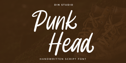 Punk Head is a handwritten font. With a natural and beautiful handwritten style, it brings a classy and chic typeface. Chalk Brush is best used for branding, logotype, and quotes. Includes: - Punk Head (OTF) Features: - Alternates - PUA Encoded - Multilingual Support - Numerals and Punctuation
 - Industria - Unknown license

- Rase Nicolous by Graffiti Fonts,
$24.99 Rase Nicolous is a tall, handwritten graffiti font built to emulate a particular category of modern American, west coast graffiti styles. The varied stroke width & rough edges can produce the look of a number of different writing implements, paint brush, pencil, marker, chalk etc.
 - Skippy Sharp by Chank,
$99.00 Skippy Sharp was drawn by Skippy McFadden in 1995 and faxed to Mister Chank Diesel. Chank completed the character set, added extensive kerning and created a very friendly, informal marker handwriting font. The font is also enhanced for OpenType use with Contextual Alternates for a more natural and organic handwriting style, and true Small Caps, too.
 - Gobbler by Chank,
$49.00Gobble gobble gobble! The Gobbler font was drawn with a leaky pen on a napkin at the Modern Cafe in Northeast Minneapolis while the designer, Mister Chank Diesel, was waiting for some pot roast. “Apple cobbler drippings on the napkin add more character to the strokes of each letter,” says Chank. This font was originally named Modern Napkin, a free font released in 1997. Chank completed the character set, fixed some curves, and cleaned up some of the apple cobbler to make a more elegant font in 1999. Gobbler works great for either text or display purposes. - Arco Crayon by Okaycat,
$29.95 Real crayons were used in the making of this font. Yes, design can be fun again! Need to create the textured look of crayon, chalk, conte, or charcoal? Use Arco Crayon. Arco Crayon is extended, containing West European diacritics & ligatures, making it suitable for multilingual environments & publications.
 - Of the Fleshlady - Unknown license

- BabOonjaZzbaSsoOn - Unknown license

- Rabid by AdultHumanMale,
$15.00 Rabid is an inky, messy, super distressed display font. It's part charcoal, part chalk strokes, add a splash a of red and it starts to look like blood. Why SO Serious? It has about 200 glyphs including all those extra pesky foreign features. O Hope you like it.
 - Transam - Unknown license

- Woodrow by Chank,
$49.00If Mister Frisky is a bit too kooky for your project, try Woodrow. The big floppy serifs and hand-drawn strokes give this font very "Chanky" characteristics. Woodrow is bold, bouncy, fun and legible like Mister Frisky, but it is also a little more traditional and structured. Chank created Woodrow in 1997. It was named in honor of The Chank Company's first office assistant, Scott "Woodrow" Macdonald. - Red Pen Society - Unknown license

- Treves Sans by AdultHumanMale,
$15.00 Treves Sans is a scratchy, messy, hand written display font. It has the look of charcoal or a brass rubbing, reversed in lighter tones it looks like chalk. It reminds me of Edward Gorey's or Eddie Campbell's styles of sketching. It has about 200 glyphs including all those extra pesky foreign features.
 - Cocaine by Chank,
$39.95Chank worked with Josh Eshbach, an intern from Minneapolis College of Art and Design, to create Cocaine as the Chank Font of the Month for November 2000. Inspired by Speedball type designs of the ’20s and ’30s, Cocaine has been redrawn and streamlined for use in the digital age. Curvy and round and relishing in its idiosyncrasies, Cocaine recalls vintage French wine posters and antique sheet music covers. - Badoni by Chank,
$49.00"Grunge Typography? I invented it!" claims Chank Diesel. Badoni was created in 1993 for use in CAKE, a fanzine that reveled in grunge music. As creative director of CAKE, Chank wanted the magazine's design to reflect the music it glorified. Kurt Cobain was alive and miserable. Soundgarden had long hair. Seattle was everywhere. Chank's answer was Badoni, a gritty and distressed typeface that is a sign of the grunge glory years. - Ass - Unknown license

- Manlychalk by Allouse Studio,
$16.00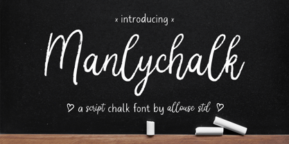 Proudly Presenting, Manlychalk A Script Chalk Font. Manlychalk is perfect for any titles, logo, product packaging, branding project, megazine, social media, wedding, or just used to express words above the background. Manlychalk also come with Multi-Lingual Support. Enjoy the font, feel free to comment or feedback, send me PM or email. Thank You!
 - Chalkvibes by Allouse Studio,
$16.00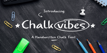 Proudly Presenting, Chalkvibes A Handwritten Chalk Font. Chalkvibes is perfect for any titles, logo, product packaging, branding project, megazine, social media, wedding, or just used to express words above the background. Chalkvibes also come with Multi-Lingual Support. Enjoy the font, feel free to comment or feedback, send me PM or email. Thank You!
 - Pennychalk by Allouse Studio,
$16.00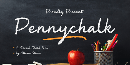 Proudly Presenting, Pennychalk A Script Chalk Font. Pennychalk is perfect for any titles, logo, product packaging, branding project, megazine, social media, wedding, or just used to express words above the background. Pennychalk also come with Multi-Lingual Support. Enjoy the font, feel free to comment or feedback, send me PM or email. Thank You!
 - Karara Shadow by Kufic Studio,
$20.00 Karara Shadow, a complete font set and additional font style of Karara. The word Karara means patience & steady. The style is achieved by practicing and studying the modern techniques to deliver high-end professional font. This specific font had a tint of wall chalking & texture. Carefully engraved and stenciled to delivery clean cuts and design.
 - Worldchalk by Allouse Studio,
$16.00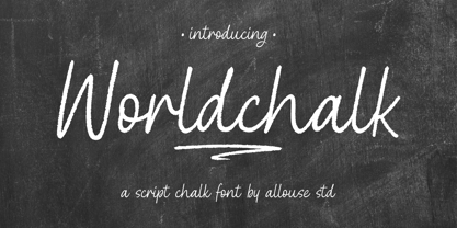 Proudly Presenting, Worldchalk A Script Chalk Font. Worldchalk is perfect for any titles, logo, product packaging, branding project, megazine, social media, wedding, or just used to express words above the background. Worldchalk also come with Multi-Lingual Support. Enjoy the font, feel free to comment or feedback, send me PM or email. Thank You!
 - Gradechalky by Allouse Studio,
$16.00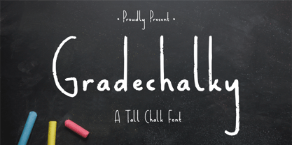 Proudly Present, Gradechalky A Tall Chalk Font. Gradechalky is perfect for any titles, logo, product packaging, branding project, megazine, social media, wedding, or just used to express words above the background. Gradechalky also come with Multi-Lingual Support. Enjoy the font, feel free to comment or feedback, send me PM or email. Thank You!
 - Onlychalk by Allouse Studio,
$16.00 Proudly Presenting, Onlychalk A Handmade Chalk Font Onlychalk is perfect for any titles, logo, product packaging, branding project, megazine, social media, wedding, or just used to express words above the background. Onlychalk also come with Multi-Lingual Support. Enjoy the font, feel free to comment or feedback, send me PM or email. Thank You!
 - LC Chalk, although a fictional creation for the sake of this description, embodies the essence of nostalgia and creativity, merging the simplicity of handwritten notes with the rustic charm of chalkb...
- Farmhouse Chalkboard by Allouse Studio,
$16.00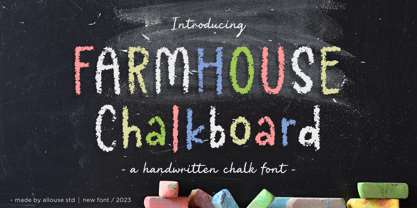 Proudly Presenting, Farmhouse Chalkboard A Decorative Chalk Font. Farmhouse Chalkboard is perfect for any titles, logo, product packaging, branding project, megazine, social media, wedding, or just used to express words above the background. Farmhouse Chalkboard also come with Multi-Lingual Support. Enjoy the font, feel free to comment or feedback, send me PM or email. Thank You!
 - Uncertainty by Okaycat,
$25.50 Uncertainty 2010 Edition is an intensely textured typeface carefully rendered by hand. This font is faded with a chalk-like texture. Please be aware that working with this highly detailed font may slow some graphics software as it requires more memory. Uncertainty is extended, containing West European diacritics and ligatures, making it suitable for multilingual environments and publications.
 - Snipple - Unknown license

- Walls by Piñata,
$8.00 What do you use to write a price tag at a store or to design a wall menu in a cafe? What to choose – a marker or chalk? Now it makes no more sense to be torn apart by the choice – use both techniques for your design. Walls fontfamily allows to perfectly combine an eco-friendly style with contemporary motives. Walls fontfamily supports over 70 languages and consists of 10 typefaces in 5 popular weights (Thin, Light, Regular, Bold, Black). Initially we wanted to create a font that would imitate an inscription made by a square tip marker which is usually used to write price tags at supermarkets, shops and cafes. During the working process we've decided to extend the conceptual boundaries of the Walls fontfamily and added 5 rough typefaces that imitate the style of ecologic chalk writing
 - Dong - Unknown license

- Saltwater - Unknown license

- ZsaZsa Galore by Chank,
$39.95Chank created Zsazsa Galore as a fresh alternative to Mister Frisky, another jerky, hypercaffeinated interpretation of the traditional roman alphabet. The difference this time is that the new font has no descenders. Every letter comes to rest hard on the baseline. It sits there firmly rooted with branches wiggling around in the air. It was released as the Chank Font of the Month in October 1999 and it was named after Zsa Zsa Gabor because she is beautiful. - Moonshine - Unknown license

- Whorn - Unknown license


