10,000 search results
(0.018 seconds)
- Be Cool by Ana's Fonts,
$12.00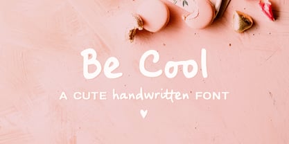 Be Cool is a cute handwritten font with an alternate character set (A-Z, a-z) and an extra set of swashes and ornaments to help decorate your text. This font includes: - A-Z, a-z, numbers and punctuation - Multilingual support - Dozens of ligatures that give it a true handwritten feel Use Be Cool in any design that needs a handwritten feel, such as signatures, notes and quotes, logos and branding.
 - Be Bright by Seniors Studio,
$13.00 Be Bright is a sweet elegant handbrushed calligraphy font. It has a varying baseline with separate swashes that can be applied to the beginning and ends of all lowercase letters. Painted on paper, then scanned, vectorized and carefully made into a font. Be Bright includes several ligatures and international support for most western languages. For the separate swashes font, type lowercase a-z for the beginning swashes and end swashes (access to the glyphs panel is not available, just add swashes manually). The font is perfect for branding, logos, greeting cards, wedding stationery, quotes and more.
 - OCR Be by T-26,
$29.00 - Just Be by Roland Hüse Design,
$12.00 JUST BE is a playful brush script. Perfect for titles, headings and logotypes for blogs, ads, quote prints, home decor, book title, invitation, birthday, custom product, lifestyle imagery (like quotes and stuff). Character set contains Eastern and Western European Latin accented letters. For additional customisations (for logotypes for example) please email me at contact@rolandhuse.com You MAY NOT sell this font or claim them as your own. You MAY NOT edit or rename this font. You MAY NOT redistribute this font. Thank you I hope you like this font & good luck with your project! Roland Instagram: @rolandhusedesign Background images of "Just Be" main poster by Annie Spratt from unsplash https://unsplash.com/@anniespratt "Your best moments in life are ahead" by Helena Hertz https://unsplash.com/@imperiumnordique paper bag mock up by Graphic Burger https://graphicburger.com"
 - Manno - Unknown license

- Annon - Unknown license

- annone - Unknown license

- Cannu by DYSA Studio,
$19.00 Cannu is a Modern Typeface. This another collection of Serif is perfect for your next branding project, excellent for your business. Cannu have a smooth edges, so this font gives an authentic handcrafted feel style. Cannu is perfect choice for people looking for clean, modern, minimalist, elegant, beauty design styles. Suitable for almost any graphic designs such as logo, branding materials, business cards, gift cards, t-shirt, cover, thumbnail, print, poster, photography, quotes .etc
 - Kanote by Letterhend,
$15.00 Introducing, Kanote. A Whimsical display font. This typeface is have a playful and casual look, very suitable to use for headline, title, logo or anything especially related with fun themed design project. Features : uppercase & lowercase (alternates) numbers and punctuation multilingual PUA encoded We highly recommend using a program that supports OpenType features and Glyphs panels like many of Adobe apps and Corel Draw, so you can see and access all Glyph variations. How to activate opentype feature : https://letterhend.com/tutorials/using-opentype-feature-in-any-software/ Email us to letterhend@gmail.com if you need something! Happy Designing!
 - Canto by Lipton Letter Design,
$29.00 Inspired by Edward M. Catich’s seminal thesis on the origins of the Roman inscriptional style, such as that found on Trajan’s column, Richard Lipton’s Canto traces the path from an expressive, preparatory Brush (with Brush Open to preserve gestural details at smaller sizes), through informal Pen, to the formal Roman. Classical capitals are accompanied by Lipton’s own calligraphic lowercase, small caps, and swashes.
 - Grand Canyon by Red Rooster Collection,
$45.00 Based on an early wood type design. An original creation, that kept growing...!
 - BR Candor by Brink,
$30.00 BR Candor is a geometric sans based on the functional characteristics and raw geometry of early European sans serifs. BR Candor however, is a more modernist interpretation of these classic styles, and its distinctly geometric letterforms produce a strikingly clear and contemporary typographic aesthetic. As the name suggests BR Candor is open, honest and straight talking.
 - Banknote 1948 by Ingo,
$39.00 A very expanded sans serif font in capital letters inspired by the inscription on a bank note Old bank notes tend to have a very typical typography. Usually they carry decorative and elaborately designed markings. For one thing, they must be practically impossible to forge and for another, they should make a respectable and legitimate impression. And in the days of copper and steel engravings, that meant nothing less than creating ornate, shaded or otherwise complicated scripts. Designing the appropriate script was literally in the hands of the engraver. That’s why I noticed this bank note from 1948. It is the first 20 mark bill in the then newly created currency ”Deutsche Mark.“ All other bank notes of the 1948 series show daintier forms of typography with an obvious tendency toward modern face. The 1949 series which followed shortly thereafter reveals the more complicated script as well. For whatever reason, only this 20 mark bill displays this extremely expanded sans serif variation of the otherwise Roman form applied. This peculiarity led me in the year 2010 to create a complete font from the single word ”Banknote.“ Back to those days in the 40’s, the initial edition of DM bank notes was carried out by a special US-American printer who was under pressure of completing on time and whose engravers not only engraved but also designed. So that’s why the bank notes resemble dollars and don’t even look like European currency. That also explains some of the uniquely designed characters when looked at in detail. Especially the almost serif type form on the letters C, G, S and Z, but also L and T owe their look to the ”American touch.“ The ingoFont Banknote 1948 comprises all characters of the Latin typeface according to ISO 8859 for all European languages including Turkish and Baltic languages. In order to maintain the character of the original, the ”creation“ of lower case letters was waived. This factor doesn’t contribute to legibility, but this kind of type is not intended for long texts anyway; rather, it unfolds its entire attraction when used as a display font, for example on posters. Banknote 1948 is also very suitable for distortion and other alien techniques, without too much harm being done to the characteristic forms. With Banknote 1948 ingoFonts discloses a font like scripts which were used in advertising of the 1940’s and 50’s and were popular around the world. But even today the use of this kind of font can be expedient, especially considering how Banknote 1948, for its time of origin, impresses with amazingly modern detail.
 - Jannon Sans by Storm Type Foundry,
$59.00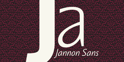
- Deserted Canyon by Letterhend,
$17.00 Deserted Canyon is a textured SVG typeface with bold and strong look and feel. Available in two types, solid version and transparent version. This type of font perfectly made to be applied especially in headlines which is need a standout font, and the other various formal forms such as invitations, labels, logos, magazines, books, greeting / wedding cards, packaging, fashion, make up, stationery, novels, labels or any type of advertising purpose. Features : Solid version and svg version numbers and punctuation multilingual ligatures PUA encoded
 - South Canyon by Rillatype,
$15.00 Saddle up and embrace the untamed spirit of the Wild West with South Canyon, a captivating display font inspired by fearless cowboys and rugged landscapes. With its bold and distinctive letterforms, South Canyon brings an authentic and powerful presence to your designs. Choose between the regular version for a perfect balance of legibility and boldness or the stamp version for a vintage, weathered look.
 - Jannon Pro by Storm Type Foundry,
$55.00 The engraver Jean Jannon ranks among the significant representatives of French typography of the first half of the 17th century. From 1610 he worked in the printing office of the Calvinist Academy in Sedan, where he was awarded the title "Imprimeur de son Excellence et de l'Academie Sédanoise". He began working on his own alphabet in 1615, so that he would not have to order type for his printing office from Paris, Holland and Germany, which at that time was rather difficult. The other reason was that not only the existing type faces, but also the respective punches were rapidly wearing out. Their restoration was extremely painstaking, not to mention the fact that the result would have been just a poor shadow of the original elegance. Thus a new type face came into existence, standing on a traditional basis, but with a life-giving sparkle from its creator. In 1621 Jannon published a Roman type face and italics, derived from the shapes of Garamond's type faces. As late as the start of the 20th century Jannon's type face was mistakenly called Garamond, because it looked like that type face at first sight. Jannon's Early Baroque Roman type face, however, differs from Garamond in contrast and in having grander forms. Jannon's italics rank among the most successful italics of all time – they are brilliantly cut and elegant.
 - Carrot Juice by Hanoded,
$15.00 I like Carrot Juice a lot. I don’t drink it that often (and I should, really), but nothing beats a freshly squeezed glass of cold carrot juice!! Carrot Juice font is a lovely script font: handmade with love (and a rather cheap Chinese brush pen which I bought online). Carrot Juice will come in handy when you need that handmade look - cookbooks, websites and product packaging spring to mind. Comes with a abundant harvest of diacritics.
 - Canyon Slab by Hipfonts,
$17.00 Saddle up and venture into uncharted typographic territory with Canyon Slab, a wild west-inspired serif slab typeface that beckons you to explore the untamed frontiers of design. Like the rugged canyons that have withstood the test of time, this font's bold serifs and sturdy letterforms exude a sense of strength and adventure. Canyon Slab captures the spirit of the old west, where legends were born and tales of grit and determination echoed through the canyons. As you wield this powerful typeface, you'll feel the dust of the trail beneath your feet, hear the echo of revolvers in the air, and taste the thrill of unbridled exploration. Channel the untamed spirit of the wild west with Canyon Slab, and let your designs ride into the sunset of creativity.
 - Hannover Modern by Type-Ø-Tones,
$40.00 Hannover Modern belongs to a series of typefaces used at the Estudio Mariscal in Barcelona. José Manuel Urós developed this weight, a vigorous egyptian-style, the embodiment of the Javier Mariscal style.
 - Caslon Open Face by Monotype,
$29.00Open, outline or inline faces became very popular in the 1940's. By removing the usual weight, a clear-cut letterform is achieved. In Caslon Open Face, the right-hand strokes are accentuated, providing a slightly three-dimensional effect. The ascenders of Caslon Open Face are large and the overall design of this version does not relate to Caslon 3 Roman. This Caslon Open Face font is good for personal stationery, or sentences where a decorative but distinguished result is sought. - Herzel Open MF by Masterfont,
$59.00
- Augustea Open EF by Elsner+Flake,
$35.00 - Caslon Open Face by Image Club,
$29.99Open, outline or inline faces became very popular in the 1940's. By removing the usual weight, a clear-cut letterform is achieved. In Caslon Open Face, the right-hand strokes are accentuated, providing a slightly three-dimensional effect. The ascenders of Caslon Open Face are large and the overall design of this version does not relate to Caslon 3 Roman. This Caslon Open Face font is good for personal stationery, or sentences where a decorative but distinguished result is sought. - Opening Night JNL by Jeff Levine,
$29.00 Add some twinkling lights to a bold Art Deco font such as Art Lesson JNL, and the result is a typeface which truly puts your name (or message) up in lights. Opening Night JNL conjures up images of Broadway plays and Hollywood premiers.
 - LTC Goudy Open by Lanston Type Co.,
$39.95Goudy Modern/Open was designed by Frederic Goudy, who was inspired by the caption of a French engraving. It is Goudy's first attempt at a "modern" face, but with less contrast and rigidity normally found in Bodoni style Modern faces. Goudy Modern was designed later in 1918 after viewing a proof of Goudy Open with the line filled in. Not a true modern face, but still a Goudy classic. The Pro versions include ligatures, varieties of numerals and Central European character sets. - Adva Open MF by Masterfont,
$59.00 Highly legible single stroked stencil font family in 3 weights. Use for titles, signage, captions etc.
 - Cloister Open Face by Bitstream,
$29.99Designed for ATF in 1913, Morris Fuller Benton’s version of Nicholas Jenson’s roman, the best of the Venetians and a model for regularity in color and fit. - Open TECH Neue by TypoGraphicDesign,
$9.00 The typeface Open TECH Neue is designed from 2018—2021 for the font foundry Typo Graphic Design by Manuel Viergutz. 6 font-styles (Sans Serif, Invert, Outline, Slab Serif, Stretch, Box Puzzle) + 1 icon-style with 1097 glyphs (Adobe Latin 3) incl. 400+ decorative extras like icons, arrows, dingbats, emojis, symbols, geometric shapes, catchwords, decorative ligatures (type the word #LOVE for ♥︎ or #SMILE for ☺ as OpenType-Feature dlig) and stylistic alternates (6 stylistic sets). For use in logos, magazines, posters, advertisement plus as webfont for decorative headlines. The font works best for display size. Have fun with this font & use the DEMO-FONT (with reduced glyph-set) FOR FREE! ■ Font Name: Open TECH Neue ■ Font Styles: 6 (Sans Serif, Invert, Outline, Slab Serif, Stretch, Box Puzzle) + Icons + DEMO (with reduced glyph-set) ■ Font Category: Display for headline size ■ Glyph Set: 1097 glyphs (Adobe Latin 3) incl. 400+ icons (decorative extras like arrows, catch words, dingbats, emojis, symbols) ■ Design Date: 2018—2021
 - Open Book ING by Ingrimayne Type,
$9.00 OpenBookING is a gimmick or novelty font that has letters on pages of a book. It is caps only and monospaced. The letters on the upper-case keys are on the left-handed pages of an open book and the letters on the lower-case keys are the same letters but on the right-handed pages of an open book. One could alternate upper and lower case keys to get letters on complete books, but the Opentype feature of contextual alternatives (calt) does this automatically. Several previous typefaces from IngrimayneType used the calt feature to alternate shapes that fit together in an interlocking pattern, such as alternating concave and convex shapes. OpenBookING uses the calt feature in a different way, to alternate two halves of a symmetrical shape. To provide two copies of numbers and common symbols, some non-alphabetical characters are unavailable because their slots were taken by the second form of the number or common symbol. If stylistic set one (ss01) is turned on, spaces are replaced with empty pages. This may leave you with unwanted spaces at the end of lines, and to eliminate them, turn off the feature (or change the font) for these spaces. The empty pages can be used in a layer to add color to the text. There is also a second set of empty pages with a filled page that can also be used in layers. (See poster for examples.) These pages are on the (logicalnot multiply) and (register divide) characters for the first set and on the (ordmasculine ellipsis) and (macron trademark) keys for the second set. Finally, OpenBookING has a large set of accented characters if anyone should need them. The letters used on the books were derived from the font Myhota-Bold. For a related typeface of letters on book covers, see NewLibrary. OpenBookING has limited uses and is priced accordingly.
 - CA Fourty Open by Cape Arcona Type Foundry,
$29.00 CA Fourty Open is another take on the idea of a double-line font. It reminds us of neon-sings, but lifts the 50s aesthetics to a contemporary level. Although it’s an all-caps font, upper and lower cases differ a little bit. The upper cases are more open. CA Forty Open has a full Central European letterset.
 - Open Sans Soft by Matteson Typographics,
$9.95 Open Sans Soft is the warm and friendly cousin of the web’s 2nd-most viewed font family – Open Sans designed by Steve Matteson. Open Sans Soft tones down your communications by adding organic-looking curvature to the corners of letters. A similar effect is found in such popular fonts as Microsoft’s Calibri and Linotype’s DIN Next. Open Sans Soft approximates the same, proven letterforms and letter spacing as Open Sans making it a wonderful companion for any application – correspondence, headlines, branding, packaging or interface design.
 - Open Case JNL by Jeff Levine,
$29.00 Open Case JNL is the distant cousin to the 2009 release by Jeff Levine Fonts called Cold Case JNL, as both were based on sets of lettering stencils designed and manufactured by the Huntington Oil Cured Stencil Company (originally of Huntington, New York and later of Delray Beach, Florida). While sharing similar design traits, there are enough differences to have both type designs work well together in a complimentary setting. Open Case JNL is available in regular and oblique styles.
 - Canne - Unknown license

- Anno by Linotype,
$29.99The impulse behind André Maaßen’s design of the Anno typeface was the design of a New Year’s card for the year 2000 (Anno 2000). His desire to create the perfect printed image developed into a family with four styles: Anno 1, Anno 1 Italic, Anno 2, and Anno 2 Italic. Anno 1 and its Italic are semi-classicist typefaces, with a high degree of stroke contrast, while Anno 2 and its Italic are semi-grotesks, with less stroke contrast. Both Anno 1 and Anno 2 are sans serifs typefaces, but they each offer a new interpretation of the genre. The Anno typeface may be used in a number of applications and sizes. And it is naturally suitable for New Year’s greetings and other cards, of course! - Canting by Omotu,
$16.00 Canting is a decorative serif font. It perfectly represents vintage esthetics in a modern and minimalist way. The font includes special uppercase letters and alternate characters. The font is perfect for elegant logo design, product packaging, quotes, poster design, brand identity, lettering, and many more. What's Include? 1. Uppercase characters with 3 styles (regular, outline, and rough) 2. Supports international languages 3. Opentype features: stylistic alternates with beautiful swashes 4. Accessible in the Adobe Illustrator Glyphs panel, or under Stylistic Alternates in the Adobe Photoshop OpenType menu, Adobe InDesign, Corel Draw, even work on Microsoft Word. 5. TTF and OTF files PUA Encoded Characters - Fully accessible without additional design software. Don't forget to visit our other products: Crown: https://fontbundles.net/omotu/218250-crown Sweet Candy: https://fontbundles.net/omotu/200017-sweet-candy Alitta: https://fontbundles.net/omotu/194813-alitta Sattay: https://fontbundles.net/omotu/188296-sattay Thanks for looking, and I hope you enjoy it! Please don't hesitate to drop me a message if you have any issues or queries. Regards, Omotu (ibnu.blawong2@gmail.com)
 - Stencil Gothic BE - Unknown license

- KR Be Mine - Unknown license

- Be My Valentine - Unknown license

- Couldnt Be Bothered - Personal use only


