10,000 search results
(0.044 seconds)
- Futura Black by URW Type Foundry,
$39.99 The Futura Black font, related to the Futura font family is boldly geometric and has detached strokes suggesting stencil lettering.
 - Futura SH by Scangraphic Digital Type Collection,
$26.00Since the release of these fonts most typefaces in the Scangraphic Type Collection appear in two versions. One is designed specifically for headline typesetting (SH: Scangraphic Headline Types) and one specifically for text typesetting (SB Scangraphic Bodytypes). The most obvious differentiation can be found in the spacing. That of the Bodytypes is adjusted for readability. That of the Headline Types is decidedly more narrow in order to do justice to the requirements of headline typesetting. The kerning tables, as well, have been individualized for each of these type varieties. In addition to the adjustment of spacing, there are also adjustments in the design. For the Bodytypes, fine spaces were created which prevented the smear effect on acute angles in small typesizes. For a number of Bodytypes, hairlines and serifs were thickened or the whole typeface was adjusted to meet the optical requirements for setting type in small sizes. For the German lower-case diacritical marks, all Headline Types complements contain alternative integrated accents which allow the compact setting of lower-case headlines. - Futura TS by TypeShop Collection,
$24.80 - Futura Classic by Wiescher Design,
$39.50 FuturaClassic is a recut of Paul Renners original Futura. This version was what Mr. Renner wanted the Futura to look like. He had to change his very stringent design because the market wanted a more pleasing typeface. I think the original design is worth saving because it is much more typical and has a personal and distinguished touch. I have also designed Geometra Rounded with rounded endings that looks more interesting than your usual DIN type Yours trying to save the typographical past Gert Wiescher
 - Futura Maxi by Monotype,
$29.00 First presented by the Bauer Type Foundry in 1928, Futura is commonly considered the major typeface development to come out of the Constructivist orientation of the Bauhaus.movement in Germany. Paul Renner (type designer, painter, author and teacher) sketched the original drawings and based them loosely on the simple forms of circle, triangle and square. The design office at Bauer assisted him in turning these geometric forms into a sturdy, functioning type family, and over time, Renner made changes to make the Futura fonts even more legible. Its long ascenders and descenders benefit from generous line spacing. The range of weights and styles make it a versatile family. Futura is timelessly modern; in 1928 it was striking, tasteful, radical - and today it continues to be a popular typographic choice to express strength, elegance, and conceptual clarity. The PL Futura Maxi font family was created by Victor Caruso in 1960 to add more display weights to Paul Renner's 1927 Futura family. Typefaces in the same style like Futura are: Avenir, Metromedium, Neuzeit Grotesk,
 - Futura BT by Bitstream,
$39.99 Futura is the fully developed prototype of the twentieth century Geometric Sanserif. The form is ancient, Greek capitals being inscribed by the Cretans twenty-five hundred years ago at the time of Pythagoras in the Gortyn Code, by the Imperial Romans, notably in the tomb of the Scipios, by classical revival architects in eighteenth century London, which formed the basis for Caslon’s first sanserif typeface in 1817. Some aspects of the Geometric sanserif survived in the flood of Gothics that followed, particularly in the work of Vincent Figgins. In 1927, stimulated by the Bauhaus experiments in geometric form and the Ludwig & Mayer typeface Erbar, Paul Renner sketched a set of Bauhaus forms; working from these, the professional letter design office at Bauer reinvented the sanserif based on strokes of even weight, perfect circles and isosceles triangles and brought the Universal Alphabet and Erbar to their definitive typographic form. Futura became the most popular sanserif of the middle years of the twentieth century. Ironically, given its generic past, Futura is the only typeface to have been granted registration under copyright as an original work of art, and, further irony, given the key part played by the Bauer letter design office, the full copyright belongs to Renner and his heirs. This decision in a Frankfurt court implies that a further small group of older typefaces may also be covered by copyright in Germany, particularly those designed for Stempel by Hermann Zapf. This situation appears to be limited to this small group of faces in this one country, although protection of designers’ rights in newer typefaces is now possible in France and Germany through legislation deriving from the 1973 Vienna Treaty for the protection of typefaces. Mergenthaler’s Spartan is a close copy of Futura; Ludlow’s Tempo is less close. Functional yet friendly, logical yet not overintellectual, German yet anti-Nazi... with hindsight the choice of Futura as Volkswagen’s ad font since the 1960s looks inevitable.
 - Futura PT by ParaType,
$30.00 Futura is a classic geometric sans serif, one of the crucial typefaces of the 20th century. It remains relevant today and is widely used in logos, headings, web and print. Futura was designed by Paul Renner for Bauersche Gießerei (Bauer) in 1927. The typeface is based on simple geometric forms and is close in the aesthetics to 1920s-30s constructivism and the Bauhaus. Futura PT is the most complete Cyrillic version of Futura. It’s a type system of 25 styles: 16 regular and 9 narrow, from Thin to Extrabold. Futura PT has linear and old style figures, subscripts and fractions. The typeface supports more than 100 languages: Western and Central European Latin and the Cyrillic-extended. The Cyrillic version of Futura was designed by Vladimir Yefimov in 1991–1995. He partially redesigned the typeface in 2007, making it a wholesome consistent system, and Isabella Chaeva added new styles. The typeface was released under the name Futura PT. Isabella Chaeva returned to work on Futura in 2022. The typeface has three new styles, old style figures and extended Cyrillic support.
 - Futura Black by Bitstream,
$39.99Josef Albers drew a stencil sanserif form at the Bauhaus in 1923 (published in 1926); Paul Renner and the Bauer design office made a similar design into a typeface in 1929, and rather confusingly included it in the Futura series. Many websites erroneously attribute the stencil design to Josef Albers, but there is no evidence that the two met or collaborated on Futura Black. In 1929 Josef Albers and Jan Tschichold corresponded on the “Transito” typeface (another very similar stencil typeface, while Paul Renner was working with Jan Tschichold. - Futura EF by Elsner+Flake,
$35.00 - Futura Script by Linotype,
$42.99 - Futura SB by Scangraphic Digital Type Collection,
$26.00Since the release of these fonts most typefaces in the Scangraphic Type Collection appear in two versions. One is designed specifically for headline typesetting (SH: Scangraphic Headline Types) and one specifically for text typesetting (SB Scangraphic Bodytypes). The most obvious differentiation can be found in the spacing. That of the Bodytypes is adjusted for readability. That of the Headline Types is decidedly more narrow in order to do justice to the requirements of headline typesetting. The kerning tables, as well, have been individualized for each of these type varieties. In addition to the adjustment of spacing, there are also adjustments in the design. For the Bodytypes, fine spaces were created which prevented the smear effect on acute angles in small typesizes. For a number of Bodytypes, hairlines and serifs were thickened or the whole typeface was adjusted to meet the optical requirements for setting type in small sizes. For the German lower-case diacritical marks, all Headline Types complements contain alternative integrated accents which allow the compact setting of lower-case headlines. - Futura Next by Neufville Digital,
$45.25 Our most up-to-date Futura adapted to the new times. Its peculiarity lies in the curved endings of three of its letters (“j”, “l” and “t”), which gives the typeface a more dynamic and modern look, making it easier to visualize on small and low-resolution screens. The original designs of these characters are also included. Futura is a Trademark of BauerTypes SL
 - Futura Now by Monotype,
$53.99 For nearly 90 years, Paul Renner’s Futura has been as popular as it is versatile—from children’s books to fashion magazines to the plaque on the Moon. Futura is a typographic icon. Futura Now offers designers a chance to see Futura with fresh eyes. It’s more truly Futura-like than any digital version you’ve ever worked with. “It brings some much-needed humanity back to the world of geometric sans serifs,” says Steve Matteson, Monotype’s Creative Type Director who led the design team. “Despite its reputation as the ultimate modern typeface, Futura Now is surprisingly warm,” he explains. “It’s just as at home set next to a leafy tree as it is next to a stainless-steel table, because it skillfully navigates the border between super-clean geometry and humanist warmth.” Futura Now—the definitive Futura—contains 102 styles, including: new Headline and Text weights; new Script and Display weights and styles; and new decorative variants (outlines, inlines, shadows, and fill). Its contemporary alignment of names and weights makes the family easier to understand and use, and its comfortable Text and judicious Headline subfamilies provide instantly refined spacing. With a large Latin, Greek, and Cyrillic character-set, Futura Now serves a wider international creative community. Futura Now is available both as individual OpenType fonts and as a set of Variable fonts, delivering limitless styles in a tidy digital footprint.
 - Futura Round by URW Type Foundry,
$39.99 Futura is THE prototype of a geometric or constructed linear sans serif and the font most commonly font of its kind used to date. Futura, very much influenced by the Bauhaus movement in Germany, was designed in 1927 by Paul Renner. Although being around for almost 90 years, Futura seems eternally young and fresh which also explains its continuous popularity with designers and typographers. Futura simply means efficiency and functionality documented by both its many usages as corporate type (e.g. Volkswagen, formerly IKEA, Vuitton, Shell, formerly HP, SMA and many more) as well as in various famous film projects (e.g. Kubrick, Anderson etc.). Futura’s iconic status was probably established when it walked on the moon with the Apollo 11 crew in 1969. It was used for the lettering of the plaque that was left up there. Now, URW has expanded its range of Futura styles by Futura Round with 14 additional styles.
 - Futura Paneuropean by Linotype,
$65.00First presented by the Bauer Type Foundry in 1928, Futura is commonly considered the major typeface development to come out of the Constructivist orientation of the Bauhaus movement in Germany. Paul Renner (type designer, painter, author and teacher) sketched the original drawings and based them loosely on the simple forms of circle, triangle and square. The design office at Bauer assisted him in turning these geometric forms into a sturdy, functioning type family, and over time, Renner made changes to make the Futura fonts even more legible. Futura’s long ascenders and descenders benefit from generous line spacing. The range of weights and styles make it a versatile family. Futura is timelessly modern; in 1928 it was striking, tasteful, radical — and today it continues to be a popular typographic choice to express strength, elegance, and conceptual clarity. NEW: the new Futura W1G versions features a Pan-European character set for international communications. The W1G character set supports almost all the popular languages/writing systems in western, eastern, and central Europe based on the Latin alphabet including Vietnamese, and also several based on Cyrillic and Greek alphabets. - CAC Champagne - Unknown license

- CAC Pinafore - Unknown license

- Cat Cat Cat by URW Type Foundry,
$39.99
- Caslame - 100% free

- Capsule - Unknown license

- Capsule by Eclectotype,
$40.00 Capsule is a reverse-stress, high-contrast, rounded sans-serif font with two distinct personalities. An all-caps face, there are however variations of some letters in the lowercase slots. The lowercase variants are more playful, with more bulbous elements that riff on phototype faces like Amelia and Data 70, but all can work together and be mixed and matched to your heart's content. Capsule boasts a bunch of esoteric discretionary ligatures to play around with, and stylistic alternates for 4, 7 and £. The language support is extensive enough to set essays in most Latin-based languages, even though that's the last thing you should be doing with this font! Capsule should be set large. The fit is tight and the kerning is aggressive. It's not what you'd call a workhorse, but Capsule is an All-Caps you'll (see what I did there?!) want to use for impactful headlines, cutting edge logos and post-modern layouts.
 - Castile by Eyad Al-Samman,
$3.00 Castile is a central region of Spain that formed the core of the Kingdom of Castile, under which Spain was united in the 15th and 16th centuries. "Castile" is a Kufic modern Arabic typeface. It is suitable for books' covers, advertisement light boards, and titles in magazines and newspapers. It is very distinctive when used in black and white printout. It decorates colored pages and makes artworks more attractive. This font comes in three different weights. I adore Spain and the historical achievements of the Islamic civilization existed there in the past. By designing "Castile" Typeface, I wanted to refer to the Islamic civilization that Muslims had in Spain and especially in Andalusia. Today the name of Castile survives in two autonomous regions of Spain: Castile-La Mancha (capital city is Toledo) and Castile-Leon (capital city is Valladolid). The main characteristic of "Castile" Typeface is in its modern open-end style for some of its Arabic characters such as "Sad", "Dad", "Seen", "Sheen", "Qaf", "Faa", "Yaa" and others. The shape of the characters' "dot", "dots", and "point" is innovative; a triangle with a semi-circle shape. "Castile" Typeface is suitable for books' covers, advertisement light boards, and titles in magazines and newspapers. Its charactersí modern Kufic styles give the typeface more distinction when it is used also in posters, greeting cards, covers, exhibitionsí signboards and external or internal walls of malls or metroís exits and entrances. It can also be used in titles for Arabic news and advertisements appeared in different Arabic and foreign satellite channels.
 - Manual by TypeUnion,
$39.00 Manual is an 80 font super family formed of 10 weights in 4 different widths. The font is styled with a slight retro feel to give it a unique appearance. Manual is a blue-collar font that works hard for you and your design ideas. The higher x-height enhances the readability for smaller, more informative text sizes whereas the black weights create beautiful, impactful headlines to fit a variety of spaces. The support of the expansive weights and widths will give your design a truly unique feel.
 - Coastal by Arkitype,
$10.00 Coastal is a typeface made up of 12 fonts, it is a display sans family with some cues that give it a fun looking and informal type family. Coastal has rounded, rough, hand and outline versions so there are a lot of options to play around and have some fun with. Coastal is great for headlines, posters and artwork where larger type is needed. It also has some neat alternate glyphs that give the user a few more additional options to get creative with.
 - Raskal by PizzaDude.dk,
$20.00Yiehar! Woohee! This is a funky and chunky wild west PizzaDude font! Buy all three versions at once and save a fistful of dollars! - Nahualli by Ixipcalli,
$30.00 La tipografía Nahualli, esta basada en los escritos castellanos del Códice Méndoza del siglo XVI. Aunque no es un estilo claro, la caligrafía aporta un estilo perfecto para documentos historicos. The Nahualli typography is based on the Castilian writings of the Méndoza Codex of the 16th century. Although it is not a clear style, calligraphy provides a perfect style for historical documents.
 - Pasquale by Monotype,
$39.00Pasquale was designed by Tony Stan. The Pasquale font family has short ascenders, and the lowercase and caps A, B, D, E and Q are open. This versatile warm design is suitable for advertising, magazines, brochures, letterheads and text work. - Castel by HansCo,
$12.00 Castel is a handwritten font made with natural watercolor texture. The solid texture makes it look modern and simple, strong and feminine at the same time. Some purposes you can use Castel for are logos, product branding, wedding invitations, quotes, flyers, magazine, Instagram templates or for text overlay to any background image. Thank you for your purchase! I hope you have fun with Castel. Enjoy!
 - Rascals by Letterhend,
$14.00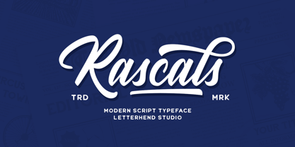 Rascals is a script typeface with vintage and rustic look! It works perfectly for those who need a typeface for headlines, logotype, apparel, invitation, branding, packaging, advertising etc. This typeface is comes in uppercase, lowercase, punctuation, symbols, numerals, stylistic set alternate, ligatures, and also contains multilingual characters.
 - Pascal by GRIN3 (Nowak),
$16.00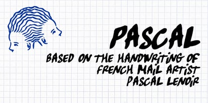 Pascal is a font inspired by handwriting of mail artist Pascal Lenoir.
 - Visualism by Arendxstudio,
$15.00 Visualism Font is a free style font that has the characteristics of street art that shows freedom and is filled with unique characters Features : • Character Set A-Z • Numerals & Punctuations (OpenType Standard) • Accents (Multilingual characters)
 - Faltura - Personal use only

- Datura - Unknown license

- Phutura - 100% free

- !Futurelic - Unknown license

- Futurex - Unknown license

- Futurex - Unknown license

- Futurex - Unknown license

- Phutura - 100% free

- Altura by Jonahfonts,
$35.00 Uncommon-serifs with common Glyphs. Recommended for posters, titles, book covers, books, greeting cards, signage, packaging, invitations, magazine articles and advertising.


