589 search results
(0.019 seconds)
- Dingle Hopper by Fonthead Design,
$9.00 - Hip Hopper by Pink Broccoli,
$19.00 An offbeat typeface inspired by the lettering on an art poster by Patrick Owsley for the cartoon character Hoppity Hooper. This typeface goes beyond the basic opentype features you've seen (i.e. extended language character sets, stylistic alternate character variations, etc) and offers not only a ligature feature that automatically alternates between the Capitals & Lowercase (Alt Capitals) sets, but also a unique Contextual Alternates feature that enables an automatic alternating BOUNCING effect. All this piled into a single typeface with loads of personality, just waiting to be played with!
 - Great Copper by Pixesia Studio,
$19.00 Introducing Great Copper - An Old Handcraft Display Font With a perfect combination of its unique yet classic shapes, Great Copper greatly portrays the familiar feeling that you are looking for. This typeface suits the nostalgic feeling you want to evoke through words. It comes as if Great Copper is written personally as letters to deliver good news. As splendid it curves in delivering the sweet vibe, Great Copper comes also with its firm shape to emphasize how valuable the messages and stories that it brings. Enchanting yet emphatic, Great Copper typeface will be perfect to depict the great story about the past you'd be delighted to tell and share. Hope you Like it. Thanks.
 - Copper Harbor by Maulana Creative,
$12.00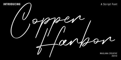 Copper Harbor is a fancy script font. With regular stroke, fun character with a bit of ligatures. To give you an extra creative work. Copper Harbor font support multilingual more than 100+ language. This font is good for logo design, Social media, Movie Titles, Books Titles, a short text even a long text letter and good for your secondary text font with sans or serif. Make a stunning work with Copper Harbor font. Cheers, MaulanaCreative
 - String Hopper by Letterhend,
$17.00 String Hopper is a unique serif typeface font with bold and vintage feel. This font has unique shape, very suitable for horror, thriller and spooky yet fun theme design. This font also perfectly made to be applied especially in logo, and the other various formal forms such as invitations, labels, logos, magazines, books, novels, labels or any type of advertising purpose. Features : altermate and ligatures numbers and punctuation multilingual PUA encoded We highly recommend using a program that supports OpenType features and Glyphs panels like many of Adobe apps and Corel Draw, so you can see and access all Glyph variations.
 - Aviano Copper by insigne,
$29.99 The retro-inspired design of Aviano Copper echos the bold style of America’s Gilded Age. Inspired by the copper-inscribed intaglio printing designs of the early 20th century, the powerful, wide character shape of this font walks softly across your page while carrying a big stick. To create the right balance, small wedge serifs were added onto Aviano Sans, giving you a sophisticated style that looks and acts like it belongs nowhere short of Boardwalk. Developed to a new level of excellence, this design offers a wide range of weights from thin to black. There's full multilingual support of all Latin-based languages and five stylistic sets, swash designs, and 1000 glyphs per weight, including some unique ligatures. Number options include old style figures, tabular figures, and superscripts. Unique median spur alternates, swashes, and ligatures will help you customize every single design. The feel of last century’s personal and business correspondence is waiting for you in this member of the Aviano family. While ideal for headings, displays, logos, and short texts, Aviano Copper’s use for everything from letterhead to wine labels may just give you the monopoly you’re looking for.
 - CA Slalom Condensed by Cape Arcona Type Foundry,
$40.00 The starting point for CA Slalom was the aspiration to create a contemporary interpretation of classics like Gill and Antique Olive in terms of aesthetics, flexibility and usefulness. The outstanding S soon became the visual hook and starting from the extra bold extended weight, CA Slalom evolved into a huge family with four widths. It’s rather round instead of squarely with stroke-ends pulled deep and a relatively low x-height. This gives CA Slalom a taste of its own, and although it is clearly contemporary, it has the potential to become a classic.
 - CA No Dr. by Cape Arcona Type Foundry,
$30.00 No Dr. was inspired by an old movieposter lettering for the 1962 movie "James Bond: Dr. No". Just like the original Dr. No, No Dr. has a diabolical charm. It was developed into a font family that combines distinctiveness with versatility. It has a good readibility as a textfont but also looks great as a Headline. The two widths and the two weights give you a big choice. Intended to become an interesting alternative to the much used DIN Schrift, it has now developed into a highly functional family of it's own.
 - CA Magic Hour by Cape Arcona Type Foundry,
$19.00 You remember the time when the Concorde was the fastest passenger plane on earth? When it was possible to travel from Paris to New York in 3 3/4 hours? Those were cool times. Times when cocktails tasted good and you didn’t think of an eventual headache afterwards. Times when you didn’t have to think how to dress because there was only one way. Straight from that time comes CA Magic Hour. A vintage font from a time from which we could learn a lot today. Optimistic and straight forward, it will speed up your designs.
 - CA Saygon Text by Cape Arcona Type Foundry,
$40.00 CA Saygon Text is the logic consequence of CA Saygon. It is much calmer and therefore also suitable for reading texts and everyday’s editorial tasks. Basic shapes and proportions were adopted from Saygon and continued in such a way that a font family from Thin to Extrabold resulted. A fundamental inspiration were early static grotesque typefaces such as Akzidenz Grotesk. Nevertheless, the typeface was by no means intended to have a historical look. Thus, a relatively high x-height was chosen, which makes the typeface quite economical in type-setting, since the letters appear visually larger. A relatively small line spacing with good legibility can be achieved due to the small ascenders and the low cap height. Letters like f and t, which otherwise tend to end in curves, were given right angles, which on the one hand meets certain design elements of the original Saygon, but on the other hand also refers to contemporary trends in typeface design. A special feature are the five styles in which CA Saygon Text can be used. The default setting is the Helvetica style, with two-storey a and g. The Futura style has a single-storey a and a two-storey g accordingly. The third style with two-storey a and three-storey g is called the Franklin style. But the real highlight is the Cape style with single-storey a and three-storey g – a real rarity up to now. Let yourself be inspired by this unusual typeface. If you like it even more progressive, you should try the flat style, which continues the right angles in a, g, and y as well. Thanks to the Cyrillic and Latin Extended character sets, a huge linguistic area is covered that even extends to Vietnam! Even the exotic German capital-double-s is available and appears automatically when typed between other capital letters. Numerous OpenType features make life easier for the professional typographer: there are fractions, superscript and subscript numbers, as well as proportional and tabular capitals.
 - CA Slalom Extended by Cape Arcona Type Foundry,
$40.00 The starting point for CA Slalom was the aspiration to create a contemporary interpretation of classics like Gill and Antique Olive in terms of aesthetics, flexibility and usefulness. The outstanding S soon became the visual hook and starting from the extra bold extended weight, CA Slalom evolved into a huge family with four widths. It’s rather round instead of squarely with stroke-ends pulled deep and a relatively low x-height. This gives CA Slalom a taste of its own, and although it is clearly contemporary, it has the potential to become a classic.
 - CA Rough Rider by Cape Arcona Type Foundry,
$29.00 Rough Rider is a handcrafted bold italic typeface. Intended as a rough display style typeface it’s perfect for illustrative titles, logotypes and small texts. Initially developed for a logo design, Rough Rider was expanded to a full Central European character set.
 - CA El Amor by Cape Arcona Type Foundry,
$19.00 This typeface has the most important ingredient of all: love. So it’s not surprising that the font is called El Amor. It is a reversed oblique all-caps headline font that consists of two styles, “Regular” and “Fill”. Feel free to experiment with them, together or alone. Write something with “Regular”, copy paste it to another layer and switch to “Fill”. Give it a little offset if you like or place it straight on top, both works fine. You can also use the “Fill”. style for body text, but do so at your own risk, spacing and kerning is optimized for the use with the “Regular” style, so be generous if the result looks not as even as text-font. Maybe you’ll discover the charm of a more dynamic spacing that fit perfectly with the vivid and crispy outlines. Unlike other display fonts CA El Amor features a huge character set covering most languages that you can write with a Latin alphabet.
 - CA Normal Serif by Cape Arcona Type Foundry,
$40.00 CA Normal Serif is the perfect companion to its grotesque brother CA Normal. But it is not just a serifed equivalent. It has a character of its own while preserving the principal proportions and the idea of quirkiness. It was not the aim to build a typeface that can immediately be identified as a relative of CA Normal. The intention was to create a matching typeface in aspects of aesthetic and concept. Whereas commonly serif-companions to grotesques are old-style or slab-serif, CA Normal Serif is situated between modern and slab-serif typefaces. CA Normal Serif is a little bit of an uncomfortable typeface. Nothing is smooth and cozy. It picks up elements of classic newspaper type as brought to us by Chauncey H. Griffith's legibility group, sharing the flavor of abrasive details and "slabbish" serifs. But the proportions are more condensed than the ones of its predecessors giving it a bit more elegance, which moves it closer to the aesthetic of "Scotch Romans".
 - CA BND Trash by Cape Arcona Type Foundry,
$39.00 Based upon CA BND (the clean version) CA BND Trash is a rough and dirty version of our favorite DIN-like font. We recommend it for use in zombie movies title design, headlines for ads of a soft-drink manufacturer (who hopes to be cooler, if he uses rough typefaces), or for emocore, hardcore, softcore or "whatever-core" bands. Uhhh, its the time for the living dead.
 - CA Cape Rock by Cape Arcona Type Foundry,
$39.00 CA Cape Rock, first released in 2007 and now reissued and expanded, is an impressive display typeface. Designed with a fat Clarendon and wood type in mind, the typeface’s bold and distinctive forms add spice and personality to any design that requires a strong display aesthetic. CA Cape Rock is particularly enjoyable for use in headlines and ideal for highlighted text. With already two dozen existing ligatures and many OpenType swashes, the new edition also received letters for use in the Central European and South Eastern European area. Cleaned and harmonized paths, a completely new kerning as well as a newly added Italic (Slanted) style are also among the new features.
 - CA Slalom Compressed by Cape Arcona Type Foundry,
$40.00 The starting point for CA Slalom was the aspiration to create a contemporary interpretation of classics like Gill and Antique Olive in terms of aesthetics, flexibility and usefulness. The outstanding S soon became the visual hook and starting from the extra bold extended weight, CA Slalom evolved into a huge family with four widths. It’s rather round instead of squarely with stroke-ends pulled deep and a relatively low x-height. This gives CA Slalom a taste of its own, and although it is clearly contemporary, it has the potential to become a classic.
 - CA Fourty Open by Cape Arcona Type Foundry,
$29.00 CA Fourty Open is another take on the idea of a double-line font. It reminds us of neon-sings, but lifts the 50s aesthetics to a contemporary level. Although it’s an all-caps font, upper and lower cases differ a little bit. The upper cases are more open. CA Forty Open has a full Central European letterset.
 - CA Spy Royal by Cape Arcona Type Foundry,
$19.00 Spy Royal is a junctionless script typeface and comes in 6 styles. It’s a hybrid between script and so called streamline fonts. The origins are based on an advertising by Japan Airlines, dated around 1954, offering flights to San Francisco, Honolulu and Okinawa in the new DC-6B “Pacific Courier” airplane. Only the letters for the words “JAPAN AIR LINES” were used, so that the creative part was to reimagine a full font out of just a handful of uppercase letters. Originally released in 2004, Spy Royal was now undergoing a major rework and is now republished with additional styles like shadow-lines and 3D-shadow. Its charm is manifold, we think everything related to cars, racing, hot rod, vintage, cocktails, retro, restaurants, gasoline and of course airlines will look great in Spy Royal. Spy Royal includes alternate characters, ligatures and West European diacritics.
 - CA Gothique Superfat by Cape Arcona Type Foundry,
$44.00 The name says it all. It is aesthetically located between American Gothics and European Grotesques and features small caps, a Central European character set and four number formats plus small caps numerals. This makes it not only a heartbreaking headline font, but also extremely versatile.
 - CA Mystery Girl by Cape Arcona Type Foundry,
$29.00 Elegance meets accident. A sturdy distressed all caps typeface that gives you the feeling of the happy little incidents that may happen when you print with silkscreen or letterpress. A whole bunch of alternative letters embedded in a pseudo-random OpenType feature does the magic. Get yourself surprised CA Mystery Girl speaks a lot of languages, at least all those covered by the extended Latin character set. Which means you can travel to Iceland, Turkey, France or Poland, this girl will always be your interpreter.
 - CA Cula Superfat by Cape Arcona Type Foundry,
$40.00 CA Cula Superfat is a distinctive fatty typeface, mainly intended for display purposes. You will find out that it looks best in extremely large sizes, or in very small ones. Whatever you do, avoid the ordinary and expectable. It’s not only beautifully fat, it’s also useful. A central European character set, loads of ligatures, oldstyle and lining figures make it a versatile companion in the daily struggle for outstanding typography.
 - CA Weird Stories by Cape Arcona Type Foundry,
$19.00 A font from outer space, CA Weird Stories - the perfect font for science fiction novels or to create a spooky atmosphere. A bit too weird and a bit too slanted for this world. Treat yourself with the ability to stack the two styles on top of each other to create great special FX. You may even consider to use the "fill" style on its own, it might look a bit uneven, as it was actually designed to be used in combination with the "shadow/regular" style, but hey – that's what this font is all about!
 - CA Rusty Nail by Cape Arcona Type Foundry,
$19.00 Rusty Nail is a carefully hand-made uppercase only typeface with a full Central European character set which comes in two styles, Regular & Bold. It was created for a liquor company where hand-made letters were part of the corporate design. It’s perfect for labels or lettering with a "used look".
 - Chapter Eight by Aldedesign,
$19.00 Chapter Eight is a stylish signature font that is inspired by modern photography. It’s easy to use, to create a stunning watermark for your photos, invitations, branding. It also works great as a business signature or on other branding materials. - PUA encoded = Accessible in Adobe Illustrator, Adobe Photoshop, Adobe InDesign, even work on Microsoft Word. - PUA Encoded Characters - Fully accessible without additional design software. How to access alternate glyphs? you can see it on this link: http://goo.gl/1vy2fv
 - Chapter 11 by Canada Type,
$24.95 Chapter 11 is a pseudo-random typewriter font with the ribbon on the fritz. The single font contains four different character sets of varying ranges. If your program supports advanced OpenType features, activate the contextual alternates to see the ghost in the machine while you type. Otherwise, character variations are accessible through any character map or glyph palette, so you can manually mix and match your setting. This font is highly recommended for use in filling out government bailout forms. It will make the whole world believe you actually need it.
 - Chapter Initials by Greater Albion Typefounders,
$5.95 Chapter Initials provide a true demonstration of how elegant simplicity can be modern yet retain traditional character without the blandness which seems so common these days. It's ideal for exactly what the name implies, providing elegant initial capitals with which to commence a chapter. The design also has uses in Poster layout and compliments Greater Albion's Vertrina particularly well.
 - Aviano Copper Variable by insigne,
$199.99 The retro-inspired design of Aviano Copper Variable echos the bold style of America’s Gilded Age. Inspired by the copper-inscribed intaglio printing designs of the early 20th century, the powerful, wide character shape of this font walks softly across your page while carrying a big stick. To create the right balance, small wedge serifs were added onto Aviano Sans, giving you a sophisticated style that looks and acts like it belongs nowhere short of Boardwalk. Developed to a new level of excellence, this design offers a wide range of weights from thin to black. There's full multilingual support of all Latin-based languages and five stylistic sets, swash designs, and 1000 glyphs per weight, including some unique ligatures. Number options include old style figures, tabular figures, and superscripts. Unique median spur alternates, swashes, and ligatures will help you customize every single design. The feel of last century’s personal and business correspondence is waiting for you in this member of the Aviano family. While ideal for headings, displays, logos, and short texts, Aviano Copper’s use for everything from letterhead to wine labels may just give you the monopoly you’re looking for.
 - MGT American Copper by Magetype,
$29.00 American Copper Family is a vintage font inspired by an old American motorcycle logo. The logo looks very manly and strong, just like the motorbike. American Copper Script is the dominant one that turns the logo into a font. Whereas the Sans and Block family is a complement to the Script. But all three are a very good unit to be juxtaposed together. American Copper is a font made for you (designers) who love automotives: old cars and motorbikes. Anything related to automotive. Besides these two objects, this font is also very cool for music-themed design needs; rock n roll, metal, rockabilly, and others. Oh yes, Custom Culture is another very interesting thing to be depicted with this font. Workshop logo for example. It will look very unique with Interlock on American Copper Script. Pair it with American Copper Block. And, BOOM! The logo will look very manly. If you are curious, you can download the American Copper Script Demo version to try. Happy Designing. Cheers
 - Hooper dooper - Unknown license

- Battered Cooper - Personal use only

- Cooper Goodtime by Breauhare,
$35.00 Cooper Goodtime is a font based on the lettering used on the CBS-TV variety series The Glen Campbell Goodtime Hour (1969-1972). The name pays tribute to its two origins, the other being Cooper Black. It was never an actual complete font set on the TV show, only a limited number of handmade letters, all upper case. It has lain dormant since the show went off the air in 1972. With this incarnation, a set of lower case letters has been created to complement the upper case letters. These lower case letters never existed before now. Cooper Goodtime is a funky, nostalgic, cool way to create a display, and it works surprisingly well in text sizes, too.
 - Cooper Screamers by Wordshape,
$- In 1925, at the request of Barnhart Brothers & Spindler, the foundry he worked for, Oswald Bruce Cooper designed a wide selection of "screamers", oversized exclamation points used to grab attention in display advertising. The foundry rushed the screamers into production, much to Cooper's dismay. Cooper was disappointed with the final form of the screamers– they were designed in assorted weights to match the assorted Cooper series of typefaces, as well as in a variety of other formal solutions- squaredoff, incised, wavy, Tuscan, and rounded. Cooper's working design methodology was to re-draw his projects a number of times in order to refine the formal results. However the screamer project was hastily cut by the head of BB&S's matrix engraving room in fourteen sizes from the initial sketches, causing Cooper to fire off a fiery missive stating, "Everything I draw is bum the first half-dozen times I draw it; the trouble with these is that I drew them only once!" This typeface is the result of researching Cooper's original drawings and series of engraved proofs for the screamers, as well as the original Screamer type specimen. Cooper Screamers have never been available before in digital format.
 - Cooper BT by Bitstream,
$34.99 Cooper Black, commissioned by Barnhart Brothers & Spindler, is the best known of Oswald Cooper’s typefaces. Bitstream has expanded the 1921 original into a complete series of round-edged text faces.
 - Cooper Antique by URW Type Foundry,
$35.00
- Cooper Black by URW Type Foundry,
$89.99Cooper Black The Cooper Black font should be used in display sizes only. Cooper Blacks serifs are rounded and the counters are small. Cooper Black was designed by Oswald B. Cooper for Barnhart Brothers & Spindler in 1921 for advertising and posters. The capital O and Q of the Cooper Black font are tilted back; in the lowercase, the dot on the I and j become elliptical. The extra bold Cooper Black font has a remarkable personality and reproduces well in sizes over 18 point in titles, subheadings and generally short sentences. - Chopsee Softee by TypeUnion,
$35.00 Chopsee Softee is the marshmallowy version of our 2017 release Chopsee. It's fun and curvaceous and comes in 8 weights with matching italics. Just like Chopsee the soft version maintains the fluidity and movement with the accentuated curves and terminals, but with added fun and freedom. Chopsee Softee is perfect font for packaging to branding and everything in between.
 - Cooper Black by Mecanorma Collection,
$45.00 - Cooper Black by Linotype,
$40.99 Oswald Bruce Cooper designed Cooper Black, an extra bold roman face, based on the forms of his earlier typeface Cooper Old Style, which appeared with Barnhart Brothers & Spindler Type Founders in Chicago. Copper Black was produced by Barnhart in 1922 and acquired in 1924 by the Schriftguß AG in Dresden, where it was later completed with a matching italic. Although Cooper Black appeared in the first third of the 20th century, it still looks contemporary and it can be found on storefronts in almost any city scene. The flowing outer contours create forms that are both strong and soft, making Cooper Black an extremely flexible font.
 - Cooper Poster by GroupType,
$15.00 Cooper Poster was inspired by showcard lettering samples featured in the book, Commercial Art Of Show Card Lettering, published in 1945. Although named ""Western"", the design was modeled after Ozwald Cooper's 1921 original Cooper Black.

