1,538 search results
(0.014 seconds)
- MC Bregor by Maulana Creative,
$18.00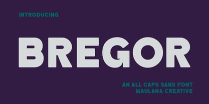 Bregor is an All caps simply strong sans serif font. With Bold stroke, fun character with a bit of ligatures and alternates. To give you an extra creative work. Bregor font support multilingual more than 100+ language. This font is good for logo design, Social media, Movie Titles, Books Titles, a short text even a long text letter and good for your secondary text font with script or serif. Make a stunning work with Bregor font. Cheers, Maulana Creative
 - Browser Serif by AVP,
$19.00 Browser Sans is a companion to Browser Sans, sharing similar forms and metrics. The four styles (Regular, Italic, Bold and Bold Italic) make it simple to use in desktop applications and easy to implement on websites.
 - Time Breaker by Motokiwo,
$15.00 Time Breaker, a bold caps typeface crafted from a classic brush with stylish and casual gesture. It's great for branding, logo, headline, poster, title, etc. This font contains all caps characters, numeral, large range of punctuations, and also multilingual support.
 - Browser Sans by AVP,
$19.00 Browser Sans is a companion to Browser Serif, sharing similar forms and metrics. The four styles (Regular, Italic, Bold and Bold Italic) make it simple to use in desktop applications and easy to implement on websites.
 - Christmas Preference by Seemly Fonts,
$12.00 Christmas Preference is a clean, simple, and natural handwritten font. Not too thin and not too thick, balanced and varied, this font was designed to enhance the beauty of your projects.
 - Breaker Rockin by Nathatype,
$29.00 Two is better than one, right? With Breaker Rockin, you will not have problems in terms of lack font options. It is a versatile font duo that brings your design result vintage looks. The display font comes all in uppercase characters makes this font easy to read, while the script font shows bold and curvy strokes. You can mix and match this harmonious font duo to make gorgeous result in your design. Even more, this font duo has fascinating features that allows you maximize your design. Features: Stylistic Sets Ligatures Multilingual Supports Numerals and Punctuations PUA Encoded It can be used for many design projects, such as poster, logo, book cover, branding, heading, printed product, merchandise, quotes, social media campaign, etc. Learn more about how to use it by seeing the font preview. Thank you for purchasing our fonts. Please don’t hesitate to contact us, if you have any further question or issues. We’re happy to help. Happy Designing.
 - Bree - Personal use only

- Bree by TypeTogether,
$37.50 The Bree font family is a spry sans serif by Veronika Burian and José Scaglione that delivers a spirited look and feel for branding and headline usage. As an upright italic, Bree shows a pleasant mix of rather unobtrusive capitals with more vivid lowercase letters, giving text a lively appearance. Bree is clearly influenced by handwriting. As such, some of its most characteristic features are the single-story ‘a’, the cursive ‘e’, the outstroke curves of ‘v’ and ‘w’, the flourished ‘Q’, and the fluid shapes of ‘g’, ‘y’, and ‘z’. Alternates of these letters are available when a more neutral look is desired. Bree has a touch of cheekiness, a wide stance for each character, and an extra-large x-height. All this adds up to a big personality, so even when set in small text there is no skimming past the words Bree voices. In 2019, the Bree font family got a huge update. A few shapes were updated or added (the ‘k’ and German capital ‘ß’), two entirely new weights were added (Book and Book Italic), and spacing was perfected. More than that, Vietnamese support was added to Bree Latin, and the Bree Greek and Bree Cyrillic scripts were designed from scratch to parallel the Latin’s tone. Additionally, Bree was designed in variable font format for those who want complete control over the font’s appearance while simultaneously saving digital weight in the form of kilobytes and megabytes. Bree is in the perfect position for the next digital revolution. The complete Bree font family, along with our entire catalogue, has been optimised for today’s varied screen uses. Bree has been chosen for such wide-ranging uses as Breast Cancer Awareness Month in the US, the branding for the country of Peru, and numerous layouts including mobile apps, magazines, newspapers, and books. Awards – Tipos Latinos exhibition 2008 – Several best-of-the-year typeface lists of 2008 MyFonts Top 10 Fonts of 2008 Smashing Magazine: 60 Brilliant Typefaces For Corporate Design https://www.smashingmagazine.com/2008/03/60-brilliant-typefaces-for-corporate-design/ Die besten Schriften 2008 http://www.fontwerk.com/619/die-besten-schriften-2008/ – Selected for Typographica’s Best Typefaces of 2008 – Won Bronze for Original Typeface in the 2009 European Design Awards
 - Tasmin Reference - Unknown license

- Breve Title by DSType,
$50.00 Breve was designed for use in editorial projects. Simple but with enough personality to stand by is own, in a quest for a more forceful and contemporary appearance. All the fonts in Breve superfamily, share the same exact structure, both in terms of anatomy and functionality. The Text versions provide a softer and warm feel to the typographic palette and is intended for use in much longer passages of text, while the Title versions are distinguished by non-descending letterforms, making the titles and headlines much more uniform and interesting. The News version is more classic, with ball terminals and classic proportions, while the Display is, somehow, the set of fonts we had to design: extra-black, ultra-contrasted, proud-display fonts.
 - Breve News by DSType,
$50.00 Breve was designed for use in editorial projects. Simple but with enough personality to stand by is own, in a quest for a more forceful and contemporary appearance. All the fonts in Breve superfamily, share the same exact structure, both in terms of anatomy and functionality. The Text versions provide a softer and warm feel to the typographic palette and is intended for use in much longer passages of text, while the Title versions are distinguished by non-descending letterforms, making the titles and headlines much more uniform and interesting. The News version is more classic, with ball terminals and classic proportions, while the Display is, somehow, the set of fonts we had to design: extra-black, ultra-contrasted, proud-display fonts.
 - Boho Breeze by Sohel Studio,
$16.00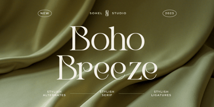 Boho Breeze is a Modern elegant serif typeface with Unique alternative , multilingual support with perfect kerning. This typeface is perfect for an elegant & luxury logo , classy editorial design, women's magazine, fashion brand , cosmetic brand, fashion promotion , modern advertising design, invitation card, art quote, home decoration , book/cover titles, special events, Tote bag, T-shirt, Advertising and much more.
 - Breve Text by DSType,
$50.00 Breve was designed for use in editorial projects. Simple but with enough personality to stand by is own, in a quest for a more forceful and contemporary appearance. All the fonts in Breve superfamily, share the same exact structure, both in terms of anatomy and functionality. The Text versions provide a softer and warm feel to the typographic palette and is intended for use in much longer passages of text, while the Title versions are distinguished by non-descending letterforms, making the titles and headlines much more uniform and interesting. The News version is more classic, with ball terminals and classic proportions, while the Display is, somehow, the set of fonts we had to design: extra-black, ultra-contrasted, proud-display fonts.
 - Kokomo Breeze by Nicky Laatz,
$35.00 Say hello to Kokomo Breeze - A deliciously bold and nonchalant casual marker font. Kokomo Breeze was designed to keep a naturally handwritten marker-style look , while still maintaining some subtle inky marker imperfections on its edges , to keep in line with a more realistic, yet very legible look. Great for headlines, bold branding, classy packaging, eye-catching callouts and stand-out advertising, Kokomo Breeze is designed to be your jack of many trades. Be sure to turn on your OpenType features when type with Kokomo Breeze - it’s packed with natural-looking ligatures and alternate characters for both upper and lower case - all of these opentype extras make your type design look mush less mechanical, and much more like naturally formed words as you type. Pair it with a bold tall sans serif font, or a classy serif to add another whole new dimension to this very versatile marker font. Great as large and small sizes, Kokomo Breeze is perfect for any size design.
 - Minty Breeze by Creativemedialab,
$20.00 Minty Breeze is a modern serif with lots of ornamental alternatives that allows you to design expressive logos or titles for all types of your projects. The vintage yet elegant style combined with modern typographic art is the main attraction of this font, from Branding to fashion-related concepts. Thanks to its beautiful character. The fonts come in 7 styles, from thin to black, as well as variable formats as well.
 - Breve Display by DSType,
$50.00 Breve was designed for use in editorial projects. Simple but with enough personality to stand by is own, in a quest for a more forceful and contemporary appearance. All the fonts in Breve superfamily, share the same exact structure, both in terms of anatomy and functionality. The Text versions provide a softer and warm feel to the typographic palette and is intended for use in much longer passages of text, while the Title versions are distinguished by non-descending letterforms, making the titles and headlines much more uniform and interesting. The News version is more classic, with ball terminals and classic proportions, while the Display is, somehow, the set of fonts we had to design: extra-black, ultra-contrasted, proud-display fonts.
 - Mixed Breed by TypeArt Foundry,
$45.00
- Brewery No 2 Paneuropean by Linotype,
$103.99An entry in the Second Linotype Design Contest, Linotype Brewery, designed by Gustavs Andrejs Grinbergs, became part of the TakeType Collection in 1997. Brewery No 2 represents a significantly improved version of its precursor, and the typeface has been both extended and enhanced. When asked about prototypes, Grinbergs cites German typefaces of the early 20th century. It is thus not surprising that the characters of Brewery™ No 2 are based on geometrical forms. However, this is no mere synthetic Grotesque-derived typeface. It has significant contrasts in line thickness and triangular line terminals that are not unlike serifs, placing it in the middle ground somewhere between a Grotesque and serif font. The contrast between the features of a synthetic Grotesque and an Antiqua gives the characters of Brewery No 2 their distinctive charm and is the distinguishing attribute of this contemporary typeface. Additional vibrancy is provided by bevelled line endings (as in the case of the 'E' and the 'F'), the circular punctuation marks and the slight curve of the descending bar of the 'k'. Thanks to a generous x-height and its open counters, Brewery No 2 is also highly legible in small point sizes. Only in its bolder versions is another aspect of Brewery No 2 apparent; Grinbergs has here made the linking elements more rectangular and has emphasized the counters, so that the Bold variants of Brewery No 2 exhibit elements typical of a broken typeface. Brewery No 2 is available in seven finely graduated weights, ranging from Light to Black. Every variant has a corresponding, slightly narrower Italic version. In addition, the lowercase 'a' is given a closed form, the 'e' is more rounded and the 'f' has a descender. The character sets of Brewery No 2 leave nothing to be desired. In addition to small caps and ligatures, there are various numeral sets with old style and lining figures for setting proportional text and table columns. In its most extensive form (the Pan-European variant), Brewery No 2 can be used to set texts in many languages that employ the Latin alphabet and also texts in international languages that use Cyrillic or monotonic Greek orthography. Although some of the features of Brewery No 2, such as the tiny serifs, are only evident in the larger point sizes, this typeface is not just at home when used to set headlines. Brewery No 2 also cuts a good figure in short or medium length texts. This contemporary typeface with its formally elegant quality looks good, for example, on posters, in newspapers and promotional material. It can also be used for websites as it is also available as a web font. - Preferred Shares JNL by Jeff Levine,
$29.00 A bold, condensed slab serif face A July 9, 1935 trade paper ad for Paramount Pictures’ 1st quarter film releases sported hand lettering with chamfered slab serifs. This condensed type design is now available as Preferred Shares JNL in both regular and oblique versions.
 - Printers Drawer JNL by Jeff Levine,
$29.00 Printers Drawer JNL continues building on a library of letterpress illustrations, cartoons, ad builders, Art Deco ad panels, ornaments, embellishments, and general miscellany. The images are re-drawn from vintage source material, and this font is jam-packed with 89 images spread throughout most all of the standard keyboard positions. This is officially the 1000th release from Jeff Levine Fonts since its inception in January of 2006. Jeff Levine Fonts aims to preserve the almost-lost artwork and lettering styles of the past within a digital type format, and often recreates the designs complete with their evident flaws, idiosyncrasies and eccentricities; allowing for a “real world” and nostalgic look to the computer generated art projects of today.
 - Desk Drawer JNL by Jeff Levine,
$29.00Desk Drawer JNL is a collection of twenty-six images representing the kinds of small items lying around inside a desk at any given time… From a thumbtack to a spring clip… from a postage stamp to a roll of tape… even some shirt pins or some gummed labels… the center drawer of a desk can house just about anything that fits inside it! - Radio a Treqer by Letterena Studios,
$10.00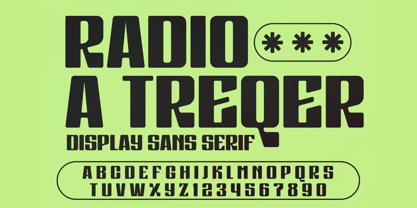 A serif modern and classic typeface that has its own unique style & modern look. This typeface is perfect for an elegant & luxury logo, book or movie title design, fashion brand, magazine, clothes, lettering, quotes, and so much more. This font is PUA encoded which means you can access all of the amazing glyphs and ligatures with ease! **Uppercase
 - Ongunkan Tifinagh Berber by Runic World Tamgacı,
$45.00 It is necessary to keep the memories of our ancestors alive. Although the languages and cultures of the past societies were different, in my eyes the ancestor of our humanity is. Having to experience everything in that world, no matter where in the world it is. This font is a Runic member. It is a kind of variety that belongs to different geographical regions.
 - Type Drawer JNL by Jeff Levine,
$29.00Type Drawer JNL is an assortment of various letter and number styles for use in novelty headlines. Limited character set. - Prussian Brew - Unknown license

- Strange Brew - Unknown license

- Toxic Brew by PizzaDude.dk,
$15.00 The Toxic Brew font was initially designed to be a Halloween font, but I guess it turned out not so scary in the end. But maybe you can use it for something scary anyway? I've added several versions, and they mix very well
 - Beer Time by Vozzy,
$10.00 Introducing a vintage look label font named "Beer Time". This font support multilingual characters and punctuation symbols. All available characters you can see at the screenshot. This font have 2 basic styles (Serif and sans serif) and 4 effect styles for each. This font will good viewed on any retro design like poster, t-shirt, label, logo etc.
 - Craft Beer by Gleb Guralnyk,
$15.00 Decorative vintage font with few beer theme sign glyphs.
 - Cold Brew by Fenotype,
$29.00 Cold Brew is a swift brush script family of three weights and a set of extras. Cold Brew is based on hand drawn letters polished with care to retain the vivid appearance of ink brush. Cold Brew is equipped with OpenType features to give you tools for custom-looking design: turn on Stylistic Alternates or Swash in any OpenType savvy program for flashier letters or manually select from even more Alternates from Glyph Palette. Cold Brew Extras is a set of brush strokes and swashes designed to support the font. You can for example easily create custom letters by combining the swash shapes from Extras with the letters. Combine Extras with uppercase letters or use them as underline or just plain extra strokes to emphasise your words.
 - Bree Serif by TypeTogether,
$-
- Draft Beer by FontMesa,
$25.00Draft Beer is a bold script suitable for logos, letterheads & headlines and was inspired by the lettering used by Miller Brewing Co. - Brer Rabbit by Kitchen Table Type Foundry,
$15.00 Brer Rabbit (or Brother Rabbit) is the central figure in an oral tradition passed down by African-Americans. Brer Rabbit is a trickster, just like the other popular trickster character in African stories called Anansi the spider. Brer Rabbit was based on an old font of mine called Rabbit On The Moon. It is a nice, cute children’s book font that comes with extensive language support and Brer Rabbit himself, in the shape of the alternative asterisk glyph.
 - Black Beer by Fractal Font Factory,
$10.00 Black beer, strong Gothic. It is designed for logos, prints, headlines and more. The font has 4 styles, base, blurred, outlined, and aged. Contains basic characters and punctuation marks as well as extended multilingual characters.
 - Brewing Crafters by Vozzy,
$10.00 Introducing a vintage look label font named Brewing Crafters. All available characters you can see at the screenshot. This font have 6 styles - Regular, Full, Shadow, Texture, Shadow FX and Texture FX. This font will good viewed on any retro design like poster, t-shirt, label, logo etc.
 - Brew House by Vozzy,
$15.00 Introducing a vintage look label font named "Brew House". All available characters you can see at the screenshot. This font have 5 basic styles - Regular, Full, Shadow, Light and Aged. This font will good viewed on any retro design like poster, t-shirt, label, logo etc.
 - MS Reference Specialty by Microsoft Corporation,
$29.00MS Reference Specialty is a unique font that was originally developed for inclusion in a Microsoft product. The MS Reference Specialty font is available in TrueType with a custom character set. - Breve Sans Text by DSType,
$50.00 Breve was designed for use in editorial projects. Simple but with enough personality to stand by is own, in a quest for a more forceful and contemporary appearance. All the fonts in Breve superfamily, share the same exact structure, both in terms of anatomy and functionality. The Text versions provide a softer and warm feel to the typographic palette and is intended for use in much longer passages of text, while the Title versions are distinguished by non-descending letterforms, making the titles and headlines much more uniform and interesting. The News version is more classic, with ball terminals and classic proportions, while the Display is, somehow, the set of fonts we had to design: extra-black, ultra-contrasted, proud-display fonts.
 - Breve Slab Text by DSType,
$50.00 Breve was designed for use in editorial projects. Simple but with enough personality to stand by is own, in a quest for a more forceful and contemporary appearance. All the fonts in Breve superfamily, share the same exact structure, both in terms of anatomy and functionality. The Text versions provide a softer and warm feel to the typographic palette and is intended for use in much longer passages of text, while the Title versions are distinguished by non-descending letterforms, making the titles and headlines much more uniform and interesting. The News version is more classic, with ball terminals and classic proportions, while the Display is, somehow, the set of fonts we had to design: extra-black, ultra-contrasted, proud-display fonts.
 - Beware The Neighbors by Intellecta Design,
$23.90 Beware The Neighbors is based on “Personality Script”, a rough alphabet originally drawn by Ross F. George, and published in one of the Speedball series of lettering catalogs that ran from 1935 to 1948. The design is something of a minor classic, and several foundries have recreated digital fonts based on it. However, mostly of these interpretations are very “geometric”, formed using straight lines. Intellecta preferred to create a new interpretation using smoother, curved lines to create a creepy appearance. Also included are several ligatures and OpenType stylistic alternates. This version also has an extended character set for use in Central as well as and West European countries, plus Baltic, Turkish and Romanian. Check out Intellecta’s Clarvoyant for another creepy experience based on lettering from old Speedball catalogs. CLOSE THE DOORS AND WINDOWS AND BEWARE OF YOUR NEIGHBORS!


