3,727 search results
(0.011 seconds)
- Office Doodles by Outside the Line,
$19.00 Fun, little illustrations in line and reverse of what one finds in an office-- or at least my office. See Food Doodles for more matching little drawings.
 - EasyPeasyLemonSqueezy by lgtm,
$25.00 There is an addiction to symmetry. When I draw, when I write, when I take pictures, when I design. So in this font. Best use in Headlines.
 - NorB Architect Pencil Condensed by NorFonts,
$35.00 NorB Architect Pencil Condensed fonts are the fruit from learning architectural lettering books so featuring 7 condensed weights going from Light to Extra Bold version. These Architectural fonts will add a beautiful architectural hand-lettering style to all your CAD project drawings. Architects have always wanted their CAD drawings to look more like they were drawn by hand, rather than by a CAD program. These AutoCAD fonts are the first step in bringing back that “artistic hand-drawn” feel to your CAD drawings or any graphic design project that can use true type fonts. They also can be used with any word processing program for text and display use, print and web projects, apps and ePub, Comics, graphic identities, branding, editorial, advertising, scrapbooking, cards and invitations … or even just for fun!
 - NorB ARCHITECT PENCIL by NorFonts,
$35.00 NorB Architect Pencil fonts are the fruit from learning architectural lettering books so featuring 7 weights going from Light to Extra Bold version. These Architectural fonts will add a beautiful architectural hand-lettering style to all your CAD project drawings. Architects have always wanted their CAD drawings to look more like they were drawn by hand, rather than by a CAD program. These AutoCAD fonts are the first step in bringing back that “artistic hand-drawn” feel to your CAD drawings or any graphic design project that can use true type fonts. They also can be used with any word processing program for text and display use, print and web projects, apps and ePub, Comics, graphic identities, branding, editorial, advertising, scrapbooking, cards and invitations … or even just for fun!
 - Quodlibet Serif by Signature Type Foundry,
$43.00 The new typeface system is based on legibility of Renaissance and Baroque Antiqua. It maintains the quality of drawings without an overpowering historical legacy. The current concept makes the system a universal whole. Abrading of sharp edges which could catch one’s attention leads to a fine rounding of details. In this way, a sans drawing does not look hard and sterile unlike most of its contemporaries. Special attention was paid to every detail of each letter. The professional question of how to incorporate brightening wedges into the dark places of individual strokes’ onsets was resolved by rounded shapes that have their graphic response in the detail of the serifs. Particularly in larger sizes the typeface offers drawing sophistication and dimensional interconnection. Apart from Cyrillic alphabet, the alphabet design includes Vietnamese accents.
 - Quodlibet Sans by Signature Type Foundry,
$43.00 The new typeface system is based on legibility of Renaissance and Baroque Antiqua. It maintains the quality of drawings without an overpowering historical legacy. The current concept makes the system a universal whole. Abrading of sharp edges which could catch one’s attention leads to a fine rounding of details. In this way, a sans drawing does not look hard and sterile unlike most of its contemporaries. Special attention was paid to every detail of each letter. The professional question of how to incorporate brightening wedges into the dark places of individual strokes’ onsets was resolved by rounded shapes that have their graphic response in the detail of the serifs. Particularly in larger sizes the typeface offers drawing sophistication and dimensional interconnection. Apart from Cyrillic alphabet, the alphabet design includes Vietnamese accents.
 - Electrack - Unknown license

- R&C by JBFoundry,
$16.00 R&C is totally drawn with a ruler and a pair of compasses. It is advisable for technical drawing. By stacking its eight styles, all combinations are possible.
 - Aspic by Elemeno,
$25.00Aspic was inspired by the handwriting and drawings of Robert Blechman. Although informal, squiggly and even sloppy, Blechman's work communicates a quiet dignity which this font aspires to. - Essence Round by kloeg architecture,
$24.00 This font is especially designed by architects for architect, urban planners, landscape architects, industrial and product designers. It is ideal for the use with line drawings. Because of it's geometric shape it blends in with your drawings. It's adjusted to fit most of the common line width types. It also contains many icons, especially for use in these professions. On top of that you can find many glyphs and icons to create legends and title blocks. More information about kloeg design.
 - Essence by kloeg architecture,
$29.00 This font is especially designed by architects for architect, urban planners, landscape architects, industrial and product designers. It is ideal for the use with line drawings. Because of it's geometric shape it blends in with your drawings. It's adjusted to fit most of the common line width types. It also contains many icons, especially for use in these professions. On top of that you can find many glyphs and icons to create legends and title blocks. More information about kloeg design.
 - Instructor by Chank,
$59.00Introduced as the Chank Font of the Month for May 1998, Instructor was drawn Roger Lootine and fontified by Chank. Roger was an instructor at Art Instruction School. You know the "Draw Tippy the Turtle" ads? That's where Roger used to teach. He also draws a cool comic called Residue. "Roger's got the best handwriting I've ever seen, and you can download it today!" says Chank. "How lucky are you? Way lucky!" Now available in OpenType format for your Personal or Commercial Use. - Cooper Screamers by Wordshape,
$- In 1925, at the request of Barnhart Brothers & Spindler, the foundry he worked for, Oswald Bruce Cooper designed a wide selection of "screamers", oversized exclamation points used to grab attention in display advertising. The foundry rushed the screamers into production, much to Cooper's dismay. Cooper was disappointed with the final form of the screamers– they were designed in assorted weights to match the assorted Cooper series of typefaces, as well as in a variety of other formal solutions- squaredoff, incised, wavy, Tuscan, and rounded. Cooper's working design methodology was to re-draw his projects a number of times in order to refine the formal results. However the screamer project was hastily cut by the head of BB&S's matrix engraving room in fourteen sizes from the initial sketches, causing Cooper to fire off a fiery missive stating, "Everything I draw is bum the first half-dozen times I draw it; the trouble with these is that I drew them only once!" This typeface is the result of researching Cooper's original drawings and series of engraved proofs for the screamers, as well as the original Screamer type specimen. Cooper Screamers have never been available before in digital format.
 - Pepino by Robert Petrick,
$19.95 Pepino is loosely based on the classic font Hobo but Pepino is a completely new and original drawing. The font is bold, fun, casual, easy to set and read.
 - VideoTech by The Northern Block,
$12.80 VideoTech is an 8 font family consisting of 4 weights open and 4 weights closed. A heavyweight typeface that draws inspiration from loading computer games onto the Commodore 64.
 - Albertina by Monotype,
$29.99Albertina was a typeface ahead of its time. It was in the early 1960s when designer Chris Brand, an accomplished calligrapher, aspired to draw a typeface based on the principles of calligraphy. Unfortunately, typesetting machines of that era put many restrictions on designers. Characters had to be drawn within a very coarse grid, which also defined their spacing. Technological limitations meant that italic designs often had to share the same character widths as the romans. Designers were forced to draw italic faces much wider and with more open spacing than what would be typical in calligraphic lettering or hand-set type. Not surprisingly, production of the first Albertina fonts went very slowly. Brand would submit his character drawings, and the Monotype Drawing Office would modify them to be compatible with the company's typesetting equipment. The new drawings would then be sent back to Brand for approval or rework. Most were reworked. The process took so long, in fact, that by the time the face was completed it was once again out of phase with the times: instead of being released as metal type for the Monotype composing machines it had been tailored for, Albertina debuted as phototype fonts for the Monophoto typesetter. The design's first use was for a catalog of the work of Stanley Morison, exhibited at the Albertina Library in Brussels in 1966. Sales of the design were not remarkable. With the advent of digital type technology, Albertina's story took a far happier turn. Frank E. Blokland, of the Dutch Type Library, used Brand's original, uncompromised drawings as the foundation of a digital revival. The Monophoto version had taken a considerable battering from the limitations of Monotype's unit system," recalls Blokland, "but there was no need for me to incorporate these restrictions in the digital version." With the full backing of Monotype and original designer Brand looking over Blokland's shoulder, a new design for Albertina emerged, displaying all the grace and verve of Brand's original drawings. The basic family drawn by Brand also grew into three weights, each with an italic complement and a suite of small caps and old style figures." - Alleyway JNL by Jeff Levine,
$29.00 Alleyway JNL is an original typeface by Jeff Levine drawing heavily on Art Deco influences. It's elegant, condensed design is perfect for anything from invitations to letterheads to ad copy.
 - P22 Petroglyphs by P22 Type Foundry,
$24.95 The oldest known form of visual communication, rock art expresses the culture and traditions of primitive humankind. P22's Petroglyphs picture font presents ancient drawings and illustrations from four continents.
 - Arturo by Hackberry Font Foundry,
$24.95 Arturo is a brand new font family drawn from the original inspiration of an old alphabet in one of Dan Solo 's Dover Clip Art books. It has moved far away from those raw roots, however. Every character has been redrawn. For example, I had a light version that I never could get working. Arturo is based on that light style and called Arturo Book. The name comes from a good friend of mine in El Paso. He was the guinea pig upon whom I foisted off the beginnings of this style so many years ago. I did several marketing pieces for him using the raw drawings. I figured that he deserved to have the family named after him, at the very least. This is a normal font family for me in that it has caps, lowercase, small caps with the appropriate figures for each case. This font has all the OpenType features in the set for 2009. There are several ligatures for your fun and enjoyment: bb gg ff fi fl ffi ffl ffy fj ft tt ty Wh Th and more. Like all of my fonts, there are: caps, lowercase, small caps, proportional lining figures, proportional oldstyle figures, & small cap figures, plus numerators, denominators, superiors, inferiors, and a complete set of ordinals 1st through infinity. Enjoy!
 - Andre Drafting by André Design,
$19.95 Developed for use in our design drawings by the renowned museum exhibit design firm André & Associates Interpretation & Design, the André Drafting font is being made available publicly for the first time. Based on the hand drafting lettering of our Senior Designer Andrew Farrell, this neat and tidy font will add a personal touch to CAD drawings, concept sketches and more. This font contains a full character set and is available in regular weight. Visit our website at www.aaid.ca for examples of our exhibit design work.
 - Puchiflit by sugargliderz,
$44.00 Puchiflit is a typeface disguised as a pen script. I didn't create this typeface by importing the letters on paper and tracing them into a computer with a draw application. So I think it's a pseudo-pen script typeface. By the way, I used a famous Japanese maker's felt-tip pen as a reference for line widths. I thought, "Isn't this what it would look like if I wrote with this pen? I drew a line in the draw application while fantasizing about this.
 - Fran Hand by Signs of Gold,
$25.00 The "Architect's Font" for Everyone! Having taught Mechanical Drawing - BC (before computers), I have always wanted to digitize my every day lettering as I have previously done with my calligraphic lettering. Based on my own daily lettering style, which in turn is modeled after the hand lettering of draftsmen and architects, Fran Hand comes with Regular and Italic versions each for the same low price. Use "Fran Hand" for writing letters, fax cover sheets, invoices, spec drawings, or for enjoying a change from the prosaic and commonplace.
 - Antique Packaging JNL by Jeff Levine,
$29.00 The box cover of “Drawing Stencils No. 3 for Use on Slate or Paper” [a children’s drawing set produced by Montgomery, Ward & Company of Chicago circa the 1890s] had its title in an elegant spurred Roman type face. Working from the few letters available, a complete character set was created that resulted in Antique Packaging JNL, which is available in both regular and oblique versions. To note, this is the 1500th font release from Jeff Levine Fonts since its inception in January of 2006.
 - Tritura by estudioCrop,
$19.90 Tritura is my personal take on textura fonts. Several methods of drawing were used, both analog and digital, to bring its overall rough feel. Each and every character was designed not from historical references, but from my view on this very peculiar typographic style. Instead of following established rules of character construction, I preferred to just keep in mind the mechanics of the pens used in textura drawings, as well as the little I already knew from the style, to create my own characters from there.
 - Gill Floriated Capitals by Monotype,
$29.99 Gill Floriated is based on a single character which Eric Gill drew as a decorated initial for use on a specimen setting of his Perpetua type. Although Gill was at first reluctant to produce a full alphabet, Monotype advisor Stanley Morison was able to persuade him to draw a few more characters from which the Type Drawing Office was able to create a full set. Issued in 1937 for display casting, it was revived by Monotype in 1995 for electronic publishing. Best used sparingly as dropped initials.
 - quiñók - Unknown license

- Kebo by DLetters Studio,
$12.00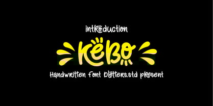 Introduction Kebo handwritten font, funny style, and playful hand draw display typeface and perfect for many design projects! Kebo font includes uppercase, lowercase, numbers, punctuations, ligatures, swash, and has multilingual support.
 - Zura by Caoni Studio,
$19.00 Zura’s font family design draws its inspiration from nature and a tribal style. The use of geometrical expression emotes a technological undertone. Opentype features include: Old style numerals Case sensitive forms
 - Hyperbole by Dmitry Bogolyubov,
$10.00 Hyperbole is a condensed futuristic display typeface, suitable for writing headlines and drawing posters. This font is strict, cosmic, bewitching. It contains alternative styles for latin letters and extended latin letters.
 - Boholah by Sulthan Studio,
$10.00 Old style fonts or also writing from teenagers, as a form of expression for those who are bored or looking for cool and creative ideas by drawing something accompanied by writing.
 - Katler by Lone Army,
$10.00 "Where Confidence Meets Flow, Retro Vibes, Modern Sophistication, and Raw Rustic Beauty." KATLER TIMEY FONT Multilingual Support.
 - Assimilation - Unknown license

- Damage™ Bludgeon - Unknown license

- Dos Crayones by Fat Hamster,
$15.00 Dos Crayones - Hand drawn textured fonts Dos Crayones inspired by child crayons drawing. Textured fonts are perfect for your great projects, quotes, playful branding, children's products, fun greeting cards, packaging and more!
 - FM Aloysius by FontMeister,
$24.95 Art Nouveau typeface ‘Aloysius’ draws inspiration from Wiener Secession Movement. You can use this font to create posters, greeting cards, scrapbooks, CD labels, T-shirts, coffee mugs, digital videos websites and banners.
 - Richie by Monotype,
$29.99 The Richie™ typeface grew out of a lettering experiment inspired by the work of Czech type designer Oldrich Menhart (1897-1962). Menhart’s typefaces were primarily text designs with a strong personal calligraphic influence. Monotype Studio designer, Jim Ford, wondered what a display typeface from Menhart might look like, and began drawing bold script characters with a broad-tipped chisel marker. “It was a familiar but laborious exercise,” explains Ford, “I tried to achieve an authentic – yet controlled – randomness that would serve as the foundation of a typeface.” Ford first drew a large suite of characters using the marker. All the drawings were then carefully adjusted, and scanned. Ford then pieced together a typeface from the best versions of letters, and refined those further. The result is a rugged, somewhat eccentric and playful script built on an obvious hand-drawn foundation. In a world of smooth scripts, the Richie design is heavy, chunky and rough. Its hand-made feel and vigorous rhythm put the power of raw brush lettering into the typographer’s hands. OpenType® fonts of Richie include standard, contextual and discretionary ligatures, in addition to contextual and stylistic alternates, old style, lining and superior figures, plus a large complement of swash characters. The name “Richie”? It grew out of Ford’s original premise for the design. “I wondered what it might it look like if ‘Old Richie’ had designed a heavy display face or script.”
 - Bramz by Ergibi Studio,
$19.00 BRAMS Display Serif Font. This font has unique and sleek letterform, make it great to be used for modern and minimalistic design theme. The unique ligatures on serif makes this typeface cool and stands out rather than the regular serif font, perfectly for headlines, logos, posters, packaging, T-shirts,coffee shops, restaurants, magazine’s headers, signs or gift/post cards,cafe’s and weddings or any type of advertising purpose. BRAMS only comes with an uppercase, Numeral, Punctuation, Ligature, and also Support Multi Language. if you have any Question please Message Me. Thank you ERGIBI STUDIO
 - Petroglyph by ParaType,
$25.00PT Petroglyph™ was designed by Ekaterina Kulagina and licensed by ParaType in 2002. The type was created on the basis of petroglyphs (rock-carvings) that are known in 77 countries. They remained in a form of geometrical drawings in the caves of North Spain and France. Scientists claim that the radial spread-out of circles or center-pointed circles that are usually depicted show the development of solar symbolism at that period of time. We know for sure that such mysterious signs as drawings carved on rocks already existed 40 centuries ago. - Gaisma by Lamatas un Slazdi,
$59.00 Art Nouveau typeface "Gaisma" ("Light" in Latvian) contains characters for all the European languages, Cyrillic and modern Greek as well as a huge set of contextual and stylistic alternates and historical characters to replicate the texts of the era. It draws inspiration from Vienna Secession movement and Nordic National Romanticism. The work on the design started as drawings of several characters for the graphic standard for the Jugendstil museum in Riga. To use it more effectively and to get acquainted with the possible stylistic sets download the Gaisma specimen in pdf format.
 - Rise Up With Fists by Ana's Fonts,
$15.00 Rise Up With Fists is a fun, sans serif font with lots of variations and extra drawings, inspired by protest posters. Use Rise Up With Fists in any design that needs a bold font, such as logotypes, quotes and social media posts, website and magazine layouts, and poster designs. Rise Up With Fists includes: Rise Up With Fists Regular, with 100 ligatures that makes this font look truly handmade and realistic (and fun to use!) A Filled alternative for a more bold look An Extras font with floral drawings and doodles


