9,404 search results
(0.018 seconds)
- Ma Braille by Echopraxium,
$5.00 The "Ma" in "Ma Braille" is used as a minimalist way to say "Negative Space". "Ma" in japanese arts is an "esthetical usage of emptiness". Thus this font explicits the negative space around visible braille dots in each glyph. A. Font user guide a.1. Lowercase glyphs { A..Z } In these glyphs, dots are represented as "black squares" while the negative space is displayed as 1 or 2 white filled polygons. a.2. Uppercase glyphs { a..z } In these glyphs, dots are represented as "white squares" while the negative space is displayed as 1 or 2 black filled polygons. a.3. Digits: they are just the same than a..j, but the "North US version" is also provided in ascii codes 0xE0..0xE4 (1..5) and 0xE7..0xEB (6..0). a.5. "Dashed Border": a.5.1. "Black dashed" border glyphs; { £, ¥, µ, Â, Ä, Ê, Ë, Î, Ï, Ô } a.5.2. "White dashed" border glyphs; { Ö, Õ, °, ô, ö, î, ï, û, u, õ } B. Posters Poster 1: "Font Logo" version 1, it displays "Ma Braille" text surrounded by the "black dashed border" glyphs. Poster 2: "Font Logo" version 2, it displays "MA" glyphs in big size and smaller "Braille" glyphs within "M" and within "A" as well. Poster 3: the classical pangram to test a font "The Quick Brown Fox jumps over the Lazy dog". Poster 4: Article 1 of the Human Rights: All human beings are born free and equal in dignity and rights. They are endowed with reason and conscience and should act towards one another in a spirit of brotherhood. Poster 5: the "Glyph set" (Border glyphs not included) with A..Z, a..z, digits and special characters.
 - Café Brasil by Sofia Mohr,
$39.00 Café Brasil is a font designed to represent coffee, especially for use in packaging, brand titles, logos and menus. Based on the shape of a coffee bean, Café Brasil has delicate details and ligatures that represent the liquid, foam and steam of a good cup of coffee. In March 2014, Café Brasil was chosen to be part of the main exhibition at the “Tipos Latinos 2014”.
 - Crayon Crumble by Hanoded,
$15.00 Crayon Crumble is exactly what it reads on the package: it was made using cheap crayons, since the cheapies crumble a lot. It is a fun, kiddie font, with a grown-up look to it. Of course it comes with all the accents.
 - Cookie Crumble by Hanoded,
$10.00 I like cookies. Especially butter cookies and ginger nuts. The word cookie comes from the Dutch word ‘koekje’ - which means exactly the same. Cookie Crumble is a cute little font that I made on a rainy day. I just needed something that looked and sounded happy and I guess it applies to this font. Cookie Crumble comes with a bunch of alternates, a full set of diacritics and a bit of sunshine to chase away your rainy day.
 - Quarter Braille by Echopraxium,
$20.00 Presentation QuarterBraille (Abbreviated as "QB" thereafter) is a decorative, steganographic and lattice font. Its core design concept is that Braille dots are represented as "quarters of a square"[1]. This is illustrated by posters 1 and 2 (NB: these glyph parts will be called "QB dots" thereafter). The other glyph parts (see poster 3) are purely decorative and meaningless in terms of Braille dots encoding[2]. All glyph parts are meant to generate a wide variety of patterns from horizontal and vertical combinations of glyphs. There is also a graphic convention to differentiate uppercase from lowercase letters with the presence or absence of shape subparts (in the "endings", "quarter of a circle with a ring" and "quarter of a diamond with a small square in the middle") like shown by poster 4. This font is suitable for very short texts (e.g. logos, acronyms, quotes, ambigrams, pangrams, palindromes, etc...) but on the other hand it may be used for steganographic purpose like geocaching as well as fictive alphabets (e.g. Alien/SciFi/Fantasy/Antique civilizations). Posters 1. Font Logo: the displayed text is " Quarter " followed by " Braille". There's a rainbow layer above the text to highlight the "QB dots", this is achieved by A..Z glyphs with "only QB dots" (codes 230..255) 2. Anatomy of a Glyph (L) and "QB Dots" (quarters of a square) 3. Glyphs Parts: Square and Cross (Inverted square), Circle and Inverted Circle (with or without the small circle in the middle), Diamond (with or without the small square in the middle), Inverted Square and Circle, Shape combos, Ending 4. Uppercase vs Lowercase (tiny shape subparts are shown in red) 5. Sample 1: Bathroom sink with QB tiles on the credence 6. Sample 2: Hands knuckle tatoos: "LOVE/HATE"[4] 7. Sample 3: Poker Hand: pocket Aces. It's an Ace of Hearts (Ah) on the left and an Ace of Spades (As) on the right. Like in regular cards, the card value (e.g. Ah) is displayed twice: at the top and rotated by 180 degrees at the bottom. This poster also illustrates that QB could be used to print embossed playing cards with tactile and visual display of card values. 8. Sample 4: Pangram: "Adept quick jog over frozen blue whisky mix" 9. Sample 5: Latin Magic Square: "SATOR AREPO TENET OPERA ROTAS" (NB: for compensation of the 2/3 glyph ratio, letters on each line are separated by a space: "S A T O R", ...). 10. Sample 6: Quote of Mahatma Gandhi: "Learn as if you will live forever, live like you will die tomorrow.". This is also a demonstration of border glyphs combinations. 11. Sample 7: Steganography use case: the text is a sequence of 64 aminoacids (1 Letter notation), this protein was described in a research paper "The complete Aminoacid sequence of an amyloid fibril protein AA of unusual size (64 residues) 1975". 12. Sample 8: Border Glyphs with the provided styles and mixed styles. The words are the same than in poster 9 ("SATOR AREPO TENET OPERA ROTAS"). Despite the 2/3 glyph ratio, the "TENET cross" was achieved by both inserting spaces in horizontally ("T ENE T") and by using the "thin borders glyphs". Notes a. Border glyphs[3] are meant to enhance the esthetics of text samples displayed with QB b. Special characters (e.g. *$()[].,;:&@# ...) are provided and follow the NABCC (North American Braille Computer Code) convention. c. A..Z Glyphs with only the "QB dots" are provided as demonstrated by posters 1 and 2 (A/N: this was very useful to create them). d. Glyph Map: 32..64: Special characters - 161..187: "Thin variant" of Border glyphs, 192..229: Border glyphs, 230..255: A..Z with only the "QB dots" - Codes 176 an 181 are "regular SPACE" (empty glyph). Footnotes 1. There is indeed two shapes which represent the braille dot: the "quarter of a square" and the "quarter of a cross". It's because a cross may be considered as an "inverted square" because the square corners are merged in the center. 2. That's why the SPACE glyph is only made of decorative/meaningless glyph parts (i.e. no "QB dots"). 3. For other fonts with border glyphs, please take a look at my other "decorative Braille fonts" (GoBraille, HexBraille, KernigBraille, StackBraille, MaBraille, DiamondBraille, LorraineBraille). 4. LOVE/HATE knuckle tatoos are inspired by the anthology scene from "The Night of the Hunter" movie (Charles Laughton 1955), it also appearead in "Do The Right Thing" movie (Spike Lee 1989). Disclaimer This font is not appropriate and not meant to print text documents in Braille for the blind readers audience.
 - Cristal Crumble by Johannes Krenner,
$4.98 This typeface is a carefully crafted display-typeface of fairy-tale breadcrumbs and fleeting love messages in the sand: Dusty or sparkly, legible or hard to decipher … but always a little bit magical. DEUTSCH: Hänsel und Grete hätte ihre Freude an diesem magischen Brotkrumen-Font. Ob taubig, sandig oder funkelnd. Dieser mit viel Liebe kreierte Font hat viele Anwendungen…
 - Hex Braille by Echopraxium,
$5.62 The purpose of this monospace font is to display braille in an original although rather steganographic way. Its glyphs are built from a flat hexagon which can be read as 3 rows of 2 vertices (i.e. regular braille glyph grid). The initial design is illustrated by glyphs 'ç' (no dot) and 'û' (6 dots) as shown by poster 5. Glyphs are connected to each other, thus 6 connections for each hexagon (2 on left/right and 4 on top/bottom). In the final design many diagonal segments of the hexagon were removed for esthetical reason. Text is displayed not as a honeycomb but as a lattice instead which mixes hexagons, squares and "irregular convex octagons" (mostly unclosed), the design favored squares over octagons. The whole slightly resembling a PCB. Text can be framed with 3 sets of Frame glyphs (as shown in Poster 4): Octagonal: { €, °, £, µ, §, ¥, ~, ¢ } which can be mixed with Rectangular High Rectangular Low: { è, é, ê, ï, î, à, â, ä } Rectangular High: { Â, ù, Ä, Ê, Ë, ô, õ, ë } which can be mixed with Octagonal NB: When using Frame glyphs, it is advised to show Pilcrow (¶) and Non Breaking Space, which are replaced by empty shapes (e.g. in Microsoft Word, use CTRL+8 or use [¶] button in the ribbon).
 - Scramble Storm by Gassstype,
$27.00 Introducing of our new product **Scramble Storm** Horror brush Font is handmade Rough Brush Font with ligature and Multilanguage support. Can make it easier to convey the message in your design. use for awesome display, labeling, movie sceen, poster, movie title,quotes, posters, DIY projects, branding, packaging, greeting cards, websites, photos, photography overlays, signs, window art, tags and so much more! Best for project that need horror vibes , horror poster, childrenbook, cartoon, comic etc
 - Peanut Crumble by Balpirick,
$15.00 Peanut Crumble is a Handwritten Font. Whether you’re using it for crafts, digital design, presentations, or making greeting cards, this font has the potential to become your favorite go-to font, no matter the occasion! This font only has allcaps letters. Enjoy the font! Feel free to comment or feedback! Thank you!
 - Lorraine Braille by Echopraxium,
$9.50 This is a decorative and steganographic Braille font based on Lorraine Cross pattern. As the Lorraine cross splits space into six areas, it may be used to represent Braille glyphs. Provided Glyphs * Lowercase letters (a..z): a White cross and Black square dots * Uppercasecase letters (A..Z): a Black cross and White square dots * Special characters (e.g. !#$%*+<>{}()[]...) * Decorative glyphs (provided in black and white as well) Glyph code intervals - Codes 48..57: Bullets (0..9 digits) - Codes 130..150: 'White Stars' - Codes 192..233: 'Black Stars', Black border glyphs and other black patterns. - Codes 214..233: Border/Decorative glyphs (Black) - Codes 235..255: Border/Decorative glyphs (White) - Codes for Cross w/o dots: Black (192), White (235) - Codes for Cross and 6 dots: Black (191), White (234) - Code for 'Half-width space' (166) Posters 1. Logo: illustrates usage of border glyphs 2. Meta: Two big Lorraine Braille glyphs drawn with pattern glyphs 3. Stars: illustrates usage of 'Star' and pattern glyphs 4. Bullets: illustrates usage of bullet glyphs (0..9) 5. Human rights - Article 1 NB: - Encoding is: Windows Latin ("ANSI") - Published in two versions: Commercial and Free for personal use
 - Diamond Braille by Echopraxium,
$5.00 Here is a "Decorative Braille font". The initial design was indeed drawn on a K.I.S.S digital sketchpad, the Windows default drawing tool (Microsoft Paint, classic version). A. Glyph Concept The Braille 2x3 dot matrix is weaved around a diamond-shape. a.1. Each "dot" is represented by a "right-angle isocel triangle". a.2. Braille dots in Diamond Braille a.2.I. "Dots" are outside the diamond for first Braille row (Braille dots 1, 4) and third Braille row (Braille dots 3, 6). a.2.II. "Dots" are inside the diamond for second Braillle row (Braille dots 2, 5). a.3. Diamond lattice Glyphs are connected horizontally (to/bottom diamond's corners) and vertically (left/right corners) to each other (see poster 5). a.4. Special Glyphs - Space: its is either empty ("Empty cell") or a "non Braille shape" { _, ° } depending on your display needs (as explained in b.3.II) - 6 dots: { £, =, û } - 6 empty dots: { ç, ¥ } B. Font user guide b.1. Lowercase glyphs { A..Z } In these glyphs the "dots" are represented as a white right-angle isocel triangle filled with a smaller black triangle. b.2. Uppercase glyphs { a..z } In these glyphs, the "dots" are represented as an empty triangle (this is an "empty dot"). b.3. 'Space' vs 'Empty Cell' b.3.I. 'Space' - 'Space' glyph is an empty shape - '¶' glyph (at the end of each line in Microsoft Word) is also an empty shape b.3.II. 'Empty cell' glyphs: _ (underscore), ° (degree). In these glyphs there are 2 "empty dots" at top and bottom corners of the diamond, which differentiates them from regular Braille glyphs (which dont have a "dot in the middle"). b.4. Diamond Lattice To display text as a 'diamond lattice', replace each 'Space' by an 'Empty cell' (as explained in b.3.II, see poster 5) b.5. Connectors The connector glyphs allow the creation of "circuit like" designs (see poster 1). Here are the connector glyphs: { µ, à, â, ä, ã, è, é, ê, ë, î, ï } b.6. Domino feature Some Glyphs represent numbers 1..6 in a way which is similar than on dominos (see poster 6) C. Posters Poster 1: the "Font Logo", it displays "Diamond Braille" text together with the Connectors feature. Poster 2: a pangram which is published on pangra.me ( "Adept quick jog over frozen blue whisky mix" ). Poster 3: an illustration of the Domino feature. Poster 4: a DiamondBraille version of the Periodic table. Poster 5: illustration of the Diamond lattice using only 6 dots ( û ) and 6 empty dots ( ç ) glyphs.
 - Rambla Alt by TipoType,
$- Rambla Alt is a variation of Rambla, which has certain modifications without altering its main structure (Rambla is also available in Myfonts). For this reason Rambla Alt is great when used together with Rambla. Rambla Alt is a humanist sans for medium-long texts. It’s slightly condensed, with a generous x-height and short ascender/descenders. Its proportions have the objective of gaining space in height and width. It’s elegant in large sizes and legible at the same time, with a lot of rhythm in small sizes.
 - Trembling Hands by Olivetype,
$18.00 With its flowing strokes and natural-looking letterforms, Trembling Hands captures the essence of hand-drawn beauty. Each character has a slightly wobbly touch, giving it a charming imperfection that sets it apart from other fonts. Whether you're creating headlines, logos, or branding materials, Trembling Hands adds an artistic flair that will grab attention.
 - Braille Alpha by Deniart Systems,
$10.00 This font can be used as a play'n learn tool to teach the meaning of these modern day communication symbols. Each alphabetical character can be printed with or without the corresponding roman symbols. NOTE: comes with an interpretation guide in pdf format.
 - Room Shambles by Linecreative,
$16.00 Room Shambles is an Art Deco typeface .This includes multilingual capitalization, numbers and punctuation. Room Shambles Art Deco typeface is perfect for your up coming projects. Such as luxury logo and branding, classy editorial design, woman magazine, cosmetic brand, fashion promotional, art gallery branding, museum, historical of architectural, boutique branding, stationery design, blog design, modern advertising design, card invitation, art quote, home decor, book/cover title, special events and any more.
 - Stack Braille by Echopraxium,
$5.00 This is a monospace font for the Braille alphabet. The idea came while exploring new ways to display the regular braille glyph ( 3 rows of 2 dots ). The glyph design is inspired by "stackable multiple board" games like the famous Vulcan chess (from Star Trek series) and the Qubic (3D tic-tac-toe). The stack is made from 3 levels, each level is a 3x3 grid with 2 "playable" cells (South-West and North-East). Each cell can be either empty, filled by a white square token or a black square token. The 3D effect is obtained by means of the classic isometric perspective. Lowercase letters use black tokens, while uppercase letters use white tokens. Most special characters (e.g. digits, *$#@, []{}() etc.. ) are also provided for special usages like program source code (see poster 5).
 - Go Braille by Echopraxium,
$4.00 A Braille font designed with the look of the Go Game. Lowercase glyphs use black stones while uppercase use white stones. To make the text more like within a Goban, Corner and border glyphs are provided. Also the font allows a "new kind of ASCII Art" by providing the missing glyphs (black stones) which enable this usage (see "drawille" project on Github).
 - Kernig Braille by Echopraxium,
$5.00 This font is the younger sister of HexBraille with which it may be combined to create new patterns. This also explains why their introductory text are similar. Introduction The purpose of this monospace font is to display braille in an original and "steganographic" way. The Kernig prefix means "Robust" in German, this is because of the crank shapes . The core of the glyph design is a flat hexagon which can be read as 3 rows of 2 dots (i.e. regular braille glyph grid). Even if within a glyph, braille dots ("square dots" indeed) are placed on the vertices of a flat hexagon, the difference with HexBraille is that edges connecting vertices are not straight lines but "crank shapes" instead. This can be summarized by saying that the whole glyph is a Hexcrank (a flat hexagon where vertice pairs are connected by a crank shape) NB: The initial design is illustrated by glyphs 'ç' (no dot) and 'û' (6 dots) as shown by poster 6. A. "Kernig Lattice" In KernigBraille, glyphs are connected to each other, thus for each Hexcrank glyph there are 6 connections: 2 on left/right and 4 on top/bottom. In the final design some cranks were removed for esthetical reason (i.e. leave empty space for allowing patterns diversity). In summary, a text using this font won't display a honeycomb but a lattice instead. NB: Please notice that in order to obtain the lattice without vertical gaps, you must set the interline to 0. The lattice is made from 3 kind of shapes: a.1. Hexcrank a.2. Square a.3. Irregular cross (mostly unclosed) The design favored squares over crosses. The whole slightly resembling a PCB. B. Text Frames It's possible to frame the text with 4 sets of frame glyphs (as illustrated by poster 2) b.1. Kernig { € ° £ µ § ¥ ~ ¢ } b.2. Rectangular-High { è é ê ï î à â ä } b.3. Rectangular-Low { Â ù Ä Ê Ë Ô õ ö } b.4. Mixed Kernig+High: a mix of Kernig and Rectangular-High frame glyphs When using frame glyphs, it is advised to show Pilcrow (¶) and Non Breaking Space, which are replaced by empty shapes in this font (e.g. in Microsoft Word, use CTRL+8 or use [¶] button in the ribbon).
 - Crumble Bakery by Timurtype,
$14.00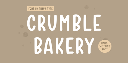 Introducing by Timur type Proudly Present, Crumble Bakery Crumble Bakery A Handwritten Font Crumble Bakery is perfect for product packaging, branding project, megazine, social media, wedding, or just used to express words above the background. Crumble Bakery also multilingual support. Enjoy the font.Thank you!
 - BR Nouveau Ramblings - Unknown license

- Tabaiba wild ffp - Personal use only

- Wild West Shadow - Unknown license

- Wild West USA - Unknown license

- EDB Wild Things - Unknown license

- KR Wild West - Unknown license

- Wild Gang Graffiti by Sipanji21,
$16.00 WIld Gang Graffiti font is a unique display font with a graffiti-like appearance. Use this font for any crafting project, apparel design, logotype, advertising, wall decoration, and pretty much anything that requires a personalized look. Take your designs to the next level with this stunning font! thanks for order and have a nice day
 - Wild Title Sans by Caron twice,
$39.00 Wild Title Sans is ideal for projects that are intended to be leisurely and relaxed. The font deliberately destroys the principles of restrained fonts, emphasizing unbridled individuality. The distinct notches in the font are enlarged ink traps, which are used for typesetting in small sizes and usually copy the structure of the character. In this case, the ink trap becomes part of the structure of the character, giving the font a strong and original feature. The weight of individual styles is also distinct: the emphasis on the vertical breaks with traditional approaches to posture. This font literally draws attention to itself. Individual styles are suited to a variety of uses, from small-point texts to bold, distinctive headings. Specimen: http://carontwice.com/files/specimen_Wild_Title_Sans.pdf
 - Wilde Fraktur Pro by SoftMaker,
$10.99 Blackletter is the classic “German” printing type. Starting in the 16th century and lasting well into the 20th century, most works in Germany were printed using blackletter types. Today, blackletter fonts are mainly used decoratively. If you want to communicate a feeling of old-world quality or nostalgia, blackletter fonts are the preferred choice – use them on signs, in brochures or on invitation cards. “Wilde Fraktur Pro” is a classic blackletter font of its epoch which inspires you to create vintage-looking designs with ease.
 - East of Wild by Clevus,
$17.00 Proudly present East of Wild is a Ornament serif font with a touch of elegant. Font Features : Lettres, numbers, symbols, and punctuation 28 alternates and ligatures No special software required they may be used even in canva, any basic program /website apps that allows standard fonts That's it folks! Multilingual Support Language Support: Danish, English, Estonian, Filipino, Finnish, French, Friulian, Galician, German, Gusii, Indonesian, Irish, Italian, Luxembourgish, Norwegian Bokmål, Norwegian Nynorsk, Nyankole, Oromo, Portuguese, Romansh, Rombo, Spanish, Swedish, Swiss-German, Uzbek (Latin) Follow My Shop For Upcoming Updates Including Additional Glyphs And Language Support. And Please Message Me If You Want Your Language Included or If There Are Any Features or Glyph Requests, Feel Free to Send me A Message. Kindly check over on Instagram! https://www.instagram.com/clevustudio/ Have a Good Day !
 - Wild Rebel Layered by Sipanji21,
$15.00 Wild Rebel is an urban graffiti font characterized by sharp edges and a bold look. Ideal for music posters, apparel designs, shirts, and streetwear, this font brings a touch of edginess to your projects. The unique style of "Wild Rebel" makes it the perfect choice for street style or urban graffiti themes. Whether you want to create a strong and powerful statement or simply add a touch of attitude to your designs, "Wild Rebel" is the font for you.
 - Wild Comedy JNL by Jeff Levine,
$29.00 John Sigvard ‘Ole’ Olsen and Harold Ogden ‘Chic’ Johnson were musicians-turned-comedians who rose to fame in the zany 1938 Broadway musical review “Hellzapoppin'”. They reprised their roles in the 1941 film adaptation of the show, and the opening title card of the film has “Hellzapoppin'” hand lettered in a tall, condensed sans serif design with an inline. This is now available as Wild Comedy JNL in both regular and oblique versions.
 - ITC Wild West by ITC,
$29.99Janet Murphy designed ITC Wild West Pi in 1997. A symbol font containing all of the cowboy-like pictograms one could ever need, ITC Wild West Pi includes such symbols as a ten-gallon hat, horseshoes, revolvers, and steer skulls. - Wild Fat Font by Softulka,
$10.00 Wild Fat Font - playful handwriting experimental display typeface inspired by classic old cartoons. Wild Fat Font is available in 3 styles: outline, outline distorted, and regular. The regular style imitates writing with a fat marker. The Wild Fat Font works perfectly for bold titles, Festival posters, a graphic element for bright T-shit or hoodies, designs for Kids, graffiti concepts, modern aesthetics, fashion, any visual design project, and even backgrounds! This bulging and chunky font likes an experiment with spacing and different deformation. Please, don't hold back on your bold modern ideas!
 - Wild Style Basic by Graffiti Fonts,
$14.99Wild Style basic is a simpler version of our Wild Style font with outlined letters on the capital keys and filled letters on the lowercase keys. This font also includes several symbols & foreign language characters. - Deco Neue Wilde by Open Window,
$- Deco Neue Wilde is a filter font based on Deco, an original Open Window classic. It sort of speaks for itself but it reminds me of a lava lamp and the countless shapes that you could waste time watching appear.
 - Back Wild Graffiti by Sipanji21,
$15.00 "Back Wild" is a bold and chubby graffiti font that includes swash characters. Fonts with these attributes generally feature bold and wide letterforms, often with playful and rounded elements. Swash characters add decorative and stylish touches to the font, If you have any specific questions or if there's anything specific you'd like to know or discuss about graffiti fonts or design, feel free to ask!
 - Brab by VSF,
$30.00 A bold grotesque typeface in the best traditions of the Star Wars logo. It has clean geometric lines, a humnaist character, it combines a tech feeling with a friendly organic feeling. Will work excellently as a white text on a busy background.
 - Bambe by Gian Studio,
$10.00 INTRODUCING BAMBE is handwritten, made with a brush, this font will rip your text with unmistakable energy, a dynamic and spontaneous flow. To help you create a stunning custom handwritten look, Bambe is perfect for magazines, t-shirts, packaging, logos, advertisements, quotes, branding, posters, editorials, cover artwork, films, websites, etc. BAMBE contains uppercase letters and some alternative characters, punctuation marks, numbers. Also includes the added bonus of a handcrafted, perfectly designed swash for headlines and short text. BAMBE encoded with Unicode PUA, Allows full access to all additional characters without designing any special software. Mac users can use Font Book, and Windows users can use Character Map to view and copy any additional characters for pasting into your favorite text editor / application. Thank you very much for viewing and Enjoying it!
 - Brams by La Boîte Graphique,
$21.00 Funny font designed for use in titles.
 - Rambo Killer - Unknown license


