10,000 search results
(0.234 seconds)
- Varial Medium by Cloud9 Type Dept,
$35.00
- Bookman Old Style Paneuropean by Monotype,
$92.99The origins of Bookman Old Style lie in the typeface called Oldstyle Antique, designed by A C Phemister circa 1858 for the Miller and Richard foundry in Edinburgh, Scotland. Many American foundries made versions of this type which eventually became known as Bookman. Monotype Bookman Old Style roman is based on earlier Lanston Monotype and ATF models. The italic has been re drawn following the style of the Oldstyle Antique italics of Miller and Richard. Although called Old Style, the near vertical stress of the face puts it into the transitional category. The Bookman Old Style font family is a legible and robust text face. - Confinental FREE - Personal use only

- Network Free - Personal use only

- Nasalization Free - Unknown license

- Negotiate Free - Unknown license

- Get Free - Unknown license

- Expressway Free - 100% free

- Eighties FREE - 100% free

- Rexlia Free - Unknown license

- Zekton Free - Unknown license

- Pakenham Free - Unknown license

- Mufferaw Free - Unknown license

- Larabiefont Free - Unknown license

- Fat Free - Unknown license

- Free Money by Jeremy Woods,
$10.00 Free money is an organic-looking display font. It was inspired by gig poster art, alternative comics and b-grade movies.
 - Sugar Free by PizzaDude.dk,
$17.00 Don't be afraid to taste something sugar free - most times you will be surprised how good it tastes! My Sugar Free font may not look as very much at first glance - but play around with the Regular and Italic versions (and notice the 4 different versions of each letter, that automatically cycles as you type!) and you will see how lively the font is!
 - Sultan Free by Linotype,
$155.99Sultan Free, designed by Sultan Maktari in 2005, is a freestyle Ruqaa and a winner in Linotype’s first Arabic Typeface Design Competition. The design is open, calligraphic, and very dynamic. This makes it suitable for large display sizes, especially in the area of advertising, while still functioning well as a text face. The font includes a matching Latin design and support for Arabic, Persian, and Urdu. It also includes proportional and tabular numerals for the supported languages. - Abdo Free by Abdo Fonts,
$49.50
- Free Zone by Aboutype,
$24.99A Sans serif design that follows a continental style with design characteristics that combine condensed and open counters. The lowercase has tall ascenders. Family includes common capitals and alternate lowercase characters. FreeZone requires subjective display kerning and compensation. - Shades Bookah by Maulana Creative,
$15.00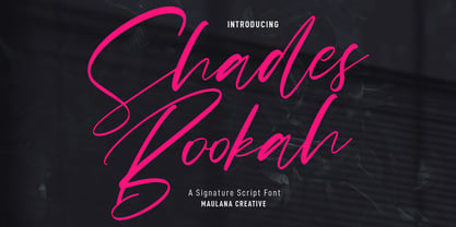 Shades Bookah is an expressive modern signature script font. With high contrast stroke, fun character with a bit of ligatures and alternates. To give you an extra creative work. Shades Bookah font support multilingual more than 100+ language. This font is good for logo design, Social media, Movie Titles, Books Titles, a short text even a long text letter and good for your secondary text font with sans or serif. Make a stunning work with Shades Bookah font. Cheers, MaulanaCreative
 - Bree - Personal use only

- Freeze! - Unknown license

- Fred by E-phemera,
$20.00The Fred family is based on the casual hand lettering of Fred G. Cooper: cover artist, cartoonist, and letterer for Life magazine in the 1920s and '30s. His relaxed style captures the flavor of the Roaring Twenties, and the digital font was developed for use in the credits and title cards for a 1920s-style silent movie, The Call of Cthulhu. In an effort to keep the hand-lettered look, the OpenType font has numerous discretionary ligatures and contextual alternates, along with fleurons and ornaments. - Dree by VP Creative Shop,
$14.00 Introducing Dree - typeface - 6 serif and display fonts Dree is creative and minimal typeface loaded with 6 fonts and multilingual support. It's a very versatile font that works great in large and small sizes. This font is perfect for branding projects, home-ware designs, product packaging, magazine headers - or simply as a stylish text overlay to any background image. FEATURES Uppercase, lowercase, numeral, punctuation & Symbol Serif and Display Alternate Italics Multilingual support No special software is required to type out the standard characters of the Typeface. Canva friendly Feel free to contact me if you have any questions! Mock ups and backgrounds used are not included. Thank you! Enjoy!
 - Bree by TypeTogether,
$37.50 The Bree font family is a spry sans serif by Veronika Burian and José Scaglione that delivers a spirited look and feel for branding and headline usage. As an upright italic, Bree shows a pleasant mix of rather unobtrusive capitals with more vivid lowercase letters, giving text a lively appearance. Bree is clearly influenced by handwriting. As such, some of its most characteristic features are the single-story ‘a’, the cursive ‘e’, the outstroke curves of ‘v’ and ‘w’, the flourished ‘Q’, and the fluid shapes of ‘g’, ‘y’, and ‘z’. Alternates of these letters are available when a more neutral look is desired. Bree has a touch of cheekiness, a wide stance for each character, and an extra-large x-height. All this adds up to a big personality, so even when set in small text there is no skimming past the words Bree voices. In 2019, the Bree font family got a huge update. A few shapes were updated or added (the ‘k’ and German capital ‘ß’), two entirely new weights were added (Book and Book Italic), and spacing was perfected. More than that, Vietnamese support was added to Bree Latin, and the Bree Greek and Bree Cyrillic scripts were designed from scratch to parallel the Latin’s tone. Additionally, Bree was designed in variable font format for those who want complete control over the font’s appearance while simultaneously saving digital weight in the form of kilobytes and megabytes. Bree is in the perfect position for the next digital revolution. The complete Bree font family, along with our entire catalogue, has been optimised for today’s varied screen uses. Bree has been chosen for such wide-ranging uses as Breast Cancer Awareness Month in the US, the branding for the country of Peru, and numerous layouts including mobile apps, magazines, newspapers, and books. Awards – Tipos Latinos exhibition 2008 – Several best-of-the-year typeface lists of 2008 MyFonts Top 10 Fonts of 2008 Smashing Magazine: 60 Brilliant Typefaces For Corporate Design https://www.smashingmagazine.com/2008/03/60-brilliant-typefaces-for-corporate-design/ Die besten Schriften 2008 http://www.fontwerk.com/619/die-besten-schriften-2008/ – Selected for Typographica’s Best Typefaces of 2008 – Won Bronze for Original Typeface in the 2009 European Design Awards
 - Xree by Katatrad,
$22.00 - Medina by Hatftype,
$15.00 Medina - Cute Valentine Display Font is a font with distinctive handwritten characters perfect for branding projects, logos, wedding designs, media posts, advertisements, product packaging, product designs, labels, photography, watermarks, invitations, stationery, and any project who need handwritten dishes. Features : • Character Set A-Z • Numerals & Punctuations (OpenType Standard) • Accents (Multilingual characters) • Ligature. Multilingual Support : Afrikaans, Albanian, Asu, Basque, Bemba, Bena, Catalan, Chiga, Cornish, Danish, English, Estonian, Faroese, Filipino, Finnish, French, Friulian, Galician, German, Gusii, Icelandic, Indonesian, Irish, Italian, Kabuverdianu, Kalenjin, Kinyarwanda, Low German, Luo, Luxembourgish, Luyia, Machame, Makhuwa-Meetto, Makonde, Malagasy, Malay, Manx, Morisyen, North Ndebele, Norwegian Bokmål, Norwegian Nynorsk, Nyankole, Oromo, Portuguese, Romansh, Rombo, Rundi, Rwa, Samburu, Sango, Sangu, Scottish Gaelic, Sena, Shambala, Shona, Soga, Somali, Spanish, Swahili, Swedish, Swiss German, Taita, Teso, Vunjo, Zulu. There it is. I really hope you enjoy it. Comments & likes are always welcome and accepted.
 - Helium by Red Rooster Collection,
$45.00 Re-tooled from the QBF Collection.
 - Medika by MC Creative,
$15.00 Medika is a sweet and a natural script stylish script. Medika Modern Calligraphy is perfect for branding wedding designs, invitation, social media posts, advertisements, product packaging, product designs, label, projects, logo, photography, watermark,stationery and any projects that need handwriting taste. What’s Included : · Standard glyphs · Ligature · Works on PC & Mac · Simple installations · Accessible in the Adobe Illustrator, Adobe Photoshop, Adobe InDesign, even work on Microsoft Word. · PUA Encoded Characters – Fully accessible without additional design software. · Fonts include multilingual support for; ä ö ü Ä Ö Ü ß ¿ ¡ Thank you for your purchase! Hope you enjoy with our font!
 - Radium by Typespec,
$32.00 Radium is a futuristic display face with a robust attitude and sharp geometric ideals. Drawing inspiration from computer games, graffiti and nineties dance music, Radium is a versatile typeface for branding, posters, packaging and point of sale. Radium is available in three weights and comes in OpenType (.otf) format for Mac and Windows. Features: Radium supports the following OpenType features: Standard ligatures, discretionary ligatures, ordinals, custom fractions, numerators, denominators, superscript, scientific inferiors, proportional and tabular lining figures, and a slashed zero. Supported Languages: Each weight has a 528 glyph character set for use in the following Latin languages: Albanian, Afrikaans, Basque, Bosnian, Breton, Catalan, Croatian, Czech, Danish, Dutch, English, Esperanto, Estonian, Faroese, Finnish, French, Gaelic, German, Greenlandic, Hungarian, Icelandic, Indonesian, Irish, Italian, Latvian, Lithuanian, Luxembourgish, Maltese, Norwegian, Occitan, Polish, Portuguese, Romanian, Sami, Serbian (Latin), Slovak, Slovene, Sorbian, Spanish, Swedish, Swahili, Turkish, Walloon and Welsh.
 - Mediator by ParaType,
$30.00 Mediator is a balanced contemporary sans serif typeface that performs well both in display sizes and body text. The family contains 30 fonts in 3 widths: 8 romans with matching italics, of slightly extended proportions, from Thin to Black; 7 narrow and 7 condensed, from Thin to ExtraBold. The character set in normal upright faces was expanded to include small caps and all faces include old style figures. The typeface was designed by Manvel Shmavonyan with the participation of Alexander Lubovenko and released by ParaType in 2016.
 - Cesium by Hoefler & Co.,
$51.99 An inline adaptation of a distinctive slab serif, Cesium is an unusually responsive display face that maintains its high energy across a range of different moods. The Cesium typeface was designed by Jonathan Hoefler in 2020. An energetic inline adaptation of Hoefler’s broad-shouldered Vitesse Black typeface (2000), Cesium is named for the fifty-fifth member of the periodic table of the elements, a volatile liquid metal that presents as a scintillating quicksilver. From the desk of the designer, Jonathan Hoefler: I always felt that our Vitesse typeface, an unusual species of slab serif, would take well to an inline. Vitesse is based not on the circle or the ellipse, but on a less familiar shape that has no common name, a variation on the ‘stadium’ that has two opposing flat edges, and two gently rounded sides. In place of sharp corners, Vitesse uses a continuously flowing stroke to manage the transition between upright and diagonal lines, most apparent on letters like M and N. A year of making this gesture with my wrist, both when drawing letterforms and miming their intentions during design critiques, left me thinking about a reduced version of the typeface, in which letters would be defined not by inside and outside contours, but by a single, fluid raceway. Like most straightforward ideas, this one proved challenging to execute, but its puzzles were immensely satisfying to solve. Adding an inline to a typeface is the quickest way to reveal its secrets. All the furtive adjustments in weight and size that a type designer makes — relieving congestion by thinning the center arm of a bold E, or lightening the intersecting strokes of a W — are instantly exposed with the addition of a centerline. Adapting an existing alphabet to accommodate this inline called for renovating every single character (down to the capital I, the period, and even the space), in some cases making small adjustments to reallocate weight, at other times redesigning whole parts of the character set. The longer we worked on the typeface, the more we discovered opportunities to turn these constraints into advantages, solving stubbornly complex characters like € and § by redefining how an inline should behave, and using these new patterns to reshape the rest of the alphabet. The New Typeface The outcome is a typeface we’re calling Cesium. It shares many of Vitesse’s qualities, its heartbeat an energetic thrum of motorsports and industry, and it will doubtless be welcome in both hardware stores and Hollywood. But we’ve been surprised by Cesium’s more reflective moods, its ability to be alert and softspoken at the same time. Much in the way that vibrant colors can animate a typeface, we’ve found that Cesium’s sensitivity to spacing most effectively changes its voice. Tighter leading and tracking turns up the heat, heightening Cesium’s sporty, high-tech associations, but with the addition of letterspacing it achieves an almost literary repose. This range of voices recommends Cesium not only to logos, book covers, and title sequences, but to projects that regularly must adjust their volume, such as identities, packaging, and editorial design. Read more about how to use Cesium. About the Name Cesium is a chemical element, one of only five metals that’s liquid at room temperature. Resembling quicksilver, cesium is typically stored in a glass ampule, where the tension between a sturdy outer vessel and its volatile contents is scintillating. The Cesium typeface hopes to capture this quality, its bright and insistent inline restrained by a strong and sinuous container. Cesium is one of only three H&Co typefaces whose name comes from the periodic table, a distinction it shares with Mercury and Tungsten. At a time when I considered a more sci-fi name for the typeface, I learned that these three elements have an unusual connection: they’re used together in the propulsion system of nasa’s Deep Space 1, the first interplanetary spacecraft powered by an ion drive. I found the association compelling, and adopted the name at once, with the hope that designers might employ the typeface in the same spirit of discovery, optimism, and invention. —JH Featured in: Best Fonts for Logos
 - Reditum by Mans Greback,
$59.00
- Modicum by Elemeno,
$10.00 - Podium by Identikal Collection,
$23.00 - FS Koopman Variable by Fontsmith,
$299.99New York to London via Europe The hardworking FS Koopman is a crossbred workhorse which draws inspiration from Swiss and Germanic grotesks, American gothics and early British grotesques, but refuses to fit neatly into any of these categories. Its neither one nor the other, but all of the above. Fontsmith designers Andy Lethbridge and Stuart de Rozario decided to take the characteristics they admired from each category and distill them down into one functional family. Neo meets Neue FS Koopman aims to swim against the tide of Helvetica-ish derivatives by bringing some personality and soul to a genre that all too often ends up feeling bland and sterile. FS Koopman subtly embraces the quirkiness and charm often seen in early twentieth century designs but pairs this with the functionality of later pioneers of the genre. It’s a grotesque isn’t it? The term grotesque surfaced around the early 1800s and refers to the early sans serif designs that many initially believed were strange or ‘grotesque’ due to their lack of elegant serifs. Later variations became known as neo-grotesques and this moniker stuck around even after they gained mass popularity. Some American variants became known as gothics. FS Koopman takes cues from all three categories and blends them into one cohesive design. - FF Beekman Square by FontFont,
$41.99 Dutch type designer Donald Beekman created this display FontFont in 1999. The family has 6 weights, ranging from Light to Bold (including italics) and is ideally suited for film and tv, music and nightlife as well as poster and billboards. FF Beekman Square provides advanced typographical support with features such as ligatures and case-sensitive forms. It comes with proportional lining figures.
 - LT Festive Medium - 100% free

- Wiegel Latein Medium - 100% free


