5,447 search results
(0.011 seconds)
- Bim Runger by madeDeduk,
$14.00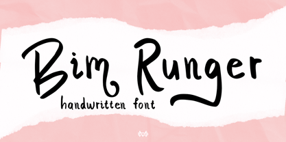 Introducing Bim Runger is a realistic handwritten font come with alternative and ligature and will be perfect for book, title branding, product packaging, invitation, quotes, label, poster, logo etc. Feature Uppercase & Lowercase Number & Symbol International Glyphs Multilingual support Alternative Ligature Thanks so much for checking out my shop and feel free to drop us a message any time and follow my shop for upcoming updates
 - Friz Biz by studiocharlie,
$24.00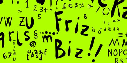 Friz Biz is an handwritten font; your designs will be really funny and fancy!
 - Sweet Fig by Din Studio,
$29.00 Sweet Fig is a bold script. This font is suitable for any design like branding especially for food packaging, quotes, printing, etc. The design can elevate your design project. Features: Beautiful Ligatures Stylistics Set Many Swashes Multilingual Support Numerals and Punctuation
 - Linotype Bix by Linotype,
$29.99Linotype Bix Plain, from Argentinian designer Victor Luis Garcia, is part of the Take Type Library, chosen from the entries of the 1999 International Digital Type Design Contest for inclusion on the Take Type 3 CD. The font is composed exclusively of capital letters. The figures have constructed basic forms and show the influence of the advertisement types of the 1920s, with all their well-mannered details. The lower sections of the graceful letters are white and set against a black background, the upper sections are black on white. This makes the overall picture look as though written on stripes and gives the delicate letter stability. The nostalgic-modern Linotype Bix Pleain is best for headlines in point sizes of 18 or larger. - Fig Bun by PizzaDude.dk,
$20.00Fig Bun is a slightly curly font with a cute attitude. When used in CAPS only, Fig Bun is is suitable for text in comics! - Rough Bits by Matthias Luh,
$15.00 Some old broken characters. It reminds me of old labels on walls, streets or on tanks.
 - Love Bug by PizzaDude.dk,
$20.00Yet another one of those romantic looking fonts. The lowercase looks pretty ordinary, while the uppercase swings around with a mixture of tagging / grunge / comicscript and casual handwriting. It works out extremely well with letters and stuff!. For fun, try writing in uppercase only...looks swell!! - Candy Bits by Bitstream,
$30.99Candy Bits was originally designed at Bitstream as a custom project for a large printer manufacturer. Released in 1997, Candy Bits was designed by Jim Lyles. The typographic characters were fashioned after a well known American candy. The balance of the characters in the font are designed to enhance the 3D illusion by appearing to recede into the page. Soon after its completion, Mr. Lyles joined a local health club. - Rig Shaded by Jamie Clarke Type,
$15.00 Rig Shaded is an award-winning 3D type family with a geometric sans serif at its heart. As its name suggests, Rig is designed as a framework to support a range of striking 3D effects. It has four versatile weights including a unique ‘zero’ weight. Each has two grades of distinctive halftone shading, Fine and Coarse, which emphasises Rig’s solid appearance. Rig developed from my quest to find ideal letter shapes for a shaded typeface while retaining their geometric principles and legibility. Each character has been designed to ensure maximum clarity and harmony when combined with 3D effects. The extrude and shaded styles have been handcrafted to produce a consistent weight and tone. Rig’s character set includes 230 glyphs, supporting 198 languages, including all Western, Central and South Eastern European languages. You can buy individual weight packs of Rig Shaded or the entire family for a discounted cost. See the full specimen for Rigs design features, additional examples and tips on using the typeface. Note: Rig’s shading styles have a high level of detail so may process more slowly in some applications.
 - Rig Sans by Jamie Clarke Type,
$25.00 Rig Sans is a streamlined geometric typeface, that speaks in a confident, affable tone. Its open, clean structure lends text a neutral, transparent quality. Distinct features enable Rig Sans to thrive, both in print and on screen: Minimalist Design Terminals clipped at 90º Generous x-height Wide apertures Distinct I,l,1 (uppercase i, lowercase L, Number 1) Rig Sans’ sturdy characters produce text settings with excellent clarity and readability. Their shape has been adapted from robust letterforms originally designed to withstand 3D distortions. This unique approach has resulted in an original sans serif rendition and an adaptive, durable type family. Rig Sans is comprised of eight weights and accompanying italics. Each weight contains 514 glyphs. OpenType features include: Alternate characters Three figure styles All caps punctuation Fractions Ordinals Superscript Subscript
 - Pesky Bug by PizzaDude.dk,
$16.00 Pesky Bug is a clean comic and kids font. Initially drawn by hand, but cleaned up digitally, leaving a fresh look - which makes it perfect for anything that has to do with kids products, sports, toys, clothing etc. The x-height, width of strokes and variating baseline are off here and there, and that leaves this active look!
 - Pig Scratch by KTEN Fonts,
$10.00 Need some Pig Scratch to go with your chicken scratch? This is a full fat font with a side of delicious glyphs. Perfect for merch, school lessons, invitations.
 - Rig Solid by Jamie Clarke Type,
$20.00 Rig Solid extends your typography toolkit with a range of energetic 3D fonts. Add dynamism to headlines and logos 13 styles across four weights Solid and gradient 3D designs Clean ‘unbreakable’ geometric shapes Rig Solid follows the award-winning design of its big brother, Rig Shaded. Each style can be used individually, making it even easy to achieve eye-catching 3D effects in print and on the web. The striking halftone styles add texture to your typography, while the hardy solid styles give your designs a visual punch and remain prominent when used over photography and patterned backgrounds. The family includes the unshaded style, ‘Bold Solo’, to perfectly compliment the shaded styles or be used on its own. Rig Solid does not require professional design software to use and is compatible with Microsoft Word.
 - Bix Bats by Linotype,
$29.99The Bix Bats symbol family was developed in 2003 by Argentinean designer Victor Garcia to complement his display text font Bix Plain. Bix Bats contains four different symbol fonts. Most of the characters in these fonts have their lower halves reversed out. Typing a line of text in these symbol fonts, or mixing these symbol fonts with Bix Plain, will create a very interesting text effect: the bottom half of your lines of text will be reversed out, on top of a colored bar. Bix Bats Arrows contains numerous possible arrow combinations, from archery references to the American recycling symbol. Bix Bats Funny includes all of the symbols needed for a party, from beer steins to bunny rabbits! Bix Bats Shiny has enough starbursts to light up a night sky, and in Bix Bats Wired you will find all of the technological accessories needed to be in the now. All four fonts are included in the Take Type 5 collection from Linotype GmbH." - DB Bugs by Illustration Ink,
$3.00DoodleBat Bugs brings fun, creepy crawly bugs inside your home, but don't worry they won't crawl off the page. - Stan Bugs by Dingbatcave,
$15.00 - Bix Metric by S6 Foundry,
$20.00 Bix Metric is a stylistic display font developed within a set grid. The mono-spaced first set of the family comes in 3 styles in both upper and lowercase glyphs allowing mixing of infinite combinations. Perfectly suited for headlines, large-format prints, brand identities, social media, advertising, editorial design, posters, magazines, logos, headings, digital and more. With multi-language support.
 - Q-bo - Personal use only

- McBoing Boing - Unknown license

- Atyp BL by Suitcase Type Foundry,
$39.00 The sources of inspiration for the Atyp typeface are spread out widely both stylistically and chronologically. The basic proportions of the uppercase refer to the elementary geometric constructions of the Bauhaus. The subtle details in the drawing of the characters and the microscopic adjustments, which evoke the illusion of uniformity and mechanical purity, pay homage to the rationalism of the typefaces popular in the International Style. The increased contrast of the joints of the bowls and shoulders in the Display weight, which in certain diagonal curves transition into almost deconstructive permutations. For a change these take delight in doing things on purpose, teasing readability and breaking the rules of the new millennium's typography. Atyp was created by adapting a typeface originally made for a commercial television station. The potential of the neutral grotesque, proven by its excellent readability on screens, gave the impetus for its preparation into an extremely wide character set. Coherence across all eight key masters lays the groundwork ideally for using the variable font format. The key benefits of this technology are a significant reduction in data consumption in the case of web fonts, as well as an unlimited access to the full range of styles, which in turn is a significant benefit in the area of responsive design.
 - Los Alamos by Red Rooster Collection,
$60.00 Although Los Alamos was originally designed as a complementary sister typeface to Grand Canyon, it evolved into a comprehensive and unique type family in its own right. It incorporates a unicase that is fully interchangeable with the caps, and vice versa, giving the user many different options and looks. Los Alamos Pro includes over 800 glyphs and ligatures, and supports 131 languages.
 - Los Feliz by Emigre,
$39.00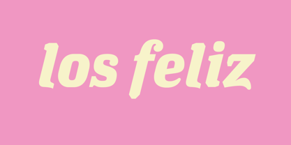
- Pansy Bo by Dharma Type,
$19.99 Based on some script in the 19th century. Inky texture gives realistic handwriting appearance. Smooth writing feeling creates antiqued and nostalgic atmosphere. There are two other script designed by in the same concept. -Daisy Lau -Lily Wang -Pansy Bo
 - Vivala bl by Johannes Hoffmann,
$38.00 Vivala bl has a high black ratio that supports a compact typographic style. It is particularly suitable for decorative typesetting, for example, for posters, logos, and book illustrations. Complementing the ornamental style, Black Letter has a narrow style that works well for smaller type sizes. And it is equipped with various contextual alternates and ligatures.
 - Lo-Res by Emigre,
$39.00 The Lo-Res family of fonts is a synthesis of pixelated designs, including Emigre's earlier coarse resolution fonts, as well as bitmap representations of Base 9. It replaces the preexisting Emigre, Emperor, Oakland and Universal families and groups these related bitmap designs under one family name in the font menu, thereby simplifying their naming. The Lo-Res fonts also offer technical improvements, including a more complete character set, more consistent character shapes among styles and weights, as well as improved alignment among the various resolutions.
 - Los Niches by Latinotype,
$39.00 Los Niches is a stylized sans serif typeface that combines modern, monoline characters with strokes and loops reminiscent of manuscript lettering. With a consistant, harmonious style Los Niches takes on a youthful flair when presented in bright colors, but is elegant and contemporary when dressed all in black. The flexible personality of Los Niches makes it ideal for catalogs, magazines or product packaging.
 - Los Banditos by Dicky Syafaat,
$15.00 The classical vintage font Los Banditos comes in a serif and sans serif form with a lot of of stylistic alternates and ligatures that will give a unique, classic, amd retro look on your design projects. Use it as a Display font on a poster, logo, menu, clothing brand, magazine, movie, website and much more.
 - Los Lana by T-26,
$19.00 - Los Muertos by Just My Type,
$25.00 Happy Halloween (and All Souls Day and Day of the Dead)! I’ve seen other fonts made up of bones of various kinds, but none with this variety. Henry Gray’s Anatomy of the Human Body (the book, not Grey’s Anatomy, the TV series) was heavily scoured to find more unusual bones shaped like letters. You’ll find Los Muertos both fun and appropriate for the up-coming holidays. (Uppercase is Solid, lowercase is Outline).
 - Los Vampiros by Comicraft,
$39.00 Wooden Stake? Check. Holy Water? Check. Gideon's Bible? Check. Crucifix? Check. One PC or Mac copy of the Los Vampiros font from the pages of Cliffhanger's CRIMSON? Check. Slayers shouldn't leave home without one.
 - Pea Glo-Girl Script - Personal use only

- Vandal Blow Graffiti Regular by Sipanji21,
$15.00 "Vandal Blow" is a 3D layered graffiti font that includes solid, shadow, and inner shadow styles, providing the tools to create a three-dimensional appearance in your text. Fonts with layered styles like this are commonly employed in graffiti art, street art, posters, and other designs where a dynamic and eye-catching 3D effect is desired. By utilizing the solid, shadow, and inner shadow layers in "Vandal Blow," you can enhance the visual impact of your text, creating a sense of depth and dimension. This font is particularly suitable for projects where you want to infuse a graffiti-style aesthetic with a three-dimensional twist, making your text stand out and grab attention.
 - Digs My Hart - Personal use only

- Zig Zag ML - Personal use only

- Bit Folder15 (sRB) - Unknown license

- KR Santas Bag - Unknown license

- 8 bit Darling by Norio Kanisawa,
$5.00 8bit darling is digital taste font. I think digital fonts are bitmap fonts generally, but dared to make digital fonts that are not bitmap fonts and made it. The name "8bit darling" borrowed a name from my favorite song. I made it consciously that it is a digital style but not so much inorganic. It contains hiragana, katakana, alphanumeric characters, some symbols. Horizontal writing only, vertical writing is not possible. Although it is slightly unique, I think choose a scene to use too much. I would be pleased if it could help you. <「エイトビットダーリン」紹介文> カクカクしたデジタル風のフォントです。 デジタル風のフォントといえばビットマップフォントかと一般的には思うのですが、敢えてビットマップフォントではないデジタル風のフォントを作りたいと思って作りました。 「エイトビットダーリン」という名前は私の好きな曲から名前を拝借しました。 デジタル風ではあるけれどもあまり無機質にならないように、と意識して作りました。 収録文字はひらがな、カタカナ、英数字、一部記号です。横書き専用、縦書きはできません。 ちょっと個性的ですがあまり使う場面を選ばないかと思います。 みなさまのお役に立てれば幸いです。 <スタイルカテゴリー> 角ゴシック
 - Bit Player JNL by Jeff Levine,
$29.00 Bit Player JNL is the extra-condensed companion font to Cast and Crew JNL, and features an additional oblique version. Useful wherever a large block of copy text needs to fit into a constrained space, Bit Player JNL can be applied to movie title credits, disclaimers, warranty information, end user license agreements and similar projects.
 - Tote Bag JNL by Jeff Levine,
$29.00Totebag JNL continues the stencil font series from Jeff Levine originally inspired by classic lettering stencils of the 1940s and 1950s. This particular design is common amongst "painting stencils", the individual letters used for marking and identification. Some characters are solid shapes while others have the more traditional "breaks" in the letters. - Tea Bag JNL by Jeff Levine,
$29.00 Inspired by a grocery store chain logo used up until 1975, this unusual Victorian-style typeface has a unique and interesting charm.


