2,035 search results
(0.028 seconds)
- Corrodated J - Unknown license

- Dolce Caffe by Resistenza,
$39.00 Dolce Caffe is a pretty hand-written font, designed in 2011, that is very legible and high in style and carefully constructed all-uppercase letters. It was totally inspired by hand-written chalkboards in Berlin, a city that I love. Take also a look at Merendina
 - QuaText by LucasFonts,
$39.00 This special newstext version of TheAntiqua was developed in close collaboration with the Berlin newspaper Die Tageszeitung (taz). Its sturdy forms were optimized for newspaper stock. This font family is currently being reworked and will be further developed with variable weights that can be adjusted to clients’ specifications.
 - Copperlove by Resistenza,
$49.00 Copperlove was born during a very long and hard wintertime in Berlin. This font is based on Giuseppe Salerno’s Copperplate calligraphy. Oblique nib and sepia ink were the tools used to create this sublime english typeface. There are also many opentype features like alternates and beautiful swashes. Turquoise Nautica
 - Creighton by Red Rooster Collection,
$60.00 It was our initial intention to develop a suitable lowercase for Les Usherwood's Elston typeface, based on a few characters from an old German typeface called Hermes Grotesque (Woellmer, Berlin). However, the new design quickly took on a life of its own, and we decided to call it ‘Creighton’.
 - Ohio by Wiescher Design,
$39.50 OHIO is a rough headline type in the tradition of Louis Oppenheimer. It is closely related to Lo-Type from Berthold, redesigned in the 1980s by Erik Spiekermann. Matter of fact, I discovered Ohio while visiting Erik in Berlin, searching his endless archive. Your typeface-looter Gert Wiescher
 - Fancy Dancing JNL by Jeff Levine,
$29.00 The 1938 movie musical "Carefree" starring Fred Astaire and Ginger Rogers featured the song "Change Partners" by Irving Berlin. A copy of the sheet music for this song had the title hand lettered in a wonderful tri-line design that has been recreated in the digital typeface Fancy Dancing JNL.
 - Linotype Atlantis by Linotype,
$29.99Lutz Baar was born in Berlin, now living in Gothenburg, Sweden. He is an art director at his own advertising and Web design studio Miraculus. Among his typeface designs you find the award winning Linotype Pisa, the hand tooled looking Linotype Atlantis, and the strictly Linotype Ordinar, designed for Web usage. - Adana by astype,
$19.00 The roots of Adana going back to the year 1930, to the Berlin-based German graphic designer Wilhelm Berg. His typeface can be interpreted as an answer to Lucian Bernhards Schönschrift. Adana Circular and Regular play well together in all kinds of adverts, as well with designs like Bodoni or Didot.
 - ZonoToon - Unknown license

- ZonoPlanet - Unknown license

- Haenel Fraktur by RMU,
$25.00 A bold but nevertheless pleasant black-letter font which was released for the first time about 1840 by the Haenel'sche Printshop and Letterfoundery in Berlin. Haenel Fraktur contains a bunch of useful ligatures, and by typing 'N', 'o' and period you get an old style number sign by activating the Ordinals feature.
 - Zono - Unknown license

- nekoFont - Unknown license

- Zono Dingbats - Unknown license

- Visillo Adornado NF by Nick's Fonts,
$10.00This unicase beauty is based on the typeface Vesta, originally designed by Albert Auspurg for H. Berthold AG, Berlin and introduced in 1926. Classic, stylish and elegant, this typeface will add grace and charm to any project. Both versions of this font include the complete Unicode 1252 Latin and Unicode 1250 Central European character sets. - Megaphone by Red Rooster Collection,
$60.00 It was our initial intention to develop a suitable lowercase for Les Usherwood's Elston typeface, based on a few characters from an old German typeface called Hermes Grotesque (Woellmer, Berlin). The new design became Creighton. Then, for good measure we decided to experiment with a 'crisper version' of this design; the result is 'Megaphone'.
 - Gagarin Star Mix Cyrillic - Unknown license

- 21 Kilobyte Salute - 100% free

- Spandau by Hanoded,
$15.00 Spandau is one of the 12 boroughs of Berlin and, if you add Ballet, a New Romantic British band. It is also a very nice all caps art deco font. Not too soft, not too angular, just about right! Some upper case letters differ from their lower case kin. Comes with all the diacritics you'll need.
 - Music Nouveau JNL by Jeff Levine,
$29.00 The interesting hand lettered sans design of Music Nouveau JNL was found as the title of a vintage piece of early 20th Century sheet music for a song written by famed composer Irving Berlin and called "They Were All Out of Step but Jim". Judging by the cover art, it was a novelty song about a soldier.
 - Hermes by ParaType,
$30.00 The typeface was designed at ParaType (ParaGraph) in 1993 by Tagir Safayev. Based on Placard typeface (Hermes Grotesk) of the Lange type foundry (St.-Petersburg), an adaptation of Hermes Grotesk, of the Woellmer type foundry (Berlin, middle of the 19th century). This sans serif with its old-fashion stability looks well in advertising and display typography.
 - Haenel Antiqua by RMU,
$30.00 This narrow neoclassical revival is based upon a font released by the Haenel Foundry, Berlin, in the 19th century. By typing [alt] + p respectively [alt] + b you have access to a framing element as it can be seen on the posters. By using the OT feature stylistic alternative you can change the normal numbersign into an oldstyle numero sign.
 - Shadowlawn JNL by Jeff Levine,
$29.00 If you like a rough-hewn, rugged and vintage typeface, then Shadowlawn JNL will certainly please you. Re-drawn from vintage examples of a hand-cut wood type, the rustic charm of this typeface brings a reminiscence of Old West themes.
 - Scotch FB by Font Bureau,
$40.00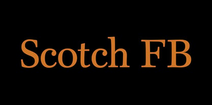 Scotch FB by David Berlow.
 - Jurassic - Unknown license

- Goethe Fraktur by RMU,
$25.00 First released by the Woellmer Foundry, Berlin, in 1910, Goethe Fraktur is a strong and legible blackletter font which has been now revived and carefully extended for modern use. To get access to all ligatures, it is recommended to activate both standard and discretionary ligatures. You will find the longs by typing option + b or by using the OT feature historical forms.
 - Acid Squares by Milan Vuckovic,
$29.00Acid Squares is a casual ornamental (fun) font. It was inspired by squares, the 70’s, the 90′s, street art and Berlin. Due to its limited readability it is recommended to use it in words that are common and uncomplicated or in logo design. As a decorative element it can be used well if the kerning is adjusted by the user. - FaxFont by Emboss,
$19.95Designed after receiving a bearly legible fax. - Custer by Font Bureau,
$40.00 In 2009, a book from 1897 in the library of the University of Wisconsin caught David Berlow’s attention. It was set in a clear text face—a predecessor of Bookman—cast by the Western Type Foundry who called it Custer. Upon noting how well the typeface worked in sizes of 6 and 7 points, Berlow developed it into a member of the Reading Edge series specifically designed for small text on screen. Custer RE was a broad and approachable typeface drawn large on the body with a tall x-height to maximize its apparent size when set very small. This was the beginning of the newly expanded series; in 2020, Berlow added new optical sizes and weights, growing the original design’s versatility up to headline sizes.
 - The Subway Types by HVD Fonts,
$30.00 The idea was to create a package containing prominent tag styles of graffiti strongholds like New York, Berlin and Paris. Shik (New York), Deon (Paris) and Etan (Berlin) came together to show the typical tag styles of their respective metropolitan areas. The fonts were digitized, spaced, kerned and programmed by Hannes von Döhren. The Subway Types are highly equipped. Each one consists of 4 alphabets (Uppercase, Lowercase, Small Caps & Swash). They also include ligatures and some specials like underlines and a huge range of accents for a wide language support. With the OpenType technology these features can be applied easily. For those who never used the OpenType features, we created the Std (Standard) and the SC (Small Caps) versions of the fonts. They contain the same basic characters like the OT versions but are split in two fonts. Hence you don’t need any OpenType knowledge to use the Std and SC fonts.
 - WildWest-Normal - Unknown license

- PGF Elyss Sans by PeGGO Fonts,
$29.00 To see more technical details download PDF specimen document: https://peggofonts.com/pdf/PGF-Elyss-Sans_%28Specimen-2023%29.pdf PGF Elyss Sans is based on its previous family relative PGF Elyss Roman. With clean and modern lines, but preserving the original Roman style, created to be in labels, invitation, website design, digital graphics, book headlines & titles, brochures, newspaper and magazines design, logotypes, branding and corporate design and much more. In seven weights with more than 900 glyphs each, and ready for more than 200 languages. Including: Standard and Discretionary Ligatures Contextual Alternates Scientific and fractional forms Lining, OldStyle and Tabular figures (Numerals, Mathematical operators and Currency Symbols) SmallCaps (alphabet, numerals and symbols) Social Network & Letter alike symbols Localized language customization (for Azeri, Crimean Tatar, Tatar, Kazakh German, Dutch, Polish, Catalan, Romanian, Moldavian and Turkish)
 - Nouveau Song JNL by Jeff Levine,
$29.00 The Art Nouveau free-form, hand lettered title on the cover of the 1912 sheet music for Irving Berlin’s “Wait Until Your Daddy Comes Home” formed the basis for Nouveau Song JNL, which is available in both regular and oblique versions.
 - Essay by Noem9 Studio,
$5.00 Essay was born from an afternoon in Berlin in September 2013, looking at old book covers. Inspired by Herb Lubalin, Athletics & Rock music. Its details relate with speed & punk styles but keeping the main structure intact. Works perfectly as main/bold typography combined with some serif typefaces. - More than 250 Glyphs - Full Accented Character Set - Numbers + Punctuation Marks - International Characters - 8 Different Styles (Normal, Display, Poster, Poster Heavy, and Oblique versions)
 - Kiez by Blackmoon Foundry,
$24.00 The “Kiez“ is an old school style font designed by Elena Albertoni in 2016. Inspired by shop and bar signage of the sixties and seventies, which can still be found today in the so called “Kiez“ in Hamburg St. Pauli or in one or another “Kiez“ in Berlin, which means neighborhood here. It also has a cinematic touch, again: think of the sixties and seventies or your favorite b-movie.
 - Enge Journal Antiqua by RMU,
$30.00 Hermann Zehnpfundt’s Enge Journal Antiqua, released by the Emil Gursch Foundry, Berlin, in 1910, revived and redesigned. This font contains also a long s, which can be reached by typing option + b, or turning the round s into the long one by using the OT feature historical forms. It is recommended to also use the OT feature discretionary ligatures to get access to all ligatures in this font.
 - Excalibur Sword by Comicraft,
$19.00 The Sword has been Drawn! The Quest for the Holy Grail has begun! When Arthur took the mighty sword of Excalibur from the Lady of the Lake, little did he know of the stories that would be spun, the myths that would be built around him, the Legend of Camelot and the Knights of the Round Table! And The Font. Merlin might have been King Arthur’s sage advisor, a font of wisdom and magicks, but never was Merlin available in postscript, truetype and opentype formats, nor was Lancelot, Arthur’s First Knight suitable for Celtic Display Lettering! See the families related to Excalibur Sword: Excalibur Stone.
 - Moskau Pattern by Letter Edit,
$49.00 The design of the typeface Moskau Grotesk and Moskau Pattern is based on the signage created for the Café Moskau in Berlin by the graphic artist Klaus Wittkugel in the beginning of the 1960s. The Café Moskau, across from the Kino International on Karl-Marx-Allee in Berlin Mitte was one of the prestige edifices of the former DDR (German Democratic Republic). Built in the early 1960s, it advanced over the years and changing social developments to a trademark building of the capital. The lettering display on the roof was created by the graphic artist Klaus Wittkugel (October 17, 1910 – September 19, 1985). He had been Professor at the School for Applied Arts in Berlin, and, in addition to the creation of many posters, book covers and postage stamps, he was responsible for the signage of the Kino International as well as for the complete graphic treatment for the Palace of the Republik. The signage for the Café Moskau with the words »RESTAURANT«, »CAFÉ«, »KONZERT« and »MOCKBA« set in capital letters, becomes the basis for the Moskau Grotesk which was developed by Björn Gogalla in 2013. This face should not be seen as an imitation. A few shortcomings were »fixed«. In favor of maintaining the core characteristics some unique features were, however, not relinquished. Lower case letters and the missing capital letters were designed from scratch. It is not surprising that the plain, unassuming geometrical direction of the basic character style forms a bridge to the architecture of the 1960s. Inspired by the then favored, diverse possibilities inherent in the architectural example and wall reliefs, two complimentary pattern fonts emerged.
 - Moskau Grotesk by Letter Edit,
$39.00 The design of the typeface Moskau Grotesk is based on the signage created for the Café Moskau in Berlin by the graphic artist Klaus Wittkugel in the beginning of the 1960s. The Café Moskau, across from the Kino International on Karl-Marx-Allee in Berlin Mitte was one of the prestige edifices of the former DDR (German Democratic Republic). Built in the early 1960s, it advanced over the years and changing social developments to a trademark building of the capital. The lettering display on the roof was created by the graphic artist Klaus Wittkugel (October 17, 1910 – September 19, 1985). He had been Professor at the School for Applied Arts in Berlin, and, in addition to the creation of many posters, book covers and postage stamps, he was responsible for the signage of the Kino International as well as for the complete graphic treatment for the Palace of the Republik. The signage for the Café Moskau with the words »RESTAURANT«, »CAFÉ«, »KONZERT« and »MOCKBA« set in capital letters, becomes the basis for the Moskau Grotesk which was developed by Björn Gogalla in 2013. This face should not be seen as an imitation. A few shortcomings were »fixed«. In favor of maintaining the core characteristics some unique features were, however, not relinquished. Lower case letters and the missing capital letters were designed from scratch. It is not surprising that the plain, unassuming geometrical direction of the basic character style forms a bridge to the architecture of the 1960s. Inspired by the then favored, diverse possibilities inherent in the architectural example and wall reliefs, two complementary pattern fonts emerged.


