10,000 search results
(0.025 seconds)
- In a Jar by Latinotype,
$29.00 In a Jar is a display typeface based in hand lettering. Inspired by the grandmother's kitchen, its colors, forms, smells and the new way for rescue this old things. Designed for use in short text and big sizes is perfect for brand design, headlines, labels, greetings cards and all kind of things related to kitchen and foods. In a Jar is a sweet little family that include alternates, compounds words, ligatures plus a serie of dingbats and ornaments very cute to compliment and accentuate the handmade design. Try and enjoy all fun in a jar! Designed by Coto Mendoza with technical support of Luciano Vergara.
 - Core Sans A by S-Core,
$19.00 Core Sans A Family from S-Core is a modern sans-serif typeface that is clean, simple and highly readable. It is a part of the Core Sans Series (Core Sans N SC, Core Sans N, Core Sans NR, Core Sans M and Core Sans G). Letters in this type family are designed with genuine neo-grotesque and neutral shapes without any decorative distractions. The spaces between individual letter forms are precisely adjusted to create the perfect typesetting. Core Sans A family consists of 8 weights (Thin, Extra Light, Light, Regular, Medium, Bold, Extra Bold, Heavy) with their corresponding italics. Core Sans A contains complete Basic Latin, Cyrillic, Central European, Turkish, Baltic character sets. Each font includes proportional figures, tabular figures, numerators, denominators, superscript, scientific inferiors, subscript, fractions and case features. We highly recommend it for use in books, web pages, screen displays, and so on.
 - OCR-A M by URW Type Foundry,
$35.00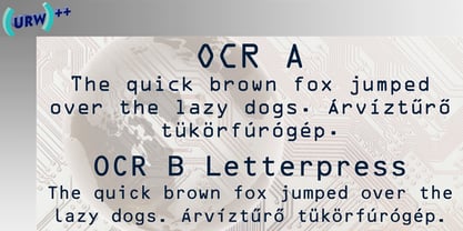
- A Quick Note by Mvmet,
$9.00 A Quick Note is a fun quick handwriting font. You can use it for anything ranging from regular typing notes, school projects, to t-shirts, kids’ book designs, greeting cards, stickers, posters, or anything that needs a casual touch. Fall in love with its incredible style and use it to create lovely designs!
 - Like A Cat by PizzaDude.dk,
$20.00 As a kid I used to write my favourite football teams name with 3D letters over and over again. I spent hours doing this - often to find out I had the colors wrong, or I had made a spelling error or two - but now, several years after, I have created the "Like a cat" font - so that you can make "handmade" headlines or funny quotes or even your favourite football teams name in a swoosh! If you get the colors wrong, or you make a spelling error, it's fast and easy to correct! :) Like a cat comes with substitution characters for double letters!
 - Scripio A Simple by AType,
$24.95This font is a simple version of my Scripio A. - A Hundred Miles by Kimberly Geswein,
$5.00 The adorable handwriting of a teen girl.
 - OCR A SB by Scangraphic Digital Type Collection,
$26.00Since the release of these fonts most typefaces in the Scangraphic Type Collection appear in two versions. One is designed specifically for headline typesetting (SH: Scangraphic Headline Types) and one specifically for text typesetting (SB Scangraphic Bodytypes). The most obvious differentiation can be found in the spacing. That of the Bodytypes is adjusted for readability. That of the Headline Types is decidedly more narrow in order to do justice to the requirements of headline typesetting. The kerning tables, as well, have been individualized for each of these type varieties. In addition to the adjustment of spacing, there are also adjustments in the design. For the Bodytypes, fine spaces were created which prevented the smear effect on acute angles in small typesizes. For a number of Bodytypes, hairlines and serifs were thickened or the whole typeface was adjusted to meet the optical requirements for setting type in small sizes. For the German lower-case diacritical marks, all Headline Types complements contain alternative integrated accents which allow the compact setting of lower-case headlines. - Like A Fool by PizzaDude.dk,
$20.00 Clumsy handmade font with ligatures for double letters
 - Segment A Type by Kobuzan,
$35.00 Segment A is a powerful display type family with 18 styles inspired by condensed European grotesques of 19th-century, but with clear geometric proportions. In Black weights, the letterforms are inspired by the aggressive industrial graphic design of the 1960s and 70s. Both have 3 axes and are adjustable in weight, width and 10˚ italic. It is a typeface with narrow proportions, distinctive character, high-quality outline and lots of details. Characters have oblique cuts, sharp tails and highly visible ink traps. All this makes the font more aggressive and edgy. The huge x-height with short ascenders and descenders allows this typeface to be used in blocks with minimal line spacing. Features: – Total glyph set: 631 glyphs; – 18 styles (3 weights x 3 widths + italic); – Support 210+ languages; – Latin Extended; – Cyrillic Basic + Bulgarian letters; OpenType features: – Proportional numerals, tabular numerals, superiors, fractions; – Punctuations and symbols; – Arrows; – Stylistic alternates (ss01-ss05); – Ligatures; – Case-sensitive forms.
 - Baroque Borders A by preussTYPE,
$21.00 PT Baroque Borders A is a baroque ornament-font for borders. Especially in combination with Fleischmann Gotisch you can made very impressive greeting cards, wedding invitations or decorative certificates.
 - DF A Bit by Dutchfonts,
$33.00 DF A Bit is made for screen display which is the final form of a lot of information nowadays. But there is more in this BIT... in display sizes it unfolds it’s skin, a beautiful ink on paper structure caused by the letterpress printing of copper lines. Analogue BITS indeed. With all the wealth of the ‘non perfect’, to please the eye and to satisfy the mind.
 - OCR A Tribute by Linotype,
$57.99OCR-A was originally designed in 1968 as a machine-readable alphabet. Its functionality was its most important element, instead of its design. Over the following decades, the typeface has become popular in the design world nevertheless. But typographically pleasing results are often hard to come by, due to the original design’s “non-design design”, as well as its undeveloped character set. In 2006, Miriam Röttgers revised and extended OCR-A, creating OCR A Tribute. OCR A Tribute is a typeface family comprising of two versions: one in which the glyphs have been proportionally-spaced, and another that is monospaced. In the monospaced version, all glyphs have the same width, like the letters in the original OCR-A font do. Both versions of OCR A Tribute contain complete character sets and expert glyphs, as well as lining and old style figures. Now you can rest easy, and finally use this classic design for display purposes and headlines! - Fling-a-Ling by TypeArt Foundry,
$45.00
- OCR-A EF by Elsner+Flake,
$35.00 - Etch A Sketch by JOEBOB graphics,
$9.00 I finally managed to create a font from the characters I wrote on my Etch A Sketch board. A bit grungy, but definitely something else.
 - Radio a Treqer by Letterena Studios,
$10.00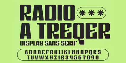 A serif modern and classic typeface that has its own unique style & modern look. This typeface is perfect for an elegant & luxury logo, book or movie title design, fashion brand, magazine, clothes, lettering, quotes, and so much more. This font is PUA encoded which means you can access all of the amazing glyphs and ligatures with ease! **Uppercase
 - SAA Series A by URW Type Foundry,
$35.00
- Stick-A-Round by PintassilgoPrints,
$24.00 Stick-A-Round started as an attempt to domesticate the wild Daft Brush font. During the process, though, it begun taking its own shape and personality, with friendly rounded terminals, dynamic interlock pairs and lots of alternates. There are at least 4 variations for each letter and 2 for the numbers and for some punctuation marks, plus an extra set of stylistic alternates. Besides showing up such a good humor, this font brings a lovely mate loaded with handy ornaments to jazz up your designs. Stick-A-Round, And Have Some Fun. I bet you will!
 - Initials Bergling A by Alter Littera,
$15.00 A comprehensive set of initials (usually referred to as Uncials, Lombardic Initials, or Lombards) of the French variety, adapted from Bergling, J.M. (1918), Art Alphabets and Lettering (Second Edition), Chicago: Blakely-Oswald Printing Company. The font contains over one hundred glyphs, including character outlines for two-color layering. Suitable to accompany most Gothic (especially Textura and Rotunda) and many Roman typefaces, or to be displayed as drop caps or in full titles and headings. Specimen, detailed character map, OpenType features, and font samples available at Alter Littera’s The Initials “Bergling A” Font Page.
 - BB book A by bb-bureau,
$65.00 bb-book A — breaking rules typeface Expressive book serif (triangular and curved) kicking up weight, width and contrast — in 4 styles: light, regular, medium and bold.
 - a Morris line by JOEBOB graphics,
$9.00 Here's a Morris line; a traditional and legible font in small sizes, but almost abstract in big sizes. Named after my son Morris and it's got nothing to do with a certain musical...
 - P&A Sans by Prominent and Affluent,
$24.00 Introducing P&A Sans, a modern sans serif font that combines geometric shapes with unique and glitchy characters that will make your design stand out from the crowd. This typeface is perfect for editorial design, branding, or advertising needs. P&A Sans has a solid character structure and supports multiple languages, so it's great for anyone looking to create designs with a global impact. Whether you're a freelancer, student or professional designer, P&A Sans can help you create something truly unique and special.
 - Corporate A WGL by URW Type Foundry,
$210.99 The Corporate ASE typeface trilogy was designed by Prof. Kurt Weidemann, a well-known German designer and typographer, from 1985 until 1990. This superb trilogy consisting of the Corporate A (Antiqua), Corporte S (Sans Serif), and Corporate E (Egyptian) is a design program of classical quality, perfectly in tune with each other. Weidemann says: "My ASE trilogy, quite like triplets, is in perfect harmony and covers all needs of modern typography!" Initially exclusively designed for DaimlerChrysler as a corporate font, the ASE trilogy may be now licensed and used without restriction. URW++ digitized the ASE for DaimlerChrysler and Prof. Weidemann and is the exclusive licencing agent for this outstanding and extremely popular typeface program. Meanwhile, URW++ enhanced the Corporate ASE family in regular, bold, italic, and bold italic by Greek, Cyrillic, and all additional Latin characters to cover Eastern Europe including the Baltic Rim, Romania and Turkey. Corporate ASE in regular, bold, italic, and bold italic is now available in the WGL 4 character complement.
 - Not A Chance by PizzaDude.dk,
$20.00
- OCR A Extended by Monotype,
$40.99OCR A and OCR B are standardized, monospaced fonts designed for Optical Character Recognition" on electronic devices. OCR A was developed to meet the standards set by the American National Standards Institute in 1966 for the processing of documents by banks, credit card companies and similar businesses. This font was intended to be "read" by scanning devices, and not necessarily by humans. However, because of its "techno" look, it has been re-discovered for advertising and display graphics. OCR B was designed in 1968 by Adrian Frutiger to meet the standards of the European Computer Manufacturer's Association. It was intended for use on products that were to be scanned by electronic devices as well as read by humans. OCR B was made a world standard in 1973, and is more legible to human eyes than most other OCR fonts. Though less appealingly geeky than OCR A, the OCR B version also has a distinctive technical appearance that makes it a hit with graphic designers. - A Likely Story by Comicraft,
$39.00 Finally an animated alphabet with a tall tale to tell -- perfectly suited to putting words in the mouths of mutts, talking tigers and anthropomorphic animal characters of all kinds. The precise thick and thin pen strokes of these eight versatile weights are well suited to gag strips, classic cartoons and maybe even that internet meme you've been thinking about for weeks!
 - AF Generation A by ACME Collection,
$44.00 - Dusk Til Dawn by Scholtz Fonts,
$19.95 As with Nocturne, Dusk til Dawn recalls the romantic, sophisticated Zeitgeist of the early 20th century, that nostalgic time "between the wars". It as a number of attractive ligatures and upper-case alternates. I have used Nocturne as a basis for Dusk til Dawn, given the font really bold down-strokes, reduced the width of some upper case characters and changed the shape of many lower case characters. Dusk til Dawn comes in two styles: Dusk til Dawn Regular, which uses the Art Deco convention of small x height, and long ascenders. This Display style is perfect for headers, posters, labels etc. Dusk til Dawn Book, which, with its higher x-height and slightly wider characters, is extremely legible and suitable for longer passages of smaller size text.
 - P22 Tai Chi by IHOF,
$24.95 Experimental lettering Stephen Rapp created in 1999 became the spark that Stephen's imagination transformed into the Tai Chi design. Tai Chi is a display face but it could also be used as a textured calligraphic script. Its delightful sense of movement distinguishes it from other scripts. Individual characters stand poised in a vertical Zen-like balance while at the same time displaying an inner rhythm that makes them appear to dance along the line. Rich in texture and variation, Tai Chi works very well at medium and large point sizes. The font contains several alternate letters that help maintain a hand-lettered look. Tai Chi includes both upper and lowercase letters but works well in all uppercase settings.
 - Mengelt Basel Antiqua Paneuropean by Linotype,
$103.99Inspired by the excellent serif fonts of the Basel printer of the 15th and 16 Century, Christian Mengelt designed the Mengelt Basel Antiqua. The typeface is a Renaissance Antiqua with stylistic reference to the historical model, but with the technical and typographic qualities of a modern text typeface with excellent reading quality. - OL Hebrew Formal Script With Tagin by Dennis Ortiz-Lopez,
$30.00 This font contains every variant found in the Hebrew Bible such as the “mutilated” Waw in Numbers 25: verse 12, the small Heh in Genesis 2: verse 4 and the Nun Inversum before Numbers 10: verse 35 and after verse 36 and elsewhere as well as oversized consonants and various double-wide consonants used in inscriptions.
 - Black Shirt Slime Trail - Unknown license

- Rail Route Stencil JNL by Jeff Levine,
$29.00 Rail Route Stencil JNL is based on a hand-cut paper stencil depicting a logo for the Baltimore and Ohio (B&O) Railroad. The lettering is from the motto encircling an image of the Capitol dome: "Linking 13 Great States with the Nation". This motto was not present on some other versions of the B&O logo.
 - Tall And Narrow JNL by Jeff Levine,
$29.00 Let Me Call You Sweetheart was one of the most popular songs of the early 20th Century, and a piece of vintage sheet music for this tune had its title hand lettered in a square, narrow block lettering style. With a few adjustments and adaptations, this led to the creation of Tall and Narrow JNL, a digital version of the type design which is a perfect alternate to the more conventional condensed faces.
 - Gotham Rail Company NF by Nick's Fonts,
$10.00An Italian travel poster from 1931 provided the inspiration for this attention-getting headline font with a strong architectural feel. The Opentype version of this font supports Unicode 1250 (Central European) languages, as well as Unicode 1252 (Latin) languages. - Lord of the Sith - Unknown license

- Magical Unicorn - 100% free

- KG What A Time - Personal use only

- a Theme for murder - Personal use only


