9,801 search results
(0.021 seconds)
- Southern Flight by Intellecta Design,
$9.00typeface based on old lettering by an 1930's advertise lettering in a Flight Magazine - Sphinx by Red Rooster Collection,
$45.00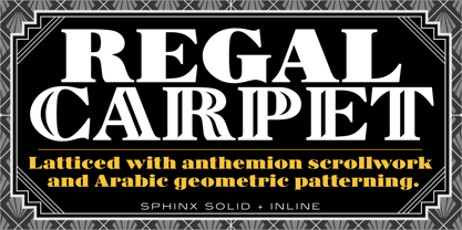 Based on the Deberny & Peignot, circa 1925. Originally the inline was a capitals only font.
 - Displayced JNL by Jeff Levine,
$29.00Displayced JNL is a technology-based font with the look of an LED/LCD Display. - Artemisia NF by Nick's Fonts,
$10.00A crisp, geometric semiscript, based on the font Adonis, originally released by American Type Founders. - ABC by Fontmill Foundry,
$15.00ABC is based on a set of children's stickers bought in a second hand shop. - Paunchy by Mirco Zett,
$15.00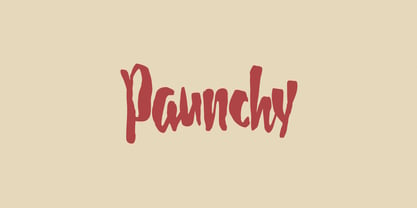 Paunchy is a playful and handlettered, calligraphy based font. Especially made for Logos and Headlines.
 - Biphoton by Typodermic,
$11.95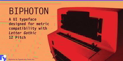 Introducing Biphoton—the monospaced sans-serif typeface designed to elevate your screen captions and UI applications to a new level of clarity and precision. With proportions that match Letter Gothic 12 Pitch, Biphoton can easily replace this font in any application where it has been specified. Unlike Letter Gothic, Biphoton is optimized for screen performance, ensuring that your message is delivered with utmost clarity and impact. This font features a range of currency symbols, numeric ordinals, primes, and common precomposed fractions, ensuring that your message is conveyed with precision and style. Biphoton is available in Regular, Italic, Bold, and Bold-Italic in TrueType, making it easy to integrate into your existing design workflow. Whether you’re designing for mobile or desktop applications, Biphoton delivers superior performance and visual appeal. Most Latin-based European, Vietnamese, Greek, and most Cyrillic-based writing systems are supported, including the following languages. Afaan Oromo, Afar, Afrikaans, Albanian, Alsatian, Aromanian, Aymara, Azerbaijani, Bashkir, Bashkir (Latin), Basque, Belarusian, Belarusian (Latin), Bemba, Bikol, Bosnian, Breton, Bulgarian, Buryat, Cape Verdean, Creole, Catalan, Cebuano, Chamorro, Chavacano, Chichewa, Crimean Tatar (Latin), Croatian, Czech, Danish, Dawan, Dholuo, Dungan, Dutch, English, Estonian, Faroese, Fijian, Filipino, Finnish, French, Frisian, Friulian, Gagauz (Latin), Galician, Ganda, Genoese, German, Gikuyu, Greenlandic, Guadeloupean Creole, Haitian Creole, Hawaiian, Hiligaynon, Hungarian, Icelandic, Igbo, Ilocano, Indonesian, Irish, Italian, Jamaican, Kaingang, Khalkha, Kalmyk, Kanuri, Kaqchikel, Karakalpak (Latin), Kashubian, Kazakh, Kikongo, Kinyarwanda, Kirundi, Komi-Permyak, Kurdish, Kurdish (Latin), Kyrgyz, Latvian, Lithuanian, Lombard, Low Saxon, Luxembourgish, Maasai, Macedonian, Makhuwa, Malay, Maltese, Māori, Moldovan, Montenegrin, Nahuatl, Ndebele, Neapolitan, Norwegian, Novial, Occitan, Ossetian, Ossetian (Latin), Papiamento, Piedmontese, Polish, Portuguese, Quechua, Rarotongan, Romanian, Romansh, Russian, Rusyn, Sami, Sango, Saramaccan, Sardinian, Scottish Gaelic, Serbian, Serbian (Latin), Shona, Sicilian, Silesian, Slovak, Slovenian, Somali, Sorbian, Sotho, Spanish, Swahili, Swazi, Swedish, Tagalog, Tahitian, Tajik, Tatar, Tetum, Tongan, Tshiluba, Tsonga, Tswana, Tumbuka, Turkish, Turkmen (Latin), Tuvaluan, Ukrainian, Uzbek, Uzbek (Latin), Venda, Venetian, Vepsian, Vietnamese, Võro, Walloon, Waray-Waray, Wayuu, Welsh, Wolof, Xavante, Xhosa, Yapese, Zapotec, Zarma, Zazaki, Zulu and Zuni.
 - Rolade by Akufadhl,
$25.00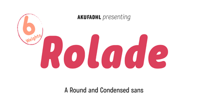 Rolade is a Rounded Condensed Sans. Designed for Display purpose. Firstly designed on late 2015 as an All Caps typeface based on a personal project. Rolade has a Rounded and cute character with condensed proportion. It also come with some alternates to give more flavour and variation. Supports a wide range of latin based language.
 - Lunair by Seventh Imperium,
$22.00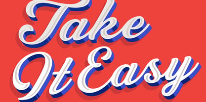 Lunair is a display script layered font. Feature the modern script layered The base layer is regular; add an extrude and extrude shadow to create a dimensional look. the font styles can be mixed and matched together to create different style details. are several fonts with a stand-alone script Base, Emboss And Inline,
 - FT Giorgio by Fenotype,
$19.95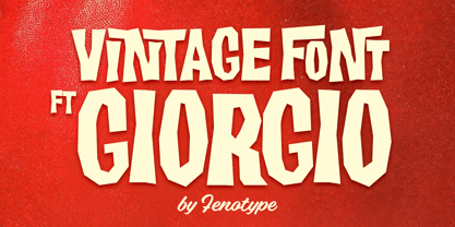 FT Giorgio is based on a hand lettering in a movie poster La Dolce Vita by Giorgio Olivetti. FT Giorgio has class-based kerning and around 200 automatic interlock ligature pairs which gives your design a custom look. To use the ligatures you only need to write in CAPS and use an OpenType-aware application.
 - ALS Dulsinea by Art. Lebedev Studio,
$63.00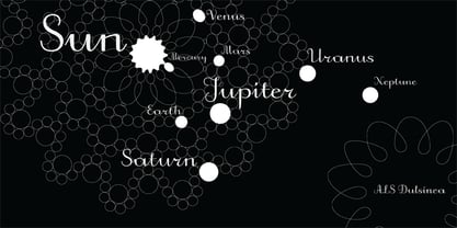 Decorative font based on XIX century Cyrillic handwriting. Dulsinea is a handwriting-based font, that is why most of the letters are tied to each other. Such handwriting is often seen in documents dated 2nd half of the XIX century. Its special features are rounded lengthy movements and unusual for present days sequence of strokes.
 - Klatter by Scholtz Fonts,
$19.00Klatter is a font that is "in your face". It can't be ignored, and draws attention to itself no matter how noisy the environment. It is available in three styles: - Klatter Regular is a clean, spunky, non-grunge font that uses a combination of straight lines and sharp angles to make a strong, no-nonsense statement; - Klatter SmallCaps, in which the lower case is a true "small caps" and not a shrunken version of the upper case (generated by the operating system); - Klatter Grunge is based on Klatter Regular but is "dirty" and messy, giving the impression of printing problems and wet ink being smudged. Unlike many other grunge fonts, Klatter Grunge is a font that is full of character. Both styles have a full character set with upper and lower case, numerals and mathematical symbols, as well as a full set of accented and special characters. The font has been carefully letter-spaced and kerned and the vertical spacing has been appropriately set. Klatter Grunge and Regular are appropriately purchased together since they complement one another when used in the same graphic design job. - BlackAdderII - Unknown license

- Stereotype by studiocharlie,
$17.00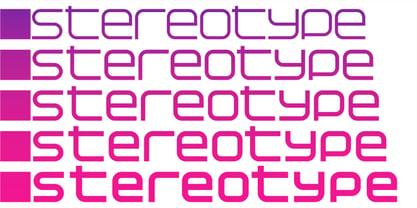 Stereotype is a geometrical font in five weights based on the same square. It's a gradient!
 - Secret Service Typewriter by Red Rooster Collection,
$45.00Based on proofs of an early Remington typewriter font from the Keystone Type Foundry, circa 1905. - Boink Scratchy Outline by Robert Petrick,
$19.95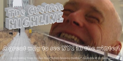 Boink Scratchy Outline is a new variation in a series based on my classic "Boink" font.
 - Kells by Classic Font Company,
$14.95A face designed specifically to complement celtic decorated capitals and based on text from the book. - Ornaments 6 AR by ARTypes,
$30.00Ornaments 6 are based on designs for the Curwen Press by Edward Bawden and Percy Smith. - Planchette by Aerotype,
$29.00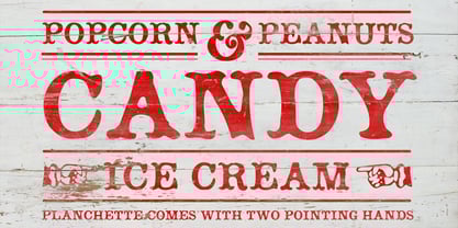 Based on a 19th century Toscanienne typeface, Planchette has two hand ornaments accessible by the < and > keys.
 - Prospector JNL by Jeff Levine,
$29.00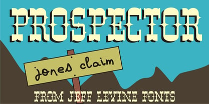 Prospector JNL is based on a lettering example found in an old Speedball-pen lettering handbook.
 - Directory Board JNL by Jeff Levine,
$29.00Directory Board JNL is based on the classic plastic letters used on office building directory boards. - Autovia by Santi Rey,
$25.99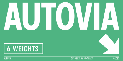 Autovia is a condensed sans-serif based on the typeface created for the US Highway signs in the 50s. Autovia comes in 6 weights. Has more than 350 glyphs and 8 stylistic sets, and supports all the Latin based languages. A new and more casual addition for the Highway fonts sub-genre ideal for big headlines.
 - Flashes by profonts,
$39.99Flashes is a striking display font based on Enric Crous-Vidal's design from 1953. Unger redesigned the font based on artwork from old font books, and extended the character set to cover not only standard Western but also the Central European character set. It has been a tremendous amount of meticulous work to digitize and edit all the flashes! - Mule Train JNL by Jeff Levine,
$29.00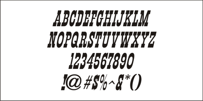 Instead of being directly based on classic wood or metal type examples, Mule Train JNL takes a roundabout route in its development. Images of a set of letters and numbers cut from plywood (which in turn were based on a vintage type design) served as the work models. Mule Train JNL is available in both regular and oblique versions.
 - Karolla by ParaType,
$30.00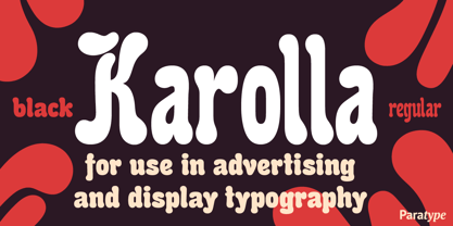 Designed at ParaType in 1994 by Tatiana Lyskova. Based on Carola Grotesk of H.Berthold and Bauer type foundries (early 20th century) and Boutique of Haas type foundry (Munchenstein, Switzerland). Bold style based on Herkules of H.Berthold foundry (early 20th century) was added for ParaType by Manvel Shmavonyan in 2002. For use in advertising and display typography.
 - Herold by ParaType,
$30.00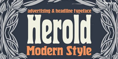 The typeface was designed at ParaType (ParaGraph) in 1993 by Vladimir Yefimov based on Herold Reclameschrift by Heinz Hoffman of H. Berthold (Berlin), 1901, and Russian Herold typeface of the Berthold typefoundry (St. Petersburg). The bold style based on Herold Heavy of H. Berthold (Berlin), 1904, of the same designer. Advertising and headline typeface in Art Nouveau style.
 - Perfecta Liner by Invasi Studio,
$17.00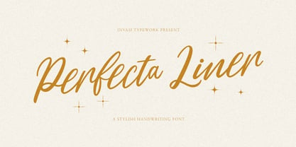 Perfecta Liner is a handwritten organic font that is perfect for branding, signatures, wedding invitations, promotions, product packaging, and more. Perfecta Liner is a modern, clean, authentic font. Perfecta Liner comes with ligatures, alternates, and supports 60+ Latin-based languages. Features: Total 261 Glyph Uppercase & Lowercase Numerals & Punctuation Alternates and Ligatures Multilanguage Supports 60+ Latin based languages
 - AT Move Holborn by André Toet Design,
$39.95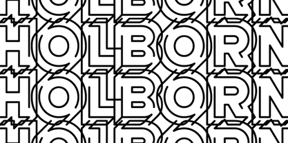 HOLBORN Aptly named after ‘High Holborn’, a high-street in London where the Central School of Art & Design was based. A font, just in capitals, based on the original design and the earlier sketches (1976) by André Toet. The strong optical illusion in this alphabet makes it an outstanding typeface. Concept/Art Direction/Design: André Toet © 2017
 - MVB Bossa Nova by MVB,
$39.00MVB Bossa Nova is based on unattributed hand-lettering found in an old book, circa 1946. Yet unlike many scripts based on a vintage source, it feels fresh and dynamic. This is due to the skilled hands of Holly Goldsmith, who gave the forms a contemporary vigor despite their age. Alternate glyphs with extended ascenders offer extra flair. - Circles JY by JY&A,
$39.00Based on electrical circuitry, David Philpott's Circles typefaces are oddly legible, even though one might think they were destined for display usage only. The circle is the base form, repeated throughout the design. Originally drafted during his time at the Massey University School of Design, subsequent refinements have turned Circles into two complete fonts with a full character set. - Mikeys Roman NF by Nick's Fonts,
$10.00Here's an amalgam of letterforms from two giants of the handlettering pantheon: an uppercase based on the work of Mike Stevens, and a lowercase based on the work of Alf Becker. The two work in perfect harmony to create warm, friendly and engaging headlines. Both versions contain the complete Latin 1252, Central European 1250 and Turkish 1254 character sets. - Magpie by Elster Fonts,
$24.00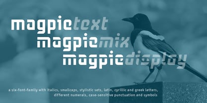 Magpie is a font family consisting of three sub-families with both regular and italic styles. Originally designed on squared paper, over time it has moved further and further away from this rigid grid, although its appearance is still based on it, so it can easily be used for logotypes or headlines with strict grid-based layouts. While Magpie Text is suitable for headlines and short texts, Magpie Display is ideal for logotypes or more playful headlines. Finally, Magpie Mix is a combination of both families. Magpie Text Regular represents stability, Magpie Display Italic is ideal for dynamic logos or headlines. To cover more languages, cyrillic and greek letters were added and Magpie can be used for nearly a hundred languages. In addition to the four common numeral variants, special numerals, punctuations and symbols for all-caps (c2sc) are included. Furthermore case-sensitive punctuations and symbols are available. To expand the typographic possibilities, four stylistic sets, different symbols, forms and standard- and discretionary ligatures have been added. Each Magpie-font contains more than 880 glyphs.
 - Strogino by maganet,
$5.00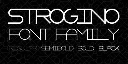 Strogino is a modern display pseudo-monospaced sans serif font. Due to the special design and some variants, all letters are easily identifiable though stuck together. It is as geometric as possible, being made with the simplest forms, capital letter sizes are exactly square. This allows to even create seamless patterns for backgrounds and watermarks. Diacritic can be added to any letter or even symbol and number, giving in total more than 1500 combinations! Strogino is perfect for logos, headings, titles, inscriptions, overlay text, backgrounds, and many more! Short paragraphs or quotes also look great with it. The font is named after Strogino (Russian: Строгино), a district in northwest Moscow, where the designer Roman Maganet came from. You can read more about making this font here.
 - Decorate The Tree by Ingrimayne Type,
$9.00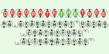 DecorateTheTree is a festive novelty font family containing two styles designed to be used in layers. Each style has letters on Christmas-tree lights. The regular style has clear bulbs and the bold style has filled bulbs. Some characters are on standing bulbs and others on hanging bulbs and these two sets are made to alternate with the OpenType contextual alternatives (calt) feature. To use only one set of bulbs, this feature must be turned off and character spacing adjusted, though why anyone would want to use only one set is a mystery. These fonts are monospaced. They are useful to display a holiday message not just in words but in the lettering itself. (The characters on the bulbs are derived from the font SansduskiMono.)
 - Coast by Blackmoon Foundry,
$42.00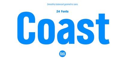 The Coast is a Sans Serif type family inspired by enamel signs from the 1920s. The Coast has a large x-height which gives the font a friendly look and guarantees great performance in very small sizes. The Coast family also works great in huge sizes since it has some very special and highly elaborated characters like the small “e” and “g” which distinguishes it from an ordinary Sans Serif. The family includes real small caps, small capital figures, medieval and monospaced lining figures for information in tables. Coast and Coast Wide both come with a variety of special characters, alternates, mathematical symbols and the unusual ligature “rt”. Also on board: the german capital letter “sharp s” = ẞ. That’s about it.
 - Bannetters by Ingrimayne Type,
$10.00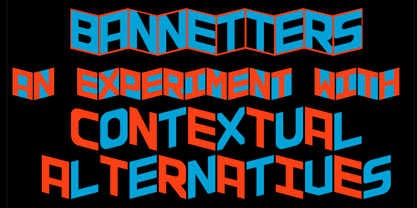 Bannetters (Banner Letters) was designed to alternate two letter sets. Both sets are formed on parallelograms, with one set of parallelograms sloped upward to the right and the other sloped downward to the right. When alternated, the result is a zigzaggy line of text. In applications that support the OpenType feature contextual alternatives (calt), the two sets of letters are automatically alternated. The Bannetters family has two styles, one with straight outer edges and the other that rounds these shapes for letters that have curved exteriors. Both styles are largely monospaced and monoline (not to mention weird, strange, and unusual). The tiling pattern of text created by Bannetters makes it attention-grabbing and appropriate for signage, posters, advertising, and other uses where eye-catching text is desired.
 - Sansduski by Ingrimayne Type,
$9.00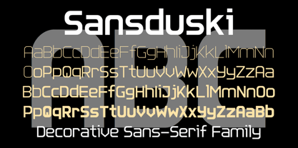 Sansduski is a sans-serif decorative/display family. Its very high x-height and tight spacing make it more suitable for use at large point sizes than small point sizes. (There are better options if one wants a readable text font.) It comes in nine weights and one outline style, with an oblique style accompanying each of these ten styles to give a total of 20 styles in the family. The letter O is a rectangle with rounded corners and this shape motif is carried over to other characters that are usually rounded. For a monospaced rather than proportional version of this design idea, see SansduskiMono. Sansduski is appropriate for titles, posters, advertising, and other uses that benefit from simple letter forms that are geometric and clean.
 - Ruskin by Fine Fonts,
$29.00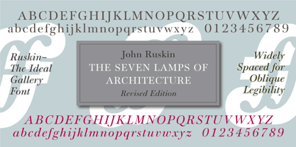 The origin of Ruskin was a commission for Michael Harvey to design a signage font for the Dean Gallery in Edinburgh. The style of the letterforms was to complement the period of the building which was originally an orphanage built in 1839. Only uppercase letters were created at first with the lowercase letters—and other characters necessary for a font—added later. With elegant and slightly extended letterforms, Ruskin fulfilled its rôle well as a signage font. It also functioned extremely well as a general display font. It is particularly suited to item descriptions and placards in galleries and museums which are frequently read from an angle, as well as head-on. The fonts have both proportionally and monospaced numerals.
 - Metrolox - Unknown license

- Songlines by Fine Fonts,
$29.00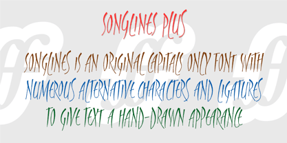 Songlines is based upon a pen-drawn script drawn by Michael Harvey to illustrate a poem by Johannes Thurman. The expressive and rough-edged letterforms of Songlines do not have any lowercase characters. Instead, alternative uppercase characters occupy their positions. By using a mixture of upper-case and lowercase characters, text can be given a very lively and vigorous character. For example, the two versions of L are designed to overlap and interact whichever way round they are used. The augmented Songlines Plus version, has many alternative characters and ligatures added together with Opentype features to enable their automatic substitution where the application in which they are used permits.

