10,000 search results
(0.02 seconds)
- Fat Font Grotesk by Intellecta Design,
$9.00a naive grotesque font - BARCO. D.A NORMAL - Unknown license

- Arco by Nicolas Massi,
$30.00 Arco is a brand new fat-face with some geometrical tweaks grabbing fresh and ideal for fashion editorial headlines. Arco also combines elegant symbols to sweet contrast. Normal & Outline version.
 - Baron Kuffner - 100% free

- Barlos-Random - 100% free

- Arcade Fire - Unknown license

- Karmatic Arcade - Unknown license

- Arcade Classic - Unknown license

- Nick Marco by Keristyper Studio,
$14.00 Nick Marco is a brush script typeface created by skilled hands which makes it look very refined. Its subtle shapes make this font suitable for all your projects. This font is perfect for branding projects, logos, wedding designs, social media posts, advertisements, product packaging, product designs, label, photography, watermark, invitation, stationery, and any projects that need handwriting taste. Multilingual support: Afrikaans, Albanian, Catalan, Danish, Dutch, English, Estonian, French, Finnish, German, Icelandic, Indonesian, Italian, Malay, Norwegian, Portuguese, Spanish, Swedish, Zulu, and many more. What’s Included : Standard & Multilingual glyphs Ligature Works on PC & Mac Simple installations Accessible in Adobe Illustrator, Adobe Photoshop, Adobe InDesign, and even work on Microsoft Word. Hope you enjoy our font!
 - Pier Arcade by Studio K,
$45.00 This font is inspired by all those end-of-the-pier amusement arcades and fairground rides. It’s also a bit of a nod to comic book graphics of the Marvel era and the superheroes who deliver knockout punches in a spew of drop shadow typography. With Pier Arcade you can now create your own fairground ride or comic book adventure. Enjoy! See also my other fun fonts Bebopalula, Barrowboy and Calypso.
 - HGB Bacco by HGB fonts,
$23.00 Since 2005, I have repeatedly attempted to create a neutral-looking grotesque with a humanistic character. I wanted a pleasant, soft typeface. The typeface should appear similar to Helvetica or Univers, but with more open shapes and therefore better readability. The features are deliberately reserved with 4 gradations plus italics. The onum feature for Old Style Figures contains additional alternative letters such as a looped g. The italics have a swash feature with some decorative shapes. As a sans serif, HGB Bacco does not appear to be technically constructed, but has a friendly, open character and is also suitable for longer texts.
 - Bacon Buffet by PizzaDude.dk,
$20.00 Is there anything more satisfying, alluring or mouth-watering than bacon? Comes with contextual alternates, which means that the font has got 8 different versions of each letter - this cycles as you type!
 - San Marco by Linotype,
$29.99San Marco is a part of the 1990 program Type before Gutenberg, which included the work of twelve contemporary font designers and represented styles from across the ages. Linotype offers a package including all these fonts on its web page, www.fonts.de. San Marco was designed by Karlgeorg Hoefer and brings to mind the style of the Italian Gothic found on the cathedrals of Milan and Florence as well as on the facade of St. Mark’s Cathedral in Venice. Its highly stylized characters make San Marco a good choice for extravagant typography. - Penny Arcade by Solotype,
$19.95A popular caps-only type of late Victorian times was called Mural, brought out by Boston Type Foundry in 1890. We always liked it, drew a lowercase for it, and then strengthened it by adding a bit of weight. It now has a nice, understated retro look for paragraphs of copy. - Marco Polo by Linotype,
$29.99Franko Luin, Marco Polo's designer, on this typeface: Marco Polo is a 'massacrated' oldstyle typeface that can be used in the same way as, e.g., Caslon Antique. I designed it - if the word design is appropriate in this case - to give the users an alternative so that they are not always directed to the same choice. For the same reason I made Marco Polo rounder. The name comes from the famous Venetian globetrotter, who has nothing at all to do with the typeface, since printing and punchcutting were still an invention of the future. - Mray Barlo by Ergibi Studio,
$20.00 MRAY BARLO is a typeface display that makes us feel nostalgic! It brings back the 60s to 70s vibe with a fun, retro typeface, with a uniquely crafted touch to each letter. The many alternative characters in this font add a unique style making this typeface stand out from the usual display fonts, perfect for headlines, logos, posters, packaging, T-shirts, coffee shops, restaurants, magazine headers, signs or gift/post cards, cafe and wedding or any kind of advertising purposes. What's Included : MRAY BARLO Standard glyphs Ligatures International Accent Works on PC & Mac Simple installations If there is a problem, question, or anything about my fonts, don't hesitate to ask! Big Thanks ~ Ergibi Studio
 - MBF Marcos by Moonbandit,
$14.00 Marcos, a playful vintage display font, bold and quirky, perfect for that retro look. every glyph is uniquely crafted. Marcos is perfect for logo, title, headline, even text, it is versatile and have high exposure.
 - Lost Arcade by Chris Rogers Fonts and Symbols,
$19.00 Are you a game developer, retro enthusiast or lover of pixel art? Ever had trouble tracking down an 8-bit display font that's classy, coherent and truly complete? This type enthusiast and veteran pixel artist once had the same problem, and cut no corners to solve it. Lost Arcade features four styles, a myriad of special characters, broad language support and an accompanying symbol font with 64 pixel art symbols. For the purists out there, each square is proportional to its neighbor.
 - Di Barros by Di Barros,
$5.00 I'm Roberto Teixeira, a Brazilian graphic designer. After looking for a form quite different from the existing types, created in 2019, Di Barros Fonts Family is composed by Di Barros Regular...for while. This,form covers the following, according to the Windows character map: Basic Latin, Latin Supplement 1, Extended Latin A, Extended Latin B, Additional Latin, Cyrillic, Greek, Greek Extended, Armenian and several other special types, such as currency symbols, numbers, fractions, Roman numerals, arrows, symbol of electricity, hearts and vector images, of own authorship and more. Di Barros, with a good length, serves several languages. I think Di Barros applies to fine environments, such as jewelry stores, fashion stores, cultural events and others, where a beautiful and non-aggressive look is required. But there is no better application than the one chosen for its inspiration and creativity. Di Barros Fonts Family was made for you. Thank you for using it.
 - Basco Std by Typofonderie,
$59.00 A mix of Renaissance & tropical atmosphere Basco is an exploration of the Renaissance style, a period in which letterforms were informed primarily by hand writing. It is clearly a contemporary interpretation of calligraphic shapes forms. The serifs are subtly asymmetrical. Slightly curved arches on the n, m and u are noticeable, creating an interesting tension in the text. Bruno Mello’s distinctive style is most obvious in his mastery of super fluid curves. It is a result of his extensive exploration of calligraphic forms, their tensions and dynamics, mixing angularities with curves. The roman weights include alternate swashes, as well as initial and terminal glyphs. The italics, based on chancellery script, feature simple stroke endings, most visible on the s and c. ➼ Basco minisite
 - Arcade King by Ditatype,
$29.00 Arcade King is an exciting display font inspired by classic arcade games. Designed in uppercase, this typeface captures the nostalgic essence of retro gaming with its playful style. With consistent letter proportions and high contrast, this font ensures easy readability while immersing you in a world of gaming fun. The consistent letter proportions of Arcade King create a sense of harmony and balance throughout the font. Each uppercase letter is carefully crafted to maintain visual cohesion, ensuring a smooth and enjoyable reading experience. This design choice guarantees that every character complements the others, resulting in a visually appealing and cohesive typographic composition. The stark difference between thick and thin strokes enhances the visibility of each letter, making them easily distinguishable even at smaller sizes. The high contrast design adds a touch of boldness and excitement to the font, capturing the essence of the arcade gaming experience. Enjoy the available features here. Features: Stylistic Sets Multilingual Supports PUA Encoded Numerals and Punctuations Arcade King fits in headlines, logos, posters, product packaging, branding materials, print media, editorial layouts, website headers, and any projects that aim to evoke a sense of fun and adventure. Find out more ways to use this font by taking a look at the font preview. Thanks for purchasing our fonts. Hopefully, you have a great time using our font. Feel free to contact us anytime for further information or when you have trouble with the font. Thanks a lot and happy designing.
 - Le Barche by Ditatype,
$29.00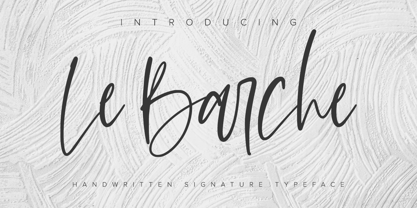 Le Barche is a modern handwritten font. With a classy and natural handwritten style, it brings a classy and chic typeface. Le Barche is best used for weddings, branding, logotype, and quotes. Features: - Beautiful Ligatures - PUA Encoded - Multilingual Support - Numerals and Punctuation
 - Worthington Arcade by Device,
$39.00 Worthington Arcade is a classically-proportioned capitals-only type incorporating a selection of ligatures and alternates. It loosely resembles the hand-painted architectural lettering of the 30s to the 50s, exemplified by the likes of Percy Smith’s interior signage for the BBC or George Mansell’s lettering for the University of London and the signs found on London’s bridges. However, rather than a slavish copy of any historical model, it is more an examination and evocation of certain idiosyncratic quirks of civic lettering of the period, and an attempt to create a peculiarly English titling typeface. The round letters, for example the O, Q and C, are wider than the perfect circle usually found in such designs, while the straight-sided characters, usually drawn on a square, are narrower. This lends the whole a subtle elegance that is also emphasized by the raised crossbars on the H, E and F and extended lower leg of the E. Includes old-style numerals.
 - Pixel Arcade by Comicraft,
$19.00 GAME OVER, MAN, GAME OVER! Time to grab your joystick, turn to channel 3 and level up, Player One, or you'll never beat the high score on your new game cartridge. Or bring a stack of quarters and a couple of friends to the mall, and we'll play some Rick Astley and Kajagoogoo over the PA while you scope out hotties near the food court. Either way, eight bit lettering has never looked more eighties than it does in our new PIXELARCADE font!
 - Fat Font Grotesk Streamline by Intellecta Design,
$21.90a stout font with the streamline art deco visual - Font - Unknown license

- Fat - Personal use only

- Fits by DearType,
$40.00 Fits is a modern version of the versatile vintage style script. It's clean, legible and easy to use. Fits was meant to be used as an everyday workhorse font, thus its uses are endless - from websites and signage to merchandise and editorial designs. It looks great on product packaging and menus, being easily readable from afar. It has some initial forms and ligatures, as well as fancier alternates for the capital letters (in case you want to spice things up a bit). Unlike its predecessor, BeachBar, Fits has more basic letter shapes which makes it the perfect script for most day-to-day design applications - think apps, websites, merchandise, posters and cards, blog titles, t-shirts, branding and animation projects, etc. As promised, Fits comes in seven weights for a different impact and with a neat set of Cyrillic letters. All in all, Fits is a simple and workable script that will fit most design tasks perfectly.
 - Baro B by Our House Graphics,
$15.00 Baro is a powerful, fun and expressive font, great for loud, cheerful and super-fat headlines and packaging for odd novelty toys. With its bold and distinctive stylized geometric forms, it is ideal for logos, heavy machinery and wacky party invites. Baro had its beginning in a handful of rigidly geometric uppercase letters from an unidentified 1960�s or 70�s era press-down lettering font, which in turn was possibly a revival of a 20�s era Art Deco font. The exercise quickly expanded into a complete typeface with 300+ characters, including several catch words (word glyphs), stylistic alternates, discretionary ligatures, multilingual support and both lining and old style numerals. Baro maintains much of the characteristic geometric rigidity of the original handful of letters, but � With the addition of just a little bit of flare, a bit of cheerfulness breaks through, like a wink and a smile on the face of a fat and otherwise stern policeman.
 - PR Arco by PR Fonts,
$10.00 Arcs for framing curved lines of text, in a style common on Victorian posters and almanac covers, and still seen on modern food packaging.
 - Arco Dot by Okaycat,
$29.95 The Arco Dot font features an exciting texture of dots in matching complimentary styles, making cool designs easy! Arco Dot features extended characters, and contains West European diacritics & ligatures. Highly suitable for international environments & publications. Arco Dot pairs well with Arco Web and Arco Crayon from Okaycat fonts.
 - Arco Star by Okaycat,
$29.50 Arco Star is a beautiful font made entirely of tiny stars, arriving with a family of styles so many different effects are possible. Arco Star is extended, containing European accents and ligatures so it is perfect for international publications. Arco Star pairs well with Arco Web and Arco Crayon from Okaycat fonts.
 - Arco Crayon by Okaycat,
$29.95 Real crayons were used in the making of this font. Yes, design can be fun again! Need to create the textured look of crayon, chalk, conte, or charcoal? Use Arco Crayon. Arco Crayon is extended, containing West European diacritics & ligatures, making it suitable for multilingual environments & publications.
 - Arco Web by Okaycat,
$29.95 The Arco Web font sets a friendly mood with casual artistic flair. Arco Web features extended characters, and contains West European diacritics & ligatures. Highly suitable for international environments & publications.
 - Big Bacon Tryout - Unknown license

- San Marcos NF by Nick's Fonts,
$10.00In his book Victorian Display Alphabets, Dan X. Solo called this specimen "Marquette". This unicase version features a complete character set, and is named after a favorite watering hole in Texas on the Guadeloupe River. Both versions of this font contain the Unicode 1252 (Latin) and Unicode 1250 (Central European) character sets, with localization for Romanian and Moldovan. - EF Witches Brood by Elsner+Flake,
$35.00 - Code 128 - 100% free

- Arco Perpetuo Pro by Hanken Design Co.,
$25.00 Arco Perpetuo Pro is a sans serif typeface with subtle rounded corners for the display stability on screen. Arco Perpetuo Pro may be used as small text or as big headlines.
 - Lifetime Font - Personal use only


