619 search results
(0.016 seconds)
- Menina Graciosa by Intellecta Design,
$20.90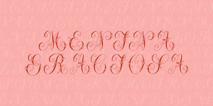
- Menina Gostosa by Intellecta Design,
$25.90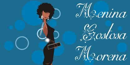
- ITC Minska by ITC,
$29.99ITC Minska is the work of Carl Crossgrove, who used a combination of upper and lower case shapes together to create new letter forms. Crossgrove created unconventional yet immediately recognizable variations in two different alphabets, which cannot quite be classifed as upper and lower case in themselves. With opulant curves and sharp angles, ITC Minska projects an unorthodox energy which is ideal for unusual effects and display settings. - TXT Monique by Illustration Ink,
$3.00Customize your lettering project with this cool and clever font. Download it for fanciful journaling on scrapbook pages and greeting cards. Try it on Halloween party invitations or wherever you might want to add a whimsical touch to a unique publication. - Mantika News by Linotype,
$67.99 Mantika News™, from German designer Jürgen Weltin, was designed to expand the Mantika super family with text and display typefaces for setting newspapers and periodicals. The suite of typefaces is comprised of regular and bold designs, with italic counterparts, for setting continuous text, and light and extra bold versions for setting larger sizes in headlines, sub heads, pull quotes and decks. The typefaces intended for text copy were designed with shared character widths, so that changes can be made in typeface choice without disrupting line endings or column length. The display designs have a slightly smaller x-height and shorter ascenders creating a more elegant demeanor while ensuring compact multi-line display copy. In addition, fonts of Mantika News have a large Monotype W1G (World Glyph Set 1) character set enabling the setting of Greek, Cyrillic and over 20 Eastern and Western European Latin-based languages. Proportional figures are available, in the OpenType® fonts, as an alternative to the tabular designs.
 - Losta Bonita by Creativemedialab,
$20.00 Introducing Losta Bonita A modern, vintage, and retro serif family. Consists of 9 weights from thin to black and variable format. The stylistic alternates allow many different unique shapes that give your lettering idea a well-looking look.
 - Mantika Sans by Linotype,
$50.99 With its well-defined characters that are readily legible even in the small font sizes, Mantika Sans by Jürgen Weltin is ideal for typesetting. The elaborately designed and highly individual set of italics enhances the attractiveness of the font.Jürgen Weltin developed the Mantika™ Sans sans serif font using older designs for an serif font as his inspiration. Nothing more than the merest suggestion of the original serifs has survived. Bevelled line endings and the slight variation in thickness of verticals, in particular, provide Mantika Sans with a very dynamic character that evokes manuscript. Short ascenders and descenders give the font a compact appearance that is also underscored by its condensed proportions. Weltin has achieved his aim of producing a typeface with excellent legibility even in small sizes not just by means of the x-height, which is tall in comparison with the capital letters, but also by using clearly defined and well differentiated designs for critical letters, such as i", "I" and "l". Lower case "i", for example, has a serif while the "l" has a curved base.In addition to uppercase numerals, Mantika Sans also has lowercase or old style numerals that have been designed so that they can be used in both tabular and proportional settings. The uppercase numerals are slightly shorter than the uppercase letters, ensuring that the latter can be sympathetically incorporated within continuous text.The Mantika Sans italics are very unusual. They are inclined at only 4.5° (the usual angle for italics is 10 - 12°) and so appear to be almost upright. In addition, they also have quite distinctive forms. The overall effect calls attention to their curvilinear, manuscript character, enhances contrasts and further emphasizes the terminals. Weltin explains: "Within the variety of forms of the italics there are many contrasting terminal elements that create dynamism. The result is a diversity of interaction between the rounded and angular forms". Mantika Sans Italic thus has all the features of a display typeface, but can also be happily used on its own to set longer text passages. Mantika Sans is available in two weights; Regular and Bold, both of which have corresponding italics sets. Mantika Sans has been designed so that the widths of the four related cuts are identical, meaning that a change of font within a single layout will have no effect on justification. In addition, the members of the Mantika Informal font family, designed by Jürgen Weltin in 2010, also have the same thickness. Other font families having weights with equal thickness can be found in the "Linotype Office Alliance series".The Mantika Sans character sets are paneuropean. There are characters for setting texts in Eastern European languages, Greek and Cyrillic. There is also a range of special symbols, including right-angled brackets, subscript and superscript lower case letters, together with numerals, arrows and many different bullet points.As a vibrant and highly legible text font, Mantika Sans has a broad spectrum of potential applications. Its unusual italics are not just perfect for use in display text. The fact that it has only four cuts means that Mantika Sans is particularly suitable for office use or for the setting of business reports. Its excellent legibility even in the small font sizes also makes it ideal as a text for electronic reading devices; this also applies to Mantika Informal.At the 3rd International Eastern Type Design Competition Granshan 2010, Mantika Sans was awarded in the category Greek text typefaces."
 - Mantika Book by Linotype,
$50.99 Mantika Book was originally conceived and drawn parallel to the first Agilita drawings. *[images: pencil drawings] It took several years before having a chance looking at these designs again. But then, my first impulse was to turn this alphabet into a new sanserif, which was to become Mantika Sans. This was the starting point to conceive a super family consisting of different design styles and corresponding weights. The initial drawings of Mantika Book were refined and an Italic was developed to go with it. The aim was to create a modern serif typeface which is reminiscent of humanistic Renaissance typefaces, yet without following a particular historic model. Its large x-height for one is far away from original Renaissance models. Mantika Book was designed as a companion serif typeface to Mantika Sans that can be set for lengthy texts as in books, hence its name. It shares the same x-height with Mantika Sans but has longer ascenders and descenders, making for better word shapes in long, continuous reading. The approach of an ›old-style‹ looking typeface with large minuscules makes Mantika Book also a choice for magazine text settings where one often needs smaller point sizes to fit in a multiple columns layout. The unique details of Mantika Book are the asymetric bracketed serifs in the upright font and its higher stroke contrast than usual in a Renaissance style. The stems are slightly curved inwards. Also, the Italics have a low degree of inclination, which makes longer passages of text set in Italic rather pleasing to read. Another feature Mantika Book shares with Mantika Sans is that all four weights take up the same line length. It covers all European languages plus Cyrillic and Greek, is equipped with lots of useful scientific symbols [double square brackets, angle brackets, empty set, arrows] and the regular weight has small caps. There is a kind of an old-style feeling to Mantika Book, yet these citations were turned into a contemporary serif typeface with a soft but sturdy character.
 - MC Bonica by Maulana Creative,
$14.00 Bonica is a casual modern condesned sans serif font. With medium low contrast stroke, fun character with a bit of ligatures and alternates. To give you an extra creative work. Bonica font support multilingual more than 100+ language. This font is good for logo design, Social media, Movie Titles, Books Titles, a short text even a long text letter and good for your secondary text font with sans or serif. Make a stunning work with Bonica font. Cheers, Maulana Creative
 - Menina Formosa by Intellecta Design,
$30.00 Meninas are the new comprehensive collection of innovative craft alphabets researched in rare cross-stitch booklets from 1850 to 1930. This alphabet series was entirely designed by hand, without use of auto-tracing, by Iza W, from Intellecta Design. Keep your eyes wide-open, because we will launch more amazing alphabets in this collection. "Menina" means "Girl" in Portuguese. Menina Formosa is a Beautiful Girl. See too her sister fonts: Menina Carinhosa, Menina Poderosa Ornaments, Menina Espinhosa, Menina Graciosa Ornaments.
 - Logika Nova by Designova,
$35.00 Logika Nova is a simple, clean typeface with a modern design and remarkable appearance. This is a perfect choice for creating logotypes, branding, headlines, corporate identities, and marketing materials for web, digital & print alike. The typeface will be a great option for branding, logo/logotype design projects, marketing graphics, banners, posters, signage, corporate identities, and editorial design. Adding extra letter spacing will make this font the perfect choice for minimal headlines and logotypes, as shown in the promo designs attached. Handcrafted and designed with powerful OpenType features in mind, each weight includes extended language support with Western European, Central European, and South Eastern European sets. A total of 280 glyphs are available. Logika Nova typeface includes 12 fonts, with six upright weights (Thin / Light / Book / Regular / Bold / Heavy) and Italic equivalents of all six weights.
 - Makika Sun by Andinistas,
$39.00 Makika Sun enhances the handwritten expressive possibilities of an architect mom and a graphic designer dad in Bogotá, Colombia. In other words, it is a versatile handwritten font family designed for writing short messages in children's contexts. Makika Sun shines for its conceptualization and logic, combining ideas from the American calligrapher Austin Norman Palmer and the Italian calligrapher Ludovico degli Arrighi. Makika Sun, a creative font family specializing in titles and paragraphs for children's books, emerged in 2009 and has developed over the years. Its essence lies in the simplicity of handwriting. In 2023, Makika Sun was applied in the book "Secret Files Tardigrades 1" for children ages 5-6 on Amazon from MyMicroSchool. The main goal of Makika Sun is to emulate handwriting that is legible and accessible to everyone. Makika Sun stands out for its readability and uncomplicated, artisanal style. It offers four typographic styles that simulate different calibers of markers: thick tip (Makika Sun Black), medium tip (Makika Sun Bold), normal tip (Makika Sun Regular) and Makika Sun Dingbats, a set of arrows and figures perfect to enrich your writing. . In short, Makika Sun's versatility and stylistic uniformity make it easy to create writing in various typographic settings. Its typographic heart communicates harmony in messages meticulously designed for spontaneous contexts that require high readability. Makika Sun offers a dynamic range of styles in 4 fonts notable for their outstanding performance in the field of children's book design and the creation of playful brand identities.
 - Modica Pro by Monotype,
$30.00 Modica Pro is here to expand upon the success and versatility of the original Modica typeface (2019). Modica has been compressed, condensed, narrowed, widened, and extended to a mega-family of 108 fonts that now includes small caps as well as additional language coverage. Modica Pro is a nimble typeface that can handle a multitude of applications – everything from body copy to retail fashion to corporate identities... why not put Modica Pro to task today? There are 108 fonts in this family, ranging from Hairline to Ultra weights across six widths in both roman and italic. A single variable font (included with the full family) covers all weights, widths, and italic angle with every increment in between to suit whatever style you prefer. Modica Pro has a character set that covers all Latin European languages. Key features: 1 Variable Font 9 Weights in Roman and Italic 6 Widths Small Caps Full European character set (Latin only) 650+ glyphs per font.
 - Moneta Sans by Monotype,
$28.00 Moneta™ Sans is an elegant transitional sans-serif with high contrast. Its morphology is based on the study of traditional broad-edge pen script. It comes in 2 styles and 4 different weights (Light, Regular, Bold and Black) and has variable features. Designed by Santi Rey and launched on May 2020.
 - Mantika Informal by Linotype,
$50.99 Jürgen Weltin's Mantika Informal is pretty difficult to categorize, but very easy to like. This particularly reader-friendly typeface in regular and bold weights, brings to the table the informal fluidity of a script, the consistency of an inclined italic, and the open and airy forms and contrast of a humanist sans. The result is a warm, approachable, and very legible typeface that is never static and staid, but rather invites an attentive, reading eye. The original idea behind Mantika Informal lay in the challenge to create a typeface for setting children's books. German designer Jürgen Weltin aimed to create a reading typeface for those just starting to learn how to read. On the one hand, it should help create clear word-images; on the other, its letterforms should remain uncomplicated but resist mechanical and industrial sterility. Mantika?s subtle cursive lines stress the printed word's connection with handwriting, in addition to making the transition from school writing exercises to printed texts seamless and effortless. The resulting slightly organic and cursive forms that developed during the design process are so captivating that Mantika Informal may be used for a multitude of unintended applications - anywhere a friendly and informal yet sophisticated character could lend a helping hand, Mantika is there, giving a fresh accent to anything from packaging design to food products. With a broad character set encompassing support for Cyrillic and Green, Mantika Informal's two fonts make for a versatile and dynamic typeface that surely will find its place in a broad range of applications.
 - Manila Style by Sensatype Studio,
$15.00 Manila- Modern Elegant Serif Font Manila font is a modern Elegant Serif font with a Elegant , fancy, playful, unique, and versatile vintage sans serif that you can combine to get a beautiful typography. It is a Serif font with moderate contrast that perfect for branding projects, logo, wedding designs, social media posts, advertisements, product packaging, product designs, label, photography, watermark, invitation, stationery, and any projects, it makes with a high level of legibility. What's Included: Ready 9 Weight (Thin, Extralight, Light, Regular, Medium, SemiBold, Bold, ExtraBold, Black) Character set A-Z Alternative Uppercase & Lowercase Numerals & Punctuation Accented Characters (West Europe) Works on PC & Mac Wish you enjoy our font. :)
 - Menaka Serif by Gunjan,
$49.00 Menaka is a high contrast type family. The main feature of the typeface is round shaped stroke ends, which distinct it with other serif fonts. Menaka solves problem in many design areas such as books, fashion brands and beauty products. Thought behind Menaka is to give classic yet modern form to a font. Menaka also serves well in short texts, article introductions, brands identity and packaging. Have fun with Menaka!
 - Mogila Display by Letterfreshstudio,
$15.00 Mogila is a display font with a touch of style that's cheerful, elegant and strong. So it is suitable for use in product design and appearance, both in modern or vintage designs. OpenType feature with several alternative characters that allow you to mix and match letter pairs to suit your design. Mogila also includes 4 different styles, namely Regular,Italic, Bold and Outline which are made with different styles but still have the same characters. Mogila is included in a display font so it is very suitable for use in titles, poster products, logos, book menus, websites, books, t-shirts, posters, book covers, labels, business cards, branding, print templates and many other designs according to your needs. Mogila includes a complete set of upper and lowercase letters, as well as multi-language support, punctuation, ligatures and alternatives. Thank you very much for looking and Enjoying it!
 - Menina Carinhosa by Intellecta Design,
$25.00 Meninas are the new comprehensive collection of innovative craft alphabets researched in rare cross-stitch booklets from 1850 to 1930. This alphabet series was entirely designed by hand, without use of auto-tracing, by Iza W, from Intellecta Design. Keep your eyes wide-open, because we will launch more amazing alphabets in this collection. "Menina" means "Girl" in Portuguese. Menina Carinhosa is a Loving Girl. See too her sister fonts: Menina Formosa, Menina Poderosa Ornaments, Menina Espinhosa, Menina Graciosa Ornaments.
 - Manita Px by Letradora,
$10.00 Manita is a quirky, humorous unicase face, reminiscent of comic lettering. Supports most Central and Western European scripts. Includes ligatures and several fun dingbats!
 - Flanela Monicha by Essentials Studio,
$16.00 Flanela Monicha Is a Modern Script Font Flanela Monicha is perfect for product packaging, branding project, megazine, social media, wedding, or just used to express words above the background. Enjoy the font, feel free to comment or feedback, send me PM or email
 - OT Minima by OtterType,
$15.00 OT Minima is a carefully crafted display font that looks incredible. You can use it for a variety of design projects like posters, business cards, wedding invitations, games, covers, social media posts, quote photos, branding, editorials, and much more. --- Language Support: Afrikaans • Albanian • Asu • Azerbaijani • Basque • Belarusian • Bemba • Bena • Bosnian • Bulgarian • Catalan • Cebuano • Chiga • Colognian • Cornish • Corsican • Croatian • Czech • Danish • Dutch • Embu • English • Erzya • Esperanto • Estonian • Faroese • Filipino • Finnish • French • Friulian • Galician • German • Gusii • Hungarian • Icelandic • Ido • Indonesian • Interlingua • Irish • Italian • Javanese • Jju • Kabuverdianu • Kalaallisut • Kalenjin • Kamba • Kikuyu • Kinyarwanda • Kurdish • Latvian • Lithuanian • Lojban • Low German • Lower Sorbian • Luo • Luxembourgish • Luyia • Machame • Makhuwa-Meetto • Makonde • Malagasy • Malay • Maltese • Manx • Māori • Meru • Morisyen • North Ndebele • Northern Sotho • Norwegian Bokmål • Norwegian Nynorsk • Nyanja • Nyankole • Occitan • Oromo • Polish • Portuguese • Romanian • Romansh • Rombo • Rundi • Russian • Rwa • Samburu • Sango • Sangu • Sardinian • Scottish Gaelic • Sena • Shambala • Shona • Sicilian • Slovak • Slovenian • Soga • Somali • South Ndebele • Southern Sotho • Spanish • Sundanese • Swahili • Swati • Swedish • Swiss German • Taita • Taroko • Teso • Tsonga • Tswana • Turkish • Turkmen • Upper Sorbian • Vunjo • Walloon • Walser • Welsh • Western Frisian • Xhosa • Zulu - Thank you!
 - AO Hyperion by OwunStudio,
$12.00 Hyperion is high contrast serif font with clean, sharp and elegant lines and shapes. Features a mixed modern-futuristic design, being a typeface whose conception is highly drawn to the idea of modernity. All contain character sets that includes approximately 600+ glyphs, support multilingual languages, numbers, punctuation and many alternative-ligatures. This Hyperion Display can make your project perfect for headlines, editorial design, monograms, branding, logos, poster design, or other typographic compositions.
 - AO Tenko by OwunStudio,
$12.00 Proudly present AO Tenko Display Typeface, a serif font designed for a versatile and stylish looks. This font features a full set of uppercase letters, multilingual symbols, numerals, fractions, punctuations and etc, making it perfect for a wide range of design projects like a branding, social media, poster, book cover, or a website design.
 - B de bonita - Personal use only

- Komika Display Tight - Unknown license

- Komika Text Kaps - Unknown license

- Komika Text Kaps - Unknown license

- Komika Text Tight - Unknown license

- Komika Text Kaps - Unknown license

- Komika Text Kaps - Unknown license

- Komika Text Tight - Unknown license

- Mantika Sans Paneuropean by Linotype,
$67.99With its well-defined characters that are readily legible even in the small font sizes, Mantika Sans by Jürgen Weltin is ideal for typesetting. The elaborately designed and highly individual set of italics enhances the attractiveness of the font.Jürgen Weltin developed the Mantika™ Sans sans serif font using older designs for an serif font as his inspiration. Nothing more than the merest suggestion of the original serifs has survived. Bevelled line endings and the slight variation in thickness of verticals, in particular, provide Mantika Sans with a very dynamic character that evokes manuscript. Short ascenders and descenders give the font a compact appearance that is also underscored by its condensed proportions. Weltin has achieved his aim of producing a typeface with excellent legibility even in small sizes not just by means of the x-height, which is tall in comparison with the capital letters, but also by using clearly defined and well differentiated designs for critical letters, such as i", "I" and "l". Lower case "i", for example, has a serif while the "l" has a curved base.In addition to uppercase numerals, Mantika Sans also has lowercase or old style numerals that have been designed so that they can be used in both tabular and proportional settings. The uppercase numerals are slightly shorter than the uppercase letters, ensuring that the latter can be sympathetically incorporated within continuous text.The Mantika Sans italics are very unusual. They are inclined at only 4.5° (the usual angle for italics is 10 - 12°) and so appear to be almost upright. In addition, they also have quite distinctive forms. The overall effect calls attention to their curvilinear, manuscript character, enhances contrasts and further emphasizes the terminals. Weltin explains: "Within the variety of forms of the italics there are many contrasting terminal elements that create dynamism. The result is a diversity of interaction between the rounded and angular forms". Mantika Sans Italic thus has all the features of a display typeface, but can also be happily used on its own to set longer text passages. Mantika Sans is available in two weights; Regular and Bold, both of which have corresponding italics sets. Mantika Sans has been designed so that the widths of the four related cuts are identical, meaning that a change of font within a single layout will have no effect on justification. In addition, the members of the Mantika Informal font family, designed by Jürgen Weltin in 2010, also have the same thickness. Other font families having weights with equal thickness can be found in the "Linotype Office Alliance series".The Mantika Sans character sets are paneuropean. There are characters for setting texts in Eastern European languages, Greek and Cyrillic. There is also a range of special symbols, including right-angled brackets, subscript and superscript lower case letters, together with numerals, arrows and many different bullet points.As a vibrant and highly legible text font, Mantika Sans has a broad spectrum of potential applications. Its unusual italics are not just perfect for use in display text. The fact that it has only four cuts means that Mantika Sans is particularly suitable for office use or for the setting of business reports. Its excellent legibility even in the small font sizes also makes it ideal as a text for electronic reading devices; this also applies to Mantika Informal.At the 3rd International Eastern Type Design Competition Granshan 2010, Mantika Sans was awarded in the category Greek text typefaces." - Mantika Informal Paneuropean by Linotype,
$67.99Jürgen Weltin's Mantika Informal is pretty difficult to categorize, but very easy to like. This particularly reader-friendly typeface in regular and bold weights, brings to the table the informal fluidity of a script, the consistency of an inclined italic, and the open and airy forms and contrast of a humanist sans. The result is a warm, approachable, and very legible typeface that is never static and staid, but rather invites an attentive, reading eye. The original idea behind Mantika Informal lay in the challenge to create a typeface for setting children's books. German designer Jürgen Weltin aimed to create a reading typeface for those just starting to learn how to read. On the one hand, it should help create clear word-images; on the other, its letterforms should remain uncomplicated but resist mechanical and industrial sterility. Mantika?s subtle cursive lines stress the printed word's connection with handwriting, in addition to making the transition from school writing exercises to printed texts seamless and effortless. The resulting slightly organic and cursive forms that developed during the design process are so captivating that Mantika Informal may be used for a multitude of unintended applications - anywhere a friendly and informal yet sophisticated character could lend a helping hand, Mantika is there, giving a fresh accent to anything from packaging design to food products. With a broad character set encompassing support for Cyrillic and Green, Mantika Informal's two fonts make for a versatile and dynamic typeface that surely will find its place in a broad range of applications. - Menina Graciosa Ornaments by Intellecta Design,
$17.90 Meninas are the new comprehensive collection of innovative craft alphabets and ornaments researched in rare cross-stitch booklets from 1850 to 1930. This alphabet and ornaments series was entirely designed by hand, without use of auto-tracing, by Iza W, from Intellecta Design. Keep your eyes wide-open, because we will launch more amazing alphabets in this collection. “Menina” means “Girl” in Portuguese. Menina Graciosa is a Graceful Girl. See too her sister fonts: Menina Formosa , Menina Carinhosa , Menina Poderosa Ornaments , Menina Espinhosa .
 - F2F Monako Stoned by Linotype,
$29.99The Face2Face (F2F) series was inspired by the techno sound of the mid-1990s, personal computers and new font creation software. For years, Alexander Branczyk and his friends formed a unique type design collective, which churned out a substantial amount of fresh, new fonts, none of which complied with the traditional rules of typography. Many of these typefaces were used to create layouts for the leading German techno magazine of the 1990s, Frontpage. Branczyk and his fellows would even set in type at 6 points, in order to make it nearly unreadable. It was a pleasure for the kids to read and decrypt these messages! F2F Monako Stoned was inspired by the Apple system font Monaco, and is one of 41 Face2Face fonts included in the Take Type 5 collection from Linotype. Branczyk designed 16 of these himself." - Monique Sans BF by Bomparte's Fonts,
$40.00 Monique Sans features an unconventional thick/thin stroke weight pattern, that creates a fresh, unique appearance throughout. Aside from being a superb choice for a diverse variety of applications in headline and display, Monique Sans is remarkably legible and distinctive in short passages of mid-range text (10 pt to 14 pt). Wherever your design project requires a stylish, sophisticated look, Monique Sans is sure to shine!
 - Mantika Book Paneuropean by Linotype,
$67.99Mantika Book expands the Mantika super family: a contemporary serif font with a soft, yet robust character and a classic lookMantika Book, an Antiqua, is the third member of the Mantika super family, which consists of the Mantika Sans and Mantika Informal. Designer Jürgen Weltin has gone back to the roots of his font, which he had originally derived from a Renaissance Antiqua. These origins are recognizable in the first member of the Mantika family, Mantika Sans, in the form of carefully suggested line use and a contrast in the weights that recalls the Antiqua. This solid sans serif, optimized for use in text, also has a particularly energetic and dynamically designed italic. Mantika Informal also brings to mind a cursive font at first glance; ultimately, however, it is not easily categorized. Its light, organic shapes combine the informally flowing style of cursive handwriting with the open and airy form and contrast of a humanist sans serif. The shapes in the serif Mantika Book are also based on the Renaissance Antiqua, just like the other members of the Mantika super family. However, the contrast in the weights is somewhat stronger than is conventional for this genre, and the serifs are characteristically asymmetrical, with slanted ends. Lightly grooved stems with an implied curvature in the lower-case letters as well as dots whose shape flirts with a fountain pen lend the Mantika Book a dynamic and particularly friendly character. Details like the open "g" or the contoured foot of the "k" emphasize this dynamism. The letters of Mantika Book have the same large x-height as the other members of the super family, but are equipped with somewhat longer ascenders and descenders. - Menina Poderosa Ornaments by Intellecta Design,
$27.00 Meninas are the new comprehensive collection of innovative craft alphabets and ornaments researched in rare cross-stitch booklets from 1850 to 1930. This alphabet and ornaments series was entirely designed by hand, without use of auto-tracing, by Iza W, from Intellecta Design. Keep your eyes wide-open, because we will launch more amazing alphabets in this collection. “Menina” means “Girl” in Portuguese. Menina Poderosa is a Powerful Girl. See too her sister fonts: Menina Formosa , Menina Carinhosa , Menina Espinhosa , Menina Graciosa Ornaments .
 - Yo ho ho by Fractal Font Factory,
$10.00 Yo-ho-ho. Vintage label font Yo-ho-ho. This is a vintage pirate style layered font. Good for for illustrations for T-shirts, alcohol labels, logos and corporate identity. The font has 6 font styles, Uppercase, lowercase, numbers, punctuation and multilingual characters for each style


