10,000 search results
(0.067 seconds)
- Argentile by Scrowleyfonts,
$14.00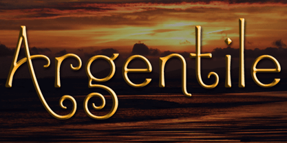 Argentile is a stylish, swirling, magical font with an organic, fairytale feel. Argentile is ideal for any project involving elves, goblins, wizards or suchlike. It includes contextual alternates for characters with swash elements or extravagant ascenders and descenders to avoid overlap.
 - Hardwood LP by LetterPerfect,
$39.00 Hardwood is a reworked foundry typeface from the 1930's, providing an interpretation of the Art Deco graphic style. It harkens back to the golden era of poster design and Hollywood movie marquees, while retaining superb legibility at virtually any size.
 - Stencil Piece JNL by Jeff Levine,
$29.00 Based on an antique metal stencil plate used for identifying crates, bales or barrels, Stencil Piece JNL is one of the numerous stencil designs available through Jeff Levine Fonts. The type design is available in both regular and oblique versions.
 - Anabelia by Rockboys Studio,
$23.00 The Anabelia is a handcrafted monoline font. It has a vintage and classic feel with an old, handmade look. Included in this download are various styles which gives you the opportunity to create unique designs, every time you use it!
 - Coffee Bar JNL by Jeff Levine,
$29.00 An image of the wide, Art Deco influenced lettering of a sign over a coffee bar inside a Jacksonville, Florida Lovett’s Supermarket (a predecessor to Winn-Dixie) inspired the namesake font Coffee Bar JNL – available in both regular and oblique versions.
 - Curly Gloom by Heyfonts,
$15.00 Curly gloom is an experimental font adapted from a combined groovy font and graffiti that makes its unique character as a display font, this font is very suitable to use as your project design such as a graphic template or clothing.
 - Nouveau Lettering JNL by Jeff Levine,
$29.00 A 1916 lettering book provided an example of a slab serif alphabet with Art Nouveau influence designed by Thomas Wood Stevens. This alphabet served as the model for Nouveau Lettering JNL, which is available in both regular and oblique versions.
 - Deco Neue Wilde by Open Window,
$- Deco Neue Wilde is a filter font based on Deco, an original Open Window classic. It sort of speaks for itself but it reminds me of a lava lamp and the countless shapes that you could waste time watching appear.
 - Ghostly Forest Cyrillic by RodrigoTypo,
$29.00 It is an extension or variant of the "Ghostly Forest" typeface that has been adapted to include the Cyrillic alphabet and also incorporates many alternatives, such as Swash glyphs, for a more fun design suitable for casual or Halloween-related concepts.
 - MPI No. 507 by mpressInteractive,
$5.00 No. 507 is an elegant headline font with added angled flourishes. Its unique features are angled terminals, small, pointed serifs, and no contrast in stroke weight. It is similar to No. 506, designed by William H. Page & Company around 1890.
 - Compact by ParaType,
$25.00 The typeface was designed at ParaType (ParaGraph) in 1991 by Vladimir Yefimov. Based on Anons by Gennady Baryshnikov. An extra condensed sans serif. For use in advertising and display typography. The decorative styles were added in 1997 by Alexander Tarbeev.
 - Kitra 77 by LightHouse,
$49.00Kitra 77 was one of the studies to Hamuel Nine Five. Though at first glance we can find several similarities, a closer look will reveal a completely different font in color and proportion. Kitra 77 is an OpenType/TTF Unicode font. - Gabuters by Letterena Studios,
$10.00 Gabuters is a cool, brushed display font. No matter the topic, this font will be an incredibly asset to your fonts’ library, as it has the potential to elevate any creation. Features: Multilingual Support Ligatures Swash PUA Encoded Numerals and Punctuation
 - Lightning Christmas by Letterafandi Studio,
$16.00 Lightning Christmas is handwitten font featuring stars light. It will add an awesome to any design project that you wish to create! This font is PUA encoded which means you can access all of the glyphs and swashes with ease!
 - Bindweed by Solotype,
$19.95From an old wood type owned by a San Francisco printer. Wood types were customarily given somewhat generic names (Antique Tuscan) or, more frequently, numbers to identify them. Our clients liked colorful, easily-remembered names better, and so did we. - Argentina Cursive NF by Nick's Fonts,
$10.00 Here's an elegant addition to Argentina NF, carefully crafted after the pattern provided by master type designer Morris Fuller Benton in 1919. Both versions of this font support the Latin 1252, Central European 1250, Turkish 1254 and Baltic 1257 codepages.
 - Wine Vat Stencil JNL by Jeff Levine,
$29.00 An image of a vintage metal stencil for the French wine region Côteaux du Tricastin [now Grignan-Les Adhemar] served as the inspiration for Wine Vat Stencil JNL. This condensed sans serif design is available in both regular and oblique versions.
 - Embryo by HVD Fonts,
$30.00 Typedesigner Hannes von Döhren created a display typeface called "Embryo". A superblack, sweet font with filled counters. Perfect for use in big sizes on posters or flyers. Embryo has an extended character set to support Western, Central and Eastern European languages.
 - Lemon Rolls by Illushvara,
$12.00 Lemon Rolls is a cute and casual handwritten font with an incredibly friendly feel. Whether you’re looking for fonts for Instagram or calligraphy scripts for DIY projects, this font will turn any creative idea into a true piece of art!
 - Bell Ring by Seemly Fonts,
$12.00 Warmth and friendliness are at the heart of Bell Ring, a handwritten font that captures the essence of the season. Its distinct charm makes it an ideal choice for a wide spectrum of design projects, where your creativity knows no bounds.
 - Benguiat Caslon by House Industries,
$33.00 Designed to be set in big, large and huge sizes in classic TNT (tight-not-touching) style, Benguiat Caslon is dynamite for a wide range of display demands. We also included outline and drop-shadow versions as well as numerous swash caps, ligatures, contextual alternates and automatically-shifting punctuation. Ed Benguiat originally designed this alphabet for the Photo-Lettering library during his tenure as the legendary type house’s art director. When we purchased Photo-Lettering in 2003, one of the first things we did was start picking some of our favorite films to digitize as fonts. Photo-Lettering partner Christian Schwartz chose this expressive serif specimen for its high contrast strokes that stand up to the most vigorous display typography demands without withering against pesky design limitations like screen resolution, ink spread and dot gain. FEATURES: Alternate characters, ligatures and contextual substitutions add an unexpected flair to words and phrases. We also provided a drop shadow to add depth and dimension. Shifting punctuation marks take care of those optical tricks so you don't have to. A delicately expressive outline version adds color even in black and white. BENGUIAT CASLON CREDITS: Typeface Design: Ed Benguiat Typeface Digitization: Christian Schwartz, Bas Smidt Typeface Production: Ben Kiel, Jason Campbell Like all good subversives, House Industries hides in plain sight while amplifying the look, feel and style of the world’s most interesting brands, products and people. Based in Delaware, visually influencing the world.
 - Rolie Twily by Jolicia Type,
$25.00 Introducing Rolie Twily, a font that effortlessly combines the elements of display and decorative styles to bring you a unique typographic experience. This font exudes an aura of Curly Elegant Modernity that is sure to make your designs stand out and leave a lasting impression. Key Features: Display and Decorative Fusion: Rolie Twily seamlessly blends the characteristics of display and decorative fonts, resulting in a versatile typeface that can be used for a wide range of creative projects. Curly Elegance: The graceful and whimsical curls in Rolie Twily's letterforms add a touch of sophistication and elegance to your text, making it perfect for invitations, posters, and branding materials where a touch of luxury is desired. Modern Aesthetic: While rooted in tradition, Rolie Twily maintains a contemporary edge, making it ideal for modern design trends. Its clean design ensure that your message remains clear and stylish. Versatile Usage: Whether you're designing wedding invitations, packaging, social media graphics, or any creative project, Rolie Twily brings a sense of charm and refinement to your typography. Attention-Grabbing: The unique and eye-catching nature of Rolie Twily ensures that your content won't go unnoticed. It's a font that demands attention and leaves a lasting impression. Rolie Twily is the perfect choice when you want to infuse your designs with a touch of Curly Elegant Modernity. Elevate your creative projects and make them truly memorable with this exceptional font. Download Rolie Twily today and watch your designs flourish with a newfound sense of style and sophistication.
 - Seddon Penmans Paradise Capitals by Intellecta Design,
$29.50 John Seddon (1644-1700), was a famous English writing master, the leading calligrapher of his time, and master of Sir John Johnson’s Free Writing School in Priest’s Court, Foster Lane. His portrait was drawn by William Faithorne and was engraved by John Sturt as the frontispiece for his copy-books, such as ‘The Ingenious youth’s companion’ of c.1690 and 'The pen-man’s paradise' of c.1695. These were engraved after his work by others. Your extra-rare book - "The Pen-mans Paradise Both pleasent & Profitable OR Examples of all ye usuall hands of this Kingdome. Adorn'd with variety of ffigures an Flourishes done by Command of hand. Each ffigure being one continued & entire Track of the pen most where of may be struck as well Reverse (or to answer bothwayes) as Forward", London (1965). - (YES, that is the title of the book!) was the starting point to these new extra accurated works of Iza W, a series of revivals of the penmanship Seddon’s artworks, like this highly ornamented animal kingdom inspired capitals and alphabets: the Seddon Penmans Paradise Capitals typeface. And, on the other hand, you can get the animal and human kingdon inspired penmanship forms in the Bestiario font. The “SeddonsFleurons” will complete the collection. Fantastic choice to elaborated barocque/renaissance inspired and historical accurated layouts.
 - Figgins Antique by HiH,
$12.00 “Hey, look at me!” cried the new advertising typefaces. With the nineteenth century and the industrial revolution came an esthetic revolution in type design. Brash, loud, fat display faces elbowed their way into the crowd of book faces, demanding attention. Those who admired traditional book types harumphed and complained. Robert Thorne had fired the opening round with his Fatface. With the cutting of Figgins Antique, the battle was well and truly joined. Job printing came into its own and it seemed like everything changed. The world of printing had been turned upside down and the gentile book-type aficionados recoiled in horror much as the rural landed gentry recoiled at the upstart middle class shopkeepers and manufacturers. William Savage, approvingly quoted by Daniel Berkeley Updike over a hundred years later, described the new display faces as “a barbarous extreme.” These were exciting times. According to Geoffrey Dowding in his An Introduction To The History Of Printing Types, “The types which we know by the name of Egyptian were first shown by Vincent Figgins in his specimen book of 1815, under the name Antique.” Of course, dating the design is not quite as simple as that. Nicolete Gray points out that Figgins used the same “1815” title page on his specimen books from 1815 to 1821, adding pages as needed without regard to archival issues. As a result, there are different versions of the 1815 specimen book. In those copies that include the new Antique, that specific specimen is printed on paper with an 1817 watermark. The design is dated by the 1817 watermark rather than the 1815 title page. Figgins Antique ML is an all-cap font. This typeface is for bold statements. Don't waste it on wimpy whispers of hesitant whimsies. And please don't use it for extended text -- it will only give someone a headache. Think boldly. Use it boldly. Set it tight. Go ahead and run the serifs together. Solid and stolid, this face is very, very English. FIGGINS ANTIQIE ML represents a major extension of the original release, with the following changes: 1. Added glyphs for the 1250 Central Europe, the 1252 Turkish and the 1257 Baltic Code Pages. Added glyphs to complete standard 1252 Western Europe Code Page. Special glyphs relocated and assigned Unicode codepoints, some in Private Use area. Total of 331 glyphs. 2. Added OpenType GSUB layout features: liga and pnum. 3. Added 86 kerning pairs. 4. Revised vertical metrics for improved cross-platform line spacing. 5. Redesigned mathamatical operators. 6. Included of both tabular (standard) & proportional numbers (optional). 7. Refined various glyph outlines.
 - P22 Albers by P22 Type Foundry,
$24.95 This set of typefaces was produced in conjunction with the Guggenheim Museum and the Josef Albers Foundation. Josef Albers was one of the most important artists and educators of the twentieth century. He was a member of the Bauhaus first as a student and then as a teacher from 1920 until its closing in 1933. He then moved to America, where he continued making art and teaching at numerous institutions until his death. Known principally as an abstract painter, he was also an accomplished designer, draftsman, typographer, and photographer. His works explore permutations of form, color, and perception using a restricted visual vocabulary. Created when he was at the Bauhaus, his Kombinationschrift alphabets exemplify the school's ethos. Using 10 basic shapes based on the circle and the rectangle, he created a system of lettering that was meant to be efficient, easy to learn, and inexpensive to produce. These 10 shapes in combination could form any letter or number. The letterforms of this computer version were taken directly from Albers' drawings and notes.
 - Shackle One by Christoph Reichelt,
$18.00 Shackle One is a geometric Sans Serif with a twist. As a modern classic that does not wear out visually it is suitable, for example, for luxury items, leather goods, watches and jewelry, high-class sports, documentation of historical technology or graphics in the field of art and design. It works excellently for huge headlines, but can also show particular strengths in continuous text – its gray value is almost flawlessly uniform. All line connections and terminations are perpendicular, which means that slopes or curves have a light bend at their ends, similar to the lordosis of the cervical spine. This makes the font look upright and straight and at the same time agile and dynamic, like an athlete with good posture – a typeface that is powerful and confident without appearing steely or violent. Shackle One is a classic but casual looking font with sophisticated details. It has a classy appearance without being pretentious. It can appear stern and serious as well as playful and humorous. Its strong character also makes it an excellent corporate font for certain branches. You will love it.
 - DF Dejavu Pro by Dutchfonts,
$39.00 This font is an orphanage where all the beautiful details of classical grotesque typefaces from the early twentieth century are gathered, and thus living together, are forming a ‘new’, happy family. The aim was to collect my favorite characters in one font. The start was an eclectic collection orientated on British types from the Caslon Doric No. 4, the Monotype Grotesque, the Gill, the Franklin Gothic up to the Transport. In this amalgamation I avoided the narrow apertures in the ‘e’, ‘c’ and in the numerals ‘5’, ‘6’ and ‘9’ and enlarged the x-height dramatically. To the classical slanted form of the italics I added real italic forms for ‘a’, ‘e’ and ‘g’ in order to obtain a more distinguished italic style. DF-Dejavu Pro supports all Latin-based languages (Western, Central-European, Eastern-European, Baltic and Turkish) and includes small capitals, ligatures, inferior & superior numerals and letters, fractions, various numeral styles: proportional lining, tabular lining, proportional old-style, tabular old-style and last but not least a slashed zero.
 - Kade by Re-Type,
$45.00 Kade is a display/semi display sans family of fonts based on vernacular lettering photographed over the last ten years in and around the harbors of Amsterdam and Rotterdam. Hence the name Kade that translates into English as ‘quay’, also the name of its designer. Kade grew slowly from many different ideas and elements. The letters reflects the industrial method in which they are cut for the side of ships from large steel plates. Frequently subtleties of curves are compromised due to the cutting tools and the fact engineers are in control. Kade’s italics have an experimental character and were produced in an unorthodox manner by rotating 8 degrees, rather than slanting the roman characters, a method sometimes employed in shipyards. Kade constructed character is ideal for contemporary editorial works, architecture magazines, museums communication and posters. The six distinct styles are published in OpenType format, featuring small caps and four sets of numbers (proportional old style, tabular old style, proportional lining and tabular lining), as well as matching currency symbols and a complete set of fractions.
 - Bonspire Script by Mans Greback,
$69.00 Bonspire Script is a dynamic and creative script typeface. Brimming with lively swashes and optimistic flair, Bonspire Script embodies the essence of movement and creativity. Its swirly strokes lend it an air of playful sophistication, making it equally suitable for heartfelt love letters or eye-catching advertisements. Its handwriting-inspired design gives it an approachable and personal feel. The typeface dances across the page, infusing any text with a sense of joy and possibility. Use underscore _ anywhere in a word for swashes. Example: Love_rose Use multiple underscore for different swashes. Example: Wonder________woman Use Bonspire Script's built-in swashes and stylistic alternates to fully express your creativity. Its OpenType functionality ensures top-notch quality and customizability. The typeface offers extensive lingual support, covering all Latin-based languages, and includes all the characters and symbols you'll ever need. The creative force behind Bonspire Script is Mans Greback. Renowned for his ability to evoke emotion through typography, Greback has outdone himself with this lighthearted yet intricate design. His extensive portfolio showcases a knack for blending practicality with artistic flair, making each font a unique masterpiece.
 - Mirella Script by Intellecta Design,
$52.90 Mirella Script is a modern and clean approach of the classic French Bastarde script style. Mirella has the follow resources : - Lots os ligature forms (using contextual alternates open-type feature), - many stylistic alternates for each letter (upper- and lowercase and all accessed with the glyph palette), a set of 55 ornaments and fleurons accessed with the glyph palette or using the Ornaments feature); - initial and final letters with artistic variations accessible using the initial and final form open-type features - a tour-de-force kerning work: almost 700 gliphs in this font was adjusted to your kern pairs handly. In non-OpenType-savvy applications it works well as an unusual and beautiful script style font. We ever suggest the use of the glyph palette to find ideal solutions to specific designs, because the high number of gliphs. The sample illustrations will give you an idea of the possibilities. You have full access to this amazing stuff using InDesign, Illustrator, QuarkXpress and similar software. Mirella Script has original letters designed by Iza W and overall creative direction plus core programming by Paulo W.
 - FF Dagny by FontFont,
$68.99 Swedish type designers Örjan Nordling and Göran Söderström created this sans FontFont in 2009. The family has 12 weights, ranging from Thin to Black (including italics) and is ideally suited for editorial and publishing, logo, branding and creative industries, poster and billboards, software and gaming as well as web and screen design. FF Dagny provides advanced typographical support with features such as small capitals, case-sensitive forms, fractions, super- and subscript characters, and stylistic alternates. It comes with proportional lining, tabular oldstyle, and tabular lining figures. In 2011, FF Dagny received the ISTD award.
 - Miedinger by Canada Type,
$24.95 Helvetica’s 50-year anniversary celebrations in 2007 were overwhelming and contagious. We saw the movie. Twice. We bought the shirts and the buttons. We dug out the homage books and re-read the hate articles. We mourned the fading non-color of an old black shirt proudly exclaiming that “HELVETICA IS NOT AN ADOBE FONT”. We took part in long conversations discussing the merits of the Swiss classic, that most sacred of typographic dreamboats, outlasting its builder and tenants to go on alone and saturate the world with the fundamental truth of its perfect logarithm. We swooned again over its subtleties (“Ah, that mermaid of an R!”). We rehashed decades-old debates about “Hakzidenz,” “improvement in mind” and “less is more.” We dutifully cursed every single one of Helvetica’s knockoffs. We breathed deeply and closed our eyes on perfect Shakti Gawain-style visualizations of David Carson hack'n'slashing Arial — using a Swiss Army knife, no less — with all the infernal post-brutality of his creative disturbance and disturbed creativity. We then sailed without hesitation into the absurdities of analyzing Helvetica’s role in globalization and upcoming world blandness (China beware! Helvetica will invade you as silently and transparently as a sheet of rice paper!). And at the end of a perfect celebratory day, we positively affirmed à la Shakti, and solemnly whispered the energy of our affirmation unto the universal mind: “We appreciate Helvetica for getting us this far. We are now ready for release and await the arrival of the next head snatcher.” The great hype of Swisspalooza '07 prompted a look at Max Miedinger, the designer of Neue Haas Grotesk (later renamed to Helvetica). Surprisingly, what little biographical information available about Miedinger indicates that he was a typography consultant and type sales rep for the Haas foundry until 1956, after which time he was a freelance graphic designer — rather than the full-time type designer most Helvetica enthusiasts presume him to have been. It was under that freelance capacity that he was commissioned to design the regular and bold weights of Neue Haas Grotesk typeface. His role in designing Helvetica was never really trumpeted until long after the typeface attained global popularity. And, again surprisingly, Miedinger designed two more typefaces that seem to have been lost to the dust of film type history. One is called Pro Arte (1954), a very condensed Playbill-like slab serif that is similar to many of its genre. The other, made in 1964, is much more interesting. Its original name was Horizontal. Here it is, lest it becomes a Haas-been, presented to you in digital form by Canada Type under the name of its original designer, Miedinger, the Helvetica King. The original film face was a simple set of bold, panoramically wide caps and figures that give off a first impression of being an ultra wide Gothic incarnation of Microgramma. Upon a second look, they are clearly more than that. This face is a quirky, very non-Akzidental take on the vernacular, mostly an exercise in geometric modularity, but also includes some unconventional solutions to typical problems (like thinning the midline strokes across the board to minimize clogging in three-storey forms). This digital version introduces four new weights, ranging from Thin to Medium, alongside the bold original. The Miedinger package comes in all popular font formats, and supports Western, Central and Eastern European languages, as well as Esperanto, Maltese, Turkish and Celtic/Welsh. A few counter-less alternates are included in the fonts.
 - Posterama by Monotype,
$40.99 The Posterama™ typeface family contains 63 fonts and is a true journey through space and time. Designed by Jim Ford, each Posterama family contains 7 weights from Thin to Ultra Black, in 9 distinct families. What makes Posterama so unique and versatile are the eight alternative display families. By making use of a collection of alternative glyphs, Posterama sets an evocative flavor to visualize an entire century of futuristic reference points from art, architecture, poster design and science fiction into one family. Posterama Text is the base family. It has the most robust character set including upper and lowercase glyphs and pan-European language support (including Greek and Cyrillic). Note: all the other Posterama variants described below do not have lowercase letters or Greek and Cyrillic support. Posterama 1901 recalls the decoratively geometric style of Art Nouveau from the turn of the 20th century. Letterforms such as the slender, snaking ‘S’, the high-waisted ‘E’ and the underlined ‘O’ revive the spirit of Charles Rennie Mackintosh and the designers of the Viennese Secession. Posterama 1913 pays homage to the Armory Show, or 1913 Exhibition of Modern Art, which brought the revolutionary work of European artists such as Picasso, Duchamp and Kandinsky to the US for the first time to the shock and astonishment of press and public. Near-abstract, angular characters such as the ‘A’, ‘E’ and ‘N’ hint at cubism’s jagged and clashing planes. Posterama 1919 uses a small, but important, variation to set a tone when the Bauhaus was founded, and the surge in radical European typography that followed. The straight-sided, roundheaded ‘A’ adds a flavor of 1919 – this style of ‘A’ can still be seen in the Braun logo, designed in 1934. Posterama 1927 captures the year of Metropolis, The Jazz Singer and Paul Renner’s pioneering, geometric Futura typeface from 1927, which had a profound influence on design in the US and Europe. Posterama 1933 – With its low-waisted, sinuous designs, the Posterama 1933 typeface family echoes lettering of the Art Deco period, which in turn had its roots in Art Nouveau, the key influence on Posterama 1901. The two fonts make a great team and can be used interchangeably. Posterama 1945 features a few Cyrillic characters to conjure up an era when Russian art and political posters made their mark in cold war propaganda, espionage and also giant aliens and monsters. Posterama 1984 takes its typographic influences from George Orwell’s classic novel, publicity for the dystopian action and sci-fi movies (Blade Runner, Videodrome and Terminator) and games like Space Invaders and Pac-Man that made an impact at that time. Posterama 2001 was inspired by Stanley Kubrick’s science fiction masterpiece, which made extensive use of the Futura typeface. Posterama 2001 finds its cosmic orbit with its nosecone-style ‘A’ from NASA’s much-missed ‘worm’ logotype. There’s an echo, too, in Bauhaus designs from as early as 1920, whose minimalist, geometric lettering also featured a crossbar-less ‘A’.
 - Masonic Writing by Deniart Systems,
$10.00Based on an ancient secret writing system. NOTE: this font comes with an interpretation guide in pdf format. - Fountain Service JNL by Jeff Levine,
$29.00Fountain Service JNL was inspired by an exterior neon sign seen in an old photograph from the 1950s. - Felice by Nootype,
$40.00 Felice is an elegant serif font family. The humanistic touch gives a warm aspect to this complete text font. Those italics are perfect to give a refined look to text. Felice consists in a 10 styles family, from Light to Black with their italics. Each font includes Small Caps, OpenType Features such as Proportional Figure, Tabular Figures, Numerators, Superscript, Denominators, Scientific Inferiors, Subscript, Ordinals, Fractions and many ligatures. The ligatures are a good feature to make an original and creative layout. The range of styles provides flexibility for text and title. Felice family supports Latin and Cyrillic, all these languages are covered: Latin language support: Afar, Afrikaans, Albanian, Asturian, Azeri, Basque, Bosnian, Breton, Bulgarian, Catalan, Cornish, Corsican, Croatian, Czech, Danish, Dutch, English, Esperanto, Estonian, Faroese, Filipino, Finnish, Flemish, French, Frisian, Friulian, Gaelic, Galician, German, Greenlandic, Hungarian, Icelandic, Indonesian, Irish, Italian, Kurdish, Latin, Latvian, Lithuanian, Luxembourgish, Malagasy, Malay, Maltese, Maori, Moldavian, Norwegian, Occitan, Polish, Portuguese, Provençal, Romanian, Romansch, Saami, Samoan, Scots, Scottish, Serbian, Slovak, Slovenian, Spanish, Swahili, Swedish, Tagalog, Turkish, Walloon, Welsh, Wolof Cyrillic language support: Adyghe, Avar, Belarusian, Bulgarian, Buryat, Chechen, Erzya, Ingush, Kabardian, Kalmyk, Karachay-Balkar, Karakalpak, Kazakh, Komi, Kyrgyz, Lak, Macedonian, Moldovan, Mongol, Permyak, Russian, Rusyn, Serbian, Tatar, Tofa, Tuvan, Ukrainian, Uzbek
 - Monkton Aged by Club Type,
$36.99 This antique-aged version of Monkton can be used to imitate old letterpress printed documents such as old English text. The rough edges resemble ink spread on paper to give an old look. The inspiration for this typeface family came from my childhood experiences at Monkton, amidst an historic part of the South West of England. Studies of the original incised capitals of the Trajan column in Rome were analysed and polished for this modern version. The lower case letterforms and numerals were then created in sympathy, taking their proportions from the incised letters of local gravestones. Its name honours not only the area where the original alphabet was conceived and drawn, but also the people responsible for fostering my initial interest in letters.
 - Leco 1976 by CarnokyType,
$- LECO 1976 is a headline display typeface in OpenType format. The title at the 1976 bottle of Lečo became an inspiration for creating this font. Besides the regular weight of the font, the font is drawn in light and bold font styles too, while each of these typefaces consists of a special alternative of an embedded diacritic. The font contains several specific styles as Stencil, Pixel, Tride, Shadow which combinations offer interesting possibilities for the typesetting. The metrics and kerning of every glyph of the font (except several glyphs in Bold) are identical. All the signs share the same character and size of the capital letters. This font is best used on strong posters or as a headline display typeface.
 - Jonze by KC Fonts,
$19.00 Jonze & Jonzing from KC Fonts is an all uppercase based font that resembles a rubber stamp; Jonze being more on the saturated side and Jonzing on the rather dry. Both fonts each have four glyphs for each letter & two per number, which are accessed by uppercase, lowercase & Contextual Alternates. The Jonze family takes the grungy look that you love one step further by creating a handmade look for you by randomly cycling through Contextual Alternates & Double Letter Ligatures for a unique and authentic look to your creative. When not using the Contextual Alternates feature, you can still alternate between uppercase and lowercase letters to change it up or by accessing the Stylistic Alternates feature. The Jonze family has an extended character set for multilingual support.
 - Mervale Script Pro by Stiggy & Sands,
$39.00 An Unusual Hero Script Mervale Script Pro is based on inspiration from the 1940's Fawcett Publications “Mary Marvel” comic. This unusual brush lettered script blends script and serif capitals with a mix of unusual brush strokes to create a lively font that draws attention. Clean letterforms with an eclectic offbeat flavor in letter stances lends Mervale Script Pro to a unique variety of uses from casual to lightly sophisticated. The stylistic alternates feature adds swash capitals to the mix to offer even more diversity. See the 5th graphic for a comprehensive character map preview. OpenType features include: A collection of ligatures. Full set of Inferiors and Superiors for limitless fractions. Tabular, Proportional, and Oldstyle figure sets. Stylistic Alternates for Caps to Swash Caps conversion.