10,000 search results
(0.02 seconds)
- ITC Ludwig by ITC,
$29.99ITC Ludwig has an edge. It's nervous, tense - maybe even a little scary. Drawn by Italian designer Giuseppe Errico, ITC Ludwig refuses to be confined to a traditional baseline. Its twisted lowercase g" and an "e" that could double as an upside-down "a" both add to the design's spooky personality. As a young man, Errico studied to be a fine artist. He became a graphic designer only after a “long reflection period,” he says. His early training is evident in many of ITC Ludwig's suggestive qualities. There is far more to this face than cranking up the “distort” knob in Fontographer. Reflection and personal expression are at its core." - Mosafin by Yukita Creative,
$12.00 The Mosafin font is a sans-serif typeface that has a modern and elegant design. This font has a very consistent and proportional letterform, and has clean and firm lines, making it easy to read and very suitable for various graphic design purposes. Made with the latest technology and excellent design, the Mosafin font has distinctive characteristics, such as very geometric letter shapes, with sharp angles and clear, thin lines. This font can be used in various media, such as poster designs, logos, business cards, banners, and various other design purposes. This font also has a proportional font size ratio, so it's easy to read at any size
 - HS Hadeel by Hiba Studio,
$50.00 HS Hadeel is a versatile display typeface designed for use in titles and graphic projects that require both Arabic, Persian and English characters. It draws inspiration from the modern kufi style and boasts a unique blend of sharp and curved lines that lend a beautiful and geometric structure to each character. The sharp endings at the bottom of each character add an additional aesthetic touch. With five weights available, ranging from Light to Black, HS Hadeel offers a diverse range of options for designers seeking to elevate their Arabic typography. Overall, HS Hadeel is a great choice for those seeking a visually striking and flexible typeface for their projects.
 - Xtencil Pro by John Moore Type Foundry,
$25.00 Xtencil is a typeface inspired by the shapes of the drawing templates letters, based on the letter forms of Photo-lettering Glaser Stencil from universal teacher Milton Glaser who at the same time was influenced by the modernism and the Futura of Paul Renner. Xtencil is a round letter to create a great looks, ideal for posters and headlines. Xtencil not come as a drawing template, but as true Pro OpenType typography. Now in a complete family with upper and lower cases, an inline and a thickened Shadow versions to play with layers, also accompanied by a Dingbats font with fun graphics in the same spirit.
 - SK Cynic by Shriftovik,
$10.00 SK Cynic is a modern geometric experimental font. Inspired by modern industrial graphic design. The font form is based on a 8x8 grid, which makes it stricter and more accurate. Bevels are created at the corners of each letter, giving the symbols a special industrial look. The font is multilingual and supports almost all Latin and Cyrillic languages. For some characters, stylistic alternatives are provided for better readability. The font will give any work a unique look and is suitable for use on print and on the Internet. This font delivered in 8 styles: Thin, Light, Regular, Medium, Bold, Outline Light, Outline, Outline Medium
 - Rodge by Designova,
$15.00 Rodge is a unique display typeface perfect for headlines, big text, branding, logotypes & graphic design purposes such as posters, flyers and advertisements. This all-caps font can be an excellent choice for creating outstanding logos, promotional content, and marketing presentations that can bring uniqueness and freshness at its level best. The typeface comes with OpenType Stylistic Alternatives feature giving you the option to add some unique characters. Please see the examples shown above to get an idea of the capability of this typeface. Rodge comes with extended language support including Western European, Central European, and South-Eastern European character sets (total of 238 glyphs).
 - Honess by Zamjump,
$17.00 Honess is a luxurious handwritten script font with a thick classic feel this font is perfect for craft artists to elevate their work into beautiful masterpieces. Honess is also great for graphic designers looking for a cute font for their work. includes : - uppercase, - lowercase, - standard punctuation, - standard ligature, - bigining swash. - ending swash - numbers. - multi lingual to use a character with a line prefix is quite easy, that is, simply by typing an unterscore is added to the desired character, for example (_a) then the character a will have a line at the beginning, as well as a ending swash, type the character then followed by an underscore (a_).
 - TA Typefire by Tural Alisoy,
$- Typefire font will be known as TA Typefire from now on. Additionally, Cyrillic, Caucasian Albanian scripts and some glyphs were added. I made some slight modifications to letters. I hope you like it. Much love! TA Typefire is perfectly suited for editorial design, branding, magazines, logos, headings and more. TA Typefire OT Features: aalt, calt, case, dlig, dnom, frac, kern, liga, locl, numr, ordn, salt, sinf, ss01, ss02, ss03, subs, sups Supported Languages: Western Europe, Central/Eastern Europe, Baltic, Turkish, Romanian, Cyrillic, Caucasian Albanian Amount of glyphs included 456 Latin Plus languages supported 94% Latin Plus diacritics included 88% source: underware TA Typefire graphic presentation at Behance
 - LiebeFish by LiebeFonts,
$19.90 LiebeFish is a collection of 172 individually hand-drawn fish. Each has its very own personality; some are happy, some are sad. Some like company, some are bored, most are cute and a few are weird. If you look closely, some fish will surely look like people you know. LiebeFish probably is the most comprehensive collection of hand-drawn fish ever. They look great on almost any greeting card, birthday card or invitation. LiebeFish also serve as a perfect companion to any informal graphic design that needs a personal, handmade touch. If you like this font, have a look at our other cute fonts such as LiebeTweet and LiebeRobots.
 - Geller Sans by Ludka Biniek,
$29.00 Geller Sans typeface have been developed based on his serif predecessor’s proportions. He’s quite handsome, quite organised. Looking at thin–extraheavy styles he has enough of charm to stand out in advertisement. In text styles you can relay on him. He’s able to meet demand of complex design tasks. Geller Sans has been fitted with wide range of OpenType features. As Geller Serif, he has bullets & dingbats, for easier entry-point making. Entire font family comes in 4 width (Regular, Narrow, Condensed, Compressed). Each width finds its best application in different typographic fractions what makes Geller Sans easy to apply in editorial graphic design. Who’d like to challenge him?
 - Altmann Grotesk by Ateljé Altmann,
$50.00 Altman Grotesk was initially planned as an internal studio typeface for the graphic design studio Ateljé Altmann based in Stockholm, Sweden. After thoroughly researching both classic and contemporary sans serif typefaces, the aim for Altmann Grotesk was set at joining unobtrusiveness yet distinctiveness in one look. As a result, the sans serif successfully embraces a polarizing image of minimalism and uniqueness. During the design process of Altmann Grotesk, it soon became clear that it had the potential to be more than a studio typeface—which ultimately led to a sans serif font family with five distinctive weights that are perfected to fit every possible typography use case.
 - Magnetic Script by Mysterylab,
$14.00 Introducing Magnetic Script, a bold stylized font family that is not only eye-catching and assertive, but highly legible at both display and text sizes. The heart of this font's usefulness is the three-layer setup that allows you to quickly copy a text block twice, then reassign the main layer, the extruded shadow underlayer, and the top highlight layer to three different colors. Magnetic Script is massively versatile, and appropriate for many uses including university / collegiate logos, sports team logos, graphics for motorcycle clubs, automotive rallies, microbrewery labels, and vintage & retro styles of all kinds. It's the ultimate branding and logo design font suite.
 - Friends by W Type Foundry,
$25.00 Friends is a complete and contemporary language system for postmodern graphics. Inspired by the idea of making new art and graphic design keeping in mind new ways of visual language like emojis as a formal way of communication and contemporary graphic arts. Friends is perfect for web design, postmodern arts, book design, posters, editorial design, branding, advertising, headlines, and short texts. Friends includes 14 style typeface plus italics, icons, emojis, arrows, ligatures, fractions, special numbers, etc.
 - RRollie by Eurotypo,
$38.00 RRollie is a typeface family inspired on the proportions of the Roman capital in the Augusto's age, some of them can be seen in inscriptions of Pompeii; in this particular case, it has taken an inscription from a tomb of the year 15 AD. The subtlety of the serif is hardly insinuates, helping to strut the terminals of the stems. Ascenders and descenders are very short. The thickness variation is presented quite delicate, highlighting the light-dark passage and even the agile counterblocks of the typeface. These fonts can be used in many kind of graphic works by its strong personality, visual impact and readability. This font family include OpenType features: Standard and discretionary ligatures, small caps, case sensitive from, old style figures, tabular, diacritics for western languages and many others. Roberto Rollie (1935-2003) was an outstanding professional of Graphic Design, Photography and Visual Artist. He was involved in the creation of the career of Visual Communication Design at the Faculty of Fine Arts (National University of La Plata, Argentina), in the late '60s; he was a pioneer and great teacher too, who loved the Roman Capitals for its subtle and balanced design, especially for high readability and clever design. Those who, like me, knew him as a person and teacher, we are deeply grateful for having received their warmth and enthusiasm for graphic design.
 - Ciclamino by TrueBlue,
$16.00 “Ciclamino” is the Italian name for a small, elegant forest flower with a sweet but strong fragrance. This font is inspired by the peculiars characteristics of this flower, to the elegant shapes of the petals and its intense fragrance but sweet and refined. The result is a font with a particularly incisive but elegant layout suitable for high-impact graphic projects with a modern and decisive flavor but with a note of balanced elegance. There are no limits to the situations in which you can use it to give a touch of originality to your graphic creations but there are some project categories in which it could be a choice of great visual impact and help you express all your creativity. The particular can give excellent results in all those situations that have a flavor of modernity, and innovative technology and express innovation and dynamism and decision. At the same time, its decisive and sinuous lines also adapt to situations with a gothic and fantasy relish and even to tribal graphics. But this is just a minimal list of situations in which it can express its potential, it is a very versatile font and you can find a lot of other situations in which its use can make a difference and help you obtain an original result with a great visual impact.
 - Natom Pro by Mostardesign,
$25.00 A family of fonts with rhythm. Natom Pro is a modern and geometric font family adapted to the professional requirements of graphic designers, web designers and mobile application developers. Comprised of 19 styles including 8 styles designed especially for the design of headlines, Natom Pro is a very versatile family of fonts that can be used in many projects such as editorial design, branding or corporate identity creation, design of posters or logos, the creation of websites or the development of mobile applications. This font, with a resolutely contemporary aspect, also hides a unique typographic design since it has 2 distinct styles (Title and Roman) which have 2 different typographic rhythms in order to graphically differentiate the appearance of titles, subtitles and long paragraphs. With this design of rhythmically differentiated glyphs according to the styles, the headlines have a very graphic aspect while the long texts have a more classic aspect in order to keep optimal readability in all scenarios. Its architecture is also very modern since it was designed and drawn with particular attention to the geometry of the forms with clear and open endings cut at 90 degrees. The number of styles has also been simplified with the most used thicknesses (Extra Light, Light, Regular, Medium, Bold and Black) in order to speed up your graphic design process. For the more experienced designers, Natom Pro is also available in a variable version. Natom Pro is also equipped with powerful OpenType features like case sensitivity, true small caps, full ligature set, tabular figures for tables, « old styles figures » to elegantly insert figures into your sentences, numbers circled or even alternative characters to satisfy the most demanding professionals.
 - fancyPens - Unknown license

- Fringe by La Boîte Graphique,
$20.00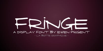 Fringe is a hand made font ideal for your graphic project.
 - Bear by La Boîte Graphique,
$16.00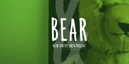 Bear is a hand made font ideal for your graphic project.
 - College Grad by Throndsen,
$9.00 College Grad is inspired by my Graphic Design class of 2019!
 - Kikster by La Boîte Graphique,
$29.00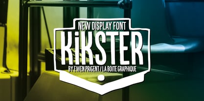 Kikster is a hand made font ideal for your graphic project.
 - Ombres by Typephases,
$25.00 Very close thematically and in style to the rest of our “whimbats” (the Absurdies, Bizarries, Illustries, Genteta and Whimsies series), the Ombres contain a number of peculiar silhouettes and illustrations of people that range from cute to scary, with everything in between. Ombres offers152 pictures in 3 files. These imaginary characters were produced with different techniques: quick pencil sketches, ink, watercolour, though once digitized and simplified to bring them into the font files there is little apparent difference. The silhouettes, rather than flat shadows are more dimensional in their look, because they have been digitized retaining the original brushwork or pencil strokes of their source drawings. Some of them remind of the venerable tradition of metal stock cuts from vintage type foundries. The digitized results are quite different, but the energetic nature of the subjects has been mantained. Their vectorial file format means you can use them at any size with no loss of quality. Every Ombres dingbat offers ready-made images for a variety of creative projects. They can be used as they come or easily customized in any graphics program. At small sizes they are ideal spot illustrations with a whimsical touch; at large sizes they can bring a whole page, a spread or even a big poster to live.
 - Caflisch Script by Adobe,
$35.00Caflisch Script was designed by Robert Slimbach in 1993. The design is based on the handwriting of Max Caflisch, one of the foremost graphic designers of this century. Caflisch, a teacher of graphic arts for over three decades in Zurich, is author of several books on typography and designer of the 1952 Columna typeface. Caflisch�s handwriting has a free flowing yet disciplined character, the result of years of practice and devotion to the calligraphic arts. Slimbach retained the subtleties and natural letter joins of Caflisch�s original handwriting while adapting it into a typographically sound and highly practical script typeface. Caflisch Script is a multiple master typeface with a weight axis that allows the typeface to transition smoothly from light to heavy weights, maintaining legibility and visual appeal at a full range of point sizes. Caflisch Script can be used anywhere the appearance of a fine hand is desired, as well as more sophisticated and practical situations such as display work in books and copysetting for advertisements. - Stage Grotesk by Designova,
$15.00 A classic sans-serif typeface made with perfection and readability in focus, Stage Grotesk is your simple choice for textual representation at its level best. Created with a special focus on minimalism and simplicity in typography, this typeface can transform your design projects to another level of visual appeal. Stage Grotesk typeface family comes with a total of 14 fonts having 7 weights (Thin / Light / Regular / Bold / ExtraBold / Black) including upright as well as Italic versions of all weights. Handcrafted and designed with powerful OpenType features in mind, each weight includes extended language support including Western European & Central European sets. A total of 618 glyphs are included covering extra symbols, punctuations, and marks. Stage Grotesk is a perfect choice for graphic design, text presentation, web design, print, and display use. The typeface can be an amazing option for beautiful branding, logo/logotype design projects, marketing graphics, banners, posters, signage, corporate identities as well as editorial design. Adding extra letter-spacing for the upright capital letters will make this font perfect for minimal headlines and logotypes as shown in promo images here.
 - TT Norms Std Condensed by TypeType,
$35.00 TT Norms® Std Condensed useful links: Specimen | Graphic presentation | Customization options TT Norms® Std Condensed is the logical development of our bestselling TT Norms®. Since the release of TT Norms®, we received a bunch of requests to create its narrow version and even managed to make several custom projects of the narrow TT Norms® before we decided to start creating a full-fledged commercial version of the typeface. At the very beginning of the project, we did some research and tested several options for the possible width of the typeface. Despite the fact that TT Norms® Std Condensed has narrower proportions than the original family, it inherited the classic proportions of characters, attention to detail and meticulous elaboration of each character in the typeface. The TT Norms® Std Condensed font family consists of 18 faces (9 upright and 9 italics). Each style includes a sufficient set of characters that allow you to solve most of the problems that arise in the field of graphic design, branding, packaging design or website design.
 - Sabre by Alias,
$60.00 I generally refer to our typefaces as ‘graphic’ rather than typographic. By that I mean their starting points are usually ways of constructing shapes and systems of shapes. As with other Alias typefaces, Sabre has stone and wood cut letterforms as a starting point. What is interesting about lettercutting is the connection between shape and material. These beautifully crafted letterforms have a particular sharpness which reflects, of course, how they were made. The idea of constructing letters from a kit of parts we first explored in early fonts Elephant and Factory. These are different in that they were very much grid-based, with a geometric structure. For Sabre I also had Fred Smeijers’ stencil construction drawings in mind. These show how a set of components can be the basis for a crafted, elegant typeface. Sabre is quite a loose interpretation of this idea. Sabre’s graphic shape means it works well at large sizes, with a dramatic, angular impact. Its aim is to be typographic enough to function for blocks of small-size text too.
 - ITC Merss by ITC,
$29.99ITC Merss proves that sometimes accidents work out just fine. Late one evening Eduardo Manso, an Argentinean graphic and type designer, spilled coffee on his desk. When he began to wipe up the mess, he noticed that one of the splashes looked like a roman letter 'l' - complete with serifs. This triggered his imagination. “What if a complete alphabet was created with this same irregular flow to the character designs?” ITC Merss was the result of Manso's experiments with “fluid” letter shapes. The oddly handsome design looks aged and spontaneous at the same time. Its irregular texture is striking-the result of careful modeling of character shapes. While Manso wanted to maintain the free-form character of spilled liquid, he also knew the individual letters had to work together with an underlying harmony. When not experimenting with typefaces - or spilled coffee - Manso creates award-winning graphic and publication designs. A contributor to the design magazine el Huevo (the Egg), he also writes articles on type and typography and is part of the publication's design team. - Roseborough by BeckMcCormick,
$14.00Roseborough is best for: - logos + branding, especially cosmetics, fashion, & clothing brands - website design + website accents - think feminine websites, creative professionals, travel blogs, fashion blogs, & more - clean print design, like magazines + flyers - header elements that need a clean, modern look - quote graphics for social media - chic graphic tees - CorTen by The Northern Block,
$12.80 An industrial-weight typeface inspired by graphics laser-cut from sheet metal.
 - ALT Apollo13 by ALT,
$5.00 Apollo13 is a custom decorative typeface for any type of graphic design.
 - Rostel by Dieza Design,
$10.00 Rostel is great for headlines of all sizes, as well as for text blocks that come in both maximum and minimum variations. This font are applicable for any type of graphic design in web, print, motion graphics, and perfect for t-shirts and other items like posters and logos.
 - NationalyzeALP - Unknown license

- Deng Thick - Unknown license

- SnowDream - Unknown license

- MilkyWell - Unknown license

- Aberration - Unknown license

- Linear Gothic by BA Graphics,
$45.00A great headline face very bold and graphic. Not recommended for small sizes! - TT Ricordi Marmo by TypeType,
$29.00 TT Ricordi Marmo useful links: Specimen | Graphic presentation | Customization options TT Ricordi Marmo extends the series of experimental projects within the TT Ricordi fonts collection. The main goal of the TT Ricordi project is to look for gems in old signs and on stone and bringing those inscriptions back to life in the form of contemporary fonts with the umbrella name TT Ricordi. TT Ricordi Marmo is an original experimental project by Eugene Tantsurin inspired by inscriptions at Basilica di Santa Croce in Florence. Working on it, we wanted to create a contemporary typeface that would unite the elements of a Florentine sans-serif mixed with more traditional visual solutions typical for the period's serifs. As a result, we got a bright and somewhat provocative typeface with irregular serif distribution, some unusual contours and a free spirit. In small body size TT Ricordi Marmo makes a neutral impression, but as the size gets bigger, the user is taken on a playful quest to search for interesting moves, graphic peculiarities and unusual solutions. TT Ricordi Marmo is great for poster design, packaging, and setting large and medium-sized inscriptions. Thanks to its idiosyncrasy, the typeface may look nice both at a poster in a grand academic theater and at an acid rave party. You can find a set of icon patterns that can be used in several ways. First, you can substitute letters with these patterns, thus getting an inscription with a visible graphic element. Then you can also construct borders and interval marks, or just use them as icons. All patterns are perfectly adapted to the design of letters in the font. TT Ricordi Marmo consists of 2 styles and one variable font. Each of the styles contains over 630 glyphs and 18 OpenType features. As we have conceived TT Ricordi Marmo as a poster typeface from the very beginning, it features small capitals instead of lowercase characters. In addition, the typeface has a set of interesting ligatures, stylistic alternates, pointers, hands, and pattern icons. TT Ricordi Marmo OpenType features list: AALT, CCMP, LOCL, NUMR, ORDN, TNUM, PNUM, CASE, SS01 (Alternative latin E), SS02 (Alternative Eszett), SS03 (Alternative Cyrillic I), SS04 ( Alternative Amper- sand), SS05 (Romanian Comma Accent), SS06 (Dutch IJ), SS07 (Catalan Ldot), DLIG, CALT, SALT.
 - Bell Centennial by Bitstream,
$29.99 Designed specifically for AT&T by Matthew Carter at Mergenthaler to replace Bell Gothic with a typeface that made effective use of digital typesetting technology, Bell Centennial gets several more lines per page than Bell Gothic, reduces calls to information because of its significantly higher legibility under adverse printing conditions, saving AT&T many millions of dollars per year. Although intended for use at small sizes, Mazda UK used Bell Centennial at huge sizes to striking effect in a mid-1990s ad campaign.
 - Cow-Spots - Unknown license


