10,000 search results
(0.01 seconds)
- Limoen by Hanoded,
$15.00 Limoen means 'lemon' in Dutch. Why did I call this font Limoen? Well, I guess I ran out of meaningful names, so I had to work with whatever popped in my head - which happened to be Limoen. Don't ask… Limoen is a very cute, very threedee-ish typeface. It works great in poster ads and as a display font. It comes with upper and lower case letters and a whole bunch of diacritics. Enjoy!
 - Front Row JNL by Jeff Levine,
$29.00 Front Row JNL is an all-caps reinterpretation of Morris Fuller Benton's 1937 type design "Empire", and is available in both regular and oblique versions. As is often the case when a digital type font is based on a few letter examples found on a printed sample [in this case, the sheet music of the 1946 Guy Lombardo hit "What More Can I Ask For"], the missing characters were drawn from scratch.
 - Antique Slabserif JNL by Jeff Levine,
$29.00 Antique Slabserif JNL is a reinterpretation of Monotype's Modern Antique 26, released in 1909. The name of the typeface is an oxymoron because Modern conflicts with Antique. Despite many critics of the "mechanical" look of the font's design, it has developed a bit of charm with age and the passing of time. Available in both regular and oblique versions, Antique Slabserif JNL can be used as both a text and headline font.
 - Hymers JNL by Jeff Levine,
$29.00 Born on May 8, 1892 in Reno Nevada, Lewis Franklin (“Lew” ) Hymers left an indelible mark as a caricaturist, cartoonist and graphic artist. At the age of twenty [in 1912] he worked for the San Francisco Chronicle. During World War I he worked for the Washington Post. He even was employed for a time by Walt Disney as an animator - but most of his life was spent in either Tujunga, California or his birthplace of Reno, Nevada as a self-employed illustrator. Hymers inked a feature for the Nevada State Journal called “Seen About Town”, which was published during the 1930s and 1940s. In this panel, he caricaturized many of the familiar faces around Reno. He also designed signs, logos, post cards and numerous other commercial illustrations for clients, but what has endeared him to a number of fans was his vast library of stock cuts (the predecessor to paper and electronic clip art) which feature his humorous characters in various professions and life situations. So popular is his work amongst those “in the know” that a clip art book collection of over seven hundred of his drawings that was issued by Dover Publications [but long out of print] commands asking prices ranging from just under $15 to well over $100 for a single copy. Lew Hymers passed away on February 5, 1953 just a few months shy of his 61st birthday. Although his artwork depicts the 1930s and 1940s lifestyles, equipment and conveniences, more than sixty years after his death they stand up amazingly well as cheerful pieces of nostalgia. The twenty-seven images (and some variants) in Hymers JNL were painstakingly re-drawn from scans of one of his catalogs and is but just a tiny fraction of the hundreds upon hundreds of illustrations from the pen of this prolific artist.
 - Bottega by Keristyper Studio,
$14.00 Bottega is a script bold classic font with a relaxed theme, featuring a lovely style. This font was created to look as close to a natural handwritten script as possible. It is good for logo design, Social media, Movie Titles, Books Titles, short text even long text letters, and good for your secondary text font with sans or serif. Featured: Standard Uppercase & Lowercase Numeral & Punctuation Multilingual : ä ö ü Ä Ö Ü ß ¿ ¡ Alternate & Ligature PUA encoded We recommend programs that support the OpenType feature and the Glyphs panel such as Adobe applications or Corel Draw. so you can use all the variations of the glyphs. Hope you enjoy our fonts!
 - Tomate by Re-Type,
$45.00 Tomate started in 2006 as a brush lettering exercise for a poster and was later used for the ReType identity. In 2008 its author decided to turn it into a super fat typeface suitable for packaging and mass consumption products. The possibilities of ultra heavy forms are explored in this alphabet; trying to solve the design problems that these sort of forms present. Tomate shows influences from the beautiful Goudy Heavyface Italic which is a design the author admires.
 - Eckhardt Titling JNL by Jeff Levine,
$29.00Eckhardt Titling JNL is another treatment of a popular typeface that lends itself well to the hand-lettered sign and display work of days past. A clean sans serif with a slight touch of Art Deco, this font renders well from small point sizes to large posters. As with other fonts in this series, it is named in honor of Jeff Levine’s good friend Albert Eckhardt, Jr. who owned Allied Signs in Miami, Florida from 1959 until his passing. - Alonso Flair by BA Graphics,
$45.00This font, as indicated by its namesake, was designed and started by the late Bob Alonso. It represents the first of his unfinished work to be completed by friend and colleague John Bomparte, following Bob's passing in December of 2007. It is a font that speaks with a distinctively robust voice; and would be a great choice for a wide variety of uses. Central European languages are supported through OpenType, and Windows/Mac OSX TrueType versions. - Treppenwitz by Hanoded,
$15.00 Treppenwitz (literally: ‘Staircase Wit’) is a German word describing a conversational remark that only occurs to someone after the opportunity to make it has passed. I love words like this: they can sum up a whole sentence or a complex train of thought. Treppenwitz font is hand brushed. It’s a little uneven, a little shaky, but will look good on product packaging and book covers. Comes with loads of diacritics and double letter ligatures as well.
 - Hemingway's Shotgun by Burghal Design,
$29.00Once upon a time (a.ka. 1984), there was a Goth band who called themselves "Hemingway's Shotgun." As a symbol of his commitment to this band, the bass player acquired a tattoo of a shotgun on his forearm. Unfortunately, this tattoo wasn't very well drawn: the barrel was much too short, and was much thinner at one end than the other. The tattoo rather resembled a small, cordless, rechargeable hand-held vacuum cleaner. Thus, the band "Hemingway's Dustbuster" was born. - Safety by Pelavin Fonts,
$25.00 Safety is influenced by works from the Machine Age which had its greatest period between the two world wars and celebrated the triumphs of the late Industrial Age including mass production, skyscrapers, radio & phonographs, hydroelectric power and streamlined styling in industrial design. It is based on an Art Deco display style lettering known most popularly as Broadway or Manhattan but, having existed in a multitude of incarnations from showcard lettering to neon signs for a century.
 - F2F Mekkaso Tomanik by Linotype,
$29.99The techno sound of the 1990s, a personal computer, font creation software, and some inspiration all came together to inspire the F2F (Face2Face) font series. Alessio Leonardi and his friends had the demand to create new unusual typefaces, which would be used in the leading German techno magazine of the day, Frontpage. Even typeset as small as 6-points, in nearly undecipherable layouts, it was a pleasure for the kids to read and try to decrypt the messages. F2F Mekkaso Tomanik is a font whose letters have had diamond holes punched into them. In fact, so many holes have been punched into the letters that one could ask whether this font is more letterforms, or more holes! - Jorge by Galapagos,
$39.00(pronounced hor-hay) Some years ago my wife and I had our evening meal in a restaurant on what is called the northshore of Massachusetts. Of course, if you check a globe or map you'll see that the pilgrims needed a compass, it should have been called the eastshore as it's on the east end of the rectangle/hook we call the Commonwealth of Mass. In any event, the menu our waitress gave us was hand-lettered with shapes that I used to develop the 4 fonts called Jorge. When I brought the preliminary drawings into the office Steve Zafarana, a designer and cartoonist referred to them as Jorge's new design, the name stuck. - Handel Gothic by URW Type Foundry,
$35.00 The Handel Gothic? typeface has been a mainstay of graphic communication for over 40 years - all the while looking as current as tomorrow. Designed by Don Handel in the mid-1960s, and used in the 1973 United Airlines logo developed by Saul Bass, Handel Gothic was an instant success when released to the graphic design community. Its generous lowercase x-height, full-bodied counters and square proportions make the design highly readable at a wide range of sizes. Handel Gothic's slightly idiosyncratic character shapes gave the face a futuristic look 40 years ago that retains its power today. In addition, its Uncial-like lowercase is instantly identifiable - and unique among sans serif typestyles.
 - Handel Gothic by Linotype,
$40.99The Handel Gothic™ typeface has been a mainstay of graphic communication for over 40 years - all the while looking as current as tomorrow. Designed by Don Handel in the mid-1960s, and used in the 1973 United Airlines logo developed by Saul Bass, Handel Gothic was an instant success when released to the graphic design community. Its generous lowercase x-height, full-bodied counters and square proportions make the design highly readable at a wide range of sizes. Handel Gothic's slightly idiosyncratic character shapes gave the face a futuristic look 40 years ago that retains its power today. In addition, its Uncial-like lowercase is instantly identifiable - and unique among sans serif typestyles. - Khamden Script by Solidtype,
$16.00 Khamden is a thick handmade font of beautiful bold type with an authentic touch. This includes OpenType features with encoded PUA such as alternatives and ligature. This font is perfectly made to be applied especially in logos, and various other formal forms such as invitations, labels, logos, magazines, books, greeting / wedding cards, packaging, fashion, makeup, stationery, novels, labels, or any type from advertising purposes. Feature: uppercase & lowercase letters numbers and punctuation marks multilingual PUA is coded We highly recommend using a program that supports OpenType features and the Glyphs panel like many Adobe and Corel Draw applications, so you can see and access all Glyph variations. Thank you! - Don't hesitate to ask me
 - Mojacalo AH - Unknown license

- 1462 Bamberg by GLC,
$38.00 Font designed from that used in Bamberg by Albrecht Pfister, in early years of printing, exactly for a book titled "Ackermann Von Böhmen" writen in old German by Johannes Von Tepl, and decorated by a lot of splendid colored carved woods. This font include "long s", naturelly, as typically medieval, but any abbreviated characters, and, curiously no german "ß", no more than "W". (The only one I did found where a hand drawn one.) In addition, the "k" have not a German gothic form. Added, the accented characters, no longer existing on this time, and capitals when was a lack. A render sheet, in the font file, makes all easy to identify on a keyboard. This font is used as variously as web-site titles, posters and fliers design, editing ancient texts... This font supports as easily enlargement as small size, remaining readable, original and beautiful, especially in capitals.
 - Eckhardt Brushletter JNL by Jeff Levine,
$29.00 The wealth of vintage hand-lettering styles found in a 1941 edition of the Speedball® Lettering Pen instruction book has allowed Jeff Levine to re-draw a number of them in digital format for today's designers. As with other fonts in the Eckhardt Series of sign painter-inspired styles, this font is named in honor of Jeff's good friend Albert Eckhardt, Jr. Al was quite the talented sign writer, and ran Allied Signs in Miami, Florida from 1959 until his passing.
 - Dark Razoor Graffiti by Sipanji21,
$13.00 This Fonts designed so that users can use it more easily and make graffiti designs easier. Dark Razoor is very suitable for use in various media such as; packaging, logos, labels, posters, shirt designs, bulletins, typography, and many other media, especially with graffiti look. Features: All Caps PUA Encoded open Support for MAC or PC Simple installation for Adobe Illustrator, Corel Draw, Photoshop, or Procreate (New Updated) That's it! If you have any questions don't hesitate to ask! Stay Classy!
 - Belita by Gatype,
$12.00 Belita Modern & Feminine Script Fonts are suitable for branding, invitations, stationery, wedding designs, social media posts, advertising, product packaging, product design, labels, photography, watermarks, special events and many more. OpenType can be accessed very easily using programs that understand OpenType such as Adobe Illustrator and Adobe InDesign. (You can access most of these great features in Microsoft Word and other similar programs too, but you'll need to familiarize yourself with Word's font menu's advanced tab. If you need help with this, ask me!)
 - Event Horizon - Personal use only

- Shape Variable Script by Roland Hüse Design,
$32.00 A shape-shaky script font that reacts to audio! Thanks to the variable font technology, fonts today can be variable be it weight, width or any other parameters that are defined by values such as shape! Even better: in html, with a bit of css (and in this case, javascript as well) it is possible to animate them between these values. This gave me the idea to create something really fun which is a quirky, informal handwritten font that can react to sound. The html file along with css and javascript is taken from codepen.io and I was using and tweaking it to this specific project. Please read more details in this pdf where you can also find link to a demo and download the txt files: https://drive.google.com/file/d/15J_6g3NgmZKJYO6SrnOHj4Rk7qltkfwE/view?usp=sharing The character set of this font contains Western, Eastern and South-Eastern Latin accented characters, special characters, basic symbols, punctuation and signs. Best use is with large size and a few words rather than large sentences. I hope you guys like it and it will add up to your next creative project! Have fun and happy creating!
 - Maxim by profonts,
$39.99Splendor was originally produced and released in 1930 by Schriftgu� AG, Dresden. The typeface was designed by Berlin designer Wilhelm Berg. Ralph M. Unger, who in the last few years has created a whole series of revivals and redesigns from the hot metal era, ?retrieved? this jewel of a typeface design, redesigning, complementing and digitally remastering it for profonts. Splendor is a broad nip, non-connecting handwriting script of timeless elegance, charm and beauty. It needs tight setting with plenty of space around it. The font contains a number of alternate characters: Two uppercase As, Ss (with descender); in addition, two uppercase Ms, Ns and Zs as well as two lowercase zs. - Splendor by profonts,
$41.99 Splendor was originally produced and released in 1930 by Schriftgu� AG, Dresden. The typeface was designed by Berlin designer Wilhelm Berg. Ralph M. Unger, who in the last few years has created a whole series of revivals and redesigns from the hot metal era, ?retrieved? this jewel of a typeface design, redesigning, complementing and digitally remastering it for profonts. Splendor is a broad nip, non-connecting handwriting script of timeless elegance, charm and beauty. It needs tight setting with plenty of space around it. The font contains a number of alternate characters: Two uppercase As, Ss (with descender); in addition, two uppercase Ms, Ns and Zs as well as two lowercase zs.
 - Shampoerna Betoel by Taznix Creative,
$9.00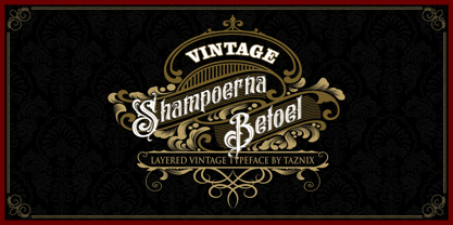 Shampoerna Betoel is an elegant and classic blackletter font. Fall in love with its incredibly versatile style and use it to create spectacular designs! Shampoerna Betoel Typeface includes a full set of character A-Z, as well as multi-lingual support, currency figures, numerals, and punctuation. What's Included : Standard glyphs Ligature Works on PC & Mac Simple installations Accessible in the Adobe Illustrator, Adobe Photoshop, Adobe InDesign, even work on Microsoft Word. PUA Encoded Characters - Fully accessible without additional design software. Fonts include multilingual support for; ä ö ü Ä Ö Ü ß ¿ ¡
 - Corso by Dominik Krotscheck,
$7.99 Corso is a clean condensed sans serif font family. It comes in upright, slanted and italic, in six weights each. It includes useful typographic features such as fractions, ligatures and case sensitive forms. Also included are double- or single-storey versions of a and g, you can switch via stylistic OpenType sets. Other letters with alternative forms accessible the same way are ß and ampersand. Corso works especially great for larger size uses such as signage, headlines or posters. But that doesn’t mean that it isn’t also useable for short texts.
 - Franzi Variable by Wannatype,
$211.00 The new sans-serif Franzi typeface family – as neutral as can be, but at the same time individual and striking. Its unmistakable character lies in the detail, with no effect pushing itself to the fore. As a wide-running typeface with a relatively large x-height, the typeface family is perfectly suited to small text sizes but, with its elegant details, it leaves nothing to be desired in display applications either. Originally designed with constructed, often rectangular elements, Franzi has gradually been rounded during the development process and is now less hard in order to guarantee optimal legibility. Franzi Variable is designed alongside the italic and the weight axes. The italics are softly and elegantly drawn, while the upright characters appear much more severe. The design appeal reveals itself in the two-storey ‘a’ – a tribute to legibility in body copy; however, for those who prefer the geometric in applications, an alternative single-storey ‘a’ is also available. All styles have small caps, superscript and subscript lowercase letters, lining, non-lining and small caps figures, fractions as well as several ligatures, alternative fonts, symbols and arrows. The Latin uppercase letters are also available as discreet swash variants. In addition to the extended Latin alphabet, the typeface family also includes the complete Greek, Cyrillic and International Phonetic Alphabet IPA. Franzi was created as a further development of an order to produce a sign for a therapy practice in Vienna’s Franz-Hochedlinger-Gasse – hence the name, which is more common as an abbreviation for Franziska than as a diminutive for the male name Franz: Franzi is therefore a hybrid typeface name which has female tendencies.
 - Big Welly by Inclusive Fonts,
$19.95 Big Welly …in the United Kingdom we have a very British phrase which is ‘Give it some Welly (Wellie)’ this is often shouted to a person as encouragement or criticism, it asks for more effort to be put into whatever he or she is doing. The saying comes from an informal name for Wellington Boots; Wellies - named after The Duke of Wellington. Hence, ‘Big Welly’ the font, this font is bold and big on the one hand and handwritten on the other. These two attributes make this font ideal as a poster font or t-shirt font for instance to make your message really stand out. So, if you need a bit of added oomph in your design – look no further than ‘Big Welly’.
 - Regime by Barnbrook Fonts,
$75.00 Historical influences coalesce with a contemporary twist to form the striking slab serif typeface Regime. In the early 19th century, as the Industrial Revolution began to transform Britain, the slab serif was born. The impact of new technology created a demand for a visual language that was compatible with mass-production and that could capture the attention of a newly-literate consumer. The design of the first slab serif typeface is credited to British punchcutter and typefounder Vincent Figgins and was released under the name Antique in 1815. In the same year, Napoleon was defeated at Waterloo. The name Regime alludes to this moment in history, when Britain emerged as the principal naval and imperial power of the 19th century.
 - Andalush by Dora Typefoundry,
$18.00 Andalush is a new type of bold script that is modern and elegant designed with a sense of pleasure, Andalush is suitable for use in various media such as; packaging, logos, labels, posters, clothing designs, wisdom quotes, newsletters, typography and many other media. You can mix and match alternatives with the OpenType feature. Andalush comes with uppercase and lowercase Standard Characters, Punctuation, Numbers. And other Glyph variations of OpenType features such as Standard Ligature, Stylistic Alternate, and Stylistic Set, and includes a series of multilingual characters. We really hope you enjoy and are interested in our offer. If you want to upgrade or need a license or ask questions, you can send me a message and you can immediately start your service doratypefoundry@gmail.com. Thank You
 - Middle Name by Graphicfresh,
$14.00 Middle Name - Minimal Classic Font Middle Name Sans is a geometric styled font. However, the design strays from the natural limitations of many sans-type fonts. Its eccentric style with a mix of today's styles makes this font suitable for various purposes. We added a bit of a classic touch to it. So that users can reminisce with the style of the past. You can create various designs with this font. Such as logos, posters, design templates, magazines, flyers and others. The strong character of the letters makes your design feel more modern and minimalist. Middle Name Sans comes with two versions. Regular and italic versions. When downloading, If there are things you want to ask or problems you face with this font. Don't hesitate to ask us. Because we are very happy to help you. Thanks Graphicfresh
 - Saint Petersburg by Haksen,
$14.00 "Saint Petersburg" fonts were created to look as close to a natural handwritten script as possible by including over 20 ligatures. With built-in OpenType features, this script comes to life as if you are writing it yourself. It's highly recommended to use it in OpenType capable software - there are plenty out there nowadays as technology catches up with design. Other than Photoshop, Illustrator and Indesign, many standard simple programs now come with Opentype capabilities - even the most basic ones such as Apple’s TextEdit, Pages, Keynote, iBooks Author, etc. Even Word has found ways to incorporate it. Your download will receive 4 font files, designed to work as perfect companions or simply as strong standalone typefaces. WHAT'S INCLUDED : 1. Saint Petersburg • A clean, free-flowing script font containing upper & lowercase characters, numerals and a large range of punctuation. 2. Saint Petersburg Alt • This is a second version of Saint Petersburg Script, with a completely new set of upper & lowercase characters. If you wanted to avoid letters looking the same each time to recreate a custom-made style, or try a different word shape, simply switch to this font for an additional layout option. 3. Saint Petersburg Slant • The Slant Version of the point 1. 4. Saint Petersburg Slant Alt • The Slant Version of the point 2. I surveyed mostly common letter combinations and made 20 Discretionary ligatures with following letter combos: aa bb ee ff ll ss tt at et it ot sl st rt ut att ett itt ott utt (in Saint Petersburg & Slant Version) aa bb ee ff ll ss tt at et it ot sl st rt ut att ett itt ott utt (in Saint Petersburg Alt & Slant Version) By using these ligatures, you can give realistic handlettered style, escaping font "pattern" effect.
 - Loxley by Canada Type,
$24.95 Drawn shortly before Jim Rimmer's passing in 2010, Loxley was designed to be used in a fine press edition of the folklore story of Robin Hood. It was named after the cited birthplace of the story's classic hero. Loxley's shapes were inspired the same early Roman faces (such as Subiaco from the late 1400s) that influenced Frederick Goudy's Aries, Franciscan and Goudry Thirty types. It exhibits the preculiarities of Jim's left-handed calligraphy, as well as his outside-the-box thinking with exit strokes and serif variations. Loxley was remastered for the latest technologies in 2013. Now it comes with a character set of over 450 glyphs, including plenty of stylistic alternates, a full compliment of f-ligatures, a Th-ligature, basic fractions, ordinals, a long s for historic setting, comprehensive class-based kerning, and extended Latin language support. 20% of this font's revenues will be donated to the Canada Type Scholarship Fund, supporting higher typography education in Canada.
 - Bomber TV by Kustomtype,
$25.00 I was asked by a good friend of mine to design his tattoo lettering. This fellow prefered an easy stencil with no ornament, such as swirls or loops. After some preliminary design I finally accepted the challenge and while completing the whole alphabet, the idea of creating a cool font of it occured to me. Only a few months later this new font family already contained 4 weights, every weight has a companion Italic style, punctuation, numerals and mathematical operators, as well as all accented characters. Bomber TV is a brand-new font and all glyphs have been contemplated very carefully so that all characters match in a well-balanced and streaming way. In both shaped weights, the font suits extraordinary well for headings, slogans etc. The cleanly cut and powerful Bomber TV font can easily be used for logotype, games, prints, magazines, web, apps, packaging, posters, T-shirts, signage & design projects. The font is original and custom made by Kustomtype.
 - mzw teaparty - Unknown license

- Freight Text Pro by Freight Collection,
$39.00 Fresh yet at the same time projecting a familiar feeling, Freight Text provides the stable foundation on which all other Freight serif families were built. As its name implies, it was designed to handle standard text sizes for large and small quantities of copy. Unique enough to catch the eyes but comfortable enough keep them from bleeding, Freight Text is a workhorse intended for magazines, newspapers, cookbooks, data-intensive technical documents and collateral. What more could you ask for from such a humble family?
 - Franzi by Wannatype,
$26.00 The new sans-serif Franzi typeface family – as neutral as can be, but at the same time individual and striking. Its unmistakable character lies in the detail, with no effect pushing itself to the fore. As a wide-running typeface with a relatively large x-height, the typeface family is perfectly suited to small text sizes but, with its elegant details, it leaves nothing to be desired in display applications either. Originally designed with constructed, often rectangular elements, Franzi has gradually been rounded during the development process and is now less hard in order to guarantee optimal legibility. A total of 20 well-developed fonts are available: 10 line thicknesses from hairline to black, each of which can be upright and italic. The italics are softly and elegantly drawn, while the upright characters appear much more severe. The design appeal reveals itself in the two-storey ‘a’ – a tribute to legibility in body copy; however, for those who prefer the geometric in applications, an alternative single-storey ‘a’ is also available. All styles have small caps, superscript and subscript lowercase letters, lining, non-lining and small caps figures, fractions as well as several ligatures, alternative fonts, symbols and arrows. The Latin uppercase letters are also available as discreet swash variants. In addition to the extended Latin alphabet, the typeface family also includes the complete Greek, Cyrillic and International Phonetic Alphabet IPA. Franzi was created as a further development of an order to produce a sign for a therapy practice in Vienna’s Franz-Hochedlinger-Gasse – hence the name, which is more common as an abbreviation for Franziska than as a diminutive for the male name Franz: Franzi is therefore a hybrid typeface name which has female tendencies.
 - Verie by Prototype Fonts,
$20.00Inspired by digital displays and mass transit. - Rothest by Taznix Creative,
$7.00 Rothest is an elegant and classic blackletter font. Fall in love with its incredibly versatile style and use it to create spectacular designs! Rothest Typeface includes a full set of character A-Z, as well as multi-lingual support, currency figures, numerals, and punctuation. What's Included : Standard glyphs Ligature Works on PC & Mac Simple installations Accessible in the Adobe Illustrator, Adobe Photoshop, Adobe InDesign, even work on Microsoft Word. PUA Encoded Characters - Fully accessible without additional design software. Fonts include multilingual support for; ä ö ü Ä Ö Ü ß ¿ ¡ Hope you enjoy with our font! Taznix


