10,000 search results
(0.011 seconds)
- Capcay Spicy by Asd Studio,
$10.00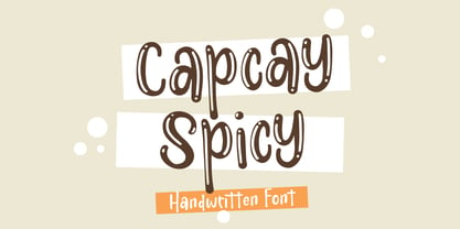 ntroducing Capcay Spicy, created by Asd Studio is a quirky and relaxed handwritten font. Whatever the topic, this font will be a wonderful asset to your font library, as it has the potential to enhance any creation. What's Included? :: Uppercase & Lowercase :: Numbers & Punctuation :: Multilingual Support Enjoy our font, thank you.
 - Melted Cheese by Asd Studio,
$10.00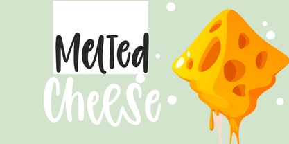 Introducing Melted Cheese, created by Asd Studio is a quirky and relaxed handwritten font. Whatever the topic, this font will be a wonderful asset to your font library, as it has the potential to enhance any creation. What's Included? :: Uppercase & Lowercase :: Numbers & Punctuation :: Multilingual Support Enjoy our font, thank you.
 - Summer Children by Asd Studio,
$12.00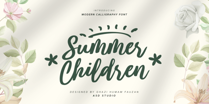 Introducing Summer Children by Asd Studio Summer Children is a modern calligraphy font. Whatever the topic, this font will be a wonderful asset to your font library, as it has the potential to enhance any creation. What's Included? :: Uppercase & Lowercase :: Numbers & Punctuation :: Swashes Ligature :: Multilingual Support Enjoy our font, thank you.
 - Geraldica by Etewut,
$30.00 Geraldica is a monoline script that supports foreign languages and has special characters such as ß, ñ, and ç. It includes 381 symbols including alternates with different calligraphic swashes.
 - Gravitational Pull by Hanoded,
$15.00 My 9-year old son Sam asks a lot (a LOT!) of questions. Like: ‘what killed the dinosaurs?’ (probably an asteroid), ‘what is the distance to Pluto’ (about 7.5 billion km), ‘how big is space’ (93 billion lightyears - give or take). I am pretty sure he asked me about gravity as well. Gravitational Pull is a messy pencil script font. It comes with a whole bunch of double-letter ligatures and some really wonky glyphs. And no, in its virtual form, this font is not subject to the Earth’s gravitational pull.
 - Jocham by Hubert Jocham Type,
$39.00 Since I have my new logotype people are asking me about the typeface it is based on. But it did not exist and I did not believe that it would actually work. I still love my logotype and so I went on to try to make it work as a font. After many different versions and some doubts I am glad to present Jocham. It is the first typeface with my name. For an obvious reason. There is only one weight with an italic. I tried different weight, but they were all not as strong as the final.
 - Swing Vote JNL by Jeff Levine,
$29.00 A 1964 piece of sheet music entitled “Old Soldiers Never Die (They Just Fade Away)” was based on the farewell speech General Douglas MacArthur gave to Congress on April 19, 1951. This particular edition of the song sheet had part of his speech (as well as its title) hand lettered in a free-form sans serif reminiscent of the lettering done by such noted lettering artists as Paul Coker and Saul Bass. The casual and playful style of this type design became the inspiration for Swing Vote JNL, which is available in both regular and oblique versions.
 - LP Harmonia by URW Type Foundry,
$35.99 LP Harmonia arose from its designer’s private life. As a type designer, Peter Langpeter was often asked by friends or relatives to write a greeting on a birthday card or create a good looking invitation. Over the years, he used ink and a soft feather to form his personal handwriting: LP Harmonia.
 - Tabloid Edition JNL by Jeff Levine,
$29.00 The headline across the October 7, 1918 edition of the UK’s Daily Mail stated: "Germany Asks the Allies for Peace". Set in extrabold sans serif lettering, it’s now available digitally as Tabloid Edition JNL in both regular and oblique versions. This is another “redrawn from the headlines” typeface from Jeff Levine Fonts.
 - South Wind by Ivan Rosenberg,
$16.00 South Wind Font is a handlettered font with 107 ligatures, lot of alternate characters and multilingual support. Is ideal for blog website, instagram, branding, invitations, business cards, weddings and many more. Ligatures list: ab ae al am an ar as at ax ay bb bl cc ch cl ct dd ee ef el en ep er es et ff ft gh ia ic ie il in it iu kt ll of ok ol om on oo op ot ov rr sh sl sm ss st th ts tt Af Ap As Be Dl Em Es Et Eu Ft If Is It Kt Ml Mr Ms Mt Ph Pl Pt Se Sh Sl St Us outh all alt arr ass can cus ell esl etl ett ill obl old oll oth out sim ted South Wind font also include multilingual support for Western and Central Europe. South Wind Font is a set of 542 glyphs, Upper and Lowercase characters with 107 ligatures, numerals, lot of punctuation glyphs, 3 alternates for each lowercase character and 2 alternates for each uppercase character. For access to Stylistic Alternates is required software with glyphs panel like Photoshop, llustrator, Inkscape etc. No special software is required to use Ligatures.
 - Love Casual by Gatype,
$14.00 Introducing new Love Casual Serif Typefaces with lots of alternative characters, multilingual support and unique ligatures. Love Casual is a very versatile font. Perfect for branding projects, logos, magazine imagery, wedding invitations, posters, apparel, packaging, website headers, or simply as a stylish text overlay onto any background image. Any Questions? Just Ask! Hope you enjoy !
 - Sinder by The Fontry,
$5.00 It's extended. Somewhat. It's got all the characters. There's a plus. It's fully kerned. That's awesome! And it is rubbed down to the nub. Whuh??? That means it's highly distressed, manually eroded on my work bench. Tortured further to open the wounds using my bitmap editor. Tweaked lovingly and built up to even higher standards of distortion in my vector program. The end result is a font called Sinder. I've even included an "ash" effect. Using the bracket or brace left gives you ashes from left to right as you type your text. Finish your text with ash terminals by typing the bracket or brace right. But be careful. This font is a heavy duty downloader. Make sure all your programs are up to the task, especially before you go converting to vectors.
 - Continuo by Delve Fonts,
$39.00 Continuo is a fascinating, all-uppercase display typeface wherein the contour of each letterform is described with a single, continuous line. The challenges presented by that simple idea are similar to constructing letterforms with neon tubing. For example, when the strokes of a letterform need to be heavier than the width of the neon tube, two tubes are employed to create the outer contours, effectively leaving an unfilled void inside the stroke. Also, since neon tubes cannot be broken apart as they trace the contours, they must follow a path that, for reasons of economy and to avoid optical massing (or bright spots in neon), the tubes are not crossed. So too, the construction of Continuo follows. The newly updated Continuo now has alternate forms of letters A-Z available in the lowercase a-z and by extension those alternates are also present in the lowercase diacritics. The new Latin Plus glyph repertoire of Continuo contains almost 900 glyphs, supporting 224 languages, including Vietnamese and multiple African languages. A handy set of arrows and additional international currency symbols were added as well. The name is derived from the musical term “Basso Continuo” meaning an almost constant bass line, an integral part of most musical melodies. As an in-line display type, Continuo is ideal for headlines and most oversized applications and its unique appearance commands attention from viewers.
 - Baggage Claim JNL by Jeff Levine,
$29.00 Sometimes type designs are set aside as one project takes priority over another and occasionally it becomes overlooked. One such example is a set of extra bold, sans serif stencil characters drawn out in 2017. Regrettably, as much time has passed, no backstory can be applied to this typeface. It was checked against existing releases in the Jeff Levine Fonts library and didn’t seem to have been re-worked for any subsequent release. With this in mind, Baggage Claim JNL makes its belated appearance and is available in both regular and oblique versions.
 - Eckhardt Dualine JNL by Jeff Levine,
$29.00 While searching online for vintage type inspirations, an image was spotted of an old letterhead for a steel manufacturing company. The hand lettering of the word 'Ludlum' only offered D,L,M and E as visual examples, but from this Jeff Levine has designed Eckhardt Dualine JNL - a Deco-flavored dual-line type font. As with a number of other releases that emulate hand-lettering or sign painting, Jeff has named this font in honor of his good friend, the late Albert Eckhardt, Jr.; who ran Allied Signs in Miami from 1959 until his passing.
 - Eckhardt Trilinear JNL by Jeff Levine,
$29.00 Eckhardt Trilinear JNL was inspired by [and modeled from] a pen-drawn alphabet found in a 1960 edition of the Speedball® lettering textbook. As with many other "sign painter-oriented" typefaces by Jeff Levine, it is named in honor of Jeff's good friend -- the late Albert Eckhardt, Jr. Al ran Allied Signs in Miami, Florida from 1959 until his passing.
 - Eckhardt Slabserif JNL by Jeff Levine,
$29.00Eckhardt Slabserif JNL is a bold, condensed slab serif font that's perfect for attention-getting headlines, signs, banners, price cards or any printed project where a strong type face is needed. Its name (as others in a series of sign shop-oriented fonts) is Jeff Levine's way of honoring his friend Al Eckhardt, who ran Allied Signs in Miami until his passing. - Stonecross by Scriptorium,
$18.00People are always asking us for chiseled-stone style fonts, so we thought we'd give them what they want, but with a slightly different spin. Stonecross has the look of classic Celtic uncial lettering as it would look if it was cut in stone, with some fanciful variant character forms and the nicks and chips which give it the look of stone. - Charminette by Vanderfont,
$24.00 Released in November 2003, Charminette is the Collection's first face with a consistent baseline and x-height. Intended as a display face to be used large, it's also surprisingly readable at smaller sizes. Charminette asks to be considered for invitations to formal parties and weddings, any occasion when proper manners are called for. Or, when proper manners need to be subverted. A toast to civility!
 - Meroche by MlkWsn,
$15.00 Introducing - Meroche Sweet and Classsy Sans Display Family Meroche Sans Family consists of 4 weight : Thin, regular, medium and bold equipped with 20+ ligatures and alternative letters that look sweet and classy and are very good for your work such as logos, branding, packaging, posters, invitations, insta stories and your advertising needs. If there is anything you need to ask, you can contact me at mlkwsn999@gmail.com
 - Sabana by fragTYPE,
$20.00 Sabana is my first step in font design. A font that is born from the organic, from a creative process that starts from improvisation as a result of my training as an artist. To design Sabana I asked myself the question, why not make a font that emulates my own writing? as I found it fun to see my handwriting on a computer. This font can be used in a wide range of projects such as editorial design, motion graphics, web, advertising and branding where emulating handwriting is a necessity. The font has coverage for more than 200 languages ??derived of the latin alphabet in addition to Cyrillic. Sabana is where I come from, where I am from, a constant on the horizon that is occasionally interrupted by vertical lines and that together make a perfect visual symphony.
 - PiS Malefiz by PiS,
$24.00 PiS Malefiz is inspired by the hand-drawn type on the package of the german 60's version boardgame „Malefiz“, also known as Barricade or Barricata. Extended to five hand-drawn weights PiS Malefiz turned out to be the weird lovechild of Saul Bass and Ralph Steadman, fun and childish plus angry and strange. Just as playing the boardgame, PiS Malefiz is a wild and superfast rollercoaster ride of emotions! Combine the five interchangeable weights for total whackyness or use the clean and legible thin and regular versions for sleek and slender slanting. Have fun! Keep the dice rolling!
 - Whatzis JNL by Jeff Levine,
$29.00Whatzis JNL is a collection of over 85 decorative question marks gathered from the Jeff Levine font collection and assembled into one convenient file for use in specialty projects where ad copy is based on questions or curiosity. No need to search through dozens of fonts for your background images, as they're all here. Ads such as "Have a question about your insurance?," "What's New at Harper, Jones and Harper?" or "Ask Us! - We are the Experts!"... or signs saying "May We Help You?" benefit from some well placed display question marks - especially when printed in contrasting colors or screened-back in halftones. - Alasassy Caps by Leksen Design,
$19.00 Bring some sass to your signage! Alasassy is a font inspired from Sharpie pen drawings, featuring ink ball terminals. The lowercase letters are a mix of uppercase and lowercase letters that share the same cap height and baseline. There are several alternate characters with a mix of high and low crossbars as well as crossbar overhang options and language support for each. This display font will bring some zest to your logo, signage, packaging design or large titles on book covers or advertising. It is a great combination of an organic, hand drawn feel but still clean and crisp enough to look professional.
 - Tartaria by Dima Pole,
$29.00 The font is devoted to the historical past of the peoples of Europe, which today is hidden, but which can not be lost forever, because it lives in the genetic memory and hearts of people. Beautiful font in the historical traditions of 17-19 centuries. Elegant, luxurious, sweet. Some forms and combinations of forms are not always ordinary, but always interesting and exciting. - Letters for all Latin alphabets - Letters for all Slavic alphabets - Ligatures. All standard (ff, fi, fj, etc.) as well as fb, fk, tt, ft - Stylistic alternates a, y, g - Ordinals - Fractions - Historical forms of letters s, я - Historical ligatures ss, si, st - Historical Slavic letters - Lowercase alternates for ж, к, я, ect. - National ligatures: German ss, Icelandic and French ae, oe, Dutch ij - Uppercase German SS (Eszett Große) - Currencies: dollar, ruble, euro, pound, cent, yen and more...
 - Schwarzkopf by IHOF,
$24.95 SchwarzKopf is an 18th Century European "Schwabacher" blackletter which features a distressed edge for creating authentic "antique" documents. Old features the long "s" and other archaic forms. Both Old and New variations feature many additional ligatures such as tz, sch, ss, ff and ck.
 - Halfway There by Hanoded,
$15.00 Halfway There… We love to go camping as a family and we usually go to France (because France is only a 5 hour drive from where we live, it is usually sunny and they have the best bread in the world - enough said!). Somewhere around Lille, or Luxembourg City (depending on our destination in France), the kids always ask: ‘are we almost there?’ and my answer is always: ‘we’re halfway there!’.
 - Qidung Swara by Creative17studio,
$20.00 Qidung Swara is a heritage typeface. Inspired by Aksara Jawa, character that has its own uniqueness and privilege. Qidung Swara was created to support use in all designs, such as branding, magazines, advertising brochures, music album covers and other uses. Qidung Swara also support multilingual language. Available in 2 styles: Regular and Italic. Grab this exclusive and awesome font fast. Don't miss it. Any question? Jusk Ask. Free update Thank You
 - Factor BF by Bomparte's Fonts,
$39.00 Factor BF takes inspiration from automotive lettering, and has elements of techno. It’s clean, strong and friendly, due to its overall soft, square, sturdy letterform construction. OpenType features include stylistic alternates for letters Q, a, e, f, y and ß; as well as automatic fractions, that are accessible in OpenType capable applications. Consider Factor BF for use in branding, signage, and logos to name just a few of its many areas of application.
 - South Central by Loshaj Foundry,
$9.00 "To us it ain't vandalism. It's just letting the people know: We grew up here. This is our neighborhood. And as they pass by they know where we're at." – Los Angeles gang member Graffiti is equivalent to local news, its intended purpose is to inform general populace where gang members are, where they operate, as far as territory lines, and which neighborhoods are at war. Gang Graffiti can be used for: – Marking territory with graffiti. – It's a form of gang advertisement. – Letting people know who's in the gang, living, dead, or in prison. – Which neighborhoods they are at war with. – Who are their allies. Graffiti has along history, specifically Los Angeles gang graffiti, which has has been around since the 1930s. South Central typeface includes uppercase letters, numbers, and select punctuation glyphs.
 - Fugu by Positype,
$25.00 When Baka and Baka Too did very well commercially (Baka was named the Best Cursive Rough Script in 2005), I shied away from doing rough, handwritten scripts in fear as being seen as a one-trick-pony. A few years have passed and some early sumi-e brush ‘doodles’ kept appealing to me. I initially thought this new font would just fall under the Baka mantle and just become a new sibling, but as brush hit paper over and over again, the letters took on a different personality from Baka. This new font was turning out to be far more expressive, smooth and rough, tasty but sticky. This dichotomy demanded a new name. The rough and smooth texture suggested the name Fugu—oddly delicate while rough and functional.
 - Lust Hedonist by Positype,
$50.00 Check out the new Lust Pro & Lust Pro Didone to see how the series has grown and evolved. Confident, voluminous and versatile, Lust is an exercise in indulgence—an attempt to create something over the top and vastly useful. Lust Hedonist pushes contrast almost to the limit. The letterforms, especially the Script style are very self-indulgent for me, dare I say Hedonistic, and how I like to see letter masses taken to extreme contrast. The series unapologetically channels Herb Lubalin, but produced with a deliberate, contemporary twist. There is an intentional slyness infused in the letterforms—the extreme thick and thin lines flow effortlessly without becoming gratuitous. It’s always just enough, not too much. What makes the type series so appealing? The curves. When asked to describe the letterforms, most people unwittingly allude to the human form, using adjectives usually reserved for describing physical traits… creating all-too-familiar comparisons. Summerour has grown to accept this as unavoidable and reasonable given his acknowledgement of its influences and has provided nuances within the letterforms to accentuate that.
 - Diad by Andinistas,
$29.95 Diad was born on 2000 in order to design posters about second World War. The original idea was obtained by breaking, burning and getting wet a bunch of written copies with an old writing machine. Today, Diad is a small typographic system useful for bringing relevance to any content with a grunge look. Each and every detail passed through a strict experimentation process. Its outrageous and unconventional spirit travels from high leveled corrosion, up to a delicate visual neglect. Diad 2 and 3 work for designing words. Diad 1 is ideal for long phrases and titles. Diad dingbats includes 26 illustrations about motocross. In total, adding Diad 1,2 and 3, it has around 260 glyphs. Diad will make your design shine providing different graphic atmospheres, optimizing time and work to its users. Diad is perfect for graphic design on contexts such as death metal, drum and bass, films, war and horror video games. It could work also for logos, words, titles and short texts in covers, tags, clothes, wraps, cards, stickers, toys, bicycles, surf boards, etc.
 - Calligraphy - Unknown license

- Commuter - Unknown license

- Paternoster AH - Unknown license

- Storyline by Comicraft,
$19.00 It starts slowly, gently drawing you in... you're introduced to a number of strangely interesting and compelling characters. The plot seems at first to be satisfyingly predictable, then -- suddenly -- the narrative takes a completely unexpected turn! The protagonist is thrown into a series of devastating and alarming twists and turns! The antagonist triumphs -- evil trounces good, mass hysteria seizes the city streets! Our Hero is separated from his One True Love, and it seems that she has fallen for The Villain of the Piece! Will Good Prevail? Will Evil Perish? Will Love Conquer All?!? I don't know yet -- that's as far as I've got. Don't worry, it has a Great Ending.
 - Project D by DM Founts,
$22.00 Project D is the fourth typeface released by DM Founts. It was inspired by the infamous graffiti atop the former Heygate Estate in South London, which I had passed by numerous times on the overground train years ago. Heygate Estate has since been replaced by soulless luxury flats, as per the gentrification agenda. The letters don't entirely match the graffiti as they were created from memory, but I thought such a profound statement should be honoured. Project D is best used for impact at large sizes, although it should scale well. Use it for computer interfaces, retro headings and anything involving defiance, espionage, infiltration and spy games.
 - Artios Pro by DBSV,
$70.00 There are a lot of narrow passages... like the Straits of Gibraltar, Hormuz, of Malacca, of Thermopylae, the Dardanelles, the Dervenakion, Magellan, Rentina of Naruto, Kerch etc. I tried to pass into mine closely with the name «Artios Pro". Walking on the same considerations as the previous series (Khamai/Aeolus/Corset) I tried to give some sense of diversity for narrow passages of the letters. These twelve style are the result. And here, the "Rail" engage with "Semi Bold" in the same way as the previous series. This series is composed and includes 12 fonts with 625 glyphs each, with true italics and supports Latin, Greek and Cyrillic.
 - Zega Grot by Isaco Type,
$24.00 Celebrate good times with Zega Grot family! This font is the companion of Zega Text but less “serious” than its predecessor. The Grot version has old vertical proportions, with higher capitals and asc-descenders, height difference between capitals and ascenders, beyond the redesign of various glyphs, giving a less formal tone, more rounded and cheerful. The family consists of 14 styles, 7 weights plus their respective italic versions. The fonts are available in OpenType PS and have extended character set to support CE, Baltic, Turkish as well as Western European languages. You can test Zega downloading the free trial font in Extrabold version (TT only).


