1,861 search results
(0.017 seconds)
- Olia Vuzo by Javanice Studio,
$16.00 Introducing Olia Vuzo by Javanice Studio Olia Vuzo is A Fun Display Font Olia Vuzo is perfect for branding project, apparel, labels, magazines, books, greeting / wedding cards, packaging, fashion, make up, stationery, and any type of advertising purpose or just used to express words above the background. This font includes OTF&TTF&Woff, Olia Vuzo also multilingual support. Enjoy the font, feel free to comment or feedback, send me PM or email.
 - HV Olive and Figs by Harmonais Visual,
$15.00 Olive&Figs - a classic Roman-culture-inspired calligraphic serif with elegant, regal, artistic touch. Specially designed for regal, classy projects, perfectly suitable for creating elegant, simple, lifestyle design such as logos, title, packaging and more.
 - Artigo by Nova Type Foundry,
$42.00 Artigo is an old style inspired typeface system for text. It was inspired by the handwriting aspect of the first roman types but it intends to be a contemporary interpretation. Its abilities are in small text with personality. The italics capture a lot of its dynamic feeling even more expressive on the display version that stands as the most handwritten one. It gives text a lot of personality and great readability.
 - Antika by Letterara,
$12.00 Antika is a beautiful modern script font featuring flowing letters. It will add a romantic touch to any crafting project!
 - Antigen by insigne,
$21.99Antigen is a forceful and fresh typeface with a strong futuristic feel. Its characters have a wide stance, and the lettering is subtly rounded. It includes a set of OpenType alternates that remove the spike crossbars for a less aggressive appearance. Antigen is great for titling that needs an edgy, assertive and ultramodern look. - Ambiguity by Monotype,
$50.99 Ambiguity is a type family with five distinct personalities or ‘states’, created as a tool for coaxing designers and brands out of their comfort zone. It embraces both tradition and radicality, as well as generosity and thrift, encouraging us to question our beliefs about the intersection of style and meaning. The family is designed by Charles Nix, who describes Ambiguity as “as much thought experiment as typeface.” Its five states—Tradition, Radical, Thrift, Generous and Normate—each express or subvert different aspects of typographic tradition. Tradition is conservative, relying on historical letter shapes. Radical rejects inherited ideas of proportion, making typically slender letterforms wide, and wide letterforms slender. “It’s contrarian,” says Nix. Thrift cherry picks the condensed shapes from Tradition and Radical, while Generous does the same for wide forms. Normate sits at the center, a synthetic blend of all of the others. “Tradition is very comforting,” says Nix. “It’s the mask of conservatism. It’s calming because it delivers the proportions we expect. With Thrift more fits into a smaller space, so it’s great where words want to get large, like gigantic headlines, or text needs to cram in, like small screen type. You get a sense of carefree and luxury from the Generous cut. One would expect the Radical to be used in a sort of Dadaist way, but in a classic context it provides an enjoyable jolt.” Ambiguity is a litmus test. Designers could spend hours trying on typefaces that offer just one of these voices. Ambiguity provides five different personalities—ideas—beliefs—each of which also work seamlessly together. “It’s a palettea, like idea cards,” he says. “It’s a way of making yourself see differently. My hope is that traditionalists will try on radical clothes and vice versa. It’s a way of exploring outside your comfort zone, breaking out of the doldrums, by stepping through a variety of voices.”
 - Artigua by Picador,
$29.00 High contrast, sharp endings and geometrical shapes – these are the main features of Artigua. The relation of vertical and horizontal lines reduces with weight – this makes regular weight appropriate for longer texts and black ideal weight for headings. Whole family contains small caps, subscript, superscript, italics, fractions old style and tabular figures. Over 1100 glyphs and 18 fonts makes a perfect match for clean and minimal projects. With Artigua it’s super easy to prepare adverts, books or web headings.
 - Ambigue by Linotype,
$29.99The original name for Ambigue was “Confidence”. This font family received the first prize at the German Kurt Christians-Foerderpreis in 1997/98. Its interpolated weights offer a subtle differentiation in the grey levels. A special “Small” weight is available that offers better readability in very small sizes. The work was supported by Professor Jovica Veljovic. - Asticus by Teweka,
$10.00 New Fresh! Asticus was born by adapting the Blackletter style. This font is very distinctive, with lines that still maintain the blackletter style. This font has 372 glyphs and is multilingual. and some ligatures in it. This font is very suitable for various product designs, t-shirts, branding and others.
 - Antium by Eurotypo,
$58.00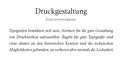
- Xantigo by PizzaDude.dk,
$20.00Xantigo is a fun, smooth and romantic font with rounded edges. - Ambiguous by Dumadi,
$18.00 Ambiguous is a very powerful font suitable for any branding design in your project! This font is perfect for shirt designs, websites, home decor, branding, blogs, logos, posters, fashion, custom stickers, music, food menus, games, magazines, and many others.
 - Cantiga by Isaco Type,
$19.00 Cantiga is a monophonic song or melody, sometimes repetitive, often with unpretentious themes. In the same simplicity, this font family combines robustness with some very fine details, with 44 versions for various purposes. Choose thinner (or thicker) versions for titles, and intermediate versions (normal, medium, etc.) to small sizes. Explore the condensed versions when you need to save space. Use the light versions for special cases in huge sizes. Cantiga intended to be your new "Swiss army knife" sans typeface. The Cantiga family consists of 2 widths (normal and condensed) with 11 weights each, plus their respective italic versions. The fonts are available in OpenType PS format and have extended character set to support CE, Baltic, Turkish as well as Western European languages.
 - Antica by Sudtipos,
$39.00 Antica has sharp triangular serifs, and in 8 weights with true italics, it forms a family that stylistically finds its origins in Latin styles of the nineteenth century. The font incorporates additional swashes, small caps and stylish alternates that advance the aesthetic from its roots and make it appropriate for modern design. Commonly named ‘Latin types’ did not vary in weight, but we decided to create Antica with a range that goes from thin to black and we also added extra curlicues to the letterforms. Antica borrows from the versatility and freedom granted to type founders of the nineteenth century – a time when the meteoric growth of mass-produced consumer goods led to an increased demand for publicity that needed fresh, attention grabbing typefaces. And as an homage to these Latin types we designed Antica to function well with an array of projects from stylized labels and formal editorial design requiring small type sizes to large-scale posters and billboards. The Antica family supports a wide variety of Latin alphabet-based languages.
 - Fatigue by Typesthetic Studio,
$13.00 Heroic is a bold and playfull handwritten brush font. This font is very unique because sometimes it can look fierce like in modern street art graffiti if with capital letters, but sometimes it can look cute if it is included with the lowercase letters. As a result, this font can matches a wide pool of designs.
 - Caslon Antique - Unknown license

- Mayflower Antique - Personal use only

- Effloresce Antique - Unknown license

- Roman Antique - Unknown license

- Caslon Antique - Unknown license

- Powell Antique - Personal use only

- Roman Antique - Unknown license

- Packard Antique - Personal use only

- Airmole Antique - Unknown license

- Figgins Antique by HiH,
$12.00 “Hey, look at me!” cried the new advertising typefaces. With the nineteenth century and the industrial revolution came an esthetic revolution in type design. Brash, loud, fat display faces elbowed their way into the crowd of book faces, demanding attention. Those who admired traditional book types harumphed and complained. Robert Thorne had fired the opening round with his Fatface. With the cutting of Figgins Antique, the battle was well and truly joined. Job printing came into its own and it seemed like everything changed. The world of printing had been turned upside down and the gentile book-type aficionados recoiled in horror much as the rural landed gentry recoiled at the upstart middle class shopkeepers and manufacturers. William Savage, approvingly quoted by Daniel Berkeley Updike over a hundred years later, described the new display faces as “a barbarous extreme.” These were exciting times. According to Geoffrey Dowding in his An Introduction To The History Of Printing Types, “The types which we know by the name of Egyptian were first shown by Vincent Figgins in his specimen book of 1815, under the name Antique.” Of course, dating the design is not quite as simple as that. Nicolete Gray points out that Figgins used the same “1815” title page on his specimen books from 1815 to 1821, adding pages as needed without regard to archival issues. As a result, there are different versions of the 1815 specimen book. In those copies that include the new Antique, that specific specimen is printed on paper with an 1817 watermark. The design is dated by the 1817 watermark rather than the 1815 title page. Figgins Antique ML is an all-cap font. This typeface is for bold statements. Don't waste it on wimpy whispers of hesitant whimsies. And please don't use it for extended text -- it will only give someone a headache. Think boldly. Use it boldly. Set it tight. Go ahead and run the serifs together. Solid and stolid, this face is very, very English. FIGGINS ANTIQIE ML represents a major extension of the original release, with the following changes: 1. Added glyphs for the 1250 Central Europe, the 1252 Turkish and the 1257 Baltic Code Pages. Added glyphs to complete standard 1252 Western Europe Code Page. Special glyphs relocated and assigned Unicode codepoints, some in Private Use area. Total of 331 glyphs. 2. Added OpenType GSUB layout features: liga and pnum. 3. Added 86 kerning pairs. 4. Revised vertical metrics for improved cross-platform line spacing. 5. Redesigned mathamatical operators. 6. Included of both tabular (standard) & proportional numbers (optional). 7. Refined various glyph outlines.
 - Antique Spenserian by Dharma Type,
$24.99 This antique script is based on Spencerian script released from MacKellar, Smiths, & Jordan in the 19th century. This family comes in two varieties, Standard and ornamented capitals. The Standard has orthodox style for formal text and display. This makes it possible you to use this style for any projects. The unique Ornamented is suitable for eye-catching part of your project: headlines, wedding invitations and logo. Every glyphs were added antique and distressed effect by hand work with great care to be looked like natural. Use your ideas to enjoy this exclusive script.
 - Eureka Antique by Solotype,
$19.95You may be familiar with a caps and small caps type called Cruickshank. In Germany the same face was called Eureka. We took the small caps, which are not so overblown as the caps, and designed a lowercase to harmonize with it. - Mussica Antiqued by Corradine Fonts,
$19.95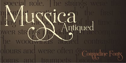
- Flat10 Antique by Dharma Type,
$9.99 This 8-bit pixel font is designed with respect for 80s game designers and the pixel font pioneers in middle 90s. Use at size 10 pixels or multiples of 10 with anti-alias off is recommended. List of our Pixel Font Project. ·Flat10 Antique ·Flat10 Artdeco ·Flat10 Arts&Crafts ·Flat10 fraktur ·Flat10 Holy ·Flat10 Holly ·Flat10 Segments ·Flat10 Stencil ·Flat20 Gothic ·Flat20 Headline ·Flat20 Hippies ·Flat20 Streamer ·Behrensmeyer Vigesimals ·Civilite Vigesimals
 - Antique Trove by Letterhend,
$16.00 Antique Trove is a classic display font. This type of font perfectly made which is need a standout font, and the other various formal forms such as invitations, labels, logos, magazines, books, greeting / wedding cards, packaging, fashion, make up, stationery, novels, labels or any type of advertising purpose. Features : Lowercase & uppercase Numbers and punctuation multilingual ligatures PUA encoded We highly recommend using a program that supports OpenType features and Glyphs panels like many of Adobe apps and Corel Draw, so you can see and access all Glyph variations.
 - Rusulica Antique by Type Fleet,
$- Rusulica Antique distinct aroma & flavor Rusulica Antique is a modification of the erstwhile script. With rough edges it has a distinctive appearance, rich aroma and antique charm. Because of its ornamental and playful design, it offers plenty of possibilities. Rusulica Antique has a high contrast. Its edges are rough and there is an alternate for almost every capital letter. The typeface’s x-height is bigger than usual and it is constructed at a 30° angle.
 - Antique Tuscan by Wooden Type Fonts,
$20.00 A revival of one of the popular wooden type fonts of the 19th century, condensed, bold, curved serifs, a very useful design for display, upper and lower case.
 - Antique Heritage by Din Studio,
$20.00 Dreaming to make remarkable projects? Wanna travel your audiences or costumers to aged world? Then, this is the path that you looking for. Introducing Antique Heritage- A Monoline Script Font This font is best to add antiques to your projects that have vintage styles and shapes can help bring to a fine new level. Also, to increase a real sense of timelessness. Use it for headings, logos, business cards, printed quotes, invitations of all sorts, cards, packaging, and your website or social media branding. Our font always includes Multilingual option to make your branding globally recognised. Features: Standard Ligatures Stylistic Sets Swashes Multilingual Support (91 languages) PUA Encoded Numerals and Punctuation Thank you for downloading premium fonts from Din Studio
 - Gillies Antique by URW Type Foundry,
$35.00 - Austin Antique by HiH,
$10.00 “More is better” may have been the motto of Richard Austin of Austin and Son’s Imperial Letter-Foundry on Worship Street at Finsbury Square in London when he designed and cut his Antique typeface. The year it was created is uncertain, but it is known to have appeared in a specimen book produced in 1827. At first glance, the upper case letters of Austin Antique look very much like Figgins Antique. But, upon examination, one will note that the Austin face is much darker. In general, the letters designed and cut by Richard Austin have fatter strokes, larger serifs and smaller counters -- more metal and less daylight. The premise was that the darker the letter, the more attention an ad using the typeface would receive. In old pictures of London and Paris one may see walls crowded with posters and “bills” -- competing for the attention of the passerby. Morris and Updike aside, the early nineteenth century marked the beginning of a commercial as well as industrial revolution. Patterns of commerce were changing. With new methods of marketing came the need for new typefaces to support the new methods. Foundries found the display types were very profitable and competed most energetically and creatively for the trade. There was a lot of trial-and-error. Some ideas faded away. Others, like the Antiques or Egyptians, were refined and developed. From them came the Clarendons that were to prove both popular and long lasting -- because they worked. Their job was to sell goods, not please the aesthetic sensibilities of the critics. They did their job well. Austin Antique has a full Western European character set, plus the following ligatures: ct, st, fi, fl, ff, ffi and ffl. Tabular numbers. Surprisingly readable.
 - Helios Antique by W Type Foundry,
$25.00 Helios Antique & Helios Stencil Check our PDF specimen for more details Helios type family is the result of a mixture between the early sans serif and the modern trends of our era. Its rational structure is subtly wider than the majority of the first sans, generating a higher impact in its uses. All the typeface terminals are more open in order to balance better the whites and blacks of Helios, and where the strokes meet it has a deeper contrast giving more legibility to the reader. Furthermore, in some letters it is possible to see some prominent features such as the leg of the "R" and the tail of the "Q", which are particular gestures that identify this type family. Helios Stencil is the tough version of this type family. All the stencil gaps were measured rigorously, thus in small sizes it conveys a neutral aesthetic whereas in big sizes a display logic appears. Helios Antique is composed by 36 styles, 782 glyphs and small caps. Besides, it has powerful OpenType features for each style, including alternates characters, ligatures, fractions, special numbers, arrows, extended language support and many more.
 - Antique Shadow by Wooden Type Fonts,
$15.00A modified remake of one of the popular wooden type fonts of the 19th century. This is an extra bold, shadowed, sans serif suitable for display. - Antique Vintage by Arendxstudio,
$15.00 Antique Vintage - Script font is a type of font that features thick and prominent strokes, giving it a bold and impactful appearance. The letters are usually interconnected, creating a flowing and handwritten look. The boldness of the font makes it stand out and grabs attention, making it a popular choice for headlines, titles, and logo designs. It exudes confidence, strength, and creativity, making it suitable for various design projects that require a strong visual impact.
 - French Antique by Wooden Type Fonts,
$20.00A revival of one of the popular wooden type fonts of the 19th century, extremely condensed, bold, flat thick serifs, a very useful design for display. - Caslon Antique by Linotype,
$40.99 Caslon Antique was designed by Berne Nadall and brought out by the American type foundry Barnhart Bros & Spindler in 1896 to 1898. It doesn’t bear any resemblance to Caslon, but has the quaint crudeness of what people imagine type looked like in the eighteenth century. Use Caslon Antique for that “old-timey” effect in graphic designs. It looks best in large sizes for titles or initials.


