1,368 search results
(0.015 seconds)
- Burgstaedt Antiqua by Linotype,
$29.99At first glance, Burgstaedt Antiqua looks like an old typewriter face, or rather like a typeface from a typewriter that has gone hopelessly wrong! Only after your second glance will you see this font for what it really is - a thoroughly new text face. Several features of Burgstaedt Antiqua, and its companion italic face, are worth special attention: First, the terminal styles of the letters vary throughout the alphabet. This gives text set in Burgstaedt Antiqua a slightly jittery feeling. A second interesting feature is the lowercase q", which takes the form of a shrunken-down uppercase "Q". Burgstaedt Antiqua Regular and Burgstaedt Antiqua Italic may be used in both text and headlines. For use in text, we recommend employing a slightly larger point size (12 pt or 14 pt and above). British designer Richard Yeend designed this family in 2002. - Meister Antiqua by RMU,
$35.00 Voilà, the Meister Antiqua font family, which was originally released by Typoart, Dresden, circa 1951, is again available as a remastered, modernized and digitized version, with swash caps integrated in the Italics.
 - Antimage Retro by Rhd Studio,
$15.00 Introducing Antimage Retro, a charming and versatile Bold Retro Script Font that easily takes your designs back in time while adding a modern twist. This typeface exudes nostalgia and is perfect for a variety of creative projects, especially those with a vintage theme. Antimage Retro's timeless elegance and lots of alternative character make it a great choice for designers who want to infuse their work with a sense of the charm of the past. Feature A set of lowercase glyphs Numbers, symbols and punctuation Multilingual Support Alternatives & Ligatures
 - Antara Script by Hrz Studio,
$16.00 Antara script is a calligraphy font that comes with very beautiful changing characters, a type of classic decorative copper script with a modern touch, designed with high detail to present an elegant style. Antara Script is attractive because the typeface is smooth, clean, feminine, sensual, glamorous, simple, and very easy to read because there are many luxurious letter connections.
 - Vinque Antique by Typodermic,
$11.95 Introducing Vinque Antique, a typeface that echoes the soulful and authentic spirit of a bygone era. Its humble, earthy rendition of nineteenth-century Arts & Crafts revival of medieval lettering is a tribute to the timeless beauty of handcrafted art. What sets Vinque Antique apart are its legible letterforms that effortlessly capture the essence of a bygone era. The typeface is imbued with OpenType fractions, f-ligatures, and old-style numerals that lend it an air of authenticity and tradition. But that’s not all. Vinque Antique also boasts three texture variations of letters that are automatically shuffled in OpenType-savvy programs to give a more natural and organic feel. If you prefer a cleaner look, simply toggle the ligatures functionality in your application. Available in three weights and italics, Vinque Antique is perfect for designers looking to infuse their work with a touch of nostalgia and rustic charm. Whether you’re creating vintage-inspired logos, packaging, or print designs, Vinque Antique is the perfect choice for adding a touch of old-world charm to your work. So why not elevate your designs with Vinque Antique’s humble yet timeless style? Get it today and experience the beauty and versatility of this classic typeface. Most Latin-based European, Vietnamese, Greek, and most Cyrillic-based writing systems are supported, including the following languages. Afaan Oromo, Afar, Afrikaans, Albanian, Alsatian, Aromanian, Aymara, Azerbaijani, Bashkir, Bashkir (Latin), Basque, Belarusian, Belarusian (Latin), Bemba, Bikol, Bosnian, Breton, Bulgarian, Buryat, Cape Verdean, Creole, Catalan, Cebuano, Chamorro, Chavacano, Chichewa, Crimean Tatar (Latin), Croatian, Czech, Danish, Dawan, Dholuo, Dungan, Dutch, English, Estonian, Faroese, Fijian, Filipino, Finnish, French, Frisian, Friulian, Gagauz (Latin), Galician, Ganda, Genoese, German, Gikuyu, Greenlandic, Guadeloupean Creole, Haitian Creole, Hawaiian, Hiligaynon, Hungarian, Icelandic, Igbo, Ilocano, Indonesian, Irish, Italian, Jamaican, Kaingang, Khalkha, Kalmyk, Kanuri, Kaqchikel, Karakalpak (Latin), Kashubian, Kazakh, Kikongo, Kinyarwanda, Kirundi, Komi-Permyak, Kurdish, Kurdish (Latin), Kyrgyz, Latvian, Lithuanian, Lombard, Low Saxon, Luxembourgish, Maasai, Macedonian, Makhuwa, Malay, Maltese, Māori, Moldovan, Montenegrin, Nahuatl, Ndebele, Neapolitan, Norwegian, Novial, Occitan, Ossetian, Ossetian (Latin), Papiamento, Piedmontese, Polish, Portuguese, Quechua, Rarotongan, Romanian, Romansh, Russian, Rusyn, Sami, Sango, Saramaccan, Sardinian, Scottish Gaelic, Serbian, Serbian (Latin), Shona, Sicilian, Silesian, Slovak, Slovenian, Somali, Sorbian, Sotho, Spanish, Swahili, Swazi, Swedish, Tagalog, Tahitian, Tajik, Tatar, Tetum, Tongan, Tshiluba, Tsonga, Tswana, Tumbuka, Turkish, Turkmen (Latin), Tuvaluan, Ukrainian, Uzbek, Uzbek (Latin), Venda, Venetian, Vepsian, Vietnamese, Võro, Walloon, Waray-Waray, Wayuu, Welsh, Wolof, Xavante, Xhosa, Yapese, Zapotec, Zarma, Zazaki, Zulu and Zuni.
 - Beatrix Antiqua by Zetafonts,
$39.00 Beatrix Antiqua is a humanist sans-serif typeface designed by Francesco Canovaro. Beatrix Antiqua is part of the Beatrix Family that takes its inspiration from the classic Roman monumental capital model: its capitals are directly derived from the stone carvings in Florence Santa Croce Cathedral - where the serifs are often removed while keeping the variable width strokes. So, even if it’s basically a sans-serif, Beatrix keeps a subtle swelling at the terminals suggesting a glyphic serif - in the same vein as Herman Zapf classic Optima typeface. In the lowercase design, Beatrix references early humanist typefaces, keeping small calligraphic details (as the prolongation of the e nose) that are especially visible in the italics. While Beatrix Antiqua, the companion typeface to Florentia , slightly exaggerates its antique stylistical features, Florentia tries to mix those influence with a more robust & digital age ready design, featuring bigger X-height and an extended character set that covers over forty languages using the latin alphabet, as well as Greek and Russian Cyrillic.
 - Antique Extended by Intellecta Design,
$25.90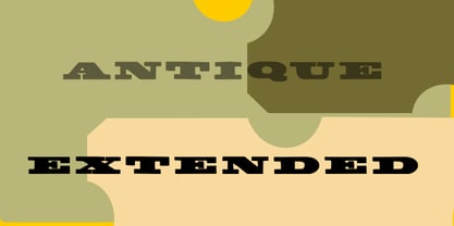
- Gans Antigua by Intellecta Design,
$9.00See also other font families inspired by Gans' original typefaces: Gans Tipo Adorno , Gans Lath Modern and Gans Titular Adornada . - Caslon Antique by URW Type Foundry,
$35.00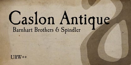
- Enviro Antique by URW Type Foundry,
$35.00 - Attic Antique by Three Islands Press,
$29.00 Attic Antique by Three Islands Press. Flipping through a friend’s old hardbound collection of John Burroughs nature essays a while back, I thought it'd be fun to try to develop a typeface with the same uneven, imperfect look to it. I picked and chose among various printed characters, enlarged them somewhat with a photocopier, then hand-rendered each. Had to custom-make some of the accents and symbols, then added a couple goofy dingbats just for the heck of it. The result: an amazingly legible serif family akin to the Century faces.
 - URW Antiqua by URW Type Foundry,
$89.99 URW Grotesk was designed exclusively for URW by Prof. Hermann Zapf in 1985. At the same time, Zapf designed URW Antiqua to go with URW Grotesk. At that time, we were working with a large German publishing house (Axel Springer) on type design solutions to replace certain of their newspaper fonts. Test pages of large German newspapers (e.g. Bildzeitung) were printed with URW Grotesk and URW Antiqua font families. For reasons not disclosed to us, the project was dropped and Springer never used URW Grotesk and URW Antiqua for that purpose. Anyway, Zapf finished his designs and URW produced both families. Zapf's intention for the two typefaces was to design two highly legible, open and classical fonts that could be used for any kind of typography, especially books, newspapers, magazines, etc. However, we realized later on, that URW Grotesk is very well suited for multi media applications on screen.
 - Hesse Antiqua by Monotype,
$21.99 Hesse Antiqua is the very first typeface designed by Gudrun Zapf von Hesse. It was a pioneering project originally created by her over 70 years ago as a set of brass punches to stamp into leather book covers and spines at the Bauer Type Foundry in Germany. In celebration of her 100th birthday on 2 January 2018, Ferdinand Ulrich and the Monotype Studio team collaborated with her to bring her brass punches to live as a digital font. Hesse Antiqua was developed with careful considerations and decisions to capture the nuance of the beautiful letterforms as they originally appeared in gold and blind stampings. We are pleased to introduce this modern OpenType typeface featuring a proper set of capitals and small capitals, figures, punctuation and some ornaments as well. Hesse Antiqua is best used at 36 points and above, as the designer intended.
 - The Antique by Almarkha Type,
$29.00 The Antique - Vintage Serif is a inspired by classic fonts with retro style combined with decorative Serif style nuances of western back to the era of the 70's - 80's, a style that is timeless The Antique is perfect for vintage social media posts, Craft , Product packaging, product designs, label, branding projects, logo, advertisements, watermark, invitation, stationery and any projects
 - Kner Antikva by Font HU,
$39.00 The favorite typeface of the best Hungarian printer, Imre Kner.
 - Antura Script by Solidtype,
$18.00 Antura Script is a calligraphic script font that comes with very beautiful changing characters, a kind of classic decorative copper script with a modern touch, designed with high detail to bring stylish elegance. Antura Script is an attractive typeface that is smooth, clean, feminine, sensual, glamorous, simple and very easy to read because there are many fancy letter connections. I also offer a number of viable style alternatives for many letters. The classic style is perfect to be applied in various formal forms such as invitations, labels, restaurant menus, logos, fashion, make up, stationery, novels, magazines, books, greeting/wedding cards, packaging, labels or any type of advertising purpose.
 - Antique Three by Wooden Type Fonts,
$15.00A revival of one of the popular wooden type fonts of the 19th century, suitable for text. - Organic Antique by Sarid Ezra,
$19.00 Introducing, Organic Antique, Handmade Blackletter Fonts Organic Antique is blackletter fonts with organic and handmade feels. Containing two styles, regular and true italic, will make your presentations more standout when you use both of the styles. With classic and vintage vibes, you can use this fonts for logotype, quotes, branding, or even movie poster. The hand lettered and rough of this fonts will also make your designs have more stunning and earthy. This fonts also support multi language!
 - Angina Display by Masa Type,
$17.00 Introducing, Angina Display - a modern sans with ligatures and alternates! Angina Display is a modern sans with a bunch of ligatures and alternates that will make your poster, cover or logo even more stunning and stand out! You can use this font as a stand alone font for any project such as logo, headline or branding. Also comes with the right arrow and star! This fonts support Multi Language. Feature UPPERCASE lowercase Number & Symbol International Glyphs Ligatures Thanks You.
 - Antique Vignette by Putracetol,
$32.00 Antique Vignette is a quirky vintage script font. I call this font quirky font because the concept of this font uses a very visible difference in the thickness of the font. Because of its thickness, it makes this font look more unique and has a more vintage feel. The perfect combination of vintage/groovy style with classic lettering. So this font is suitable for your projects with vintage/retro/groovy themes. In addition, this font is also suitable for logos, branding, lettering, badges / emblems, quotes, posters, svg, book titles, packaging, t-shirts / apparel and others. Come with Opentype feature with a lot of alternates, its help you to make great lettering. This font is also support multi language.
 - Antique Light by Wooden Type Fonts,
$15.00 One of the classic display types of the 19th century, a slab font, suitable for text and display.
 - Caslon Antique by Mecanorma Collection,
$45.00 - Antique Dubplate by Okaycat,
$29.95 A gritty, deeply textured font where each letter was sketched by hand! Need to create an artistic, rich & friendly feeling with your text? Use Antique Dubplate. Antique Dubplate is extended, containing West European diacritics & ligatures, making it suitable for multilingual environments & publications.
 - Stefania Antique by insigne,
$21.99 Stefania Antique is an aged version of Stefania, an elegant italic script. Stefania Antique is perfect for creating unique and ancient looking chancery manuscripts. A regular version and a more distressed alternate are available. Stefania Antique includes 64 OpenType ligatures that are used to automatically replicate the natural appearance of letterpress printing. Stefania Antique works great in conjunction with insigne Splats!
 - Antique XX by Wooden Type Fonts,
$15.00A revival of one of the popular wooden type fonts of the 19th century, suitable for display, extra condensed. - Behrens Antiqua by Solotype,
$19.95Designed by Peter Behrens, well known graphic artist and architect in Germany in the late 19th and early 20th century. This "Antiqua" was done for Rudhard's Typefoundry in Offenbach A. M. around 1902, and has been used in modern times for museum retrospectives of the designer's work. - Antiqua Pro by SoftMaker,
$14.99 Antiqua Pro is one of the fonts of the SoftMaker font library.
 - Caslon Antique by GroupType,
$19.00 Caslon Antique is a decorative American typeface that was designed in 1894 by Berne Nadall. It was originally called "Fifteenth Century", but was renamed "Caslon Antique" by Nadall's foundry, Barnhart Bros. & Spindler, in the mid-1920s. The design of the typeface is meant to evoke the Colonial era. Early printers would reuse metal type over and over again, and the faces would become chipped and damaged from use. Caslon Antique emulates this look. Despite the name, it is not a member of the Caslon family of typefaces. The renaming is believed to have been a marketing maneuver to boost the popularity of a previously unpopular typeface by associating it with the highly popular Caslon types. Caslon Antique is popular today when a "old-fashioned" or "gothic" look is desired. It is used by the musical group The Sisters of Mercy on their albums, for the logo of the musical Les Misérables, and for the covers of the books in A Series of Unfortunate Events. It is also frequently used on historical displays. It was used for the previous edition of the Warhammer Fantasy Role-Play. Most recently, it has been used on promotional material for the smash musical Monty Python's Spamalot on Broadway, the West End, and its tour of the United States. British 80's band The The also used the font in several of their music videos, usually displaying several lyrics from the song in the opening scenes. It used on the cover of Regina Spektor's album, Begin to Hope. This description was sourced (in part) from Wikipedia, the free encyclopedia.
 - Hattan Antique by Solotype,
$19.95This font is a somewhat modified version of the original issued by the Manhattan Type Foundry in the 1880s. This New York foundry was in business for less than five years, so its fonts are not too well known. - Bucanera Antiqued by Corradine Fonts,
$24.95 Bucanera Antiqued is the black ship of Bucanera's family, sure you will use it in any dark or dirty project. Try the Open Type version to reach its numerous swashes, flourished and alternate characters.
 - Mercearia Antique by PintassilgoPrints,
$12.00 Mercearia is a bold typestyle font, based on a 1944 Brazilian book about alphabets and letterings styles. Combining squarish letterforms and soft edges with a handcrafted feel, Mercearia is best suited for display sizes and works like a charm from 18pt and up. Try it!
 - Haenel Antiqua by RMU,
$30.00 This narrow neoclassical revival is based upon a font released by the Haenel Foundry, Berlin, in the 19th century. By typing [alt] + p respectively [alt] + b you have access to a framing element as it can be seen on the posters. By using the OT feature stylistic alternative you can change the normal numbersign into an oldstyle numero sign.
 - Galadriel Antique by URW Type Foundry,
$35.00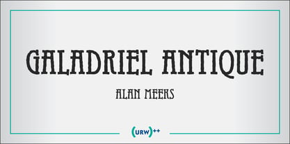
- West Coast Antics NF by Nick's Fonts,
$10.00This roly-poly romp through the alphabets is based on a showing from Carl Holmes' 1950s book, ABC of Lettering, published by art-for-the-masses magnate Walter T. Foster. Named as an apt companion to my East Coast Frolics. - Koch-Antiqua Zier - Personal use only

- MVB Celestia Antiqua by MVB,
$39.00Mark van Bronkhorst designed MVB Celestia Antiqua at a time when font choice was limited. Design was characterized by overuse of the few fonts that came with laser printers. A rustic typeface, recalling the roughness and irregularity of pre-digital printing, was a response to the cold crispness of DTP. MVB Celestia Antiqua holds its own among a large group of other “weathered” serif fonts, in part due to the size of the family: three weights, small caps, italics, and two titling styles. But it's also successful because it's simply drawn well, the contours only as rough as they need to be, enabling text at any size, large or small. - Bernhard Antique SB by Scangraphic Digital Type Collection,
$26.00Since the release of these fonts most typefaces in the Scangraphic Type Collection appear in two versions. One is designed specifically for headline typesetting (SH: Scangraphic Headline Types) and one specifically for text typesetting (SB Scangraphic Bodytypes). The most obvious differentiation can be found in the spacing. That of the Bodytypes is adjusted for readability. That of the Headline Types is decidedly more narrow in order to do justice to the requirements of headline typesetting. The kerning tables, as well, have been individualized for each of these type varieties. In addition to the adjustment of spacing, there are also adjustments in the design. For the Bodytypes, fine spaces were created which prevented the smear effect on acute angles in small typesizes. For a number of Bodytypes, hairlines and serifs were thickened or the whole typeface was adjusted to meet the optical requirements for setting type in small sizes. For the German lower-case diacritical marks, all Headline Types complements contain alternative integrated accents which allow the compact setting of lower-case headlines. - Antique Unique JNL by Jeff Levine,
$29.00 A page from an 1880s type specimen book presented a unique "Barnum"-like design with top horizontal lines much thinner than the bottom ones. Titled "Ten Line Antique Compressed No. 7", the design transcends the years; for it's not only an antique wood type font, but is also reminiscent of the 1960s hippie counterculture movement. Antique Unique JNL is available in both regular and oblique versions.
 - Antique Tuscan Condensed by Wooden Type Fonts,
$20.00A revival of one of the popular wooden type fonts of the 19th century, condensed, bold, curved serifs, a very useful design for display. - Preissig Antikva Pro by Storm Type Foundry,
$39.00 This vintage, iconic typeface of original Czech letter-founding has been faithfully revised, extended and newly rendered in 2012. The majority of Vojtěch Preissig’s type faces have been, from their very creation, subject to controversial evaluations which might perhaps fill more pages than have been set in these type faces so far. The considerable technological backwardness of Czech typography between the world wars intensified the author’s creative effort even more. He had been devoting thought to his Antikva type face from 1912 onwards and dozens of hardly perceptible nuances of the same design have been preserved in his drawings. It was his only book type face, but it shows no signs of any hard struggle in creating it. Its extraordinary vividness and elegance are really surprising. It may be still indebted to the forms of Art Nouveau, which was withering away at that time, but its proportions, colour and expression inspire other Czech type designers. Preissig’s Antikva, Menhart’s Figural (and also Růžička’s Fairfield) and Týfa’s Antikva represent a clear line of development, very far away from the soft aesthetics of Tusar, Dyrynk or Brunner. The co-author of the modification for computer composition is Otakar Karlas. Without his experience the work would remain only a shadow of Preissig’s design. Our aim was to produce a large family of type faces for the setting of both books and jobbing works. The digital transcription of Preissig’s Antikva came into existence from summer till winter 1998. The direct model for this type face is the most successful, two-cicero (24 pt.) design dating from 1925. The designs of other sizes (12 pt., 14 pt., 16 pt. and then 36 pt. and 49 pt.) lack vividness and are the source of the widespread mistaken belief that Preissig’s Antikva consists of straight lines. That is, unfortunately, how even Muzika and Menhart describe it. Neither is it a Cubist type face as many of the semi-educated think today. Special attention had to be paid to italics. It is apparent that their design is not as perfect as that of Preissig’s Antikva. In contradistinction to the original we have deleted almost all lower serifs in the lower-case letters, enlarged the angle of inclination and completely redesigned the letters a, e, g, s, k, x, ... All crotches have been lightened by marked incisions. In other words, none of the italic letters corresponds to Preissig’s model. The signs which were missing have been supplemented with regard to the overall character of the alphabet. Preissig did not deal with bold designs, but the crystal-clear logic of his “chopping-off” of the round strokes enabled us to complete the type face family without any greater doubts. An excessively fragile type face, however, cannot be used for setting in smaller sizes; that is why we have prepared a separate family of text designs which has shortened ascenders, normal accents, slightly thickened strokes, and is, in general, optically more quiet and robust. We recommend it for sizes under 12 points. By contrast, the elegance of the basic design will be appreciated most in the sizes used for headlines and posters. Preissig’s Antikva is suitable not only for art books and festive prints, but also for poetry and shorter texts.
