495 search results
(0.011 seconds)
- Trebuchet MS by Microsoft Corporation,
$49.00Trebuchet™ Family, designed by Vincent Connare in 1996, is a humanist sans serif designed for easy screen readability. Trebuchet Family takes its inspiration from the sans serifs of the 1930s which had large x heights and round features intended to promote readability on signs. The typeface name is credited to a puzzle heard at Microsoft, where the question was asked, 'could you build a Trebuchet (a form of medieval catapult) to launch a person from the main campus to the consumer campus, and how™' The Trebuchet fonts are intended to be the vehicle that fires your messages across the Internet. 'Launch your message with a Trebuchet page'. Character Set: Latin-1, WGL Pan-European (Eastern Europe, Cyrillic, Greek and Turkish). - Mariam by Linotype,
$187.99Mariam is a traditional-style Arabic headline face designed by the famous Arabic type designer Ismet Chanbour, who also designed Al Harf Al Jadid - another highly successful typeface from Linotype. Mariam is characterised by certain design features which contribute to its stylistically lively, yet graceful appearance: downward-pointing tails combining with the swinging finial strokes of certain characters, and the various cut-away" effects. This headline face successfully offers a wide range of applications, from very large, bold poster-size work to use at 18 point for emphasis in text work. Available as in the OpenType format, Miriam incorporates the Arabic codepage (CP 1256), and supports Arabic and Persian. It also includes both tabular Arabic and Persian numerals, as well as Latin figures and complete punctuation." - FF Info Text by FontFont,
$75.99 German type designers Erik Spiekermann and Ole Schäfer created this sans FontFont between 1996 and 2000. The family has 10 weights, ranging from Regular to Bold (including italics) and is ideally suited for book text, editorial and publishing, small text as well as web and screen design. FF Info Text provides advanced typographical support with features such as ligatures, small capitals, alternate characters, case-sensitive forms, fractions, and super- and subscript characters. It comes with a complete range of figure set options – oldstyle and lining figures, each in tabular and proportional widths. In 1998, FF Info Text received the The Big Crit award. This FontFont is a member of the FF Info super family, which also includes FF Info Correspondence and FF Info Display.
 - Lotus Arabic by Linotype,
$179.00Lotus is a traditional-style Arabic text face derived from foundry types cut earlier in the 20th Century, based on the calligraphic models in the Ottoman Naskh style (the traditional style of Arabic script for use in printing). Its graceful finials and elegant logotypes contribute to the classic look of the face making it particularly suitable for serious book and journal work. The conversion of the PostScript versions of these fonts to OpenType format has taken full advantage of the latest digital technology, allowing accurate positioning of diacriticals and kerning refinements. The Lotus typeface is available in two weights: Lotus Light and Lotus Bold. These two fonts incorporate the Arabic codepage (CP 1256), and support Arabic and Persian. They also include both tabular Arabic and Persian numerals. - Cooper BT by ParaType,
$30.00Bitstream Cooper was designed at Bitstream in 1986 by means of adding light, medium, and bold styles, with the corresponding italics, to the existing black ones. Based on Cooper Black, 1919, by Oswald Bruce Cooper, which was firstly released as a hand composition font in 1922 by Barnhart Brothers & Spindler of Chicago and later spread by ATF. Cooper Black is an extra bold face based on Cooper Old Style. Bitstream Cooper is an old style face with rounded serifs and tilted back ovals. For use both in text (normal weights) and in advertising and display typography (heavy weights). Cyrillic version was developed for ParaType in 2000 by Manvel Shmavonyan and based on TM Oswald face of TypeMarket, 1996, by Victoria Grigorenko. - Garnet Euro Typewriter by Coniglio Type,
$19.95Garnet is a rare TT typewriter face, made digital from analog samples gathered with great care by Coniglio Type. A time and place; type and life. Garnet Euro Typewriter is the first new release by designer Joseph V Coniglio in over 5 years. It is contemporary designer type, made from the struck steel hammers of an art deco san serif face transferred from a mechanical 1926 Royal Portable typewriter. It has an obsessively complete commercial roman character set ––for the pre-opentype environment of the late 1990's. Yes, it has that great “Monopoly Game” question mark -- and all on a period-piece typewriter! You should have no trouble grafting that sorely needed Euro symbol.” –And he very well did! - P22 FLW Exhibition by P22 Type Foundry,
$29.95 This font set is the second in a series from P22 Type Foundry based on the lettering styles of Frank Lloyd Wright. Created in 1931, the Exhibition lettering was intended primarily to accompany Frank Lloyd Wright's exhibition drawings and models. Many of the 72 Extras were designed to form continuous linking borders. Combinations of these geometric forms can provide endless variations of decorative elements in the style of Frank Lloyd Wright. Many of these images were based on Mr Wright's "Saguaro Forms and Cactus Flowers" illustration for an unused Liberty magazine cover of 1926. Other imagery in this set was derived from assorted geometric designs by Wright. Exhibition Regular, Light, and Bold have been remastered and now contain almost 400 characters including support for Western and Central European languages.
 - FF Info Display by FontFont,
$72.99 German type designers Erik Spiekermann and Ole Schäfer, and German design agency MetaDesign created this sans FontFont between 1996 and 2000. The family has 18 weights, ranging from Regular to Bold (including italics) and is ideally suited for advertising and packaging, book text, editorial and publishing, logo, branding and creative industries, small text, wayfinding and signage as well as web and screen design. FF Info Display provides advanced typographical support with features such as ligatures, alternate characters, case-sensitive forms, fractions, super- and subscript characters, and stylistic alternates. It comes with proportional lining, proportional oldstyle, and tabular lining figures. In 1998, FF Info Display received the The Big Crit award. This FontFont is a member of the FF Info super family, which also includes FF Info Correspondence and FF Info Text.
 - Cruickshank ML by HiH,
$12.00 Cruickshank is a decorative typeface from the late Victorian period. The upper case includes several letters with swash strokes, extending well below the baseline, as found in the original design. Alternatives to the swash caps are provided. The lower case contains small caps of simpler design. The face was designed by William W. Jackson and released by MacKellar, Smiths and Jordan Type Foundry of Samson Street, Philadelphia, Pennsylvania in 1886. MS&J was founded originally as Binny & Ronaldson in 1796 and later known as The Johnson Type Foundry. Cruickshank has a strong late Victorian flavor without the extravagance of so many fonts of the period. In its simplicity and clarity, it may be seen as a precursor to the Art Nouveau style that would develop a decade later.
 - FF Real Text by FontFont,
$50.99 FF Real is a convincing re-interpretation of the German grotesque style from between 1998 and 1908, but with much more warmth and improved legibility as well as a hint towards the warmer American grotesques. Later on, not just slanted styles, but a “proper” italic version was added inspired by the way Roman and Italic are distinguished in traditional serif faces. NEW: a specially created set of obliques were added in 2018 to give designers more design flexibility, for those looking for a less calligraphic look. In 2020 the family was extended with matching condensed weights. FF Real was originally conceived by Erik Spiekermann as one text weight and one headline weight to be used as the only faces in his biography ‘Hello I am Erik’, edited by Johannes Erler, published in 2014. While Spiekermann drew the alphabets, he passed on the font data to Ralph du Carrois and Anja Meiners who cleaned it up and completed it. In the meantime, FF Real has been extended to a family of two styles and 65 weights each. The design of FF Real is rooted in early static grotesques from the turn of the century. Several German type foundries – among them the Berlin-based foundries Theinhardt and H. Berthold AG – released such designs between 1898 and 1908. The semi-bold weight of a poster-size typeface that was lighter than most of the according semi-bolds in metal type at the time, gave the impetus to FF Real’s regular weight. In the words of Spiekermann, the historical example is “the real, non-fake version, as it were, the royal sans serif face“, thus giving his new typeface the name “Real” (which is also in keeping with his four-letter names, i.e. FF Meta, FF Unit). FF Real is a convincing re-interpretation of the German grotesque style, but with much more warmth and improved legibility. With a hint towards the warmer American grotesques, Spiekermann added those typical Anglo-American features such as a three-story ‘g’ and an ‘8’ with a more defined loop. To better distinguish characters in small text sizes, FF Real Text comes in old style figures, ‘f’ and ‘t’ are wider, the capital ‘I’ is equipped with serifs, as is the lowercase ‘l’. What’s more, i-dots and all punctuation are round.
 - FF Real Head by FontFont,
$50.99 FF Real is a convincing re-interpretation of the German grotesque style from between 1998 and 1908, but with much more warmth and improved legibility as well as a hint towards the warmer American grotesques. Later on, not just slanted styles, but a “proper” italic version was added inspired by the way Roman and Italic are distinguished in traditional serif faces. NEW: a specially created set of obliques were added in 2018 to give designers more design flexibility, for those looking for a less calligraphic look. In 2020 the family was extended with matching condensed weights. FF Real was originally conceived by Erik Spiekermann as one text weight and one headline weight to be used as the only faces in his biography ‘Hello I am Erik’, edited by Johannes Erler, published in 2014. While Spiekermann drew the alphabets, he passed on the font data to Ralph du Carrois and Anja Meiners who cleaned it up and completed it. In the meantime, FF Real has been extended to a family of two styles and 65 weights each. The design of FF Real is rooted in early static grotesques from the turn of the century. Several German type foundries – among them the Berlin-based foundries Theinhardt and H. Berthold AG – released such designs between 1898 and 1908. The semi-bold weight of a poster-size typeface that was lighter than most of the according semi-bolds in metal type at the time, gave the impetus to FF Real’s regular weight. In the words of Spiekermann, the historical example is “the real, non-fake version, as it were, the royal sans serif face“, thus giving his new typeface the name “Real” (which is also in keeping with his four-letter names, i.e. FF Meta, FF Unit). FF Real is a convincing re-interpretation of the German grotesque style, but with much more warmth and improved legibility. With a hint towards the warmer American grotesques, Spiekermann added those typical Anglo-American features such as a three-story ‘g’ and an ‘8’ with a more defined loop. To better distinguish characters in small text sizes, FF Real Text comes in old style figures, ‘f’ and ‘t’ are wider, the capital ‘I’ is equipped with serifs, as is the lowercase ‘l’. What’s more, i-dots and all punctuation are round.
 - Ovink by The Northern Block,
$30.36 Ovink is a rounded type family designed for great distance legibility. Named after the legibility researcher Gerrit Willem Ovink, in its early stages was subjected to experimental legibilty investigations of distance and time threshold methods. The results of this heavily influence the design. The high regularity of the letters also makes the typeface suitable for running text and the wide span of weights motivates a broad usage for the setting of both display and text. Ovink is also loosely inspired by Knud V. Engelhardt’s work for the street signage, designed around the years 1926-27 for Gentofte in Denmark. Being rooted in the Danish typography tradition, Ovink has a sturdy unpretentious look to it, yet compared to its predecessor the curves are tighter, and characters have a higher level of differentiation. Details include 9 weights with matching italics.
 - Galena Pro SC by Typorium,
$45.00 Galena Pro is an extended version of Galena, a typeface published for Bayer Corporation in 1996. Galena Pro is based on the open and organic forms imagined by the writers of humanist Italy, who designed the first so-called Roman characters. Humanist style fonts have moderate stroke contrast, uneven widths, and a classic, but soft and easy-to-read appearance. Galena Pro gives a new birth to the 15th century incunabula, a typographic drawing where the gestures of this standardized handwriting are not mechanical, but more fluid. The Galena Pro series can provide professional typography with OpenType features such as alternative sets of numbers, fractions and an extended character set to support Central and Eastern European as well as Western European Languages. The different styles of the Galena are enriched with a condensed variant to meet the need for space savings in titles and texts.
 - Galena Pro Condensed by Typorium,
$45.00 Galena Pro is an extended version of Galena, a typeface published for Bayer Corporation in 1996. Galena Pro is based on the open and organic forms imagined by the writers of humanist Italy, who designed the first so-called Roman characters. Humanist style fonts have moderate stroke contrast, uneven widths, and a classic, but soft and easy-to-read appearance. Galena Pro gives a new birth to the 15th century incunabula, a typographic drawing where the gestures of this standardized handwriting are not mechanical, but more fluid. The Galena Pro series can provide professional typography with OpenType features such as alternative sets of numbers, fractions and an extended character set to support Central and Eastern European as well as Western European Languages. The different styles of the Galena are enriched with a condensed variant to meet the need for space savings in titles and texts.
 - Black Drum by Coniglio Type,
$19.95 Black Drum is a rare revival typewriter face, made digital from analog samples gathered with great care by Coniglio Type. A time and place; type and life. Black Drum is contemporary designer type, made from the struck steel hammers of an Art Deco Period san serif face transferred from a mechanical 1926 custom editor Royal Portable typewriter. Anna Conroy of Type Heritage, LLC, Philadelphia comments on Black Drum and its new place in time today: “Wow! nice lookin’ face Joseph! —Perfect, somewhere between Cable; [Rudolph Koch, 1927] (which was about the first transatlantic telegraph cable) with its raised x-height; and Futura [Paul Renner, 1928]. Yup, it has that great “Monopoly Game” question mark -- and all on a period-piece typewriter! You should have no trouble grafting that sorely needed Euro symbol.” –And he very well did! Author: Joseph Coniglio Producer: Coniglio Type MyFonts debut: October 2021
 - Indigo Antiqua 2 by Fontanova,
$36.00 Indigo Antiqua 2 is an old-style humanist serif typeface primarily based on personal studies of a typeface by Francesco Griffo (1450–1518) Italian punchcutter. But it is not a revival of the so called original Bembo (1496) or any other typeface. My Inspirations are of various kinds, but some outstanding old typeface masters like Guillaume le Bé, Miklós Kis, Peter de Walpergen and Christoffel van Dijck are important. Indigo Antiqua 2 is most commonly used for body text were legibility / readability matters – and is a reliable multi-purpose typeface. It has been applied for thousands of book titles and between the book covers made reading comfortable. By using Indigo Antiqua 2 with OpenType features You can reach additional ligatures, various figure sets, small caps, stylistic options and a lot of other typographical choices. Multi-Lingual support: Central European languages and many others. | See www.fontanova.se
 - Patent Reclame by HiH,
$10.00 Patent Reclame manages to be light-hearted, while clearly showing its blackletter roots both in the shape of the individual letters and the rhythm of text on a page. The designer is unknown. Schriftgeisserei Flinsch of Frankfurt a.M. cast the face around 1895. Nicolete Gray shows a quite similar face called “Graphic,” from Stephenson Blake in 1896. Personally, I don't think that Patent Reclame looks like an English design, but I do not have any proof one way or the other. The numbers are proportional, intended for posters, not spreadsheets. Two ornaments are included, an art nouveau rose at #172 and a lilypad with long tendril at #177. Great for invitations, posters and flyers announcing fun events. Do not use for obituaries. Quite readable in smaller sizes for short blocks of text. I really like the buoyant quality -- a nice combination of discipline and enthusiasm.
 - Galena Pro by Typorium,
$45.00 Galena Pro is an extended version of Galena, a typeface published for Bayer Corporation in 1996. Galena Pro is based on the open and organic forms imagined by the writers of humanist Italy, who designed the first so-called Roman characters. Humanist style fonts have moderate stroke contrast, uneven widths, and a classic, but soft and easy-to-read appearance. Galena Pro gives a new birth to the 15th century incunabula, a typographic drawing where the gestures of this standardized handwriting are not mechanical, but more fluid. The Galena Pro series can provide professional typography with OpenType features such as alternative sets of numbers, fractions and an extended character set to support Central and Eastern European as well as Western European Languages. The different styles of the Galena Pro are enriched with a condensed variant to meet the need for space savings in titles and texts.
 - Alter Gotisch by Alter Littera,
$25.00 This is Alter Littera’s first original design. The font has been created by attempting not to reproduce any historical typeface in particular, but only to re-create the overall forms and style of classic black-letters from different time periods and places. Two specific sources must be acknowledeged nonetheless: (1) the “Black” type from William Caslon’s A Specimen of Printing Types (1785), and (2) the “Caslon Gotisch” type by D. Stempel A.G. (1926). In addition to the usual standard characters for typesetting in modern Western languages, the font includes a comprehensive set of special characters, alternates and ligatures, plus Opentype features, that can be used for typesetting as in antique writings and printings. The glyphs are clean, smooth and definitely readable, so the font will be suitable not only for large titles and headings, but also for full text pages. Specimen, detailed character map, OpenType features, and font samples available at Alter Littera’s The Oldtype “Alter Gotisch” Font Page.
 - Nima by Naghi Naghachian,
$64.00 I dedicate this font family to Nima Yooshij (1896-1960), the great poet and innovator of Persian poetry. Nima is a new creation of Naghi Naghashian. Nima design fulfills the following needs: A. Explicitly crafted for use in electronic media fulfills the demands of electronic communication. B. Suitability for multiple applications. Gives the widest potential acceptability. C. Extreme legibility not only in small sizes, but also when the type is filtered or skewed, e.g., in Photoshop or Illustrator. Nima's simplified forms may be artificial obliqued in InDesign or Illustrator, without any loss in quality for the effected text. D. An attractive typographic image. Nima was developed for multiple languages and writing conventions. Nima supports Arabic, Persian and Urdu. It also includes proportional and tabular numerals for the supported languages. E. The highest degree of calligraphic grace and the clarity of geometric typography. This typeface offers a fine balance between calligraphic tradition and the Roman aesthetic common in Latin typography.
 - P22 Wedge by IHOF,
$24.95 Wedge’ is the outcome of a search for the essence of a formal alphabet for text — for 26 letters of the simplest form consistent with ease of reading.. Noted New Zealand architect Bruce Rotherham (1926–2004) was inspired by Herbert Bayer’s ‘universal alphabet’ created at the Bauhaus in 1927. While he admired Bayer’s pure geometry, Rotherham felt it was ‘virtually unreadable’. The Bauhaus-inspired inclination for architectural publications to use sans serif faces provoked Rotherham to consider how a readable Roman book face might be approached using some of Bayer’s same principles of simplification, but also retracing the evolution and use of the Roman form in an analytic manner. The Wedge alphabet was started in 1947 when Rotherham was an architecture student at the University of Auckland. It was worked on and refined over several decades but never commercially released, until now. Over sixty years after it was first conceived, Wedge is available from P22.
 - Museum Tertia Cursive by T4 Foundry,
$21.00Museum Tertia Cursive is inspired by a beautiful set of 126 matrices in the Swedish Norstedts type collection. These types were probably manufactured in Germany before 1750. The matrices are part of a set imported to Sweden by J.P. Lindh from Breitkopf & Härtel 1818. Now this exquisite design is available again, thanks to type designer Torbjörn Olsson. Please note modern additions like the ?-mark, @-sign and €-sign. Museum Tertia Cursive is an OpenType creation, for both PC and Mac. Swedish type foundry T4 premiere new fonts every month. Museum Tertia Cursive is our eighth introduction. Museum Tertia Cursive is part of the growing Museum type family. Museum also includes three different border fonts, an ornament font with some of Granjon's arabesques and a flowery Fournier font with Rococo capitals. - ITC Ellipse Script by Typorium,
$30.00 The Typorium presents a new optimized and enriched version of ITC Ellipse which first appeared in 1996 in the International Typeface Corporation typeface library. ITC Ellipse Script is a complementary typeface to ITC Ellipse Neo, designed a very legible handwriting style. ITC Ellipse Script is both modern and classic. Modern in the unusual shape based on the geometric ellipse form. And classic in the structure of some letters like the lower cases c, e, g, o, s. These letters alone could come from a traditional typeface, but they fit perfectly with the atypical rest of the alphabet giving it a present-day and traditional mix. Furthermore, the ellipse shape fits naturally in the italic styles, giving the font an organic and fluid feeling. ITC Ellipse Script offers OpenType features such as alternate characters for upper and lower case, and an extended accented character set to support many languages. Five weights have been created for each style to offer a wide range of graphic possibilities in a tidy digital footprint. Designer: Jean-Renaud Cuaz Publisher: Typorium MyFonts debut: Nov 1, 2020 Le Typorium présente une nouvelle version optimisée et enrichie d'ITC Ellipse qui est apparue pour la première fois en 1996 dans la bibliothèque de caractères de l'International Typeface Corporation. ITC Ellipse Script est une police complémentaire à ITC Ellipse Neo, conçue dans un style d'écriture très lisible. ITC Ellipse Script est à la fois moderne et classique. Moderne dans le dessin inhabituel basé sur la forme géométrique de l’ellipse. Et classique dans la structure de certaines lettres comme les minuscules c, e, g, o, s. Ces lettres pourraient provenir d'une police de caractères traditionnelle, mais elles s'intègrent parfaitement avec le reste de l'alphabet plus insolite en lui donnant un mélange de modernité et de tradition. De plus, la forme de l'ellipse s'intègre naturellement dans les styles italiques, donnant à la police une sensation organique et fluide. ITC Ellipse Script offre des fonctionnalités OpenType telles que des caractères alternatifs pour les capitales et les bas de casse, et un jeu de caractères accentués étendu pour prendre en charge de nombreuses langues. Cinq graisses ont été créés pour chaque style afin d'offrir un large éventail de possibilités graphiques pour une empreinte numérique rigoureuse.
 - Bookseller Bk by Cyanotype,
$20.00 Bookseller Bk is a typeface designed for books and legible text at a small sizes, with an old book feeling. This typeface is the reinterpretation of a sample found in a French book, published between 1882 and 1893 and its author —Ernest Michel— lived between 1837 and 1896. This sample has influence from Didot, Scotch Roman and Clarendon (typefaces which were in use at that time). This reinterpretation expands the basic set for the contemporary era. Bookseller Bk includes small caps, old style figures, lining figures, fractions and basic Cyrillic alphabet. Everything in 3 different optical widths. You can save some lines with Reduced weight or fill some lines with Ample weight. All of them with italics, bold and bold italics. Bookseller Bk is also available in Caption size. 12 fonts for legibility at smaller sizes. Subhead & Title sizes are now in development. Finally this typeface was the result of the course Digital Reinterpretation of Classic Typography by Oscar Guerrero Cañizares at Domestika. Do you require additional glyphs? Please contact me to consider your request in order to expand Bookseller in further updates.
 - SP Honey Bunny by Studio Pulp,
$12.00 Discover the effective simplicity of SP Honey Bunny, a masterfully crafted display font created in 2023 by Studio Pulp. Inspired by the character Honey Bunny, the partner of Pumpkin in the cinematic classic "Pulp Fiction" (1996), this font, while not taking center stage, exudes a striking presence. This remarkable typeface, designed with meticulous attention to detail and craftsmanship, showcases versatility that seamlessly complements various design projects, particularly excelling in titles. The three well-balanced weights provide the freedom to unleash your creativity, while the clear, open forms optimize readability. SP Honey Bunny, anchored in a clean grid design, embodies modern minimalism and accessible elegance. Whether you're working on web design, graphic design, or print materials, this font adds a touch of timeless class to your creations. Be inspired by the seamless blend of functionality and aesthetics in SP Honey Bunny. Specifically crafted to meet the demands of 2023, this font brings a contemporary flair to your projects while remaining true to Studio Pulp's legacy of dedication to quality and innovation. Transform your typographic landscape with SP Jody and leave a lasting impression.
 - Futura Headline EF Pro by Elsner+Flake,
$103.00 The design of Futura seems to be timeless. This typeface family which had been developed in 1926 by Paul Renner for the Bauer Type Foundry in the style of constructivism and as part of the Bauhaus movement, experienced, however, in the course of the past 90 years, repeated time-appropriate revivals which guaranteed its on-going popularity. The version of the Futura EF Pro contains the original character constructions which Dennis Megaw described as the “first designs of Futura” in 1938 in “20th century sans serif types, Typography no. 7” (See: Dr. Christopher Burke: Paul Renner, Princeton Architectural Press, New York 1998). What makes it exceptional is the extension into three weights: “Text”, “Headline” and “Index” which came about as part of a degree dissertation at the Hochschule für Bildende Künste (HFBK) in Hamburg. In this context, the accompanying documentation “Die Kritik der reinen Futura” (“The Critique of the Pure Futura”) by Katharina Strauer was published by the Materialverlag, Hamburg, in 2003. Some copies are still available at Elsner+Flake.
 - Futura Text EF Pro by Elsner+Flake,
$103.00 The design of Futura seems to be timeless. This typeface family which had been developed in 1926 by Paul Renner for the Bauer Type Foundry in the style of constructivism and as part of the Bauhaus movement, experienced, however, in the course of the past 90 years, repeated time-appropriate revivals which guaranteed its on-going popularity. The version of the Futura EF Pro contains the original character constructions which Dennis Megaw described as the “first designs of Futura” in 1938 in “20th century sans serif types, Typography no. 7” (See: Dr. Christopher Burke: Paul Renner, Princeton Architectural Press, New York 1998). What makes it exceptional is the extension into three weights: “Text”, “Headline” and “Index” which came about as part of a degree dissertation at the Hochschule für Bildende Künste (HFBK) in Hamburg. In this context, the accompanying documentation “Die Kritik der reinen Futura” (“The Critique of the Pure Futura”) by Katharina Strauer was published by the Materialverlag, Hamburg, in 2003. Some copies are still available at Elsner+Flake.
 - Bookseller Cp by Cyanotype,
$20.00 Bookseller Cp is a typeface designed for books and legible text at a smaller sizes, with an old book feeling. This typeface is the reinterpretation of a sample found in a French book, published between 1882 and 1893 and its author —Ernest Michel— lived between 1837 and 1896. This sample has influence from Didot, Scotch Roman and Clarendon (typefaces which were in use at that time). This reinterpretation expands the basic set for the contemporary era. Bookseller Cp includes small caps, old style figures, lining figures, fractions and basic Cyrillic alphabet. Everything in 3 different optical widths. You can save some lines with Reduced weight or fill some lines with Ample weight. All of them with italics, bold and bold italics. Bookseller Cp is also available in Book size. 12 fonts for legibility at small sizes. Subhead & Title sizes are now in development. Finally this typeface was the result of the course Digital Reinterpretation of Classic Typography by Oscar Guerrero Cañizares at Domestika. Do you require additional glyphs? Please contact me to consider your request in order to expand Bookseller in further updates.
 - Georgia Pro by Microsoft,
$40.00Georgia was originally designed in 1996 by Matthew Carter and hand-tuned for the screen by Tom Rickner. The Georgia family received a major update in 2011 by Monotype Imaging, The Font Bureau and Matthew Carter. Georgia is the serif companion to the sans serif screen font, Verdana. It was designed specifically to address the challenges of on-screen display with elegant yet sturdy and open forms. If you must have one serif face for reading on a computer, then you've found the best one right here. The original Georgia family included four fonts: regular, italic, bold and bold italic. The new and expanded Georgia Pro family contains 20 fonts in total. The Georgia Pro and Georgia Pro Condensed families each contain 10 fonts: Light, Regular, Semibold, Bold and Black (each with matching italic styles). Georgia Pro includes a variety of advanced typographic features including true small capitals, ligatures, fractions, old style figures, lining tabular figures and lining proportional figures. An OpenType-savvy application is required to access these typographic features. - Belwe by ITC,
$29.99The typeface Belwe, created in 1926 by German typographer and teacher Georg Belwe, has an uncommon style that is difficult to describe. It is a synthesis of many different genres: it is a slab serif with Art Nouveau style but also with many blackletter influences. The angled serifs on the ascenders and the calligraphic flourishes on the the upper and lowercase V, W, and Ys reference marks made by pens. There are also many other special characters that are unlike any other designs. Have a look at the fun lowercase a, the quirky lowercase f and g, and the unique C, F, L, and R for the uppercase. This design works especially well for display sizes, but is also good for short amounts of text. The mood and image suggested by this typeface is great for menus, invitations, and signs when you want to send a personal and friendly message. It's Art Nouveau roots also give it a place in history for designs from the Victorian period up through the 1920's and 30's - SP Butch by Studio Pulp,
$29.99 Explore the powerful simplicity of SP Butch, a masterfully crafted sans serif font designed in 2023 by Studio Pulp. Drawing inspiration from the timeless aesthetics of the cinematic classic "Pulp Fiction" (1996), SP Butch exudes the fearlessness and style of the iconic character that lends it its name. This striking typeface, developed with an eye for detail and craftsmanship, offers versatility that seamlessly aligns with various design projects. The seven carefully balanced weights provide you with the freedom to unleash your creativity, while the clear, open shapes maximize readability. Anchored in a sleek grid design, SP Butch embodies modern minimalism and accessible elegance. Whether you're working on web design, graphic design, or print materials, this font adds a touch of timeless class to your creations. Let yourself be inspired by the seamless fusion of functionality and aesthetics in SP Butch. Designed to meet the demands of 2023, this font brings a contemporary flair to your projects while remaining true to Studio Pulp's legacy of dedication to quality and innovation. Transform your typographic landscape with SP Butch and leave a lasting impression.
 - Ballet Mechanique by Characters Font Foundry,
$25.00 Ballet Mechanique is a custom designed font for musician Jeroen Borrenbergs, aka Ballet Mechanique. For his upcoming record releases Jeroen asked me to create a special font for him. As co-founder and graphic designer at Stoere Binken Design he creates his own artwork and therefor had very specific wishes. The font should be warm, soft and have soul. He gave me some sketches for his logo that I should use as a starting point. The result is a very narrow, kind of techno, monocased font called "Ballet Mechanique" (what else). After having served his purpose, Jeroen Borrenbergs allowed his font to be sold publicly. Jeroen Borrenberg’s debut work, in 1996, received hugely praising reviews. Muzik Magazine made Evolutionary Entities techno single of the month, Laurent Garnier and Mister C constantly played it in their sets and Morgan Geist just said “I won’t do a review here - let me just encourage all of y’all to listen to and/or pick up the new Eevolute 12″. Beautiful stuff - complex, melodic, soaked in just enough reverb to take it to another room. Check or regret.”
 - Belwe Mono by ITC,
$29.99 The typeface Belwe, created in 1926 by German typographer and teacher Georg Belwe, has an uncommon style that is difficult to describe. It is a synthesis of many different genres: it is a slab serif with Art Nouveau style but also with many blackletter influences. The angled serifs on the ascenders and the calligraphic flourishes on the the upper and lowercase V, W, and Ys reference marks made by pens. There are also many other special characters that are unlike any other designs. Have a look at the fun lowercase a, the quirky lowercase f and g, and the unique C, F, L, and R for the uppercase. This design works especially well for display sizes, but is also good for short amounts of text. The mood and image suggested by this typeface is great for menus, invitations, and signs when you want to send a personal and friendly message. It's Art Nouveau roots also give it a place in history for designs from the Victorian period up through the 1920's and 30's
 - Rhapson Script by Max.co Studio,
$10.00 Rhapson Script is a soft, bold, elegant & fun vintage script font. Can be used for various purposes such as logos, wedding invitation, t-shirt, letterhead, signage, news, posters, badges etc. Rhapson Script features 472 glyphs and 196 alternate characters, ligatures, swash and multiple language support. To enable the OpenType Stylistic alternates, you need a program that supports OpenType features such as Adobe Illustrator CS, Adobe Indesign & CorelDraw X6-X7. How to get access alternate glyphs from open type fonts: http://youtu.be/iptSFA7feQ0 There are additional ways to access alternates/swashes, using Character Map (Windows), Nexus Font (Windows), Font Book (Mac) or a software program such as PopChar (for Windows and Mac). How to access all alternative characters, using Windows Character Map with Photoshop: https://www.youtube.com/watch?v=Go9vacoYmBw Need help? If you need help or advice, please contact me by e-mail: maximal.fonts@gmail.com Thank you!
 - Raceryouth by LetterStock,
$23.00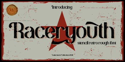 **Raceryouth Font** This pair was inspired by the retro motorbike poster design that i saw on some coffee shop, It was crafted by hand specially to add natural handmade feeling in its brand identity than i make it clean with pentool. **Opentype features** Raceryouth font has 196 character set included Raceryouth Font is very good looking in logo, labels, product packaging, invitations, advertising and others. This fonts works with folowing languages: Afrikaans, Albanian, Asu, Basque, Bemba, Bena, Chiga, Cornish, Danish, English, Estonian, Filipino, Finnish, French, Friulian, Galician, German, Gusii, Indonesian, Irish, Italian, Kabuverdianu, Kalenjin, Kinyarwanda, Low German, Luo, Luxembourgish, Luyia, Machame, Makhuwa-Meetto, Makonde, Malagasy, Malay, Manx, Morisyen, North Ndebele, Norwegian Bokmål, Norwegian Nynorsk, Nyankole, Oromo, Portuguese, Romansh, Rombo, Rundi, Rwa, Samburu, Sango, Sangu, Scottish Gaelic, Sena, Shambala, Shona, Soga, Somali, Spanish, Swahili, Swedish, Swiss German, Taita, Teso, Vunjo, Zulu Thank you for using this font. LS
 - Mecklay by LetterStock,
$23.00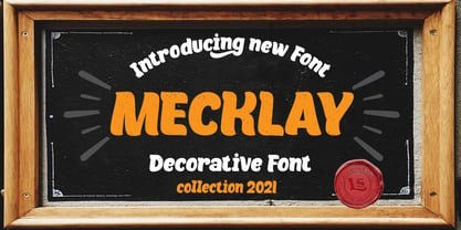 Mecklay Font This pair was inspired by the retro poster design that i saw on some coffee shop, It was crafted by hand specially to add natural handmade feeling in its brand identity than i make it clean with pentool. Opentype features Mecklay font has 196 character set included Mecklay Font is very good looking in logo, labels, product packaging, invitations, advertising and others. This fonts works with folowing languages: Afrikaans, Albanian, Asu, Basque, Bemba, Bena, Chiga, Cornish, Danish, English, Estonian, Filipino, Finnish, French, Friulian, Galician, German, Gusii, Indonesian, Irish, Italian, Kabuverdianu, Kalenjin, Kinyarwanda, Low German, Luo, Luxembourgish, Luyia, Machame, Makhuwa-Meetto, Makonde, Malagasy, Malay, Manx, Morisyen, North Ndebele, Norwegian Bokmål, Norwegian Nynorsk, Nyankole, Oromo, Portuguese, Romansh, Rombo, Rundi, Rwa, Samburu, Sango, Sangu, Scottish Gaelic, Sena, Shambala, Shona, Soga, Somali, Spanish, Swahili, Swedish, Swiss German, Taita, Teso, Vunjo, Zulu Thank you for using this font LS
 - ITC Ellipse Neo by Typorium,
$30.00 The Typorium presents a new optimized and enriched version of ITC Ellipse which first appeared in 1996 in the International Typeface Corporation typeface library. ITC Ellipse Neo design has been lightly modified. Three weights have been added (light, Medium, Extra Bold, including Italics) to the original Regular and Bold styles. ITC Ellipse Neo is both modern and classic. Modern in the unusual shape based on the geometric ellipse form. And classic in the structure of some letters like the lower cases c, e, g, o, s. These letters alone could come from a traditional typeface, but they fit perfectly with the atypical rest of the alphabet giving it a present-day and traditional mix. Furthermore, the ellipse shape fits naturally in the italic styles, giving the font an organic and fluid feeling. ITC Ellipse Neo offers OpenType features such as alternate characters for upper and lower case, and an extended accented character set to support many languages. Five weights have been created for each style to offer a wide range of graphic possibilities in a tidy digital footprint. Designer: Jean-Renaud Cuaz Publisher: Typorium MyFonts debut: December 15, 2020 Le Typorium présente une nouvelle version optimisée et enrichie d'ITC Ellipse qui est apparue pour la première fois en 1996 dans la bibliothèque de caractères de l'International Typeface Corporation. Le design de ITC Ellipse Neo a été légèrement modifié. Trois graisses ont été ajoutées (léger, moyen, extra gras, y compris les italiques) aux styles originaux Regular et Bold. ITC Ellipse Neo est à la fois moderne et classique. Moderne dans le dessin inhabituel basé sur la forme géométrique de l’ellipse. Et classique dans la structure de certaines lettres comme les minuscules c, e, g, o, s. Ces lettres pourraient provenir d'une police de caractères traditionnelle, mais elles s'intègrent parfaitement avec le reste de l'alphabet plus insolite en lui donnant un mélange de modernité et de tradition. De plus, la forme de l'ellipse s'intègre naturellement dans les styles italiques, donnant à la police une sensation organique et fluide. ITC Ellipse Neo offre des fonctionnalités OpenType telles que des caractères alternatifs pour les capitales et les bas de casse, et un jeu de caractères accentués étendu pour prendre en charge de nombreuses langues. Cinq graisses ont été créés pour chaque style afin d'offrir un large éventail de possibilités graphiques pour une empreinte numérique rigoureuse.
 - Asbigan by Sealoung,
$25.00 Asbigan is an beautiful and very elegant font for brand and logo design. Based on our experience as a graphic designer who works for a lot of companies, we often are requested to design a logo in a unique style but with an elegant shape. So, we try to brainstorming and create this font to make the idea is going out. This font have 126 BEAUTIFUL LIGATURES is perfect for BRANDING and LOGO DESIGN. You will get classy, elegant, and certainly unique logos with this font. Asbigan is also included full set of: ligatures uppercase and lowercase letters multilingual symbols numerals punctuation HOW TO ACCESS LIGATURES CHARACTERS Open glyphs panel: In Adobe Photoshop go to Window - glyphs In Adobe Illustrator go to Type - glyphs Thanks for checking out our font! I really hope you enjoy using it! If you have any questions I'd be more than happy to answer them, just send me a message!
 - Eternal Patrol by LetterStock,
$23.00 **Eternal patrol Font** This pair was inspired by the Army poster design that i saw on some coffee shop, It was crafted by hand specially to add natural handmade feeling in its brand identity than i make it clean with pentool. **Opentype features** Eternal patrol font has 196 character set included Eternal patrol Font is very good looking in logo, labels, t-shirt prints, product packaging, invitations, advertising and others. This fonts works with folowing languages: Afrikaans, Albanian, Asu, Basque, Bemba, Bena, Chiga, Cornish, Danish, English, Estonian, Filipino, Finnish, French, Friulian, Galician, German, Gusii, Indonesian, Irish, Italian, Kabuverdianu, Kalenjin, Kinyarwanda, Low German, Luo, Luxembourgish, Luyia, Machame, Makhuwa-Meetto, Makonde, Malagasy, Malay, Manx, Morisyen, North Ndebele, Norwegian Bokmål, Norwegian Nynorsk, Nyankole, Oromo, Portuguese, Romansh, Rombo, Rundi, Rwa, Samburu, Sango, Sangu, Scottish Gaelic, Sena, Shambala, Shona, Soga, Somali, Spanish, Swahili, Swedish, Swiss German, Taita, Teso, Vunjo, Zulu Thank you for using this font. LS
 - Anziano Pro by MAC Rhino Fonts,
$59.00 Anziano follows the direction staked out with Delicato. When creating traditional typefaces, it is inevitable to be influenced by earlier designs. Anziano does show touches of another classic typeface – Weiss (by Emil Rudolf Weiss, 1926). Weiss is often misjudged and overlooked. Perhaps the most well known Swedish typeface – Berling (by Karl-Erik Forsberg, 1914–1995) is actually based largely on Weiss. MRF have appreciated the design of Weiss uprights for a long time. When Stefan Hattenbach bought the first Swedish edition of The Lord of the Rings (1959–61), in 2004, he was amazed by the excellent flow of the text presented on each page. Despite the very original character that Weiss has, it was a pleasure to read a book set in such a typeface. MRF realized that several major foundries had already done interpretations of Weiss, more or less true to the original. MRF didn’t want to add on to that list! Instead Stefan tried to find his own path. Anziano consists of three core styles, Regular, Italic and Bold; each with small caps, ornaments, stylistic ligatures, and extended Latin accents. Lining, tabular, oldstyle and smallcap numerals help round out Anziano’s typographic range and function.