811 search results
(0.014 seconds)
- FF Engine by FontFont,
$47.99
- Mybook Again by Alit Design,
$18.00
- Antoine Drop Caps by Kaer,
$19.00
- Jus Hangin PB by Pink Broccoli,
$16.00
- Angie Lou by FontFuel,
$12.00
- FF Angie by FontFont,
$65.99
- All Over Again - Personal use only

- KG Begin Again - Personal use only

- See You Again by Seemly Fonts,
$14.00
- Engine Company JNL by Jeff Levine,
$29.00
- KG Begin Again by Kimberly Geswein,
$5.00
- All Over Again by Hanoded,
$20.00
- Do It Again by Thinkdust,
$10.00
- Aggressive Angry Baby Killer - Personal use only

- KR Be Mine Again - Unknown license

- Angie Sans Std by Typofonderie,
$59.00
- Just Me Again Down Here - Personal use only

- Just Me Again Down Here - Personal use only

- MTF Noted by Miss Tiina Fonts,
$10.00
- Temperamental by Bogstav,
$17.00
- Smash Int'l by Comicraft,
$19.00 - Smash by Comicraft,
$19.00
- Gothic by Red Rooster Collection,
$45.00 - Maximo by Red Rooster Collection,
$45.00
- Waverly by Red Rooster Collection,
$45.00 - Sycamore by Red Rooster Collection,
$45.00 - Diesel Rudolf by Ingo,
$82.00
- Florentine Cursive by Red Rooster Collection,
$45.00 - P22 GD&T Geometric Dimensioning and Tolerancing by P22 Type Foundry,
$24.95
- Bodoni Black Condensed by Red Rooster Collection,
$45.00
- Coronet by Red Rooster Collection,
$45.00 - Walrod - Unknown license

- Augereau by Abrams Legacy,
$52.00 - Garamond (Ludlow) by Red Rooster Collection,
$45.00 - Basset by Red Rooster Collection,
$45.00
- Bodoni Classic Swirls by Wiescher Design,
$39.50
- Menca by Kvant,
$59.00
- Mimogie by Youngtype,
$14.00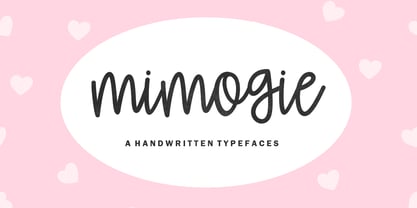
- Tequila by BA Graphics,
$45.00
- Radiant by Red Rooster Collection,
$45.00


