667 search results
(0.006 seconds)
- Ames' Text by Greater Albion Typefounders,
$16.00 Ames’ text is designed for use in its own right and also as a complement to our Ames’ Roman family. Ames’ text is a ‘New-Style’ Didone family offered in three weights and three widths. It is designed to embody clarity combined with contrast between horizontal and vertical strokes, but with sufficient stroke width in both directions to display well at small point sizes. All typefaces include small capital forms, new and old style numerals (and ‘small capital’ numerals for consistency). Ames’ text is distinctive enough for use in headings and titles, but comes into it own as a text face. Keep a lookout for our forthcoming Ames Display faces…
 - AM Godina by Errea Type,
$10.00 Godina was born from the interest in learning and deepening in the basic forms and how they are combined to compose a typographic system. The name, a tribute to the town of La Almunia de Doña Godina, the town for which the author of the typography connects. La Almunia is a crossroads in the typography designer's travels, a link between his family and friends. It combines the scent of a straight and modular typeface with sinuous and curved shapes, which make it a fun and playful typeface.
 - AM Floriana by URW Type Foundry,
$39.99 The origin of AM Floriana is already several decades ago. At a time when there was no photo set and the choice of metal type fonts was still very manageable, Alois Menacher received an order to design a custom business logo from a flower shop. He then created a hand-drawn lettering based on the form of leaves and plants. Now Alois Menacher professionally designed and developed AM Floriana on the basis of this lettering. AM Floriana is ideally suited for packaging design, as well as for display design and logo design. AM Floriana is available as a Bold version and will soon be complemented by further cuts.
 - Pea Amy*Rica Script - Unknown license

- I AM SHERLOCKED - Personal use only

- Am Sans light - Unknown license

- I am simplified - Unknown license

- I am Monotonous - Unknown license

- Sans I Am - 100% free

- I am simplified - Unknown license

- AM False Etruscan by Alberto Milli,
$30.00I created this font following my love for Etruscans, their culture and their myths. Many times I looked for a false, but similar, Etruscan TrueType font on the Internet, but I didn't find it, so one day I decided to make it myself. - AM Sans One by URW Type Foundry,
$39.99 When designing AM Sans One, it was a great challenge for me to develop a modern sans serif, which despite the large number of existing fonts in this sector has its own unique character. Starting point for the design concept was the cap O, designed as a rectangle with rounded corners, and not as usual as a circle or oval. The O should form the basis for the whole alphabet. Another feature are the characters with oblique starting and end strokes such as "A, V, W". These have not exactly straight, diagonal lines, but have a slight curvature. Thus, these letters do not look too geometric. Also the cap K deviates slightly from the usual shape which makes AM Sans One different from other already existing fonts. I could well imagine applying this font for areas such as engineering or architecture.
 - MW Ding-A-Lings - Unknown license

- Ame Chan Pop Maru by Norio Kanisawa,
$40.00 I make this font imaging rounded candy, this theme is cute and round but you can use scenes less often. Because the circle is interrupted in places such as voiced points and parts of kanji(chinese characters), it may be fun to look for it. It corresponds to Hiragana · Katakana · Alphabet · Numerals · Symbols · Kanji(chinese characters). You can also write vertically. You can use it easily, because it contains JIS first · second level, and IBM extended Kanji(about 6700chinese characters). This font is bold, recommended to use it for headlines and prominent places. It might be good for shop pop etc. Because it is soft, pop and cheerful impression, I recommend it for contents for children. About the name, I like Osaka, and I thought "This font's name that is loved by everyone", and since the sound is also cute, I attached the word "Amechan". I heard they called candy as "Amechan" in Osaka, and some madam in Osaka always have candy, and give it to people. I think this font gives happy feeling to you and people look it, like madam in Osaka gives "Amechan". <「あめちゃんポップ まる」紹介文> ころころ丸っこい飴玉をイメージして、「丸くてかわいいけどシーンをあまり選ばずに使えるフォント」をテーマに作りました。 濁点や漢字の一部など、所々に丸がまぎれてますので、探してみるのも楽しいかもしれません。 ひらがな・カタカナ・アルファベット・数字・記号類・漢字に対応。縦書きもできます。 漢字はJIS第一水準・第二水準・IBM拡張漢字(約6700文字)に対応しているので、使いやすいかと思います。 太めのフォントなので、見出しや目立つ場所に使うのがオススメです。お店のポップなどにもいいかもしれません。 柔らかくポップで元気な印象なので、子供向けのコンテンツにもオススメします。 名称については、大阪が好きなのと「皆に愛されるような名前を」と思って、響きも可愛いので「あめちゃん」という単語を名前につけました。 大阪では飴のことを「あめちゃん」と言うらしく、大阪のおばちゃんの中にはいつも飴を持っている方もいるそうで、色んな人にその飴をあげるそうです。 大阪のおばちゃんが「あめちゃん」をくれる時みたいに、使ったり見てくださる方の心があったかくなるようなフォントになればいいなぁ、と思います。 <スタイルカテゴリー> ファンシー、装飾
 - AW Conqueror Std Slab by Typofonderie,
$59.00 Slab serif with a 70’s aesthetic A version of AW Conqueror Sans, AW Conqueror Slab draws inspiration from geometrical slab serifs of the 1930s, of which Rockwell is a perfect example. Lubalin Graph, a reworking of the genre, came out in the wake of the Avant Garde wave of the early 70s. In recent years, ‘slabs’ have made a comeback in the graphic design world. AW Conqueror Slab advances the cause quite happily. AW Conqueror superfamily AW Conqueror Didot is part of a larger family, who include 4 others subfamilies with great potential: They’re but based on same structure, with some connection between them (width for example), to offer a great & easy titling toolbox to any designers, from skillful to beginner. Each of the members try their best to be different from the others because of their features. They should work harmoniously in contrast. Club des directeurs artistiques Prix 2010 European Design Awards 2011
 - AW Conqueror Std Inline by Typofonderie,
$59.00 30s inspired geometric inline display typeface Several titling typefaces made their appearance at the start of the 20th century, notably Acier and Bifur, both created by French poster artist Cassandre. Later, in the Netherlands, S.H. de Roos designed a version of Inline for its Nobel family called, naturally, Nobel Inline. AW Conqueror Inline pays homage to this beautiful version. AW Conqueror superfamily AW Conqueror Didot is part of a larger family, who include 4 others subfamilies with great potential: They’re but based on same structure, with some connection between them (width for example), to offer a great & easy titling toolbox to any designers, from skillful to beginner. Each of the members try their best to be different from the others because of their features. They should work harmoniously in contrast. Club des directeurs artistiques Prix 2010 European Design Awards 2011
 - AW Conqueror Std Carved by Typofonderie,
$59.00 Engraving inspired typeface The AW Conqueror Carved encapsulates perfectly the lettering styles in fashion during the 19th century quite often in the frontispieces of books. It wasn’t rare to see these kinds of typefaces, with their variations in depth and relief effects, adorning boxes and other forms of packaging of the time. AW Conqueror superfamily AW Conqueror Didot is part of a larger family, who include 4 others subfamilies with great potential: They’re but based on same structure, with some connection between them (width for example), to offer a great & easy titling toolbox to any designers, from skilful to beginner. Each of the members try their best to be different from the others because of their features. They should work harmoniously in contrast. Club des directeurs artistiques Prix 2010 European Design Awards 2011
 - AW Conqueror Std Sans by Typofonderie,
$59.00 AW Conqueror Sans was born out of this desire to fuse geometric and humanistic sans. It remains a typeface fundamentally influenced by both Bauhaus spirit — with its simplified geometric forms — and Jan Tschichold’s attempts to link this modular spirit to Eric Gill’s humanist sans serif. AW Conqueror Sans is a claimed French synthesis of Germanic Modernism and English classical tradition. Spheres of influence The core set of capitals are based on the proportions of the Roman capitals like Futura, Erbar, Nobel, Johnston, Gill Sans. During the 1930s, the Futura was a true success. Since then, Monotype offered a geometric version of the Gill Sans, and Linotype added Futura-like variants to WA Dwiggins’ Metro. AW Conqueror Sans is kind of a “fusion” of this approach. The lower case “b, d, p, q” are also directly influenced by Eric Gill’s, while the “y” is influenced by some of Jan Tschichold’s alphabets. In italics, drawn narrower, AW Conqueror Sans reinterprets Gill’s idea: a rigorous italic like a roman but which sometimes reveals some aspects of a Renaissance italic. AW Conqueror Sans and its extensions AW Conqueror Sans is the initial reference point for an extended family, including AW Conqueror Inline, Slab, Carved, Didot. The potential of these mixed families is powerful. Because AW Conqueror typefaces are based on an identical structure, and compatible proportions.
 - AW Conqueror Std Didot by Typofonderie,
$59.00 Homage to 70s phototype typography in 3 styles The AW Conqueror typeface family is a nod to the spirit of phototype typefaces and transfer lettering from the early 70’s. Founded by Ed Rondthaler, Photo-lettering catalogs swarmed with more daring typefaces than the others. Both transfer letter and phototitling have liberated the principle of letter-to-letter spacing, previously impossible with metal type. Phototype allowed operators to position millimeters, on the fly, letter after letter: words, sentences according to the specifications of the art director. AW Conqueror superfamily AW Conqueror Didot is part of a larger family, who include 4 others subfamilies with great potential: They’re but based on same structure, with some connection between them (width for example), to offer a great & easy titling toolbox to any designers, from skilful to beginner. Each of the members try their best to be different from the others because of their features. They should work harmoniously in contrast. Club des directeurs artistiques Prix 2010 European Design Awards 2011
 - I am not a robot by PizzaDude.dk,
$15.00 The other day I had to login to a page several times, and as security I had to check the "I am not a robot" box. Actually, I think I did a login at that particular page like 30 times that day...and in the end I was thinking "Come on, you should know by now that I am not a robot" And even though I thought it was a repetitious hassle I figured that I needed to name a font "I am not a robot" - and not a robotic-like one, but a sweet and funny cartoonish one! :)
 - I am online with u by Pisto Casero,
$19.00 The "Line" style of "I am online with u" font family was inspired by the idea of the digital connection of two people living in different parts of the world. Later on this idea was expanded, including different styles such as "Dashed" or "Dotted", which built the font family taking the initial idea to another level and keeping the connectivity concept alive. This typeface works best when used in big sizes.
 - GP I Am A Worm! by Intellecta Design,
$18.90
- Romantically by Abo Daniel,
$13.00 Romantically -the lovely natural signature font- It is classy, it is naturally, it is beauty signature fonts... - Fantastic 417 Ligature I was created 417 ligatures to keep this font looks naturally, al bl cl dl el fl gl hl il jl kl ll ml nl ol pl ql rl sl tl ul vl wl xl yl zl at bt ct dt et ft nt ot pt qt rt st tt ut yt all ell att ett itt ott utt alt elt ilt olt ult atl etl itl otl utl ftl attl ettl ittl ottl uttl ab bb cb eb ib jb mb nb ob sb ub abb ebb ibb obb ubb abl abh ebh ibh obh ubh abt ebt ibt obt ubt ah bh ch eh gh hh ih jh mh nh oh ph rh yh zh ahh ehh ihh ohh uhh ak ek ik kk ok rk sk uk yk zk akk cc dd ee ff mm nn oo pp ss zz am em im om um amm emm imm omm umm amb amh an en in on un ann inn anb anh ank enh inh anl enl ant ent ar er ir or ur arb arh erh irh orh urh ark arl erl url art ert fr urt ce co com ay eel iu ppl erfl Ar Br Cr Dr Er Fr Gr Hr Ir Jr Kr .............and more as you seen on presentation pictures. I am also created it for multilingual characters. àl ál âl ãl äl ål æl œl èl él êl ël ìl íl îl ïl ñl òl ól ôl õl öl ùl úl ûl ül àt át ât ãt ät åt æt ............and more as you seen on presentation pictures. - Swashes Swashes make it completed. You only need adding underscore 2x after lowercase from a to j . For example a__ - Multilingual Support Fonts include punctuations and multilingual support. Romantically is perfect for branding, photography, invitations, quotes, watermarks, advertisements, product designs, labels, and much more! I hope you really enjoy it.. Regards, Abo Daniel
 - First Contact by SilverStag,
$19.00 I am First Contact, a super ultra condensed all caps font with support for over 90 languages and over 540 ligatures. I am a cutting-edge font that is both cool and chic, yet still personal. I am perfect for a wide range of design projects, from logos and branding to headlines and posters. I am the future of your typography. I am the font that will take your designs to the next level. I am bold, I am confident, and I am here to make a statement. I am not like other fonts. I am not afraid to be different. I am unapologetically myself. I am First Contact, and I am here to shake things up. I am the perfect font for anyone who wants to stand out from the crowd. I am the font for the bold, the brave, and the innovative. I am First Contact, and I am the font for the cool kids. I am the font for the trendsetters. I am the font for the people who want to be ahead of the curve. I am First Contact, and I am here to help you create something truly unique. I am more than just a font. I am a movement. I am a call to action. I am a challenge to be different. So what are you waiting for? Use me today!
 - Cock Boat - Unknown license

- Beautiful Blossoms by Arendxstudio,
$15.00 Introducing a Beautiful Blossoms - Handwritten Script Font with sharp and beautiful letters that create fonts that are modern, trendy and elegant. Wayfaring came with opentype features such stylistic alternates, stylistic sets & amp; amp; ligatures good for logotype, poster, badge, book cover, tshirt design, packaging and any more. Features : • Character Set A-Z • Numerals & Punctuations (OpenType Standard) • Accents (Multilingual characters) • Ligature • Alternate There it is! I really hope you enjoy it
 - Recollect by Arendxstudio,
$15.00 Introducing a Recollect - Handwritten Script Font with sharp and beautiful letters that create fonts that are modern, trendy and elegant. Matsuyama came with opentype features such stylistic alternates, stylistic sets & amp; amp; ligatures good for logotype, poster, badge, book cover, tshirt design, packaging and any more. Features : • Character Set A-Z • Numerals & Punctuations (OpenType Standard) • Accents (Multilingual characters) • Ligature • Alternate There it is! I really hope you enjoy it
 - Ovation by Arendxstudio,
$15.00 Introducing a Matsuyama - Modern Script Font with sharp and beautiful letters that create fonts that are modern, trendy and elegant. Matsuyama came with opentype features such stylistic alternates, stylistic sets & amp; amp; ligatures good for logotype, poster, badge, book cover, tshirt design, packaging and any more. Features : • Character Set A-Z • Numerals & Punctuations (OpenType Standard) • Accents (Multilingual characters) • Ligature • Alternate There it is! I really hope you enjoy it
 - Workfares by Arendxstudio,
$15.00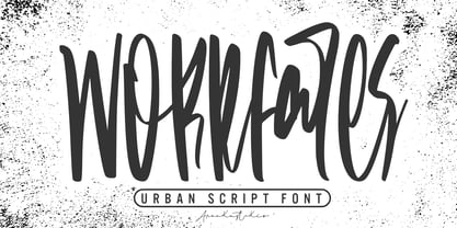 Introducing a Workfares - Urban Script Font with sharp and beautiful letters that create fonts that are modern, trendy and elegant. Workfares came with opentype features such stylistic alternates, stylistic sets & amp; amp; ligatures good for logotype, poster, badge, book cover, tshirt design, packaging and any more. Features : • Character Set A-Z • Numerals & Punctuations (OpenType Standard) • Accents (Multilingual characters) • Ligature • Alternate There it is! I really hope you enjoy it !
 - Matsuyama by Arendxstudio,
$15.00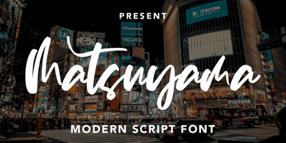 Introducing a Matsuyama - Modern Script Font with sharp and beautiful letters that create fonts that are modern, trendy and elegant. Matsuyama came with opentype features such stylistic alternates, stylistic sets & amp; amp; ligatures good for logotype, poster, badge, book cover, tshirt design, packaging and any more. Features : • Character Set A-Z • Numerals & Punctuations (OpenType Standard) • Accents (Multilingual characters) • Ligature • Alternate There it is! I really hope you enjoy it
 - Stereobytes by Stereo Type Haus,
$10.00 54 audio dingbats scoured from pages of vintage aural enthusiasts magazines and fontified just for you… from tubes to amps, turntables, headphones and more.
 - Fmiring Campotype One - Personal use only

- End Zone Express by Hipfonts,
$9.00 Get ready to amp up your game with the ultimate font for sports enthusiasts and athletes alike! Introducing Endzone Express, the breathtakingly bold and stunning sport typeface that will leave you in awe. This font is a powerhouse of strength, exuding a thick and robust presence that commands attention. Its flawless curves and meticulously crafted letterforms make every word you write feel like a championship victory. Whether you're designing team jerseys, creating motivational posters, or crafting sports-themed branding materials, Endzone Express delivers an unbeatable combination of style and intensity. Don't settle for ordinary fonts when you can embrace the boldness of Endzone Express and make your designs stand out from the competition. Let your creativity soar as you score big with this extraordinary font that truly captures the spirit of winning!
 - Ornata A by Wiescher Design,
$39.50 Ornata A is the first of a series of old ornaments that I am trying to save from oblivion. I am not just scanning these, I am completely redesigning the ornaments from scratch, thereby eliminating imperfections. Your digitizing type-designer, Gert Wiescher
 - CloseCall - Unknown license

- Dolenzo J - Unknown license

- pks-masry - 100% free

- Mrs. Santhi by Abo Daniel,
$15.00 Proudly present Mrs. Santhi, a fancy Signature Font. This font is very unique. I designed it for you who want something different from the others. It is perfect for branding, photography, invitations, quotes, watermarks, advertisements, product designs, labels, and much more! I created 194 ligatures to keep this font look natural: aa ab ah ak al am an at ant all amm ann att bh bt cc ch ct dd eb ee ek em en et enn ent ett ff gh hh ii ib ik in it inn int itt ix ixx kh ll mm mt nt nn oo oh on ob ok ol oll om ot ont ott oot onn ox oxx ph pt and more as you can see on the presentation pictures. Mrs. Santhi also features punctuations and multilingual support. Hope you love it!
 - Bestlady by Dhan Studio,
$19.00 Bestlady is a romantic textured brush font suitable perfectly for invitations, brand projects, logos, greeting cards, news, product packaging, posters blogs, everything including personal charm etc. This font is alternates all lowercase,also have equipped with 69 ligatures unique and beautiful: zz yy ww vv uu tt tl th st ss sh rr qq pp oz oy ow ov ou ot os or op oo on om ol ok oj oi og of od oc ob nt nn nl ng mm lt ll lh kk is ii id hh gg ff et el ee cl ck ch cc bl bb aw at ap an am al ah af ab aa
 - Ornata C by Wiescher Design,
$39.50 Ornata C is the third of a series of old ornaments that I am trying to save from oblivion. I am not just scanning these, I am completely redesigning the ornaments from scratch, thereby eliminating imperfections. These ornaments have been first designed by a designer named Ben Sussan. The designs date back to about 1910. Your digitizing type-designing savior, Gert Wiescher


