10,000 search results (0.024 seconds)
  1. Filbert Color by Mans Greback, $59.00
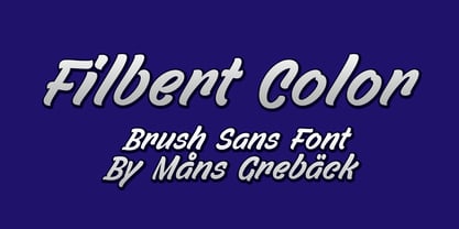
  2. Architype Aubette by The Foundry, $50.00
    Architype Konstrukt is a collection of avant-garde typefaces deriving mainly from the work of artists/designers of the inter-war years, whose ideals have helped to shape the design philosophies of the modernist movement in Europe. Due to their experimental nature character sets may be limited. Architype Aubette is based on Theo van Doesburg’s 1928 signage lettering for the Café Aubette in Strasbourg. A collaborative project with Jean and Sophie Arp, the design and decoration of the entire restaurant and leisure complex was one of the largest projects to exemplify 1920s avant-garde, and the theories of Dutch De Stijl.
  3. Arbeit Technik by Studio Few, $20.00
    Arbeit Technik, a semi-mono condensed variation of the Arbeit Pro typeface, is designed specifically for technical drawings and user interface applications. With a Stylistic Set that allows users to remove the 'mono' style serifs, this typeface offers versatility and a clean, professional appearance perfect for a variety of design projects.
  4. Neutraliser Alternate by HamburgerFonts, $20.00
    The Neutraliser family is a versatile collection of geometric-based fonts with 24 styles. The 6 Alternate styles are suitable for headlines and are complemented by the Sans and Serif styles suitable for small amounts text. The Caps styles allow for extra typographic variation within the family. Neutraliser is a direct result of the designers' initial exploration of typography and is uncompromising in its geometric nature. As the name suggests, the typeface celebrates the precision of the digital medium as a drawing tool in which the critical points that make up a letterform can be almost 'plotted' according to a grid-based logic.
  5. Accord Alternate by Soneri Type, $48.00
    The main difference between Accord Alt and Accord is in the way curved strokes join with vertical stems in letters such as “bpn”. The Italics are designed at an italic angle of 10 degrees. All the letter forms have been kept similar while designing italic instead changing the form e.g. 'a' remains same double story in italic also instead changing it to single story. The intention is to keep it simple and neutral which helps communicate the corporate sense of professionalism.
  6. Gilbert JNL by Jeff Levine, $29.00
    Gilbert JNL is an interpretation of Eric Gill's classic sanserif typeface, which has become an all-purpose workhorse in ad copy. While other versions of gill-sans fonts have multiple weight sets, Jeff Levine chose to replicate this particular weight as a single design [in both regular and oblique versions] because of its popularity with sign makers of the past and give to it the minor nuances of hand-made lettering.
  7. Worstveld Sling Extra Oblique - Personal use only
  8. Nineteen Ten Vienna - Extra - Unknown license
  9. Lady Ice - Extra Light - Unknown license
  10. Lady Ice - Extra Light - Unknown license
  11. D3 Egoistism outline extra - Unknown license
  12. MPI Tuscan Extra Condensed by mpressInteractive, $5.00
    Tuscan X Condensed (whose actual name is Gothic Concave Tuscan Extra Condensed) was first produced in wood type by William H. Page & Company around 1872. The design is derived from a Gothic Condensed typeface, but with vertical stokes bowing inwards at the center. We modified the weight of the uppercase characters (since the original wood type has a lowercase much thinner than the caps) to harmonize with the lowercase when used digitally.
  13. Printing Press Extras JNL by Jeff Levine, $29.00
    Printing Press Extras JNL is another collection of classic printing embellishments and stock cuts from Jeff Levine, with a few new ones thrown in for good measure.
  14. Archive Antiqua Extra Condensed by Archive Type, $19.95
    Extra condensed display typeface.
  15. Radiant Extra Condensed CT by CastleType, $59.00
    I was commissioned by the Emporium (now Macys) to digitize Radiant Bold Extra Condensed (originally designed by Robert Middleton in 1940) for use in their Sunday supplement to the San Francisco Examiner. For several years, I stubbornly refused to add the lowercase letters to the font, because I thought it looked best just used with caps, but finally relented, added the lowercase letters and at the same time created two more weights as well: Light and Medium. Used very large and carefully, these faces can be quite elegant.
  16. Major Pro Extras NF by Nick's Fonts, $10.00
    A supplement to Major Production NF, which includes an assortment of symbols and logos for video, web and mobile applications, including the Blu-ray logo with its region designators. Please remember that logotypes are the property of their respective copyright holders, and should be used solely in accordance with the copyright holder’s guidelines.
  17. THINK EXTRA PERSONAL USE - Personal use only
  18. Shorelines Script Bold - Personal use only
  19. DIST Inking Bold - Unknown license
  20. Goulong Bold Outline - Unknown license
  21. D3 Biscuitism Bold - Unknown license
  22. DDD Pipe Bold - Unknown license
  23. D3 Euronism Bold - Unknown license
  24. Monday Bold (sRB) - Unknown license
  25. Spylord Bold Expanded - Unknown license
  26. Phat Grunge Bold - Unknown license
  27. Pecot Outline Bold - Unknown license
  28. BN Pinky Bold - Unknown license
  29. Walkway Oblique Bold - Unknown license
  30. D3 Honeycombism Bold - Unknown license
  31. Yukon Tech Bold - Unknown license
  32. Samson Bold Oblique - Unknown license
  33. Walkway Condensed Bold - Unknown license
  34. Bagad Bold Tryout - Unknown license
  35. D3 LiteBitMapism Bold - Unknown license
  36. GF Matilda bold - Unknown license
  37. Spylord Bold Italic - Unknown license
  38. Rowling Stone Bold - Unknown license
  39. Walkway UltraCondensed Bold - Unknown license
Looking for more fonts? Check out our New, Sans, Script, Handwriting fonts or Categories
abstract fontscontact usprivacy policyweb font generator
Processing