10,000 search results
(0.013 seconds)
- Aire by Lián Types,
$37.00 Aire is what Sproviero would call a < big display family >. We recommend seeing its user’s guide. After his success with Reina, Sproviero comes out with this big family of 7 members: Each of them loaded with lots of sophisticated ligatures, alternates and the entire cyrillic alphabet. The overall impression that the font gives is lightness and delicateness; that’s the reason the designer chose to call it Aire, or Air, in English. "Aire was somehow having a rest from my fat face Reina [...] It started as a really thin style of Reina, but it rapidly migrated from it and grew up alone. And how it grew..." The inspiration came from his own past creations: “The heavy strokes of Reina were shouting for a more delicate thing. Something more feminine. More fragile. Something which had a lot of elegance and fresh air inside”. Aire responds to this: Sproviero found that many of the typefaces of nowadays which are used for headlines (best known as display fonts) have almost always just one, maybe two weight styles. This was his opportunity to try something new. Aire makes it easier for the user to generate different levels/layers of communication thanks to its variety of styles. With this font you can solve entire decorative pieces of design with just one font, and that was the aim of it. Aire was designed to be playful yet formal: While none of its alternates are activated it can be useful for short to medium length texts; and when the user chooses to make use of its open-type decorative glyphs, it can be useful for headlines with dazzling results. On March of 2012, Aire was chosen to be part of the most important exhibition of typography in Latinoamerica: Tipos Latinos 2012. TECHNICAL Aire is a family with many members. In total, the user can choose between almost 6,000 (!) glyphs (1,000 per style). Each member has variants inside, which are open-type programmed: The user decides which glyph to alternate, equalizing the amount of decoration wanted. Every decorative glyph has its weight adjusted to the style it belongs to. Exclusively for decoration, Aire Fleurons Pro is an open-type programmed set of ornaments. And last but not least, remember Aire is delicate. What’s my point? It is not recommended to activate all the alternates at the same time. It is typo-scientifically proved: A maximum of 3 or 4 alternates per word would be more than enough.
 - Air by NiceType,
$35.00 Air is a clean, contemporary, geometric sans typeface that has been designed for use in minimalist layouts where type is hero, such as those for high fashion magazines, and luxury brands. The rounded face is smooth, subtle, and non-intrusive, even when scaled up so will work effortlessly in editorial layouts when used with or without imagery.
 - Daily Mail by Natural Ink,
$14.00 Daily Mail Script is a modern calligraphy design, including Regular. This font is casual and beautiful with swash. Can be used for various purposes. such as logos, product packaging, wedding invitations, branding, headlines, signage, labels, signatures, book covers, posters, quotes, and more. Daily Mail Script includes a change of the OpenType language style, binding and international support for most Western languages. To activate the OpenType Stylistic alternative, you need a program that supports OpenType features such as Adobe Illustrator CS, Adobe Indesign & CorelDraw X6-X7, Microsoft Word 2010 or newer versions. How to access all alternative characters using Adobe Illustrator: https://www.youtube.com/watch?v=XzwjMkbB-wQ Daily Mail Script is coded with PUA Unicode, which allows full access to all additional characters without having to design special software. Mac users can use the Font Book, and Windows users can use Character Map to view and copy one of the additional characters to insert into your favorite text editor / application. How to access all alternative characters, using Windows Character Map with Photoshop: https://www.youtube.com/watch?v=Go9vacoYmBw If you need help or have questions, please let me know. I am happy to help :) Thank you & Congratulations on Designing!
 - Direct Mail by Partnrz,
$15.00 Direct mail designers rejoice! Finally, a font family made just for you. Created to be as in-your-face as possible: for use as a primary headline; for dates and phone numbers; and for coupon heads and price points. Tired of kerning numbers for your coupons and prices? Then you'll love this font! All of the kerning has been done for you. (No more spacey 1's!) Designed for a tight kern - just track it in on larger sizes. Instead of standard weights, this font was designed to fit different width needs. Have a long headline, but your client wants it in one line and tall? Use the extra-condensed. Need something really bold for a phone number or price point, but you don't have much height available? Use the fat. And there are two more widths for those in-betweens. And to top it off - you can get them all in an oblique as well.
 - Maize - Unknown license

- Nails - Unknown license

- Mael - Unknown license

- Railing by Nathatype,
$29.00 Are you looking for a display font? Do you dream of creating headings that stand out and inspire creativity, imagination, and endless fun? Wait no more, we will give you the best choice. Railing-A Display Font Railing is a gorgeous font, designed with a modern vibe. This font is perfect for anything simple and direct. Every stroke and curve was created to entice happiness and elegance. A real head-turner for your presentation, designs, branding, quotes, invitation, website illustrations, and much more. Our font always includes Multilingual Support to make your branding reach a global audience. Inspire your audience, clients, or guests with this beautiful, statement font. Features: Alternates PUA Encoded Numerals and Punctuation Thank you for downloading premium fonts from Natha Studio
 - Maige by Sensatype Studio,
$15.00 A Modern Weird Luxury font that we created special for elegant branding needs, with unique shape will be ready to add value of your brand. And specially for Maige font, We prepared any characters to help you create unlimited variations for your creative needs. Image Modern Weird Maige Font ready with: Unique Classy Characters Preview as a inspirations that you can do with Maige font Ready with Lowercase and Uppercase characters Wish you enjoy our font. :)
 - Maim by The Type Fetish,
$25.00 Maim is one messed up sans serif typeface. Designed to be used as a family by intermixing the letters for more random looking destroyed text.
 - Maily by Nathatype,
$29.00 Maily is a display serif font to provide efficient quality, consistency and performance. It shows light, expressive, moving nuances in balanced function and creativity. The font’s main character is the hooks on each letters’ edges like other serif fonts. In addition, it is truly legible because of the wide spaces of the letters with which you may freely apply for any text sizes. You can also enjoy the available features in this font. Features: Stylistic Sets Multilingual Supports PUA Encoded Numerals and Punctuations Maily fits best for various design projects, such as posters, banners, logos, magazine covers, quotes, headings, printed products, invitations, name cards, merchandise, social media, etc. Find out more ways to use this font by taking a look at the font preview. Thanks for purchasing our fonts. Hopefully, you have a great time using our font. Feel free to contact us anytime for further information or when you have trouble with the font. Thanks a lot and happy designing.
 - Rail by Type Fleet,
$- Rail grandeur precision & leverage Rail type family is a tough conveyance mechanism for large and lengthy information packages. It offers great reading comfort and avoids unnecessary friction. The precise construction of this slab serif signals greater legibility and capacity. Rail is designed to provide reading enjoyment. It’s suitable for complex typography projects like magazines and annual reports. The typeface’s x-height is approximately 68% of its capitals. The italics are constructed at a 11° angle.
 - Maille by The Paper Town,
$23.00 Maille is a bold display font powered by OpenType, featuring contextual alternates, beautiful ligatures and stylistic sets with just a hint of retro feel. Maille comes with a set of 720+ glyphs and can cover a wide range of projects from branding to advertising, stationery, headers, quotes and so much more. OpenType features include stylistic alternates with lovely swashes, initial and terminal forms and contextual alternates to enhance your text and create beautiful designs. It also includes 139+ standard and discretionary ligatures with multilingual support. The OpenType features can be easily accessed by using an OpenType capable software such as Adobe Illustrator, Photoshop or InDesign. Maille supports multilingual characters for western, central and south-east European languages.
 - Rails by Superfried,
$32.50 Rails is an experimental, retro, outline display typeface designed by Superfried. Rails is available in four styles: display, broken, solid and solid broken. As the name suggests they are constructed from parallel tracks with the broken versions featuring distinct breaks for added impact. Combination of the two results in clean, flowing type with sudden and unexpected moments of disruption. Rails has been featured in Computer Arts magazine.
 - Magle by Konstantine Studio,
$10.00 Please welcome, Magle - Homebrew Fonts. Freshly baked double fonts, straight from human’s hand. Done with click by click for your satisfaction as our goal. Comes in Script and Sans Serif, perfect for your branding needs.
 - Maine by Fenotype,
$25.00 Maine is a modernized book antiqua consisting of six styles and matching italics. Maine's cuts are from Light to Extrabold, of which Regular and Slightly Bolder Book are especially suitable for longer texts. Thanks to its clear features and high x-height, Maine creates a beautiful and legible body text. Maine gives a professional, no-nonsense impression and it’s best used in editorial, books, magazines and everywhere where you can use many different styles and sizes of the same typeface. Go dignified with Maine.
 - Air Conditioner - Personal use only

- Air Force - Unknown license

- T-Air - Unknown license

- Street Air by Sipanji21,
$10.00 Street Air is a unique display font with a graffiti-like appearance, with three style font, Regular, outline, and Shadow style. Use this font for any crafting project, apparel design, logotype, advertising, wall decoration, and pretty much anything that requires a personalized look. Take your designs to the next level with this stunning font!
 - Air Leving by Jehansyah,
$9.00 Air Leving this is an elegant font This is an elegant font, with alternatives that you can use as needed, this font is also very suitable to be used as a logo or product icon, it adds to your creative experience and will look much different from the others, suitable for all types of elegant and minimalist themed designs. Include : numeric alternate Latin Thank you very much
 - Winter Airs by Maulana Creative,
$13.00 Winter Airs is a natural feel script font. With rough stroke, fun character with a bit of ligatures and has a two files lowercase alternates. To give you an extra creative work. Winter Airs font support multilingual more than 100+ language. This font is good for logo design, Social media, Movie Titles, Books Titles, a short text even a long text letter and good for your secondary text font with sans or serif. Make a stunning work with Winter Airs font. Cheers, MaulanaCreative
 - Air Time by Epiclinez,
$18.00 Air Time is a fun and playful display font. Its unique handwritten style makes it fitting to a wide range of designs. So add it confidently to your informal or casual ideas, and you will love the results. The font Air Time contains 204 glyphs. Supporting more than 66 languages, from English to Zulu. This cute font also contains OpenType features such as ligatures with alternates or substitutes.
 - Air Force by Indian Summer Studio,
$25.00 The family for the official US military fonts/lettering used in U.S. Air Force, U.S. Army, U.S. Navy, U.S. Marine Corps. Made after the existing Military Standards and Technical Manuals.
 - Air Crash by Jehansyah,
$12.00 Air Crush is a modified font of the previous design, I tried to give it a touch of brush, because it will look very strong and bold, and after finishing this boomb the result, looks very energized and very exotic, very suitable for all kinds of designs, titles, books, movies, t-shirts, and much more
 - Southern Aire by Mans Greback,
$59.00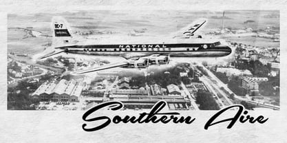
- Air Factory by Khaito Gengo,
$22.00 Air Factory was originally designed for a merchandise company, and ordered to design iconic but plain forms. Air Factory is a very simple and modern sans-serif font inspired by early 1900’s typefaces, like Futura, and consisting of 5 weights and stencil type(free). This contemporary typeface would be good used for restaurant, retail, book, poster etc. Air Factory also features various ligatures, stylistic alternates, fractions, and languages as well.
 - Air Superfamily by Positype,
$29.00 In B-movie awesomeness, Air began as Grotesk vs. Grotesque. I was trying to unify the prevailing traits of German and English Grotes(que/k)s in order to make something different but familiar. I am NOT trying to reinvent Helvetica (snore), so get that out of your system. From the onset, I intended this typeface to be a true workhorse that offers infinite options and flexibility for the user. At its core, it is the maturation of the Aaux Next skeleton I developed years ago. I worked out Aaux Next to settle my issues and love for Akzidenz. With Aaux Next, I strove to be mechanical, cold and unforgiving with it. I was single, young, cocky and it fit. Now I'm married, kids, dog and have found that I've turned into a big softy. When I look at Aaux Next (and have for the past few years) I see another typeface trying to eek out. I wanted it to avoid the trappings of robotic sans, quick tricks and compromises. The typeface’s DNA needed to be drawn and not just generated on a screen — so I set aside a year. I love type. I love working with type. I hate when my options for a slanted complement is only oblique or italic. I set out to produce both to balance usage — there are more than enough reasons to prepare both and I want the user to feel free to consciously choose (and have the option to choose) the appropriate typeface for print, web, etc. That flexibility was central to my decision-making process. The Oblique is immediate and aggressive. The Italic was redrawn at a less severe angle with far more movement and, as a result, is far more congenial when paired with the Uprights. Condensed and Compressed. Yep, why not? I know I would use them. There are nine weights currently available. The logical progression of weights and the intended flexibility demanded I explore a number of light weights and their potential uses — this has produced a number of ‘light without being too light’ options that really work based on the size. The result is a robust 81-font superfamily that is functional, professional, and highly legible without compromising its personality. Pair that with over 900 characters per font that includes ligatures, discretionary ligatures, stylistic alternates, fractions, proportional/tabular lining and proportional/tabular oldstyle figures, numerators, denominators, ordinals, superiors, inferiors, small caps, case-sensitive functionality and extensive language support and you have a versatile superfamily well-suited for any project.
 - Mail Ray Stuff - Unknown license

- KR Snail Mail - Unknown license

- Mail Route JNL by Jeff Levine,
$29.00 It’s not often a vintage cartoon can inspire a type design, but such is the case when the name “Daffy Duck” is hand lettered on a mailbox in the 1946 Warner Brothers cartoon “The Great Piggy Bank Robbery” (famously being a send-up of the popular Dick Tracy comic strip by Chester Gould). Mail Route JNL is available in both regular and oblique versions.
 - Berlin Email - 100% free

- Maple Serum - Unknown license

- Failed Attempt - Unknown license

- Meow Tails by Yumna Type,
$16.00 Meow Tails is a cute, adorable display font inspired by cat theme. All of its letters and characters are designed in flowing and round shapes to express soft and smooth nuances like a sleeping cat. Furthermore, the insertion of additional objects to the letters functions to suggest a cat’s characteristics, such as cute eyes, whiskers, and a long tail. Meow Tails, of which available features and a clipart bonus you can enjoy, will live up and charm your designs in order to attract the audience with the theme you have. In fact, it will also help you build up your brand identity to be unique and memorable, particularly brands related to cats or pets. Features: Alternates Multilingual Supports PUA Encoded Numerals and Punctuations Meow Tails fits best for various design projects, such as brandings, headings, magazine covers, quotes, printed products, merchandise, social media, etc. Find out more ways to use this font by taking a look at the font preview. Thanks for purchasing our fonts. Hopefully, you have a great time using our font. Feel free to contact us anytime for further information or when you have trouble with the font. Thanks a lot and happy designing.
 - Maple Street by Okaycat,
$29.00 Maple Street is a great looking traditional serif font composed by the Okaycat design team, Luke Turvey & Natsuko Hayashida, in 2014. Bold didone forms with structural seriffed detail combine at Maple Street to offer a cozy familiar style, without looking dated. This nicely balanced serif is designed to look outstanding for display or printed publication.
 - Hantu Tail by Attype Studio,
$18.00 Hantu Tail is a delicate and incredibly distinct Halloween Script Font. Fall in love with its incredibly versatile style and use it to create spectacular designs! Hantu Tail perfect for halloween promotion, branding, logo, invitation, stationery, social media post, product packaging, merchandise, blog design, game titles, cute style design, Book/Cover Title and more. What's Included : - Hantu Tail Family Font - ligatures - Ending Swash - Multilingual, US Roman, Latin 1 Support --- Hope you enjoy with our font! Attype Studio
 - Fairy Tail by Gatype,
$8.00 Fairy Tail is a bold and friendly typeface designed specifically for headlines. All of the letters are chunky and rounded,which is probably the reason why they are visible from afar. The overall feel of the typeface is meant to be very casual and affable, so it is great for businesses that are fun, outgoing and sincere.
 - Sail Royals by Mas Anis Studio,
$17.00 Sail Royals! Handwritten font with a personal charm. Each letters was made with brushpen on real paper, then scanned and crafted to vector carefully to add strong characteristic. With quick dry strokes and signature style, Sail Royals is perfect for branding projects, homeware designs, product packaging - or simply as a stylish text overlay to any background image like quote images.
 - Main Street by FontMesa,
$25.00 Main Street is a revival of the old font Soutache, the original version of this decorative alphabet was created in 1873 by Julius Herriet, a type designer active during the period marked by the Western expansion. Main Street with its split serifs and ornate scrollwork reflects the romantic splendor of the old west from fancy garb and Cowboy Saddles to Ice Cream Parlors and painted window signage. Main Street goes one step further by creating a base fill font which can be placed behind the regular Main Street font giving this font more of an inline appearance. You will need an application that allows layering of your fonts in order to take advantage of FontMesa Fill fonts.


Page 1 of 250Next page