9,310 search results
(0.027 seconds)
- HWT Bon Air by Hamilton Wood Type Collection,
$24.95 Bon Air was one of a series of script typefaces cut into wood by the Hamilton Manufacturing Company for the Morgan Sign Machine Co. (makers of the Line-o-Scribe showcard press) in the mid 20th Century. These were some of the last new designs cut into wood by Hamilton until the museum revival in the early 2000s. Bon Air was created in 1958 and trademarked in 1961. The wood type made for Morgan was used largely in department stores to make their own signage. The script styles are reminiscent of sign painters alphabets and evoke a Mad Men era advertising aesthetic. The font was only cut in four sizes: 12, 18, 36 and 72 line. It was distributed by Morgan for use in their presses, but as type high wood type, it could be used on any press. The font was issued with several alternate letters and ligatures to simulate the effect of hand lettering. Its lively strokes and odd details give it an exotic flavor suitable for advertising display work. The digital version includes all of the original alternates plus new characters to fill out a full European character set.
 - APF Lagoon Regular by Pomegranate,
$30.00 In 2007-8, Carolyn Puzzovio developed this OpenType typeface: Lagoon which is based on an Armenian model from the Mechitarist monastery, Venice, 1810. This project was supported by a grant from the AHRC (Arts & Humanities Research Council, UK) and won a first prize in the Granshan 08 type design competition. Oſten, Armenian digital types are designed to match the forms of Latin type characters and ‘Latinized’, by uprighting the forms; truncating ascenders and descenders and raising the x-height – but in this case the Latin characters in the OpenType font have been designed to blend in with the traditional Armenian proportions which are based on cursive forms – also incorporating some of the quirky shapes from the original model. Faithfully following the original created difficulties of ‘clashing’ characters, particularly those with long descenders, so the font contains over 100 alternative characters in the Armenian part, which will normally substitute automatically where necessary. The sloping lower case characters and upright capitals are traditional in Armenian – capitals are used less in the Armenian language. Three new characters for the Armenian unicode range are included: the Armenian dram (currency) symbol; the eternity symbol; and the index number symbol. This font which will be one of the first OpenType fonts to incorporate these newly unicoded characters.
 - Sean Henrich ATF by ActiveSphere,
$30.00 Sean Henrich ATF is a sharp, rounded geometric display font and works best in text and display applications, such as headline, posters, signage, magazine, product branding, corporate branding, logos and titles. Several alternate characters are included in this typeface. Sean Henrich ATF font has six weights; ultra light, extra light, light, regular, bold and extra bold, each available in italic, making a total of twelve styles. Each style has a full upper and lower-case, accents, punctuation and a selection of monetary symbols. Currently Available for PC, in Open Type, PostScript or TrueType.
 - ATF Poster Gothic by ATF Collection,
$59.00 ATF Poster Gothic is an expansion of a typeface designed in 1934 by Morris Fuller Benton for American Type Founders. The one-weight design was a slightly condensed display companion to Benton’s ubiquitous Bank Gothic family. This new family of aggressively rectilinear headline types expands the design’s possibilities, offering 30 fonts. The all-cap design sports square corners in the counters, creating tension between angular and curved details; this feature, and the generally rectangular shape of the whole alphabet, makes ATF Poster Gothic distinctive on the page or screen, while its relationship to Bank Gothic makes it seem somehow familiar. Vertical strokes on the C, G, J, and S, as well as on several of the numerals, are cut off at an angle, which suggest the curves those strokes might typically display if the characters were less boxy in design and more along the lines of late-19th-century headline faces. Certain weights also recall the style of lettering used on athletic team jerseys, television crime dramas, action & adventure movie titles, and engraved stationery. With three widths and five weights, ATF Poster Gothic is distinctive and versatile at the same time. The full family is also available in a “Round” version, with corners subtly rounded for a softer, more “printed” feel.
 - ATF Railroad Gothic by ATF Collection,
$59.00 First introduced by the American Type Founders Company in 1906, Railroad Gothic was the quintessential typographic expression of turn-of-the-century industrial spirit—bold and brash in tone, and a little rough around the edges. A favorite for the plain speak of big headlines, Railroad Gothic quickly gained popularity among printers. Its condensed but robust forms were likely a source of inspiration for later families of industrial sans serifs. The design feels like a cleaned-up version of some earlier Victorian gothics, notable for their uneven proportions and awkward letterforms. ATF offered a number of sizes of Railroad Gothic as metal type, with cuts varying in design considerably from size to size. Creating this new digital version involved interpreting the characteristics of different sizes and making some aesthetic choices: where to retain the design’s familiar unstudied gawkiness, and where to make improvements. The new ATF® Railroad Gothic features a measured, harmonious interpretation of the original, and has been extended with four new weights (each bolder than the last). The heaviest weights are carefully designed to keep counters open, no matter how dense the overall effect may be, maintaining legibility at any display size. This contemporary rendition of a historic American design boasts a full Latin character set, including glyphs undreamed-of in the heyday of railroads.
 - ATF Franklin Gothic by ATF Collection,
$59.00 ATF Franklin Gothic® A new take on an old favorite Franklin Gothic has been the quintessential American sans for more than a century. Designed by Morris Fuller Benton and released in 1905 by American Type Founders, Franklin Gothic quickly stood out in the crowded field of sans-serif types, gaining an enduring popularity. Benton’s original design was a display face in a single weight. It had a bold, direct solidity, yet conveyed plenty of character. A modern typeface in the tradition of 19th-century grotesques, Franklin Gothic was drawn with a distinctive contrast in stroke weight, giving it a unique personality among the more mono-linear appearance of later geometric and neo-grotesque sans-serif types. Franklin Gothic has been interpreted into a series of weights before, most notably with ITC Franklin Gothic. But as the original type was just a bold display face (later accompanied by a few similarly bold widths and italics), how Benton’s design is expanded to multiple weights and styles as a digital type family can vary significantly. Benton designed several gothic faces that harmonize with one another, including Franklin Gothic, News Gothic, and Monotone Gothic, that can serve as models for new interpretations of his work. With ATF Franklin Gothic, Mark van Bronkhorst looked to Benton’s Monotone Gothic—originally a single typeface in a regular weight, and similar to Franklin Gothic in its forms—as the basis for lighter styles. ATF Franklin Gothic may appear familiar given its heritage, but is a new design offering a fresh take on Benton’s work. The text weights are wider and more open than some previous Franklin Gothic interpretations, and as a result are quite legible as text, at very small sizes, and on screen. ATF Franklin Gothic maintains the warmth and the spirit of a Benton classic while offering a suite of fonts tuned precisely for contemporary appeal and utility. The 18-font family offers nine weights with true italics, a Latin-extended character set, and a suite of OpenType features. Download the PDF specimen for ATF Franklin Gothic.
 - Scribbles AF by Andrew Foster,
$18.00 Updated October 2014. Scribbles AF is the perfect choice when you want to add a little personality to your design. The font comes in five weights and has been created using scans of real handwriting. The soft, rounded edges of each letter in Biro, Felt Tip, Marker and Chunky give it a very relaxed and friendly appearance, or for something a little more quirky why not try the Ink version? Ideal for notes, labels, packaging and child-friendly projects. What will you use it for?
 - AF Diwa by ACME Collection,
$44.00 - AF Cashier by ACME Collection,
$44.00 - AF Screen by ACME Collection,
$44.00 - AF Interface by ACME Collection,
$44.00 - AF Hadrian by ACME Collection,
$44.00 - Seibi Ai by Nihon Literal,
$169.00 This typeface combines the rhythmic movement of Mincho and the simplicity of Gothic, with a rounded finish for a touch of elegance and style. 明朝のリズム感とゴシックのシンプルさに加え、ラウンド処理することでエレガントでおしゃれなイメージを求めた書体です。タテ画は太く、ヨコ方向はそれより細く、ハネなどはさらに細く、という三段階処理が施されています。昭和50 年(1975 年)頃、レタリング文字として開発。その後デザイン調整を経てフォント化されました。
 - Riot AF by Alien,
$40.00Riot AF is a stencil display font made for a book about zombies and undeads. - AF Carplates by ACME Collection,
$44.00 - AF Retrospecta by ACME Collection,
$44.00 - AF Kub by ACME Collection,
$44.00 - Peepz AF by Andrew Foster,
$29.00 Peepz AF features 100 different faces and has been designed to raise much needed money for Keech Hospice Care, a UK charity that runs two hospice services - one for adults and one for children. Their aim is to help patients enjoy the highest quality of life, while providing vital support for their family and friends throughout their loved one's illness and in their bereavement. All of the charity's services are offered free of charge, every single day of the year. This is all made possible because of the generous support of people like you. Profits from the sale of this font will be donated to Keech Hospice Care.
 - AF Track by ACME Collection,
$44.00 - AF PAN by ACME Collection,
$44.00 - AF Wendingen by ACME Collection,
$44.00 - Goudy AI by URW Type Foundry,
$35.99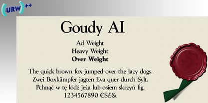
- AF Camberwell by ACME Collection,
$44.00 - AF Angel by ACME Collection,
$44.00 - AI Wood by Alphabets,
$17.95These six faces are interpreted from examples shown in Rob Roy Kelly's "American Wood Types" They are not merely scanned copies, but have been redrawn from scratch with various optical adjustments. Kelly points out that the true glory of the American Wood Types are the negative spaces, which are, in their dynamic active forms, the antithesis of the anemic flimsy letters produced by type foundries in the 19th century. The Alphabets Wood Types are designed with digital manipulation in mind. Stretch, curve and distort at will! These designs were released prior to similar revivals from Adobe. Each font has two full alphabets (one full height, one smaller) and numerals. However, certain points and accents will not be found. - Spud AF by Andrew Foster,
$12.00 100% authentic! - all characters were cut from real potatoes, creating the charming imperfections and unexpected results of the real thing. Perfect for posters, children’s projects and ‘green’ themed graphics. Spud AF brings a quirky, personal touch to any job. Please note: Spud AF Tatty has replaced the original Spud AF font.
 - Baskerville AI by URW Type Foundry,
$35.99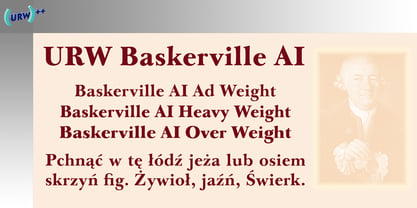
- AF Oneline by ACME Collection,
$44.00 - Air Force 30 Stencil by Indian Summer Studio,
$30.00 The family for the official US military fonts/lettering used in U.S. Air Force, U.S. Army, U.S. Navy, U.S. Marine Corps. Made after the existing Military Standards and Technical Manuals.
 - Miniver Air Raid Pro by Open Window,
$19.95 Miniver Air Raid Pro is a close relative of Miniver which was inspired by the titling from the classic movie Miniver. This font packs significantly more punch then its cousin. Give your designs a vintage blast with Miniver Air Raid Pro.
 - AF Module Pressure by ACME Collection,
$44.00 - AF Module Texture by ACME Collection,
$44.00 - OCR-A AI by Apply Interactive,
$90.00OCR-A AI Text is the version for normal use when the text will be read by humans. OCR-A AI is the version to use for machine reading. - AF Nitro Trion by ACME Collection,
$44.00 - AF Generation AzA by ACME Collection,
$44.00 - AF Generation AZ by ACME Collection,
$44.00 - AF Generation Z by ACME Collection,
$44.00 - AF Module Text by ACME Collection,
$44.00 - AF Generation ZaZ by ACME Collection,
$44.00 - AF Video Wall by ACME Collection,
$44.00