7,789 search results
(0.03 seconds)
- SW Crawl Title - Unknown license

- SW Crawl Body - Unknown license

- 101 Puppies SW - Unknown license

- Scrawl - Unknown license

- Crawling by Mevstory Studio,
$25.00 Crawling Chic & Moderf Serif. Crawling is a modern and chic typeface, best used as a display for headings, logos, branding, magazines, product packaging and invitations. Crawling come with clean lines and smooth curves give any project an extra touch of class. If there's anything else you are unsure of feel free to pop me a message :) That's it! Have fun using Crawling Typeface!!! Feel free to follow, like and share. Thanks so much for checking out my shop!
 - Untitled - Unknown license

- Untitled - Unknown license

- WBX Scrawl - Unknown license

- Kids Scrawl - Unknown license

- Scrawl Cursive by Scrowleyfonts,
$45.00 Scrawl Cursive pushes the boundaries of OpenType contextual alternates to present a font which emulates natural, modern, casual handwriting. It includes 2006 glyphs, many of these lower case alternates so that there are minimal compromises when it comes to forming and joining letters naturally. Another unusual feature is that many capital letters also join when preceding lower case letters, which creates a much more realistic flow than is normally achieved. Please view with the contextual alternates option turned on.
 - End Crawl by Wing's Art Studio,
$10.00 End Crawl - A Halloween Brush Font Introducing a new creeping terror this Halloween, End Crawl is a hand-drawn brush font inspired by the gore-soaked horror movies and comic books of the 1970s and 80s. This textured all-caps design evokes a nervous energy that will leave your readers frozen in suspense! With a bold painted look surrounded by an anxious outline, it offers the tools to leave your readers stomach in knots! The End Crawl font family includes all-caps uppercase and lowercase characters, along with numerals, punctuation, symbols and language support. Also included are a complete set of alternative characters and additional paint marks, drips and splashes. Wingsart Studio Design Tip! The uppercase and lowercase characters work great when mixed in an alternating fashion, with shapes that combine to create a dynamic, trembling look that's perfect for the Halloween season. Add the alternatives and paint marks into the mix and you'll have yourself a title or header design that looks truly custom-made. I've even included the base font and outlines separately, allowing to overlay your own colour combinations!
 - Untitled 2 - Unknown license

- Untitled-1 - Unknown license

- Untitled 1 by Device,
$29.00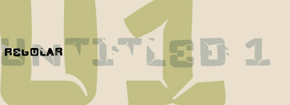
- Entitled JNL by Jeff Levine,
$29.00Way back before digital imaging, video tape and computer editing, the home movie enthusiast had to shoot on film his own titles using any one of a variety of movie titling kits on the market. One common approach was to arrange white ceramic letters on a colored background and film them. A set of such letters provided the inspiration for Entitled JNL from Jeff Levine. The classic, sleek Art Deco lines of this font makes it an all-purpose design for any headline needs. - Untitled Artwork by Arendxstudio,
$16.00 Introducing our newest Signature font Untitled Artwork. Untitled Artwork Signature is made as elegant as possible for the use of your design project. It is suitable for a variety of design projects, including logos & amps, branding, wedding designs, social media posts, advertisements, product designs, magazines and more. There it is! I really hope you enjoy it - comments & likes are always welcome and accepted. More importantly, don't hesitate to send a message if you have a problem or question. Now just read this, go there and make it happen.
 - FS Untitled by Fontsmith,
$80.00 Developer-friendly The studio has developed a wide array of weights for FS Untitled – 12 in all, in roman and italic – with the intention of meeting every on-screen need. All recognisably part of a family, each weight brings a different edge or personality to headline or body copy. There’s more. Type on screen has a tendency to fill in or blow so for each weight, there’s the choice of two marginally different versions, allowing designers and developers to go up or down a touch in weight. They’re free to use the font at any size on any background colour without fear of causing optical obstacles. And to make life even easier for developers, the 12 weight pairs have each been designated with a number from 100 (Thin) to 750 (Bold), corresponding to the system used to denote font weight in CSS code. Selecting a weight is always light work. Easy on the pixels ‘It’s a digital-first world,’ says Jason Smith, ‘and I wanted to make something that was really functional for digital brands’. FS Untitled was made for modern screens. Its shapes and proportions, x-height and cap height were modelled around the pixel grids of even low-resolution displays. So there are no angles in the A, V and W, just gently curving strokes that fit, not fight, with the pixels, and reduce the dependency on font hinting. Forms are simplified and modular – there are no spurs on the r or d, for example – and the space between the dot of the i and its stem is larger than usual. The result is a clearer, more legible typeface – functional but with bags of character. Screen beginnings FS Untitled got its start on the box. Its roots lie in Fontsmith’s creation of the typeface for Channel 4’s rebrand in 2005: the classic, quirky, edgy C4 headline font, with its rounded square shapes (inspired by the classic cartoon TV shape of a squidgy rectangle), and a toned-down version for use in text, captions and content graphics. The studio has built on the characteristics that made the original face so pixel-friendly: its blend of almost-flat horizontals and verticals with just enough openness and curve at the corners to keep the font looking friendly. The curves of the o, c and e are classic Fontsmith – typical of the dedication its designers puts into sculpting letterforms. Look out for… FS Untitled wouldn’t be a Fontsmith typeface if it didn’t have its quirks, some warranted, some wanton. There’s the rounded junction at the base of the E, for example, and the strong, solid contours of the punctuation marks and numerals. Notice, too, the distinctive, open shape of the A, V, W, X and Y, created by strokes that start off straight before curving into their diagonal path. Some would call the look bow-legged; we’d call it big-hearted.
 - Urban Scrawl-Buttah - Unknown license

- Mad's Scrawl BRK - Unknown license

- Urban Scrawl Down - Unknown license

- Urban Scrawl Chill - Unknown license

- Tall Scrawl NF by Nick's Fonts,
$10.00This very free freehand script bounces across the page and enjoys every moment of it. Use it to liven things up! Both versions of the font include 1252 Latin, 1250 CE (with localization for Romanian and Moldovan). - Johnny Mac Scrawl BRK - Unknown license

- Ænigma Scrawl 3 BRK - Unknown license

- Scrawl Of The Chief - Unknown license

- FS Untitled Variable by Fontsmith,
$319.99Developer-friendly The studio has developed a wide array of weights for FS Untitled – 12 in all, in roman and italic – with the intention of meeting every on-screen need. All recognisably part of a family, each weight brings a different edge or personality to headline or body copy. There’s more. Type on screen has a tendency to fill in or blow so for each weight, there’s the choice of two marginally different versions, allowing designers and developers to go up or down a touch in weight. They’re free to use the font at any size on any background colour without fear of causing optical obstacles. And to make life even easier for developers, the 12 weight pairs have each been designated with a number from 100 (Thin) to 750 (Bold), corresponding to the system used to denote font weight in CSS code. Selecting a weight is always light work. Easy on the pixels ‘It’s a digital-first world,’ says Jason Smith, ‘and I wanted to make something that was really functional for digital brands’. FS Untitled was made for modern screens. Its shapes and proportions, x-height and cap height were modelled around the pixel grids of even low-resolution displays. So there are no angles in the A, V and W, just gently curving strokes that fit, not fight, with the pixels, and reduce the dependency on font hinting. Forms are simplified and modular – there are no spurs on the r or d, for example – and the space between the dot of the i and its stem is larger than usual. The result is a clearer, more legible typeface – functional but with bags of character. Screen beginnings FS Untitled got its start on the box. Its roots lie in Fontsmith’s creation of the typeface for Channel 4’s rebrand in 2005: the classic, quirky, edgy C4 headline font, with its rounded square shapes (inspired by the classic cartoon TV shape of a squidgy rectangle), and a toned-down version for use in text, captions and content graphics. The studio has built on the characteristics that made the original face so pixel-friendly: its blend of almost-flat horizontals and verticals with just enough openness and curve at the corners to keep the font looking friendly. The curves of the o, c and e are classic Fontsmith – typical of the dedication its designers puts into sculpting letterforms. Look out for… FS Untitled wouldn’t be a Fontsmith typeface if it didn’t have its quirks, some warranted, some wanton. There’s the rounded junction at the base of the E, for example, and the strong, solid contours of the punctuation marks and numerals. Notice, too, the distinctive, open shape of the A, V, W, X and Y, created by strokes that start off straight before curving into their diagonal path. Some would call the look bow-legged; we’d call it big-hearted. - Untitled Wood Type by Intellecta Design,
$13.90a classic wood type font, in an attractive set of variations - Reprise Title - Unknown license

- Komika Title - Unknown license

- Ubuntu-Title - Unknown license

- Crown Title - Unknown license

- Stevens Titling by Linotype,
$29.99 Stevens Titling refers to the classic Roman alphabet as it appears on the Trajan column and numerous other monuments. With its realistic brush strokes, it shows the letterforms as they might have been sketched on the marble before the stonecutter reached for his hammer and chisel. The four fonts that constitute the Stevens Titling suite are named after animals — badger, boar, sable and wolf –, each known for the specific character of its hairs when used to make painting brushes. Sable Brush is the most formal and elegant, with solid forms which show no obvious trace of the handdrawn brush stroke; it comes with a set of small capitals for those classical titles preferred by Hollywood. In fact, each of these fonts would do a great job as a film title and poster font. The Badger Brush variant is compact and firm; Boar Brush is dramatic, and in Wolf Brush each part of the letter is made up of realistic, dry strokes.
 - Columbia Titling by Typetanic Fonts,
$24.00 Columbia Titling is a titling-caps display family based on wide Clarendon-style wood type and industrial signage design from the late-19th and early-20th Century. Columbia Titling includes a small set of OpenType features, including both tabular and proportional figures, special superscript ordinal suffixes, underlined superscript alternate letters, and OpenType fractions. Columbia Titling can have a ‘period feel’ depending on its use, but is fresh enough to use in contemporary designs, like magazine headlines, invitations, or stationery. The typeface — released in four weights — takes its name from the historic S.S. Columbia, a steamboat launched in 1903. Lettering found on the ship’s wheelhouse provided initial inspiration for Columbia Titling.
 - Breve Title by DSType,
$50.00 Breve was designed for use in editorial projects. Simple but with enough personality to stand by is own, in a quest for a more forceful and contemporary appearance. All the fonts in Breve superfamily, share the same exact structure, both in terms of anatomy and functionality. The Text versions provide a softer and warm feel to the typographic palette and is intended for use in much longer passages of text, while the Title versions are distinguished by non-descending letterforms, making the titles and headlines much more uniform and interesting. The News version is more classic, with ball terminals and classic proportions, while the Display is, somehow, the set of fonts we had to design: extra-black, ultra-contrasted, proud-display fonts.
 - Weiss Titling by URW Type Foundry,
$35.00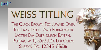
- Kress Titling by RMU,
$30.00 In 1923, the Schriftguss AG, Dresden, released this all-caps Art Deco font designed by Otto von Kress. From the existing basics, the now available font was completely redrawn and redesigned for modern use.
 - Abril Titling by TypeTogether,
$35.00 Abril is an extension of the Abril typographic system that was engineered as a response to a very specific requirement from the editorial design community: a low contrast typeface for head- lines. Given its broad range of styles though, Abril deserves to be considered a separate font family on its own. Based on the original text styles of Abril, the letter shapes are sturdy, very legible, and deliver a newsy and trustworthy feel. The accented editorial style of the Scotch Roman finds continuity in this new type family, but some of the details have been ironed out for improved performance in headline, both in print and on screen. The family is conceived as four series of different widths, with four weights in each series plus matching italics, a total of 32 fonts. This wide range of styles allows for setting titles at almost any size. The wider series are aimed for smaller point sizes while the con- densed weights can deliver a striking and cohesive appearance as front cover headlines. Abril was designed as a versatile tool for those graphic and web designers looking for a workhorse with high impact. It is also an excellent companion for the rest of the Abril type family: Abril Titling and Abril Narrow.
 - Holland Title by Monotype,
$39.00 - Zornale Title by Eurotypo,
$20.00 Zornale TITLE is a family of four fonts that can be combined with the rest of Zornale family (text and caption). These fonts have been designed with precise kerning and full OpenType features: Old-style figures, swashes, stylistic alternates, ligatures and case-sensitive forms.
 - Hermanz Titling by California Type Foundry,
$47.00 Hermanz™ Titling is inspired by the most majestic caps that Hermann Zapf ever drew. They are inscriptional caps, square caps, or “capitalis monumentalis”. These caps are some of the most beautiful letters made by one of the greatest talents of our time; so beautiful they deserve to be seen and appreciated by everyone. If you do any work for churches, wedding, funeral, anniversary, or other ceremonies, for the fine arts, exclusive clubs, or higher education—you will love how these letters make your brochures, pamphlets and announcements look. Hermanz Titling works for anything labeled "fine": fine dining, fine music, fine art (pamphlets, books, posters, cookbooks). It also fits well for religious topics: posters, events, websites, hymnals, for biblical; and ceremonies, religious or otherwise. Emotions It Can Communicate: • Importance • Timelessness • Special Event • Tradition • Reverence • Artistry • Beauty Released June 2021 on the Memorial of Hermann Zapf, as part of the California Type Foundry Memorial Series: Honoring the life and work of the great font designers. FONT STORY The Majestic Caps When I was on one of my visits to rare books rooms I found some large caps of Hermann Zapf, and I knew that I had to make a font inspired by these. I was surprised that no one had ever made them into a font. They were some of the most beautiful caps I had ever seen. These caps were surprisingly difficult to make. I thought it would take me a week or two; to get the detail and spirit right took significantly longer– but it was well worth the effort! When you print Hermanz Titling on a page, you will see what I mean. Even when printed digitally, it’s the closest thing to letterpress. You might even have some people thing it was printed by a traditional method with ink! (Note: Unless printed at very large sizes, this font is not recommended for actual letterpress, because the serifs are too thin.) If you do any work for churches, wedding, funeral, anniversary, or other ceremonies, for the fine arts, exclusive clubs, or higher education—you will love how these letters make your brochures, pamphlets and announcements look. Enjoy this breathtaking font, and may it help inspire people with your messages! –Dave Lawrence & the California Type Foundry


Page 1 of 195Next page