10,000 search results
(0.074 seconds)
- Typewriter from hell - Unknown license

- Nexus Typewriter Pro by Martin Majoor,
$49.00 Nexus (2004) consists of three matching variants – a serif, a sans and a slab – which makes it a highly versatile typeface. Nexus started as an alternative to Seria, a typeface Majoor had designed some 5 years earlier. But soon the design developed into a new typeface, with numerous changes in proportions and in details and with a redrawn italic. Besides the three connected versions (Nexus Serif, Nexus Sans, Nexus Mix) Majoor designed a monospaced version called Nexus Typewriter. The Nexus family is a workhorse typeface system like Scala, with features such as small caps in all weights, four different sorts of numbers and an extensive set of ligatures. All fonts in the Nexus family come in regular, italic, bold and bold italic. Free bonus: there are more than 100 elegant Swash italics and dozens of arrows and other icons. The Nexus family was awarded the First Prize at the Creative Review Type Design Awards 2006.
 - Intellecta Typewriter 2 by Intellecta Design,
$24.90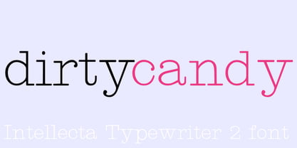
- Secret Service Typewriter by Red Rooster Collection,
$45.00Based on proofs of an early Remington typewriter font from the Keystone Type Foundry, circa 1905. - Erased Typewriter 2 by Intellecta Design,
$27.00 A distressed typewriter font design, great for mimicking the distressed and sloppy ink effect of older machines.
 - Typewriter Sans JNL by Jeff Levine,
$29.00 At first glance, Typewriter Sans JNL seems to look like the pantograph lettering of an engraved sign or the rounded-end lettering from an architect's templates. It might also be mistaken for plastic pin-back lettering used on some bulletin boards. In actuality, the design is based on examples of an electric typewriter ball element with a sans font named "Dual Gothic", suggested for use "in credit reports and other financial applications".
 - Script Typewriter Rough by Jeremia Adatte,
$19.00 Script Typewriter Rough from Jeremia Adatte Studio is the very first complete cursive typewriter font ever made after the original 1960 Smith-Corona Electra 210 typewriter that comes with a unique script typeface design. It’s loaded with more than 270 ligatures to avoid letter texture repetition in a word (switch Discretionary Ligatures on) and is extremely detailed to imitate the subtle letterpress effect you get with a real typewriter. During the typewriting era, only a few models came with this rare type style that was created to imitate hand-lettering to add more personality in a correspondence. You can send letters around the world in more than 80 languages!
 - Smith-Premier Typewriter by Intellecta Design,
$20.90 Smith-Premier Typewriter is a typewriter font design, great for mimicking the sloppy ink effect of older machines.
 - 1913 Typewriter Carbon by GLC,
$38.00 1913 Typewriter Carbon is the bold version of GLC foundry's 1913 Typewriter. It is available in two styles: Normal, and Underlined (Bold). It is a complete alphabetic font. It is used as variously as web-site titles, posters design or books editing. It may be preferable, if possible, when printing, to choose a pale color - dark grey instead of heavy black, for exemple - to give a good appearance, just like the real one, and still benefit from the full details. With inkjet printers, it may be used the economic or draft option with a good result too. The old typewriter characters size is 11 or 12 points, but this font supports easily enlargement.
 - One More Typewriter by Ana's Fonts,
$15.00 One More Typewriter font is a monospaced typewriter font in two styles: Regular and Italic, and two weights: Regular and Bold. This makes it versatile and ready to use in modern and vintage designs alike. This font is also very legible at a wide range of sizes and looks great in both long or short texts, in digital collages, branding and packaging, social media posts, logotypes, etc.
 - Lucida Sans Typewriter by Monotype,
$29.99Lucida Sans Typewriter adapts the humanized look of Lucida Sans to the fixed pitch of typewriter fonts, in which all letters have the same set width. The vertical proportions, strong stem weights, and crisp details of Lucida Sans are continued in the Lucida Sans Typewriter font family. The result is a strong, clear, fixed-pitch design that can be used wherever a functional, legible monospaced font is needed, in typewritten correspondence, memos, and telefaxes, in commercial forms, invoices, and packing lists, in programming and data processing applications, and in line printer emulations and terminal emulations. Lucida Sans Typewriter is economical in setting: at a 10 point size, it is equivalent to a 12 pitch typewriter font. For improved legibility in long lines of 80 characters or more, users can add extra line spacing, equivalent to 20% or more of the font size. When proportional fonts are needed for text to accompany Lucida Sans Typewriter, then Lucida Bright can be used. - Bitmap Typewriter JNL by Jeff Levine,
$29.00 Auto-scanning an example of a vintage typewriter font created the design which is now the digital typeface Bitmap Typewriter JNL, available in both regular and oblique versions.
 - Parma Typewriter Pro by No Bodoni,
$35.00 PARMA is a type-writer style face with the form and elegance of a Bodoni. Functional beauty was the aim of mating the two disparate ideas in one type, creating a utilitarian face with graceful features. We�re even converting the keys on our beloved old Olivetti portable to type in Parma Typowriter. And then we�re going to get a Lambretta scooter to go zipping around in and maybe one of those front opening Fiat cars for drives in the countryside. Hey, waiter! Where�s my order of Giambotti? And more Sangiovese for everyone!
 - Antique Typewriter JNL by Jeff Levine,
$29.00 “Victoria Underwood” was found within the pages of the 1923 American Type Founders specimen book. It was one of many printing fonts faithfully replicating those used on various makes and models of actual typewriters. The purpose of such type was to allow mass production of letters or notices that could appear personalized rather than shop printed. Antique Typewriter JNL is the digital version of this design, and is available in both regular and oblique versions.
 - Typewriter Olympia SM8 by Simeon out West,
$25.00 This font, based on old Olympia SM and SF typewriters from the 50’s and 60’s provides a nice clean, yet quirky look for your documents. Being a reproduction inspired by a typewriter, it works better at smaller sizes.
 - Grungy Old Typewriter by FontFuel,
$14.00 Grungy Old Typewriter is based on two typed letters, each on two pages and dated 1901. The results are eroded, rough, irregular and grungy. The final results are a vintage look. As a designer, I wanted as much flexibility as possible, so there are six versions that are designed to work together. Additionally, I decided to keep the grunge and irregularities within the shape and not include surrounding typewriter or paper marks. I leave it to the design to add those elements as desired. One note, the letter spacing is much tighter than an old typewriter. I felt that readability for modern readers suffered from the added space. Of course, you can get that same look by increasing the letter spacing in your favorite design program.
 - Victorian Typewriter JNL by Jeff Levine,
$29.00 The titles in various sections of an 1890 catalog for stencil manufacturing supplies were set in metal type that closely resembled the lettering found on a typewriter. These examples became the basis for Victorian Typewriter JNL, which is available in both regular and oblique versions.
 - Remington Elite Typewriter by Intellecta Design,
$24.90a digitization of Remington Elite model typewriter machine alphabet - Garnet Euro Typewriter by Coniglio Type,
$19.95Garnet is a rare TT typewriter face, made digital from analog samples gathered with great care by Coniglio Type. A time and place; type and life. Garnet Euro Typewriter is the first new release by designer Joseph V Coniglio in over 5 years. It is contemporary designer type, made from the struck steel hammers of an art deco san serif face transferred from a mechanical 1926 Royal Portable typewriter. It has an obsessively complete commercial roman character set ––for the pre-opentype environment of the late 1990's. Yes, it has that great “Monopoly Game” question mark -- and all on a period-piece typewriter! You should have no trouble grafting that sorely needed Euro symbol.” –And he very well did! - Manual Typewriter JNL by Jeff Levine,
$29.00 Manual Typewriter JNL was modeled from an example of the 1933 design originally created by Morris Fuller Benton, and is available in both regular and oblique versions.
 - ITC Eras by ITC,
$40.99 ITC Eras font is the work of French designers Albert Boton and Albert Hollenstein. It is a typical sans serif typeface distinguished by its unusual slight forward slant and subtle variations in stroke weight. ITC Eras is an open and airy typeface inspired by both Greek stone-cut lapidary letters as well as Roman capitals.
 - ITC Cerigo by ITC,
$29.99ITC Cerigo is the result of a challenge which designer Jean-Renaud Cuaz set for himself: to create a typeface with the grace of Renaissance calligraphy but different from the numerous Chancery scripts. He calls Cerigo a 'vertical italic' and based it on 15th century calligraphic forms. The weights are carefully designed to complement each other and are made more flexible by a number of italic swash capitals. The flexible ITC Cerigo is suitable for both text and display. - ITC Photoplay by ITC,
$29.99ITC Photoplay is another gem from Nick Curtis. Unearthed from the 1927 edition of Samuel Welo's Studio Handbook for Artists and Advertisers, the design's original suggested use was for title and caption cards for silent movies. A monoweight design that bridges the gap between turn-of-the-century decorative type and Art Deco, ITC Photoplay is both casual and stylish. And, yes, the cap S" is supposed to look that that. To expand this already handy typeface's versatility, a Black weight has been added to the original design. Curtis has also created an array of alternate characters, a couple of conjunctions, and a handful of "bishop's fingers" to help make your point. ITC Photoplay is eminently suitable for all those occasions when you need to say, "Unhand that fair damsel, you dastardly cad!", and really mean it." - ITC Gargoonies by ITC,
$29.99 - ITC Johnston by ITC,
$29.00ITC Johnston is the result of the combined talents of Dave Farey and Richard Dawson, based on the work of Edward Johnston. In developing ITC Johnston, says London type designer Dave Farey, he did “lots of research on not only the face but the man.” Edward Johnston was something of an eccentric, “famous for sitting in a deck chair and carrying toast in his pockets.” (The deck chair was his preferred furniture in his own living room; the toast was so that he’d always have sustenance near at hand.) Johnston was also almost single-handedly responsible, early in this century, for the revival in Britain of the Renaissance calligraphic tradition of the chancery italic. His book Writing & Illuminating, & Lettering (with its peculiar extraneous comma in the title) is a classic on its subject, and his influence on his contemporaries was tremendous. He is perhaps best remembered, however, for the alphabet that he designed in 1916 for the London Underground Railway (now London Transport), which was based on his original “block letter” model. Johnston’s letters were constructed very carefully, based on his study of historical writing techniques at the British Museum. His capital letters took their form from the best classical Roman inscriptions. “He had serious rules for his sans serif style,” says Farey, “particularly the height-to-weight ratio of 1:7 for the construction of line weight, and therefore horizontals and verticals were to be the same thickness. Johnston’s O’s and C’s and G’s and even his S’s were constructions of perfect circles. This was a bit of a problem as far as text sizes were concerned, or in reality sizes smaller than half an inch. It also precluded any other weight but medium ‘ any weight lighter or heavier than his 1:7 relationship.” Johnston was famously slow at any project he undertook, says Farey. “He did eventually, under protest, create a bolder weight, in capitals only ‘ which took twenty years to complete.” Farey and his colleague Richard Dawson have based ITC Johnston on Edward Johnston’s original block letters, expanding them into a three-weight type family. Johnston himself never called his Underground lettering a typeface, according to Farey. It was an alphabet meant for signage and other display purposes, designed to be legible at a glance rather than readable in passages of text. Farey and Dawson’s adaptation retains the sparkling starkness of Johnston’s letters while combining comfortably into text. Johnston’s block letter bears an obvious resemblance to Gill Sans, the highly successful type family developed by Monotype in the 1920s. The young Eric Gill had studied under Johnston at the London College of Printing, worked on the Underground project with him, and followed many of the same principles in developing his own sans serif typeface. The Johnston letters gave a characteristic look to London’s transport system after the First World War, but it was Gill Sans that became the emblematic letter form of British graphic design for decades. (Johnston’s sans serif continued in use in the Underground until the early ‘80s, when a revised and modernized version, with a tighter fit and a larger x-height, was designed by the London design firm Banks and Miles.) Farey and Dawson, working from their studio in London’s Clerkenwell, wanted to create a type family that was neither a museum piece nor a bastardization, and that would “provide an alternative of the same school” to the omnipresent Gill Sans. “These alphabets,” says Farey, referring to the Johnston letters, “have never been developed as contemporary styles.” He and Dawson not only devised three weights of ITC Johnston but gave it a full set of small capitals in each weight ‘ something that neither the original Johnston face nor the Gill faces have ‘ as well as old-style figures and several alternate characters. - ITC Atmosphere by ITC,
$29.00The Algerian designer Taouffik Semmad created the fonts in 1997. Taouffik Semmad grew up speaking Algerian-Arabic dialect and French, studied Russian, and is now living in Montreal. This could perhaps explain his current passion, to "find a universal writing", which he admits is a Utopian idea. Created with brush and Chinese ink, the characters of ITC Atmosphere came from Semmad's hand but only after they were fully formed in his mind's eye. - ITC Jamille by ITC,
$29.99Mark Jamra based the design for Jamille on the forms of the 18th century Modern Face fonts of Didot and Bodoni, but was also influenced by the work of artists like Adrian Frutiger, who reworked such fonts to adapt to the demands of modern technology. A very legible font, Jamille will give text a classic, elegant feel. - ITC Clearface by ITC,
$45.99 The Clearface types were originally designed by Morris Fuller Benton in 1907. Their forms expressed the Zeitgeist of the turn of the 20th century; typical and distinguishing characteristics are the forms of the a" and the "k." The ATF version did not include an accompanying Italic. In 1978, ITC's Victor Caruso was licensed by ATF to develop a new serif typeface and matching italic based on the forms of Clearface. The result was ITC Clearface, a serif typeface with marked stroke contrast and italic weights. The teardrop-formed endings of the lowercase a, c and f (also found in Caslon) define the character of the face. The type's design is also distinguished by its small -- almost slab -- serifs, a large x-height, and little stroke contrast. ITC Clearface, with its historical touch, is good for both texts and headlines, but its slightly condensed nature performs at its best when it is allowed its space.
 - ITC Ballerino by ITC,
$29.99Vienna designer Viktor Solt has a love affair with handwriting. “Usually” he says “when I start with a specific calligraphic style I take some historic specimens and try to integrate their main features into my own handwriting.” Although there are hints of various 18th-century calligraphic styles in Ballerino it was not based on any historical model. The swash ascenders and descenders on the lowercase are all slightly different; this and the rough texture of the edges gives Ballerino a distinctly hand-written feel. The swash caps are meant to be used only in conjunction with the lowercase not to be combined with each other. - ITC Newtext by ITC,
$40.99ITC Newtext was designed by Ray Baker, who created a well designed and legible typeface and built into it every design refinement which could optimize its usefulness. The expanded shapes are generous and legible and the economical vertical set results in more lines to the page. - ITC Mixage by ITC,
$29.99Mixage font is the work of Italian designer Aldo Novarese, who cleverly combined the character shapes and proportions like those of Syntax and Antique Olive with the grace and warmth of a calligraphic typeface. Mixage font is a good alternative to more traditional sans serif designs. - ITC Garamond by ITC,
$34.99 Drawn by Tony Stan, ITC Garamond was first released in 1975 in Book and Ultra weights only. These were intended as display faces to complement existing text designs from other foundries. (In fact, many of ITC’s interpretations of traditional typefaces began as display counterparts for existing text designs.) These first weights of ITC Garamond became so popular, however, that ITC released the Light and Bold weights and a suite of condensed faces in 1977. Now, the complete ITC Garamond family features sixteen members: four weights of roman and italic in normal width and four weights of roman and italic in companion condensed versions. The family resemblance is there, but ITC Garamond’s unique provenance gives it an unmistakable, one-of-a-kind appeal.
 - ITC Isadora by ITC,
$29.99This calligraphic typeface, designed by Kris Holmes in 1989, manages to look both confident and relaxed, while showing great intricacy and beauty upon closer inspection; it is named after the dancer Isadora Duncan. - ITC Angryhog by ITC,
$29.00The name Angryhog came out of nowhere out of free association. "When you're working on a typeface on the Mac it demands a name from you which I find a bit confrontational" says Donaldson. ITC Angryhog brings together Roman and Gothic influences in a quirky and sophisticated display face. Characteristic of this typeface are its sharp, pointed forms, especially noticeable in the serifs, which give ITC Angryhog a restless, almost aggressive feel. It is as though the letters have a mind of their own and ignore all rules and regulations. ITC Angryhog is a perfect typeface for comics or satire, best suited to short to middle length texts and headlines. - ITC Kallos by ITC,
$29.99ITC Kallos is the work of British designer Phill Grimshaw, a text typeface family with traditional calligraphic flair. It is the result of Grimshaw's first experiments with text typeface design. The long ascenders and descenders of the lowercase alphabet lend them a look of sophisticated elegance. The capitals display the unmistakable influence of the pen and the proportions of classic inscriptional forms. - ITC Jambalaya by ITC,
$29.99The talented designer of the well-known Formata typeface, Bernd Möllenstädt was born on February 22, 1943 in Germany. He has lived in Westfalia, Berlin and Munich, Germany, and now permanently resides in Munich. From his earliest years he was interested in typography, first studying as a typesetter (1961-64) and then a student of graphic design (1964-1967). In 1967 Möllenstädt joined the Berthold typefoundry and his career as one of the leading type personalities began. One year after joining Berthold, he became the head of the type design department. For 22 years he worked as the head of that department, under the leadership of Günter Gerhard Lange. Upon Lange’s retirement in 1990, Möllenstädt ascended to the type directorship of Berthold where he was responsible for type design and font mastering. Möllenstädt designed two typeface for the Berthold Exklusiv Collection, Formata (1988) and Signata (1994). Under license from Berthold, Adobe marketed Formata as part of the Adobe Type Library. Formata is now one of the most successful sans serifs in the world, used both in American and European magazines, as well as newsletters in the Far East (Gulf New Kuwait). Formata also was chosen as the corporate typeface of Postbank, Allianz, VW Skoda, Infratest Burke, etc. In addition to his work for Berthold, Möllenstädt has lectured at local Munich schools on typography and graphic design, and designed corporate type identities and diverse logos for major corporations, including Allianz, Commerzbank, Mauser Officer and Hoepfner. Möllenstädt continues his association with Berthold as a designer. He most recently completed small caps and fractions for Formata. He also has substantially contributed to Berthold's Euro symbol program (e.g. adding the Euro symbol design-specific to the most popular families). Möllenstädt currently is working on a new Berthold Exklusiv design. - ITC Bottleneck by ITC,
$39.00Tony Wenman designed the display typeface Bottleneck in the early 1970s and its figures reflect the spirit of the times. Its distinguishing characteristic is the extreme heaviness of the serifs in the lower third of the characters, a trait which the viewer could associate with the plateau shoes of the 1970s. Bottleneck is a carefree, playful typeface which can be found even today on entertainment fliers and retro advertisements. When used sparingly in headlines and slogans, it is a real eye-catcher. Similar typefaces are Julia Script, by David Harris, and Candice, by Alan Meeks. - ITC Stenberg by ITC,
$29.99ITC Stenberg was designed by Tagir Safeyev based on the forms characteristic of the Constructivism in the early days of the USSR. The brothers Vladimir and Georgii Stenberg were two of the creative artists of this movement who were turning older forms to revolutionary use. ITC Stenberg has a caps and small caps alphabet and is available in a bold and an inline version. - ITC Tyfa by ITC,
$29.99 Some words from the designer, Frantisek Storm... Designed by Josef Tyfa in 1959, digitalized by F. Storm in 1996. This Roman and Italic are well-known perhaps to all Czech graphic artists and typographers ever since their release. Although this type face in some details is under the sway of the period of its rise, its importance is timeless, in contradistinction to other famous types dating from the turn of the sixties which were found, after some time, to be trite. The italics live their own life, only their upper-case letters have the same expression as the basic design. Thin and fragile, they work excellently, emphasizing certain parts in the text by their perfect contrast of expression. When seen from a distance they are a little bit darker than the Roman face. Tyfa Roman was released in 1960 by Grafotechna in Prague for hot setting. Later on, Berthold produced letter matrices - "rulers" for Staromat devices, used for manual photosetting of display alphabets. In the eighties it was available on dry transfers of Transotype and today it is offered also by ITC. The meticulously executed designs of the individual letters in the 288 point size are arranged into a set of signs on a cardboard of about B2 in size. The yellowed paper reveals retouches by white paint on the ink. Blue lines mark the baseline, the capital line, the ascender and descender lines and the central verticals of the letters. With regard to the format of the flat scanner, the designs had to be reduced, with the use of a camera, to the format A4, i.e. to the upper-case letter height of about 30 mm. These were then scanned in 600 dpi resolution and read as a bitmap template to the FontStudio programme. The newly created bold type faces derive from Tyfa's designs of the letters "a", "n", "p", the darkness of which was increased further, approximately by 3%, to enhance their emphasizing function. The text designs have hairstrokes thickened by one third; the contrast between thin and thick strokes has been modified, in order to improve legibility, in sizes under 12 points. We have used electronic interpolation to produce the semi-bold designs. Josef Tyfa himself recommends to choose a somewhat darker design than the basic one for printing of books.
 - ITC Franklin by ITC,
$40.99 The ITC Franklin™ typeface design marks the next phase in the evolution of one of the most important American gothic typefaces. Morris Fuller Benton drew the original design in 1902 for American Type Founders (ATF); it was the first significant modernization of a nineteenth-century grotesque. Named in honor of Benjamin Franklin, the design not only became a best seller, it also served as a model for several other sans serif typefaces that followed it. Originally issued in just one weight, the ATF Franklin Gothic family was expanded over several years to include an italic, a condensed, a condensed shaded, an extra condensed and, finally, a wide. No light or intermediate weights were ever created for the metal type family. In 1980, under license from American Type Founders, ITC commissioned Victor Caruso to create four new weights in roman and italic - book, medium, demi and heavy - while preserving the characteristics of the original ATF design. This series was followed in 1991 by a suite of twelve condensed and compressed designs drawn by David Berlow. ITC Franklin Gothic was originally released as two designs: one for display type and one for text. However, in early digital interpretations, a combined text and display solution meant the same fonts were used to set type in any size, from tiny six-point text to billboard-size letters. The problem was that the typeface design was almost always compromised and this hampered its performance at any size. David Berlow, president of Font Bureau, approached ITC with a proposal to solve this problem that would be mutually beneficial. Font Bureau would rework the ITC Franklin Gothic family, enlarge and separate it into distinct text and display designs, then offer it as part of its library as well. ITC saw the obvious value in the collaboration, and work began in early 2004. The project was supposed to end with the release of new text and display designs the following year. But, like so many design projects, the ITC Franklin venture became more extensive, more complicated and more time consuming than originally intended. The 22-font ITC Franklin Gothic family has now grown to 48 designs and is called simply ITC Franklin. The new designs range from the very willowy Thin to the robust Ultra -- with Light, Medium, Bold and Black weights in between. Each weight is also available in Narrow, Condensed and Compressed variants, and each design has a complementary Italic. In addition to a suite of new biform characters (lowercase characters drawn with the height and weight of capitals), the new ITC Franklin Pro fonts also offer an extended character set that supports most Central European and many Eastern European languages. ITC Franklin Text is currently under development.
