10,000 search results
(0.042 seconds)
- Bodoni Black Condensed by Red Rooster Collection,
$45.00 Designed by R.H. Middleton for Ludlow, circa 1930. Digitally engineered by Steve Jackaman.
 - Ghitta Bodoni Cancellaresca by Spurnej Type Foundry,
$39.00 Giambattista Bodoni was an Italian engraver, printer, and publisher who was one of the best typographers of the 18th century and became known worldwide for his iconic serif typeface. In the posthumous edition of Bodoni’s “Manual of Typography” published in 1818 by his widow Margherita “Ghitta” Dall’Aglio may also be found, among the other treasures, the Cancellaresca (Chancery). Ghitta is a redesign of this typeface in its finest form. With strong stroke contrast in 4 optical grades, 850 glyphs with wide range of language support, accented ligatures, oldstyle figures, 8 stylistic sets, and unique way of letter connection, Ghitta Bodoni Cancellaresca follows and builds on the best of Bodoni’s historical prototype and shifts further to a contemporary script typeface full of grace, neatness, and beauty. *** This font is powered by OpenType feature “Ligatures”, so it is necessary to have this function turned on. If you need support or more information, please kindly contact me: spurnej@email.cz
 - Bodoni Classic Chancery by Wiescher Design,
$55.00 I became interested in designing Bodoni Classic because of a lazy graphic designer at Jacques Damase publishing house. He had to change a single letter on a bookcover about J. B. BODONI. The French call him Jean Baptiste instead of Giambattista! And that unknown graphic designer just took any old “J” from some newly cut Bodoni. All the new Bodoni cuts have square serifs, whereas the originals had rounded serifs and slightly concave feet. The single letter “J” with the squared off serif was for me like a road sign to start redesigning the entire Bodoni family. That’s exactly what I started in 1993 and a dozen years later I am finished. Okay, I am still adding new Bodoni Classics, but those are my personal additions. Yours very retro, Gert Wiescher
 - Bodoni Classic Swashes by Wiescher Design,
$39.50 Bodoni Classic Swashes is my personal addition to Bodoni’s family of typefaces. Bodoni did not design a decorative version. His quest was for purity in book design. Even though in his days it was not called design; he thought of himself purely as a printer. But I think, especially after visiting the Bodoni museum in Parma, if Giambattista were alive today he would design a decorative typeface. Yours classico, Gert Wiescher
 - Bodoni Classic Fleurs by Wiescher Design,
$39.00 Bodoni Classic Fleurs is beautifully decorated with lots of alternate glyphs for many languages.
 - ITC Bodoni Brush by ITC,
$29.99Giambattista Bodoni (1740-1813) was called the King of Printers; he was a prolific type designer, a masterful engraver of punches and the most widely admired printer of his time. His books and typefaces were created during the 45 years he was the director of the fine press and publishing house of the Duke of Parma in Italy. He produced the best of what are known as modern" style types, basing them on the finest writing of his time. Modern types represented the ultimate typographic development of the late eighteenth and early nineteenth centuries. They have characteristics quite different from the types that preceded them; such as extreme vertical stress, fine hairlines contrasted by bold main strokes, and very subtle, almost non-existent bracketing of sharply defined hairline serifs. Bodoni saw this style as beautiful and harmonious-the natural result of writing done with a well-cut pen, and the look was fashionable and admired. Other punchcutters, such as the Didot family (1689-1853) in France, and J. E. Walbaum (1768-1839) in Germany made their own versions of the modern faces. Even though some nineteenth century critics turned up their noses and called such types shattering and chilly, today the Bodoni moderns are seen in much the same light as they were in his own time. When used with care, the Bodoni types are both romantic and elegant, with a presence that adds tasteful sparkle to headlines and advertising. ITC Bodoni™ was designed by a team of four Americans, after studying Bodoni's steel punches at the Museo Bodoniana in Parma, Italy. They also referred to specimens from the "Manuale Tipografico," a monumental collection of Bodoni's work published by his widow in 1818. The designers sought to do a revival that reflected the subtleties of Bodoni's actual work. They produced three size-specific versions; ITC Bodoni Six for captions and footnotes, ITC Bodoni Twelve for text settings, and ITC Bodoni Seventytwo - a display design modeled on Bodoni's 72-point Papale design. ITC Bodoni includes regular, bold, italics, Old style Figures, small caps, and italic swash fonts. Sumner Stone created the ornaments based on those found in the "Manuale Tipografico." These lovely dingbats can be used as Bodoni did, to separate sections of text or simply accent a page layout or graphic design." - Bodoni Classic Text by Wiescher Design,
$55.00 I became interested in designing Bodoni Classic because of a lazy graphic designer at Jacques Damase publishing house. He had to change a single letter on a bookcover about J. B. BODONI. The French call him Jean Baptiste instead of Giambattista! And that unknown graphic designer just took any old “J” from some newly cut Bodoni. All the new Bodoni cuts have square serifs, whereas the originals had rounded serifs and slightly concave feet. The single letter “J” with the squared off serif was for me like a road sign to start redesigning the entire Bodoni family. That’s exactly what I started in 1993 and a dozen years later I am finished. Okay, I am still adding new Bodoni Classics, but those are my personal additions. Yours very retro, Gert Wiescher
 - Bodoni Campanile Pro by Red Rooster Collection,
$60.00 Bodoni Campanile Pro is a font that bridges the gap between a “fat” and a compressed traditional serif typeface. It was originally designed in 1936 by Robert H. Middleton for Ludlow. International TypeFounders exclusively licensed the family from the Ludlow Collection, and Steve Jackaman (ITF) produced a digital version in 1998. Jackaman completely redrew the font for its 2017 release. Bodoni Campanile Pro, much like its transitional status as a font, is successful in both formal and casual roles. The free-flowing aspects of the family, seen especially in the lowercase ‘g’ and the leg of the uppercase ‘R,’ give the family an air of elegance.
 - Bodoni Sans Text by J Foundry,
$25.00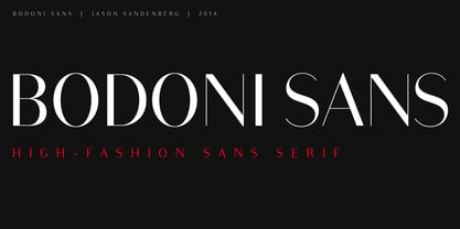
- LTC Bodoni 26 by Lanston Type Co.,
$24.95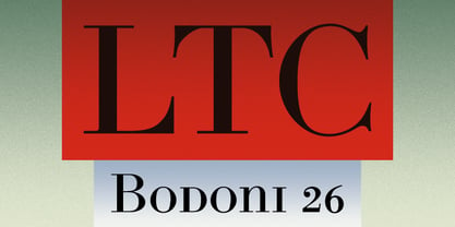
- Bodoni Classic Inline by Wiescher Design,
$49.00 Bodoni Classic Inline is a very elaborate extension of my Bodoni Classic family. The font has 5 different swashes for each capital letter, diverse swashes for lowercase letters and a full set of ligatures, oldstyle and normal numerals, all together 669 glyphs. This Inline font is good for all kind of official looking documents and of course goes together well with my forever growing Bodoni Classic family. Your Bodonian type-designer Gert Wiescher
 - New Bodoni DT by DTP Types,
$49.00A revival design by Malcolm Wooden of DTP Types Limited with associated Small Capitals and Old Style Figures. - ITC Bodoni Six by ITC,
$40.99Giambattista Bodoni (1740-1813) was called the King of Printers; he was a prolific type designer, a masterful engraver of punches and the most widely admired printer of his time. His books and typefaces were created during the 45 years he was the director of the fine press and publishing house of the Duke of Parma in Italy. He produced the best of what are known as modern" style types, basing them on the finest writing of his time. Modern types represented the ultimate typographic development of the late eighteenth and early nineteenth centuries. They have characteristics quite different from the types that preceded them; such as extreme vertical stress, fine hairlines contrasted by bold main strokes, and very subtle, almost non-existent bracketing of sharply defined hairline serifs. Bodoni saw this style as beautiful and harmonious-the natural result of writing done with a well-cut pen, and the look was fashionable and admired. Other punchcutters, such as the Didot family (1689-1853) in France, and J. E. Walbaum (1768-1839) in Germany made their own versions of the modern faces. Even though some nineteenth century critics turned up their noses and called such types shattering and chilly, today the Bodoni moderns are seen in much the same light as they were in his own time. When used with care, the Bodoni types are both romantic and elegant, with a presence that adds tasteful sparkle to headlines and advertising. ITC Bodoni™ was designed by a team of four Americans, after studying Bodoni's steel punches at the Museo Bodoniana in Parma, Italy. They also referred to specimens from the "Manuale Tipografico," a monumental collection of Bodoni's work published by his widow in 1818. The designers sought to do a revival that reflected the subtleties of Bodoni's actual work. They produced three size-specific versions; ITC Bodoni Six for captions and footnotes, ITC Bodoni Twelve for text settings, and ITC Bodoni Seventytwo - a display design modeled on Bodoni's 72-point Papale design. ITC Bodoni includes regular, bold, italics, Old style Figures, small caps, and italic swash fonts. Sumner Stone created the ornaments based on those found in the "Manuale Tipografico." These lovely dingbats can be used as Bodoni did, to separate sections of text or simply accent a page layout or graphic design." - Bodoni Egyptian Pro by Shinntype,
$59.00 Beneath the dominant signifier of identity, a surprising dimension of Bodoni is revealed—its core architecture, stripped of the famous high contrast cloak. Further subverting typographic norms, a monoline of even width (in all but the heaviest weights) here describes capitals, lower case, and serifs. And yet a certain quaintness is evident; this is, after all, both deconstruction and historical fiction.
 - Bodoni Old Fashion by URW Type Foundry,
$35.00
- Bodoni Classic Pro by Wiescher Design,
$49.50 This is my new, completely worked over and fine-tuned Bodoni Classic for Europe (no Greek and Cyrillic). I have added a set of elegant Swashes (B) and 2 alternating uppercase swirly Initials (C) as well as two lowercase end-letters (D). The fonts A and B have extensive kerning, which the initials (C) don't need, they are aligned to replace the standard capital letter. The lowercase end-letters (D) are aligned to replace the standard lowercase letters, so you might need to add a blank after the swirl. For good measure I throw in an extra set of swings for 1 Dollar (E). Your Bodoni maniac, Gert Wiescher
 - Bodoni Classic Hand by Wiescher Design,
$55.00 I became interested in designing Bodoni Classic because of a lazy graphic designer at Jacques Damase publishing house. He had to change a single letter on a bookcover about J. B. BODONI. The French call him Jean Baptiste instead of Giambattista! And that unknown graphic designer just took any old “J” from some newly cut Bodoni. All the new Bodoni cuts have square serifs, whereas the originals had rounded serifs and slightly concave feet. The single letter “J” with the squared off serif was for me like a road sign to start redesigning the entire Bodoni family. That’s exactly what I started in 1993 and a dozen years later I am finished. Okay, I am still adding new Bodoni Classics, but those are my personal additions. Yours very retro, Gert Wiescher
 - Bodoni At Home by Resistenza,
$39.00
- MPI Bodoni Ultra by mpressInteractive,
$5.00 Old Style is an example of classic roman type design. It has little contrast in stroke weight, small rounded serifs, open characters, and is very easy to read. It is based on wood type of unknown origin.
 - Bodoni Classic Swirls by Wiescher Design,
$39.50 Bodoni Classic Swirls breaks all the rules. The idea of Bodoni typefaces is no embellishments and here I go again and do another decorated set of Bodonis. But I find this is another very nice and useful typeface for all kinds of cards and certificates. Enjoy! Yours, again breaking the rules, Gert Wiescher
 - Bodoni Classic Cyrillic by Wiescher Design,
$55.00 One day shortly after Christmas 2004, the art-director of Vogue Moscow called me. Would I maybe make a Cyrillic version of my Bodoni Classic Text typeface? Well, since I had been thinking about doing it since a long time, this was the perfect reason to finally do it. It was not an easy venture, since I do not have the faintest idea of Russian but, together with those nice people in Russia and a fellow helpful type designer in Kiev, I managed. I did an enormous amount of kerning, thanks to the help of the Moscow Vogue office. Here the fonts are now for all of you: five text cuts, plus one standard roman cut that has no Cyrillic letters but an extra set of medieval numbers. At Vogue they are happy with the fonts, even though I did not quite adhere to Bodoni's originals in this case. Nastarowje (or whatever you say in Russia), Gert Wiescher
 - CAL Bodoni Casale by California Type Foundry,
$47.00 This typeface has been beloved throughout history. Bodoni used it to print his first masterwork, but it has never before been publicly available. Now available for the first time, CAL Bodoni Casale has been painstakingly crafted from hi-res scans of 4 original Bodoni printings. Unlike many Bodonis drawn from computerized straight lines, this Bodoni follows the original contours of the master himself. With small caps, old style numbers, special options for $, %, £, €, Bodoni Casale allows you to make elegant pricing, sales signs, or logos. Besides it's authentic origins, Casale's 21st century debut includes Features & Alternates never seen before, including Frankenfont (giving the font 6 fun alternative uses with 1 click!). Other alternates, such as the $ and €, give the user options when styling their work. Various word and letter spacing options are also automatically included so the user can choose to preserve Bodoni's original spacings or go with a more modern look. The Bodoni for White on Black Most Bodoni fonts will start to disappear on black. Bodoni Casale’s robust strokes don’t disappear, even when set to smaller sizes. The robust strokes of this Bodoni font also lend visibility and legibility at large sizes with dark background, such as on signage. What You Get ✓Bodoni's original font, Roman + Italic and small caps ✓Style Sets for quick and beautiful formatting ✓5 Unicase Options ✓An army of percentage signs, dollar signs, and money symbols. ✓Punctuation Options for any reading situation ✓A Realistic and Inky look ✓Designed by Bodoni Himself For a Full Tour of Bodoni Casale, here's a video!
 - Intellecta Bodoned by Intellecta Design,
$15.95a complete family of Bodoni style inspired typeface - Jester - Unknown license

- Hooters - Unknown license

- Buster - 100% free

- Custer by Font Bureau,
$40.00 In 2009, a book from 1897 in the library of the University of Wisconsin caught David Berlow’s attention. It was set in a clear text face—a predecessor of Bookman—cast by the Western Type Foundry who called it Custer. Upon noting how well the typeface worked in sizes of 6 and 7 points, Berlow developed it into a member of the Reading Edge series specifically designed for small text on screen. Custer RE was a broad and approachable typeface drawn large on the body with a tall x-height to maximize its apparent size when set very small. This was the beginning of the newly expanded series; in 2020, Berlow added new optical sizes and weights, growing the original design’s versatility up to headline sizes.
 - Fester by Fontfabric,
$150.00 Get inspired with Fester Behance presentation After several years of iterations, our brand new sans family of 16 styles is ready to take over with vector excellence! Fester is a semi-condensed Grotesque developed to beam big messages across the galaxy with a clear, bold voice. Emerging as if from the future, this low-contrast sans warps slick lines and sharp terminals into unexpected geometric shapes for extra flair. Ranging from Thin to Heavy, the typeface is loaded with 8 weights + italics, one variable style, over 760 glyphs, and Extended Latin + Cyrillic for flawless work at hyper-speed. Fester syncs with designs that feature big type, sharp layouts, interfaces, outlines, and raster images to help decipher any cutting-edge idea and make a memorable first contact. Family overview: 8 weights (from Thin to Heavy) + italics Extended Latin Cyrillic 760 glyphs Variable Font 1 free font - Fester-ExraLight 130+ languages OpenType Features: Localized Forms Subscript and scientific inferiors Superscript (Superiors) Numerators and Denominators Fractions Lining Figures Tabular Figures Oldstyle Figures Case-Sensitive Forms Standard and Discretionary Ligatures Stylistic Alternates Contextual Alternates Slashed Zero
 - Caster by Mans Greback,
$59.00 Caster is a thick poster script, created by Måns Grebäck during 2019. It is a high quality typeface and has energetic, drama-filled letter forms. It contains all necessary symbols and supports a wide range of languages.
 - Caster by Gian Studio,
$16.00 The newest Caster Serif is a complete serif typeface that is modern, simple and clean. As a typographic display it is useful for posters, logotypes, titles and short text in general. This font is easy to read and bold, easy to play. the embellished serif of the hat is slightly different from the usual hat to create an alternative glyph. We also designed an attractive uppercase set inside, to enhance your design. Enjoy!
 - Boosters by Nathatype,
$29.00 Looking for a vintage and bold font to captivate your audience or clients,? If you need to create have a t-shirt branding company, or need to create a new menu - then this is the perfect font for you. Boosters-A Vintage Font Boldy Vintage is a bold, fun, and vintage typeface that is made in uppercase and lowercase. This font is the best to maximize the amount of street vibe and vintage vibes. Ideal to create amazing headings, logos, menus, and social media graphics. Our font always includes Multilingual Support to make your branding reach a global audience. Features: Ligatures Alternates Bonus Oranament PUA Encoded Numerals and Punctuation Thank you for downloading premium fonts from Nathatype
 - Amster by PampaType,
$60.00 Amster is an energetic & refined type created by Francisco Gálvez, with a sharp idea on how elegance & legibility can meet harmoniously. Amster can build a text that is highly readable as well as friendly. It has five weights of roman & cursive both with smallcaps and fully-equipped with all OT sorts and even a wonderful set of illuminated initials. Amster is a very versatile typeface, allowing for a wide range of uses: screen to print, small text to display, science to poetry. Amster speaks more than 200 languages.
 - Lostar by Ergibi Studio,
$19.00 LOSTAR Display Modern Font. This font has unique and bold letterform, make it great to be used for modern and minimalistic design theme. The unique ligatures on serif makes this typeface cool and stands out rather than the regular serif font, perfectly for headlines, logos, posters, packaging, T-shirts,coffee shops, restaurants, magazine’s headers, signs or gift/post cards,cafe’s and weddings or any type of advertising purpose. LOSTAR only comes with an uppercase, Numeral, Punctuation, Ligature, and also Support Multi Language. if you have any Question please Message Me. Thank you ERGIBI STUDIO
 - Austerity by Heyfonts,
$15.00 Austerity Retro Script font is a vintage-inspired typeface that is perfect for creating classic design projects. Its elegant and curvy handwritten style makes it ideal for conveying a sense of nostalgia and timeless sophistication. This font is available in both regular and bold weights and includes uppercase and lowercase letters, numbers and punctuation symbols. Some of its features include: -Vintage Style: Austerity Retro Script font captures the essence of the golden age of typography with its retro-style design. It is perfect for creating vintage posters, product packaging, branding, and more. -Handwritten Appearance: The font has a unique and playful handwritten appearance, with smooth curves and a natural flow. It captures the essence of calligraphy and is perfect for conveying a sense of personal touch. -Bold and Regular Weights: Austerity font is available in both bold and regular weights, giving designers flexibility to mix and match them to achieve a wide range of styles. -Uppercase and Lowercase Letters: The font includes both uppercase and lowercase letters, making it easy to create a variety of typographic combinations for your designs. -Punctuation Symbols and Numbers: Austerity font also includes a range of punctuation symbols and numbers, making it a versatile typeface for a wide range of projects. -Multilingual Support: The font supports multiple languages, including English, French, German, Portuguese, Spanish and more. Overall, Austerity font is a perfect choice for designers who want to create a vintage feel in their design projects. Its handwritten style, bold and regular weights, and range of symbols and numbers make it a versatile and reliable font for any design project.
 - Lotter by Kaer,
$19.00 Lotter blackletter with Drop caps One fine day I found a vintage book, it called “A treatise by the Dominican friar-writer Marcus von Weida on the Brotherhood of the Holy Rosary”. It was printed in 1515 by Melchior Lotter in Leipzig. The text was illustrated by hand-colored engravings on religious and liturgical themes and beautiful initials I like. Lotter was the last name of a family of German printers, intimately connected with the Reformation. An innovation by the elder Lotter was his use of Roman types for Latin, reserving the Gothic types for German. I'm happy to present to you my new font family. Lotter font family has Drop cap and Regular styles. It's all you need to precisely imitate medieval style text. Use Drop cap style as a decorative element at the beginning of a paragraph or section, other part of the paragraph should be in Regular style. You’ll get: * Drop cap & Regular styles * Uppercase and lowercase * Multilingual support * Numbers * Symbols * Punctuation * Ligatures Please feel free to request any help you need: kaer.pro@gmail.com Best, Roman.
 - Hosperity by Letterhanna Studio,
$19.00 Introducing "Hosperity" – a captivating handwritten script font that blends artistic elegance with modern flair. Crafted by a talented font maker from Indonesia, this font is a testament to creativity and precision. With its flowing strokes and unique character, "Hosperity" adds a touch of personal charm to your designs. Whether you're designing invitations, branding materials, or any creative project, "Hosperity" is your ideal choice.
 - Laster by Calamar,
$12.00 Introducing you my NEW Laster Font! It's hand-drawn signature font with dancing baseline and elegant smooth lines that will look awesome on your branding materials, wedding invitations, headings, greeting cards and any other amazing projects you are working on. Laster font includes Upper and Lowercase Basic Characters, Standard and Discretionary Ligatures, Numbers and Punctuation. Laster is also available for Western European, Central European and South Eastern European Languages.
 - Bostero by Din Studio,
$29.00 Bostero- A Grafiti Font Bostero is a graffiti font style that embodies the urban tagging scene. This stylish font features thick, angular letters, and offers uppercase letters only. With its strong outlines and fat strokes, this is the font you need when you want to create that classic bubble graffiti font look. This font can be used for a host of different content needs and projects. Create gorgeous printed quotes, standout packaging, or beautiful t-shirts! You can even use it to create amazing headings, logos, menus, and social media graphics. Our font always includes Multilingual Support to make your branding reach a global audience. Features: Standart Ligatures Stylistic Set Multilingual Support PUA Encoded Numerals and Punctuation Thank you for downloading premium fonts from Din Studio
 - Auster by Resistenza,
$39.00 Auster, A Sans with Flair! Auster packs sensational personality in its fine-tuned forms. Confident and quirky, yet comfortable to read, this distinctive san serif family stands out from the crowd. The curves cinch and strokes flair in unconventional places making Auster an unashamed rebel sure to turn heads. Originally designed during the TipoBrda Workshop in Slovenia. Resistenza spent 3 years developing this 2 style (roman & Italic), 20 weight family. The subtle reverse contrast characters were first painted with a flat brush, then polished in pencil on tracing paper before being carefully digitized, to include language support and all the opentype features you expect in a quality contemporary font. More About Opentype Features: https://bit.ly/opentype-rsz
 - Bosten by Letteralle,
$23.00 Introducing the perfect addition to your design! Bold and masculine font! Bosten is specifically designed to make a strong impact, whether you're creating headlines or crafting brand messaging. With its sleek and powerful lines, this font is sure to grab your audience's attention and leave a lasting impression. Crafted with care, this font is not only visually stunning, but also incredibly easy to use. It's compatible with all major design software, making it the perfect addition to any designer's toolkit. Whether you're creating marketing materials, designing a website, logo design, packaging, ads, clothing, merch, etc, Bosten is the perfect choice. So why wait? Take your branding to the next level with this powerful font today! Thank You!


