10,000 search results
(0.11 seconds)
- 1462 Bamberg by GLC,
$38.00 Font designed from that used in Bamberg by Albrecht Pfister, in early years of printing, exactly for a book titled "Ackermann Von Böhmen" writen in old German by Johannes Von Tepl, and decorated by a lot of splendid colored carved woods. This font include "long s", naturelly, as typically medieval, but any abbreviated characters, and, curiously no german "ß", no more than "W". (The only one I did found where a hand drawn one.) In addition, the "k" have not a German gothic form. Added, the accented characters, no longer existing on this time, and capitals when was a lack. A render sheet, in the font file, makes all easy to identify on a keyboard. This font is used as variously as web-site titles, posters and fliers design, editing ancient texts... This font supports as easily enlargement as small size, remaining readable, original and beautiful, especially in capitals.
 - Quarzo by Corradine Fonts,
$39.95 This script font is inspired by the flexible nib strokes to create a concatenation of refinement with character mixing the contrast with pronounced but rounded angles. This angles along with the inktraps give the font a better performance when printing. Texts will have a very even rhythm due to its consistency on the stroke’s angle and spacing. The words can receive a dramatic touch by using the wide range of glyphs with curly and refined ornamentation. There are lots of caps and number variants dressed up with a variety of swashes. Also, two sets of versatile ornaments will be found: a first set of ending flourishes that match with any lowercase letter and a second set of independent flourishes to be placed around the words. Quarzo will give a great sophistication level to invitations, cards, tags, menus, advertising and packaging. Its character map covers Western and Central European characters.
 - Keiss Condensed by DSType,
$50.00 The Keiss type family is our interpretation of the popular nineteen century Scotch Roman typefaces. We intended to keep a very classic approach while introducing a couple of new elements that differentiate this type family from it’s ancestors. This design, with short descenders and ascenders, along with three very distinct optical sizes makes this type family well suited for contemporary newspapers. The Title and Big versions range from Thin to Heavy, with matching italics, in order to be used in big sizes and stand out in the design. The Text ranges from Thin to ExtraBold and is a standalone type family for text usage, with narrow proportions and wider and open italics for improved text setting. The Condensed versions, ranging from Thin to Bold, don’t have italics, although they can be matched with the italics of the Title and Big versions, due to the fact they are very condensed.
 - Pauline Didone Variable by insigne,
$99.99 Introducing Pauline Didone Variable, a flawless blend of Art Deco elegance and contemporary script. Inheriting a splash of femininity from its lineage, Pauline, it’s the perfect choice for eye-catching logos, standout headings, and memorable snippets of copy. Dive into a 10-font family arsenal, complete with 5 distinct weights, italics, and a treasure trove of OpenType alternates. Reflecting the allure of retro scripts, its geometric silhouette, paired with bold brush contrasts, commands attention. Pauline Didone’s contemporary high-contrast design ensures your artwork isn’t just in Kansas anymore but in the vibrant world of modern design. Enhance your projects with over 150 alternate characters, including a set of whimsical ball terminals reminiscent of Toto's playful spirit. Access these Oz-inspired elements with advanced software like the Adobe Suite or Quark. Step into a realm of enchantment with Pauline Didone and let your designs shine like the Emerald City.
 - Wintanceastre by Hanoded,
$25.00 I am a HUGE fan of Bernard Cornwell’s ‘The Saxon Stories’. Ever since a television series has been made, the series of books is also know as ‘The Last Kingdom’. I have read them all, at break-neck speed and I can’t wait for the next book!! Wintanceastre (Winchester) is based on a 10th century Latin manuscript. I have tried to stay close to the original letters, but since Latin does not have all modern glyphs, I found myself designing the missing ones. So, before you scold me for having made a font that is historically inaccurate: it was never meant to be an exact replica, nor would anyone want an exact replica, as it would be useless for modern texts and designs. Wintanceastre comes with a whole bunch of ligatures and alternate glyphs. Use it for any design that needs a little ‘Dark Ages’ look!
 - Frau Becker by profonts,
$51.99 Frau Becker is a very dynamic and readable handwriting script that looks great in text sizes. It is a self-confident, expressive and strong character design. How old is Frau Becker? Is she an insurance agent, a surgeon or a designer? We do not know exactly but one thing is for sure: she can be found at any place where special, high-end design in conjunction with a reliable typographic basis is demanded, e.g. for posters, books, ad campaigns or magazines. Frau Becker is different from all other classical scripts – it is outstanding! Due its excellent readability, it is a precious and exceptional text font with styles as regular, bold, and Headline (bold condensed). The character set includes Basic Latin, Basic Latin 1, Latin Eastern Europe, small caps, plenty of ligatures, old style figures, index figures, and some special characters including a skull. Wow!!
 - Keiss Condensed Big by DSType,
$50.00 The Keiss type family is our interpretation of the popular nineteen century Scotch Roman typefaces. We intended to keep a very classic approach while introducing a couple of new elements that differentiate this type family from it’s ancestors. This design, with short descenders and ascenders, along with three very distinct optical sizes makes this type family well suited for contemporary newspapers. The Title and Big versions range from Thin to Heavy, with matching italics, in order to be used in big sizes and stand out in the design. The Text ranges from Thin to ExtraBold and is a standalone type family for text usage, with narrow proportions and wider and open italics for improved text setting. The Condensed versions, ranging from Thin to Bold, don’t have italics, although they can be matched with the italics of the Title and Big versions, due to the fact they are very condensed.
 - Servus Slab by Dada Studio,
$29.00 This family is very special to me. I started working on it right after my first son was born. I decided to name the typeface "Servus" which means "Hello" in my country. The whole idea of the family symbolizes a child’s growth. It starts with Thin and Narrow weights - just like a newborn baby - then it slowly grows to Black and Wide. As You can guess, my son is quite chubby now! And I can assure You that I put all my love into details. Servus consists of 9 weights which gives us 18 fonts with matching italics. Lights and Bolds, due to their strong personality, are perfect for display uses. At the same time, Regulars create a harmonious structure that provides good legibility in long texts. Servus covers all latin languages. It contains a wide set of numerals, small capitals, fractions, ligatures and other OpenType goodies.
 - Clarks by PintassilgoPrints,
$45.00 Clarks is a modular typeface built from a work by Lygia Clark, one of the giants of Brazilian postwar art. Packed in a font equipped with clever OpenType programming, there are at least 7 different designs for each letter, thus allowing, or rather, proposing, boldly unconventional compositions. The font is programmed to cycle all these different lettershapes, avoiding repetition. The user can also manually pick up preferred forms in a glyph palette. There are choices to both keep and to defy readability and it's almost hypnotic to play with these. Lygia Clark used to invite viewers to touch her works and so we did with her 'Planes in Modulated Surface no. 4', from 1957: we fragment it and turned and inverted and recombined it. Now we return it as audacious typography and invite you to put it to work in your designs. Keep it bold and have fun! Cheers!
 - Vastine by Din Studio,
$25.00 Hello, Everyone! Ready to make your branding spark? If you need to create a big, bold logo for your business, work on a poster for an event, or whatever your project may be-then this is the perfect font for you. Vastine-A Sans Serif Font Family If we can give you many options then why not? Vastine is a package that will surprise you. With this family you will get many options to maximize your designs with stylish fonts. Vastine is made in uppercase and lowercase that easy on the eyes and nice to look while it’s also easy to read. This font designed to bring your branding to life and add a touch of modernity, fun and style. Perfect to create amazing headings, logos, menus, social media graphics, and many more. Features: Multilingual Support PUA Encoded Numerals and Punctuation Thank you for downloading premium fonts from Din Studio
 - Keiss Text by DSType,
$50.00 The Keiss type family is our interpretation of the popular nineteen century Scotch Roman typefaces. We intended to keep a very classic approach while introducing a couple of new elements that differentiate this type family from it’s ancestors. This design, with short descenders and ascenders, along with three very distinct optical sizes makes this type family well suited for contemporary newspapers. The Title and Big versions range from Thin to Heavy, with matching italics, in order to be used in big sizes and stand out in the design. The Text ranges from Thin to ExtraBold and is a standalone type family for text usage, with narrow proportions and wider and open italics for improved text setting. The Condensed versions, ranging from Thin to Bold, don’t have italics, although they can be matched with the italics of the Title and Big versions, due to the fact they are very condensed.
 - Gill Hebrew by Lerfu,
$55.00Near the end of his life, legendary type designer Eric Gill lived in Jerusalem, and became interested in the typesetting of the Hebrew alphabet and the challenges it entailed. He designed his own Hebrew font which has not (to my knowledge) been digitized before. It is sometimes held up as an example of how not to do a Hebrew font: Gill introduced strange serifs and shapes that were jarring to readers used to more traditional fonts. But it is quite readable, and does start to grow on you after a while; extended text in Gill Hebrew is possible. I've added a set of alternate digits that are based on the shapes of the letters (Gill's digits are pretty standard text figures). I've also made some of the Unicode Hebrew symbols that Gill didn't (e.g. New Sheqel Sign, Alef-Lamed ligature, etc.) and also included vowel-points. - Ballasticus by Shapovalov Fonts,
$15.00 Ballasticus is a controversial bold grotesque for logos, big headlines, posters, signage, gyms, and bodybuilders. The outer contour of the beech is rounded, while the inner space is square. The font contains two barbell icons that can be immediately inserted into your company logo. The character of Ballasticus is honest, stable, open, grounded like a weight. Ballasticus contains extended Latin, Cyrillic, ligatures, barbell and peace sign, as well as alternatives for some letters, the total number of glyphs is more than 700. It contains OpenType functions: liga, numr, dnom, calt, ss01. The font is also case sensitive, has fractions, currency signs, and arrows.
 - Cinematica by Underground,
$14.90 Cinematica was specially designed for film credits in communication pieces. Due to its space saving qualities, geometric elegance of its shapes, and eight wights; it allows a wide range of uses. Its geometry makes Cinematica able to harmonize and unify any text, incorporating the necessary signs for composition in English, Spanish, Italian, French, German and Portuguese. The Regular weight also incorporates statements that usually appear in film credits (such as "directed by", "produced by", etc.) that have been programmed as predetermined ligatures and can be accessed by typing a short sequence of signs to avoid typing the full phrase. To make the most of the alternatives proposed, use applications that support Open Type. Take a look at the User Guide.
 - HWT Roman Extended Lightface by Hamilton Wood Type Collection,
$24.95 The Roman alphabet has seen endless variations in interpretations of its classical form, and various wood type styles managed to explore everything from XXX condensed to hyper extended and expanded. This delicate and handsomely proportioned extended Roman was issued by Page Manufacturing Co. in 1872 and released as simply “No. 251” after Page was acquired by Hamilton. It is a rare font to find in print shops, most likely due to the very fine lines that would no doubt be less durable that bolder gothic jobbing fonts. While being quite wide, it still holds the elegant grace of wide Romans such as Craw Modern. This new digitization features a full Western and Eastern European Character set as well as ligatures and alternate characters.
 - Delugional by Roland Hüse Design,
$24.00 Delugional is an Atlantis theme typeface, it's character set is an imaginary alphabet inspired by Greek style scripts mixed with Classic Latin. This font is a display font family of two weights, Regular and Bold. It can be used for various creative/mythological and fantasy theme projects from book covers to games or movie titles. There are some OpenType features such as Stylistic Alternates and Discretionary Ligatures along with some extra symbols like sun, moon, snake and the stylised map of Atlantis in place of stylistic set 02 of uppercase "O". I have also created a font presentation video you can view it on youtube here: https://youtu.be/f7bKdoffWnI I hope you enjoy this one as much as I did while creating, Good luck with your project!
 - Iso 2.0 - Personal use only

- Cadency by NREY,
$25.00 Cadency is a cool and modern script font, monolinear with cut sharp ends. Can be used for your various design projects such as logotype, poster, digital lettering arts, clean design, branding design, signs, and more. Features: - Uppercase - Lowercase - Numeral & Punctuation - Standard Ligatures - Stylistic Alternates - PUA Encoded - Multilingual Support To enable the OpenType Stylistic alternates, you need a program that supports OpenType features such as Adobe Illustrator CS, Photoshop, Indesign & CorelDraw X6-X7 and more.
 - The New Elegance by Great Studio,
$18.00 The New Elegance is a new editorial serif with all clean and soft lines, tight curves, and a trendy elegant look! The New Elegance has two versions of the font, namely serif & Sans Serif which are equipped with an italic version style, very suitable for your design needs such as very suitable for creating nostalgic designs but still clean and elegant such as headlines, magazines, logos, packaging, editorial, and much more. Thank you, Great Studio
 - My Sister by Fontdroe,
$15.00 My Sister is a new modern calligraphy typeface built in 658 glyphs. It has OpenType features with PUA encode. This is a smart font works with popular design software such as Photoshop, Corel Draw X version, Illustrator, Microsoft Office, etc. This modern calligraphy typeface welcomes you to use it for various purposes such as logo, card, wedding invitation, headings, signatures, t-shirt, letterhead, cutting, hot stamping, signage, labels, posters and more. It's very craft friendly.
 - Richmond Script by Rotterlab Studio,
$14.00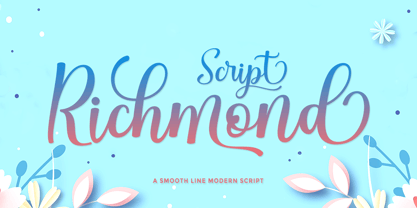 Richmond Script is a beautiful script font with many alternative styles, this font looks natural, elegant, and perfect for extraordinary projects. Richmond Script is suitable for various products such as invitations, product packaging, quotes, product designs, crafters, labels, photography, watermarks, logos & branding. Everything can be accessed using software that supports Opentype, such as Adobe Indesign, Adobe CS Illustrator, Adobe Photoshop CC, and Corel Draw. You will get: Richmond Script OTF Thank you :)
 - Landa by Sudtipos,
$39.00 As good as Nylon is, there’s nothing better than a nice woolly blanket. The smell and coarse, uneven texture are relaxing and feel reassuring. More comfortable. In a world where technology can reach millimetric precision, sometimes it’s good to connect with the imperfect and controlled impurity that is nature. Font design in particular has matured through software that can generate the most perfect letters in the world. But most of them don’t have soul. Landa is a glimpse from the cutting edge into the past. Inspired by Venetian lettering from the 15th century, whilst giving them new meaning, its letters become expressionist and have a modern touch. A rendez-vous between Nicolas Jenson, Oldřich Menhart, and nature itself. In Landa you can feel the texture of trunks and branches, from full fertile splendour to dried-out frailty. It takes the reader for a stroll through the woods on a late autumn evening, or on an adventure through the Amazonian rainforest, depending on the weight chosen. In the lighter and italic options, Landa text is organic and rustic, and very comfortable to read. What’s more, while it’s discreet on smaller screens, when enlarged it reveals brittle and expressive calligraphic shapes. This also makes it ideal for packaging or display elements. Landa provides advanced typographical support in several languages and OpenType features including case-sensitive forms, small caps, contextual alternatives, stylistic alternates, fractions, proportional and tabular figures. In this case it is technology that serves lettering, not the latter being technology dependent. Let’s not forget, as Erik Spiekermann said “we are still analogical beings. Our brains and eyes are analogical.” Perhaps that’s why to disconnect we always need to go back to forests, rivers, nature. Perhaps that’s why we still prefer wood to steel or wool to nylon.
 - Rocky Mountain Spotted Fever - Unknown license

- Mayonez by Sardiez,
$29.00 Mayonez is a typeface with rational structure and axis but softened with rounded contours and cupped serifs, getting as result a balance between seriousness and friendliness. The shapes have a soft appearance but without lacking definition. A more fluid structure influenced by calligraphy is proposed for the italic variants, in this case the uppercase letters adopted a simplified semiserif structure that works better with the lowercase letters. Also the figures are very different from the roman version and follow more faithfully the italic style. In an attempt to give Cyrillic lowercase romans a fresh look, symmetrical serifs inherited from the versal tendency are mostly avoided thus getting simpler structures closer to the latin forms. This type is good for commercial and editorial uses like advertising, packaging and pages with showy headlines where a warm touch wants to be given. The character set includes a group of figures and currency symbols with standard height and another suited to match better with lowercase letters. Mayonez was selected to be part of the Communication Arts Typography annual in 2015.
 - Diphthong by Diphthong Type Foundry,
$10.00 The challenge was to create a single typeface weight that was versatile enough without a large font family, and could be put to use with a variety of media formats, from book text to advertising spreads, all while remaining legible and delightful to read. Originally designed between the years 2002 and 2004, the inspiration for the design originated from the concepts of Stefano Giovannoni's uber-contemporary industrial designs and architecture. Where to start with such a font design was obvious to Diphthong Regular's designer, Max Hancock; to create a transitional, slab serif form that was corky and serious, interchangeably. The characteristics of the font followed a postmodern playfulness, popular in many sub-cultures looking for an alternative to the harsher, cut-shape, deconstructivist styles. And, the unique objective behind the design was to make it so that the usual difficult combination of the t and h (hth) in language was legible as well as pleasant to look at, thus the reason for the name. The soft, subtle roundings add a flair of utilitarianism while the cut edge ascenders help to blur the line between cute and diametrical mannerisms.
 - Aesthetica by Java Pep,
$15.00 Introducing an elegant bouncy font that every strike the shape brings the vibes of beauty, pretty, elegant, and aesthetic. Aesthetica font comes with several of alternates, so you can switch on for the swashes, stylistic alternate, alternate, initial and terminal form (SS01-SS02). This font is perfect for logo font, branding, greeting card, cut files for quote, silhouette font design, monogram font, and etc. The packages and features Aesthetica font PUA encoded Multilingual support for 17 languages If you have any questions about technical support and others, don't hesitate to drop me a message. Have a nice day, stay safe and healthy.
 - Rastanty Cortez by Realtype,
$12.00 Rastanty Cortez consists of sophisticated, elegant, classy and modern handwriting. With a little dirty curvature and made from the typography of new trends, this font will give you a design that looks fresh and modern. Rastanty Cortez, with a soft style and elegant nuances, classy and natural, is perfect to get a more charismatic impression or give a unique touch to your projects and branding, greeting cards, wedding, banner, name card, lettering, fonts pairing, etc. Try mixing your design with this font. Don't hesitate to pair it with serif or serif in your work idea. Find interesting layouts to complement your project.
 - Battle Road by Fachranheit,
$15.00 The Battle Road is an old, vintage display typeface. It has regular characters and a ventage style. It can be used for logos, t-shirts, quotes, badge, branding, headers, labels, packaging and much more! This is what you'll be get : Battle Road Regular.ttf Battle Road Italic.ttf Battle Road Ventage.ttf Battle Road Ventage Italic.ttf Features : Character Set A-Z Numerals & Punctuations (TrueType Standard) Accents (Multilingual characters) Above the description of this font, I hope you're satisfied with what I have created. if there's anyone who purchase and find some problem, don`t hesitate to using product support Thanks and enjoy designing.
 - FF Marselis Slab by FontFont,
$62.99 Danish type designer Jan Maack created this slab FontFont in 2013. The family has 8 weights, ranging from Light to Black (including italics) and is ideally suited for advertising, packaging, logo, and branding as well as web and screen design. FF Marselis Slab provides advanced typographical support with features such as ligatures, alternate characters, case-sensitive forms, fractions, super- and subscript characters, and stylistic alternates. It comes with a complete range of figure set options – oldstyle and lining figures, each in tabular and proportional widths.
 - FF Brokenscript by FontFont,
$41.99 Dutch type designer Just van Rossum created this blackletter FontFont in 1991. The family contains 2 weights: Bold and Condensed and is ideally suited for advertising and packaging, festive occasions, editorial and publishing, logo, branding and creative industries as well as poster and billboards. FF Brokenscript provides advanced typographical support with features such as ligatures, alternate characters, case-sensitive forms, and stylistic alternates. It comes with proportional oldstyle figures. This FontFont is a member of the FF Brokenscript super family, which also includes FF Brokenscript Rough.
 - FF Angkoon by FontFont,
$47.99 French type designer Xavier Dupré created this serif FontFont in 2003. The family has 8 weights, ranging from Light to Bold (including italics) and is ideally suited for advertising and packaging, festive occasions as well as editorial and publishing. FF Angkoon provides advanced typographical support with features such as ligatures, small capitals, alternate characters, and case-sensitive forms. It comes with a complete range of figure set options – oldstyle and lining figures, each in tabular and proportional widths. In 2004, FF Angkoon received the TDC2 award.
 - FF Blur by FontFont,
$68.99 British type designer Neville Brody created this display FontFont in 1991. The family contains 3 weights: Light, Medium, and Bold and is ideally suited for advertising and packaging, festive occasions, editorial and publishing, logo, branding and creative industries as well as poster and billboards. FF Blur provides advanced typographical support with features such as ligatures, alternate characters, and case-sensitive forms. It comes with tabular lining and proportional lining figures. In 2011, FF Blur was added to the MoMA Architecture and Design Collection in New York.
 - FF Avance by FontFont,
$65.99 Dutch type designer Evert Bloemsma created this serif FontFont in 2000. The family contains 4 weights: Regular, Italic, Bold, and Bold Italic and is ideally suited for book text, editorial and publishing, small text as well as web and screen design. FF Avance provides advanced typographical support with features such as ligatures, small capitals, alternate characters, case-sensitive forms, fractions, and super- and subscript characters. It comes with a complete range of figure set options – oldstyle and lining figures, each in tabular and proportional widths.
 - FF Schmalhans by FontFont,
$47.99 German type designer Hans Reichel created this sans FontFont in 1996. The family has 6 weights, ranging from Light to Black and is ideally suited for advertising and packaging, book text, film and tv, editorial and publishing as well as small text. FF Schmalhans provides advanced typographical support with features such as ligatures, alternate characters, case-sensitive forms, fractions, and super- and subscript characters. It comes with a complete range of figure set options – oldstyle and lining figures, each in tabular and proportional widths.
 - FF Chambers Sans by FontFont,
$68.99 German type designer Verena Gerlach created this sans FontFont in 2008. The family has 8 weights, ranging from Regular to Black (including italics) and is ideally suited for festive occasions, editorial and publishing, logo, branding and creative industries as well as sports. FF Chambers Sans provides advanced typographical support with features such as swashes, ligatures, small capitals, alternate characters, case-sensitive forms, and stylistic alternates. It comes with a complete range of figure set options – oldstyle and lining figures, each in tabular and proportional widths.
 - FF QType by FontFont,
$62.99 German type designer Achaz Reuss created this display and sans FontFont in 2004. The family has 26 weights, ranging from Extra Light to Black in Compressed, Condensed, Normal, Semi Extended, and Extended and is ideally suited for advertising and packaging, logo, branding and creative industries, poster and billboards as well as sports. FF QType provides advanced typographical support with features such as ligatures, alternate characters, case-sensitive forms, fractions, super- and subscript characters, and stylistic alternates. It comes with tabular lining and proportional lining figures.
 - Riveta by JCFonts,
$30.00 Riveta is a sharp type family available in 18 styles, designed in 2021 by Joël Carrouché. Medium and medium italic styles are 100% free to use. The typeface features a simple and solid geometric construction, with straight terminals and a very discrete triangular serif that gives the font some extra spice in big size. Riveta is equipped for advanced typography, with features such as ligatures, tabular and proportional figures, arrows and icons, stylistic alternates, case-sensitive forms, fractions, scientific inferiors and superiors, and circled figures.
 - FF Megano by FontFont,
$68.99 French type designer Xavier Dupré created this sans FontFont in 2005. The family has 11 weights, ranging from Light to Black (including italics) and is ideally suited for advertising and packaging, editorial and publishing as well as logo, branding and creative industries. FF Megano provides advanced typographical support with features such as ligatures, small capitals, alternate characters, case-sensitive forms, fractions, and super- and subscript characters. It comes with a complete range of figure set options – oldstyle and lining figures, each in tabular and proportional widths.
 - FF Balance by FontFont,
$65.99 Dutch type designer Evert Bloemsma created this sans FontFont in 1993. The family has 8 weights, ranging from Light to Black (including italics) and is ideally suited for editorial and publishing, logo, branding and creative industries as well as small text. FF Balance provides advanced typographical support with features such as ligatures, small capitals, alternate characters, case-sensitive forms, fractions, and super- and subscript characters. It comes with a complete range of figure set options – oldstyle and lining figures, each in tabular and proportional widths.
 - FF Oneleigh by FontFont,
$51.99 Canadian type designer Nick Shinn created this serif FontFont in 1999. The family has 6 weights, ranging from Regular to Black (including italics) and is ideally suited for advertising and packaging, book text, festive occasions, film and tv as well as poster and billboards. FF Oneleigh provides advanced typographical support with features such as swashes, ligatures, small capitals, alternate characters, case-sensitive forms, and fractions. It comes with a complete range of figure set options – oldstyle and lining figures, each in tabular and proportional widths.

