10,000 search results
(0.042 seconds)
- The Lucky by Masinong Studio,
$12.00 The Lucky combines a retro and hand-lettering style. I'm made it with a personal touch in every single curve. I hope this can inspiration to your work. It pairs perfectly with other fonts and contains a handy set of bonus swashes. It is ideal for logos, handwritten quotes, product packaging, headers, posters, merchandise, social media and greeting cards. Features: Basic Latin A-Z and a-z Numbers Symbols Stylistic Set Ligature PUA Encode Multilanguage Support To enable the OpenType Stylistic alternates, you need a program that supports OpenType features such as Adobe Illustrator CS, Adobe Indesign & CorelDraw X6-X7. There are additional ways to access alternates, using Character Map (Windows), Nexus Font (Windows), Font Book (Mac) or a software program such as PopChar (for Windows and Mac). If you have any question, don't hesitate to contact me by email masinong.studio@gmail.com :)
 - FS Lucas by Fontsmith,
$80.00 Pure and not-so-simple Maybe it’s the air of purity, openness and transparency that they transmit, but geometric typefaces are more popular than ever among leading brands. Based on near-perfect circles, triangles and squares, geometric letterforms look uncomplicated, even though making them readable is anything but – something the designers of the first wave of geometric fonts discovered nearly a century ago. Many of the world’s most recognisable brands in technology, retail, travel, food, manufacturing and other industries continue to be drawn to the straightforward, honest character that geometric fonts convey. Fontsmith set out in 2015 to develop a typeface in the same tradition, but optimised for the demands of modern brands – online and offline usage, readability and accessibility. And, of course, with the all-important Fontsmith x-factor built in. FS Lucas is the bold and deceptively simple result. Handle with care The letterforms of FS Lucas are round and generous, along the lines of Trajan Column lettering stripped of its serifs. But beware their thorns. Their designer, Stuart de Rozario, who also crafted the award-winning FS Millbank, wanted a contrast between spiky and soft, giving sharp apexes to the more angular letterforms, such as A, M, N, v, w and z. Among his inspirations were the colourful, geometric compositions of Frank Stella, the 1920s art deco poster designs of AM Cassandre, and the triangular cosmic element symbol, which led him to tackle the capital A first, instead of the usual H. The proportions and angles of the triangular form would set the template for many of the other characters. It was this form, and the light-scattering effects of triangular prisms, that lit the path to a name for the typeface: Lucas is derived from lux, the Latin word for light. Recommended reading Early geometric typefaces were accused of putting mathematical integrity before readability. FS Lucas achieves the trick of appearing geometric, while taking the edge off elements that make reading difficult. Perfectly circlular shapes don’t read well. The way around that is to slightly thicken the vertical strokes, and pull out the curves at the corners to compensate; the O and o of FS Lucas are optical illusions. Pointed apexes aren’t as sharp as they look; the flattened tips are an essential design feature. And distinctive details such as the open terminals of the c, e, f, g, j, r and s, and the x-height bar on the i and j, aid legibility, especially on-screen. These and many other features, the product of sketching the letterforms in the first instance by hand rather than mapping them out mechanically by computer, give FS Lucas the built-in humanity and character that make it a better, easier read all-round. Marks of distinction Unlike some of its more buttoned-up geometric bedfellows, FS Lucas can’t contain its natural personality and quirks: the flick of the foot of the l, for example, and the flattish tail on the g and j. The unusual bar on the J improves character recognition, and the G is circular, without a straight stem. There’s a touch of Fontsmith about the t, too, with the curve across the left cross section in the lighter weights, and the ampersand is one of a kind. There’s a lot to like about Lucas. With its 9 weights, perfect proportions and soft but spiky take on the classic geometric font, it’s a typeface that could light up any brand.
 - Lucky Boy by Sipanji21,
$13.00 lucky boy is a display font that has a cute character, whether it is used for various themes of children, love, or others. This font is good for crafting, packaging, apparel, comics, book titles, t shirts. and others.
 - Luce Stilren by Objectype,
$20.00 Luce Stilren is a serif font with a modern and geometric design from Objectype Studio. With clean lines and bold shapes, this font adds a professional and contemporary touch to any design project. The main feature of this font is its flexibility. Whether you’re working on a branding project, logo design, magazine headlines, or wedding invitations, Luce Stilren is the perfect choice. This font is designed to provide reading comfort, making it a great choice for both print and digital publications. Luce Stilren supports various languages and includes various typographic features such as ligatures, old-style numbers, and letter-style variations. With these possibilities, you can customize the font according to your needs. With Luce Stilren, you can take your designs to the next level. Get it now and start creating!
 - Lucky Lunch by PizzaDude.dk,
$15.00 A font to boost your creative work - handmade strokes and a scribbled 3d effect! Use the 4 different versions to create cool effects. With, or without shadow and with or without the worn effect!
 - Lucky Goldfish by Hanoded,
$15.00 I am not really sure if goldfish in general are lucky. They tend to swim in circles in a bowl, but maybe, years from now, scientists discover that these goldfish count themselves lucky to be in a bowl, rather than in a stream in Asia. Personally, I think they’d be better off in a stream. Lucky Goldfish font is a cute and happy font, ideally suited for book covers, posters and toy packaging. Comes with a school of diacritics too.
 - Lucid Dreams by Prestige Artsy Studio,
$29.99 Lucid Dreams is a timeless powerful and bold display serif. Thanks to OpenType features Lucid Dreams comes in with over 100 stylistic alternates providing you with several options to embellish your next branding project. Lucid Dreams will work perfectly for wall art work, quotes, branding, logo design, t-shirt design, posters, magazine headlines, stationary and much more. I can't wait to see what you can do with Lucid Dreams!
 - Luck Flag by Maulana Creative,
$13.00 Luck Flag is a retro stamp effect sans serif font. With medium low contrast stroke, fun character with a bit of ligatures and alternates. To give you an extra creative work. Luck Flag font support multilingual more than 100+ language. This font is good for logo design, Social media, Movie Titles, Books Titles, a short text even a long text letter and good for your secondary text font with sans or serif. Make a stunning work with Luck Flag font. Cheers, Maulana Creative
 - Lucky Brian by Beary,
$15.00 Hello guys Proudly presents our font lucky brian. lucky brian is mazing hand lettering look attractive and natural! Script font carefully created with a touch of elegance. Whether you’re looking for fonts for Instagram or calligraphy scripts for DIY projects, this font will turn any creative idea into a true piece of art!
 - Lucky Skirt by Ali Hamidi,
$10.00 Lucky Skirt is a bold, fun, and playful display font. Its well-rounded and slightly chunky characters make this typeface an extremely versatile one! It can elevate the look of almost any of your beautiful creations!
 - RMU Luchs by RMU,
$35.00 Jakob Erbar’s Art Deco font ‚Lux‘, released by Ludwig & Mayer in 1929, completely redrawn and redesign. The German umlaut glyphs Ä, Ö, and Ü come in their original form in the uppercases; in the lowercases the dieresis was placed above the letters.
 - Luco Sans by artill,
$19.00 A headline typeface with an impression of standardisation and stylish touches.
 - Maverick's Luck by FontMesa,
$20.00 From a few letters found on an old bank document from 1876, Maverick's Luck was born, and born again to give your projects that old western appearance. Maverick's Luck comes with multiple fill fonts, you will need an application that works in layers in order to use the fill fonts that come with FontMesa fonts.
 - Curly Luly by FontHaus,
$19.95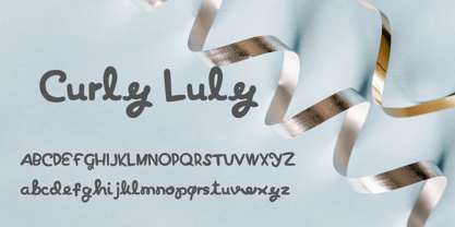
- Lucky Night by Epiclinez,
$18.00 Lucky Night is a cute, quirky, and childish handwritten font. Whimsical and relaxed, this font will brighten up each of your designs. So what’s included: Basic Latin A-Z, a-z, numbers, symbols, and punctuations Multi-Languages support: from Afrikaans Albanian Catalan Danish to Dutch English Spanish Swedish Zulu. Accented Characters : ÀÁÂÃÄÅÆÇÈÉÊËÌÍÎÏÑÒÓÔÕÖØŒŠÙÚÛÜŸÝŽàáâãäåæçèéêëìíîïñòóôõöøœšùúûüýÿžß Thank you
 - Lucifer Sans by Daniel Brokstad,
$29.00 Lucifer Sans is a modern sans serif font rooted in Scandinavian geometry and minimalism, mixed with a healthy dose of black metal and irreverent attitude. Harsh vertical cuts and angles throughout the font creates a very strict and hard look, that can either be amplified or loosened up through its stylistic sets. Lucifer Sans family contains 162 font, 9 different weights and width, plus italics. In addition there are 3 different stylistic sets. This creates substantially diverse set of characters for contrasting against another and makes it a versatile font for different formats. Style 01 takes on an almost hand drawn style, while Style 02 enhances the geometric aspects of the font further. Style 03 uses only the rounded letter 01 without the hand drawn variations.
 - Lucky Lady by JVB Fonts,
$39.00 Lucky Lady was inspired by the old, classic art and craft of brush script lettering usually applied in ads of the WWII era and 1940s. The name of the font family refers to one of the most emblematic combat units of the US air force in WWII that were decisive in the victory of the allied forces. Lucky Lady can be mainly used in titles and display texts. It supports East Europe languages. It's highly recommend to use the combined shadow styles under the main regular basic style layer. Lucky Lady includes standard and discretionary ligatures, alternative style for uppercase, fractions, numerators and denominators, end and/or terminal forms and other OpenType features.
 - Butter Luchy by FHFont,
$17.00 Butter Luchy is Handwritten script font with handlettering Brush Style, so much opentype feature include of the font. Suitable for design, element design, wedding, event, t-shirt, logo, badges, sticker, and awesome work, etc...
 - Lucky Days by PizzaDude.dk,
$19.00 This is your Lucky Day, and if you are really lucky...it could turn into Lucky Days! :) Just go ahead and type with Lucky Days, it has 6 different versions of each letter...and they are all handmade. The letters are super legible, and can be used for a great variety: posters, postcards, invitations, comics or crafts. I even imagined a label for a beer, using this font!!!
 - 161 Vergilius by GLC,
$38.00 This font was inspired by the rare manuscript Roman Quadrata used by an unknown scribe to inscribe a copy of the Roman poet Virgil’s GEORGICS, somehwere around 161 to 180 AD. Only a few sheets have survived, now preserved by different libraries around the world. In creating this font, we have adapted it for contemporary users, making differences between U and V; I and J (which made no difference at all to ancient Latin scribes) and naturally adding the glyphs for Thorn, Oslash, Lslash, W, Y, as well as the usual accented characters and punctuation, none of which existed at the time. Only capitals are present in the original; but we have provided alternates: so alternating each character A-Z/a-z will give a pleasant appearance of manual script. We have added the Roman numerals “I V X L C D M” in the OTF/TTF versions usable as “Old Style Numerals” alternates.
 - 1462 Bamberg by GLC,
$38.00 Font designed from that used in Bamberg by Albrecht Pfister, in early years of printing, exactly for a book titled "Ackermann Von Böhmen" writen in old German by Johannes Von Tepl, and decorated by a lot of splendid colored carved woods. This font include "long s", naturelly, as typically medieval, but any abbreviated characters, and, curiously no german "ß", no more than "W". (The only one I did found where a hand drawn one.) In addition, the "k" have not a German gothic form. Added, the accented characters, no longer existing on this time, and capitals when was a lack. A render sheet, in the font file, makes all easy to identify on a keyboard. This font is used as variously as web-site titles, posters and fliers design, editing ancient texts... This font supports as easily enlargement as small size, remaining readable, original and beautiful, especially in capitals.
 - Kuenstler 165 by ParaType,
$30.00 Bitstream typeface based on Koch Antiqua by Rudolph Koch (Klingspor, 1922). Koch Antiqua, also known as Locarno and Eve, is the most popular face of one of the great lettering artists of the 20th century. This delicate display face has a small x-height, very tall ascenders, and main strokes that taper gracefully downward. Koch-Antiqua appeared extensively in advertising between the wars. A refined letterform, it is best used sparingly for a distinctive look in advertising, book, and job work. Two weights of Cyrillic version including alternative lc characters were developed by Isabella Chaeva and released in 2008 by ParaType.
 - 112 Hours by Device,
$9.00 Rian Hughes’ 15th collection of fonts, “112 Hours”, is entirely dedicated to numbers. Culled from a myriad of sources – clock faces, tickets, watches house numbers – it is an eclectic and wide-ranging set. Each font contains only numerals and related punctuation – no letters. A new book has been designed by Hughes to show the collection, and includes sample settings, complete character sets, source material and an introduction. This is available print-to-order on Blurb in paperback and hardback: http://www.blurb.com/b/5539073-112-hours-hardback http://www.blurb.com/b/5539045-112-hours-paperback From the introduction: The idea for this, the fifteenth Device Fonts collection, began when I came across an online auction site dedicated to antique clocks. I was mesmerized by the inventive and bizarre numerals on their faces. Shorn of the need to extend the internal logic of a typeface through the entire alphabet, the designers of these treasures were free to explore interesting forms and shapes that would otherwise be denied them. Given this horological starting point, I decided to produce 12 fonts, each featuring just the numbers from 1 to 12 and, where appropriate, a small set of supporting characters — in most cases, the international currency symbols, a colon, full stop, hyphen, slash and the number sign. 10, 11 and 12 I opted to place in the capital A, B and C slots. Each font is shown in its entirety here. I soon passed 12, so the next logical finish line was 24. Like a typographic Jack Bauer, I soon passed that too -— the more I researched, the more I came across interesting and unique examples that insisted on digitization, or that inspired me to explore some new design direction. The sources broadened to include tickets, numbering machines, ecclesiastical brass plates and more. Though not derived from clock faces, I opted to keep the 1-12 conceit for consistency, which allowed me to design what are effectively numerical ligatures. I finally concluded one hundred fonts over my original estimate at 112. Even though it’s not strictly divisible by 12, the number has a certain symmetry, I reasoned, and was as good a place as any to round off the project. An overview reveals a broad range that nonetheless fall into several loose categories. There are fairly faithful revivals, only diverging from their source material to even out inconsistencies and regularize weighting or shape to make them more functional in a modern context; designs taken directly from the source material, preserving all the inky grit and character of the original; designs that are loosely based on a couple of numbers from the source material but diverge dramatically for reasons of improved aesthetics or mere whim; and entirely new designs with no historical precedent. As projects like this evolve (and, to be frank, get out of hand), they can take you in directions and to places you didn’t envisage when you first set out. Along the way, I corresponded with experts in railway livery, and now know about the history of cab side and smokebox plates; I travelled to the Musée de l’imprimerie in Nantes, France, to examine their numbering machines; I photographed house numbers in Paris, Florence, Venice, Amsterdam and here in the UK; I delved into my collection of tickets, passes and printed ephemera; I visited the Science Museum in London, the Royal Signals Museum in Dorset, and the Museum of London to source early adding machines, war-time telegraphs and post-war ration books. I photographed watches at Worthing Museum, weighing scales large enough to stand on in a Brick Lane pub, and digital station clocks at Baker Street tube station. I went to the London Under-ground archive at Acton Depot, where you can see all manner of vintage enamel signs and woodblock type; I photographed grocer’s stalls in East End street markets; I dug out old clocks I recalled from childhood at my parents’ place, examined old manual typewriters and cash tills, and crouched down with a torch to look at my electricity meter. I found out that Jane Fonda kicked a policeman, and unusually for someone with a lifelong aversion to sport, picked up some horse-racing jargon. I share some of that research here. In many cases I have not been slavish about staying close to the source material if I didn’t think it warranted it, so a close comparison will reveal differences. These changes could be made for aesthetic reasons, functional reasons (the originals didn’t need to be set in any combination, for example), or just reasons of personal taste. Where reference for the additional characters were not available — which was always the case with fonts derived from clock faces — I have endeavored to design them in a sympathetic style. I may even extend some of these to the full alphabet in the future. If I do, these number-only fonts could be considered as experimental design exercises: forays into form to probe interesting new graphic possibilities.
 - LOVE-BOX - Personal use only

- Love Letters - Personal use only

- Love Parade - Unknown license

- Love Parade - Unknown license

- Love Parade - Unknown license

- Craftopia Love - Unknown license

- Pinky Love by Soft Creative,
$15.00 Allow me to introduce Pinky Love Font. A carefully crafted collection of fonts combining informal, romantic, sweet, lovely design elements and hand-drawn typographic design elements. Pinky Love Font has many alternative characters, including multiple language support. You can use this font for your work very easily. Because there are many features in it. Contains a full set of upper and lower case letters, punctuation marks, numbers, and multilingual support.
 - Lovely Forever by Zeenesia Studio,
$13.00 Introducing Lovely Forever Font Lovely Forever Font is a sweet and friendly handwritten font. Its natural and unique style makes it incredibly fitting to a large pool of designs. perfect for large design project like Tshirt, mugs, Advertising, bags, quotes, food , poster, fashion, custom sticker, magazine, and many others. It completed with numbers and punctuation. Multilingual support, and came with PUA encoded.
 - Kiddie Love by Sipanji21,
$15.00 Kiddie Love is a lovely display font that radiates charm. It features gorgeous hearts in each letter which give it an incredibly romantic feel. this font suitable for valentine day poster, logo, t shirt, event banner and etc. you can use this font for any design, apparel, kids logo, logo type, with many swash for make your design awesome. feature : Kiddie Love Uppercase Kiddie Love Number and Punctuation Kiddie Love Multilingual Kiddie Love Swash
 - Angelin Love by Letterara,
$12.00 Angelin Love is a gorgeous script font, beautiful and romantic. This font looks perfect for Valentine’s Day designs, or for other romantically inclined styles and projects. To stay up to date for my latest job, follow me and let’s be friends because there will be many promos.
 - Love Letter by Adaylife,
$21.00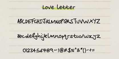
- Love Said by CBRTEXT Studio,
$16.00Love Said is a beautiful and clean calligraphic script font. This font is suitable for wedding invitations, logos, and branding. Love Said has complete uppercase and lowercase letters. This font also has many alternative letters for more than 670 glyphs. Multilingual support is also available in this font. The following features are available: - Uppercase - Lowercase - Standard Ligatures - Alternates (ss01,ss02,ss03,ss04,ss05,ss06,ss07,ss08) - Contextual Alternates - Contextual Ligatures - Kerning Have this font now and make your project look beautiful and elegant. Thank you and have a nice day. - Love Script by Positype,
$55.00 Love Script came about as a way to finally answer the requests by individuals to take my brush pen/marker lettering styles and turn them into a typeface. Literally, everything lined up perfectly and there was a renewed impetus to push this genre, this style of lettering I have adapted over the years into what will become a series of brush pen/marker typefaces. The first I chose to complete was a high-contrast variant… I seem to be attracted to high contrast, high energy letters (think Lust, Lust Slim and Lust Script). As I was finalizing everything, I kept saying ‘I love this script’, which ultimately led the christening of the typeface as Love Script. For more fun, visit the Love Script Minisite Designer’s note: for this font to truly sing, be sure you have Contextual Alternates on in your OpenType settings. Hope you love it as much as I do.
 - Love Rose by Gatype,
$12.00 Love Rose is a beautiful script suitable for branding, wedding invitations, and any other romantic project. love rose is coded with PUA Unicode, which allows full access to all additional characters without having to design any special software. Mac users can use Font Book, and Windows users can use Character Map to view and copy any additional characters for pasting into your favorite text editor / application. you need a program that supports Adobe Illustrator CS, Adobe Indesign & CorelDraw X6-X7, Microsoft Word 2010 or a later version. How to access all alternative characters using Adobe Illustrator: https://www.youtube.com/watch?v=XzwjMkbB-wQ How to access all alternative characters, using the Windows Character Map with Photoshop: https://www.youtube.com/watch?v=Go9vacoYmBw
 - Love Distance by Letterhend,
$17.00 The Love Distance is a beautiful handwritten script with organic style. This type of font perfectly made to be applied especially in logo, and the other various formal forms such as invitations, labels, logos, magazines, books, greeting / wedding cards, packaging, fashion, make up, stationery, novels, labels or any type of advertising purpose. Features : Uppercase & lowercase Numbers and punctuation Alternates & Ligatures Multilingual PUA encoded
 - Love River by SSI.Scraps,
$24.00 Love River is a thick lettered, flowing handwritten font. It looks stunning on wedding invitations, thank you cards, quotes, greeting cards, logos, business cards and every other design which needs a handwritten touch.
 - Thanks Lovely by Yoga Letter,
$15.00 "Thanks Lovely" is a modern handwritten font, featuring a decorated heart on each character. It's perfect for Valentine's Day, Christmas, Thanksgiving, weddings, invitations and more. This font is PUA coded which means you can find all glyphs and glyphs easily!


