3,739 search results
(0.007 seconds)
- neo-geo - Unknown license

- Neo Neo by ITC,
$29.99Neo Neo is the work of British designer Timothy Donaldson, a type style straight out of a 1950s time capsule. It can be set in all caps or a mixture of capitals and lowercase. The casual, slightly condensed forms with their smooth, soft lines are reminiscent of highway diners and motel ads of the time and convey a bright, inviting mood. - Geos by FineDisplayType,
$4.99 FDT Geos has re-invented airport signage. A stylish font with modern features display tech couldn't afford. FDT Geos features ligatures, fractions, numerals, stylistic sets, and even some symbols!
 - Geo by Bogusky 2,
$15.00• - Reo by Our House Graphics,
$9.00 Reo is a novel two layered, display font with a decidedly retro look and feel, inspired by the toothy grins of 1930�s and 40�s era truck grilles and the gleaming, streamlined efficiency of the automat. Reo Front (Foreground) is where all the detail resides, and Reo Back provides a background layer.
 - Leo by Canada Type,
$29.95 Leo is an economic magazine and book face meant for use in sizes suitable for immersive reading, with different cuts optimized for different body copy size ranges, like footnotes and legal text. Designed with the explicit intent of relaying information without calling attention to itself, this typeface places itself squarely on the "function" side of the eternal debate about form versus content. The roman Leo fonts were built with as little ornamentation as possible, with wedge serifs, a high x-height and a skeleton somehwat rooted in the designers' reflections on the modern, post-war Dutch archetype. Rather than follow traditional models with entirely different forms, contracted widths and steep slants, the Leo italics deliver naturally subtle emphasis in reading by closely relating to the forms, stance and rhythm of their roman counterparts. The 12 Leo fonts contain over 700 glyphs each, and include support for the vast majority of Latin languages. Included OpenType features are built-in small caps, lining and oldstyle figures in both proportional and tabular sets, superiors, numerators, denominators inferiors, ordinals, automatic fractions, ligatures, and optional long descenders for optimal counterspace management in book and magazine text layout. For more information on Leo's character set, features and some print tests, please consult the PDF in the gallery section of this page.
 - Geo by words+pictures,
$20.00 - Geo by BA Graphics,
$45.00A Bold Powerful Geometric design. Great headline face; works well in many applications. - Aeos by T-26,
$19.00 - Leo Arrow - 100% free

- 4YEO IN - Unknown license

- 4YEO OUT - Unknown license

- Kimono Geo - Unknown license

- Kimono Geo - Unknown license

- Neo Contact by URW Type Foundry,
$35.00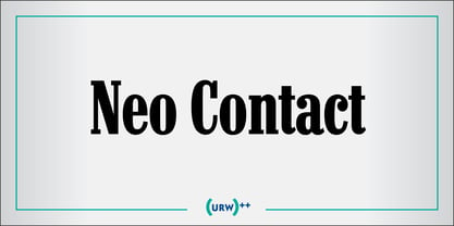
- Big Neo by Olivetype,
$18.00 Big Neo is a carefree and colorful typeface with a youthful and fun vibe. It's great for creating a happy mood in your designs. You can use it for logos, business cards, posters, headlines, T-shirts, blogs, product packaging, and more. Make your design stand out with Big Neo! So what’s included : Basic Latin Uppercase and Lowercase Numbers, symbols, and punctuations Multilingual Support. Accented Characters : ÀÁÂÃÄÅÆÇÈÉÊËÌÍÎÏÑÒÓÔÕÖØŒŠÙÚÛÜŸÝŽàáâãäåæçèéêëìíîïñòóôõöøœšùúûüýÿžß PUA Encoded and fully accessible without additional design software Simple Installations works on PC & Mac Thank You and Happy Designing!
 - Vekta Neo by Positype,
$22.00 The Vekta Type System is part of a larger, interconnected grouping of 3 families: Neo, Sans and Serif. The goal was to develop a family designed along a common skeleton and matrix that would allow for interchangeable usage along a cohesive visual system. It's About The Personality. Interchange type families to be as expressive as you want to be. Let the piece you are designing constrain your usage and not the typeface.
 - Neo Sans by Monotype,
$34.99 Designer Sebastian Lester describes his Neo Sans type collection as “legible without being neutral, nuanced without being fussy, and expressive without being distracting.” Featuring rounded, square sans letterforms, the Neo Sans family is available in six weights, ranging from light to ultra, with companion italics. Its forward-looking personality makes it an excellent choice for branding projects, as well as for editorial or publication design. Pair the Neo Sans collection with a serif design for interesting typographic contrast; for more direct continuity, consider the typeface's sister design—the Neo Tech family also from Lester, available in six weights with matching italics.
 - Neo Alcatraz by Sign Studio,
$15.00 Neo Alcatraz will help you to create futuristic and sporty designs. Perfect for branding, posters, book covers, magazines, trademarks, landing pages, mobile apps and more. This font has a simple yet strong form in its character. Minimalism, futuristic, sporty, that's the theme of Neo Alcatraz.
 - Virginia Neo by Type Associates,
$39.00 Virginia Neo is more than an update to the original Virginia family, designed in 1970 and strongly influenced by the popularity of Futura and Kabel in that era. Virginia Neo is a completely redrawn version based on the original design which won its designer first place ahead of 5,000 other submissions to the Lettergraphics International Typeface Design Competition in the same year. The original typeface family comprised 5 weights, the lightest of which was omitted from the initial 2008 digital offering but has now been included in the Neo version, along with a new Heavy weight rounding out a family of 6. Each typeface includes more than 450 glyphs, enough to satisfy more than 80 languages plus a smattering of ligatures, useful geometric ornaments and arrows. Virginia Neo fits the compact, comfortable-tightness of seventies-retro typography currently re-emerging in today’s advertising. Its high readability, femininity and elegance makes it suitable for subheads, headlines, posters, branding and the web.
 - Geo Tablet by ArFF,
$24.95You wouldn't print a book with this font; but you could sure leave a message. - Neo Contact by Linotype,
$40.99Neo Contact is the typeface used on the packaging of Marlboro cigarettes (Marlboro “Reds,” the main line of the brand). The typeface is bold and condensed, designed in the Egyptienne style. Egyptienne types were first designed in the 1800s, as type founders - especially in the westward-expanding United States - began to dream up newer, bolder styles of letters for advertising usage. During the 1800s, it became increasingly important for businesses to set themselves, and their products, apart from competitors. This desire has remained with corporations, as well as with advertisers and designers, into the 21st century. In addition to cigarette packaging, Neo Contact (as part of Marlboro’s branding efforts) can be seen on numerous items, including Ferrari’s F1 racers, and at Formula 1 race tracks. The letters in Neo Contact are filled with personality. Their forms display two distinct weights of line, and the serifs are made up of tiny, strict slabs. Ball terminals round out the design. Neo Contact is a complete font, with a complete western character set. Typefaces in the Egyptienne style preceded the development and distribution of larger, crazier wood typefaces, but also share many similarities with these descendents. More traditional, text faces in the Egyptienne manner are also available from Linotype GmbH (e.g., Adrian Frutiger’s Egyptienne F). On the opposite end of the spectrum, we offer interesting, personality-filled wood display types, like Ponderosa as well. - Sacred Geo by John Moore Type Foundry,
$29.90 Sacred Geo is a Dingbat font, containing the basic principles of geometry, perpendiculars, bisections, partitions of angles, curves joints aligned and asymmetric, thus the construction of the main spirals, construction of polygons as a square, rhombus, pentagon, hexagon, octagon and how to combine them into ornamental shapes. Discover the magical world of sacred geometry. Winner in the TL2012 International Biennial of LatinAmerican Typography, Tipos Latinos.
 - Neo Brushly by IbraCreative,
$17.00 Neo Brushly is an enchanting handlettered brush font that encapsulates the artistry of free-flowing strokes and the warmth of handcrafted expression. With each character meticulously crafted, the font exudes a genuine, human touch, reminiscent of brush strokes on canvas. The letters dance dynamically, creating a harmonious rhythm that lends a unique, personalized flair to any project. Neo Brushly captures the essence of spontaneity, making it an ideal choice for designs that seek a balance between casual elegance and a hint of playful sophistication. The organic, brush-inspired design imparts a sense of authenticity, making Neo Brushly an inviting and versatile choice for a wide range of creative endeavors, from branding to invitations, infusing a touch of handmade charm into every typographic creation.
 - Neo Phalanx by Zenmurai,
$18.00 Neo Phalanx is a rectangular, circular & curvy modern display sans inspired by Ancient Greek mass military formation. The difficulty of make this font is balancing rounded corner & sharp edge. There are letters like "M W A H R N K S Z" provides a unique personality in the title display. Numbering and punctuations also designed in unique styles to deliver different visual language. This font is suited for variety of applications from poster to branding, advertising, digital.
 - Phil Yeh by Comicraft,
$19.00 Since 1985, Cartoonists Across America & The World have been promoting literacy, creativity, the arts, and other positive issues using cartoons and humor. Founder Phil Yeh and his band of artists -- including Comicraft President and First (Flying) Tiger, Richard Starkings -- create books, paint murals, take part in school assemblies, conventions, conferences and other public events for all ages throughout the world! Cartoonists Across America & The World have worked in partnership with the Center for The Book in The Library of Congress and other organizations all over the world. They have painted more than 1000 murals in 49 of the United States as well as in Canada, Mexico, Italy, England, France, Germany, Hungary, The Netherlands, China, Taiwan, Singapore, and the Cayman Islands. So we made Phil a font 'cause he's a noble soul. Avoid Extinction -- Read, Reuse, Reduce and Recycle!
 - Neo Bulletin by Intellecta Design,
$28.90
- Geo Deco by Tipo Pèpel,
$28.00 Geodeco font family brings to you the recovery of the typographic forms from the beginning of the 20th century, with a strong ArtDecó flavour but from a new point of view: modernity and geometry. Modernity in the visual contrast between lowercase and capital letters, where rounded shapes are opposed to the breaks and graphic tensions of the strokes of the capital letters. which gives it an enormous originality. Generous doses of internal whites, assure a powerful legibility even with the spite of its short ascending and descending strokes. What we get is a coherent and martial look where fluidity and homogeneity is the main note. Soft and rounded minuscule, with large internal whites for super legibility, bombproof, especially on screens, where Geodeco lives with an astonishing naturalness. The capital letters, used alone as display, or as companions of the minuscule characters, give the family a touch of originality and exotic flavor. Like the spices in the food; a brief but intense note. Breaking the rectangular shapes so that the appearance of the letter comes out benefits from enlarging the internal whites and making them consistent with the white of the lower case. GeoDeco works very well in plain text with the obvious limitation that it is not a type for small bodies, but exceptionality weldon for plain text and signage. Maximum visibility, total beauty on screens. A family of this new century with the flavour of that epoch of experimentation that were the years 20. Extensive multilanguage support and almost all Opentype functionalities. Try it and it will convince you - for sure!
 - Neo Osaka by Bejeletter,
$12.00 Neo Osaka is a lovely neo script with stylistic features. Neo Osaka is perfect for product packaging, branding project, megazine, social media, wedding, sport jersey design number or just used to express words above the background (interior). Built with OpenType features and includes beginning and ending swashes, alternate characters for both lowercase and uppercase letters, loads of different swash alternates for lowercase letters, numbers, punctuation, alternates, ligatures and it also supports other languages. Enjoy the font, feel free to comment or feedback, send me PM or email. Thank you!
 - CEO Roman by BA Graphics,
$45.00A very clean conservative corporate look, very simple yet very dignified. Great for text and head lines, just about any application. - Sequel Geo by OGJ Type Design,
$35.00 Sequel Geo is a geometric/neo-grotesque hybrid superfamily, influenced by formalized sans-serif typefaces from Germany and Swiss modernist type design—particularly Max Bill’s greek-styled lettering. 8 subfamilies and 120 individual fonts allow for a wide range of typographic expressions. Sequel Geo’s hallmark features, such as the circular “G” and punctuation, simple “t”, and two-story “a” turning one-story in bolder weights, persist throughout all styles. But it’s the formal and functional differences between subfamilies that let you really fine-tune your layouts. The three optical sizes of the core collection, “Body Text”, “Headline”, and “Display”, boast optimized spacing for the intended use. “Extended” packs some extra punch with 18 display-oriented styles. Finally, 48 “Graphic” styles in 4 subfamilies push to the Geometric side, replacing horizontal and vertical stroke endings with angular ones, simplifying letterforms. Sequel Geo is a journey through time and space. From 1920s Germany to 1950s Switzerland. All the while, its archetypal shapes are neutral yet confident, its appearance is classic.
 - Neo mameo by Kaidosan,
$10.00 Neo mameo is a Japanese Style typeface that is ideal for projects that require a distinctly Japanese touch. This typeface will add uniqueness and creativity to your work with a beautiful style and eye-catching look. This font character is taken from Japanese traditional Japanese style. This font will leave a lasting impact and quickly grab the attention of potential customers. This font provides a vivid visual effect. I hope this font can provide solutions in your business and activities.
 - Phasma Geo by Baqoos,
$17.00 Pharma Geo is a rhapsody guileless handwritten typeface apt for headline, editorial, branding, packaging, printed materials and typographic applications. 200+ glyphs including punctuation and numerical.
 - Yel Yeah by Allouse Studio,
$16.00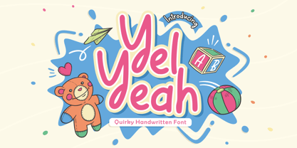 Yel Yeah a Quirky Handwritten Font tha will bring an fun and playful impression. Yel Yeah is perfect for any tittles, logo, product packaging, branding project, megazine, social media, wedding, or just used to express words above the background. Yel Yeah also come with Multi-Lingual support. Enjoy the font, feel free to comment or feedback, send me PM or email. Thank You!
 - Neo Strada by Differentialtype,
$10.00 Neo Strada is a bold geometric sans serif font that comes in many weights and several alternates. It's perfect for documents, font logos, blogs, social media, marketing campaigns and many other projects!
 - Neo MF by Masterfont,
$59.00 - Neo Tech by Monotype,
$29.00 Neo Sans began as an intriguing assignment from a branding agency. The agency’s client wanted an “ultra modern” type family that was "futuristic without being gimmicky or ephemeral.” When a bureaucratic decision cancelled the project, Monotype staff designer Sebastian Lester decided to finish the design on his own. “I was left with a sketchbook full of ideas,” he said, “and thought it would be a shame not to see what came of them.” Lester decided that the principal ingredient of an "ultra modern" typeface was simplicity of character structure: a carefully drawn, monoline form, open letter shapes and smooth, strong curves. By further amplifying these qualities, he crossed the line from modern to futuristic. Two highly functional and versatile typefaces emerged. These are Neo Sans and Neo Tech, designs Lester describes as "legible without being neutral, nuanced without being fussy, and expressive without being distracting." Both the Neo Sans and the more minimalist Neo Tech families are available in six weights, ranging from Light to Ultra, with companion italics. Neo Tech offers a suite of alternate characters.
 - Neo Paralletter by Tural Alisoy,
$34.00 Neo Paralletter is a geometric modern blackletter typeface. Neo Paralletter is a combination the boundaries between old and new, tradition and contemporary, that is an art form combines calligraphy, typography, and graffiti. You can use it as a logo, badge, packaging, headline, poster, t-shirt/apparel and wedding invitation.
 - Baskerville Neo by Storm Type Foundry,
$69.00 One of the most widely used typefaces in the world is actually a legacy of 18th century aesthetics, representing the spirit of late Baroque design, architecture, fashion and society. It has been created and printed for millions of readers around the world for more than two and a half centuries. It influenced many modern typographers. It shaped culture, education, entertainment and science, but also the development of typography itself. As a calligrapher and technical innovator, Baskerville invented new design, papermaking and printing methods, and his typography is very natural and legible to this day. Graphic design today calls for clean and minimalistic solutions, where the use of historical typefaces can achieve a vivid contrast with contemporary elements on the page or screen. Baskerville is undoubtedly the best choice for any kind of publishing house. In keeping with the original inventor’s spirit of excellence, we hereby offer its most advanced digital version. This is not a precise remake of rare Baskerville prints or a restoration of the original punches cut by John Handy, but rather our ideal essence of transitional typography. The old masters were limited by the technology of the time, but today we can dare to have very fine lines, unlimited ligatures, size variations and sophisticated OpenType functions. Drawing, programming, proofing and testing took us many years of development and brought thousands of new letters and dozens of language options. We are convinced that your readers will enjoy this font mainly for reading extensive works, but also for creating corporate identity, orientation systems and cultural posters. Baskerville is perfectly modern in its antiquity, striking in its modesty and timeless in its transiency.
 - Neo Latina by deFharo,
$12.00 Neo Latina is a classic sans serif typography in small caps of square proportions and rectilinear character with the ends of the rounded horns and a semi-stencil design that gives a futuristic aspect and of science fiction. Neo Latina is the right heiress of geometric fonts from the early 20th century inspired by the Bauhaus school and is specially designed for use in any size for both screen and print. Neo Latina is a very versatile typography for graphic design, you can use it in advertising posters, video games, film titles, logos, editorial design, etc. The Commercial version includes: - Two fonts: Regular & Bold - 460 glyphs. Latin Extended-A • OTF & TTF - Neo Latina fonts can be used unlimited for both Commercial and Personal projects. - The download file includes a PDF with the specimen sheet of typography. - OpenType features compatible with: Photoshop, Illustrator, QuarkXpress, Indesign. - OpenType Features: Subscript, Additional languages, Alternate Annotation Forms, Capital Spacing, Denominators, All Alternates, Oldstyle Figures, Superscript, Superiors, Superior letters, Standard Ligatures, Kerning, Extended Fractions, Small Capitals, Historical Forms, Inferiors, Fractions, Localized Forms, Numerators, Ordinals, Discretionary Ligatures, Scientific Inferiors, Slashed Zero. - Bitcoin & Chaos symbol: b# - a#(ligatures)


Page 1 of 94Next page