45 search results
(0.005 seconds)
- Moire by Microsoft Corporation,
$39.00Moire™ Regular is a block-style sans serif font designed by Jim Ford in the spirit of typefaces popular during the 1950's. The Moire Regular font is slightly more streamlined for a more contemporary voice than its predecessors. Moire Regular is useful for all modern display settings in signs, publications, reports and presentations. The Moire Regular font will also reproduce well in on-screen uses from User Interfaces to web graphics. Character set: Latin 1. - Voire by Creativemedialab,
$22.00 Introducing Voire is an Elegant stylish and playful modern serif family. Voire comes with two versions display and Regular, and it has 9 weights from thin to Black with tons of alternates and ligatures This modern pretty serif family is perfect for all sorts of elegant designs like wedding invitations, but can also work great for logo, branding, website font and headers, or product labels. It's easy to read and the alternates are visually interesting
 - Noir by Mindburger Studio,
$39.00 Noir is a sans serif font family of 12 fonts with contemporary aesthetics heavily influenced by early 20th century geometric typefaces. While having its geometric structure it carries organic personality with touch of warmth injected to each form. Noir font family ranges from light and elegant weights perfect for small text, to extremely heavy and masculine weights suited for large display sizes. Noir has a rich arsenal of Open Type features for highly professional use and extended Latin, Cyrillic and Greek language support. Noir is delivered as Std and Pro version. Cyrillic and Greek are available in Pro package only.
 - Vedette Noire - Unknown license

- Betty Noir - Personal use only

- MB NOIR by Ben Burford Fonts,
$30.00 MB NOIR is a 4 weight with italics font family that visually has different layers of style, at first glance its a modern clean geometry based face with some nice retro touches, it also has hints of the vintage about it, with a nod to the art deco style, with alternates and ligatures it gives a lot of scope for its uses and works very well at large and small sizes.
 - Science Noire by Fonts of Chaos,
$10.00 Science Noire is a special font with more than 154 glyphes, upper and lower case, punctuation, number and special characters.
 - Larab Noire by Hakân Özsoy,
$5.99 L´arab noire. A unique handwritten font with a strong character. Elegant, quickly curved descenders combined with varying line widths. A unique handwritten font with a strong character. Perfecty suited for creative translucent implementations in ink style, branding projects, product designs, packaging signatures - or just as a stylish text overlay to any background image.
 - Doire Royal by Evertype,
$20.00Doire is a monowidth font based on the face used on the old Royal Gaelic manual typewriter. Doire Royal is a “rough” version of that font. Doire was first digitized in 1993 by Michael Everson and originally used the MacGaelic character set on the Macintosh platform, and ISO/IEC 8859-14 on the PC. In 2008 Doire version 3 was released in OpenType format, completely compliant with Unicode encoding and with an extended character set. - Metropol Noir by Device,
$29.00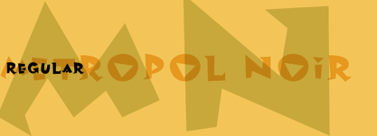
- Mon Voir by Great Lakes Lettering,
$30.00 New to the Great Lakes Lettering library is Mon Voir. Mon Voir is the signature lettering style from Jenna Rainey a talented calligrapher and illustrator and the artist behind Mon Voir studio.
 - Carré Noir by Monotype,
$29.99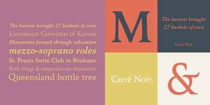
- Noir Jolie by SilverStag,
$19.00 After a couple of weeks of teasing, sneak previews & insta shots, my new typeface is finally here. Noir Jolie is a modern ligature serif font that comes with curvy & straight combo of uppercase letters and chic lowercase alphabet that together look just perfect. Noir Jolie is also my last font for 2022 so I really hope you guys like it. The font also includes full language support, punctuation, numerals and detailed instructions how to use alternates & ligatures in most of the apps on your computer, as well as in Canva. I invite you to check out the preview images, and I hope you will be immersed in my vision for this creative typeface that, I am sure, will work for all kinds of interesting projects you might be working on this year. If you end up publishing your designs on Instagram, tag me - @silverstagco and I will make sure to showcase your design and work to my audience as well! Noir Jolie - Modern Ligature Serif Includes: 25+ Ligatures Numerals & Punctuation Language Support Web Font Kit is included as well Detailed instructions on how to use alternates in most of the apps on your computer as well for Canva Happy creating everyone!
 - Pinot Noir by Jonahfonts,
$40.00 Usage recommendations: Captions, fliers, packaging, cards, posters, ads, book jackets, manuals, menus, bulletins, magazines, greetings, announcements.
 - Film Noir JNL by Jeff Levine,
$29.00Film Noir JNL is a classic Art Deco Alphabet from the brush of the late master sign painter Alf R. Becker, and appeared in Signs of the Times Magazine. Thanks to Tod Swormstedt of ST Media and the American Sign Museum for providing the reference material to make this font. - Noir et Blanc by Pelavin Fonts,
$25.00 Noir et Blanc began as a proposed logo for a new Broadway production of Moulin Rouge and ended up as a challenge to find how bold a stroke weight could still be beautifully legible. Now that it is complete, we hope it will have the chance to become noir et blanc et rouge partout.
 - Chapeaux Noirs NF by Nick's Fonts,
$10.00 A simple stylistic device gives this clean, bold sans serif face a slightly spooky feeling. Both versions of this font support the Latin 1252, Central European 1250, Turkish 1254 and Baltic 1257 codepages.
 - Poesie_Noire_DEMO - Unknown license

- Crimestopper JNL by Jeff Levine,
$29.00Crimestopper JNL is the aptly-named font fresh out the era of film noir and clever private detectives who always seemed to have the right answer to the question "Whodunit?" - Ulissia by Autographis,
$39.50 Ulissia is a hand-drawn slab serif typeface with a strong character. It reminds me of the 50s, 60s and the film noir period or of old Wild West movies.
 - Huntington JNL by Jeff Levine,
$29.00From the backlots of Hollywood to a computer near you! Quiet on the set... Huntington JNL is a bold sans serif font inspired by titles preceeding the opening of the film classic "Casablanca". Art Deco meets Film Noir... - Lichtspielhaus Handmade by Typocalypse,
$19.00 Lichtspielhaus Handmade is an ultra condensed handwritten typeface based on Lichtspielhaus. Influenced by the hand-painted signs on cinema facades of the early cinema days, Lichtspielhaus Handmade comes with 4 weights. "Lichtspielhaus Handmade“ is the second part of a Type Noir Quadrilogy.
 - Bookable Sans by Stiggy & Sands,
$24.00 A Sans Serif Family with a few unique relatives Our Bookable Sans Family was inspired by a lettering specimen from “Letters and Lettering” by Carlyle & Oring, but you'll find the inspiration has come a long way, baby. From its original reference of displaying a standard width and weight, to the two words showing a light narrow and a heavy wide, this friendly utilitarian display text face has grown to include three width families, with six weights from light to black each. The outliers of the family are Bookable Mondo: an uber heavyweight wide style exuding all brute power in an all-caps form, and Bookable Noir: a lightweight and narrow style with many unique alternate letterforms and ligatures that spoof film noir titling, but also goes off the rails having fun. Opentype features for the traditional families include: - Full set of Inferiors and Superiors for limitless fractions. - A small collection of f-based Ligatures. - Tabular & Proportional figure sets. - Ordinals. - Approx. 419 characters. Opentype features for Bookable Mondo include: - Full set of Inferiors and Superiors for limitless fractions. - Ordinals. - Approx. 391 characters. Opentype features for Bookable Noir include: - Full set of Inferiors and Superiors for limitless fractions. - Five Stylistic Alternate Sets. - Sixty-six unique ligatures. - Ordinals. - Approx. 701 characters.
 - Lichtspielhaus by Typocalypse,
$19.00 Lichtspielhaus is an ultra condensed Lichtspiele spin-Off with 8 weights. It still transports you back to a time where neon lights and marquee letters decorated cinema facades. There are 8 styles: Hairline, Thin, Light, Regular, Medium, Bold, Black and Heavy. "Lichtspielhaus" is the first part of a new Type Noir Quadrilogy.
 - Lichtspielhaus Slab by Typocalypse,
$19.00 Lichtspielhaus Slab is an ultra condensed handwritten typeface based on Lichtspielhaus. It still transports you back to a time where neon lights and marquee letters decorated cinema facades. This time with Slab. There are 8 styles: Hairline, Thin, Light, Regular, Medium, Bold, Black and Heavy. “Lichtspielhaus Slab” is the third part of a Type Noir Quadrilogy.
 - Robur by Canada Type,
$24.95 It shouldn't be a surprise to anyone that these letter shapes are familiar. They have the unmistakable color and weight of Cooper Black, Oswald Cooper's most famous typeface from 1921. What should be a surprise is that these letters are actually from George Auriol's Robur Noir (or Robur Black), published in France circa 1909 by the Peignot foundry as a bolder, solid counterpart to its popular Auriol typeface (1901). This face precedes Cooper Black by a dozen of years and a whole Great War. Cooper Black has always been a bit of a strange typographical apparition to anyone who tried to explain its original purpose, instant popularity in the 1920s, and major revival in the late 1960s. BB&S and Oswald Cooper PR aside, it is quite evident that the majority of Cooper Black's forms did not evolve from Cooper Old Style, as its originators claimed. And the claim that it collected various Art Nouveau elements is of course too ambiguous to be questioned. But when compared with Robur Noir, the "elements" in question can hardly be debated. The chronology of this "machine age" ad face in metal is amusing and stands as somewhat of a general index of post-Great War global industrial competition: - 1901: Peignot releases Auriol, based on the handwriting of George Auriol (the "quintessential Art Nouveau designer," according to Steven Heller and Louise Fili), and it becomes very popular. - 1909-1912: Peignot releases the Robur family of faces. The eight styles released are Robur Noir and its italic, a condensed version called Robur Noir Allongée (Elongated) and its italic, an outline version called Clair De Lune and its condensed/elongated, a lined/striped version called Robur Tigre, and its condensed/elongated counterpart. - 1914 to 1918: World War One uses up economies on both sides of the Atlantic, claims Georges Peignot with a bullet to the forehead, and non-war industry stalls for 4 years. - 1921: BB&S releases Cooper Black with a lot of hype to hungry publishing, manufacturing and advertising industries. - 1924: Robert Middleton releases Ludlow Black. - 1924: The Stevens Shanks foundry, the British successor to the Figgins legacy, releases its own exact copies of Robur Noir and Robur Noir Allongée, alongside a lined version called Royal Lining. - 1925: Oswald Cooper releases his Cooper Black Condensed, with similar math to Robur Noir Allongée (20% reduction in width and vectical stroke). - 1925: Monotype releases Frederick Goudy's Goudy Heavy, an "answer to Cooper Black". Type historians gravely note it as the "teacher steals from his student" scandal. Goudy Heavy Condensed follows a few years later. - 1928: Linotype releases Chauncey Griffith's Pabst Extra Bold. The condensed counterpart is released in 1931. When type production technologies changed and it was time to retool the old faces for the Typositor age, Cooper Black was a frontrunning candidate, while Robur Noir was all but erased from history. This was mostly due to its commercial revival by flourishing and media-driven music and advertising industries. By the late 1960s variations and spinoffs of Cooper Black were in every typesetting catalog. In the early- to mid-1970s, VGC, wanting to capitalize on the Art Nouveau onslaught, published an uncredited exact copy of Robur Black under the name Skylark. But that also went with the dust of history and PR when digital tech came around, and Cooper Black was once again a prime retooling candidate. The "old fellows stole all of our best ideas" indeed. So almost a hundred years after its initial fizz, Robur is here in digital form, to reclaim its rightful position as the inspiration for, and the best alternative to, Cooper Black. Given that its forms date back to the turn of the century, a time when foundry output had a closer relationship to calligraphic and humanist craft, its shapes are truer to brush strokes and much more idiosyncratic than Cooper Black in their totality's construct. Robur and Robur Italic come in all popular font formats. Language support includes Western, Central and Eastern European character sets, as well as Baltic, Esperanto, Maltese, Turkish, and Celtic/Welsh languages. A range of complementary f-ligatures and a few alternates letters are included within the fonts.
 - Teamhair Tower by Evertype,
$20.00Teamhair Tower is a “rough” monowidth font based on the face used on the old Sears Tower Gaelic manual typewriter. Teamhair was first digitized in 2002 by Michael Everson and originally used the MacGaelic character set on the Macintosh platform, and ISO/IEC 8859-14 on the PC. In 2008 Doire version 3 was released in OpenType format, completely compliant with Unicode encoding and with an extended character set. - Casablanca by Red Rooster Collection,
$45.00Casablanca is a decorative sans serif font family. It was designed and produced in 1997 by Steve Jackaman (International TypeFounders). Jackaman loosely based the designs on the Carlos Winkow typeface ‘Electra’ from the Spanish foundry, Nacional, circa early 1940’s. Casablanca has a clean, Art Deco, jazz, and/or noir film feel. It sets nicely at any size, and brings an air of bold mystery to the projects it is applied in. - Early Edition JNL by Jeff Levine,
$29.00 A bold, classic wood type newspaper headline was the inspiration for Early Edition JNL. The source of the type design was actually a dummy newspaper with the headline “Thursby and Archer Murders Linked” [which was used in the 1941 film noir classic “The Maltese Falcon” featuring an all-star cast headed by Humphrey Bogart, Mary Astor, Peter Lorre and Sidney Greenstreet]. Early Edition JNL is available in both regular and oblique versions.
 - Grim N Gritty by Comicraft,
$49.00 Thought Balloons. No use for them any more. You can't be taken seriously when your thoughts are floating above your head in cute, puffy clouds. Doesn't look good. When the streets are extended gutters and the gutters are full of blood, a thought bubble just isn't noir enough, is it? It's gotta be GRIM. It's gotta be GRITTY. Let's face it... It's gotta be GRIM'N'GRITTY. In Italic and Bold Italic. Also Regular and Bold. But I've little use for them either. Talk is cheap.
 - Kickback by Comicraft,
$39.00 Joe Canelli is a crooked cop working in a corrupt police force. Joe is haunted by nightmares of powerlessness. When his partner is brutally murdered and he's betrayed by his colleagues, it appears that Joe's nightmares are coming true. With his back against the wall there's only one thing he can do -- turn against the criminal network that he once embraced... KICKBACK is a fast-paced, action-filled, noir-style, crime thriller from the co-creator of V FOR VENDETTA, David Lloyd. KICKBACK is also a font. This one.
 - Dazzle by Device,
$29.00 Op-art never looked so good. Taking a cue from the popularity in the 1970s of deco Prismas and their related contemporary interpretations, this geometric font updates the trend. Overlap text in different colours or black and white for eye-teasing moiré combinations. An image above illustrates the use of Dazzle Underprint, a uniform-width version of the font that is placed under Dazzle and used to create two-colour effects simply and easily. Dazzle Underprint is not intended for solo use, only as an underprint — please see Dazzle Unicase for a range of undecorated weights.
 - 1913 Typewriter by GLC,
$38.00 This font was patterned after a few characters on a genuine old 1913 small portable typewriter. It looks like those early typescripts, rough, irregular and eroded, suggestive of mythical famous authors, such as Hemingway, as well as “serie noire” movies or anonymous state employee working in a gloomy Kafkaesque office. It is a complete alphabetic full font. It can be used as web-site titles, poster design, or book editing. It may be preferable, if possible, when printing, to choose a pale color a little rather than condensed - dark grey instead of heavy black, for example - to give the best appearance and to benefit from the full details. The old typewriter character size is 11 to 12 points, but this font easily supports enlargement.
 - Rijk by Wilton Foundry,
$39.00 The font name comes from the Dutch word "Rijk" meaning "rich". I'd like you to consider Rijk as a good Pinot Noir: medium bodied, offering succulent juicy berry flavors, accentuated by delicate aromas of coffee and vanilla oak. Ruby red in color, it boasts of velvety tannins and a long fulfilling fruity aftertaste. Rijk has a structure that is delicate and fresh. The aromatics are very fruity like cherry, strawberry, and plum, often with notes of tea-leaf, damp earth, or worn leather… My intent was to create a script that is rich, while not overbearing. It will serve many noble and useful purposes because of its fresh and lively texture. It is also very legible because it has a slightly more upright angle. Use Rijk for headlines, packaging, identities, advertising and online. Available in OpenType, it includes a range of ligatures as well as a full range of class kerning.
 - Wholecar by Mans Greback,
$59.00 Wholecar is a train graffiti typeface. The letters are fun and friendly, with a happy personality and cartoonish quirkiness. A street style, Wholecar is drawn and created by Mans Greback, and is the perfect combination of cool and childish typography. This hip-hop styled comic typeface family comes in eight styles: Black, Inline, Invert, Regular and White. Additionally, the Wholecar Color, consisting of Noir, Pink and Silver, specifically created for Photoshop and Illustrator. Use characters [ ] { } ¤ # _ for train parts fitting the letters. Examples: [¤#¤_¤_¤#¤] [¤Graffiti¤] The font is built with advanced OpenType functionality and has a guaranteed top-notch quality, containing stylistic and contextual alternates, ligatures and more features; all to give you full control and customizability. It has extensive lingual support, covering all Latin-based languages, from North Europe to South Africa, from America to South-East Asia. It contains all characters and symbols you'll ever need, including all punctuation and numbers.
 - Detective Client JNL by Jeff Levine,
$29.00 There is no doubt that the 1941 version of “The Maltese Falcon” was superior to the prior two attempts by Warner Brothers at filming Dashiell Hammett’s 1930 novel. Sam Spade was perfectly portrayed by Humphrey Bogart, and the supporting cast of Mary Astor, Peter Lorre, Sidney Greenstreet and Elisha Cook, Jr. rounded out the main players in a great suspense film that is considered to be the first (if not one of the first) of the film noir genre. The title cards for the production and cast credits were hand-lettered in a spurred serif type style strongly reminiscent of the Art Nouveau period, so instead of naming the digital version with some “tough guy detective” moniker, it was decided that Detective Client JNL was more appropriate. After all, this is a reasonably attractive font, and in this kind of film it’s usually the “attractive damsel in distress” [be she the victim or the actual perpetrator] that gets the story rolling… Detective Client JNL is available in both regular and oblique versions.
 - Rot by MKGD,
$13.00 Rot is clunky, clumsy, and utilitarian. It comes straight from a second rate oracle’s prognostications of a not-so-distant dystopian future. A place where film noir meets twenty first century computer cards; and rainy melancholy nights meet global warming. It speaks of a world that welcomes everyone; provided that they are romantically inclined to living life at the short end of the stick. Metaphorically, Rot is a shot of hard liquor served in a dirty glass. Rot has a glyph count of 388 and supports the following languages Afrikaans, Albanian, Asu, Basque, Bemba, Bena, Bosnian, Catalan, Chiga, Colognian, Cornish, Croatian, Czech, Danish, Embu, English, Esperanto, Estonian, Faroese, Filipino, Finnish, French, Friulian, Galician, German, Gusii, Hungarian, Icelandic, Indonesian, Irish, Italian, Kabuverdianu, Kalaallisut, Kalenjin, Kamba, Kikuyu, Kinyarwanda, Latvian, Lithuanian, Low German, Lower Sorbian, Luo, Luxembourgish, Luyia, Machame, Makhuwa-Meetto, Makonde, Malagasy, Malay, Maltese, Manx, Meru, Morisyen, North Ndebele, Norwegian Bokmål, Norwegian Nynorsk, Nyankole, Oromo, Polish, Portuguese, Romanian, Romansh, Rombo, Rundi, Rwa, Samburu, Sango, Sangu, Scottish Gaelic, Sena, Shambala, Shona, Slovak, Slovenian, Soga, Somali, Spanish, Swahili, Swedish, Swiss German, Taita, Teso, Turkmen, Upper Sorbian, Vunjo, Walser, Zulu
 - Ah, Inspector 39! If fonts were guests at a soiree, Inspector 39 would saunter in with the mysterious allure of a noir detective, blending the charm of classic cinema with the intrigue of a whodunit....
- Kingthings Lupine Pro by CheapProFonts,
$10.00 I loved this monster font the second I saw it - it reminded me of Franquins Idées Noires... Reworking it and adding the missing glyphs and diacritics was quite time-consuming - but a lot of fun! Lots of details. The Lupineless variant is Lupine with eyes, decorations and stray hairs removed - which leaves just a very usable fuzzy font for your monster-related headline. Kevin King says: "I love fantasy writing and my favorite author is Terry Pratchett. In Reaper man, my favorite book, there is a werewolf character called Lupine, I wanted to make a font for him and for Ludmilla... It's a long story, it's a hairy font." All fonts from CheapProFonts have very extensive language support: They contain some unusual diacritic letters (some of which are contained in the Latin Extended-B Unicode block) supporting: Cornish, Filipino (Tagalog), Guarani, Luxembourgian, Malagasy, Romanian, Ulithian and Welsh. They also contain all glyphs in the Latin Extended-A Unicode block (which among others cover the Central European and Baltic areas) supporting: Afrikaans, Belarusian (Lacinka), Bosnian, Catalan, Chichewa, Croatian, Czech, Dutch, Esperanto, Greenlandic, Hungarian, Kashubian, Kurdish (Kurmanji), Latvian, Lithuanian, Maltese, Maori, Polish, Saami (Inari), Saami (North), Serbian (latin), Slovak(ian), Slovene, Sorbian (Lower), Sorbian (Upper), Turkish and Turkmen. And they of course contain all the usual "western" glyphs supporting: Albanian, Basque, Breton, Chamorro, Danish, Estonian, Faroese, Finnish, French, Frisian, Galican, German, Icelandic, Indonesian, Irish (Gaelic), Italian, Northern Sotho, Norwegian, Occitan, Portuguese, Rhaeto-Romance, Sami (Lule), Sami (South), Scots (Gaelic), Spanish, Swedish, Tswana, Walloon and Yapese.
 - Haunted House by HiH,
$8.00 Halloween lends itself to graphic images: witches, ghosts, bats, jack-o'lanterns and haunted houses. When we think of a haunted house, we generally think of a large, abandoned, derelict Victorian wood-frame house. The style is usually Second Empire or Queen Anne. There tends to be a lot of decoration. There is usually a porch or two with decorative spindle work. There is probably a tower, either square with a mansard roof such as one might see in Paris or round with a conical roof borrowed from a Loire Valley chateau. These houses were generally built in the United States between 1860 and 1900, products of the exuberance of a time before income tax. It took at least three servants to maintain such a house and was very expensive. Few can afford them today. That is why so many were converted to professional offices, multi-family dwellings or simply abandoned. HAUNTED HOUSE is our typographical contribution to Halloween. Based on our font PETRARKA ML, it features decorative capitol letters that utilize the silhouette of a Second Empire style house complete with a dead tree and a full moon. The font includes 8 ornaments suitable for flyers and party invitations. Revision 2.000 eliminates dual encoding, harmonizes metrics, adds new glyphs, and adds open type features. The zip package includes two versions of the font at no extra charge. There is an OTF version which is in Open PS (Post Script Type 1) format and a TTF version which is in Open TT (True Type)format. Use whichever works best for your applications.


Page 1 of 2Next page