270 search results
(0.008 seconds)
- Waba by Lewis McGuffie Type,
$40.00 Waba Pronounced ‘Vah-bah’, is a font family that I designed. The name comes from a historical variation on the Estonian word ‘vaba’ – meaning ‘free’, or 'at liberty'. Back in 2017 I visited the Estonian Print & Paper Museum in Tartu to see its great collection of type (well worth a visit!). While I was there I saw some big woodcut blocks of Reklameschrift Herold - a super Art Nouveau/Jugendstil style display font. The Print & Paper Museum's collection covers both Latin and Cyrillic faces and as a foreigner in these parts I'm kind of fascinated by the exoticism of Cyrillic. How it is different but the same to the Latin letters I take for granted (as a humble Englander – no excuses). Not to mention, Jugendstil with its imitation of natural form, reverse-weights and looping-delicious curves (like you've left the window open all summer and the garden plants are climbing in). This mix of Jugendstil, Cyrillic letters and the beautiful historical border town of Tartu inspired me to start drawing Waba. Trimming the serifs from Herold, simplifying those angles and expanding the category of weights, then taking look at the magical logic of Berthold Block and doing a few things that just seemed right at the time – Waba is a bit of love letter to Estonia, the Baltics and the visual history of Eastern Europe. Waba Monogram Waba also contains a monogram face, which allows you to create any monogramming latin and cyrillic. Simply type out your 2-3-4 characters in Waba Monogram, making sure Contextual Alternates is turned on them voila! Monograms can be customised manually using the OpenType select-pop-up in Adobe. Also included are a few Discretionary Ligatures for Mc, De, Von etc. Monograms work best when Contextual Alternates is turned on.
 - Waza by Linotype,
$29.99 Reviving a handwriting style from centuries past is similar to playing antique musical instruments; the pleasure of communing with live music arranged centuries ago by brilliant composers is heightened by the use of authentic or reconstructed artifacts. A new revived" script from the Baroque epoch is the Waza typeface, developed by Polish designer Franciszek Otto. Waza is inspired by a Wilhelm Hondius (Hondt) etching. Hondius was a Dutch court engraver for the Polish king, Ladislaus IV of the Vasa dynasty. The decorative character of the script engraved in the etching is a display of Hondius's calligraphic skill. The tangle of the flourishes in the capital letters, as well as the decorative lengthening of ascenders and descenders in the lowercase, contrast ideally with the rhythmic 30-degree slant of the design. Waza includes a set of alternative capital letters that have been deprived of ornaments; these allow the setting of proper Roman numerals, e.g., Ladislaus IV."
 - Nata by MysticalType,
$10.00 Nata is a sans serif family with fourteen weights plus matching italics. It was designed by Candi Erwanto in 2019. This sans serif family is based and influenced by geometric styles that were popular during the 1920s and 30s and have been optically corrected for better readability. Nata has a functional look with a warm touch. While thin and black weights are great players in display size, lightweights, regular, and medium are suitable for longer texts. Small x-height and curbed shape provide a distinctive elegance. Nata is equipped for complex and professional typography. This OpenType font family has extended characters to support Central and Eastern European and Western European languages.
 - Ata by Bülent Yüksel,
$19.00 My son’s name is Ata Caner Yüksel. After building this typeface, I decided to honor it with my son’s name. I think I fully reflects the character I created in my mind. Ata typefamily, only one of the four other deep end with rounded corners consist of sharpened flat plate. Matched to one another and are optimized for screen. The family has eight weights plus matching italics was designed by Bülent Yüksel in 2016. Ideally suited for advertising and packaging, editorial and publishing, logo, branding and creative industries, poster and billboards, small text, way-finding and signage as well as web and screen design. ATA provides advanced typographical support for Latin-based languages. Case-Sensitive Forms, Classes and Features, Small Caps from Letter Cases, Fractions, Superior, Inferior, Denominator, Numerator, Old Style Figures, Stylistic Alternates in just one touch easy In all graphic programs. You will enjoy using it.
 - Data Control - Unknown license

- Data Transfer - Unknown license

- Pata Slab by In-House International,
$10.00 Pata Slab: the ultra-heavy optimism we all need in 2020 Pata Slab is the type equivalent of a catwalk stomp down a city sidewalk, a font that’s assertive, funky and more than a little sexy. Named after a colloquialism for ‘feet’, Pata features ultra-heavy slabs and contrasting hairline centers that rise from its chunky footprint. The resulting, retro-inspired vertiginous curves add instant attitude to any design. Developed in 2020, Pata is a type of its time.Pata is all upside, as it is a typeface with no descenders — one that elevates all characters to grow upward from the baseline (because, c’mon, we could all use something uplifting right now!) All uppercase characters were built to fit precisely inside a square, so they’re all the same width and height. The lowercase alphabet, eñes, cedillas, punctuation, numbers and symbols all follow the same height restrictions. Despite all that confinement, Pata sports standard-height terminals that connect seamlessly so there’s nearly endless options for modular ligatures. The upshot of all this meticulous awesomeness is that laying out, customizing and stacking text super simple. Pata Slab was created by In-House International, designed Alexander Wright in collaboration with Rodrigo Fuenzalida. It's available for Opentype format (.otf) compatible with Mac and PC.
 - Data 90 by Device,
$29.00
- Mata Hari by Holland Fonts,
$30.00 - Tata One by FontHaus,
$9.00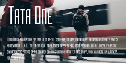
- Hata MF by Masterfont,
$59.00 As personal as a handwriting can be, the ink drops add much of genuine touch to this childish script.
 - Data 70 by ITC,
$29.99Data Seventy is a high-tech style font, with the look of old computer lettering. Data Seventy gives any text a futuristic appearance. - Ata Rounded by Bülent Yüksel,
$19.00 My son’s name is Ata Caner Yüksel. After building this character, I wanted to honor him by using his name for this font. I think it fully reflects the character I created in my mind. Ata Rounded, only one of the four other deep end with rounded corners consist of sharpened flat plate. Matched to one another and are optimized for screen. The family, with eight weights plus matching italics, was designed by Bülent Yüksel in 2016. Ideally suited for advertising and packaging, editorial and publishing, logo, branding and creative industries, poster and billboards, small text, way-finding, and signage, as well as web and screen design. ATA provides advanced typographical support for Latin-based languages. Case-sensitive forms, classes and features, small caps from letter cases, fractions, superior, inferior, denominator, numerator, old-style figures, stylistic alternates; just one touch easy In all graphic programs. You can enjoy using it.
 - Ex Kata Damaged - Unknown license

- Iwata Kyokasyo Pro by IWATA,
$199.00 児童教育のためにトメ、ハネ、ハライ、筆順や画数を明確にした書体です。 教育用書籍だけでなく、様々な書籍にもご使用いただけます。
 - Iwata Kyokasyo Std by IWATA,
$149.00 児童教育のためにトメ、ハネ、ハライ、筆順や画数を明確にした書体です。 教育用書籍だけでなく、様々な書籍にもご使用いただけます。
 - Iwata Kaisho Std by IWATA,
$149.00 書の基本を生かし、美しく格調高いデザインの筆書系書体です。伝統的な正/中太/特太楷書体に加え「力強さ」「伸びやかさ」「整然とした読みやすさ」を意識した「新楷書」「新楷書かなA」があります。
 - Iwata GMincho Pro by IWATA,
$199.00 教科書や参考書、問題集などの教育教材作成のために開発された明朝体です。 筆やペンの入り、押さえ、ハネ、トメ、筆順などを理解しやすいようデザインしています。
 - Iwata Reisho Std by IWATA,
$149.00 中国で古くから使用されていた伝統的な隷書を源流にする「イワタ隷書体」と、 新しい感覚の「イワタ新隷書体」の2種類があります。
 - Iwata Mincho Std by IWATA,
$149.00 フトコロが広くシンプルなエレメントで構成され、可読性に優れたオーソドックスな明朝体です。本文から見出しまで、様々な用途に使用できる書体です。
 - Iwata Mincho Pro by IWATA,
$199.00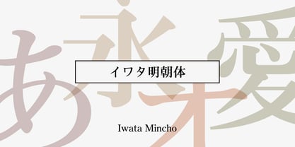 ??????????????????????????????????????????????????????????????????????
 - Iwata Souchou Pro by IWATA,
$199.00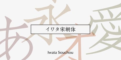 金属活字の「方宋体」をもとに開発した書体です。活字時代の漢字、仮字を再現した「宋朝体」と、仮字デザインを現代風にアレンジした「宋朝体新がな」の2書体があります。
 - Iwata Gyousho Pro by IWATA,
$199.00 楷書と草書の中間的な筆法の書体です。 字体を崩しすぎず、読みやすくなるようデザインしています。
 - Iwata New Gothic by IWATA,
$149.00 漢字・仮名とも天地左右を広くとり、 均整のとれたデザインのゴシック体です。 縦組み横組みどちらでもきれいにラインが揃い、 バランスがとれた美しい組版を実現します。
 - Data 70 SH by Scangraphic Digital Type Collection,
$26.00 Since the release of these fonts most typefaces in the Scangraphic Type Collection appear in two versions. One is designed specifically for headline typesetting (SH: Scangraphic Headline Types) and one specifically for text typesetting (SB Scangraphic Bodytypes). The most obvious differentiation can be found in the spacing. That of the Bodytypes is adjusted for readability. That of the Headline Types is decidedly more narrow in order to do justice to the requirements of headline typesetting. The kerning tables, as well, have been individualized for each of these type varieties. In addition to the adjustment of spacing, there are also adjustments in the design. For the Bodytypes, fine spaces were created which prevented the smear effect on acute angles in small typesizes. For a number of Bodytypes, hairlines and serifs were thickened or the whole typeface was adjusted to meet the optical requirements for setting type in small sizes. For the German lower-case diacritical marks, all Headline Types complements contain alternative integrated accents which allow the compact setting of lower-case headlines.
 - Iwata Kaisho Pro by IWATA,
$199.00
- Iwata Reisho Pro by IWATA,
$199.00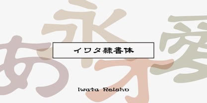 中国で古くから使用されていた伝統的な隷書を源流にする「イワタ隷書体」と、 新しい感覚の「イワタ新隷書体」の2種類があります。
 - Iwata Gyousho Std by IWATA,
$149.00 楷書と草書の中間的な筆法の書体です。 字体を崩しすぎず、読みやすくなるようデザインしています。
 - Iwata GKyoukasho Pro by IWATA,
$199.00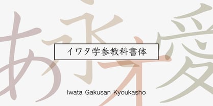 2010年に改定された常用漢字表に対応し、教科書、学習書、参考書などのあらゆる教材に使用できます。 筆やペンの入り、押さえ、ハネ、トメ、筆順などが理解しやすいようデザインしています。
 - Iwata News Mincho Std by IWATA,
$199.00 数多くの新聞社で使われてきた伝統ある「岩田新聞明朝体」を再現した「イワタ新聞明朝体」と、かなを現代風にアレンジした「イワタ新聞明朝体新がな」があります。
 - Iwata UD R Gothic by IWATA,
$199.00 - Iwata News Gothic Pro by IWATA,
$309.00
- Iwata Mincho Old Pro by IWATA,
$199.00 ?????????????????????????????????????????????????????????????????????????????????????
 - Iwata Souchou NK Pro by IWATA,
$199.00 金属活字の「方宋体」をもとに開発した書体です。活字時代の漢字、仮字を再現した「宋朝体」と、仮字デザインを現代風にアレンジした「宋朝体新がな」の2書体があります。
 - Iwata Mincho Old Std by IWATA,
$149.00 活字書体「岩田明朝体」のデザインを引き継ぐ、伝統ある明朝体です。起筆、終筆部のアクセントで表現された活字特有の文字の力強さ、小さめにデザインされたかなは可読性を高めます。
 - Iwata Maru Gothic Pro by IWATA,
$199.00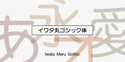 書き文字のような柔らかみのある丸ゴシック体です。字面が大きくラインが揃うデザインです。あたたかさや優しさ、親しみやすさを表現しやすい書体です。
 - Iwata GNew Gothic Pro by IWATA,
$199.00 教科書や参考書、問題集などの教育教材作成のために開発された新ゴシック体です。 筆やペンの入り、押さえ、ハネ、トメ、筆順などを理解しやすいようデザインしています。
 - Iwata GMaru Gothic Pro by IWATA,
$199.00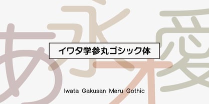 教科書や参考書、問題集などの教育教材作成のために開発された丸ゴシック体です。 筆やペンの入り、押さえ、ハネ、トメ、筆順などを理解しやすいようデザインしています。
 - Iwata New Gothic Pro by IWATA,
$199.00 漢字・仮名とも天地左右を広くとり、 均整のとれたデザインのゴシック体です。 縦組み横組みどちらでもきれいにラインが揃い、 バランスがとれた美しい組版を実現します。
 - Iwata News Mincho Pro by IWATA,
$309.00 ????????????????????????????????????????????????????????????????????????????


Page 1 of 7Next page