37 search results
(0.014 seconds)
- Starcraft - Unknown license

- Artcraft by URW Type Foundry,
$35.99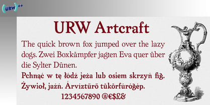
- WW2 Aircraft - Personal use only

- FF Aircraft by FontFont,
$41.99 French type designer Albert Boton created this display FontFont in 2002. The font is ideally suited for advertising and packaging, music and nightlife as well as sports. FF Aircraft provides advanced typographical support with features such as ligatures, alternate characters, and case-sensitive forms. It comes with a complete range of figure set options – oldstyle and lining figures, each in tabular and proportional widths.
 - Heirloom Artcraft by Baseline Fonts,
$29.00 Presenting Heirloom Artcraft-- by Baseline Fonts within the Grit History B series. Like an auntie who insists on baking cookies from scratch every time you visit, Heirloom Artcraft is a beacon of tradition and consistent delight with every letterform. Gentleness and subtlety keep this font far away from kitsch. This font sincerely says "ma'am" and "sir" and is perfect for business cards, custom stamps, coffeetable books, letterhead, invitations and anywhere you or your client wish to make an extremely well mannered and charming statement. There are many alternate ligatures available within the font including capital alternates for T, A, P, B, D, and N. It also boasts a full symbol set and the most darling little swashes scattered tastefully throughout the character map you ever did key. Heirloom Artcraft is available in Thin, Thin Italic, Book, Book Italic, Demi Italic, Black, and Black Italic. It also features Metrics and Optical kerning - metrics displays characters with letterpress-traditional spacing that is pleasantly askew, or more rigid optical kerning which displays characters at identical distances for times when the importance of readability exceeds that of stylistic merit.
 - Streamliner by Zang-O-Fonts,
$25.00Inspired by the typefaces used for company insignia on aircraft in the 1930's and 1940's, Streamliner is light, friendly and open. - PIXymbols FAR Marks by Page Studio Graphics,
$39.00Aircraft marking alphabets and numerals drawn in accordance with FAR Part 45 ¤ 45.29 (c), (d), and (e) of Federal Aviation Regulations. All characters are also in EPS files. - Propeller by Gleb Guralnyk,
$15.00 Introducing a script font named "Propeller". This font has a trendy look inspired by vintage aircraft ads. It has connected letters with smooth shape and round endings. Intersecting lines are made with a small overlay that gives a tiny volume effect.
 - Hopeless Diamond by Barnbrook Fonts,
$50.00 Hopeless Diamond is a contemporary display typeface inspired by the sculptural muscle of 19th century carved lettering and the radical forms of the B-2 Spirit stealth bomber and the F-117 Nighthawk stealth strike aircraft. The typeface itself contains three different styles, each with an italic and an alternate character set that can be used to generate a number of interesting permutations. The name was taken from the derisive term that test pilots used for Have Blue, a late '70s stealth demonstration aircraft –and early prototype for the F-117— designed and built by Lockheed's Skunkworks division. Due to its unusual shape and departure from received aerodynamic wisdom, Have Blue was referred to as the ‘Hopeless Diamond’.
 - Plutonian by Patria Ari,
$19.00Inspiring from space aircraft theme, Plutonian was made with simple geometric shapes and come with 3 different weights. With this typeface, you can use it for logo, title, magazine cover, headline, powerpoint templates design, signs, and many more. What's included? - Uppercase Characters - Lowercase Characters - Multilingual support. - ND Raster by NeueDeutsche,
$20.00 Transport yourself back to the year 1994, a time when MS DOS games ignited the imagination of an impressionable young boy. Enchanted by the pixelated wonders of that era, he embarks on a journey that will shape his creative destiny. As the boy loses himself in the captivating landscapes of Commander Keen, the strategic depths of Warcraft: Orcs & Humans, and the mysterious quests of The Secret of Monkey Island, a seed is planted in his mind. The beauty of these games' typography, crafted pixel by pixel, captivates his young heart and fuels a passion for design.
 - Flick Casual by Jeff Marshall,
$35.00 This hand-lettered italic casual is another versatile font produced by Jeff Marshall, aptly named “Flick” due to its off the brush casual feel. This style was a work horse back in the day where it was used on cafe menu boards through to regulation lettering on trucks and aircraft.
 - Air Corps JNL by Jeff Levine,
$29.00 What started as a small project for Mike Humphrey of Chiltern Image Service in the UK ended up as Air Corps JNL, a typeface featuring retro letters and numbers from military aircraft. Expanded to a full character set with punctuation, foreign accents, monetary figures and the like, Air Corps JNL is also available in an oblique version.
 - Stately GG by Baseline Fonts,
$39.00 TWO LAYERED FONT: Be sure to get both the FRONT and the BACK! Maintaining simultaneous shades of whimsy and versatility is no simple feat, but the meticulously constructed Stately Gothic accomplishes just that, elegantly. Stately Gothic is a redrawn version of Grit Gothic. The strong vertical character of this stacking/layered typeface make it an ideal solution for use where legibility matters most: posters, logos, book and album covers, and so on. It is part of Grit History Series B along with Heirloom Artcraft, Worn Gothic, Grit Sans, and Grit Gothic.
 - The Starcraft font by Neale Davidson is a fascinating and intriguing typeface that immediately draws in enthusiasts of science fiction and gaming, particularly those with an affinity for the iconic S...
- Workaday by Yes Please,
$45.00 Workaday from Yes Please is a bold and clean contemporary take on the classic American Sans Serif. Inspired by the wildly varied history of early to mid 20th century American signage, aircraft markings and industrial shipping vernaculars, Workaday exudes a timeless, classic flavor packed with a personality perfect for graphic headlines, packaging, copy setting and much more! Workaday features conventional ligatures, a standard set of accents and symbols, and a set of open type alternate characters to provide a versatile end-user experience. Workaday has seen action for Nike Sportswear, MSN, IFC, FX and more. Workaday is designed by Lee Schulz.
 - Ball Game JNL by Jeff Levine,
$29.00 What has become a rite of passage at baseball games got its start in 1908 when lyricist Jack Norworth and music composer Albert Von Tilzer wrote "Take Me Out to the Ball-Game" (which was published by Von Tilzer's York Music Company). The Art Nouveau hand lettered title on the cover of the sheet music was eccentric and attractive enough to warrant being turned into a digital type face, and in honor of its namesake song is called Ball Game JNL; available in both regular and oblique versions.
 - Limited Appeal JNL by Jeff Levine,
$29.00 The cover of a 1950s-era catalog for the Freedman Novelty Company (of San Francisco California) had the word "Novelty" hand-lettered in an unusually angular type style against various geometric shapes somewhat resembling balloons. While the lettering was quirky enough to warrant re-drawing as a digital font, the shapes would have presented a visual nightmare in design and spacing, so simple black rectangles were substituted and the letters appear in white. Since novelty lettering of this type would never become "standard" in use, its function became the font's name, Limited Appeal JNL. There is just a simple A-Z and 1-0 character set along with basic punctuation.
 - Grit Sans by Baseline Fonts,
$39.00 Grit Sans is a font balanced enough to stand strong on the tippy-toes of its pointed "t" ascenders. Even all caps communicates calm. Dashes of whimsy in the proportionately plump X-Heights tell of the accountant drinking too much sherry at the office Christmas party, but thick, consistent strokes never lets you forget his job title. Ascenders and descenders consistently reach the same heights and depths, further attesting to the reliability of this typeface, at even very small sizes. Available in both regular and bold face, Grit Sans is a faithful complement to thin fonts with a pinch of frivolity such as Heirloom Artcraft. It is ideal in use for titles, subheadings, menus, playbills, custom stamps, logos - anywhere a solid font can speak at a volume just above all others.
 - Oscar Bravo by Studio K,
$35.00 This font family was inspired by a visit to the Duxford Air Museum just outside of Cambridge, UK, where the whole history of aviation is represented in a series of exhibits ranging from early prop planes to supersonic jetliners. A common feature is the clipped, blockletter painted on the wing or fuselage of each aircraft, my interpretation of which I present here. To add an original touch each letter incorporates its designation in the NATO phonetic alphabet. In response to popular demand this font is now available in 'Scotch' and 'Irish' versions. If you take your whiskey with an 'e' choose Oscar Bravo Whiskey. If you prefer it neat, choose Oscar Bravo. And no, I am not going to bring out an Oscar Bravo Bourbon version! For variations on this font family see also Alma Mater.
 - Safe Font by Galapagos,
$39.00Some typefaces are more deserving of the reference "original typeface design" than are others. Such a typeface is Steve's Safefont GD. It is indeed safe to say that this design has caused some controversy. However, the management of Galapagos Design Group believes that the message of the typeface, even before its characters are used to form words in print, is important enough-and the design itself compelling enough-to warrant the risk of any unintended offense it might cause. Safefont GD is made up of condoms, in various shapes and sizes. The design originated as a lampoon of contemporary-punk- and -garagefont- designs of the nineties. It soon evolved into the quintessence of socially conscious design. Steve suggests this typeface could be "useful as a public service font aimed at important health and social issues." In addition, Safefont GD lends itself to a wide range of fun uses. - Limon by Typesenses,
$49.00 Limon was entirely hand drawn and carefully digitised to get accurate curves but keeping the handmade look. The script fonts are smart scripts, plenty of alternates designed to preserve the calligraphic rhythm. Limon is a beautiful option for menus, magazine covers, wedding invitations, cards and all kind of stationery, packaging and labels. Default positional forms appear while you are writing when Standard Ligatures and Contextual Alternates features are on. Just keep them activated and let Limon Script do the rest. It warrants that all the connections will look good. Also, you can activate stylistic alternates, swash, titling and stylistic sets to have options for capitals, initials and terminals. Each Script Font reaches a total of more than 2900 glyphs (languages for every alternate included). Use professional software that widely support Open Type features. Otherwise, you may not have access to some glyphs. For further information about features and alternates, see the User Guide. Limon has extensive Western, Central and Eastern European language support. Limon Script matches very well with Dress and Chonky When life gives you Limon, make a beautiful design!
 - Newbery Sans Pro by Sudtipos,
$49.00 Newbery Sans is a new contrasted sans serif designed by Alejandro Paul and the Sudtipos team. As Paul has lately found inspiration from different German instructional books, Newbery Sans finds its initial inspirations from the lettering work of E. Nerdinger and invokes the spirit of German designs but is imbued with personality all its own. The idea was to make the letterforms more usable and suitable for everything from corporate branding to editorial. It is an elegant, functional family with contemporary detail that will effortlessly meet the demands of the screen and printed page. From a condensed thin to an expanded black, Newbery Sans provides a usable workhorse system of three widths and seven weights, each with the original design of real italics, a selection of alternate glyphs and a complete set of small caps. Each weight is professionally crafted and includes extended Latin support for Central, East and Western Europe languages. The font’s name nods to its imagined uses in airports and street signage: Jorge Newbery was one of the first Latin American aircraft pilots, Newbery is the street where I live and it is also the name of Buenos Aires’s local airport.
 - Pershal by insigne,
$29.00 Pershal is something of an oddball, and that's the point. Dynamic and fast, Pershal attracts interest. Its architecture evokes growth and progress. Inspired by the futuristic styles of the 1990s, Pershal started on an aircraft ride as a sketch on a napkin. I set the concept aside for almost a decade before I went back to play with the typeface. Pershal is planned to complement applications in consumer finance, technology firms or biotechnology. As such, it has a complete set of both tabular and proportional figures. For the lowercase, Pershal features a distinctive shape that emphasizes its x-height. Its horizontal movement is highlighted by some of its other features, such as its crossbars. To emphasize growth, acceleration and inventiveness, crossbars and other elements are cut at a dynamic angle. It's a sans serif without a lot of contrast. Another unique feature of this typeface is the vast number of OpenType alternates. If you prefer a more conventional appearance to your sans, with stylistic alternates, you have that option. Altogether, there are more than seven separate sets of stylistic alternates and about 250 alternates for characters. This enables you to mix-and-match and create your own personal typeface. For branding, this makes it very useful. For your next project that requires a dynamic and technological appearance, give Pershal a shot.
 - Credit Crunch by Comicraft,
$29.00 Here in the heart of Santa Monica, in the disused 1940s aircraft hangar we like to call the Comicraft Studios, we know that times are tough. As we were driving to “work” in the back of our chauffeur driven Humvee limo, sipping martinis out of the navels of Playboy bunnies and wondering what font we should release next, we decided it was time to reach out to the poor people. Yes, we felt it was time to create a font for the huddled masses yearning to breathe free, for the wretched refuse of our teeming shores. A font, if you will, for the tempest-tossed. It’s a little skinny and might be described as pinched and starved, but it’s guaranteed to see you through this current economic crisis as only the 26 letters of the alphabet can. It was a tall order, but Jazzy JG Roshell created this one while he was in line at the bank, waiting for his personal bailout. Meticulously crafted using one of those ballpoint pens attached to the cashier’s station by elastic, Credit Crunch is the Hamburger Helper of comic book fonts. It’s kind of a hybrid -- just like the Priuses our trophy wives drive to their personal plastic surgeons -- and it’s solar powered and also comes with a tank full of good old fashioned Biro ink. The Recession, Climate Change AND Global Hunger will probably end mere minutes after you crack open your life’s savings to buy this font. How can you afford NOT to...? See the families related to Credit Crunch: Credit Extension.
 - Ah, the Armalite Rifle font, designed by the infamous Vic Fieger. If fonts had personalities, Armalite Rifle would be that one friend who thinks camouflage print is suitable for every occasion and be...
- Aircruiser, designed by the prolific type foundry Iconian Fonts, exudes a sleek and futuristic aura, reminiscent of designs and technology from a science fiction universe. Known for its versatility a...
- Lido STF - Personal use only

- FS Untitled Variable by Fontsmith,
$319.99Developer-friendly The studio has developed a wide array of weights for FS Untitled – 12 in all, in roman and italic – with the intention of meeting every on-screen need. All recognisably part of a family, each weight brings a different edge or personality to headline or body copy. There’s more. Type on screen has a tendency to fill in or blow so for each weight, there’s the choice of two marginally different versions, allowing designers and developers to go up or down a touch in weight. They’re free to use the font at any size on any background colour without fear of causing optical obstacles. And to make life even easier for developers, the 12 weight pairs have each been designated with a number from 100 (Thin) to 750 (Bold), corresponding to the system used to denote font weight in CSS code. Selecting a weight is always light work. Easy on the pixels ‘It’s a digital-first world,’ says Jason Smith, ‘and I wanted to make something that was really functional for digital brands’. FS Untitled was made for modern screens. Its shapes and proportions, x-height and cap height were modelled around the pixel grids of even low-resolution displays. So there are no angles in the A, V and W, just gently curving strokes that fit, not fight, with the pixels, and reduce the dependency on font hinting. Forms are simplified and modular – there are no spurs on the r or d, for example – and the space between the dot of the i and its stem is larger than usual. The result is a clearer, more legible typeface – functional but with bags of character. Screen beginnings FS Untitled got its start on the box. Its roots lie in Fontsmith’s creation of the typeface for Channel 4’s rebrand in 2005: the classic, quirky, edgy C4 headline font, with its rounded square shapes (inspired by the classic cartoon TV shape of a squidgy rectangle), and a toned-down version for use in text, captions and content graphics. The studio has built on the characteristics that made the original face so pixel-friendly: its blend of almost-flat horizontals and verticals with just enough openness and curve at the corners to keep the font looking friendly. The curves of the o, c and e are classic Fontsmith – typical of the dedication its designers puts into sculpting letterforms. Look out for… FS Untitled wouldn’t be a Fontsmith typeface if it didn’t have its quirks, some warranted, some wanton. There’s the rounded junction at the base of the E, for example, and the strong, solid contours of the punctuation marks and numerals. Notice, too, the distinctive, open shape of the A, V, W, X and Y, created by strokes that start off straight before curving into their diagonal path. Some would call the look bow-legged; we’d call it big-hearted. - FS Untitled by Fontsmith,
$80.00 Developer-friendly The studio has developed a wide array of weights for FS Untitled – 12 in all, in roman and italic – with the intention of meeting every on-screen need. All recognisably part of a family, each weight brings a different edge or personality to headline or body copy. There’s more. Type on screen has a tendency to fill in or blow so for each weight, there’s the choice of two marginally different versions, allowing designers and developers to go up or down a touch in weight. They’re free to use the font at any size on any background colour without fear of causing optical obstacles. And to make life even easier for developers, the 12 weight pairs have each been designated with a number from 100 (Thin) to 750 (Bold), corresponding to the system used to denote font weight in CSS code. Selecting a weight is always light work. Easy on the pixels ‘It’s a digital-first world,’ says Jason Smith, ‘and I wanted to make something that was really functional for digital brands’. FS Untitled was made for modern screens. Its shapes and proportions, x-height and cap height were modelled around the pixel grids of even low-resolution displays. So there are no angles in the A, V and W, just gently curving strokes that fit, not fight, with the pixels, and reduce the dependency on font hinting. Forms are simplified and modular – there are no spurs on the r or d, for example – and the space between the dot of the i and its stem is larger than usual. The result is a clearer, more legible typeface – functional but with bags of character. Screen beginnings FS Untitled got its start on the box. Its roots lie in Fontsmith’s creation of the typeface for Channel 4’s rebrand in 2005: the classic, quirky, edgy C4 headline font, with its rounded square shapes (inspired by the classic cartoon TV shape of a squidgy rectangle), and a toned-down version for use in text, captions and content graphics. The studio has built on the characteristics that made the original face so pixel-friendly: its blend of almost-flat horizontals and verticals with just enough openness and curve at the corners to keep the font looking friendly. The curves of the o, c and e are classic Fontsmith – typical of the dedication its designers puts into sculpting letterforms. Look out for… FS Untitled wouldn’t be a Fontsmith typeface if it didn’t have its quirks, some warranted, some wanton. There’s the rounded junction at the base of the E, for example, and the strong, solid contours of the punctuation marks and numerals. Notice, too, the distinctive, open shape of the A, V, W, X and Y, created by strokes that start off straight before curving into their diagonal path. Some would call the look bow-legged; we’d call it big-hearted.
 - 112 Hours by Device,
$9.00 Rian Hughes’ 15th collection of fonts, “112 Hours”, is entirely dedicated to numbers. Culled from a myriad of sources – clock faces, tickets, watches house numbers – it is an eclectic and wide-ranging set. Each font contains only numerals and related punctuation – no letters. A new book has been designed by Hughes to show the collection, and includes sample settings, complete character sets, source material and an introduction. This is available print-to-order on Blurb in paperback and hardback: http://www.blurb.com/b/5539073-112-hours-hardback http://www.blurb.com/b/5539045-112-hours-paperback From the introduction: The idea for this, the fifteenth Device Fonts collection, began when I came across an online auction site dedicated to antique clocks. I was mesmerized by the inventive and bizarre numerals on their faces. Shorn of the need to extend the internal logic of a typeface through the entire alphabet, the designers of these treasures were free to explore interesting forms and shapes that would otherwise be denied them. Given this horological starting point, I decided to produce 12 fonts, each featuring just the numbers from 1 to 12 and, where appropriate, a small set of supporting characters — in most cases, the international currency symbols, a colon, full stop, hyphen, slash and the number sign. 10, 11 and 12 I opted to place in the capital A, B and C slots. Each font is shown in its entirety here. I soon passed 12, so the next logical finish line was 24. Like a typographic Jack Bauer, I soon passed that too -— the more I researched, the more I came across interesting and unique examples that insisted on digitization, or that inspired me to explore some new design direction. The sources broadened to include tickets, numbering machines, ecclesiastical brass plates and more. Though not derived from clock faces, I opted to keep the 1-12 conceit for consistency, which allowed me to design what are effectively numerical ligatures. I finally concluded one hundred fonts over my original estimate at 112. Even though it’s not strictly divisible by 12, the number has a certain symmetry, I reasoned, and was as good a place as any to round off the project. An overview reveals a broad range that nonetheless fall into several loose categories. There are fairly faithful revivals, only diverging from their source material to even out inconsistencies and regularize weighting or shape to make them more functional in a modern context; designs taken directly from the source material, preserving all the inky grit and character of the original; designs that are loosely based on a couple of numbers from the source material but diverge dramatically for reasons of improved aesthetics or mere whim; and entirely new designs with no historical precedent. As projects like this evolve (and, to be frank, get out of hand), they can take you in directions and to places you didn’t envisage when you first set out. Along the way, I corresponded with experts in railway livery, and now know about the history of cab side and smokebox plates; I travelled to the Musée de l’imprimerie in Nantes, France, to examine their numbering machines; I photographed house numbers in Paris, Florence, Venice, Amsterdam and here in the UK; I delved into my collection of tickets, passes and printed ephemera; I visited the Science Museum in London, the Royal Signals Museum in Dorset, and the Museum of London to source early adding machines, war-time telegraphs and post-war ration books. I photographed watches at Worthing Museum, weighing scales large enough to stand on in a Brick Lane pub, and digital station clocks at Baker Street tube station. I went to the London Under-ground archive at Acton Depot, where you can see all manner of vintage enamel signs and woodblock type; I photographed grocer’s stalls in East End street markets; I dug out old clocks I recalled from childhood at my parents’ place, examined old manual typewriters and cash tills, and crouched down with a torch to look at my electricity meter. I found out that Jane Fonda kicked a policeman, and unusually for someone with a lifelong aversion to sport, picked up some horse-racing jargon. I share some of that research here. In many cases I have not been slavish about staying close to the source material if I didn’t think it warranted it, so a close comparison will reveal differences. These changes could be made for aesthetic reasons, functional reasons (the originals didn’t need to be set in any combination, for example), or just reasons of personal taste. Where reference for the additional characters were not available — which was always the case with fonts derived from clock faces — I have endeavored to design them in a sympathetic style. I may even extend some of these to the full alphabet in the future. If I do, these number-only fonts could be considered as experimental design exercises: forays into form to probe interesting new graphic possibilities.
 - DeLouisville - 100% free

- PykesPeakZero - 100% free

- AdamGorry-Lights - Personal use only

- AdamGorry-Inline - Personal use only

- Ganymede3D - Personal use only

- Waltograph UI - Unknown license


