57 search results
(0.016 seconds)
- Vincenzo by CastleType,
$29.00 Vincenzo is based on a beautiful condensed typeface from the 1920s or earlier; original designer unknown. This is a "Modern" style with fine slab serifs, vertical stress between thick and thins, and high contrast. What is unique about this design is that the triangular serifs (e.g., E, F, L, T, etc.) do not gradually taper as they join the rest of the letter, as would be the case in Bodoni and similar designs. Uppercase only.
 - Vicenza by Almarkha Type,
$29.00 Introducing Vicenza – Elegant Serif a Luxury serif font with a stylish touch inspired by the famous minimalist logo and Vicenza has 2 regular and Italic styles is perfect for the purposes of designing templates, brochures, videos, advertising branding, logos and more.
 - Vincente by Dharma Type,
$19.99 Vincente is a contemporary but Didone-look serif with condensed proportion. Inspired by vintage iron works and antique botanical pictorial book. Very simple and orthodox letter forms with some charming accent such as can be seen in "y". Sophisticated curves but they have human warmth as if they are hand-crafted. Consists of six weights and supporting almost all latin languages.
 - Vincenza Display by The Rare Form,
$35.00 Vincenza Display is a modern high-contrast semi-sans with sharp edges and sleek curves. A distinctive typeface for exquisite headlines. Winner, Gold Award, Graphis 2018 Typography 4. http://www.graphis.com/entry/f6b469fe-c5d3-4bea-87e3-796c1d727b3c/ We felt there was a missing in the world of fashion-forward high-contrast typefaces, so we created Vincenza Display. Based loosely on the proportions of Bodoni, Vincenza features stylized curved descenders and unique semi-serifs, bringing a bold and distinct look to your headlines. The typeface has several alternates and ligatures, and is spaced for all caps as well as sentence case executions. It also contains a robust number of special characters. Vincenza Display is the debut typeface from the team at The Rare Form.
 - Vinchenso Regular by BA Graphics,
$45.00A strong powerful face that really works well for any application requiring a distinguished, clean look. Headlines, subheads, and text; anything goes. Vinchenso also has a matching Bold weight. - P22 Vincent by P22 Type Foundry,
$24.95 This set is inspired by the work of Vincent van Gogh. The alphabet captures the essence of van Gogh's handwriting style, using his extensive correspondence with his brother Theo as the primary reference. This lettering style presents a bold brush-stroke appearance which bears striking similarities to the painting style of Van Gogh. A full international charcter set is featured. The extras feature selected imagery from van Gogh's drawing and paintings.
 - Vincent Handwriting by SoftMaker,
$15.99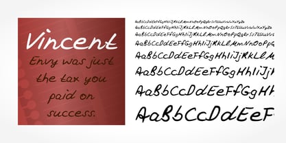 Digitized handwriting fonts are a perfect way to give documents the “very special touch”. Invitations look simply better when handwritten than when printed in bland Arial or Times New Roman. Short handwritten notes look authentic and appealing. There are numerous occasions where handwritten text makes a better impression. “Vincent Handwriting” is a beautiful typeface that mimics true handwriting closely. Use Vincent Handwriting to create stunningly beautiful designs easily.
 - SP Vincent by Studio Pulp,
$19.99 Discover the captivating charm of SP Vincent, a masterfully crafted display font developed in 2023 by Studio Pulp. Inspired by the iconic character Vincent Vega, the central figure in the film classic "Pulp Fiction" (1994), this typeface exudes a powerful and refined aesthetic, befitting a leading role. SP Vincent, with meticulous attention to detail and craftsmanship, showcases versatility that seamlessly complements a variety of design projects, especially excelling in the creation of impressive titles. The three well-balanced weights provide you with the flexibility to unleash your creativity, while the clear, open shapes optimize readability. Anchored in a sleek grid design, SP Vincent embodies modern minimalism and accessible elegance. Whether you are engaged in web design, graphic design, or print materials, this font adds a timeless class to your creations. Be inspired by the seamless blend of functionality and aesthetics in SP Vincent. Specifically designed to meet the demands of 2023, this font brings a contemporary flair to your projects while remaining faithful to Studio Pulp's commitment to quality and innovation. Transform your typographic landscape with SP Vincent and leave a lasting impression reminiscent of the unforgettable moments from "Pulp Fiction."
 - Leonardo da Vincen by Ergibi Studio,
$19.00 Leonardo da Vincen Typeface Font type font with a style that is quite unique, has interesting features that can be used in many fields This font is inspired by the shape of a branch or a natural ornament that can be shaped vintage Leonardo da Vincen is also suitable for making quotes, logos, beverage label designs, badge designs, t-shirt designs, food / coffee packaging and movie poster designs.
 - Titti - Unknown license

- >crAzy-WRiterZ) - Unknown license

- Bopollux - Unknown license

- GOAL - Unknown license

- Joker Krew - Unknown license

- Adrenaline : Zero - Unknown license

- vinceHand II by JOEBOB graphics,
$19.00 This is what my good friend and painter Vincent’s handwriting looks like. I have put in a couple of ligatures and I hope you like it.
 - La Sonnambula by deFharo,
$18.00 The Sonnambula is a handwritten and expanded font with terminal ornaments, designed to write very elegant titles or calligraphic texts. The name of this typography is dedicated to the opera La Sonnambula by Vincenzo Bellini. - Use the following characters for terminal ornaments: () [] - 380 glyphs. Latin Extended-A • OTF & TTF - OpenType Functions: Discretionary Ligatures, Kerning, All Alternates, Additional languages, Standard Ligatures, Slashed Zero, Capital Spacing, Ornaments, Ordinals, Mathematical Greek, Fractions, Localized Forms. - Bitcoin symbol: b# (ligatures)
 - American Donuts - Unknown license

- Service Deluxe JNL by Jeff Levine,
$29.00 Titles from the 1938 movie "Service Deluxe" starring Vincent Price and Constance Bennett were the inspiration for the similarly named Art Deco typeface Service Deluxe JNL.
 - ITC Pacella by ITC,
$29.99Pacella was designed by Vincent Pacella and fashioned in the tradiation of Century Schoolbook, Corona and Nimrod. Pacella maintains high legibilty and exhibits a character and personality all its own. - Cissarz Latein NF by Nick's Fonts,
$10.00This classically elegant typeface is based on a 1912 design by Johann Vincenz Cissarz for the Ludwig & Mayer Foundry. To add a little more visual interest, alternate letterforms can be found in various positions throughout the font: consult the expanded character map. This font contains the complete Latin language character set (Unicode 1252) plus support for Central European (Unicode 1250) languages as well. - Egiziano by Monotype,
$29.99The original design of Egiziano Black is attributed to Vincent Figgins in 1815. As its name suggests, Egiziano Black is a typical example of an Egyptian, or slab serif typeface. Use the Egiziano Black font for posters and titling. - Trailblazer NF by Nick's Fonts,
$10.00Another Vincent Pacella oeuvre named Pioneer provided the pattern for this rootin' tootin' typeface. Perfect for Western or patriotic themes. Both versions of this font include the Unicode Latin 1252 and 1250 Central European character sets, with localization for Moldovan and Romanian. - Jazzy Roll JNL by Jeff Levine,
$29.00 The 1915 sheet music for the tune "Dancing the Jelly Roll Song" by Nat Vincent and Herman Paley featured the title hand-lettered in a sans serif design strongly influenced by the Art Nouveau movement of the early 20th Century. This formed the basis for Jazzy Roll JNL.
 - Binghamton NF by Nick's Fonts,
$10.00This typeface gets its inspiration from a face designed by Vincent Pacella for PLINC named Bingham, and is evocative of steam locomotives and the Old West. Both versions of this font include the Unicode Latin 1252 and 1250 Central European character sets, with localization for Moldovan and Romanian. - Typemonger JNL by Jeff Levine,
$29.00 Typemonger JNL is based on Two Line Sans Serif from the British type specimen book of Vincent Figgins (circa 1860), and is available in both regular and oblique versions. The word ‘monger’ is an old term for a merchant specializing in a certain commodity (such as printing type).
 - Palo Pinto NF by Nick's Fonts,
$10.00Here’s a typeface with a stance as big as Texas. It’s based on Vincent Pacella’s 1960s oeuvre for Photo-Lettering, Inc. called Pacella Vega Extended 10, and named for a county in Central Texas, home of Possum Kingdom Lake. Both versions of this font include the complete Unicode Latin 1252 and Central European 1250 character sets. - Vinnie Culture NF by Nick's Fonts,
$10.00Vincent Pacella designed the inspiration for this typeface, which was called Carousel and was issued by Photolettering in the 70s. Fresh and bouncy, its retro charm will perk up any project it graces. The PC PostScript, TrueType and OpenType versions contain the complete Latin language character set (Unicode 1252) plus support for Central European (Unicode 1250) languages as well. - Cotton Club by Vincenzo Crisafulli,
$30.00 Cotton Club remembers the fonts of the thirties of the last century and the Bodoni, but it does not present graces: it is a sans serif. It has 360 glyphs and is composed of two regular and italic styles. Cotton Club is characterized by a high contrast between thick and thin strokes. The emphasized signs give the font an essential, sharp and elegant look. The Italic style of the Cotton Club refers to handwriting and this is noticeable in the ligatures obtained with kerning. The name of the font, “Cotton Club,” refers to the famous Jazz Club in New York, in Harlem, active in the twenties and thirties, during and after Prohibition. At that time the Bodoni, in its many derivations, was widely used not only in lead composition, but also in neon signs, plaques, posters, as well as in many other applications. Redesigning a new font that brings back to those years wants to be, therefore, a tribute and a reinterpretation of the graphics of that period as well as, it is understood, to the glorious Bodoni. Supported Languages Bulgaro, Bosnian, Catalan, Czech, Danish, German, English, Spanish, Estonian, Finnish, French, Irish, Croatian, Hungarian, Icelandic, Italian, Lithuanian, Latvian, Maltese, Dutch, Norwegian, Polish, Portuguese, Romanian, Slovak, Slovenian, Albanian, Serbian, Swedish, Turkish. Vincenzo Crisafulli font designer Vincenzo Crisafulli graduated from the Faculty of Architecture in Palermo and works as a graphic designer. He has been designing fonts since 1996 and has published with T26 (Type-Foundry, digital foundry in Chicago-California USA): Crisafulli, Chocolat, LST, Luminaria, and Stitching; with MyFonts: Rétrospectif, Bella Copy, Jasmin and Noahs Ark.
 - Flap Jacks NF by Nick's Fonts,
$10.00Head 'em up and roll 'em out! Western styling with a wagonful of whimsy combine in this little beauty, based on a typeface named Blackjack, designed by Vincent Pacella for Photolettering in the 1970s. The PC Postscript, Truetype and Opentype versions contain the complete Latin language character set (Unicode 1252) plus support for Central European (Unicode 1250) languages as well - LC Merkén by Compañía Tipográfica de Chile,
$30.00 Merkén is a typeface inspired in the Slab Serif fonts designed by Vincent Figgins in the early 20th century: his famous designs; Antique and Egiziano, were the main references when developing this project. The typeface is perfect for headlines, medium length texts, branding and advertising. His original set is strong and spicy but it also has an alternative set which is cursive and kind.
 - Earmark NF by Nick's Fonts,
$10.00This extra stout slab serif derives its inspiration from two Vincent Pacella designs: Pacella Barrel and Pacella Colossus. Essentially it’s an all-caps font, but there are biform variants of a, e, m, n and u, so you can mix things up to create more interesting headlines. This font contains the complete Latin language character set (Unicode 1252) plus support for Central European (Unicode 1250) languages as well. - Giza by Font Bureau,
$40.00 The sixteen styles of Giza bring back the colorful power and variety of the original Egyptian letterforms, a glory of the Victorian era. Designer David Berlow based the family on showings in Vincent Figgins’ specimen of 1845, the triumphant introduction of this thunderous style. The truly unforgettable “Nine” weights were designed for ultimate emphasis in posters, and do their most effective work in the very largest of sizes.
 - Goudy Stout by Microsoft Corporation,
$39.00Goudy Stout was designed by Frederic W. Goudy in 1930. This version was created by Vincent Connare while at Microsoft. Goudy Stout is a decorative typeface that is quite unusual, a novelty of sorts among Goudy's many typographic achievements. The Goudy Stout font is considered a frivolous typeface. Goudy wrote In a moment of typographic weakness I attempted to produce a 'black' letter that would interest those advertisers who like the bizarre in their print." - Moderno FB by Font Bureau,
$40.00 In 1995, David Berlow cut Moderno FB for Esquire Gentleman and Reforma from a TrueType pole of Giza. In 1996 he cut new styles with Richard Lipton for El Norte. In 1997, Roger Black ordered new weights for Tages Anzeiger. A redesign of the Baltimore Sun, with Ionic FB as text, required further growth. The whole series was then revised for Louise Vincent, at the Montreal Gazette, with further styles added in 2005 for La Stampa. FB 1994-2008
 - Plinc Goliath by House Industries,
$33.00 Vincent Pacella was a true giant of hand-lettering and typeface design. Of the dozens of styles he designed for Photo-Lettering and International Typeface Corporation, his dominant Goliath towers above the rest. The font is perhaps best known from Herb Lubalin’s American flag that the design legend created for Print magazine’s 40th anniversary cover. Pacella takes “slab” serif to heart with this colossally-proportioned font, using brawny stroke endings and minimal curves to create a powerful figure for maximum visual impact. Take advantage of Goliath’s superior stature to make viewers take notice in industrial settings, sports branding, and oversized outdoor media applications. For comparatively modest musings in accompanying running text, consider partnering it with a comparatively spartan slab serif like Municipal. Or, team up Goliath with a faceted fellow heavyweight like United Sans. Originally drawn in 1970, Goliath was digitized by Ben Kiel with Adam Cruz in 2011. GOLIATH CREDITS: Typeface Design: Vincent Pacella Typeface Digitization: Ben Kiel, Adam Cruz Typeface Production: Ben Kiel Like all good subversives, House Industries hides in plain sight while amplifying the look, feel and style of the world’s most interesting brands, products and people. Based in Delaware, visually influencing the world.
 - Giza RE by Font Bureau,
$40.00 Giza brings back the colorful power and variety of the original Egyptian letterforms, a glory of the Victorian era. Designer David Berlow based the family on showings in Vincent Figgins’ specimen of 1845, the triumphant introduction of this thunderous style. This version of the family is part of the Reading Edge series of fonts specifically designed for small text onscreen, having been adjusted to provide more generous proportions and roomier spacing, and having been hinted in TrueType for optimal rendering in low resolution environments.
 - ITC Cushing by ITC,
$29.99ITC Cushing has a long history. The typeface was originally designed by J. Stearns Cushing, a Boston-based book printer, and famous American type designer Frederic Goudy expanded it to include an italic weight. Under a special license from the American Type Founders, Vincent Pacella modified the design for ITC and added some additional weights. ITC Cushing is slightly condensed with large, bracketed serifs. Pacella changed the capital letters to better complement the lower case and replaced the sloping serifs of the italics to linear type serifs to produce ITC Cushing. - Vicentina by Eurotypo,
$39.00 Vicentina has been created starting from gothic cursive calligraphy, widely used in Italy during XIV century. The ductus of Vicentina has been derived from the documents redacted by Master Domenico Dominici from Vicenza, while most of the inspiration comes from books preserved in the archives of Orvieto Cathedral (Archivi dell'Opera del Duomo di Orvieto). As a result, Vicentina takes form with an elegant, but fast and simplified ductus respect to gothic graphs, rich in ligatures and with over 400 OpenType glyphs, in perfect harmony with the rules of readability of a modern typeface.
 - Monotype Ionic by Monotype,
$29.99 The earliest form of Ionic was brought out by Vincent Figgins in 1821 and was intended for display work. In 1863 a more refined version appeared which had more contrast between thick and thin strokes and the serifs were bracketed. Further developments were made, however the robustness of the Egyptian style was retained making the face suitable for newspaper text setting. With a large x-height and strong hairlines and serifs, the Ionic font family became widely used by the newspaper industry as a body type and provided a model for many twentieth century newspaper typefaces.


Page 1 of 2Next page