30 search results
(0.005 seconds)
- Zado - Unknown license

- Mado by Larin Type Co,
$15.00 MADO is a elegant serif font that includes two styles: regular and true Italic. This is a contrasting medium weight font and looks amazing in logos, branding, arranging wedding invitations, business cards, packaging, titles and much more, it is very readable and recognizable. This font includes alternates for Uppercase and Lowercase and ligatures for Lowercase, with them you can make your project more elegant and unique and italic style will add dynamics to your design, it also includes alternates and ligatures This font is easy to use has OpenType features.
 - Valo by Illushvara,
$14.00 Hello, We are so excited to announce our new fonts "Valo" is a classy and adaptable sans serif font. Whatever the topic, this font will be a wonderful asset to your font library, as it has the potential to enhance any creation from letterheads and titles, to the best branding. Features : Uppercase and lowercase Numbers Symbols Multilingual Accent If you have any question, don’t hesitate to contact me. Happy Designing !!! Thank You, Bayu Suwirya
 - Fado by Olga Umpeleva,
$50.00 Fado is a calligraphic typeface based on the broad nib calligraphy. It has a lot of alternates, ligatures, initial and final forms. The font has 3 sets of length and complexity of ascenders and descenders. It allows the user to chose the style: simple, with more complicated forms, with a lot of flourishes, and even mix all 3 styles.
 - Vedo by Wiescher Design,
$19.50 The name Vedo is derived from the Latin word for "I see". Vedo is a new, sturdy Sans Monoline in 7 weights and 7 Italic cuts. The Thin cuts are free of charge. Yours designing new fonts in the Bauhaus tradition - Gert Wiescher
 - Valdo by Larin Type Co,
$16.00 Valdo is an elegant and contrast serif font family, and a great fashionable solution for your project. It includes upright and Italic style, each of them has eight weights from thin to extrabold. This is a multi-purpose and classic font that is perfect for fashion project, it is contrasted, modern and easy to read. With it, you can create logos, banners, use in advertising, packaging, book covers and magazines, headings, descriptions and much more.
 - Zado Bold - Unknown license

- Zado Condensed - Unknown license

- Zado Expanded - Unknown license

- Vato Land by James White,
$11.00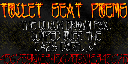
- Mica Valo by Jolicia Type,
$19.00 Mica Valo is a sophisticated serif font that exudes timeless elegance and refinement. Its graceful curves and meticulous detailing make it the perfect choice for projects that demand a touch of class. The inspiration for Mica Valo is drawn from the seamless marriage of classic serif aesthetics and a modern sensibility. The result is a font that transcends time, adding a touch of grace and poise to any visual composition. What sets Mica Valo apart is its Alternate version, which introduces a unique twist to the classic serif style. The alternates offer a subtle variation in letterforms, providing designers with the flexibility to experiment and create distinct, personalized looks. This feature makes Mica Valo an ideal choice for branding, editorial design, and other creative projects where a touch of individuality is desired. Incorporate Mica Valo into your creative toolkit and let its elegant vibes and alternate options elevate your designs to new heights, leaving a lasting impression on your audience.
 - Vako Mave by Nirmana Visual,
$24.00 Vako Mave a modern, contemporary of serif font. Ideally suited for advertising and packaging, festive occasions, editorial and publishing, creative industries and posters .
 - Much Ado by The Very Awkward,
$12.95 Much Ado is a quirky-yet-practical all-caps handwritten font family with just enough subtle variation between uppercase and lowercase letters to keep things interesting. It's pretty great on: Informative infographics Clever indie comics K-Pop cover band posters (and other types of posters) Invitations to cool parties for cool people Eye-catching Instagram posts Sliced bread ...or anything that needs a pinch of fun and a double dose of legibility. Whimsical but supremely readable, Much Ado is imperfectly perfect for both body and headers.
 - Quo Vadis Quasimodo - Personal use only

- Zado Semi-Condensed - Unknown license

- H74 Viva Los Vatos by Hydro74,
$25.00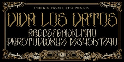
- Groove Thang NF by Nick's Fonts,
$10.00An interesting, unusual and righteously funky variation on the classic “Barnum” style of lettering, this typeface was originally named "Dado". As any woodworker knows, dado is also the name of a slot ploughed, chiseled or cut in wood: in other words, a groove thang. Both versions of the font include 1252 Latin and 1250 CE (with localization for Romanian and Moldovan) character sets. - MF Sadu by MhrfType,
$40.00 Sado is a traditional, modern typeface that create a truly captivating visual experience. with a family of 6 weights, it supports languages that use the Arabic script, such as Persian and Urdu, as well as the Latin alphabet. Sado opens up a world of creative possibilities, inviting designers to explore new horizons and create designs that leave a lasting impression.
 - ITC Typados by ITC,
$29.99ITC Typados is the joint effort of Roselyne and Michel Besnard and is composed of characters in two different senses of the word. First, it is of course made of letters and symbols, clean and legible with generous widths and x-heights. There is a hint of Art Nouveau style in the tapering, brush-like strokes. But the figures of ITC Typados are also made of characters in the theatrical sense: little tear-drop heads on tapering bodies that bend themselves into the shapes of an alphabet while maintaining a life of their own. The typeface is based on a recurring character in Michel's sculpture and painting, Ado. Ado is the first character who sings and repeats itself in all my creations," says Michel. "This adventure brings new forms for my painting and my sculpture: coiffed heads, bodies in the form of a cone, arms in the form of spread wings, etc." "Type" plus a number of "Ados" equals ITC Typados." - Griezelig by Hanoded,
$15.00 I love creating fairytale fonts, but for some reason I haven’t made one for quite a while. So, without further ado, I present Griezelig! Griezelig in Dutch means ‘scary’ or ‘creepy’. The word itself even looks kind of creepy! Griezelig was loosely based on two of my favourite (but unfortunately rather inconspicuous) fonts called Hexenhammer and Bronwen.
 - Party Pocket by Hanoded,
$15.00 I was doing the laundry the other day and, as usual, I was going through the pockets of my jeans. After I had emptied my party pockets, I figured it was a great name for a new font! So, without further ado: here’s Party Pocket: a handwritten all caps font - great for product packaging, greeting cards and posters!
 - Neuer Weltschmerz by Hanoded,
$15.00 About 7 years ago, I released a beautiful (imho) Art Deco inspired font called Weltschmerz. Weltschmerz was an all-caps font and I always wanted to do a lower case version as well. But as things so often go in life, I never found the time and forgot about it. Some time ago, I ‘rediscovered’ my good old Weltschmerz font and remembered that I wanted to create a lower case version. Without further ado: here is Neuer Weltschmerz (‘New Weltschmerz’). I redid the whole font, better kerning, better spacing, better looks… and with a proper lower case! I did keep the original handwritten look intact - because, well, it IS hand made!
 - Hwaiting Sans by Konstantine Studio,
$20.00 Inspired by the emerging Korean culture that grabbing the worldwide actuation in so many realms of the industry. To bridge the vibes and to make it easier to consume, we found the gap to fill with simple things in life that are useful for it, and yes, it’s a new day it’s a new font. So without any further ado, please welcome Hwaiting Sans. 2/3 series of Korean vibes typefaces. It’s a sans-serif font with bold and strong vibes to catch up with today’s graphic design trends. Crafted with deep research about Korean traditional letters, shaped up with the approach of universal Latin letters. This is the second drop of 3 series from the Hwaiting family. So stay tuned for the upcoming release.
 - Hwaiting Handwriting by Konstantine Studio,
$20.00 Inspired by the emerging Korean culture that grabbing the worldwide actuation in so many realms of the industry. To bridge the vibes and to make it easier to consume, we found the gap to fill with simple things in life that are useful for it, and yes, it’s a new day it’s a new font. So without any further ado, please welcome Hwaiting Handwriting. 1/3 series of Korean vibes typefaces. It’s handwriting-based fonts with the reference of the ancient style ink and brush strokes but make it modern. Crafted with deep research about Korean traditional letters, shaped up with the approach of universal Latin letters. This is the first drop of 3 series from the Hwaiting family. So stay tuned for the upcoming release.
 - Hwaiting Serif by Konstantine Studio,
$20.00 Inspired by the emerging Korean culture that grabbing the worldwide actuation in so many realms of the industry. To bridge the vibes and to make it easier to consume, we found the gap to fill with simple things in life that are useful for it, and yes, it's a new day it's a new font. So without any further ado, please welcome Hwaiting Serif. 3/3 series of Korean vibes typefaces. It's a serif font with a thick and thin style of visuals, aiming the luxury and glamorous tone to catch up with high-fashion branding and today's graphic design trends Crafted with deep research about Korean traditional letters, shaped up with the approach of universal Latin letters. This is the last drop of 3 series from the Hwaiting family. Thank you for your engagement with us.
 - Revla Sans Text by Eclectotype,
$30.00 Fun. Fun isn't it? But sometimes you can have too much fun, and things can get out of hand. Revla Sans is, in certain situations, too much fun. So, without further ado, let me introduce the straight man to Revla Sans's buffoon - Revla Sans Text. It represents a complete overhaul of Revla Sans. The bounciness has been removed and details reined in, all for the purpose of optimizing the fonts for use in longer runs of text. 'Text' is perhaps a strong word here; you're not going to be setting novels in this typeface. It still retains the charm of the original, and could well be used in display settings. Think of it like this - Revla Sans would be a great choice for the logo and branding of a board game, no? Revla Sans Text, then, would be good for setting the instructions, or body copy on the website. Revla Sans Text is not as feature-rich as Revla Sans, and is priced accordingly. Enjoy!
 - Kpop Vibes by Ronny Studio,
$19.00 Inspired by the emerging Korean culture that grabbing the worldwide actuation in so many realms of the industry. To bridge the vibes and to make it easier to consume, we found the gap to fill with simple things in life that are useful for it, and yes, it's a new day it's a new font. So without any further ado, please welcome Kpop Vibes. series of Korean vibes typefaces. It's a sans-serif font with bold and strong vibes to catch up with today's graphic design trends. 2 Font Style: - Regular - Italic Kpop Vibes Features: - Uppercase - Lowercase - Numbers & Punctuation - Alternate Style - Multilingual Support - Simple installation All features and special characters of this font are included in one file. So that it is easily accessible by using a program or software that supports opentype such as Adobe Illustrator, Adobe Photoshop, and Adobe Indesign). This font is also very easy to use as it is compatible for all supported software even for non-opentype. Please comment us if you have any questions Thank you and have a nice day. Thank You
 - Soin Sans Neue by Stawix,
$40.00 10 hours a day for almost as long as one anniversary of the Olympics to harvest the experience of designing many typefaces, thinking process and refining the craftmanship throughout these years. From Soin Sans that has been designed and released in 2011 until now, it has come to the right time to push a typeface like Soin Sans itself beyond the boundary, in terms of both usage and equipped features to serve many context of design as perfect as us, Stawix Foundry can offer to you. Soins Sans Neue is the evidence of how Stawix Foundry grows. If one seeks for a type that portrays a simple look, modern but still have a touch of humanist and a little pinch oldstyle, this little one of ours, Soins Sans Neue is the answer we have prepare for you. Technically, we are fully armed with c2sc, cpsp, frac, onum, salt and many more to minimize the chance of choosing other fonts in the project that requires diversities. Without further ado, please welcome Soins Sans Neue!
 - Fadista by Alex Beck,
$19.99 Fadista is an eccentric experimental typeface, inspired by the Portuguese fado music and letterings by the artist Stuart Carvalhais (1887–1961), created throughout the 1920ies and 1930ies. A strong and clean presence with a touch of quirky gives the typeface its overall character. Fadista includes various OpenType features that allow tailoring the type to custom needs, encouraging graphical exploration. Fadista is the result of meticulous research, graphic reinterpretation and systematization of the glyph palette, taking into account modern font standards. Balancing between a historic heritage and „hipster“ contemporary looks, Fadista represents a discourse about aesthetics, trends and currentness in graphic design. The stylistic variations of the glyphs in fadista work in an additive fashion, rather than completely altering the look of the typeface. This means that a basic framework of glyphs remains unaltered, while certain subgroups of characters are affected by the style choices. Through this behavior, stylesets in fadista work as a switch for the type of contrast you’d like entwined in the overall look of the typeface. Other unique features include stylistic alternates for specific glyph combinations, ligatures that allow internal character spacing and tiny diacritics that flow within cap height along normal height glyphs. Please note the lowercase characters within Fadista are uppercase alternates. Math operators are fully supported, as well as a wide range of symbols and punctuation. Supported Languages: Albanian, Danish, Dutch, English, Finnish, French, German, Icelandic, Italian, Malagasy, Norwegian, Portuguese, Romansh, Spanish, Swedish and Turkish. For further language support don‘t hesitate to get in touch. Fadista was awarded the Art Directors Club Bronze in the junior competition 2014 and the DDC Award 2014 in the category "Future“.
 - Gallos by W Type Foundry,
$25.00 What comes to your mind if I say Architype, Geometric, Gaelic, and Uncial? An impossible combination of features? An unrealistic setup of tastes as weird as your music list? Or some part of a joke told by your favourite comedian? Just chill and stick to the idea that is possible. Gallos combines the conceptual historical elegance of the Uncials with the practical rationalism of the Geometric style. Moreover, this typeface is composed by two sub families: Gallos Uncial and Gallos Architype. The letters “M”, “N”, “W”, “a”, “m”, “n”, “r”, and “w” differ between these two models. The first one is related to both: The Uncial script aspect displaying the leaned “a” with a closed bowl, and the classical geometric style depicting more conventional uppercase and lowercase letters “m” and “n”. The Architype one is inspired by Paul Renner’s Architype model, thus the leaned “a” has an open counter, the “r” is composed by a stem and a dot, and the rest of the mentioned letters were built using square rational features. Both models are connected by classical Uncial features such as the curved stroke “e” and curved shaft “t”, and with Gaelic vibes which can be seen in uppercase and lowercase letters “K” and “X”. Also, the curved descender “g” and “y”, alongside the curved stem “z” connect really well with the rest of the system and provide more uniqueness to the Gallos type family. Without further ado, we say to you: let’s make Uncials popular again!


