769 search results
(0.006 seconds)
- Ten Ton Truck by PizzaDude.dk,
$20.00Ten Ton Truck is a heavy, but very legible font. Works very well with massive text, as well as headlines and such. - Tsa - Unknown license

- Ten - Unknown license

- Ton by Katatrad,
$22.00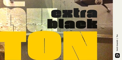
- Tin Doghouse - Unknown license

- Tin Birdhouse - Unknown license

- Tan Patty - Unknown license

- Aklatanic TSO - Unknown license

- Times Ten by Linotype,
$40.99In 1931, The Times of London commissioned a new text type design from Stanley Morison and the Monotype Corporation, after Morison had written an article criticizing The Times for being badly printed and typographically behind the times. The new design was supervised by Stanley Morison and drawn by Victor Lardent, an artist from the advertising department of The Times. Morison used an older typeface, Plantin, as the basis for his design, but made revisions for legibility and economy of space (always important concerns for newspapers). As the old type used by the newspaper had been called Times Old Roman," Morison's revision became "Times New Roman." The Times of London debuted the new typeface in October 1932, and after one year the design was released for commercial sale. The Linotype version, called simply "Times," was optimized for line-casting technology, though the differences in the basic design are subtle. The typeface was very successful for the Times of London, which used a higher grade of newsprint than most newspapers. The better, whiter paper enhanced the new typeface's high degree of contrast and sharp serifs, and created a sparkling, modern look. In 1972, Walter Tracy designed Times Europa for The Times of London. This was a sturdier version, and it was needed to hold up to the newest demands of newspaper printing: faster presses and cheaper paper. In the United States, the Times font family has enjoyed popularity as a magazine and book type since the 1940s. Times continues to be very popular around the world because of its versatility and readability. And because it is a standard font on most computers and digital printers, it has become universally familiar as the office workhorse. Times™, Times™ Europa, and Times New Roman™ are sure bets for proposals, annual reports, office correspondence, magazines, and newspapers. Linotype offers many versions of this font: Times™ is the universal version of Times, used formerly as the matrices for the Linotype hot metal line-casting machines. The basic four weights of roman, italic, bold and bold italic are standard fonts on most printers. There are also small caps, Old style Figures, phonetic characters, and Central European characters. Times™ Ten is the version specially designed for smaller text (12 point and below); its characters are wider and the hairlines are a little stronger. Times Ten has many weights for Latin typography, as well as several weights for Central European, Cyrillic, and Greek typesetting. Times™ Eighteen is the headline version, ideal for point sizes of 18 and larger. The characters are subtly condensed and the hairlines are finer. Times™ Europa is the Walter Tracy re-design of 1972, its sturdier characters and open counterspaces maintain readability in rougher printing conditions. Times New Roman™ is the historic font version first drawn by Victor Lardent and Stanley Morison for the Monotype hot metal caster." - TuNninG OxidE by RodrigoTypo,
$29.00 Tunning Oxide, is an alternative version of Tunning Pro, it contains different styles as alternatives, it also contains Cyrillic and Greek, It is special for stock titles
 - TAN Aegean by TANTypeCo.,
$17.00 TAN AEGEAN is an elegant display serif. It's classic and versatile with a touch of playfulness, it's perfect for any of your design needs.
 - Ten Mincho by Adobe,
$69.00Ten Mincho is a Japanese typeface design from Adobe Originals, designed by Ryoko Nishizuka and useful for a broad range of settings, such as advertising copy, book titles, and headings. As a traditional Mincho-style design the strokes are slightly heavy and rounded, and exhibit smaller counter spaces. Ten Mincho also features a full set of Latin glyphs, collectively known as Ten Oldstyle and designed by Robert Slimbach. This relatively feature-rich Latin subset includes OpenType features such as small caps and old-style figures. Finally, look for a small number of color emoji in an SVG table, some of which are accessible as alternates. - Tin Roof by Jukebox Collection,
$32.99 Tin Roof is a unique and original Jukebox font based on the 1958 hand lettered movie poster from "Cat on a Hot Tin Roof". The slightly modulated baseline and shaky letters give the font both a silly and sinister aspect. Perfect for any dramatic, spooky or sultry subject, Tin Roof has all the allure of a hot southern night! Jukebox fonts are available in OpenType format and downloadable packages contain both .otf and .ttf versions of the font. They are compatible on both Mac and Windows. All fonts contain basic OpenType features as well as support for Latin-based and most Eastern European languages.
 - Ten Till by Atavistic,
$10.00
- TuNninG Pro by RodrigoTypo,
$30.00 Tunning Pro, is a perfect font for action titles, it contains 12 fonts that are separated into Regular version and Alternative version, each one contains the Cyrillic and Greek alphabet, in the alt version you will find many alternative letters for example Letter "A" contains 5 styles to add to the beginning or middle or end of a text.
 - TAN KULTURE by TANTypeCo.,
$17.00 TAN KULTURE is a bold display type. Simple in a good way and efficient with tight kernings making it a nice choice if you want a retro look in your design.
 - One Ton by Luke Thompson,
$10.00 One Ton is a really chunky stencil face that sticks to some strict rules, giving it a distinctively industrial, angular look. It's designed so that the spaces between characters all align in a strong grid. It can bring a ton of personality to signage, branding, editorial and packaging projects where you can afford to be a bit experimental.
 - Zwoelf Ton by Volcano Type,
$19.00 - Ten Pounds by Up Up Creative,
$29.00 Introducing Ten Pounds, a fun, hand-drawn serif font with tons of character (and tons of characters!). Ten Pounds is perfect for branding, poster design, t-shirts, invitations, design for children, and editorial design. It comes with more than 1300 glyphs, including more than 100 ligatures. OpenType features include stylistic sets, character variants, initial and final forms, and multilingual support (including multiple currency symbols). The OpenType features can be very easily accessed by using OpenType-savvy programs such as Adobe Illustrator and Adobe InDesign. (To access these awesome features in Microsoft Word, you'll need to get comfortable with the advanced tab of Word's font menu.)
 - Ten Oldstyle by Adobe,
$35.00Ten Oldstyle is a four-weight type family from Principal Designer Robert Slimbach at Adobe. He designed it as the Latin component of Ten Mincho, a Japanese typeface by Adobe?s Chief Designer Ryoko Nishizuka. As it began to take the form of a small type family, Robert decided to release Ten Oldstyle on its own as well. - TAN Memories by TANTypeCo.,
$15.00 TAN - MEMORIES is set of serif with tight kerning. Classic and classy. Inspired by the 2000s typography in advertising. Perfect as a compliment for our more ornate typefaces or a standalone when you need subtler mood.
 - TAN Marjorie by TANTypeCo.,
$17.00 TAN - MARJORIE is a display sans serif. Bold and groovy. Inspired by fonts you can find in 80s book covers, it gives a modern yet retro vibes.
 - Axion STN by Type Innovations,
$39.00 Axion STN is an original design by Alex Kaczun and is a stencil interpretation of his Axion RX-14 font. It is but one of several alternate designs based on his original Axion family of fonts. The wide gap within this stencil treatment works well with and compliments the spacing in the font, creating a tension within this modern grotesque and adding a class of destinction and interest. This display font is not intended for text use. It was designed specifically for display headlines, logotype, branding and similar applications. The entire font has an original look which is strong, dynamic, machine generated and can be widely used in publications and advertising. Axion STN is a futuristic, techno-looking and expressive typeface with an appearance of machined parts with sharp and rounded edges. This attractive display comes in roman with lower case and lining figures. The large Pro font character set supports most Central European and many Eastern European languages.
 - Prop Ten by Galapagos,
$39.00Some years ago we developed a monospaced 12 pitch sans serif for a client. We also created a 10 pitch version that was later discarded. PropTen is the 10 pitch version modified to proportional widths. The name PropTen refers to 'Proportional 10 Pitch'- which is a technical impossibility. It does have a slight 'its time to vote' twist to it. You know, after you pick your candidate you also need to vote yes or no on the following Propositions, don't forget Prop10, the team needs those uniforms. - TAN Angleton by TANTypeCo.,
$17.00 TAN ANGLETON is an elegant combination of serif and serif-italic. They are classy and the perfect match if you needs something modestly stylish. Its high legibility makes it versatile to be used as a display type or body copy.
 - Nineteen Ten Vienna - Unknown license

- Ten Million Fireflies - Personal use only

- Twelve Ton Sushi - Personal use only

- Twelve Ton Fishstick - Personal use only

- Twelve Ton Goldfish - Unknown license

- BN M@TAN - Unknown license

- LD Hang Ten by Illustration Ink,
$3.00 - Zwoelf Ton B by Volcano Type,
$19.00 - Tin Stencil JNL by Jeff Levine,
$29.00 Tin Stencil JNL was modeled from examples of an antique metal stencil letter and number set.
 - Times Ten Paneuropean by Linotype,
$92.99In 1931, The Times of London commissioned a new text type design from Stanley Morison and the Monotype Corporation, after Morison had written an article criticizing The Times for being badly printed and typographically behind the times. The new design was supervised by Stanley Morison and drawn by Victor Lardent, an artist from the advertising department of The Times. Morison used an older typeface, Plantin, as the basis for his design, but made revisions for legibility and economy of space (always important concerns for newspapers). As the old type used by the newspaper had been called Times Old Roman," Morison's revision became "Times New Roman." The Times of London debuted the new typeface in October 1932, and after one year the design was released for commercial sale. The Linotype version, called simply "Times," was optimized for line-casting technology, though the differences in the basic design are subtle. The typeface was very successful for the Times of London, which used a higher grade of newsprint than most newspapers. The better, whiter paper enhanced the new typeface's high degree of contrast and sharp serifs, and created a sparkling, modern look. In 1972, Walter Tracy designed Times Europa for The Times of London. This was a sturdier version, and it was needed to hold up to the newest demands of newspaper printing: faster presses and cheaper paper. In the United States, the Times font family has enjoyed popularity as a magazine and book type since the 1940s. Times continues to be very popular around the world because of its versatility and readability. And because it is a standard font on most computers and digital printers, it has become universally familiar as the office workhorse. Times™, Times™ Europa, and Times New Roman™ are sure bets for proposals, annual reports, office correspondence, magazines, and newspapers. Linotype offers many versions of this font: Times™ is the universal version of Times, used formerly as the matrices for the Linotype hot metal line-casting machines. The basic four weights of roman, italic, bold and bold italic are standard fonts on most printers. There are also small caps, Old style Figures, phonetic characters, and Central European characters. Times™ Ten is the version specially designed for smaller text (12 point and below); its characters are wider and the hairlines are a little stronger. Times Ten has many weights for Latin typography, as well as several weights for Central European, Cyrillic, and Greek typesetting. Times™ Eighteen is the headline version, ideal for point sizes of 18 and larger. The characters are subtly condensed and the hairlines are finer. Times™ Europa is the Walter Tracy re-design of 1972, its sturdier characters and open counterspaces maintain readability in rougher printing conditions. Times New Roman™ is the historic font version first drawn by Victor Lardent and Stanley Morison for the Monotype hot metal caster." - Display Digits Ten by Gerald Gallo,
$20.00 Display Digits Ten is a display number font with eight sets of variations of the same digits. The digits 0 through 9, with period and comma in appropriate variations, are prepared as (1) solid, (2) outline, (3) solid with contour outline, (4) outline with 3-D shadow, (5) 3-D shadow only, (6) outline with drop shadow, (7) positive in circle, (8) negative in circle.
 - TAN Waltzing Mathilde by TANTypeCo.,
$19.00 Our fonts are supported by most design software, please make sure it can read the OpenType fonts to be able to access all ligatures. Please be informed that while our font works well in Canva, but Canva itself doesn’t support advance opentype features such as special characters.
 - Tin Lizzie JNL by Jeff Levine,
$29.00 One of the most unusual sets of antique stencils spotted for sale online comprises a set of twenty-four classic logos of early 20th Century automobile companies. For whatever purpose that is now lost to time, these stencils represented the logos of many of America's finest auto manufacturers; most now just historical memories. The logos were painstakingly redrawn, maintaining the distinctive look of the hand made cutting, although it was an exacting process - some of the images were taken at an angle, and a bit of artistic license had to be used as a compensatory factor. It is to be noted that any and all of the logos presented in this font are the intellectual property of the companies, successors or assignees that may still hold the rights to these symbols. No endorsements by such corporate entities are either expressed or implied. Additionally, it is advised that any use of these logos be restricted to historical or hobby purposes, and they should not be used in a way that would construe any authorized reproduction of the logos in a commercial fashion.
 - TS Florida by TypeShop Collection,
$24.80 - TS Media by TypeShop Collection,
$24.80


Page 1 of 20Next page